Should a pantry be the same color as the kitchen? Interior designers say no, apart from this one time it matters
Should a pantry be the same color as the kitchen? The short answer is no – in fact, it might be the easiest way to bring a new dimension to your space


Since most layouts have a pantry situated close to or within the kitchen, the color of this space and how it interacts with the kitchen can be a big factor to consider. Do you want both spaces to merge or feel like one seamless space, or should they each have a look and personality of their own?
'I think that pantries are small spaces so why not make a bit of an impact?,' says Cat Dal, founder of Cat Dal Interiors. 'We often do a bright and fun wallpaper; it’s something you just go into for a short time, so why not make it a surprise and something delightful?'
But, if you do decide to change it up for a pantry, how do you decide what color to choose? And are there any instances a pantry should be the same color as a kitchen? We find out.
Should a pantry be the same color as the kitchen?

When it comes to a kitchen pantry, interior designers are fairly decisive that it doesn't need to be the same color as the kitchen. 'Pantries have increasingly become their own special spaces in homes, often with their own design schemes and finishes and organized beautifully,' says Wendy Labrum of Wendy Labrum Interiors. 'While they can certainly match the kitchen, depending on your floor plan and layout, giving the pantry its own finishes can be a great way to add some character and charm.'
'Think of the vibe and mood you're going for in the space,' says Linda Hayslett of LH.Designs. 'I've seen where the pantry is a completely different color and I've seen it the same. It all works as long as the colors speak to one another in terms of their undertones.'
'I love mixing the color tones between the pantry and the kitchen,' says Kelly Mcdougall, founder of Kelly Mcdougall Design. 'If you choose more than one cabinet color in the kitchen palette, it's fun to balance out the space by bringing the colors through to the pantry, especially if you can see the pantry from the kitchen. Depending on your level of comfort with color, the pantry could be a fun splash with similar cabinetry details features.'
When should a pantry match the kitchen?

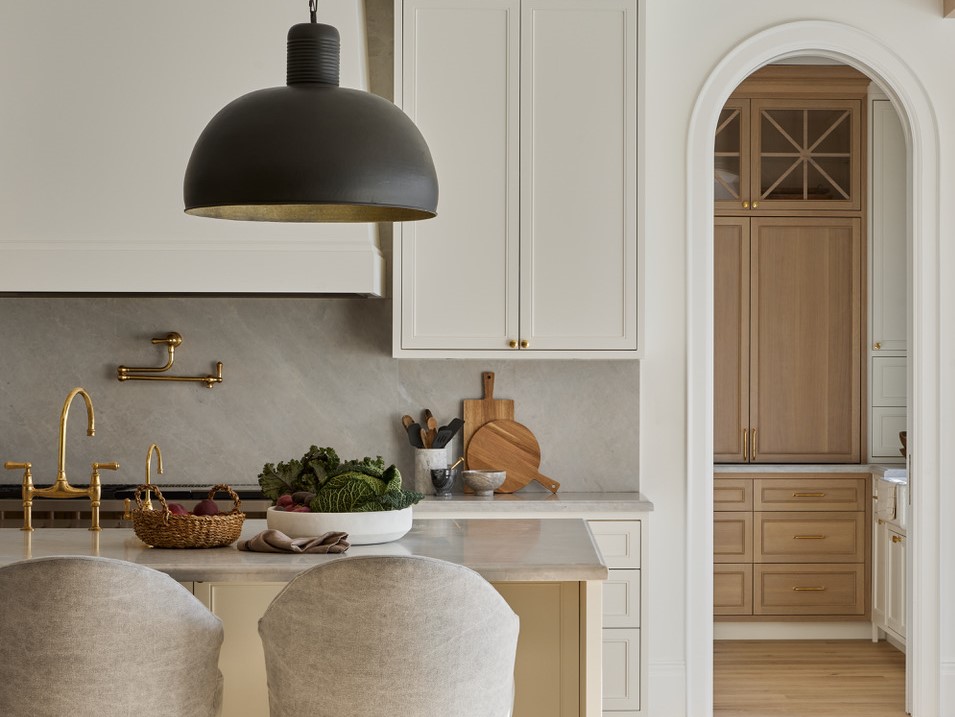
In some instances, you may need to use the same kitchen cabinet color to bring these two separate spaces together and ensure it's obvious the pantry is part of the kitchen. In a space where the pantry is on the opposite side of a room, or behind a door that feels like it could lead to a completely different room, keeping these elements connected by color is a good idea, even if it just ties into one element of the kitchen.
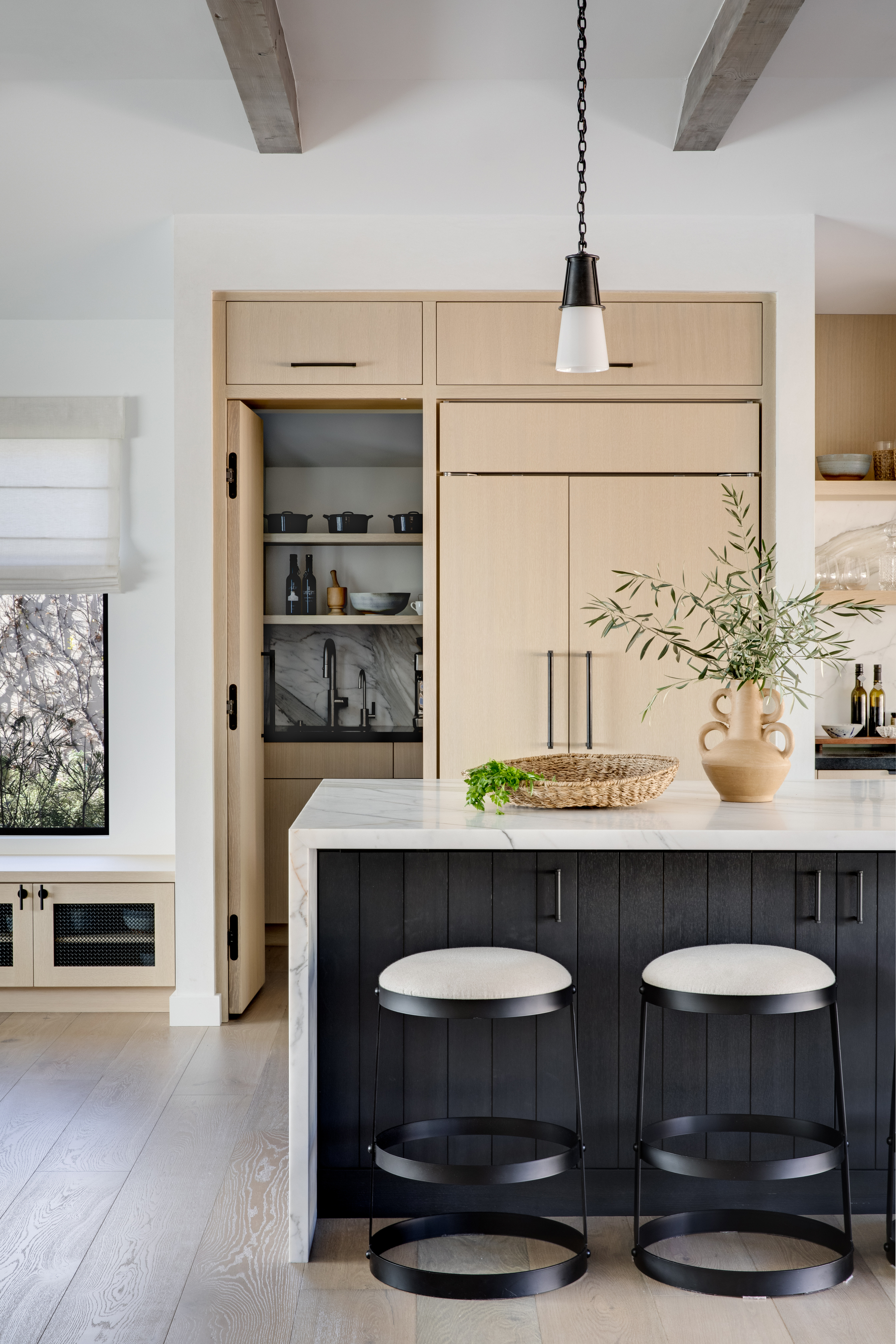
'When it comes to creating a cohesive kitchen and pantry space, connecting the material tones is key,' says Louisa Egglesotn, creative director at Humphrey Munson. 'In this kitchen, the dark painted cabinetry is finished in HM’s paint color ‘Soot’, beautifully illuminated by soft warm integrated lighting, and for a sense of flow and continuity, the pantry finish is the same as the kitchen island and the hardware and worktops throughout the project. It's all about creating a harmonious, inviting space that seamlessly integrates the different elements,' Louisa explains.
If you still want to change up the color, but keep the spaces feeling connected, consider the small touches that can pull together these rooms. 'Backsplash, or hardware could help tie the spaces together,' Kelly Mcdougal suggests.
Should the pantry be lighter or darker than the kitchen?

Next question: should your pantry color be darker or lighter than the kitchen cabinets? It truly comes down to personal preferences and tastes. There are no strict rules as to whether painted kitchen cabinets should be lighter or darker than the kitchen walls or cabinets, but do consider the relative size of the space.
'The pantry is a great opportunity to have a little more fun and implement bolder or darker colors that might not work in an open, light-filled kitchen space,' says Mindy O'Connor, principal of Melinda Kelson O'Connor Architecture & Interiors. 'Most decisions regarding depth and range of color in a kitchen or pantry should be made in consideration of the specific context that includes the light, the scale and design intent of the room and the millwork, the style of the house, the neighboring rooms and how each space will be used.'
A pantry is a great place to try out a darker color, as it's a space that you're not so worried about feeling bright, light and open. However, if you have a small walk-in pantry, and you do choose a darker tone for it, make sure you illuminate the space well to aid you searching for ingredients, especially if it's lacking in natural light anyway.
Should the pantry have the same paint finish as the kitchen cabinets?

Since kitchen shelves and cabinets see a lot more wear and tear than pantry shelves, the former needs a lot more sturdy paint finish such as semi-gloss, gloss, or satin, which do not reveal scratches or stains that easily.
With the latter, you could consider the same, if it's a heavily used space.
'Pantry shelves can get a lot of use; however, they also have items that sit on them for a while as well,' says Linda. 'But to help with any spills or leaks, it's always good to start with a sheen such as satin and then go up from there.'
If your pantry isn't an oft-used space and is one you want to design with a lot more love, then a nice matte or eggshell finish could work.
Consider this tone that pays a tribute to the winged seeds loved by many young gardeners and nature lovers. It looks particularly lively in the morning light.
Be The First To Know
The Livingetc newsletters are your inside source for what’s shaping interiors now - and what’s next. Discover trend forecasts, smart style ideas, and curated shopping inspiration that brings design to life. Subscribe today and stay ahead of the curve.

Aditi Sharma Maheshwari started her career at The Address (The Times of India), a tabloid on interiors and art. She wrote profiles of Indian artists, designers, and architects, and covered inspiring houses and commercial properties. After four years, she moved to ELLE DECOR as a senior features writer, where she contributed to the magazine and website, and also worked alongside the events team on India Design ID — the brand’s 10-day, annual design show. She wrote across topics: from designer interviews, and house tours, to new product launches, shopping pages, and reviews. After three years, she was hired as the senior editor at Houzz. The website content focused on practical advice on decorating the home and making design feel more approachable. She created fresh series on budget buys, design hacks, and DIYs, all backed with expert advice. Equipped with sizable knowledge of the industry and with a good network, she moved to Architectural Digest (Conde Nast) as the digital editor. The publication's focus was on high-end design, and her content highlighted A-listers, starchitects, and high-concept products, all customized for an audience that loves and invests in luxury. After a two-year stint, she moved to the UK and was hired at Livingetc as a design editor. She now freelances for a variety of interiors publications.
-
 Pleated Lampshades Are the Silhouette of the Season — I've Found 9 For Well Under $100 (You'll Never Guess Where)
Leave it to Walmart to bless us with a collection of stunning pleated lampshades — proving this old-fashioned feature can look fresh and modern
By Devin Toolen
-
 I Found the "Healthiest” Bedding for Earth Month — Why Ettitude Is the Sustainable Sleep Label to Know
Softer than silk and smarter than cotton, Ettitude’s innovative take on bedding delivers luxury with a conscience
By Julia Demer
