Should a kitchen floor be lighter or darker than cabinets? I asked designers to dispel the myths
To strike the right balance in your kitchen, your cabinets and flooring should work in harmony. But should your floors be light or dark?
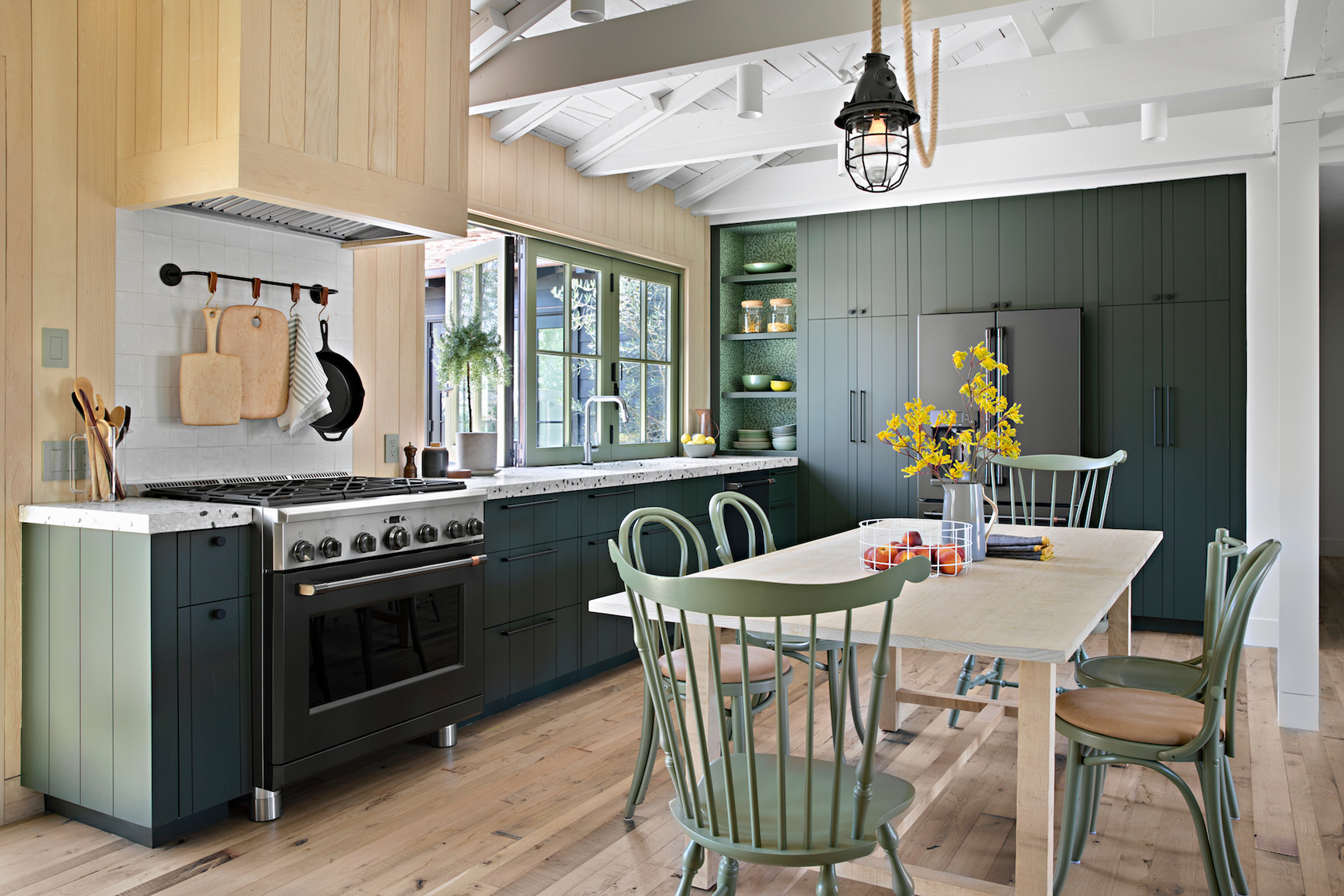

When it comes to your kitchen, achieving the perfect color balance can be a difficult task. During the process of your new revamp, a plethora of questions you never even considered are guaranteed to spring up, and one of those is the whether your kitchen floor should be lighter or darker than your cabinets.
As niche as it sounds, getting these specifics right can really make or break your new design. We all know the impact color can bring to the home, but that includes shades other than those on the walls - your furniture and flooring play key roles too. Your kitchen cabinets and flooring should work in harmony to tie together a cohesive feel in this functional spaces.
But like any design task, that's far easier said than done. From the size of your space to the amount of natural lighting it receives, there are a whole host of factors that should inform your choices when it comes to deciding on lighter or darker flooring in a modern kitchen. With the help of some trusty designers and flooring experts, we take you through them.

Lilith is an expert at following news and trends across the world of interior design. She regularly shares color stories with readers to help them keep up-to-date with ever-changing trends that promise to add personality into the home. For this piece, she ask a number of kitchen design experts whether floors should be darker or lighter than the cabinets. This is what they had to say
Should floors be lighter or darker than your kitchen cabinets?
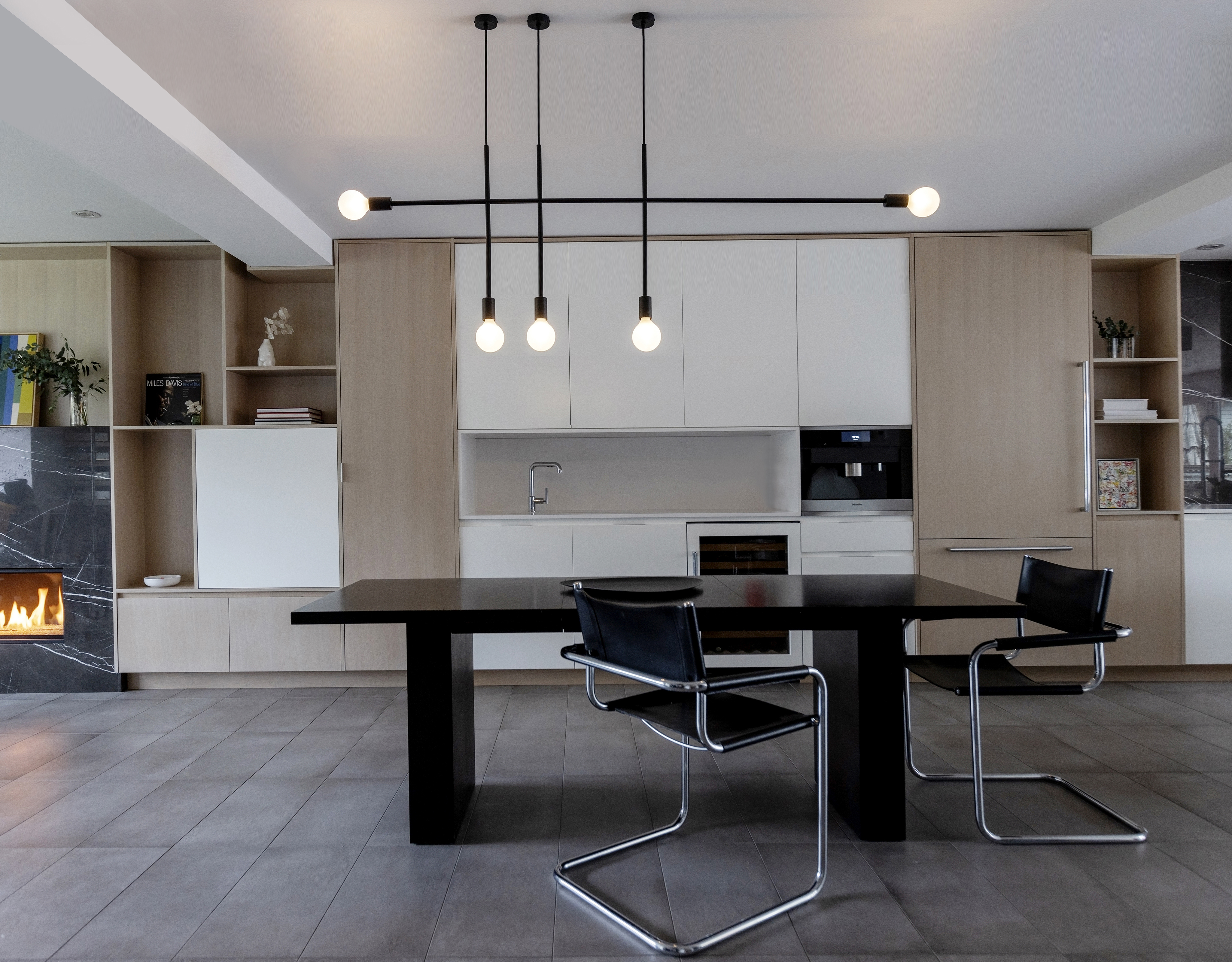
There are no hard or fast rules when it comes to whether your floor should be lighter or darker than your cabinets, but as a general rule of thumb, use darker floors with light cabinetry and vice versa.
When it comes to striking the right balance between your kitchen cabinets and your floor, contrast is a useful tool. This doesn't necessarily mean a monochromatic black and white kitchen, but it does mean experimenting with contrasting textures and tones.
'Use contrast to create balance and visual appeal by choosing two dominant colors and a minor accent color in the opposite tone to compliment the kitchen aesthetic,' says Carolina Hansson, head of design at Luxury Flooring and Furnishings.
'For example, white cabinets pair well with solid oak and herringbone parquet style flooring to add dynamic textures to a simplistic kitchen shade,' she continues. 'Then opt for silver accents with cupboard handles to counterbalance the warm tones of the flooring.'
If one of your surfaces is really dark, contrast is especially important as too many dark shades will overwhelm the space. However if both are very light, Robin Burrill, interior designer at Signature Home, doesn't think contrast is as imperative as she believes two light surfaces can work very well together.
'A lot depends on how big the space is and how much natural light there is,' she says, recommending light on light in smaller kitchens with plenty of natural light. 'However, if you’re going for that really moody maximalist look, then an over-the-top dark on dark dramatic kitchen may be the way you want to go,' she adds.
Here's just a couple of the looks you could try out, depending on the space you have.
1. Use a light floor for kitchens with plenty of natural light
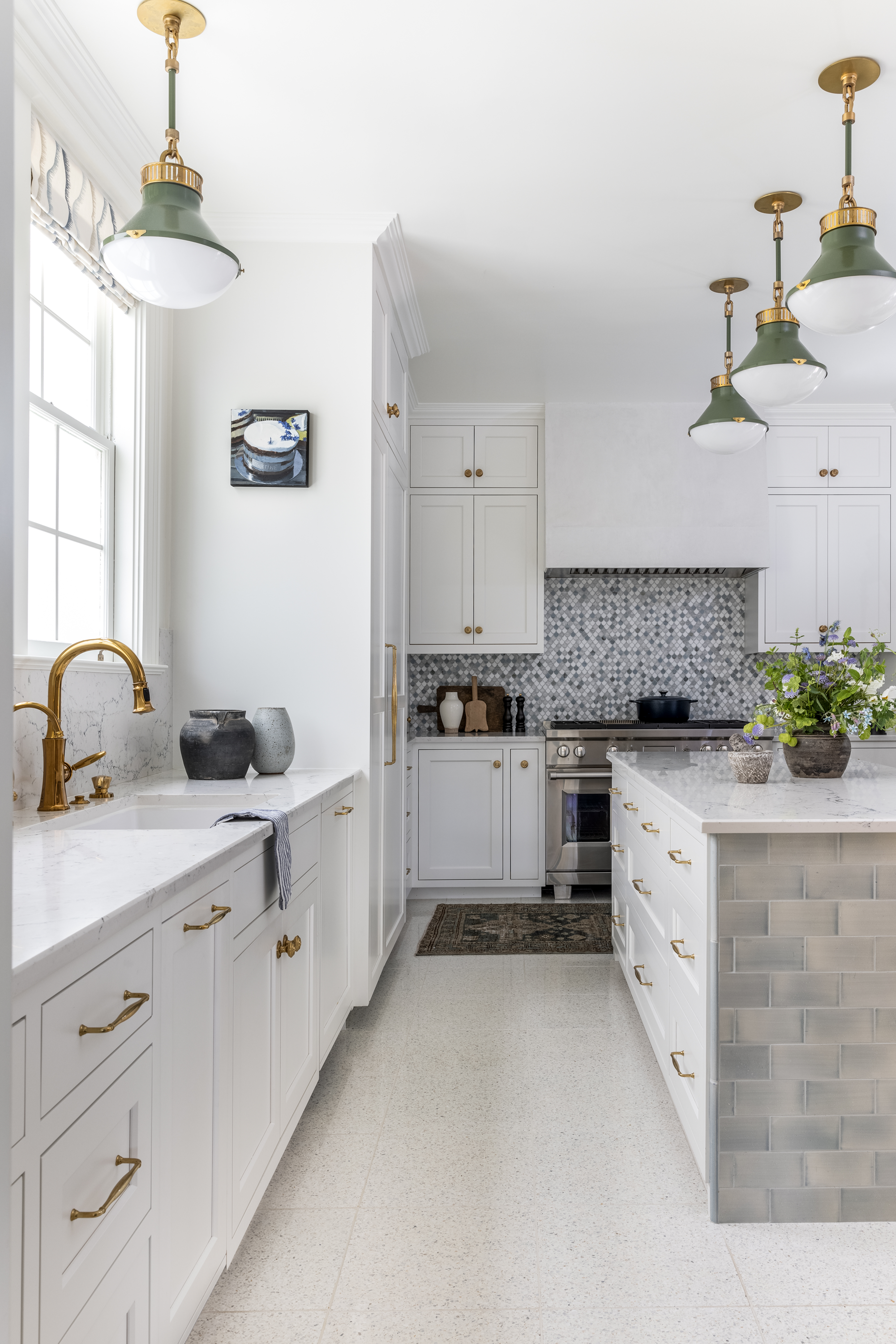
Here's a little bit of color theory for you. Lighter colors reflect more light, so, if you want to maximize the benefits of your large south-facing windows, go for a pairing of light floors and cabinets. Paler colors also recede, giving the appearance of a larger space is smaller rooms. This makes a light-on-light floor/cabinetry combo perfect for small, bright kitchens.
'If you have a small space without a lot of natural light, a lighter floor will brighten the space and at times make it appear larger,' explains Robin. As she points out, that doesn’t mean that a white floor is the only answer since, from a practical point of view, white floors in a kitchen can be a nightmare to upkeep. Instead, go for light grey tiles or light wood-style floors.
2. Go dark on dark for a moody look
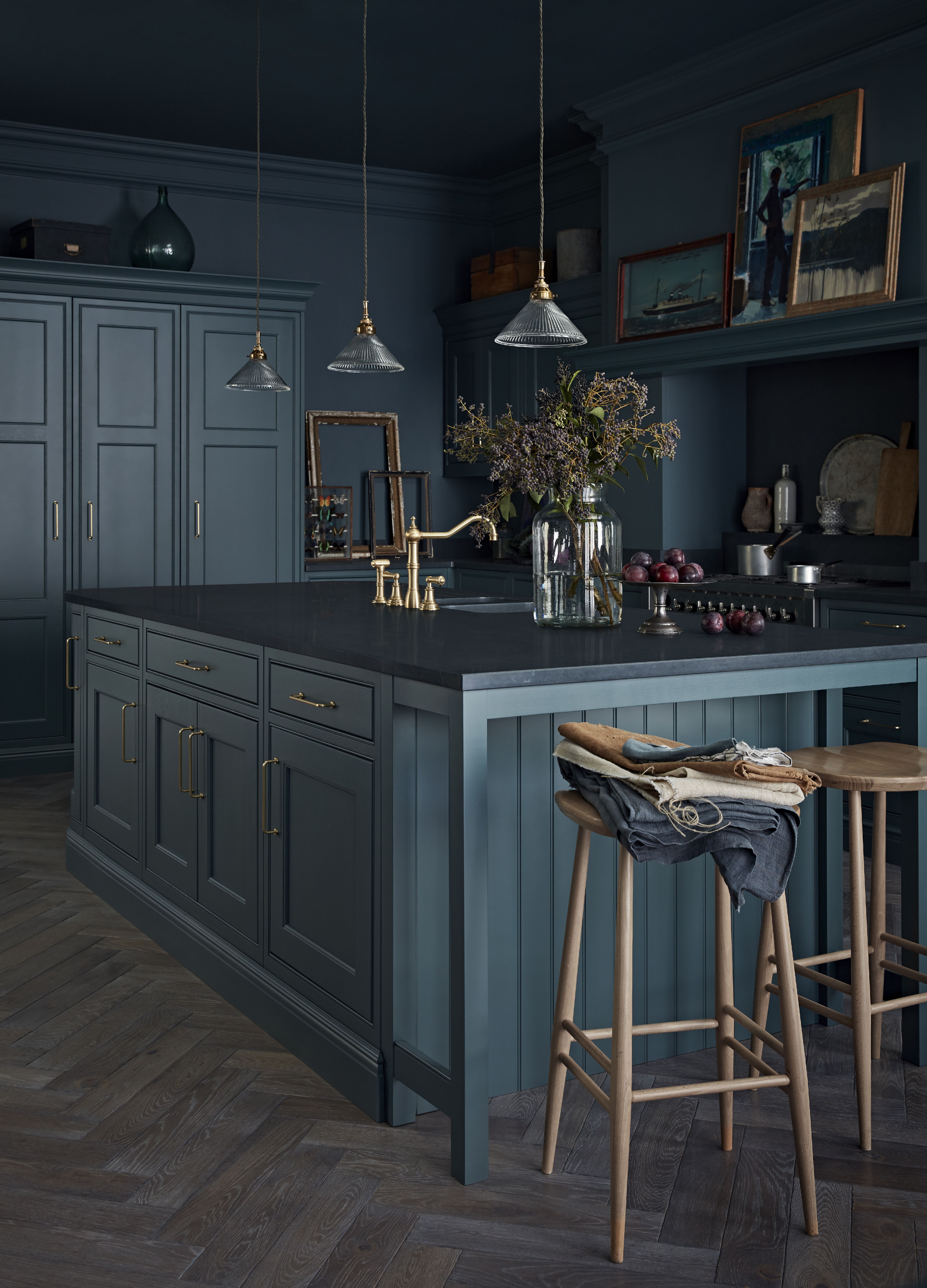
While light on light is the more risk-free option, that doesn't rule out the possibility of dark kitchen floors and dark cabinets together. While care must be taken to ensure your artificial light helps to compliment the space (and small enclosed spaces aren't recommended) a black kitchen can have a really dramatic effect.
'If you have more maximalist tastes and prefer dark grey and black kitchen cabinets, cool-toned hardwood floors in walnut and whisky shades pair well,' says Carolina. 'These colors tend to complement each other and work great with white marble tops if you want that showstopper style. To balance these striking shades, brass is a great choice for a luxurious look.'
Contrary to popular belief, Kate Diaz, interior designer and co-founder of Swanky Den, says dark on dark help create a sense of balance within a space as different colors aren't competing for your eyes to focus. 'What's more, a darker floor with rich cabinetry can make the space feel cozier and warmer when used properly,' she says.
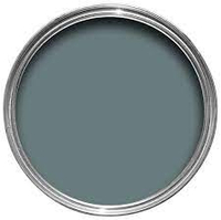
This popular shade from Farrow & Ball captures the beautiful teal green/blue tones of this dark, moody kitchen scheme. We love how the brass fixtures sets this color off perfectly.
3. For intricate flooring designs, use simple cabinetry
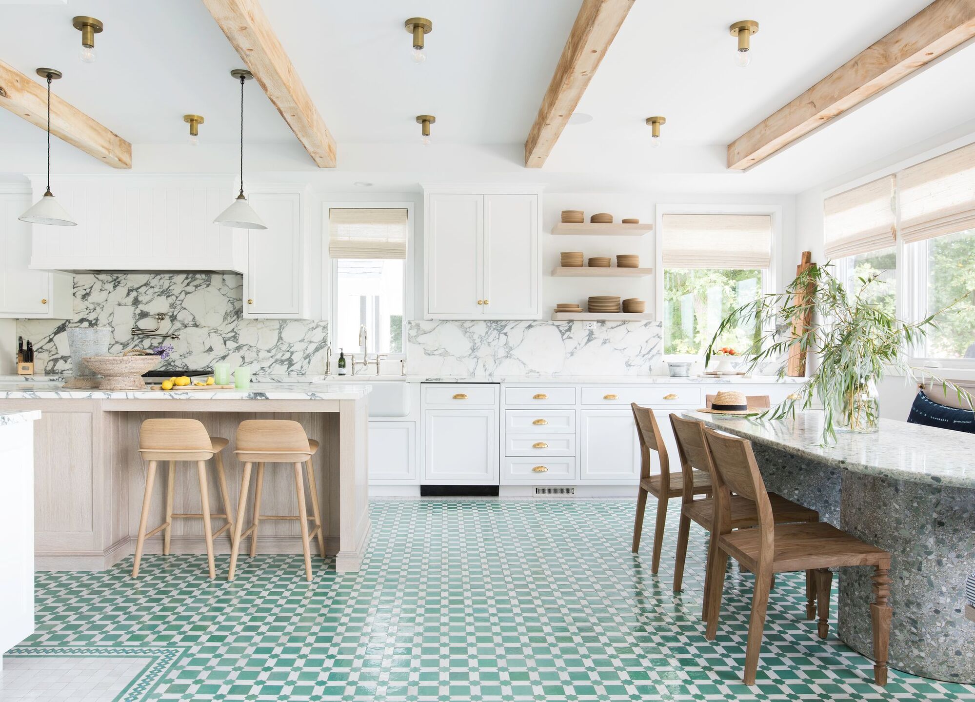
the concept of contrast doesn't only apply to color - it applies to detail, too. If you decide on a more intricate kitchen flooring idea, it's best to go for simplistic cabinetry to complete the perfect look.
'If your flooring has intricate styles such as Herringbone or Versailles, it’s best to opt for classic wooden kitchen cabinets to offer a timeless look,' says Carolina. 'If your cabinets are modern or glossy, you will want to avoid clashing styles - a single plank wooden flooring is usually complimentary for more modern kitchens.'
The same is true for tiles. Beautiful tiles designs are the perfect way to make a design statement in your kitchen, but you don't want to detract from their impact with bold, bright cabinetry. Go for white gloss cabinets for a classic look, or for a more rustic feel, pair wooden cabinets with a geometric tile design.
Should you match your floor and cabinets?
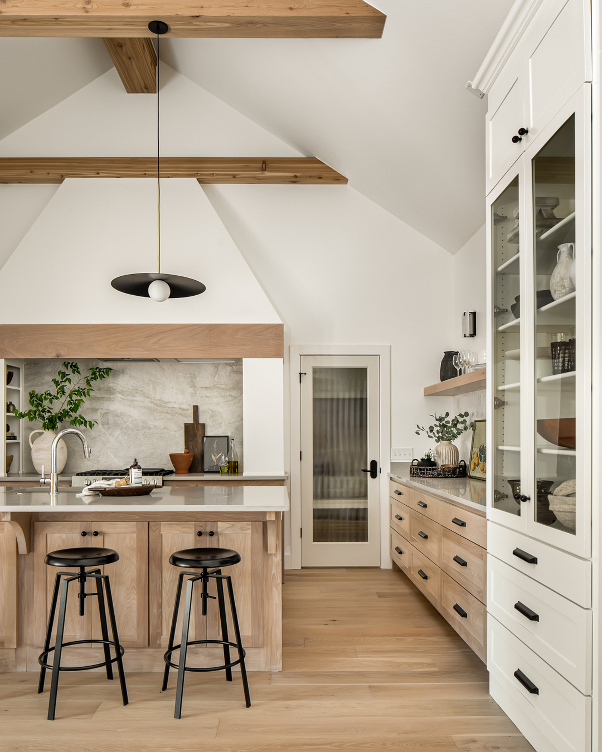
How about matching the color of your flooring and cabinets? In most cases, designers are very much against the idea. Instead, if you want a cohesive, color drenched feel, use tonal layering with different shades of the same color with a few neutrals woven in.
This applies to using wood in the kitchen, too. 'Don’t ever try to match the cabinets and the floor with stained woods,' advises Robin. 'You definitely need a contrast, and it needs to be enough so it doesn’t look like you tried to match.'
This doesn't mean wooden floors and cabinets can't work together, but use different woods with different tones and grains to achieve a subtle contrast. This is especially true if you have book-matched wood grains on your cabinets. 'They can be a cabinet makers worse nightmare, but it can be very dramatic. You just don’t want the floor to take away from that masterpiece,' says Robin.
Be The First To Know
The Livingetc newsletters are your inside source for what’s shaping interiors now - and what’s next. Discover trend forecasts, smart style ideas, and curated shopping inspiration that brings design to life. Subscribe today and stay ahead of the curve.

Lilith Hudson is a freelance writer and regular contributor to Livingetc. She holds an MA in Magazine Journalism from City, University of London, and has written for various titles including Homes & Gardens, House Beautiful, Advnture, the Saturday Times Magazine, Evening Standard, DJ Mag, Metro, and The Simple Things Magazine.
Prior to going freelance, Lilith was the News and Trends Editor at Livingetc. It was a role that helped her develop a keen eye for spotting all the latest micro-trends, interior hacks, and viral decor must-haves you need in your home. With a constant ear to the ground on the design scene, she's ahead of the curve when it comes to the latest color that's sweeping interiors or the hot new style to decorate our homes.
-
 7 Sustainable Product Designs That Are Setting the Agenda for Environmentally-Conscious Homes in 2025
From pillows made from textile waste to sanitaryware made in the world's first electric kiln, these brands are revolutionizing sustainable design — for the better
By Devin Toolen
-
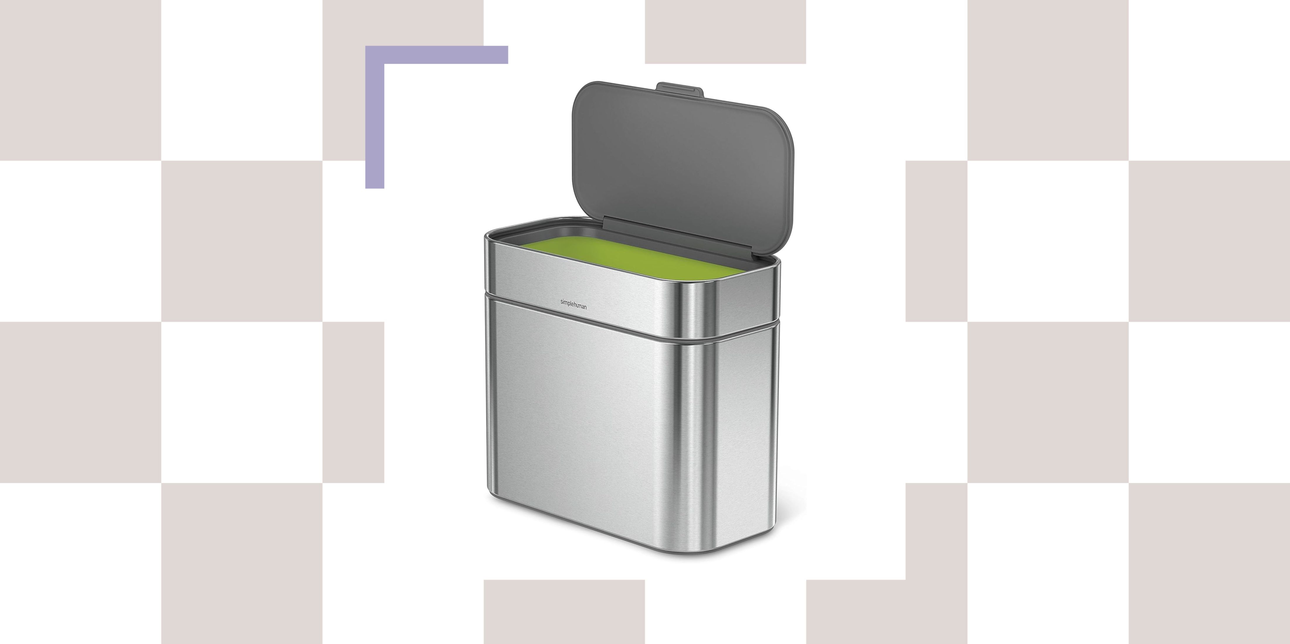 NYC's New Rules Forced Me to Find a Chic Compost Bin — Here's 7 Options Significantly Cheaper Than the $300 Fine
Composting is now mandatory in NYC. Here’s how to do it stylishly
By Julia Demer
