I Want to Paint a North-Facing Room Blue, but Is It a Good Idea? When You Can, and When You Absolutely Shouldn't
With a bit of planning and preparation, even the darkest of rooms can become a beautiful home for both light and dark shades of blue
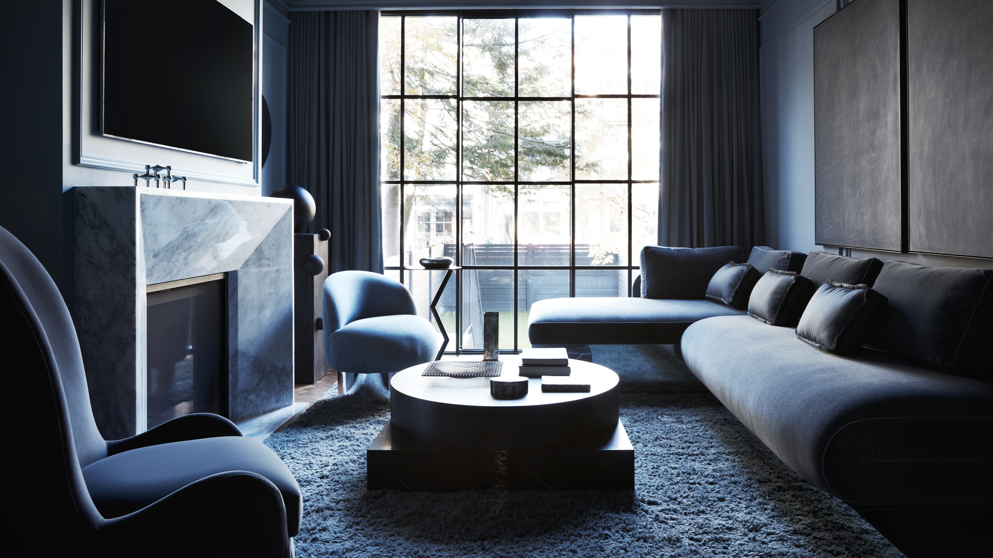

When natural light shines through a window, dark navy blues become rich and well-rounded, and soft baby blues shine with unexpected warmth. But will these shades have the same effect in rooms with less natural light? How and where to use blue in your home is not as simple as coating any room in your favorite shade. I had some big plans for using blue in a darker, north-facing room, but according to the experts, there's no need to change course — a little planning and preparation will steer me in the right direction.
So, should you decorate with blue in a north-facing room? Livingetc's color expert, Amy Moorea Wong, says, "Yes, you should use blue in a north-facing room — if you understand what you’re dealing with." The cool, diffused, often dim light that comes in from the north can make certain blues feel cold and bring out their flat side, so if you’re hoping for a more inviting feel, "blue might not be the one — unless you’re willing to put the time in finding the perfect shade, which very much can be done," says Amy.
It is true that there are times when blue makes the perfect pop and times when you shouldn't paint a room blue, but when it comes to north-facing rooms, don't let a little challenge turn you off. Blue can become a cozy, cocooning color with the right planning. Here are the best tips for preparing to paint your north-facing room blue as according to color experts.
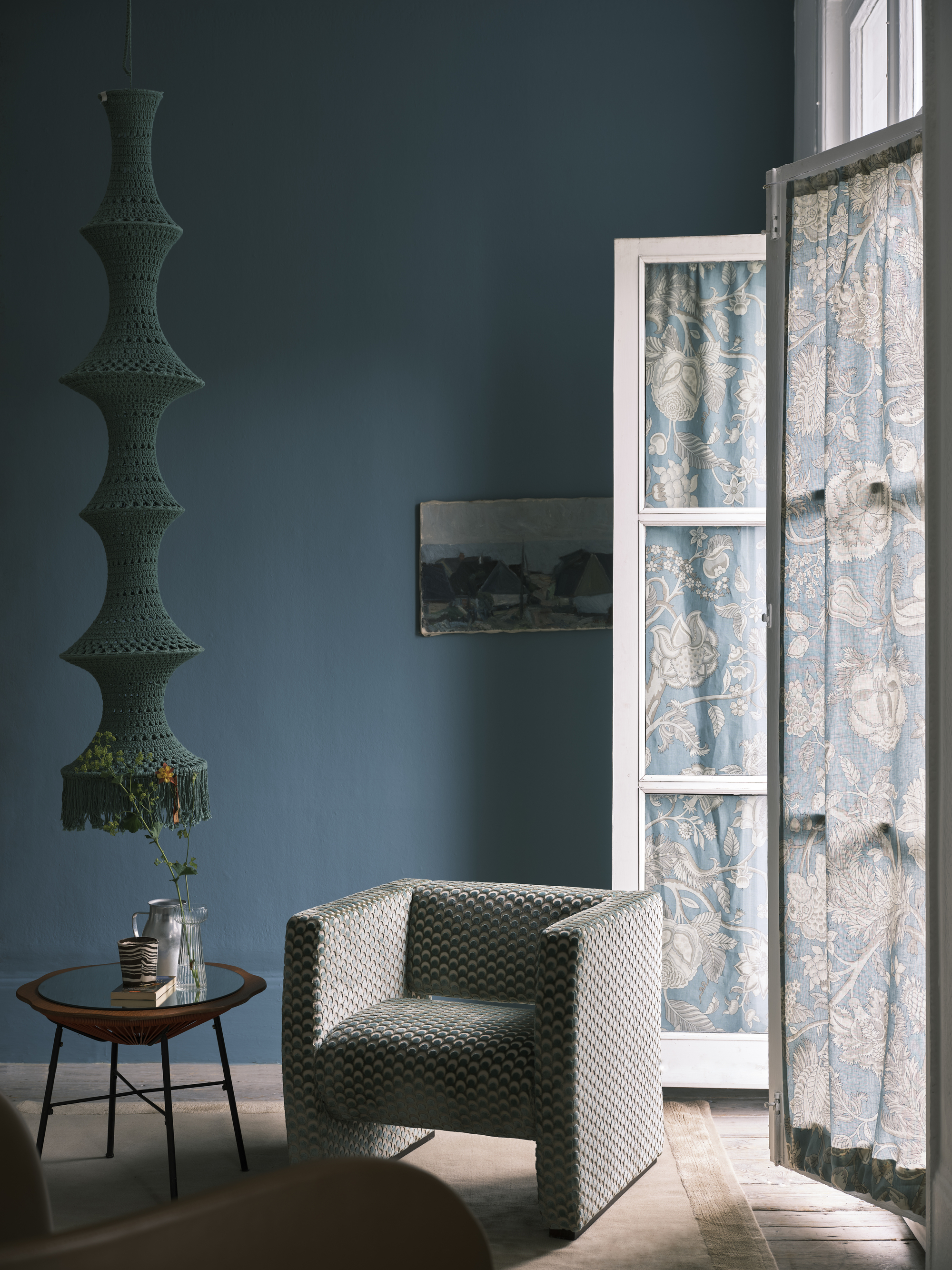
While there is some natural light in this room, it is a soft, low light. The slightly lighter and muted mid-tone blue gives the room character without feeling overwhelming.
Amy Wong says, "The first thing to remember is that there’s blue, and there’s blue and there’s blue. There’s the delicate charm of powder blue, the soft ethereality of sky blue, the purplish whimsy of periwinkle, the brazen power of cobalt, the smoky edginess of slate blue, and the midnight depth of navy blue." The blue paint shades are wildly diverse and will operate differently in north-facing rooms.
In order to make your north-facing room feel like a serene escape rather than a cold, confining space, lean into tones that will balance any coolness with their undertones, such as teal (tinted with green) and indigo (tinged with violet). Other shades of blue to consider are "jewel-like hues such as sapphire which will counteract the light with its deep richness, or a muted duck egg or powder blue which are imbued with subdued warmth," says Amy.
For drama, consider the darker end of navy blue's color family — a classic navy is always a winner when paired with warm lighting, "which brings out its beguiling depth," says Amy. Farrow & Ball's Hague Blue "work's a treat in north-facing rooms because of the underlying green note making it never feel too chilly," says Patrick O'Donnell, color expert and brand ambassador for Farrow & Ball.
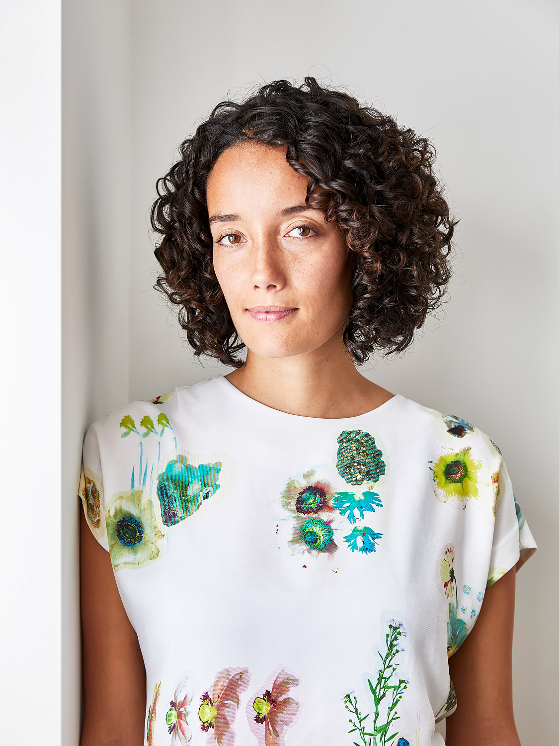
Amy Moorea Wong is a color authority and interior design writer who has specialized in all things decorating for over a decade.
Amy is a respected contemporary interior design writer, who has published a contemporary interior design book Kaleidoscope: Modern Homes in Every Colour. Amy is also Livingetc magazine’s Colour Expert and has an inspiring eye for color for describing how different hues interact with interiors.

Patrick is the brand ambassador and the face of Farrow & Ball on social media, as well as being a true color expert. Patrick has been bringing his impeccable eye to Farrow & Ball since 2012. Over that time, he’s worked in showrooms for the brand and people’s homes to transform countless spaces. He’s always had a flair for interiors, with an ISVA Fine Art & Chattels qualification and having studied specialist paint decoration at the Leonard Pardon School.
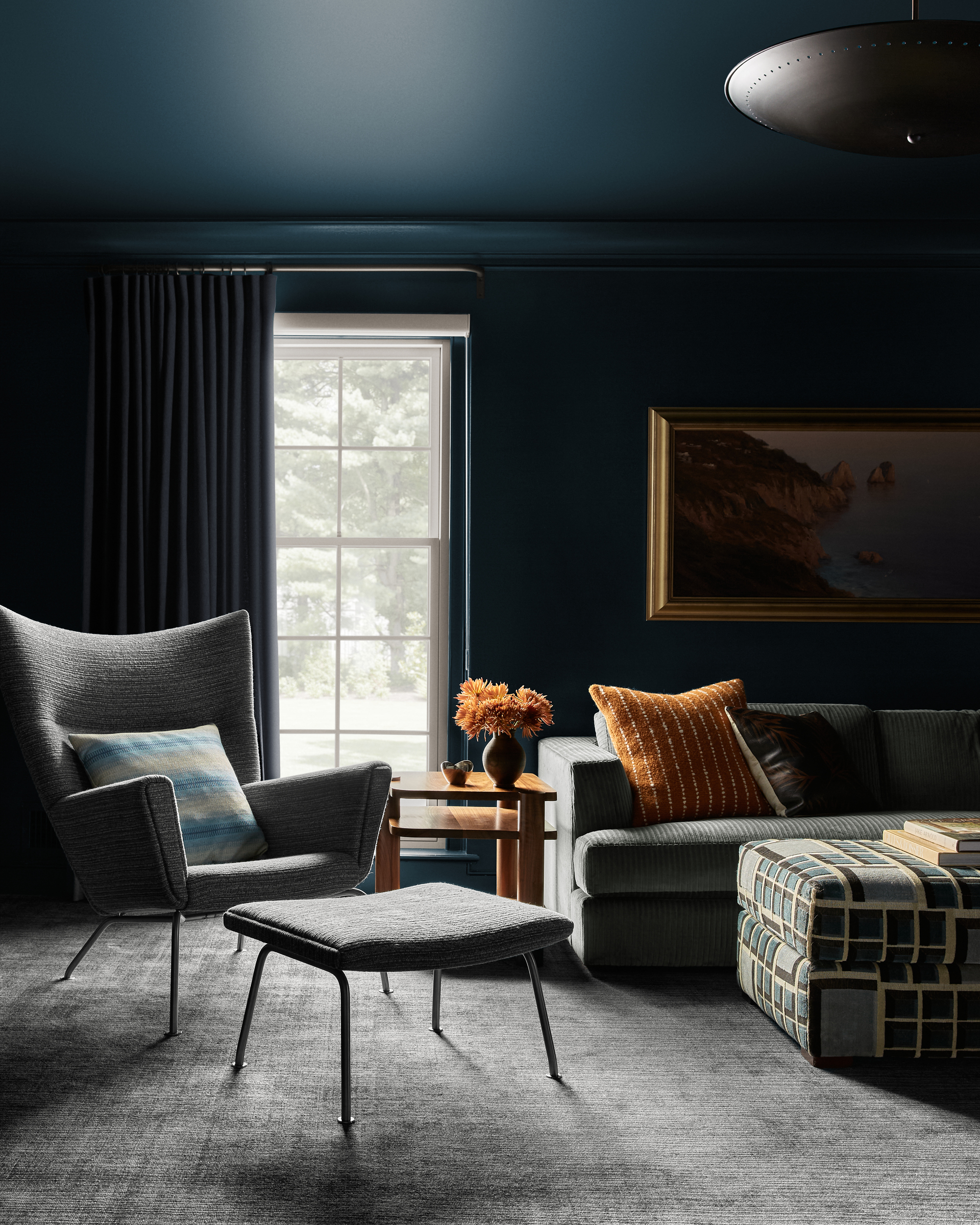
There is depth in this dark, cocooning paint color choice because with even just a silver of light, you can see that this isn't just black or gray — it is a beautifully rich teal.
Shop Shades of Blue for Darker Rooms
Work with blue joyfully, openly, and learnedly — any time you put into researching undertones and lighting conditions will come back to you in pleasure as you bask in your brilliantly chosen shade.
Before you begin your journey exploring the expansive realm of blue, Amy says, "I cannot express enough how important it is to test colors in different areas of the room, at different times of day, as blue shades are ever in flux! Do not skip this part." It isn't necessarily about how to brighten a dark room, but rather understanding how to maximize the potential of a room with less light.
"Blue has so much to give, and with such a huge wealth of shades on offer, there’s something for every mood and every space," Amy adds. Start with a few questions —What mood am I trying to conjure? What type of light is that? What other colors and materials am I using? Am I feeling light and airy, balanced and vibrant, or deep and dramatic? The right shade will materialize once you better understand how how light interacts with your space.
A dark room can become a beautiful spot in the home for relaxation and ambiance. There are plenty of stunning paint colors for rooms without much natural light, it's all about finding which one is right for you.
Be The First To Know
The Livingetc newsletters are your inside source for what’s shaping interiors now - and what’s next. Discover trend forecasts, smart style ideas, and curated shopping inspiration that brings design to life. Subscribe today and stay ahead of the curve.

Olivia Wolfe is a Design Writer at Livingetc. She recently graduated from University of the Arts London, London College of Communication with a Masters Degree in Arts and Lifestyle Journalism. In her previous experience, she has worked with multiple multimedia publications in both London and the United States covering a range of culture-related topics, with an expertise in art and design. At the weekends she can be found working on her oil paintings, reading, or antique shopping at one of London's many vintage markets.
-
 Burl Wood Decor Is 2025’s Most Coveted Comeback — Here’s How to Get the Storied Swirls for Less
Irregularity is the ultimate luxury, but you don’t need an antiques dealer to find it
By Julia Demer Published
-
 5 Garden Features That Instantly Add Value to Your Home — While Making Your Outdoor Space More Practical, too
Get to know all the expert tips and tricks for making your backyard a standout selling point for your home.
By Maya Glantz Published
-
 The Combination You Weren't Expecting to Love — 8 Blue And Orange Living Room Ideas That Feel Surprisingly Elevated
A blue and orange scheme for living rooms may sound jarring, but these spaces prove they're striking, vibrant, and certainly unforgettable
By Camille Dubuis-Welch Published
-
 Smeg Says Teal, and We’re Listening — The Kitchen Shade of the Year Is Here
Designers are already using the soft, sea-glass green everywhere from cabinetry to countertops
By Julia Demer Published
-
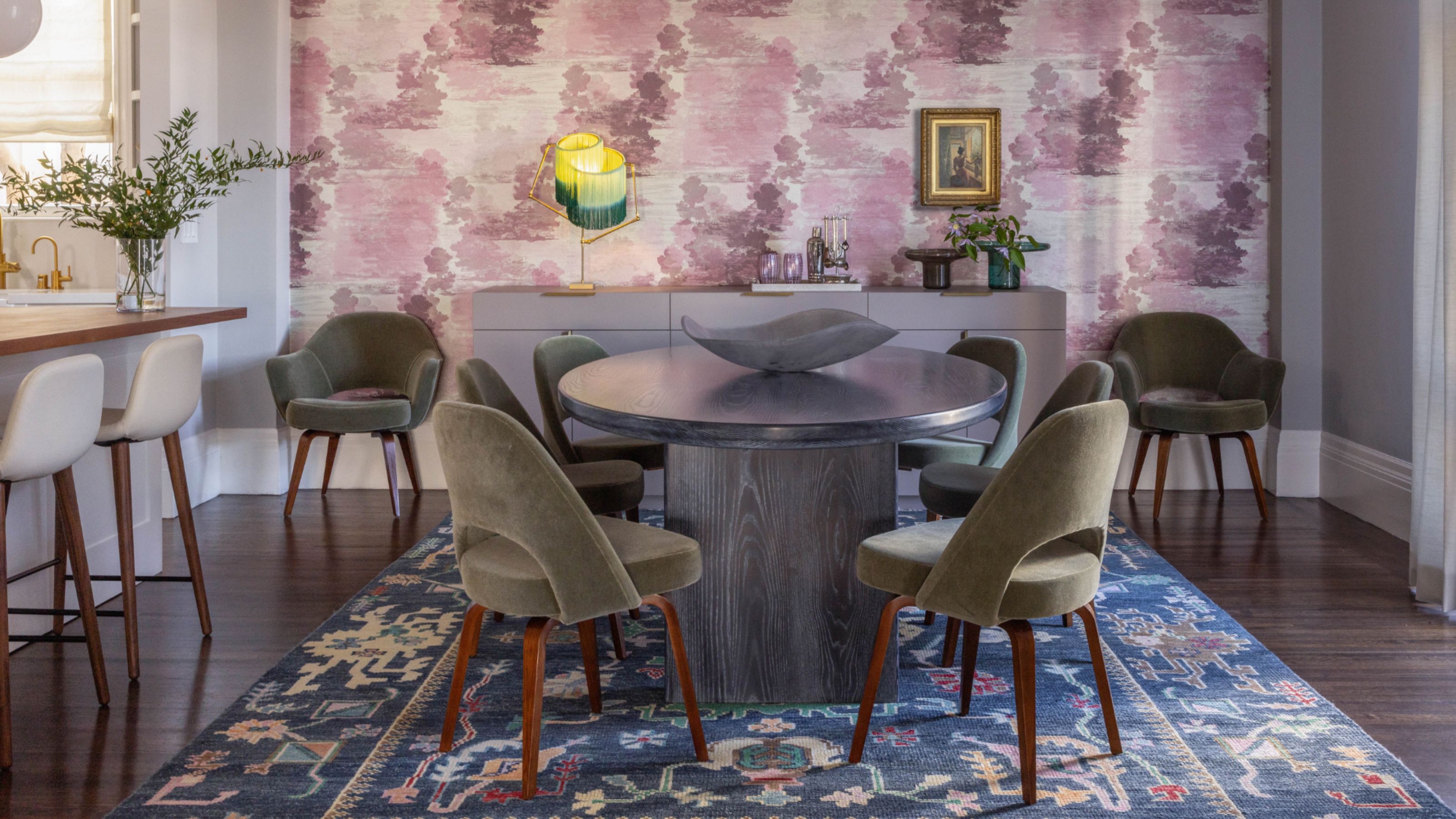 Do Yellow and Purple Go Together? Designers Reveal How to Make This Unexpected Pairing Feel "Totally Intentional"
In an era where unexpected combinations have become cool, we've done a deep-dive to discover how to pair yellow and purple in a space
By Camille Dubuis-Welch Published
-
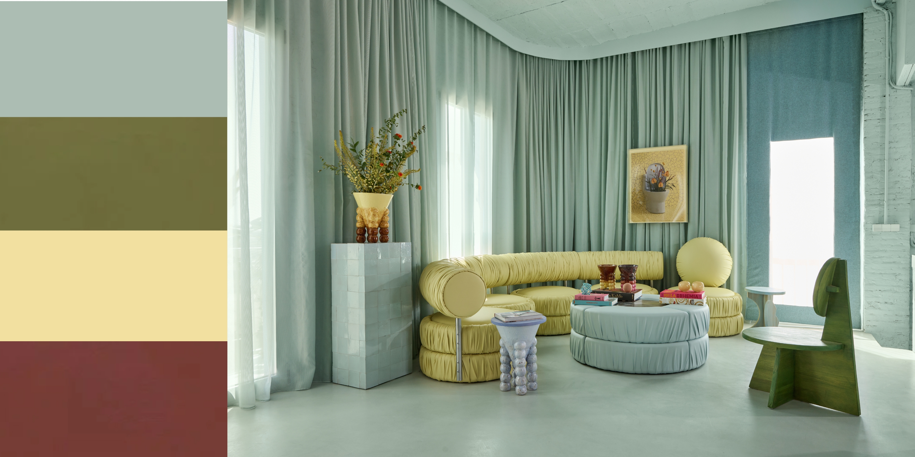 5 Unexpected but Seriously Stylish Spring Color Palettes to Shake Up the Season — "It's Pastel, but Punchy"
Spring color palettes are notorious for their use of pretty pastels, but that doesn't mean they have to lack variation
By Olivia Wolfe Published
-
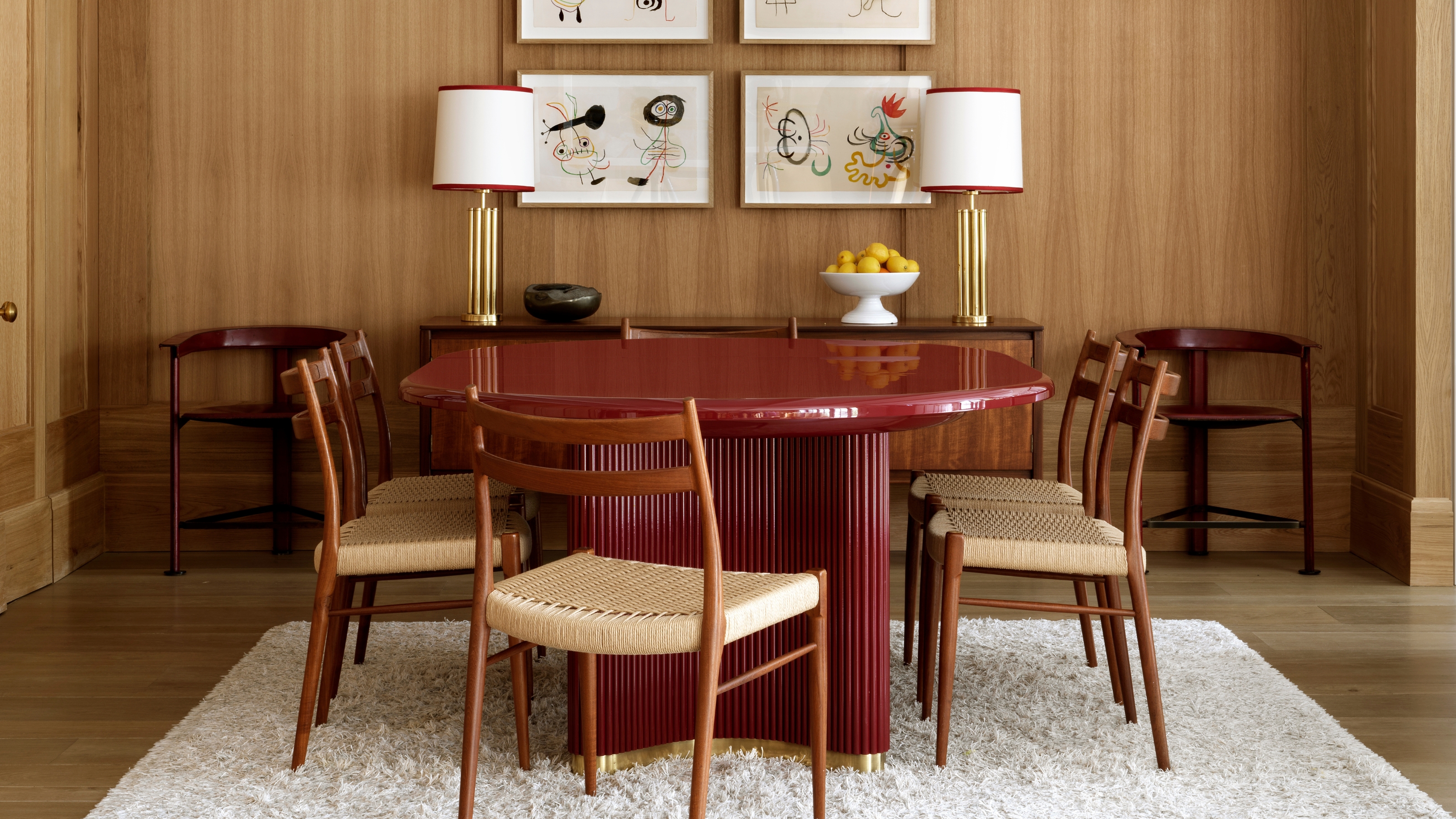 The 'Red Table Trick' Is the Easiest and Most Expensive-Looking Trend to Hit 2025 So Far
A red dining table makes a seriously stylish statement; the beloved pop of red trend just got an bold and expensive-looking upgrade
By Olivia Wolfe Published
-
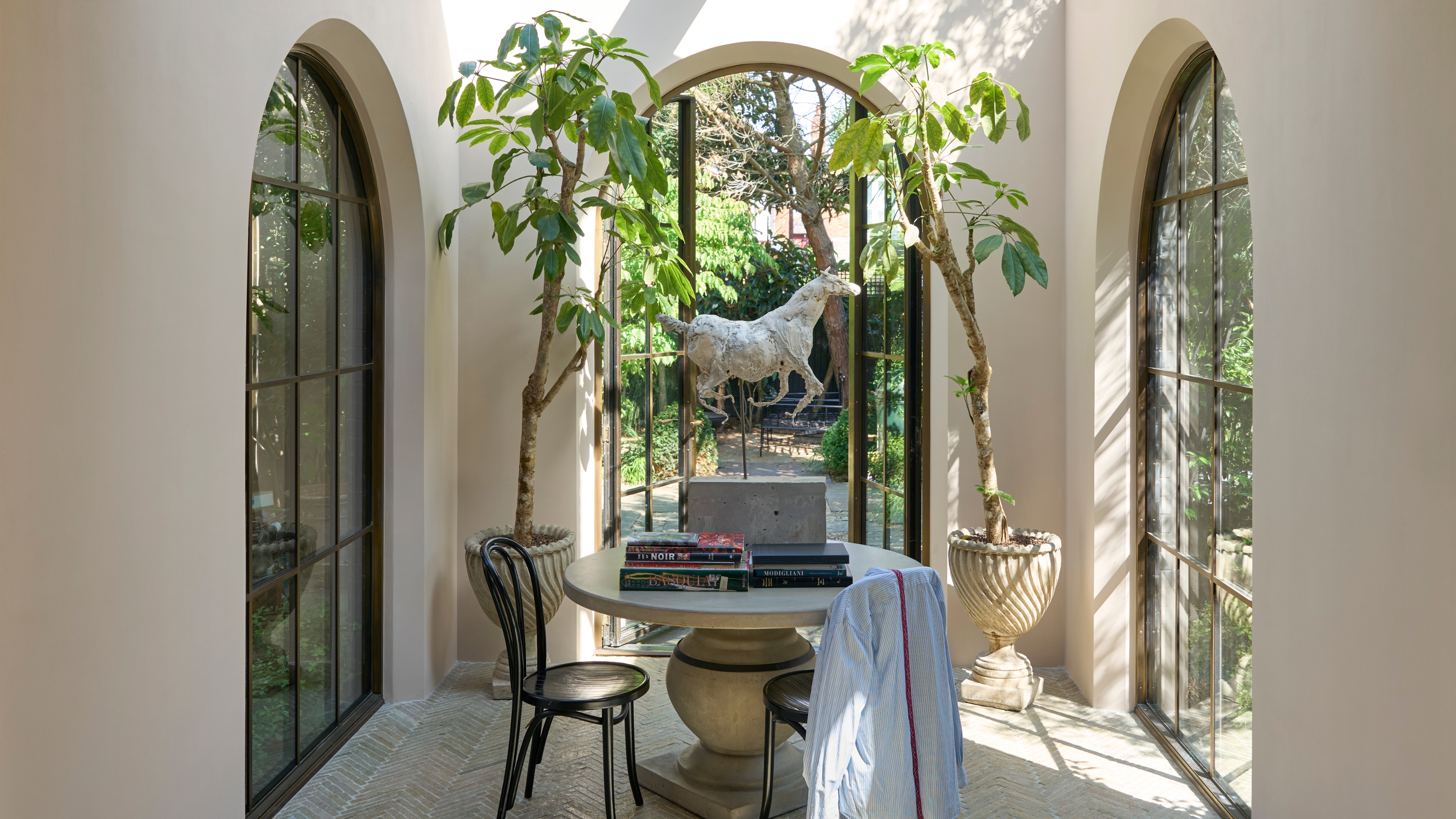 Everyone's Going Crazy for This One New Shade From Farrow & Ball Online — So What's the Big Deal With 'Scallop'?
It's a classic beige, but with a hint of blush — and it's the shade we're expecting to see in every minimalist's home this year
By Olivia Wolfe Published
-
 4 Bathroom Colors That Are Going Out of Style in 2025 — Don't Say We Didn't Warn You
If you're redecorating your bathroom this year, our design experts suggest you avoid these outdated colors
By Maya Glantz Published
-
 70s Color Palettes That Work for 2025 — 4 Designer-Approved Color 'Recipes' That Feel Modern Enough for Homes Today
It's time to bring out your paisley print and disco shoes — the golden yellows, olive greens, and deep purples of 70s color palettes are making a comeback
By Olivia Wolfe Published


