Should your shelving match the wall? Interior designers agree on the secret to perfect decor
What color should your shelves be? Interior designers agree that matching your shelves with the wall always makes for an elegant and cohesive interior.
Shelves are so much more than additional storage space; these simple structures can create stages for your most treasured items and work to elevate your interior as a whole. With a myriad of design options available, it can be tricky to understand if your shelving should blend or break away from the wall. We spoke to interior designers and experts from across the globe to help define the secret to success with shelving.
Interior designers agree that whilst each scheme is individual and there is no right or wrong when it comes to expressing your creativity, matching your shelves to the wall is an easy route to a cohesive and refined room, and a long-lasting solution that goes beyond the ups and downs of interior design trends. Whether you lean towards darker and more dramatic shades or want to keep things simple with a neutral palette of white or oak, shelves work best when they like an extension of the wall. By painting them the same color or material, you can create the illusion of a well-crafted piece of joinery at a fraction of the cost. Here are the shelving color schemes to be inspired by.
1. Clean and Contemporary White
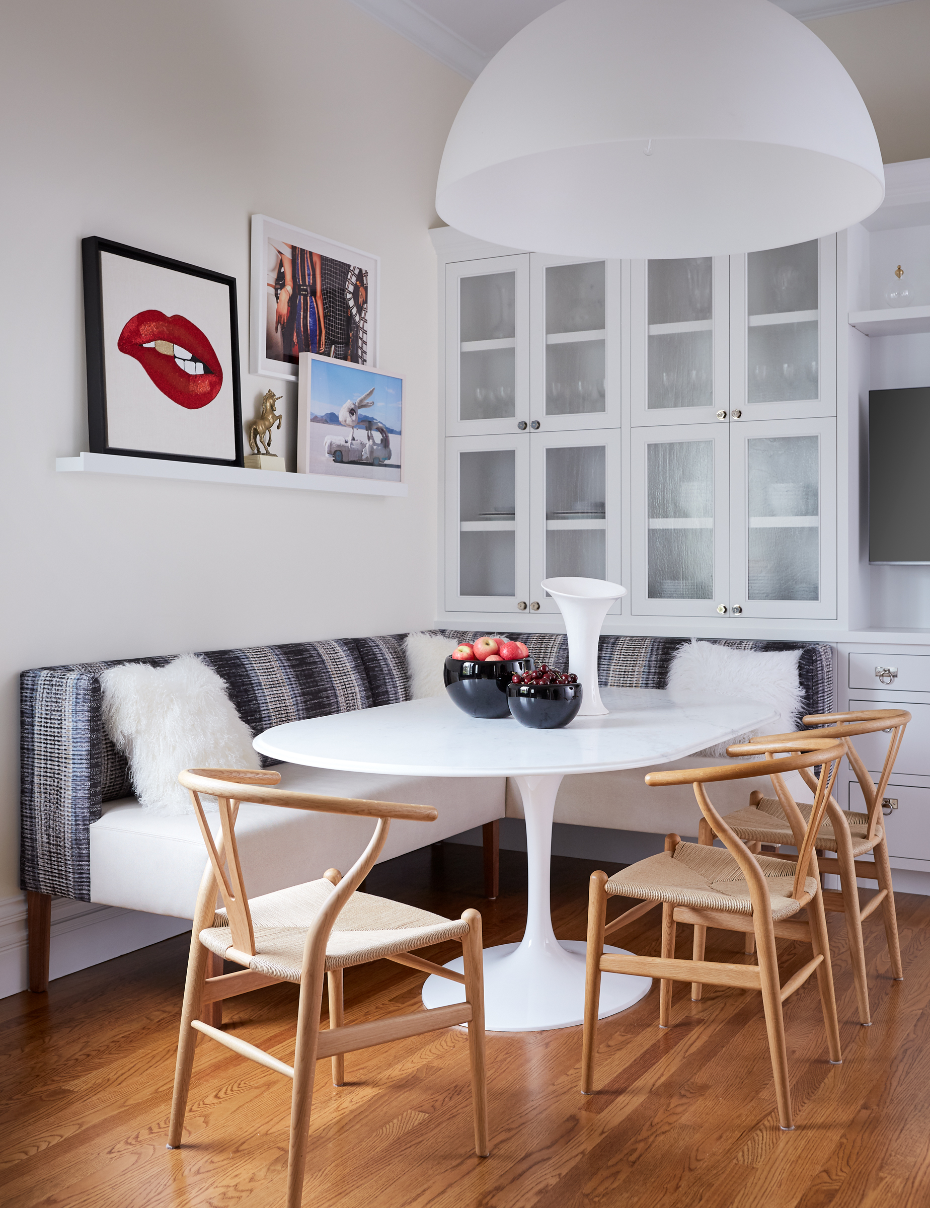
This modern kitchen dining area beautifully demonstrates the benefits of shelving. The light shelf provides a visual and physical structure for the eclectic artwork and sculpture that sits above. It allows for creative expression in this contemporary dining scene but doesn’t let the room feel cluttered or confused. The white color and simple shelving design both work to balance the more colorful elements of the design. The surrounding interior also mirrors the coloring of the walls, with the modern dining table and neutral upholstery enhancing a sense of cohesion.
Designers also love that matching the shelving recreates the look of bespoke joinery that is built for the space but isn’t as time-consuming or expensive. “If you are going for a built-in look, then shelving that is the same color as your walls makes sense,” says Eva Bradley, Principal of San Francisco-based collective, Studio Heimat.
You can inject a sense of personality into this pared-back shelving style with playful accents as well. “Customize the back of your shelving with wallpaper, mirror, or a different paint color to add more interest, and help the objects visually “pop” off the bookshelf,” adds Eva. Choosing accents that reverberate around the room, be it a color or material is another way to ensure your scheme feels succinct.
2. Enveloping Inky Blue
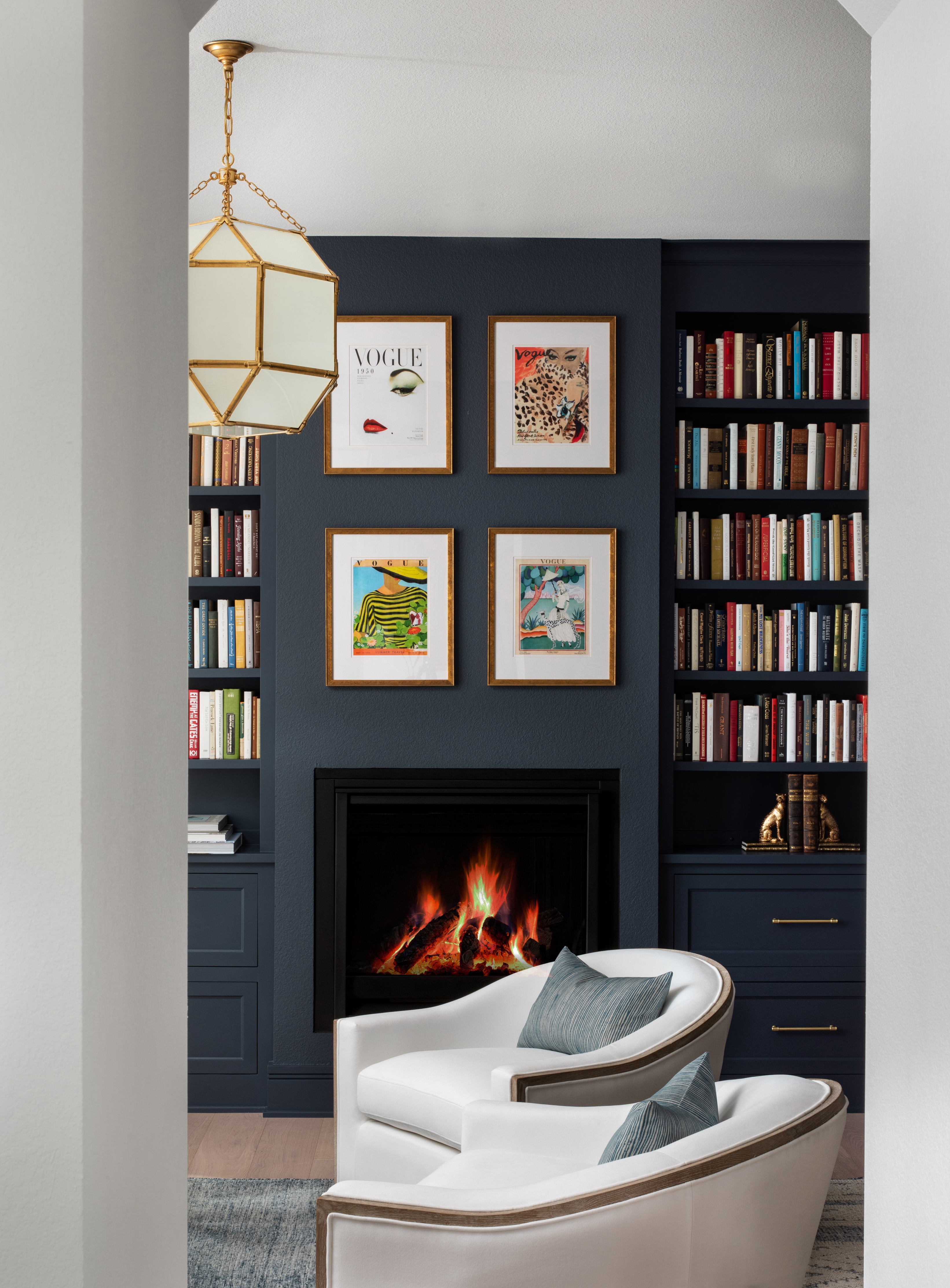
Painted in a deep dark blue, this home office from Wisconsin-based designer, Amy Carman’s Bloom Street project showcases how coordinating walls and shelving can accentuate the best of this enigmatic hue. “A monochromatic palette is harmonious and serene,” says interior designer, Amy Carman. Seamless, the shelves appear almost invisible when coordinated with the walls. If you are seeking maximum storage and want to create multiple layers of shelving, this approach works particularly well as the impactful color helps bring everything together. Blue in particular works well to create a visual calm in spaces making a versatile and effective design choice for shelving and walls.
Carman introduces contrasting and energetic colors in the books that adorn these shelves and the surrounding artwork. “The more color the better! The result is a high-style office that is vibrant, fun, and eye-catching,” reveals Amy.
When choosing your preferred inky hue, bear in mind that finishes can vary based on your surface area and material. The same shade can translate differently across materials, appearing darker or brighter on wood, metal, or walls. Testing your hues and shelving color can help ensure your final result doesn’t disappoint.
3. Soothing & Serene Oak

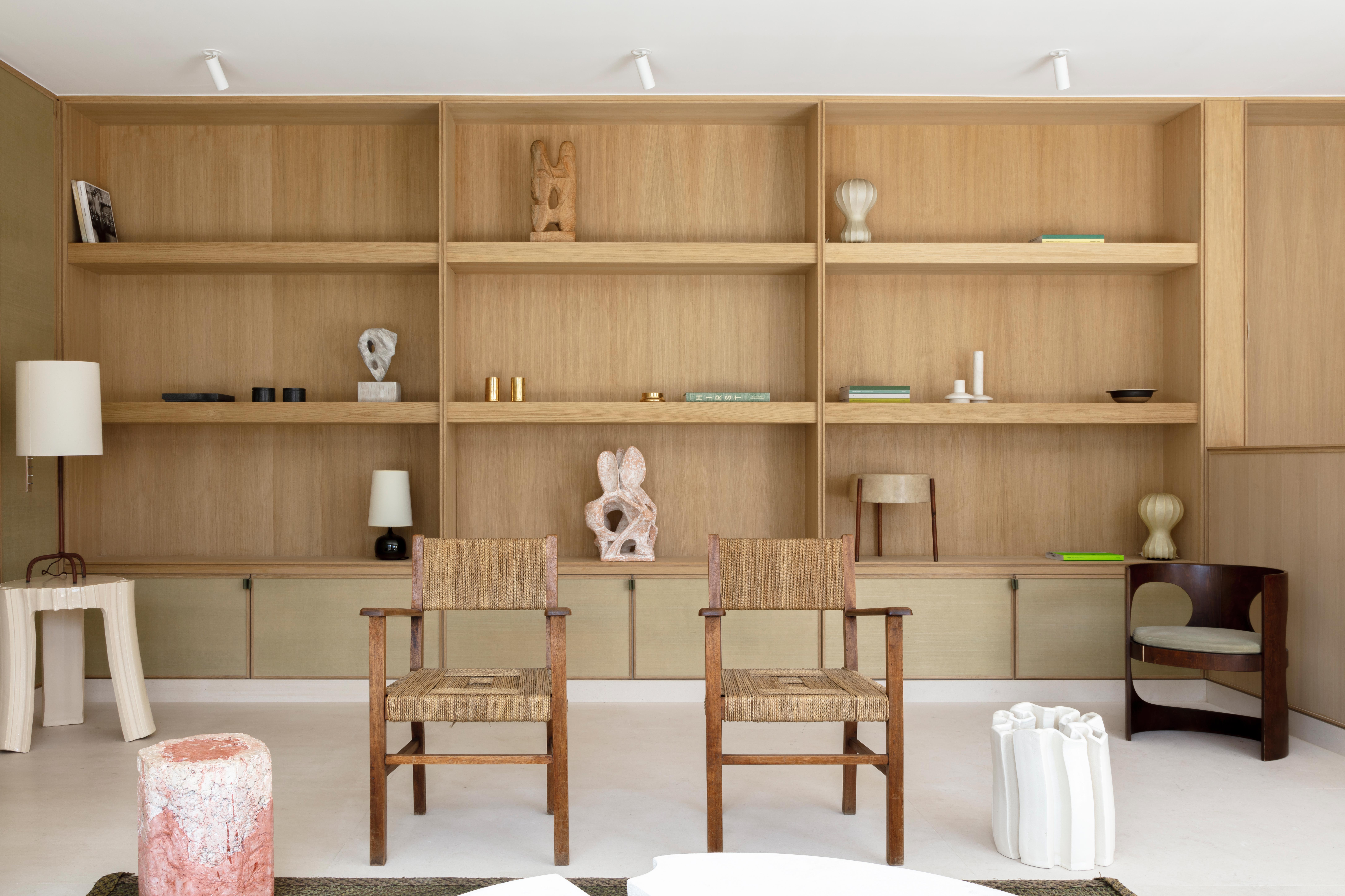
Shelves can be considered a smaller addition to spaces, an amuse bouche rather than a more substantial part of the meal but that doesn’t always have to be the case. Contemporary studio, AFTERBACH shows how shelves can be so much more with their modern Montaigne project.
“The shelves are the same materials as the wall: a natural oak. More than shelves, it was a mix between a library and an area for art, sculpture, and paintings, like a modernist alcove,” said Francesco Balzano and Jessica Barouch from Paris-based studio, AFTERBACH.
By making the shelving a part of the wall with soft and serene oak, the designers have created a feature in the room that encourages engagement and interaction both with itself and its treasures. The shelving and wall are one and the effect is calming and clean. The neutral palette found on the shelves is felt around the room, an example being the milky stone hues found in the sculptures mirrored in the lampshades and flooring.
When designing your space, remember the importance of acknowledging your shelves earlier in the design process. Question the role your shelves will play in the room, are they purely serving as storage or a space to showcase your precious pieces? Once you’ve found the answer, evaluate how you can take advantage of the architecture of the room to create an integrated shelving solution that feels seamless and proportional.
Be The First To Know
The Livingetc newsletters are your inside source for what’s shaping interiors now - and what’s next. Discover trend forecasts, smart style ideas, and curated shopping inspiration that brings design to life. Subscribe today and stay ahead of the curve.
Writer and design expert Faaizah Shah is the founder of The Interiors Consultancy. She has worked with designers such as Staffan Tollgard and design houses such as Sanderson to help them understand and communicate their narratives. She is known for crafting engaging stories and imaginative content, and understanding great decor from her years alongside some of the best creatives in the industry. She is also a contributor to Livingetc.
-
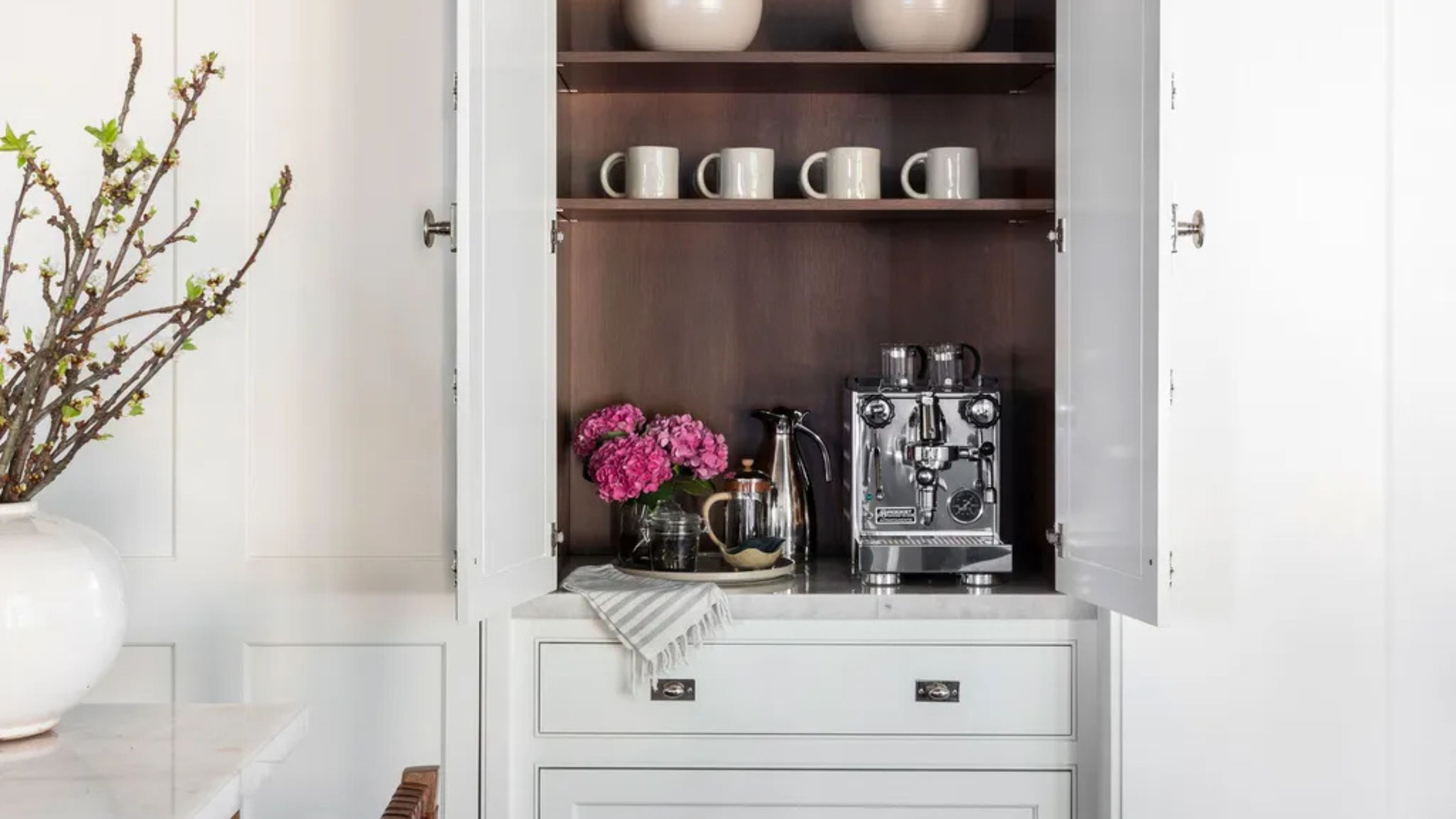 Turns Out the Coolest New Café is Actually In Your Kitchen — Here's How to Steal the Style of TikTok's Latest Trend
Goodbye, over-priced lattes. Hello, home-brewed coffee with friends. TikTok's 'Home Cafe' trend brings stylish cafe culture into the comfort of your own home
By Devin Toolen Published
-
 5 Bathroom Layouts That Look Dated in 2025 — Plus the Alternatives Designers Use Instead for a More Contemporary Space
For a bathroom that feels in line with the times, avoid these layouts and be more intentional with the placement and positioning of your features and fixtures
By Lilith Hudson Published