Are You Making One of These Small Kitchen Mistakes? 5 Designers Always Notice and How to Avoid Them
These small kitchen mistakes may seem minor at first but can have a huge impact on the functionality and looks of a compact space. Experts point out the most common errors they see

Small kitchens can be beautiful and practical, but it's even more important to make the right choices in spaces lacking square footage. Choose the right colors, lighting, and storage units, and you have a kitchen that's functional and stylish, but on the contrary, choosing things that look just pretty without proper thought can render the space impractical.
To help you avoid the common pitfalls, we asked designers about the most common small kitchen mistakes, and how to avoid them. Here's what to watch out for.
1. Overestimation of capacity
'The first mistake is the overestimation of capacity,' warns Seattle-based interior designer Nishtha Vashist. 'Many homeowners attempt to incorporate too many appliances and elements into a limited space. This not only clutters the area but also hampers practical usage. It’s crucial to prioritize appliances based on frequency of use and necessity, choosing compact and multi-functional devices wherever possible.'
Know your small kitchen layout well, so you know exactly how much space you have for all the elements you want to include in it. It may be prudent to select appliances (like the microwave, fridge, and toaster) well in advance, checking the dimensions to ensure these do not come in the way of the kitchen cabinet doors.
2. Not making the most of vertical space
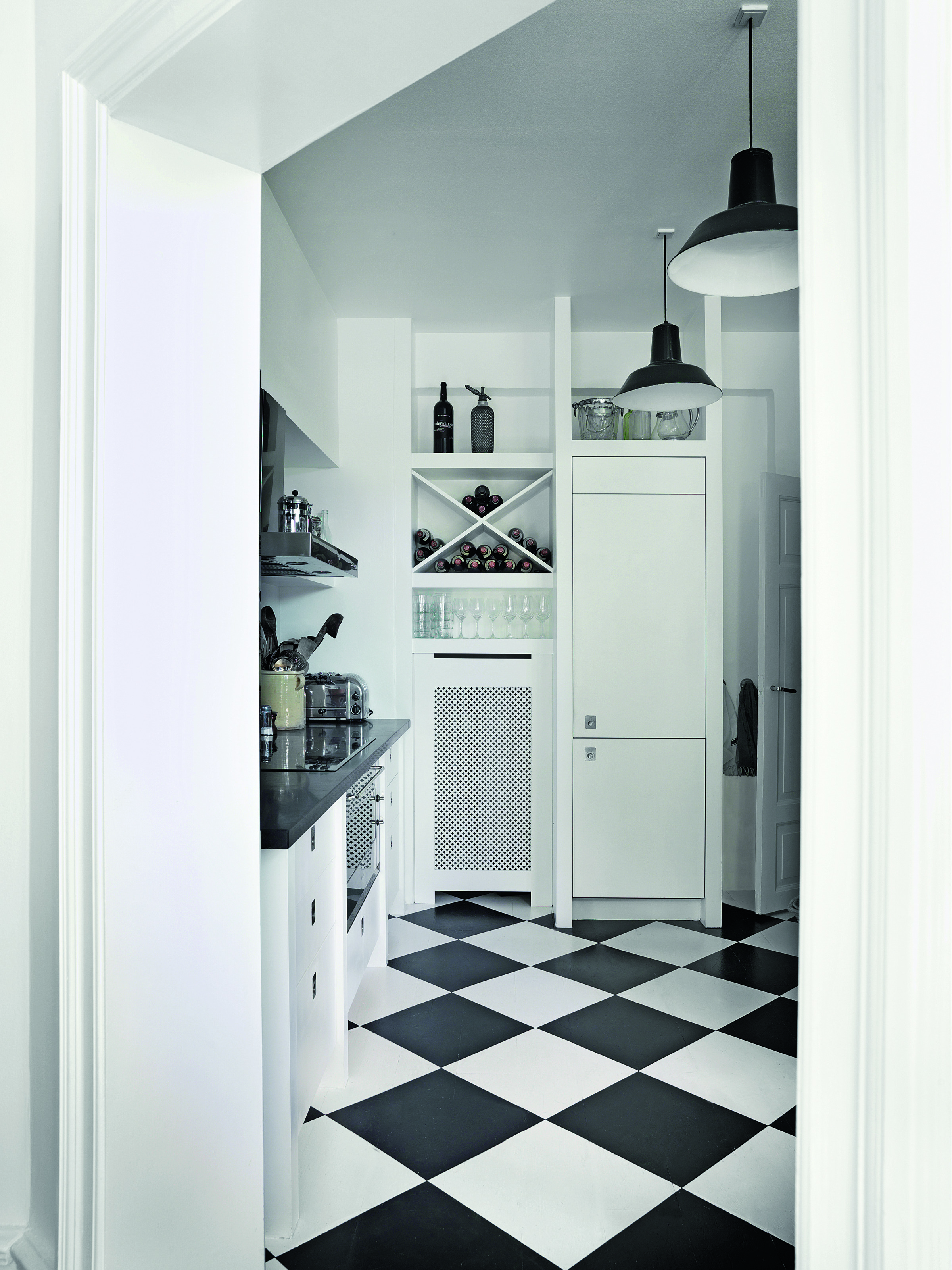
Trends for a modern kitchen learn towards lower cabinets only, with fewer things on the wall for a more minimalist space, but that might not be the best idea for a very small ktchen.
'Avoid heavy floor cabinets and bulky items; vertical space is the way to go when it comes to a small kitchen,' says Saba Kapoor, co-founder of Nivasa. 'The potential of walls and upper areas is often underrated but is amazing to save space and add functionality. Installing tall cabinets, wall-mounted shelves, or hanging racks can significantly increase storage without encroaching on valuable floor space. Utilizing hooks for utensils and magnetic strips for knives are also efficient solutions. Maximizing every inch, including corners and door backs, is crucial for a functional small kitchen.'
3. Neglecting proper lighting

Good kitchen lighting is really important especially in a small kitchen. Usually, tiny areas tend to feel closed in and dark, so lighting it up the proper way is essential. A layered lighting scheme comprising task and ambient lights would be a good way to go.
'Poor lighting can make a small kitchen feel cramped and unwelcoming,' says Nishtha. 'Utilizing under-cabinet lights or pendants can help create a sense of space and openness, making the kitchen appear larger and more inviting.'
4. Using dark colors in a poorly lit kitchen
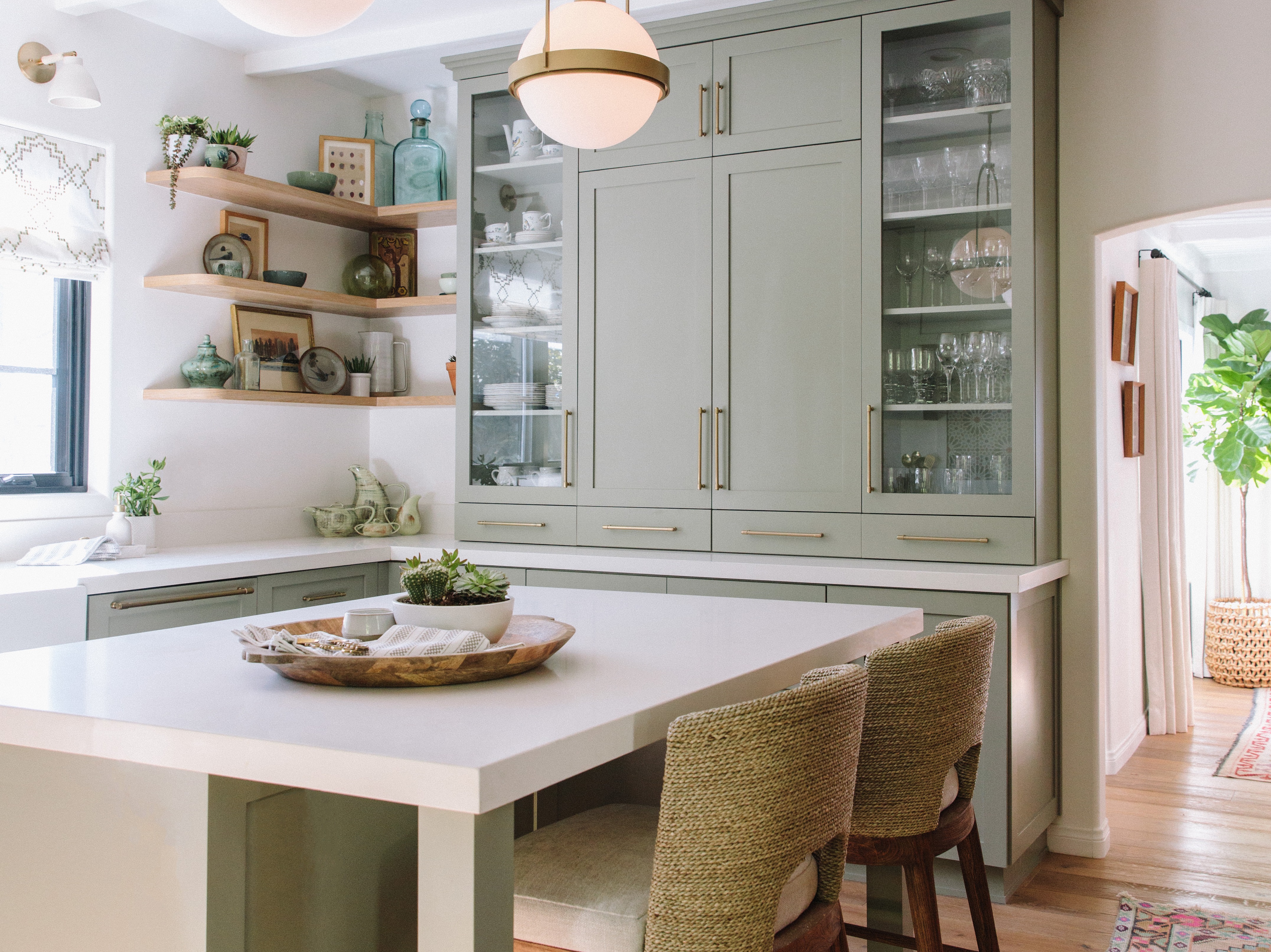
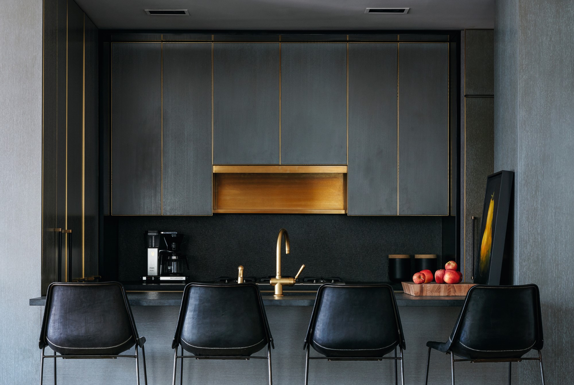
Usually, experts advise that super dark tones work well in smaller spaces that are meant for rest; say the media room, bedroom, or the lounge space. Then such colors can create a lovely jewel-box effect. But in functional, task-heavy spaces like the kitchen, it's better to go with a kitchen color that creates a feeling of openness and allows you to see all the contents of the room clearly.
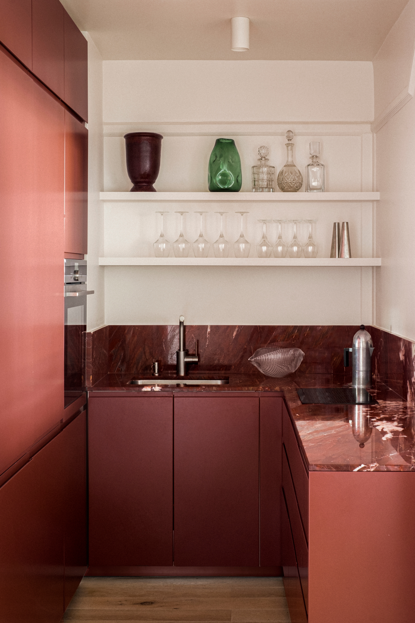
'Completely avoid dark, heavy colors that can make the space feel smaller and more confined by absorbing light rather than reflecting it,' says Saba. 'This results in a cramped and less inviting ambiance in an already small space. Instead, opting for light, neutral colors like whites, creams, and soft pastels can create an open, airy feel, making the kitchen appear larger and more spacious. Light colors reflect more light, enhancing the perception of space and improving overall brightness, which is crucial in small kitchen areas. Moreover, make sure a small kitchen has big windows and gets enough flow of natural light.'
5. Choosing bulky furnishings
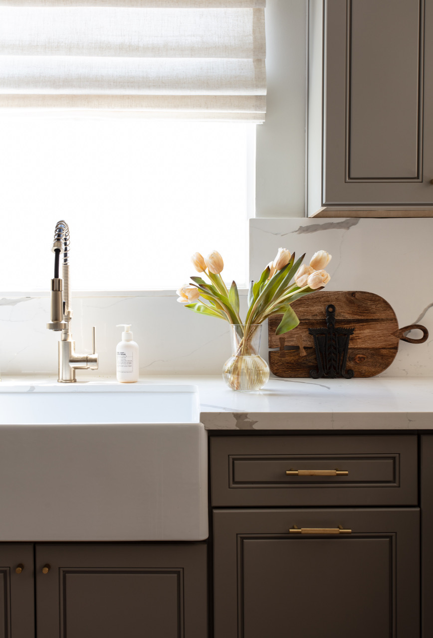
When it comes to kitchen window treatments or kitchen rugs, light, soft fabrics is a good bet. This is not a place for heavy, high-end, silky fabrics.
'In a small kitchen, avoid using heavy, bulky soft furnishings like thick curtains, oversized rugs, or large upholstered chairs,' says Saba. 'These can dominate the limited space, making the kitchen feel cramped and cluttered. Instead, opt for lightweight, compact options such as sheer or Roman blinds for windows, slim cushions for seating, and small, low-profile rugs or mats. Choosing easy-to-clean, durable materials is also essential for a tidy and functional kitchen. Minimalist, space-saving soft furnishings help keep the area open and enhance the overall efficiency and aesthetic of a small kitchen.'
Be The First To Know
The Livingetc newsletters are your inside source for what’s shaping interiors now - and what’s next. Discover trend forecasts, smart style ideas, and curated shopping inspiration that brings design to life. Subscribe today and stay ahead of the curve.

Aditi Sharma Maheshwari started her career at The Address (The Times of India), a tabloid on interiors and art. She wrote profiles of Indian artists, designers, and architects, and covered inspiring houses and commercial properties. After four years, she moved to ELLE DECOR as a senior features writer, where she contributed to the magazine and website, and also worked alongside the events team on India Design ID — the brand’s 10-day, annual design show. She wrote across topics: from designer interviews, and house tours, to new product launches, shopping pages, and reviews. After three years, she was hired as the senior editor at Houzz. The website content focused on practical advice on decorating the home and making design feel more approachable. She created fresh series on budget buys, design hacks, and DIYs, all backed with expert advice. Equipped with sizable knowledge of the industry and with a good network, she moved to Architectural Digest (Conde Nast) as the digital editor. The publication's focus was on high-end design, and her content highlighted A-listers, starchitects, and high-concept products, all customized for an audience that loves and invests in luxury. After a two-year stint, she moved to the UK and was hired at Livingetc as a design editor. She now freelances for a variety of interiors publications.
-
 9 Ingredients for 'Elevated Bed Rot' — The Chicest Way to Do Nothing at All
A Diet Coke hits different in a martini stem
-
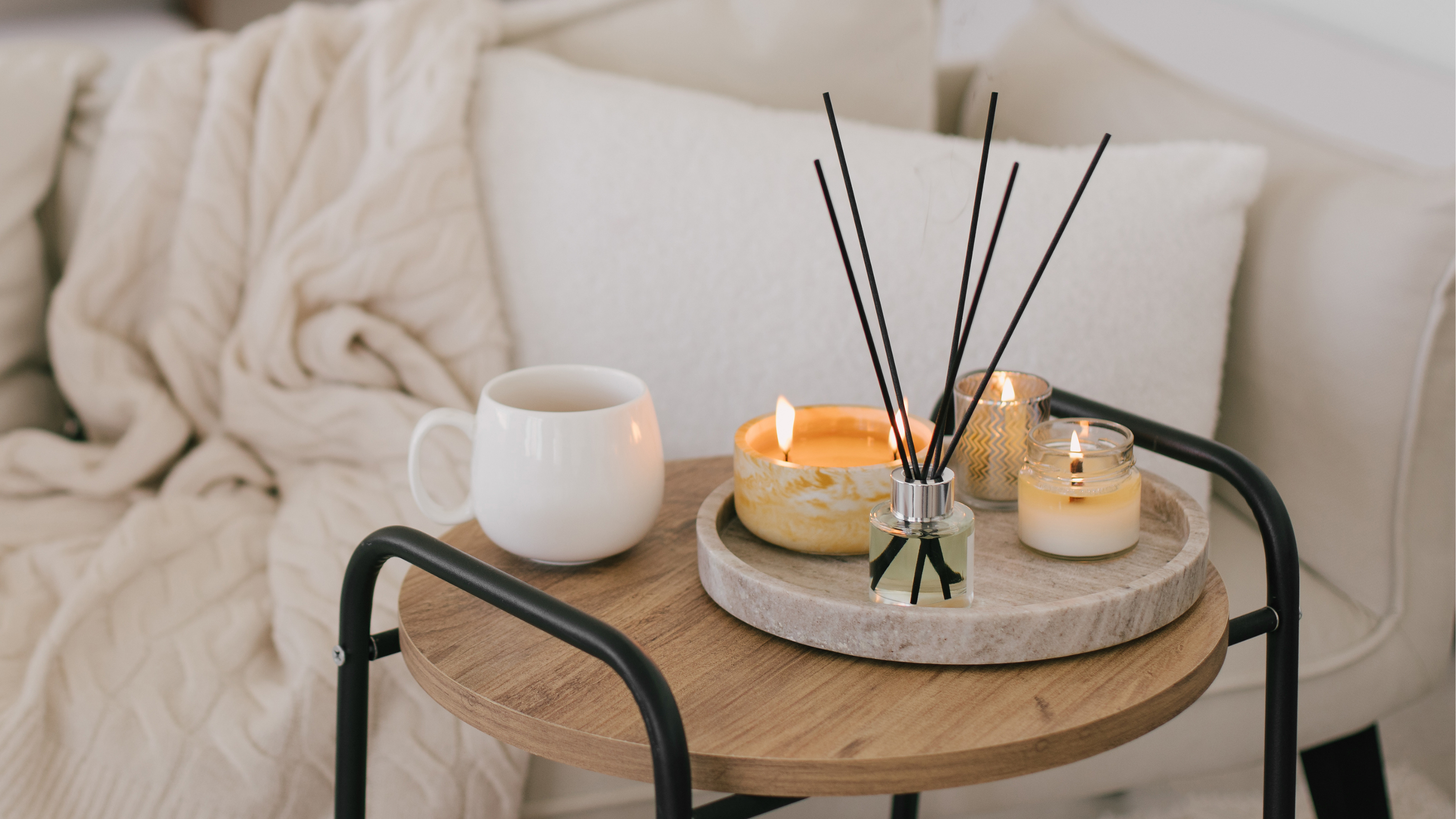 Candles vs Diffusers — A Fragrance Expert Shares Which Style of Home Scenting Works (and Looks) the Best
They might serve the same purpose, but candles and diffusers vary in fragrance intensity and overall style. So which one should you choose?
