Designers use this trick to make a bathroom feel more expensive – and it can work for a small space, too
Introducing symmetry in a bathroom can help create a synchronized, balanced and well-curated space. Experts tell us how to make it work


There's one design element that effortlessly makes a bathroom feel luxurious, and it's something we've come to see in some of the world's best bathroom designs. This trick: using symmetry in your scheme.
What does symmetry in bathrooms do to the overall look of the space? To many, it creates a visual balance and leads to a feeling of peace. While things don't have to be perfectly matched, the aim is to bring balance in terms of color, scale, light, and proportions.
This trend is also a wonderful way to create a clutter-free space, that always looks well put together and decorated. If you're looking to renovate your room and are wondering which design route to take for your modern bathroom enhanced by symmetry, no matter the size, here's everything you need to know.

Aditi is an experienced homes writer and editor. She has written hundreds of articles for various international titles helping readers make the best home design choices, and spends her days interviewing interiors industry experts to bring the latest ideas to her readers. For this piece she spoke to the world's best designers to learn about how to create symmetry in bathrooms.
What is symmetry in bathroom?
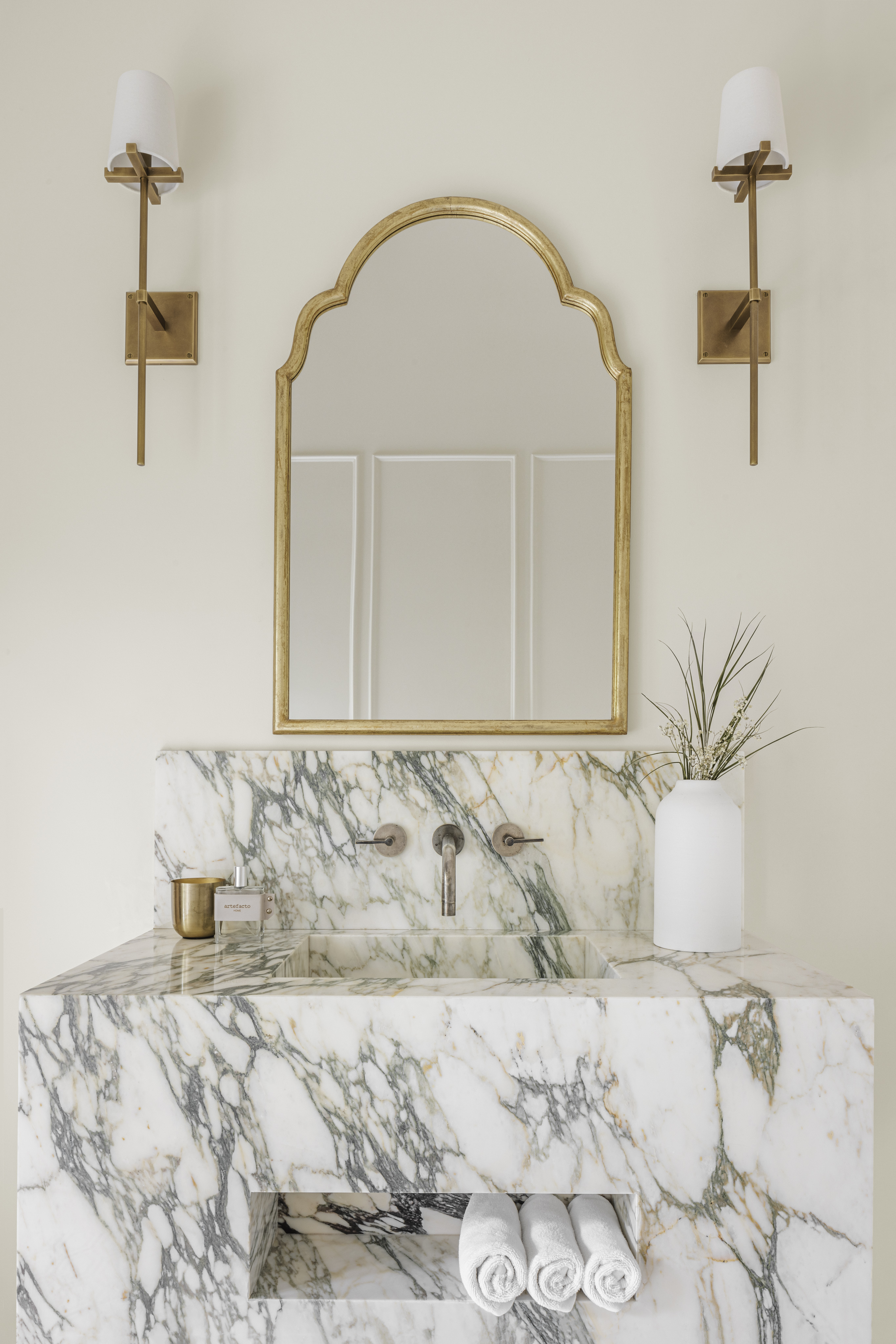
Largely, symmetry in a modern bathroom means balancing elements in your room to make them spaciously composed. Your bathroom itself doesn't need to be symmetrical in terms of its measurements to achieve this idea, but you can create symmetry through smaller vignettes. But, why bother?
'A symmetrical bathroom can feel luxurious and composed and can be found in a lot of big-budget architectural builds where space is not a problem,' says Sally Timmins, founder of Timmins + Whyte. 'These spaces usually require a square or wide rectangular footprint to design.'
'A symmetrical bathroom can feel like a luxury hotel, creating a vibe of calm invoked from memories of being on a holiday,' Sally adds. 'There is generosity to the space and a clear composition. It tends to feel uncluttered.'
How do you achieve symmetry in bathroom design?
The bathroom does come with its challenges when it comes to achieving symmetry, however. It's size, for one, as you don't have as much space to play with in a small bathroom, and the irregularity of its fixtures and fittings. A WC doesn't balance with a bathtub, for example.
'It can help to work with symmetry within a square space especially so that you don't end up with small sub-spaces like the shower with the bath running into it,' Sally says, 'or utility areas stuck in the corners creating a big space in the middle that almost feels wasted and limits useable wall space.'
1. Make sure wall covering embrace symmetry
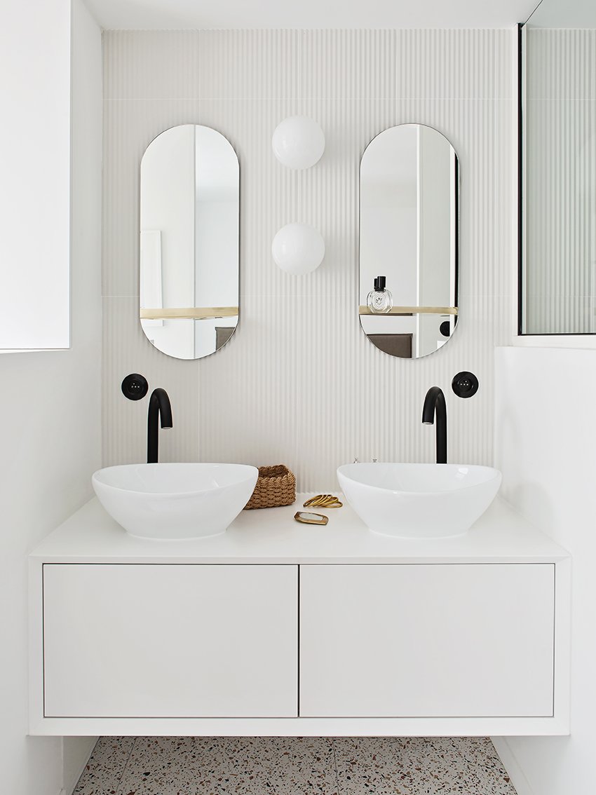
When it comes to bathroom wall ideas, consider wood paneling or long, vertical tiles to not only make the room appear taller and more voluminous but to also align fixtures and elements so they all look neat, centered, and symmetrical. Use these lines as the anchor or starting point and plot in fixtures and elements along them.
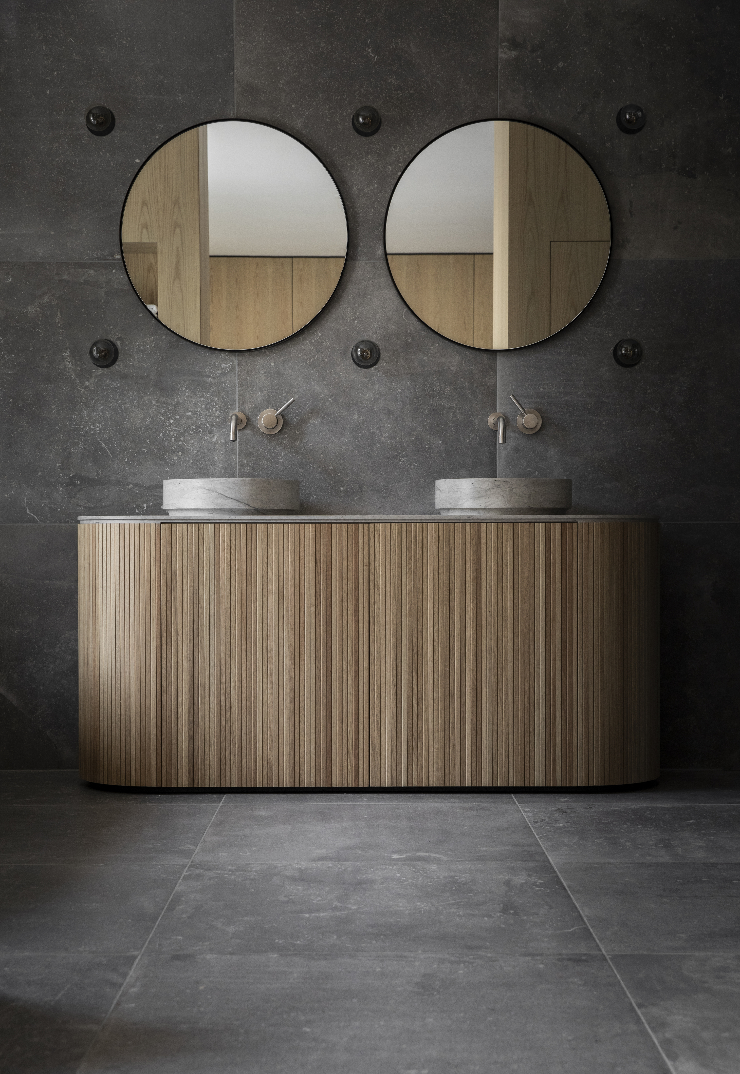
'It's interesting to note that the vanity in this bathroom is pretty small (120 cm), but the symmetry makes it look wider,' says Ophélie Doria, founder of Space Factory. 'To design a symmetrical bathroom, we specially created long, vertical lines or paneling on the walls, and placed the mirrors, the two wall sconces, and the two drawers on it. The horizontal lines of the vanity 'sit' on the vertical lines of the walls, making the space look cohesive and coordinated.'
We love how the offset faucets on this dual sink have been mirrored, too.
2. Balance the spread of color
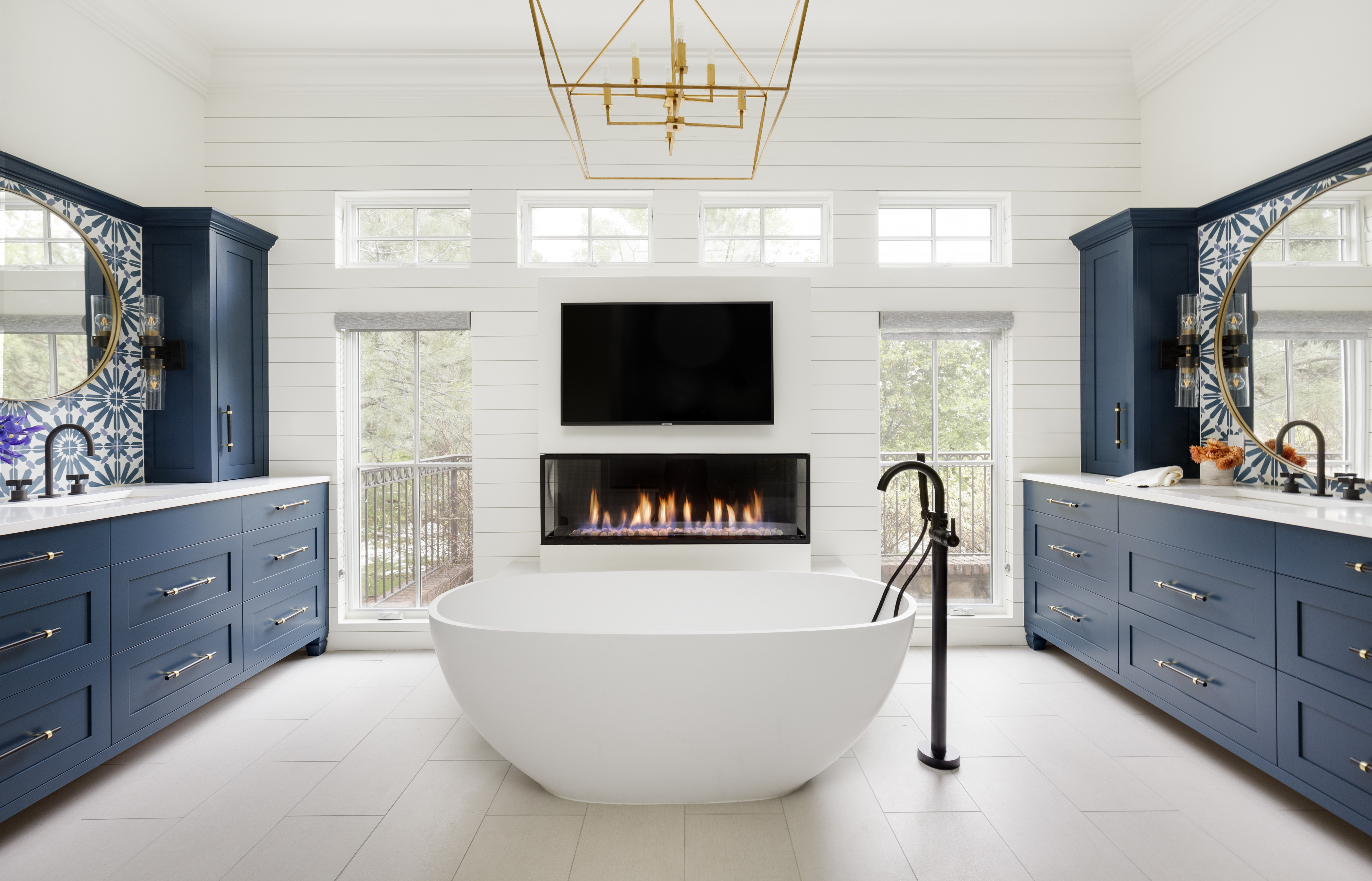
One of the easiest ways to create a symmetrical look is through bathroom color. This can be done with elements in a small bathroom, but we love this idea if you have a large bathroom with dual vanities, like in this project by Ashley Campbell Interior Design, consider creating a mirror effect, with the two ends of the room in the same tone, with the overall shell in a muted tone.
Note that when you are going ahead with a mirrored look on two sides of the room, the proportions, tones, elements to even placements need to be the same, to be able to create an effective look. This can be done effectively in a rectangular room that has equal dimensions and measurements on both sides.
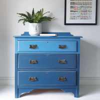
Ultra Marine Blue, Farrow & Ball
This bright and eye-catching paint can make a small space look bigger with the color's depth and impact. It can be used to create striking cabinetry, and equally aesthetic walls indoors.
3. Dual basins
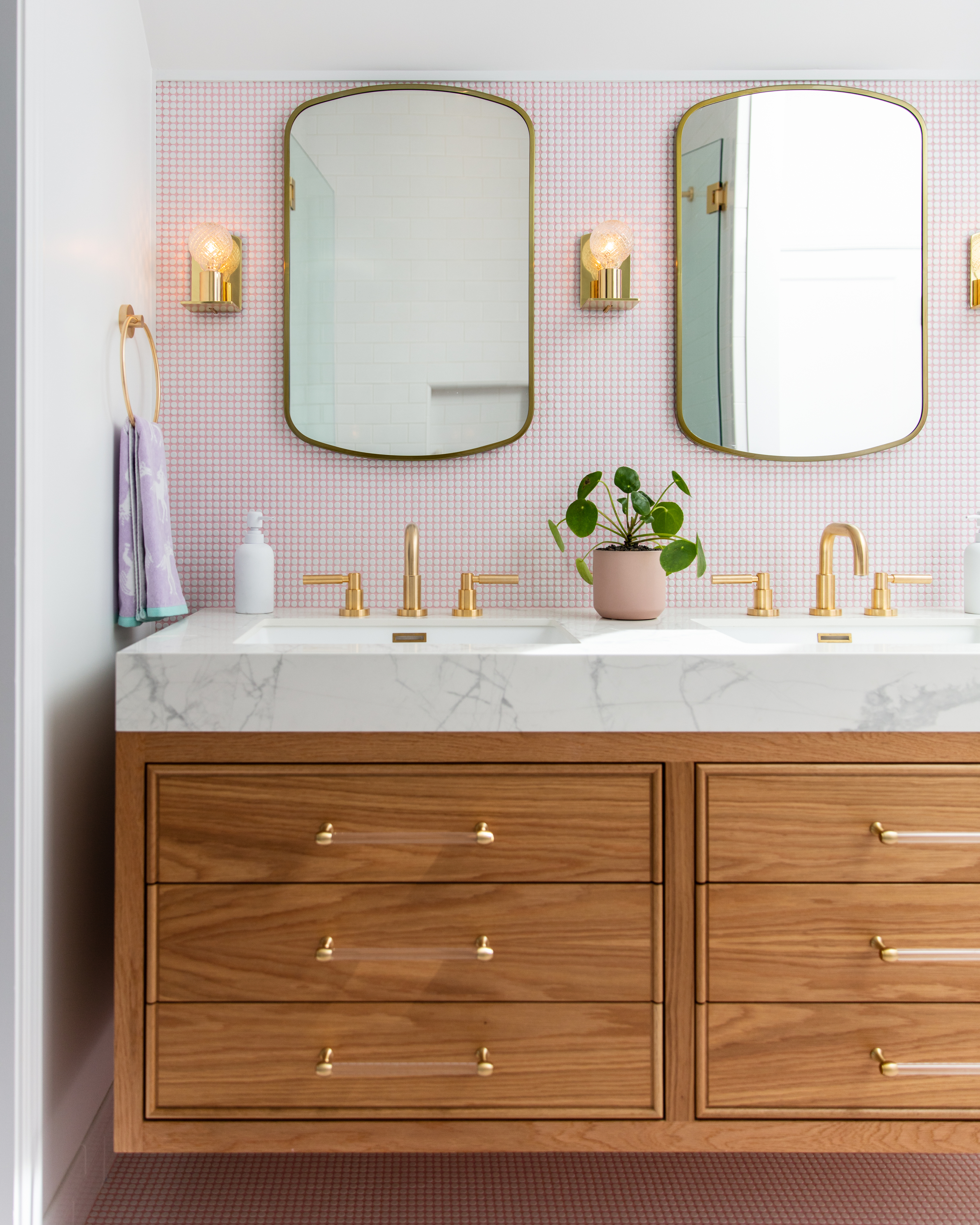
A long, single bathroom sink with double taps can help create a calm, relaxing mood, especially when in materials such as marble or other natural stone. The design promotes clean, sleek lines and a balanced look in the room.
'The dual vanity here is not only uber functional as it provides double sink access to a large family, but it also helps create a symmetrical look in the bathroom,' says Emilie Munroe, founder of Studio Munroe. 'Designing a bathroom around these elements adds warmth and connectivity to the home. Remember to include coordinated lighting and mirrors too. We prefer to mount three sconces, one on each side of both mirrors for synchrony.'
Another option is to have two singular vessel sinks fitted next to each other, matched to the size, material, shape, and even fittings. The result will be fresh and contemporary while retaining the practicality of two basins in a bathroom.
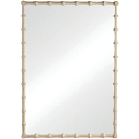
This carved mirror features a washed acacia finish that instantly enhances and uplifts any interior, perfect for the bedroom or bathroom.
4. Matching lighting
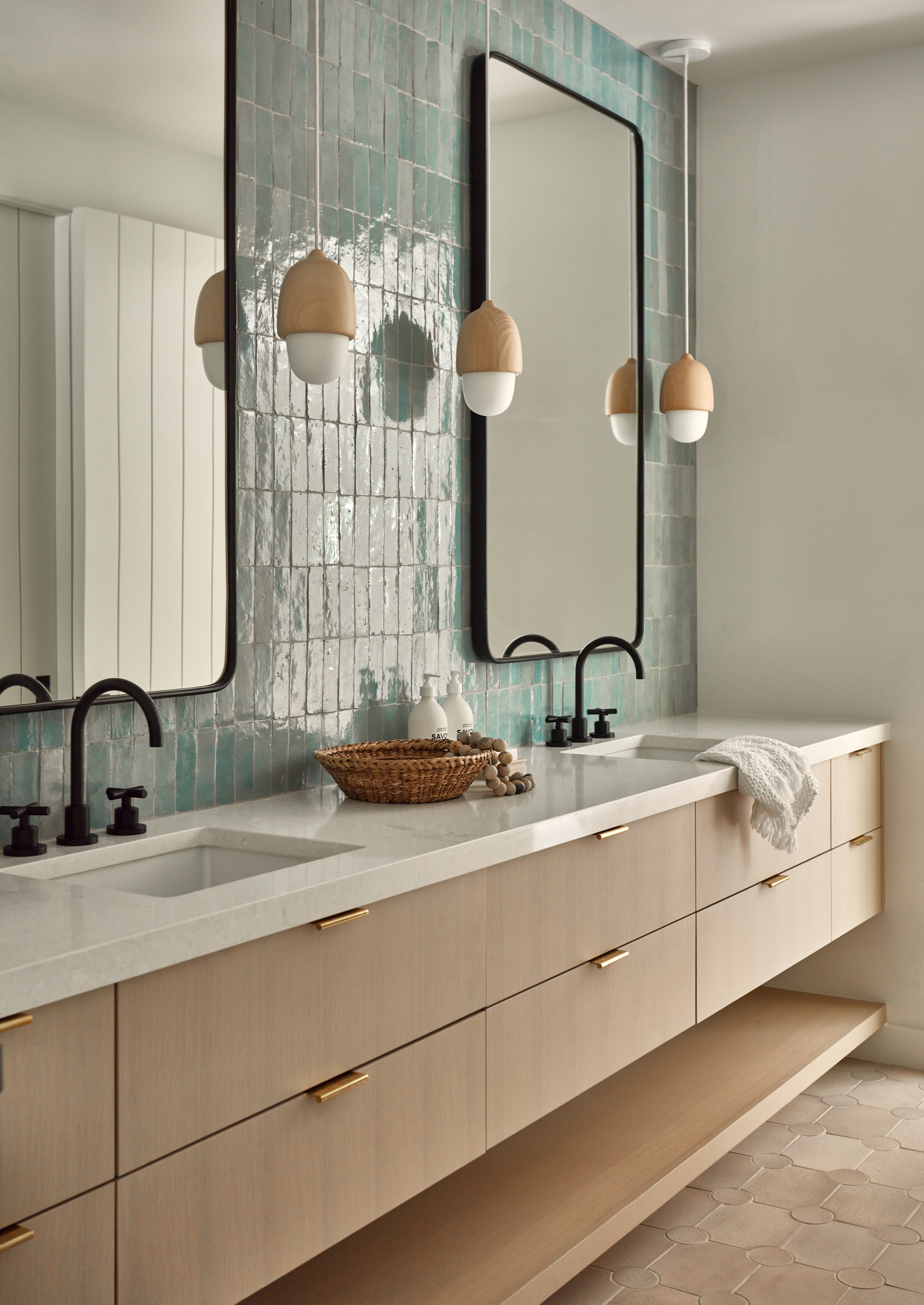
For a perfectly proportional look, pick out matching wall sconces and place them on either side of the vanity mirror. Or you could install double pendant lighting over your clawfoot tub.
Apart from sconces, another bathroom ceiling lighting fixture that can help create a symmetrical look is overhead bars. These provide more of a focused, task-lighting and if customized, can fit within the perfect width of your mirror or vanity.
Remember to choose more than one light for the vanity, and match the same number of lights on both sides of the mirror. Odd numbers tend to look more eye-catching.
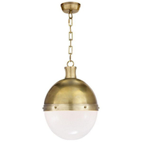
This light with a tinge of industrial design can certainly become a standout element in your bathroom. The half-metal, half-glass globe expertly diffuses light to the surrounding space.
Is it better to have a symmetrical or asymmetrical bathroom?
Symmetry is a bathroom trend that seems to have an ongoing appeal. It is pleasing to the eye. It exists in nature, is all around us and it is what humans are inherently attracted to. Everything – from symmetrical rooms, furniture, and art, to the placement of photo frames and more – create a sense of balance, stability, and a look that is neat and orderly.
However, symmetry does come with a few drawbacks. For beginners, it can sometimes be seen as unimaginative, or even boring. For an effectively symmetrical bathroom design, the floor plan should have the perfect measurements without awkward alcoves, corners, or sharp ceiling angles. It is also a classic look that does not allow the inclusion of new, pop-colored elements or looks that do not completely comply with the existing style.
Asymmetry, on the other hand, is about doing something unexpected; something that catches the eye. It is, in the simplest terms, creating a look that doesn't mirror nor match with all others in the room. This can be done with off-center placements, choosing different sizes of lighting pieces, while keeping the visual weight, color, and texture the same. It can give a room a fresh lease of life and make it more interesting.
The drawback? It can either work wonderfully well or look mismatched, uncoordinated, and cluttered. Since asymmetry doesn't follow a rigid 'theme', building a room with it can be chaotic, and often you can lose focus and end up with a badly designed space.
While both looks have a stronghold, it truly depends on your style, use, and daily usage that can dictate which way you should go.
Be The First To Know
The Livingetc newsletters are your inside source for what’s shaping interiors now - and what’s next. Discover trend forecasts, smart style ideas, and curated shopping inspiration that brings design to life. Subscribe today and stay ahead of the curve.

Aditi Sharma Maheshwari started her career at The Address (The Times of India), a tabloid on interiors and art. She wrote profiles of Indian artists, designers, and architects, and covered inspiring houses and commercial properties. After four years, she moved to ELLE DECOR as a senior features writer, where she contributed to the magazine and website, and also worked alongside the events team on India Design ID — the brand’s 10-day, annual design show. She wrote across topics: from designer interviews, and house tours, to new product launches, shopping pages, and reviews. After three years, she was hired as the senior editor at Houzz. The website content focused on practical advice on decorating the home and making design feel more approachable. She created fresh series on budget buys, design hacks, and DIYs, all backed with expert advice. Equipped with sizable knowledge of the industry and with a good network, she moved to Architectural Digest (Conde Nast) as the digital editor. The publication's focus was on high-end design, and her content highlighted A-listers, starchitects, and high-concept products, all customized for an audience that loves and invests in luxury. After a two-year stint, she moved to the UK and was hired at Livingetc as a design editor. She now freelances for a variety of interiors publications.
-
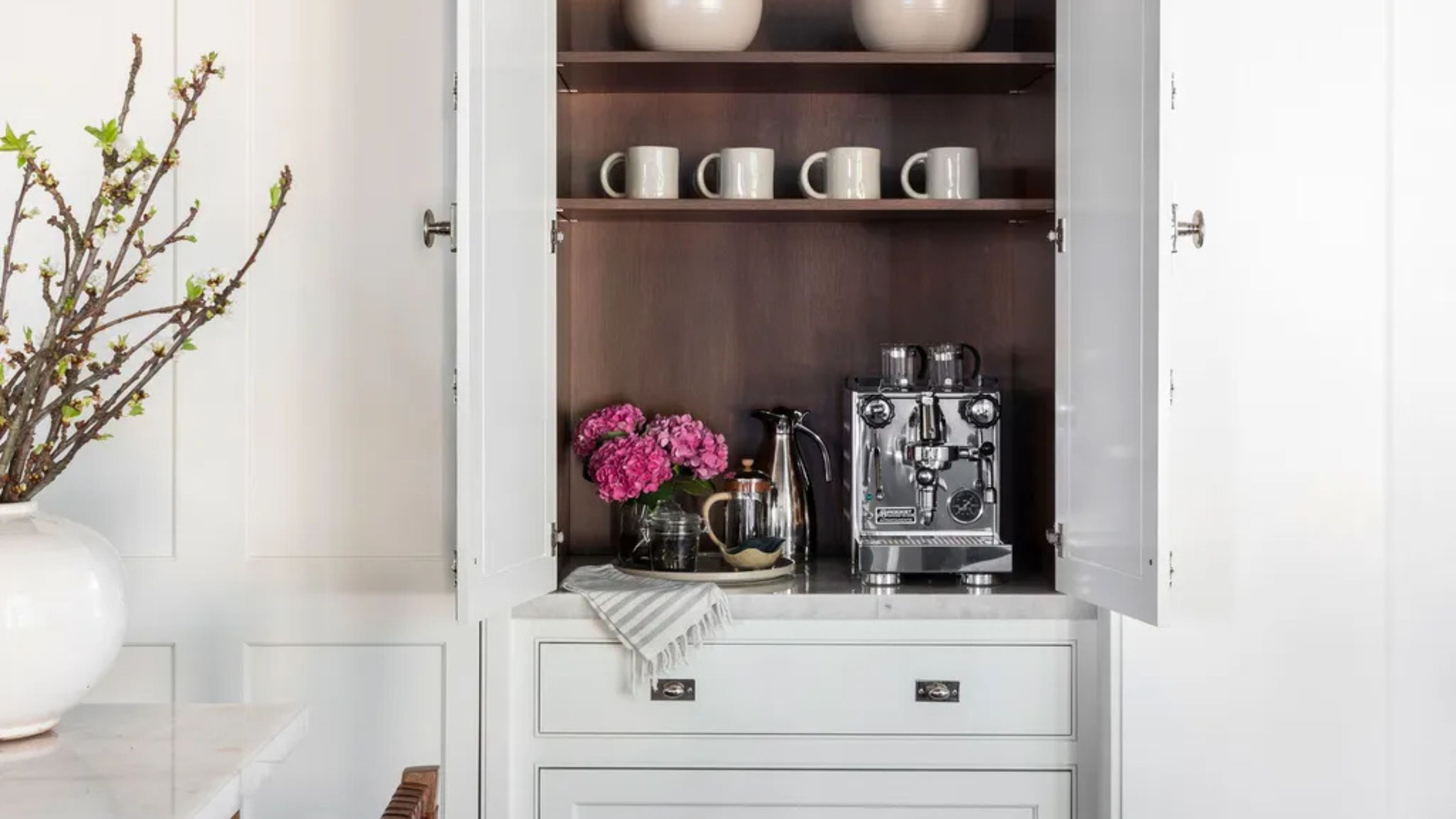 Turns Out the Coolest New Café is Actually In Your Kitchen — Here's How to Steal the Style of TikTok's Latest Trend
Goodbye, over-priced lattes. Hello, home-brewed coffee with friends. TikTok's 'Home Cafe' trend brings stylish cafe culture into the comfort of your own home
By Devin Toolen Published
-
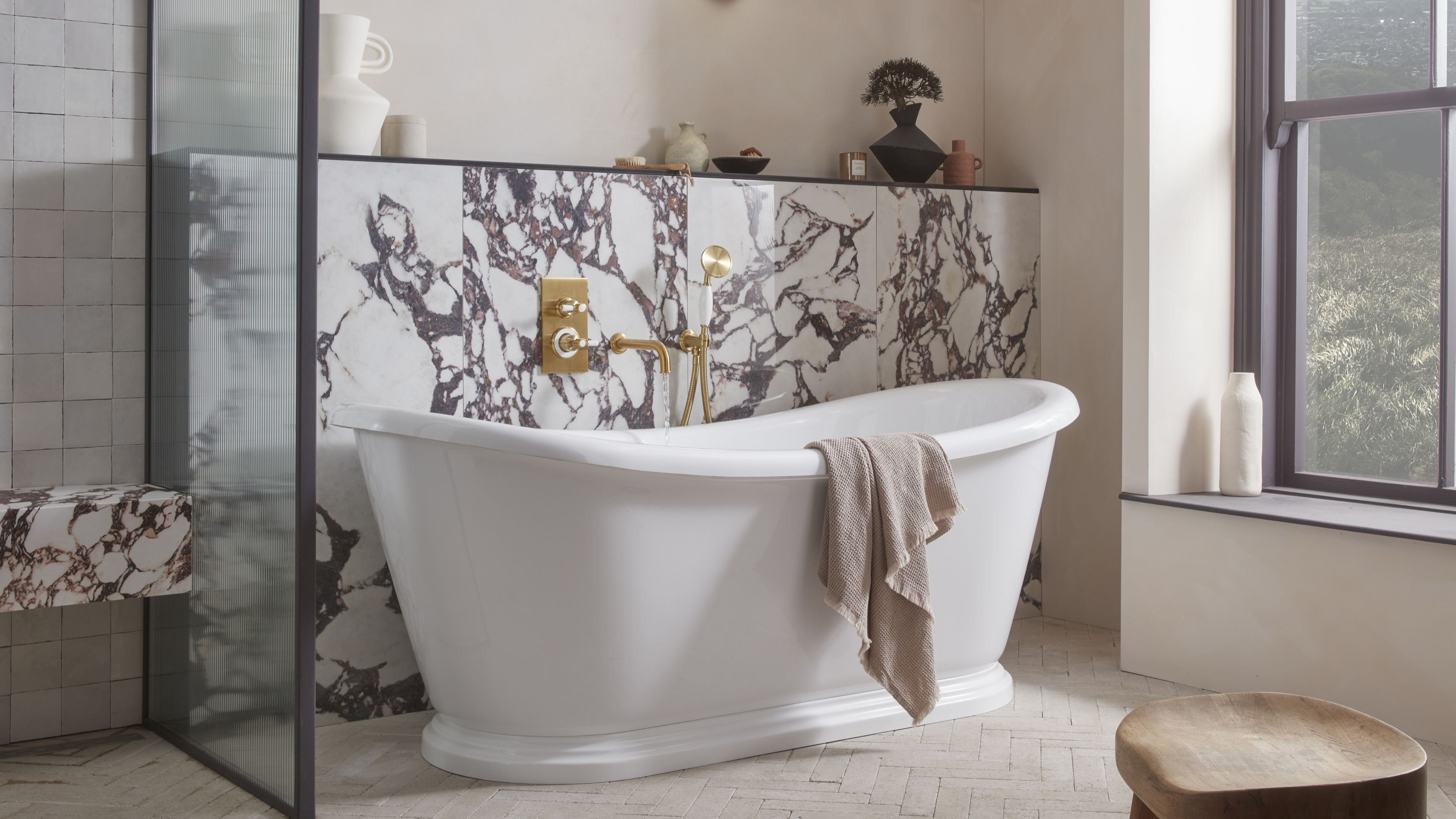 5 Bathroom Layouts That Look Dated in 2025 — Plus the Alternatives Designers Use Instead for a More Contemporary Space
For a bathroom that feels in line with the times, avoid these layouts and be more intentional with the placement and positioning of your features and fixtures
By Lilith Hudson Published
