This once much-loved layout idea is now dating our homes, say designers – here's what to do instead
Relying on symmetry in interior design when arranging your furniture can result in a formulaic, lackluster space. These designers explain why (and how) to avoid it
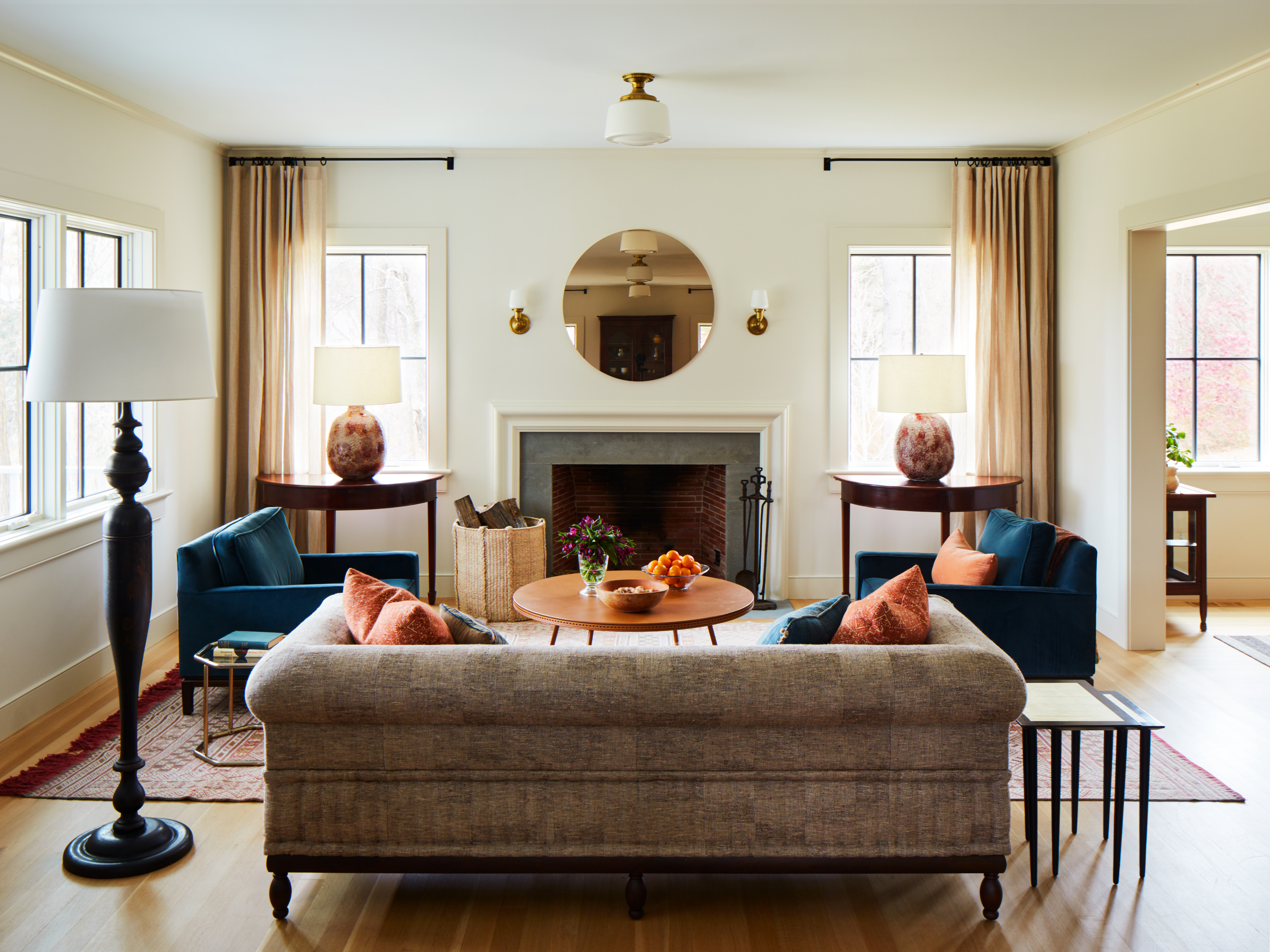

As humans, we tend to have a natural inclination towards symmetry. We find balance and order comforting and, as such, we replicate that in our designs. Often it makes the most practical sense, too; just take a look at bedrooms for example - headboard against the back wall, bedside cabinet either side, alcove shelving in the opposing two corners. It's simple, formulaic, and it looks 'nice' - but what symmetrical designs lack is any notable talking point. As design goes, they're pretty unremarkable.
Do you switch up your furniture to stay on-trend and use all the 'in' colors on your walls, only for your bedroom to still lack that exciting, contemporary look that you long for? Well, your use of symmetry in interior design might be the problem. While the architecture of our homes can sometimes limit us to a symmetrical floorplan, a less formulated layout of your furniture arrangement could be the answer to a more visually intriguing and modern look.
I know what you're probably thinking - asymmetry is risky and can make a room look off-balance; only true design pros know how to pull it off. We're hear to tell you that's not the case, but don't just take our word for it. We've rusted up some top designers to offer their reasons why symmetry ought to be avoided, as well as some tips on how to achieve a more appealing, asymmetrical look.

Lilith is an expert at following news and trends across the world of interiors. She's committed to helping readers make the best design choices through writing practical tips and guides that help them master a contemporary and on-trend style in their homes. For this article she spoke with top designers for their advice on how to embrace asymmetry for a more modern look.
1. Symmetry is dated and overused
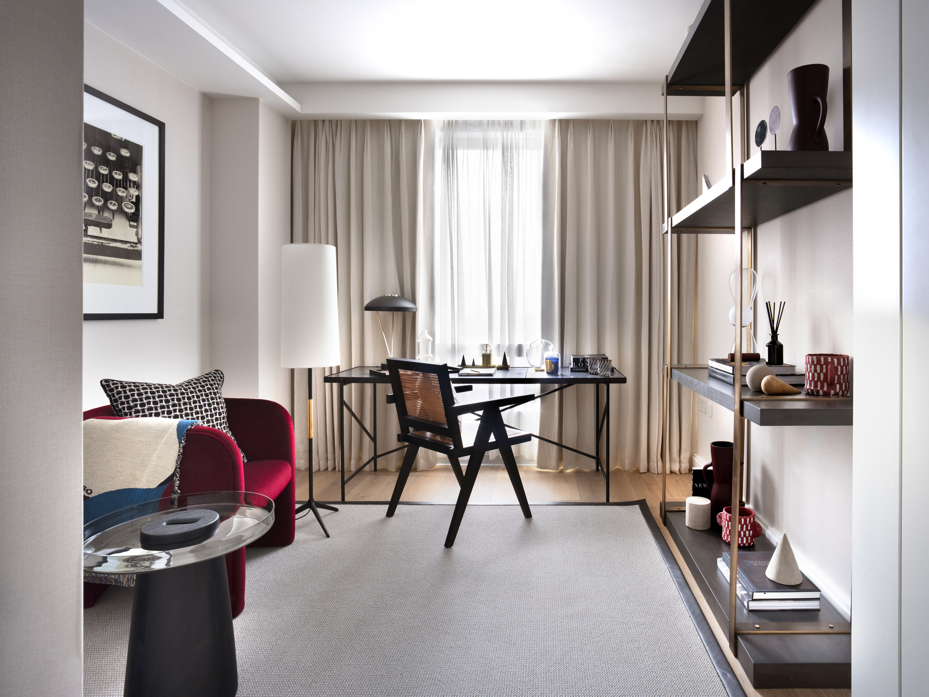
Symmetrical designs have a long history that stretches back millennia. Ancient palaces and temples are usually architecturally symmetrical, and it's a form that also translates to their interior. Symmetry is traditional (and some would say timeless), but it can also contribute to a dated look. There's a reason those hotel rooms you walk into look nice enough but always seem a bit behind the times. Besides the printed curtains, the answer is likely the symmetrical design.
'Symmetry is more of a noble classic - it is extremely beautiful but in its formality and seriousness, it can feel a little stiff and won't ever feel cutting edge,' says New York City-based designer Susanne Fox, owner of Susanne Fox Design. 'There's not much risk-taking with symmetry. In fact, the principle of symmetry essentially gives you a formula to follow, guaranteeing a certain type of result.'
While there's some good to be said for symmetrical designs, as Susanne notes, they'll never be showstoppers. This is because their easy-to-follow formula is the default arrangement for the vast majority of people who don't give that extra thought to their interiors. It's overused and restrictive, limiting the creativity of our designs, and should therefore be avoided if you want a modern interior design style. 'Asymmetry lends itself to a more abstract and avant-garde look than the formality of symmetry,' Susanne explains.
2. Symmetry is predictable
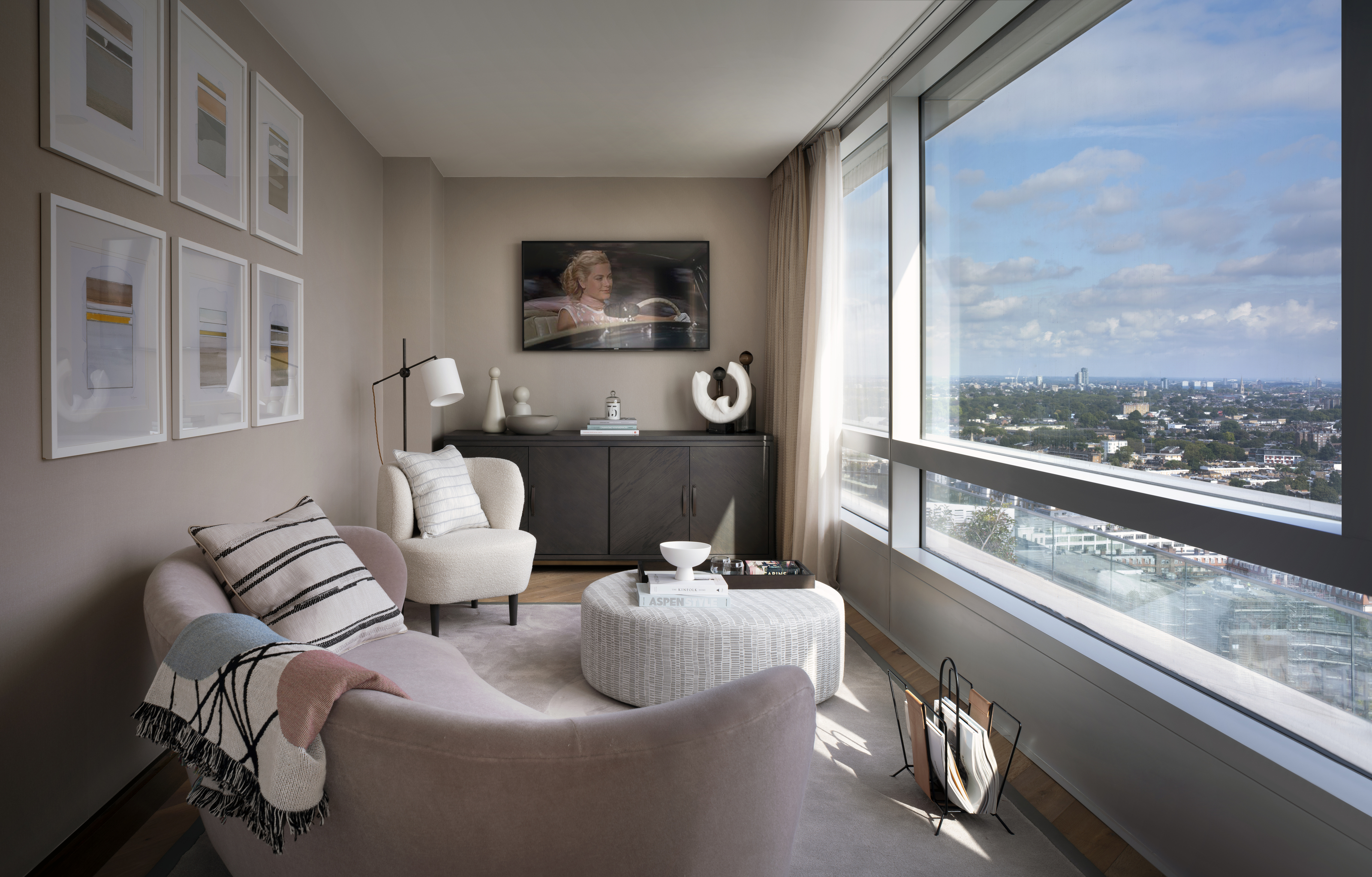
Although there is beauty in symmetry, it's incredibly simple. As such, it offers little in terms of visual interest because it's so predictable. If your eyes have noticed a bookshelf one side of a fireplace, for example, they won't be surprised when they see another bookshelf on the opposite side (a popular way of decorating a room with a fireplace in the middle). Asymmetry on the other hand is more intriguing, freeing and unexpectant, thus far more likely to catch the eye.
While you might find the idea of predictability in design safer and calming, it can actually make us feel less relaxed due to its associations with formality. 'If you're aiming for a relaxed, laid-back living space, it's best to avoid symmetry altogether,' explains London-based interior designer, Shanade McAllister-Fisher. 'Instead, opt for asymmetrical balance to achieve a more informal design.'
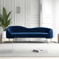
Navy velvet curved sofa, Wayfair
A curved sofa like this one from Wayfair naturally lends itself to a more symmetrical look thanks to its design. Not every sofa has to be a rectangular block, and the enduring trend for curved proves just that. The retro-inspired design with a sinuous, high-low back makes it great for breaking up a room's look. Exactly what you need for a more eye-catching living room.
3. Symmetry can feel too regimented
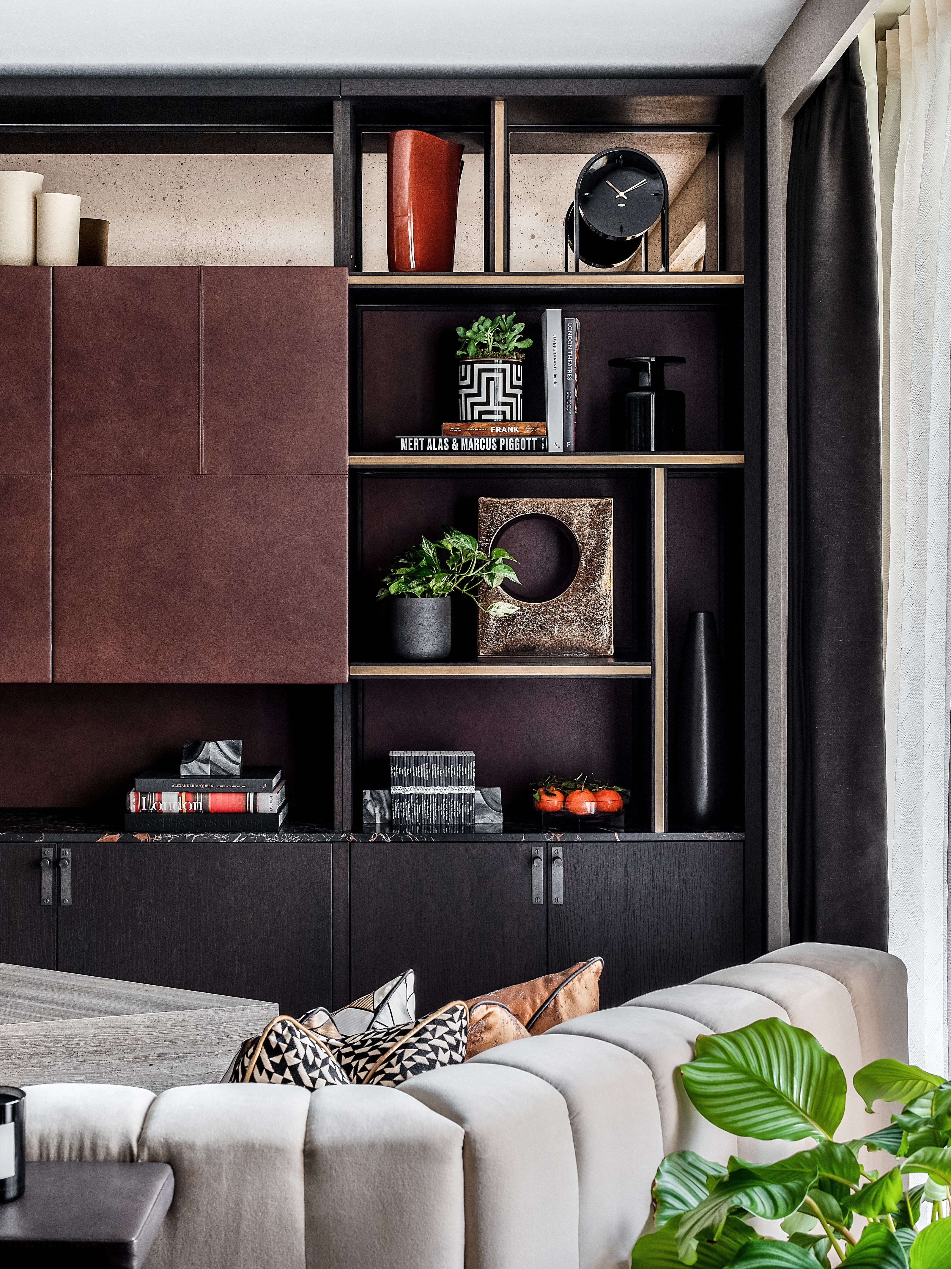
Commercial and public spaces are more likely to follow the safe rules of symmetry because of its predictable and simple nature. It's also a popular feature of more traditional styles, too. As a result, we tend to associated it with formality and rigidness, something we don't want in the comfort of our own homes.
'Symmetry is calming, pleasing to the eye and will never be truly out of fashion, but you can have too much of a good thing,' says interior designer, Rudolph Diesel. 'Going overboard with symmetry makes your space look clinical, rigid and boring. It feels more like an office than a living space.'
It's true - symmetrical designs don't feel notably homely or characterful. Aesthetical appeal is a natural result of the way asymmetry allows us to embrace individuality and self-expression. Formulated arrangements of living room furniture, for example - rectangular table opposite sofa flanked by floor lamps - make a space feel far more regimented.
As Rudolph adds: 'Symmetrical furniture placement itself won't make your room look smaller, but you should avoid being too regimented with a symmetrical layout or you'll make the room look too boxy. Instead, place a coffee table between two sofas, and a small table to the side of one sofa to throw off the symmetry a little and make the space feel cozier.'
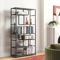
Asymmetrical iron bookshelf, Wayfair
An asymmetrical furniture arrangement is one way to get a less formulated look, but literal asymmetrically design furniture is another. This iron bookshelf from Wayfair features five tiers of asymmetrical shelf space for displaying your favorite decor. The clean lines add a dash of modern and industrial style with its tall, grey iron frame. Perfect for a contemporary living room.
How should I embrace asymmetry?
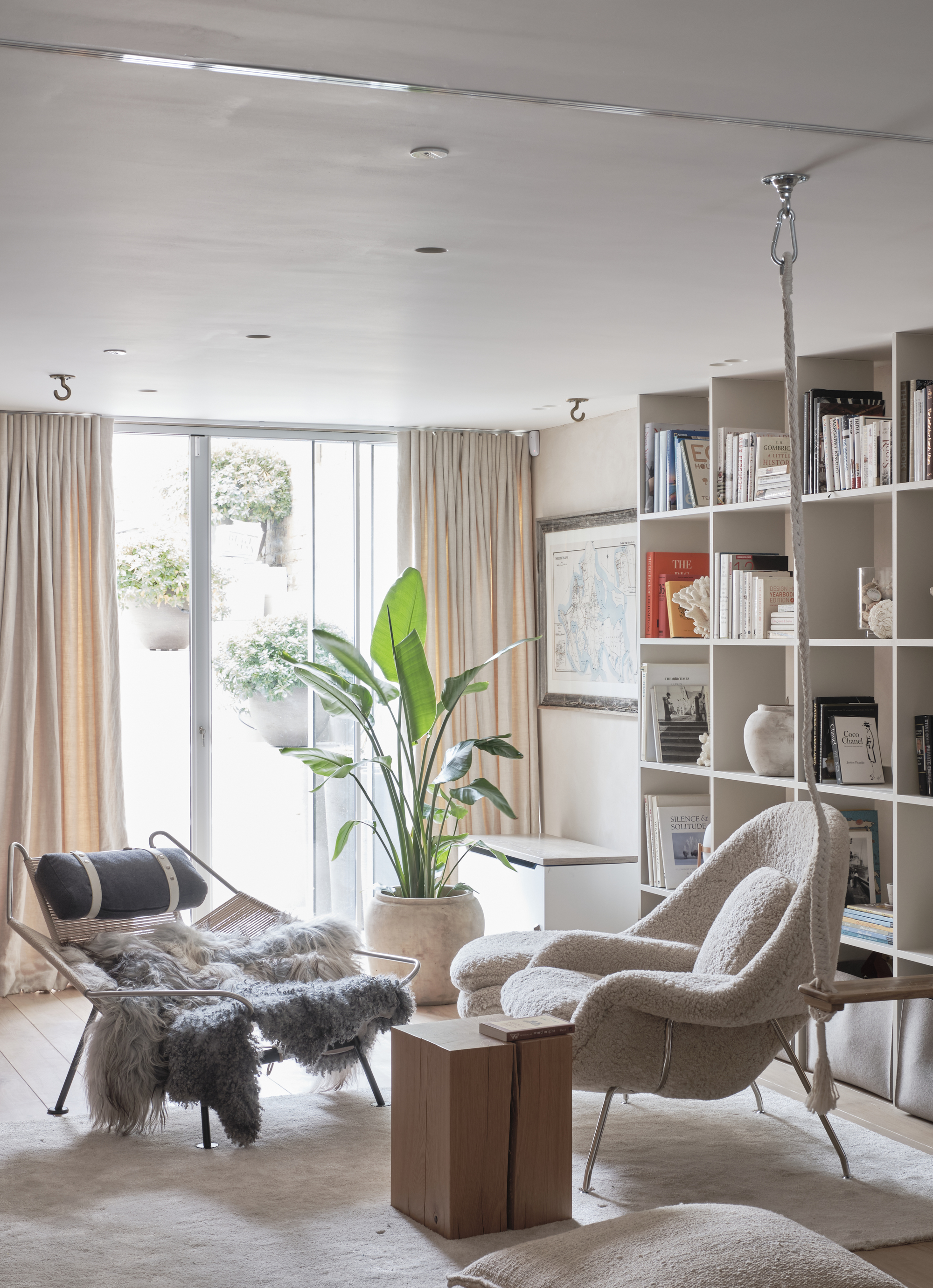
So, how should we be using asymmetry in our designs for a more contemporary feel? Contrary to popular belief, asymmetry doesn't need to mean off-balance. In fact, quite the opposite. Think about it - when you're decorating bookshelves you don't want symmetrical decor on each shelf of the same height, size, and shape. Curating shelves with decor dotted evenly across them actually has the effect of looking more balanced.
This goes for furniture arranging your furniture, too. 'Using asymmetrical balance, a room is still balanced by a repetition of similar lines and colors, but you're avoiding mirroring and packing a room out with multiple unnecessary items of furniture that can leave the space looking cramped,' explains Shanade. 'An asymmetrically balanced living room might feature one sofa with an end table on one side, and a floor lamp on the other, for instance.'
Experiment with varying heights in your space to achieve this asymmetrical yet balanced look, and let texture and material play into that, too. Use a tall floor lamp one side of the room and a heavy stone table on the other, with a curved sofa in the middle.
'Creating a beautifully composed, harmonious space in a way that is asymmetrical and yet still balanced, takes a great deal of skill, vision and some tinkering to get it just right,' Susanne notes. 'But when done well, it is always fresh and innovative. It challenges convention and pushes boundaries.' Since fresh and innovative is everything we want from our spaces, we reckon asymmetry design is worth that extra effort.
Be The First To Know
The Livingetc newsletters are your inside source for what’s shaping interiors now - and what’s next. Discover trend forecasts, smart style ideas, and curated shopping inspiration that brings design to life. Subscribe today and stay ahead of the curve.

Lilith Hudson is a freelance writer and regular contributor to Livingetc. She holds an MA in Magazine Journalism from City, University of London, and has written for various titles including Homes & Gardens, House Beautiful, Advnture, the Saturday Times Magazine, Evening Standard, DJ Mag, Metro, and The Simple Things Magazine.
Prior to going freelance, Lilith was the News and Trends Editor at Livingetc. It was a role that helped her develop a keen eye for spotting all the latest micro-trends, interior hacks, and viral decor must-haves you need in your home. With a constant ear to the ground on the design scene, she's ahead of the curve when it comes to the latest color that's sweeping interiors or the hot new style to decorate our homes.
-
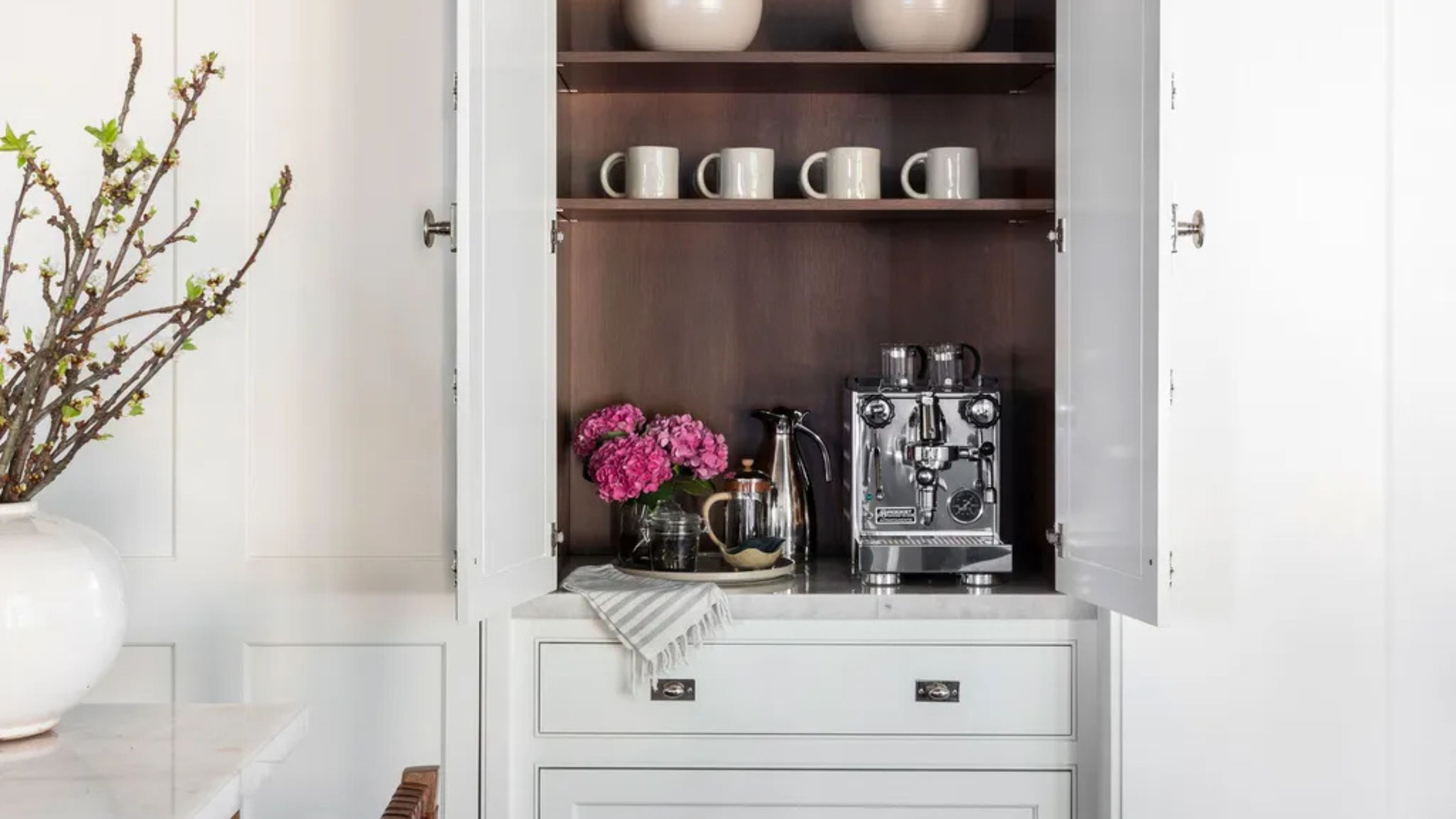 Turns Out the Coolest New Café is Actually In Your Kitchen — Here's How to Steal the Style of TikTok's Latest Trend
Goodbye, over-priced lattes. Hello, home-brewed coffee with friends. TikTok's 'Home Cafe' trend brings stylish cafe culture into the comfort of your own home
By Devin Toolen Published
-
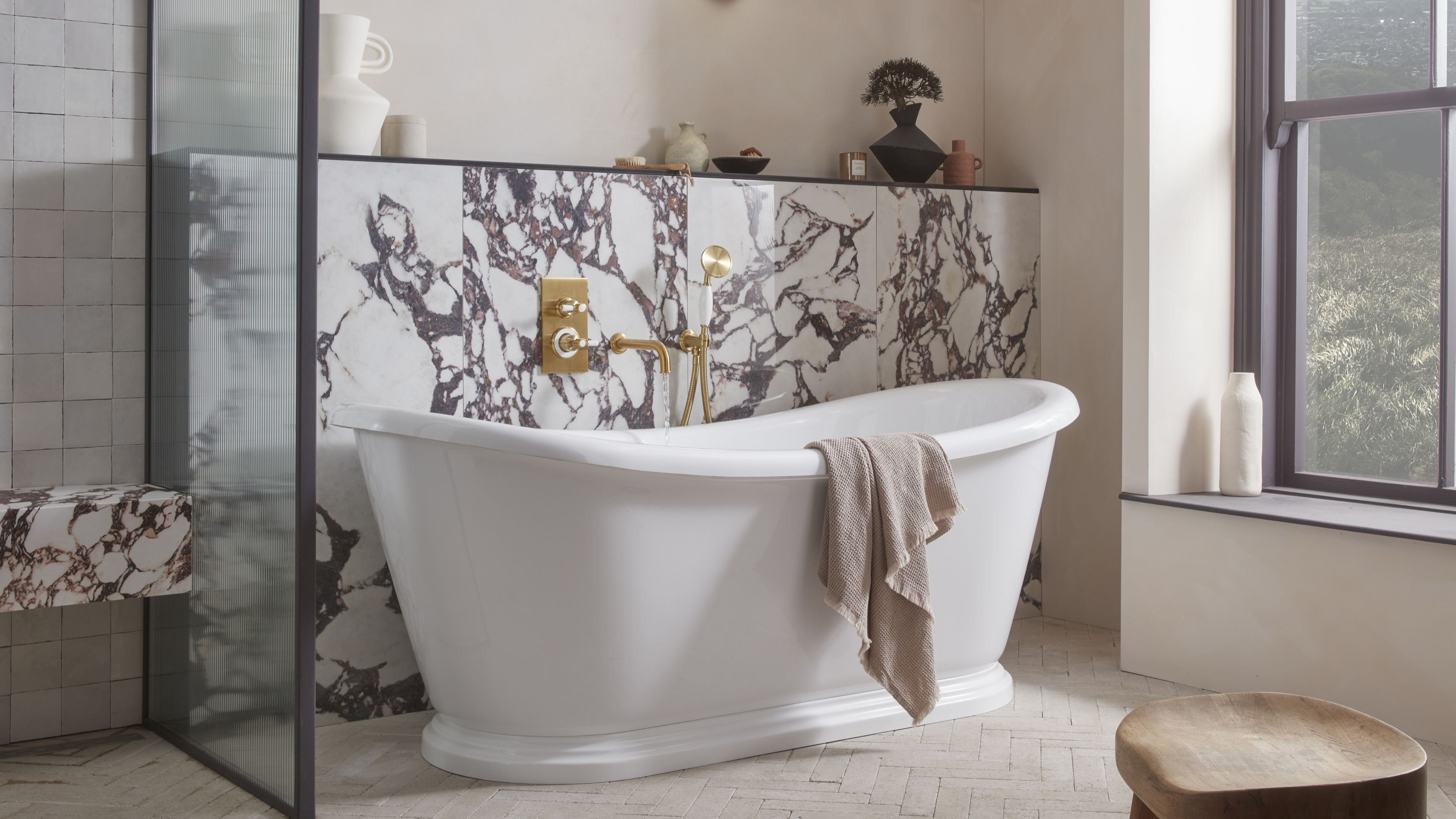 5 Bathroom Layouts That Look Dated in 2025 — Plus the Alternatives Designers Use Instead for a More Contemporary Space
For a bathroom that feels in line with the times, avoid these layouts and be more intentional with the placement and positioning of your features and fixtures
By Lilith Hudson Published
