Save Yourself the Trouble — Design Experts Reveal the Secret to Picking the Right Shade of Green for Each Room of Your Home
Whether you want it to refresh, relax, or re-energize, the shade of green you choose can completely change the feel of a room
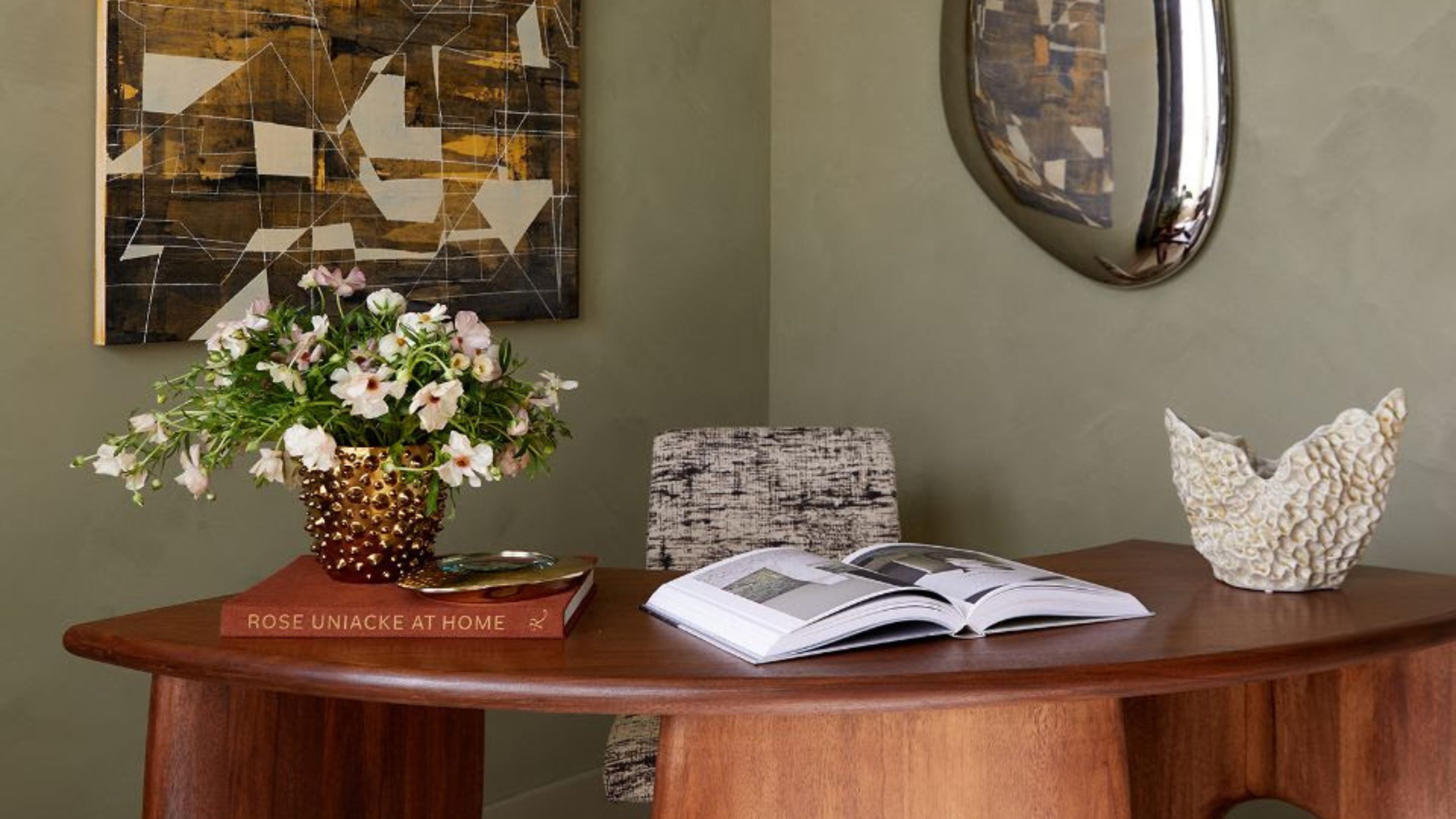

Green can be both a relaxing and energizing color — it all depends on the shade you choose. Generally, more muted, earthy greens will come across as calming, whereas brighter shades will make a space feel more energizing and vibrant. But which shade is right for each space in your home?
Choosing the perfect shade of green for your room should involve a few key considerations to get the look and feel just right. You'll need to take note of the room’s natural light, as it can greatly affect how a green shade appears. Sun-filled rooms can handle deeper greens like olive or forest without the color coming across as too dark, while rooms with low light benefit from a lighter and brighter shade.
To help you figure out the best green paint for each room in your home, you need to first determine what mood you want to convey, and what the purpose of the room is. Next, read the five secrets we've unearthed below, all shared by designers, to pick just the right shade of paint.
The Best Shade of Green for Bedrooms
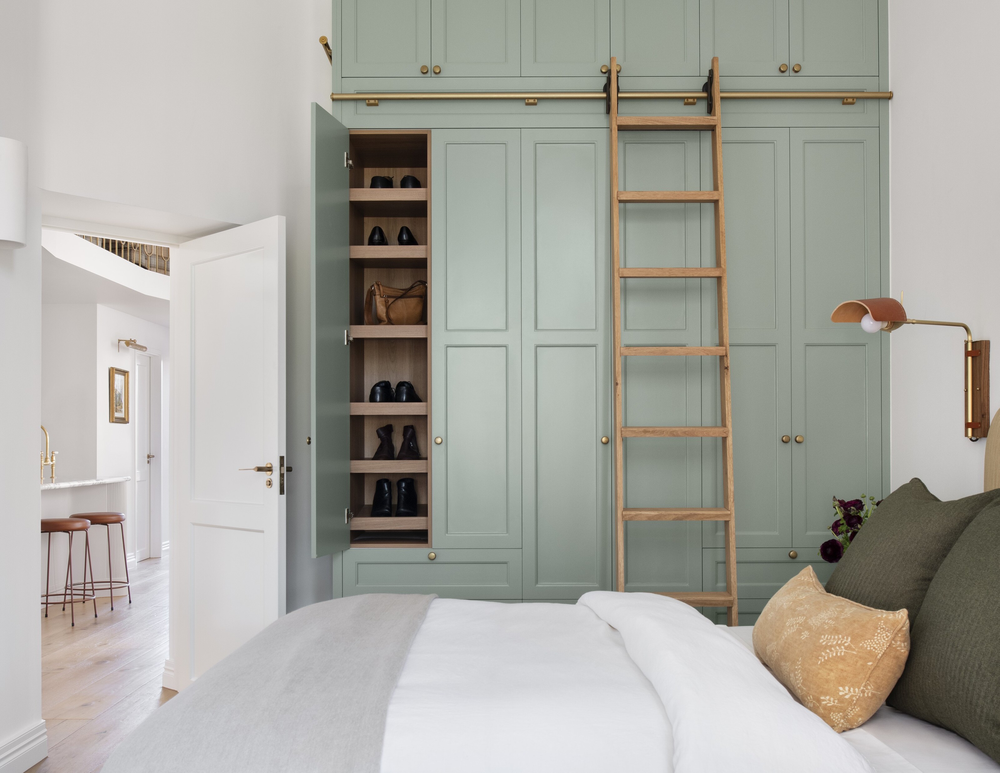
For spaces intended for rest and relaxation, such as a bedroom, interior designer Elizabeth Grace from Dream Home Making suggests opting for a soft, more muted green like sage green or eucalyptus.
"These shades have a grounding quality, drawing from nature, which can help reduce stress and create a peaceful atmosphere," she says. "I recently worked with a client who wanted a refreshing feel in their bedroom without overpowering the decor; we chose a light sage, which beautifully complemented both the natural lighting and warm wood tones in the room."
The Best Shade of Green for Kitchens
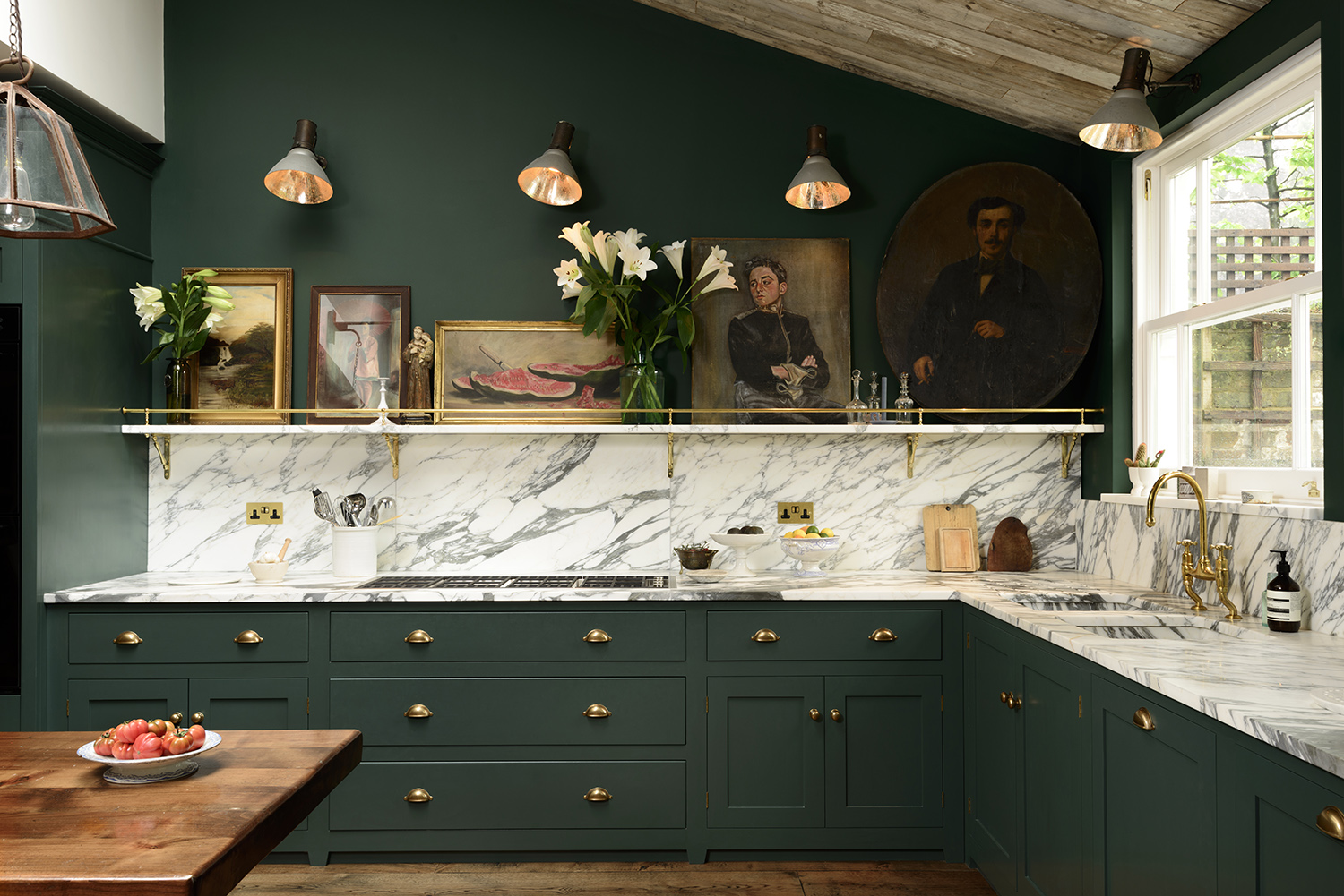
In humming social spaces like the kitchen, choosing colors that boost energy and vitality are key. When it comes to finding the best greens for kitchen cabinets, brighter shades like mint green, or even an olive with a yellow undertone, are both excellent choices.
These shades add a lively, refreshing feel to the space, while still coming across as approachable, and more importantly, timeless. Interior designer Lauren Sweet-Schuler, principal and founder of Missouri-based Studio Sweet-Schuler, says she likes to use olive green in the kitchen because it "almost acts as a neutral", adding a pop of color without taking away from other elements in the space.
Alternatively, deep forests and hunter greens also pack a punch, if you're looking for bold green kitchen ideas. This shade is a particularly elegant option and helps to make statement hardware — particularly brass or chrome — stand out.
The Best Shade of Green for Living Rooms
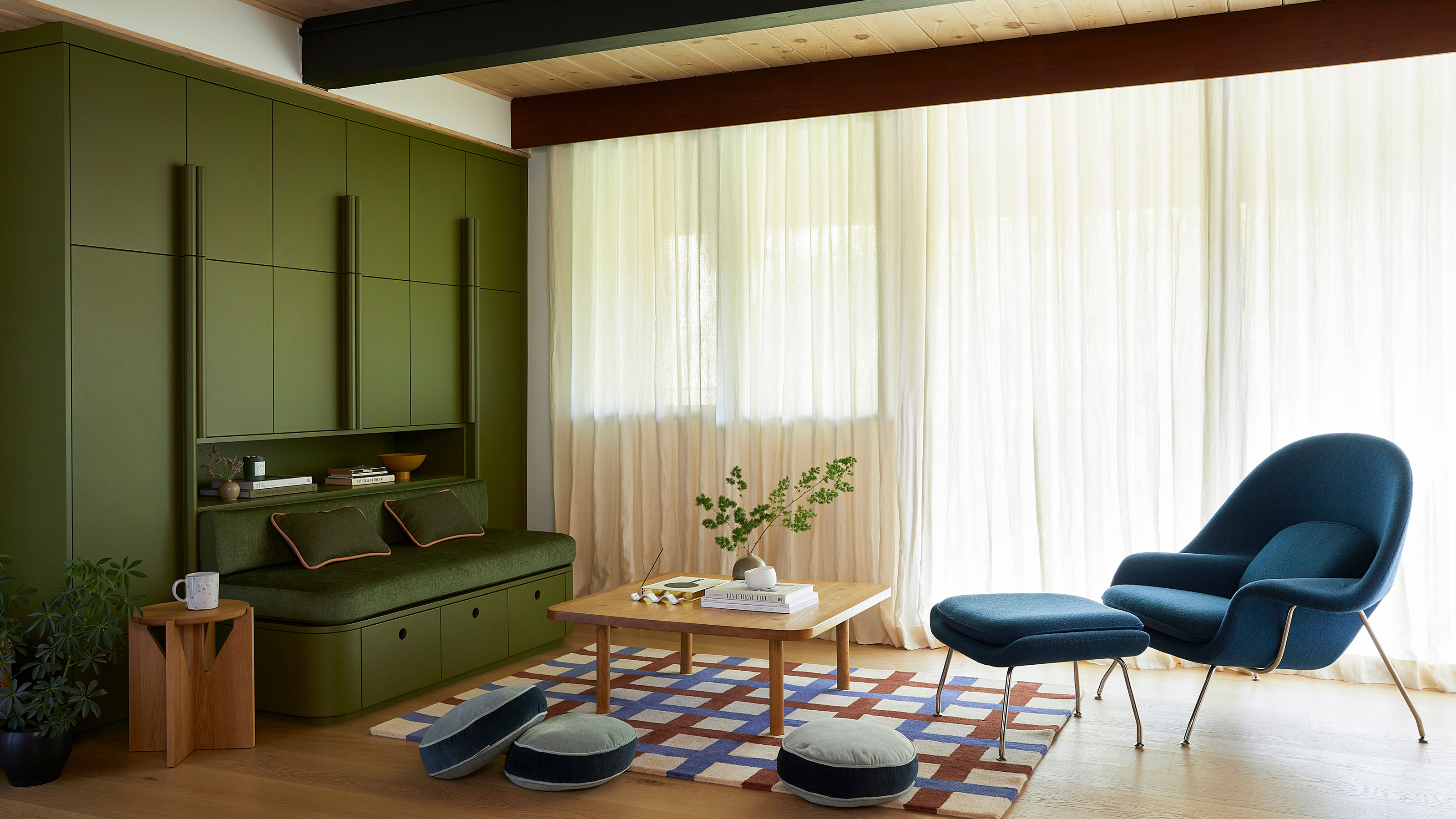
If you're looking for green living room ideas, New York-based interior designer Ariella Duker, the founder of Ariella Duker Interiors, says such spaces can benefit from deeper greens like forest of emerald, "which can add an element of sophistication and warmth."
Of living spaces she's designed in the past using these shades, she says the colors have "provided a moody yet welcoming feel that sets a perfect tone for intimate gatherings," adding that “These shades work especially well with natural elements like leather or reclaimed wood, creating a balanced and cozy environment."
The Best Shade of Green for Bathrooms
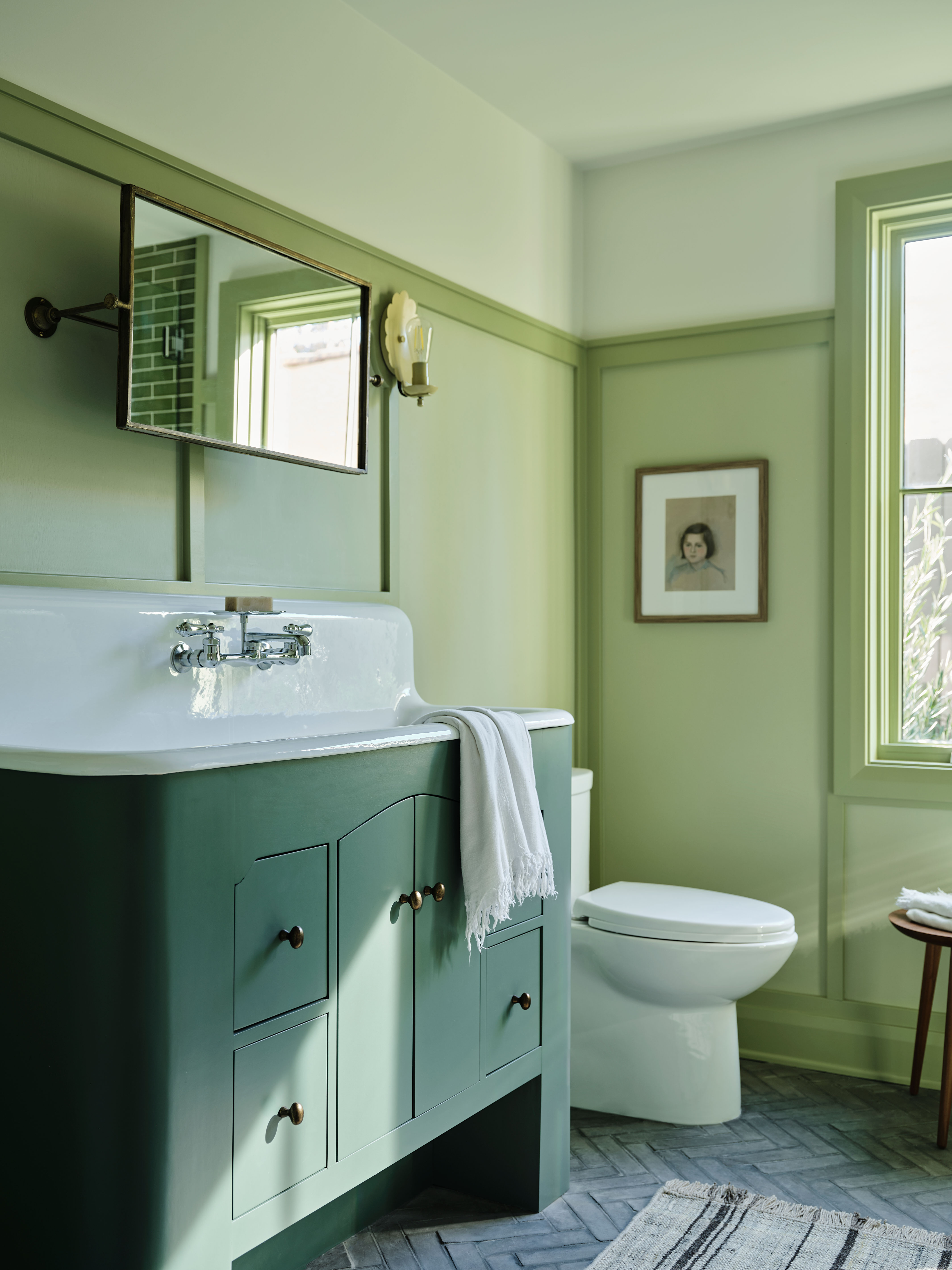
Light and uplifting shades are the best for green bathroom ideas. In fact, these spaces are a great way to experiment with brighter and more refreshing shades, including crisp, cool seafoam green, says Washington DC-based interior designer Chenise Hinds (who is also a home stager and realtor).
“This color brings an invigorating, spa-like feel that’s also easy to accessorize with white or matte black fixtures," Chenise adds. "It’s a color that reflects light beautifully and can make smaller spaces feel open and airy.”
The Best Shade of Green for Studies
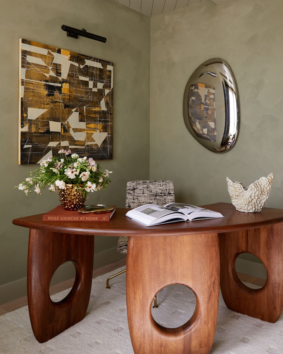
To promote focus and productivity in your study or home office, interior designer Elizabeth Vergara, founder at Vergara Homes, suggests using darker greens like olive and moss.
"These tones promote a grounded feeling and help minimize distractions, making them ideal for spaces where concentration is needed," she says. “I once recommended an olive green for an office library with walnut wood shelving, and the result was a stately yet inviting space that supported long hours of work or reading.”
Shades of olive green actually help to reduce eye strain and support concentration, due to their grounding properties. You could try Farrow & Ball’s Lichen for a subtle, sophisticated choice that feels both fresh and professional.
Once you've narrowed down which shade of green is best for your space, the next step is to paint a few swatches directly onto your wall and observe how the shades look at different times of the day, because light can affect green paint, drastically altering how it looks.
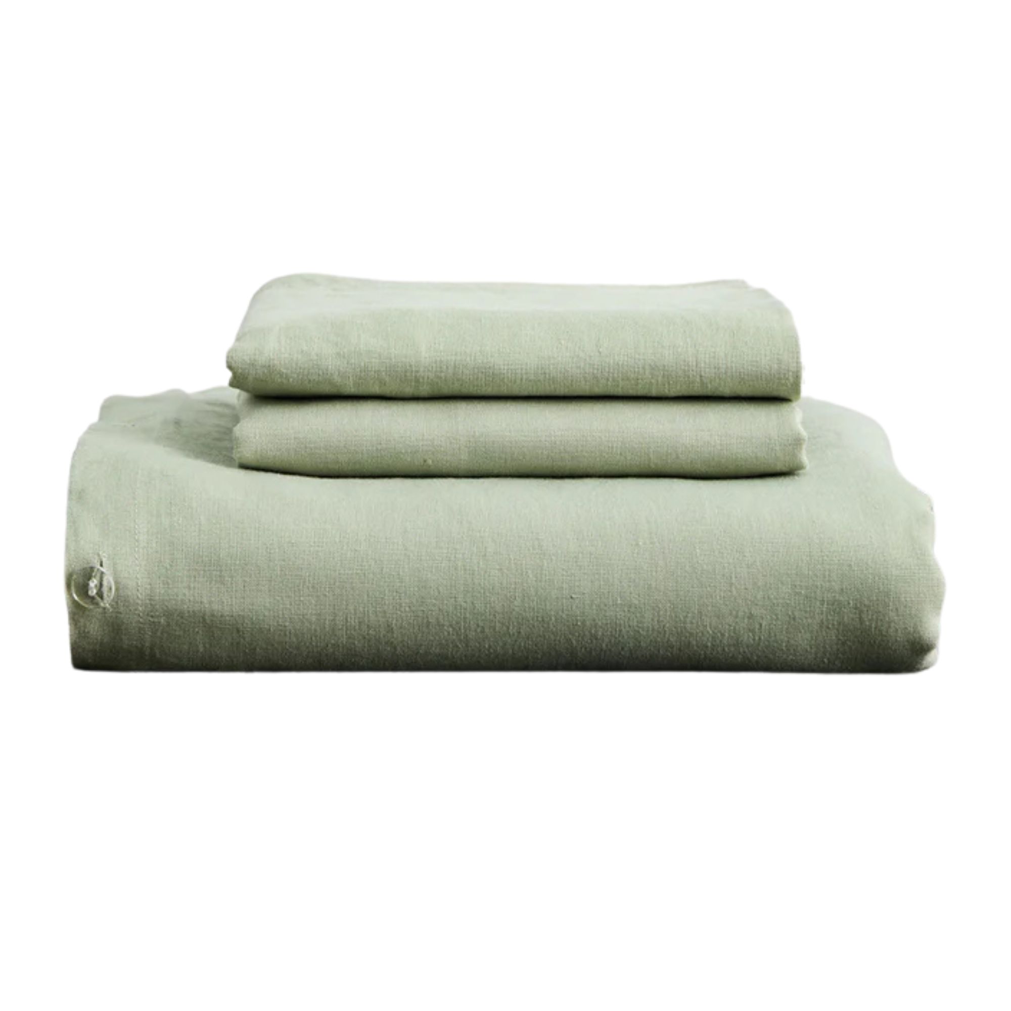
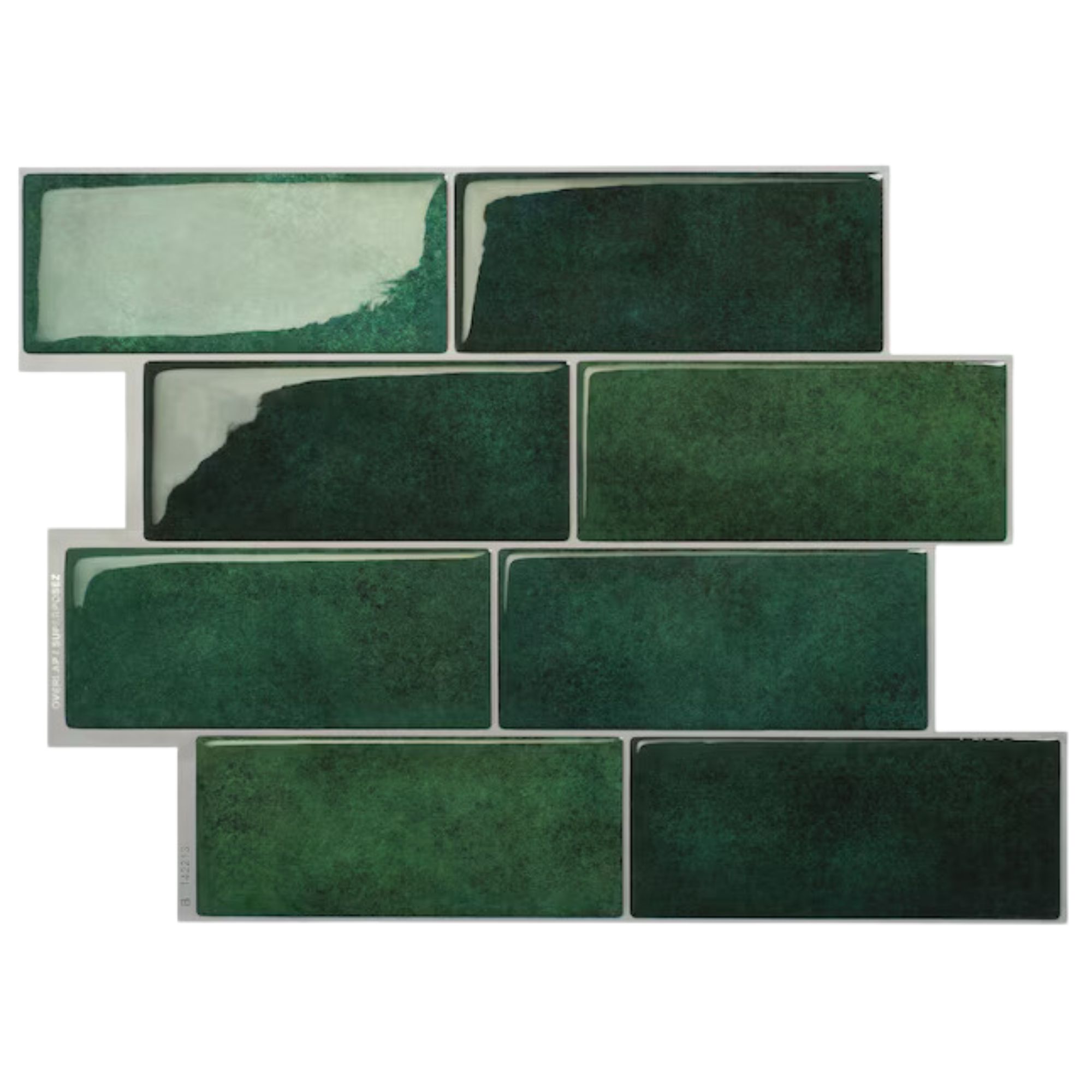
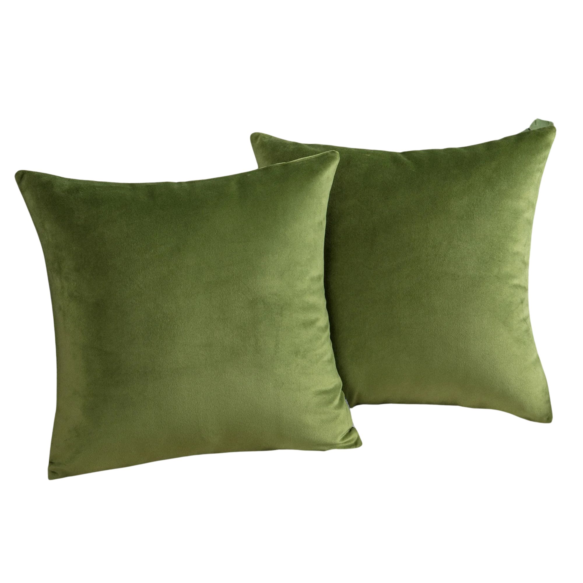
And if you're still hesitant about committing to green paint, you can start by introducing the color as an accent. A forest green wallpaper, a throw pillow, or even painting just the cabinets in a small bathroom lets you experiment with the shade without overwhelming the space.
The Livingetc newsletters are your inside source for what’s shaping interiors now - and what’s next. Discover trend forecasts, smart style ideas, and curated shopping inspiration that brings design to life. Subscribe today and stay ahead of the curve.

Seraphina is a contributing editor at Livingetc, writing Advice features on design, renovation and organisation. Seraphina is a qualified Interior Designer from KLC School of Design having worked at London-based interior design agencies Anouska Hempel and ND Studios. Seraphina has also completed her MA degree in Magazine Journalism at City, University of London, with previous experience including writing for Homes & Gardens, Women's Health, Food & Travel and Fabulous Magazine.


