These are the 5 kitchen layouts you should avoid for the most functional and cohesive space possible
The best kitchen layouts configure your space to work with you, not against you. These experts explain the common mistakes to avoid


We all want a kitchen with a design to impress but if the layout doesn't facilitate proper function, it will fall short every time. The truth is, our kitchens see a lot. Be it cooking the family meal or hosting guests at a party, its design should help to make all related tasks as simple as possible, but some common layout errors prevent that.
Part of the problem is down to the design-minded among us prioritizing style over actual utility. 'A big part of designing your kitchen is identifying your functional preferences and deciding how the space will operate first,' explains Bob Bakes, Head of Design at Bakes & Kropp. 'Are you a big cook? Do you need a 60-inch or a 36-inch range? What refrigeration do you need, and do you need a lot of it? Once you have a clear vision for functionality, your aesthetic vision is that much simpler to execute.'
All that said, when designing a modern kitchen, it also helps to have an insight into what the most common layout mistakes are and how to avoid them. To help us, we've spoken with some top kitchen makers who know a thing or two about what to steer clear of, as well as how to get it right. Here's what they had to say.

Bob is the president and CEO of Bakes & Kropp. He has over 25 years in the kitchen and interior design business both in the USA and UK, and a desire to create an exceptional luxury brand, driven by design, based on the premise of high quality construction, manufacture and service.
1. Wasting space with a too-big island
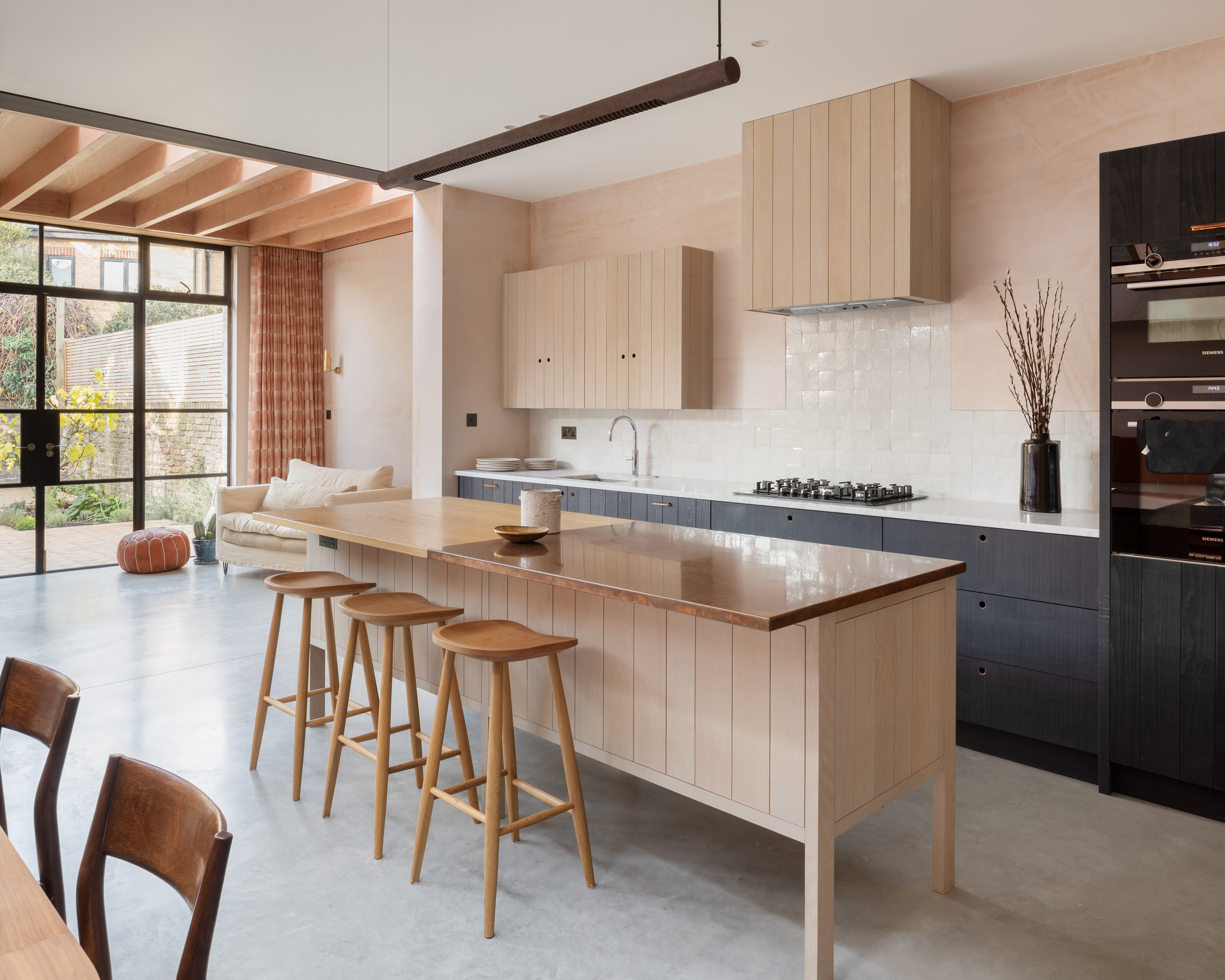
We all dream of having a large kitchen island with ample space for food prep or for friends and family to gather around. But, although it might seem alluring, there's no point opting for a huge kitchen island unless you have plenty of floor space available.
'A lot of people think the bigger the island, the better, however this can lead to a crowded kitchen with too many pieces of furniture competing for the same space,' explains Chris Alexakis, founder of CabinetSelect. 'What you should do is look at which pieces are essential and plan accordingly.'
You may not believe it if you look at Pinterest too much, but kitchens without islands can still be wonderful. And shoving a tiny one into an already small kitchen might be more trouble than it's worth. Figure out if you do have room for a kitchen island. If you do opt to have one, it should be proportionate to the room and its floor space. For example, if you have a long kitchen, choose a narrower bar-like island to leave plenty of room to maneuver around it.
'If the kitchen is large enough, you can add a medium-sized island that can be used to store utensils or as an eating area,' adds Chris. 'The trick is to find the right balance between function and design like choosing an island with drawers or shelves. A large kitchen can still benefit from a larger island, but it should be planned carefully to ensure that the space is not wasted.'
2. Not having enough countertop overhang
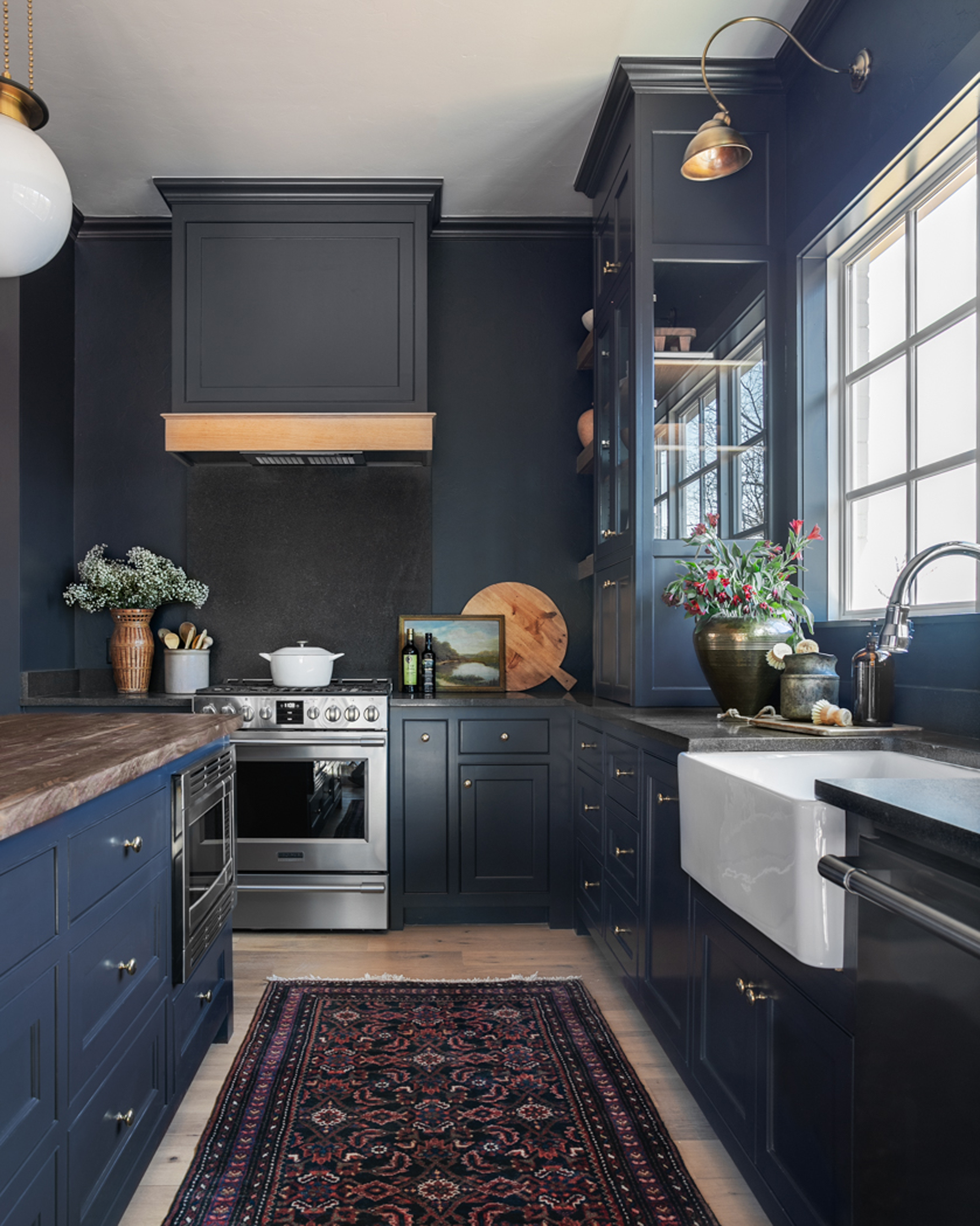
The countertop overhang is the distance from the leading edge of the kitchen countertop to the edge of your base cabinet or appliance below. You probably don't give this small detail much thought, but getting it wrong doesn't only lead your kitchen to look badly proportioned, but it can prove incredibly impractical.
'Overhang is very important because it protects your cabinets from food spills,' says Jennifer Bell, co-owner of VP & Kitchen Designer at Summit Remodeling. Not enough countertop overhang can cause crumbs and drips to make their way down your cabinets, while too much overhang will disrupt your floor space, making it difficult to maneuver around your kitchen.
In general, the recommended countertop overhang is between 1 and 1.5 inches. 'The standard overhang measurement is based on the fact that most people find this distance perfect for resting their forearms while food prep is taking place,' notes Chris Alexakis, founder of CabinetSelect. For islands and breakfast bars, you'll want the overhang to be more like 12 inches to allow space for your legs when seated.
3. Using freestanding storage rather than built-in
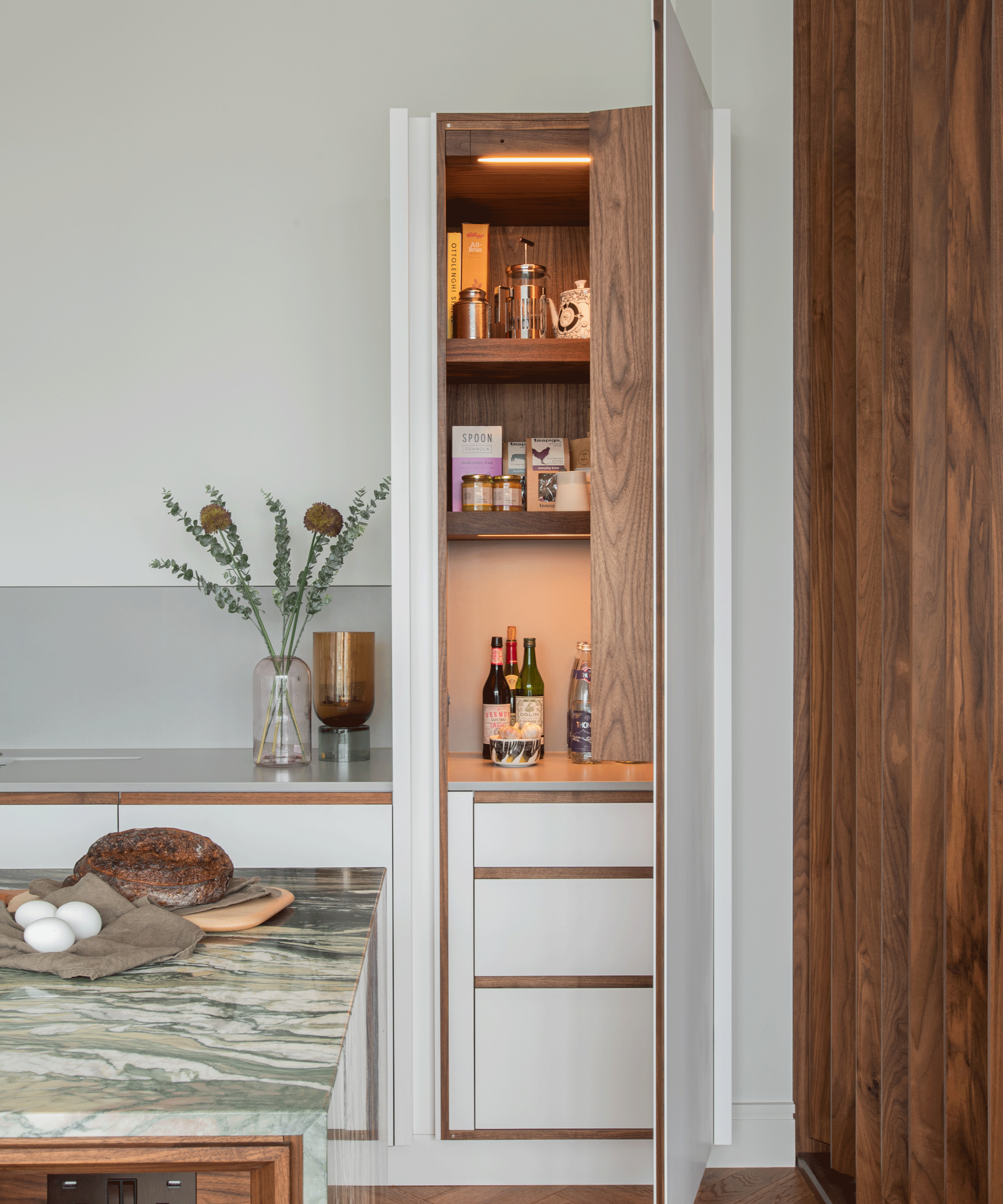
When it comes to interior design, opting for freestanding storage rather than investing in bespoke built-ins may be an aesthetic choice or a budget concern, but it is a universal layout mistake. Custom furnishings help to maximize all available space, which is especially useful in kitchens when space is often most at a premium.
'The kitchen is a multi-functional space, so it needs to be well organized and have plenty of storage options,' says Chris. 'Poorly planned storage can lead to a cluttered kitchen with too many items competing for the same space. People design their kitchens with too many shelves and cabinets, thinking that having more storage is better. But the truth is that it can lead to a messy kitchen if the space isn't designed with thought and care.'
Streamlined kitchen storage options, such as a built-in pantry or pull-out drawers with their own organizational systems, are the key to getting the most out of every inch. From an aesthetic point of view, they also make your kitchen look less cluttered and far more cohesive.
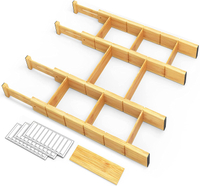
Bamboo Drawer Dividers, Amazon
For drawers that don't fill you with dread, try these bamboo organizers from Amazon. With nine inserts, you can customize the dividers to fit within a kitchen drawer of any size - perfect for your cutlery and utensils. We love that this one comes with 30 label stickers to help identify contents more easily, too.
4. Reducing countertop space with a sink that's too big
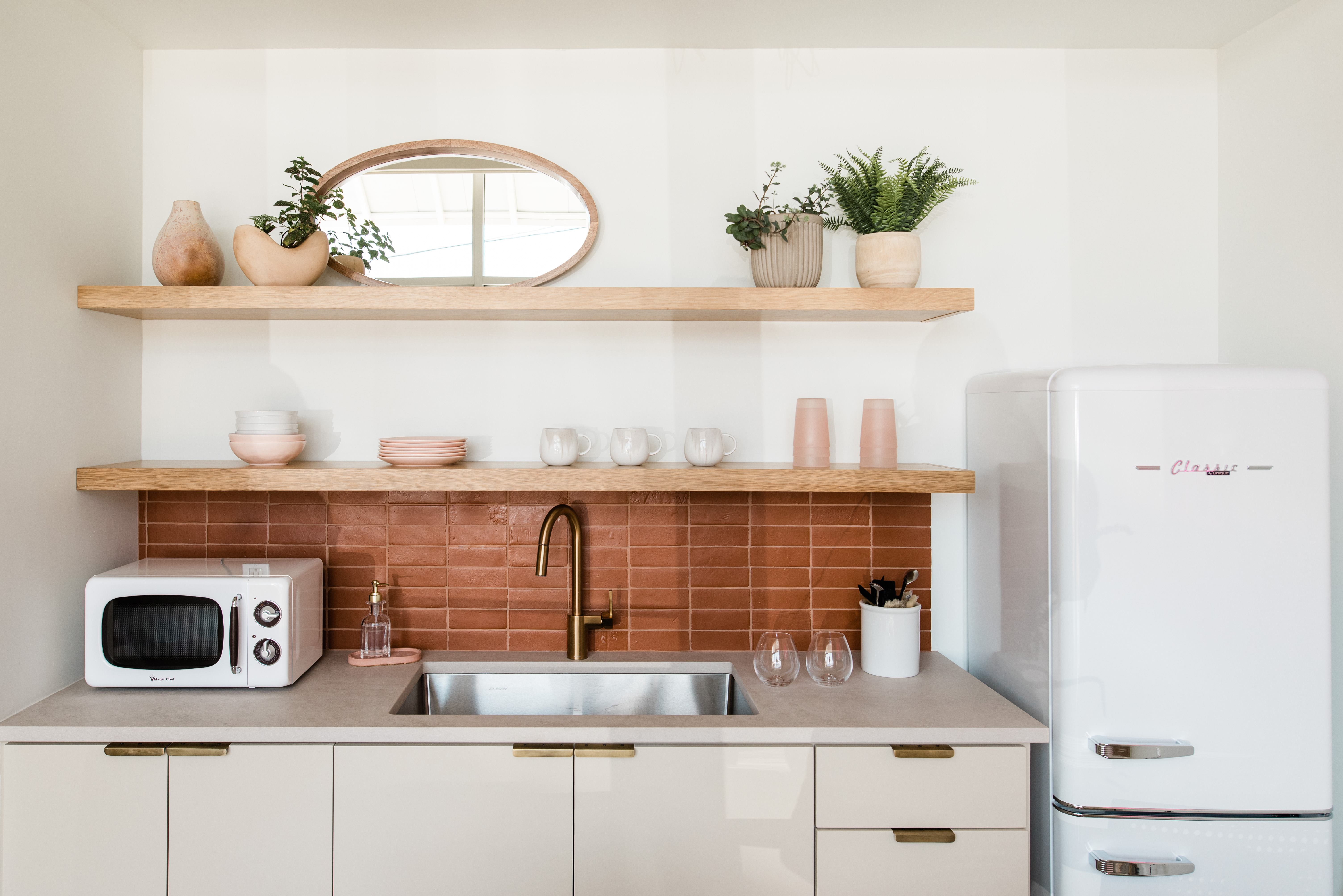
While your kitchen floor sees a lot of traffic, it's actually your countertops that should be heralded as the real powerhouse. These surfaces are where all the action takes place, so be sure not to minimize them with large, oversized sinks. According to Ibironke Ugbaja, product manager and kitchen expert at GROHE, it's actually a more common error than you'd think.
'Installing a sink that is either too large or small for your space is a common mistake,' she says. 'When choosing and installing a kitchen sink it is important to select a design that complements your style and existing interior décor, but equally as important is choosing a sink that will cater to how you use your kitchen.'
If you were considering a large double sink complete with a draining board in your small kitchen, you might want to assess how much countertop you'd be sacrificing. That said, those with a larger kitchen might find that a double bowl sink is the best way to get more out of your kitchen space since it allows more room for washing up. This one is entirely dependent on your personal situation.
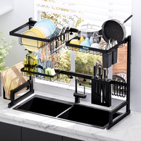
Over-the-sink matt black dish rack, Amazon
If you're really strapped for countertop space, this over-the-sink drying rack will eradicate the need for a drainer. It features an all-in-one design that conveniently stores all your washing-up supplies alongside draining racks for your dishes. The length can be freely adjusted to fit any sink too, as well as the height of the upper rail so your view outside will never be blocked. The black design makes it super stylish too.
5. Not paying enough attention to workflow or appliance arrangement
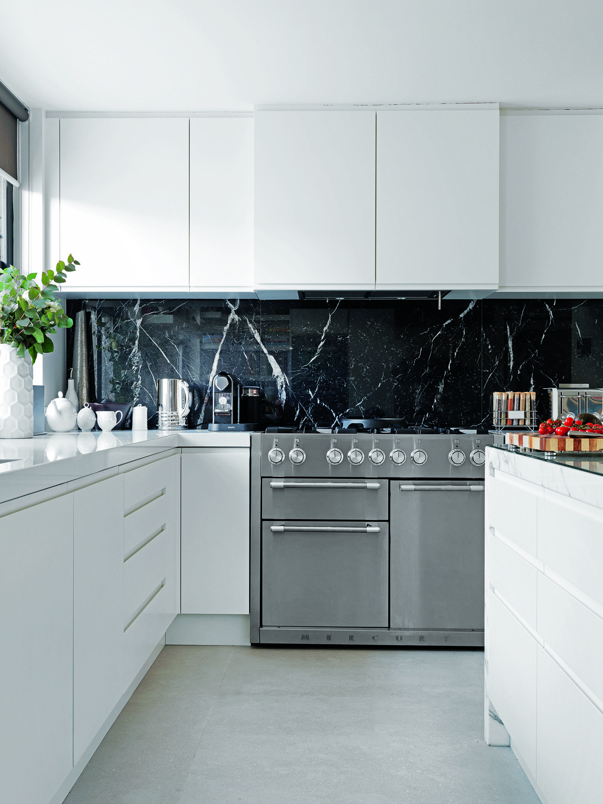
Ultimately, one of the most important aspects of any kitchen, commercial or personal, is a good workflow. More multitasking takes place here than anywhere else in the home, so you need a well-designed kitchen to cut out half the work for you.
'A kitchen layout should be determined fundamentally by the activity centers,' explains Bob from Bakes & Kropp. 'We like to use the framework of the "working triangle" which consists of areas for preparation, storage, and cooking. One example of this approach is to arrange the sink and prep area, range, and refrigerator in a triangle.' He adds that you shouldn't let this standardization takes over however; every kitchen layout will be different depending on its unique space.
Think about what works or doesn't work for you when it comes to using the kitchen for its primary function: cooking. Are you having to rush a big distance from the oven to the sink with hot pans? Are your countertops too narrow? Is your fridge not conveniently placed? When redesigning your kitchen, be sure to prioritize these. The best kitchen layouts help configure your space to work with you, not against you. 'Think through the workspace hierarchy, meaning what tasks are most important and how they should be arranged in terms of proximity to each other,' says Chris. 'For instance, the sink, stove, and refrigerator should have a direct line of sight.'
It might sound like a lot to take in, but knowing how to avoid these common mistakes really is key to a more ordered and efficient kitchen, and a good kitchen designer will always help you develop the best layout for your family. You might have also found the justification you were looking for for that new kitchen renovation... (You can thank us later.)
Be The First To Know
The Livingetc newsletters are your inside source for what’s shaping interiors now - and what’s next. Discover trend forecasts, smart style ideas, and curated shopping inspiration that brings design to life. Subscribe today and stay ahead of the curve.

Lilith Hudson is a freelance writer and regular contributor to Livingetc. She holds an MA in Magazine Journalism from City, University of London, and has written for various titles including Homes & Gardens, House Beautiful, Advnture, the Saturday Times Magazine, Evening Standard, DJ Mag, Metro, and The Simple Things Magazine.
Prior to going freelance, Lilith was the News and Trends Editor at Livingetc. It was a role that helped her develop a keen eye for spotting all the latest micro-trends, interior hacks, and viral decor must-haves you need in your home. With a constant ear to the ground on the design scene, she's ahead of the curve when it comes to the latest color that's sweeping interiors or the hot new style to decorate our homes.
-
 How to Thrift a 1970s Furniture Aesthetic — Without It Looking Kitschy
The secret to curating a stylish 70s aesthetic is by finding the real deal, and your best bet at that is thrifting secondhand — here's how
By Virginia Chamlee Published
-
 I Picked the Best Milan Hotels for Design-Addicted Travelers — And Their Retro-Futuristic Interiors Are a Masterclass in Timeless Sophistication
Our Italian Lifestyle Editor rounds up the best boutique hotels in Milan for travelers who want to get a slice of its covetable, timeless flair
By Gilda Bruno Published
