6 Things That are Making Your Kitchen Look Cheap, and How to Fix Them According to Designers
Kitchen not giving the luxurious feel you want from it? One of these 6 common pitfalls might be making it feel less expensive than it actually is
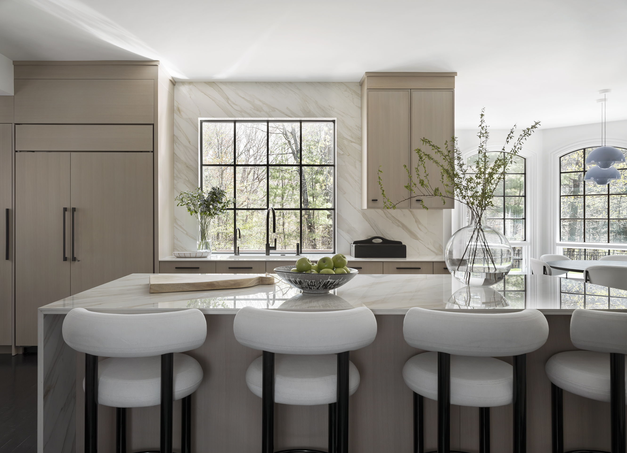

While it's not a universal truth for all interiors, if there's one thing a lot of people want from their homes aesthetically, I'd argue that it's that it looks more expensive than it actually is. While we don't all have unlimited budgets for decorating our spaces, there are certainly some clever tricks that are kind to the wallet but that give your home a more luxurious look.
On the flip side of the coin, there might be some choices you've made with your home that are having the opposite effect — certain elements making it feel cheaper in ways that are actually quite easy to avoid if you know to avoid these pitfalls.
This is especially true in the kitchen, and while you may think that you're pretty much stuck with whatever you've chosen for this space after your last remodel (or that you've inherited from a previous owner), when it comes to these areas that may be making your kitchen look cheap, they're not impossible to change. This might just be the secret to giving a modern kitchen a glow up this year, even without remodeling it.
1. Everything matching
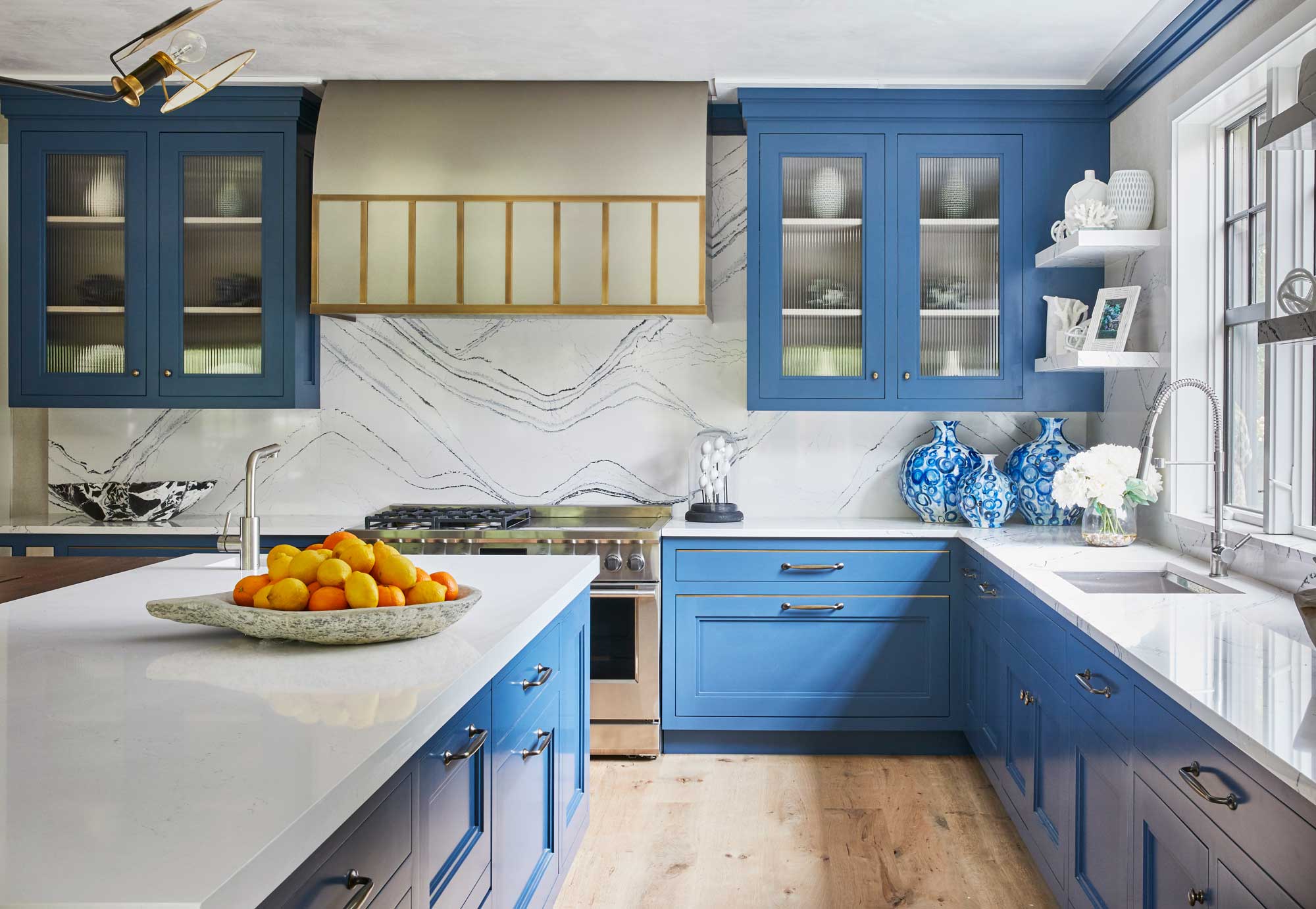
Curated, well-put-together, cohesive... These might all be words on your kitchen moodboard, but there's a fine art to getting the balance right when it comes to 'matching' decor in your kitchen that can really make a space look cheap if it's not done right.
I find a kitchen can look cheap whenever it feels too "matchy-matchy" or safe,' says Liz Hoekzema, owner and creative director of KLH Homes. 'For example, having every metal finish in a space be exactly the same vs. taking a chance with the more sophisticated route of layered finishes.'
Alongside the likes of your kitchen hardware, this goes for how you use decorative elements like color and textiles in a kitchen, too. Instead of designing a space that feels perfectly matched throughout, we want something that feels considered but a little more casual. It's a fine line to walk, but one that you can work towards with a little experimentation in your kitchen.
2. Your extractor hood
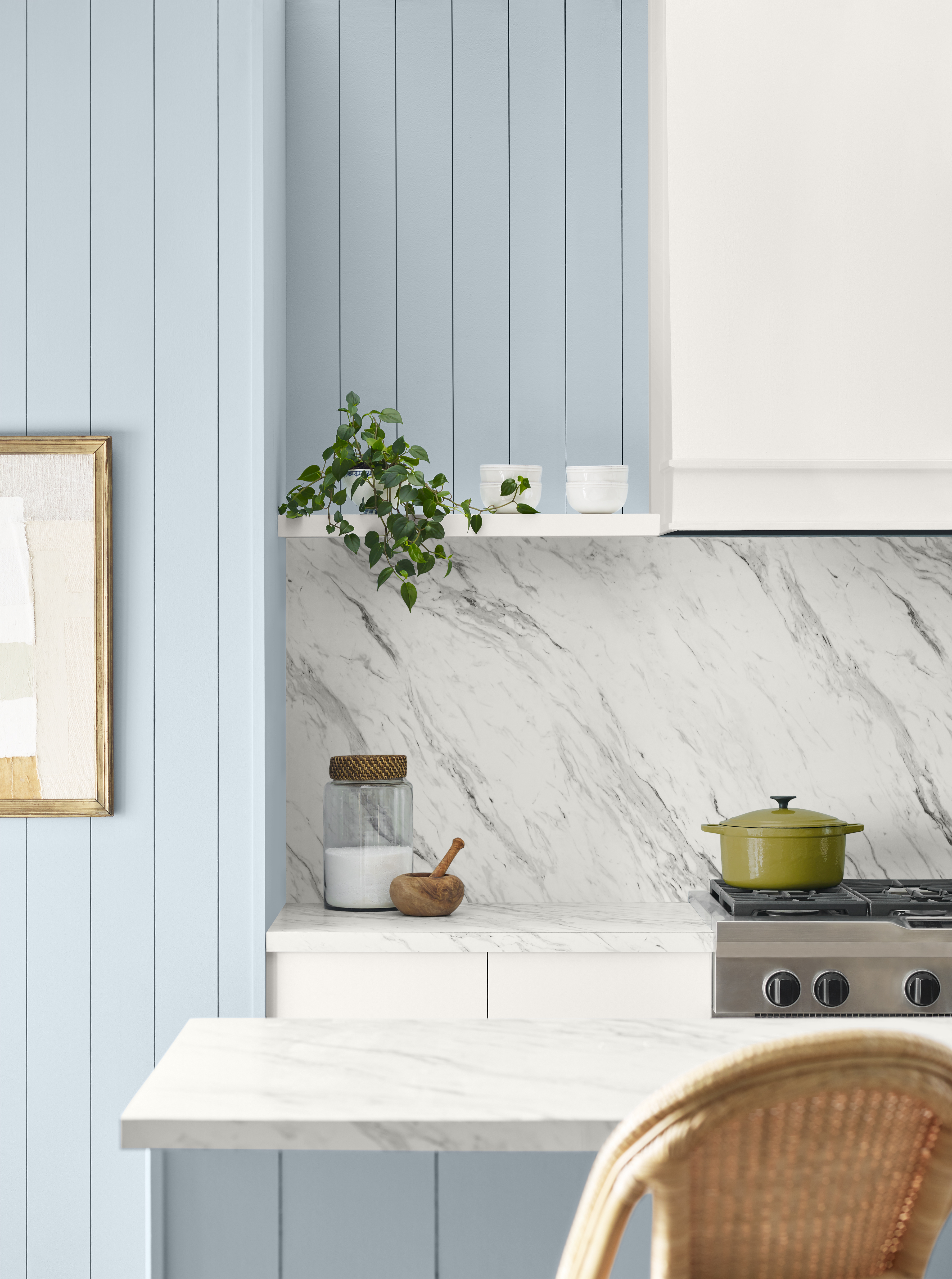
Your standard stainless steel extractor hood might be the easy option for your kitchen, but it's also likely to make it look the most basic. 'Unless you are going for an insanely modern, clean look, I always find it to be the most attractive to build your hood inside, using a hood liner, and then doing a custom surround so that you do not have a very standard and basic looking stainless steel hood,' says Brooke Spreckman, founder of Design Hutch.
'That takes away from all of your pretty upper cabinetry that was around that hood. The hood should be considered something that should be built in, and work with all of the materials in your kitchen, whether that’s enclosing it into a cabinet panel that matches the rest of your upper cabinetry, or framing it out and doing a decorative plaster, stone, or tile around it,' Brooke adds.
That might sound like an expensive alteration to make, but if you're armed with a few DIY skills, it's not an impossible task to take on by yourself, and you'll find insert extractor hoods on Amazon that you can build-in around for a couple hundred dollars.
3. Low-impact lighting
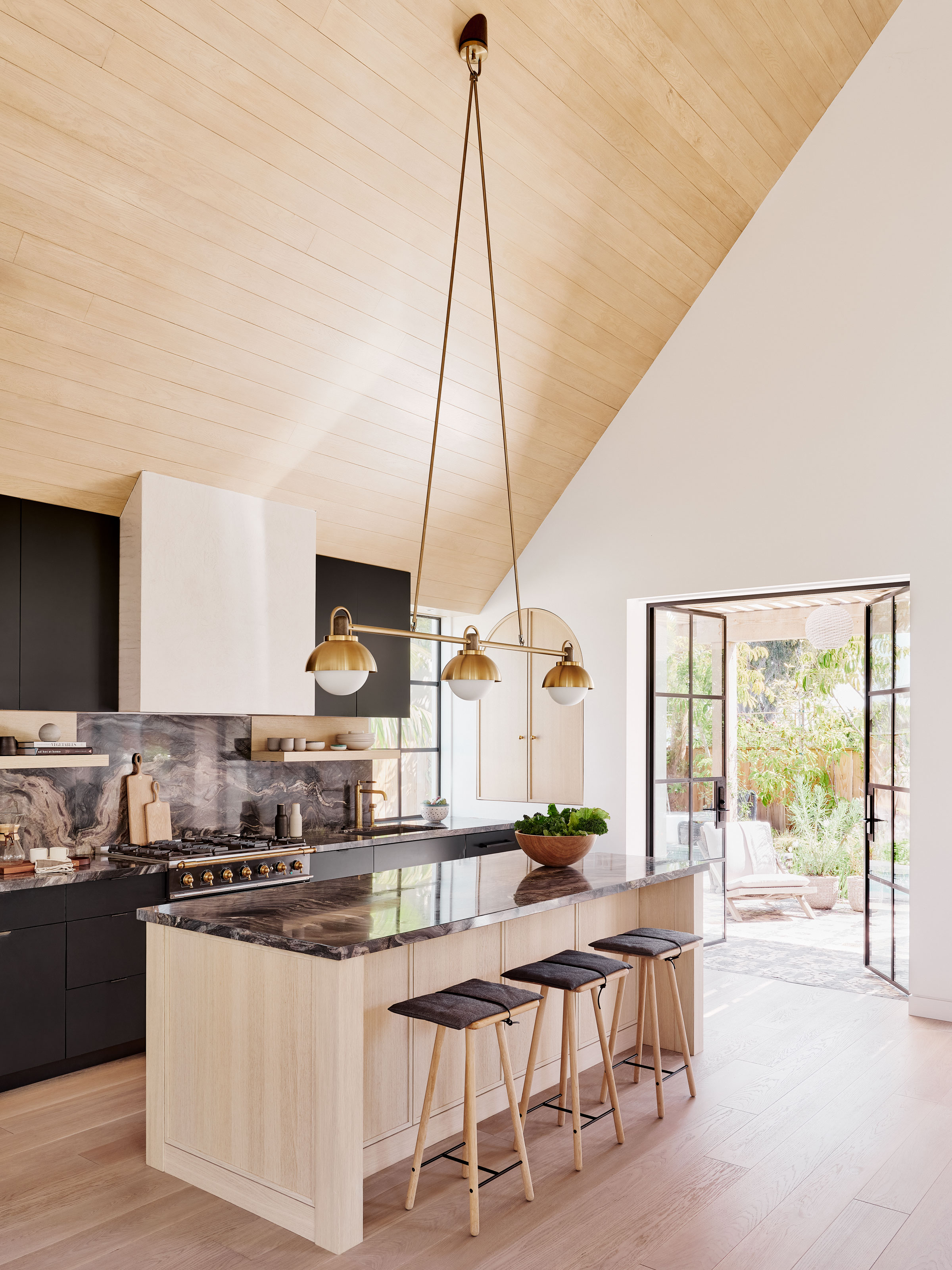
Have you heard of the idea of "quiet luxury"? It's the idea that truly expensive things don't shout for attention, they whisper. It's something that I'd say does apply to a lot of areas in a kitchen; however, the one area I'd approach this philosophy with caution is your kitchen lighting.
'Another thing I notice is that when the scale of lighting doesn't make an impact or take a risk,' designer Liz Hoekzema agrees. 'As designers, we are constantly asking ourselves, "How can we push this? What makes this feel exciting?"'
Over-simple lighting can, often, feel a little basic, especially if you're not investing in more expensive materials. However, bolder choices over a kitchen island doesn't have to mean budget-busting. Less expensive materials - think paper and rattan - can feel luxurious if they make a bit more of a statement with their design.
4. Copper
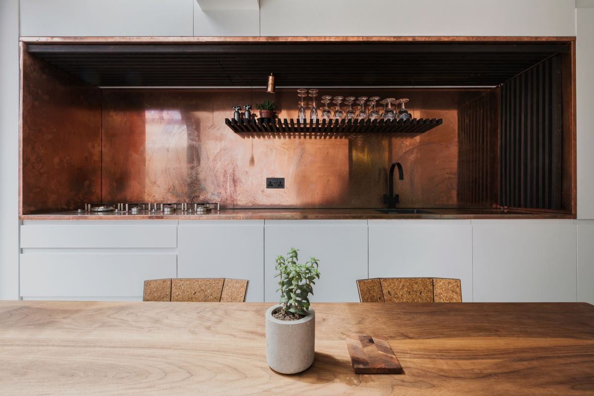
We've all seen luxurious kitchens with beautiful hammered copper finishes, but according to Bob Bakes, design director of Bakes & Kropp, it's a material that can disrupt your kitchen design and make it feel a little off-kilter.
'One of the more common kitchen remodel choices that might lead to buyer's remorse is the use of metal finishes like copper,' Bob says. 'While copper can add a unique and stylish touch to a kitchen, it doesn't always flow seamlessly from one material to the next. This lack of continuity can disrupt the overall harmony of the kitchen's design. In our approach to kitchen design, we emphasize maintaining timeless palettes by creating a harmonious balance.'
5. An on-display microwave
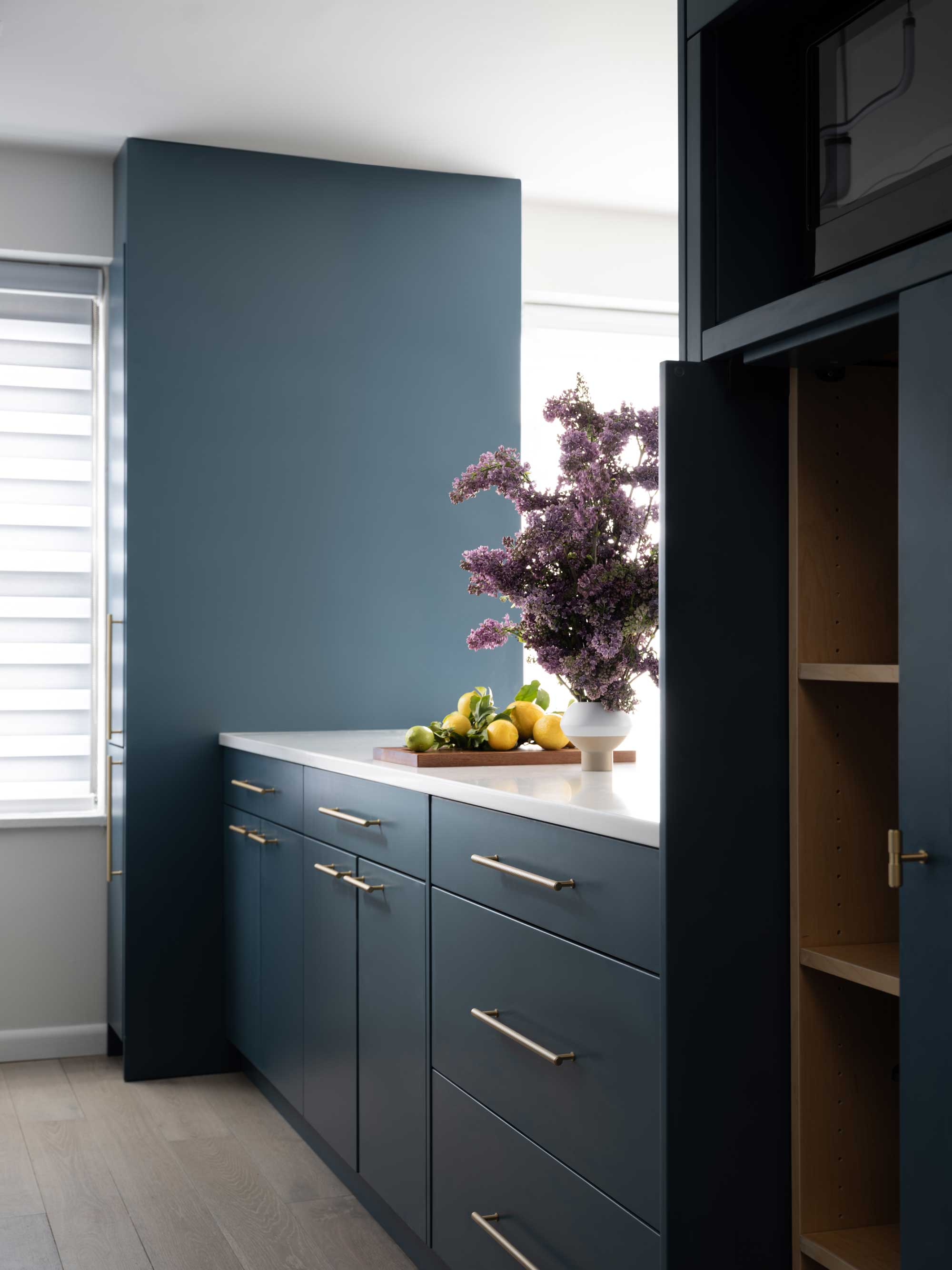
Clutter is one of those things that will instantly make your kitchen feel cheap, and it extends to the appliances you have out on your kitchen countertops, too.
'One of my first recommendations is that you build your microwave into your island, hidden on a side of the base cabinet, where it’s not too visible,' says interior designer Brooke Spreckman. 'Although some people find the microwave drawer to be a pesky appliance, due to its shaky motorized nature. Therefore, I recommend an appliance garage or just putting it inside a cabinet so that you can completely cover up that appliance.'
6. Matte black faucets
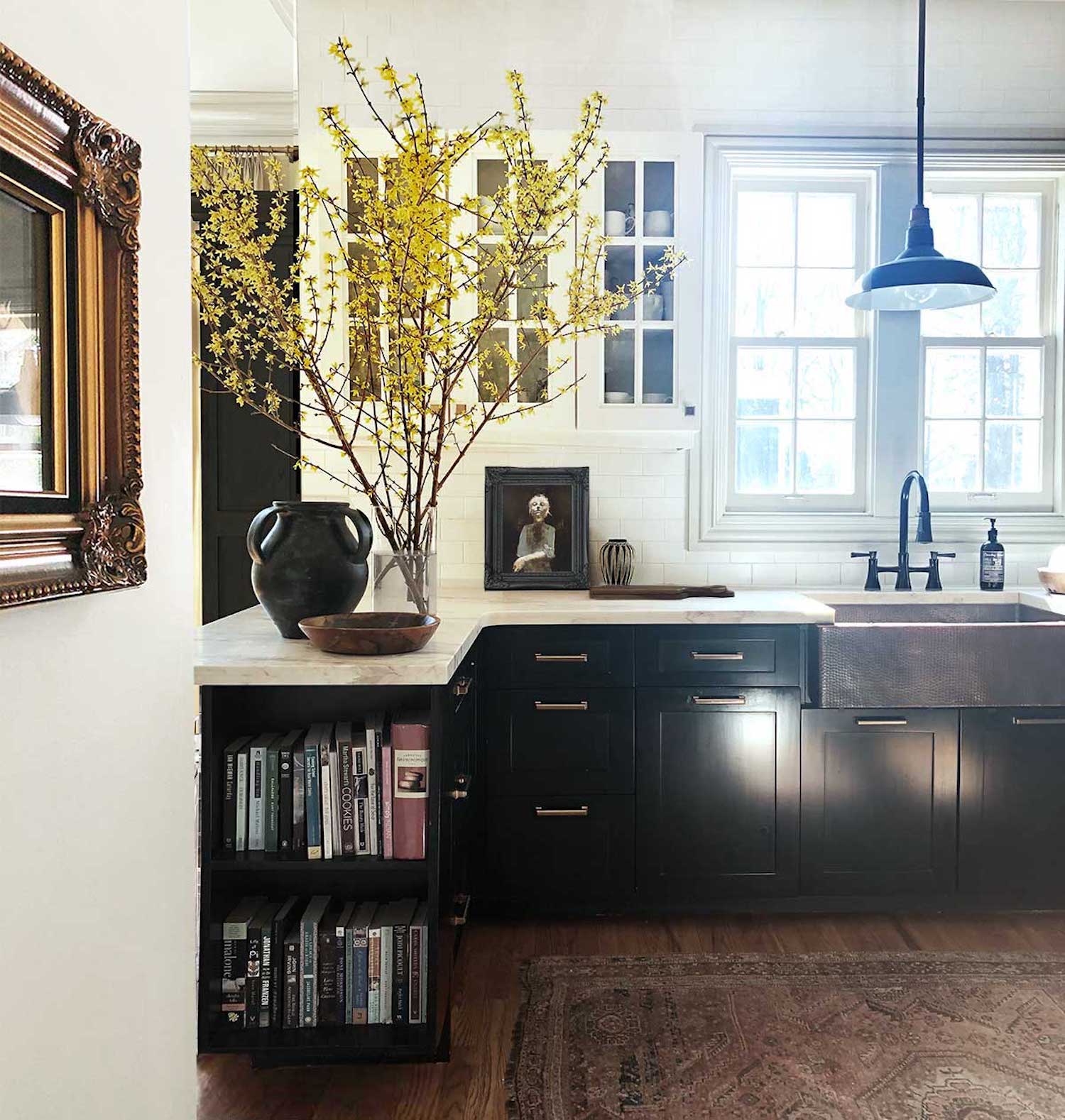
'While currently popular, matte black fixtures are likely to fall out of favor soon,' says Valerie Lush, founder of Viola House Design. There's something about this finish when used for kitchen pulls, faucets and more that can feel a little flat, and therefore inexpensive.
There are other dark kitchen faucet trends to look to instead. 'Instead, I recommend options like pewter tones or blackened stainless steel, which offer a more sophisticated and timeless look,' Valerie says, 'and avoid the harshness that can come with matte black.'
6. Bold paint colors
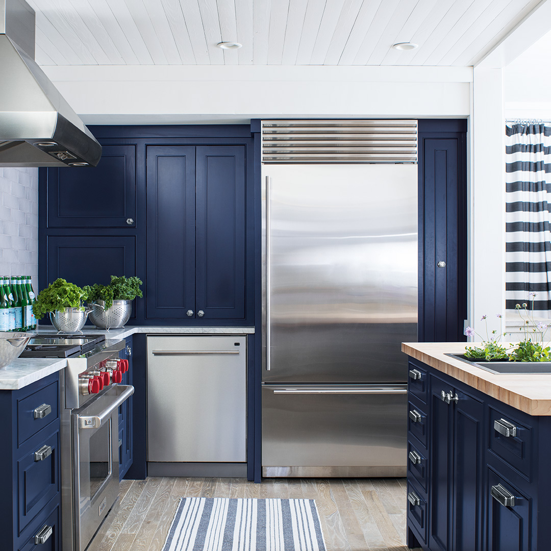
If there's one thing that realtor Eric Bramlett thinks can devalue a kitchen in the eyes of a potential buyer, it's too bold a color.
'The choice of paint color in a home is more than just an aesthetic decision,' Eric says. 'It plays a pivotal role in shaping the ambiance of a space and can influence potential buyers' perceptions. Extremely vivid or unusual paint colors can deter potential buyers, especially those who struggle to visualize beyond the existing decor.'
'Not every buyer has the imagination to see potential. I recommend opting for neutral shades that possess warm undertones as they not only make spaces feel inviting but also offer a timeless appeal, ensuring that the home remains attractive to potential buyers for a longer duration. Leaning towards neutrals and considering the broader market can be instrumental in enhancing a property's appeal and value,' Eric adds.
When it comes to your own home, you may not have to worry as much about the choice of color devaluing a space, but consider more expensive kitchen colors — think darker tones, even jewel colors, alongside more classic neutrals.
However, Valerie Lush also suggests avoiding an all-white kitchen, too. 'While they've been a staple for years, all-white kitchens can sometimes lack depth and character, and they can be challenging to keep looking clean,' Valerie says.
Be The First To Know
The Livingetc newsletters are your inside source for what’s shaping interiors now - and what’s next. Discover trend forecasts, smart style ideas, and curated shopping inspiration that brings design to life. Subscribe today and stay ahead of the curve.

Luke Arthur Wells is a freelance design writer, award-winning interiors blogger and stylist, known for neutral, textural spaces with a luxury twist. He's worked with some of the UK's top design brands, counting the likes of Tom Dixon Studio as regular collaborators and his work has been featured in print and online in publications ranging from Domino Magazine to The Sunday Times. He's a hands-on type of interiors expert too, contributing practical renovation advice and DIY tutorials to a number of magazines, as well as to his own readers and followers via his blog and social media. He might currently be renovating a small Victorian house in England, but he dreams of light, spacious, neutral homes on the West Coast.
-
 The 'New British' Style? This Victorian London Home Embraces Its Owners' Global Background
Warm timber details, confident color pops, and an uninterrupted connection to the garden are the hallmarks of this relaxed yet design-forward family home
By Emma J Page
-
 Muji Living Room Ideas — 5 Ways to Harness The Calming Qualities of This Japanese Design Style
Inspired by Japanese "zen" principles, Muji living rooms are all about cultivating a calming, tranquil space that nourishes the soul
By Lilith Hudson
