9 things experts say you should never include in a nursery
Interior experts weigh in on things to avoid altogether in a nursery design for a safe and stress-free space
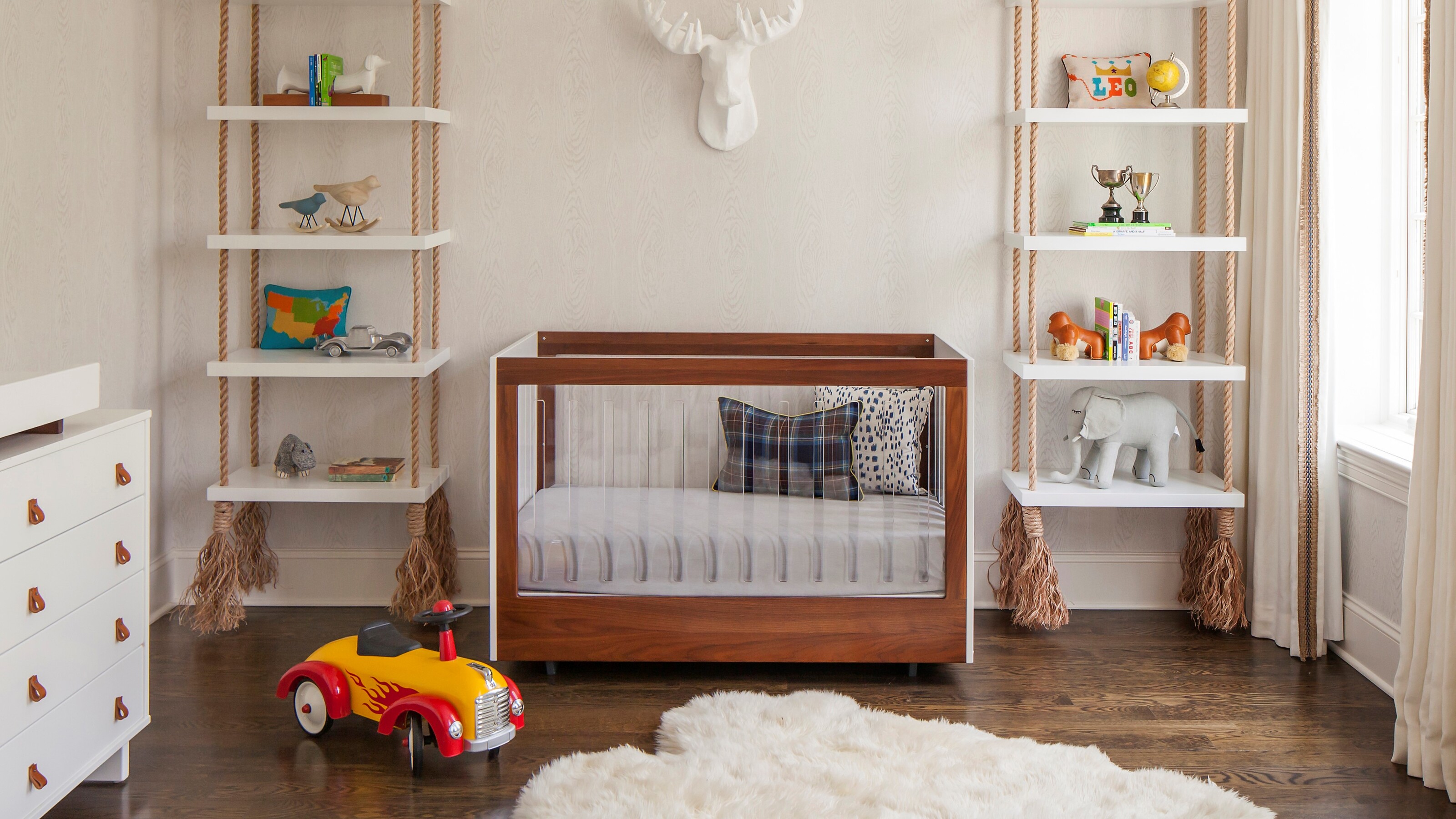

The saying 'there are no bad ideas, only bad executions' doesn't apply when you're designing a nursery. In this space, there are some ideas you need to avoid altogether.
Your baby's nursery should be a space where you feel comfortable and confident that your little one will be safe, and your design has a lot to do with these feelings of sanctuary. It should also offer a space to grow, and should give you peace of mind when you leave your baby to sleep at the end of the day.
'When you are dealing with young children who need 24-hour supervision you want to have a space that creates barriers to keep them safe,' says Fanny Abbes of The New Design Project. 'Young children are constantly putting things in their mouth or grabbing at objects so you have to keep these aspects of early life in mind when thinking through your nursery design.'
From the colors you paint the walls to the choice of furniture, right the way down to the furnishings, there are many pitfalls when it comes to designing a nursery. Here, the experts tell us what they are, and how to avoid them.
Interior experts on what to never include a nursery design
'Design in a nursery is extremely important because you need to create a space that is functional, safe and sophisticated all in one,' says interior designer, Jennifer Hunter. 'When you are dealing with young children who are consistently climbing and on the move, you need to create a safe space that allows them to explore freely, so prioritize quality furniture selections and maximize your storage capabilities.'
1. Bare floors
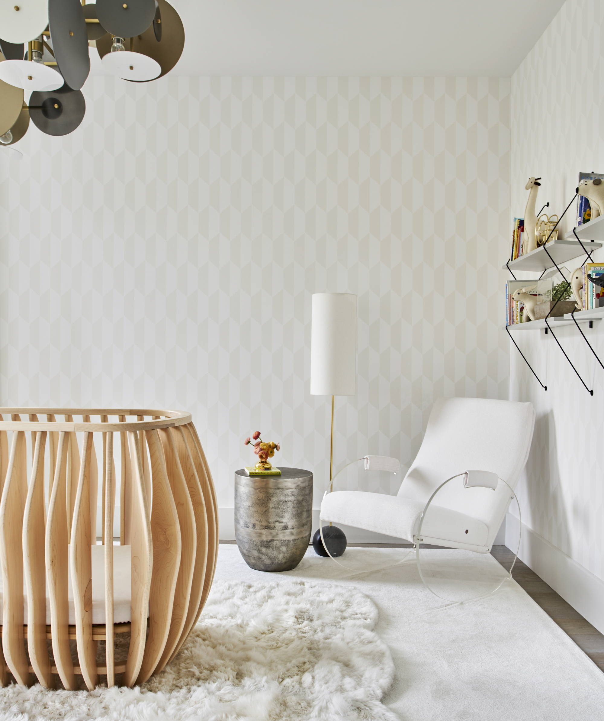
Bare wooden floors are less than comfortable for your baby when they start to explore their surroundings. 'I would really prioritize investing in an area rug,' advises Fanny Abbes of The New Design Project. 'A rug can go a long way to conceal stains and is plush for comfort purposes for when your baby begins to crawl.'
2. Too much open shelving
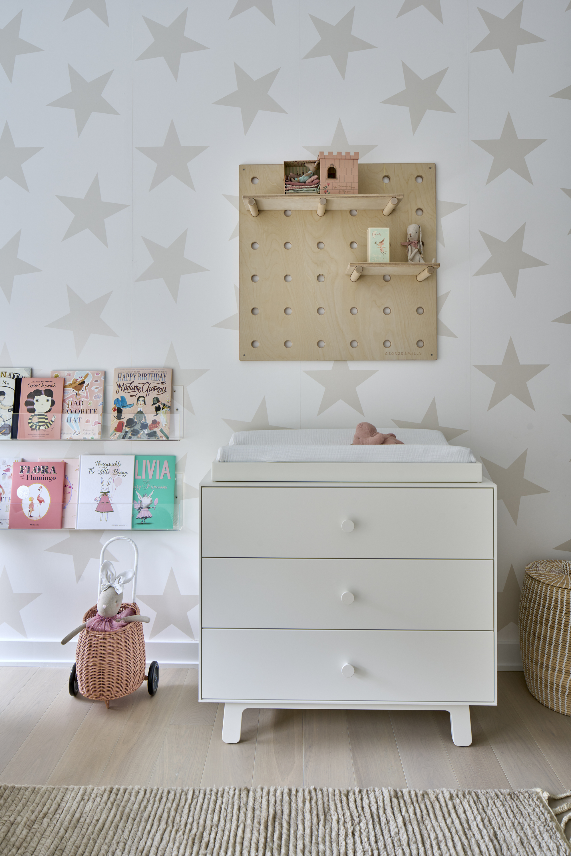
A cluttered and untidy nursery can create feelings of high stress in a room that should be calming and peaceful, so really consider how best to store your nursery accessories.
Think about clever storage solutions to make sure mess never spills out. 'I think in order to make a nursery feel calm and soothing, it’s best to keep everything quite minimal and uncluttered with ample storage to put everything away at the end of the day,' says Agata Rodriguez of Sian Zeng, the wallpaper brand specializing in children's interiors.
'Open shelves with lots of toys and objects are a nice idea, but they also collect a lot of dust which can be a nightmare to clean,' points out Agata, 'so consider cupboards, chests of drawers and shelves that can close away, helping to keep the space visually calming.'
3. Anything too permanent
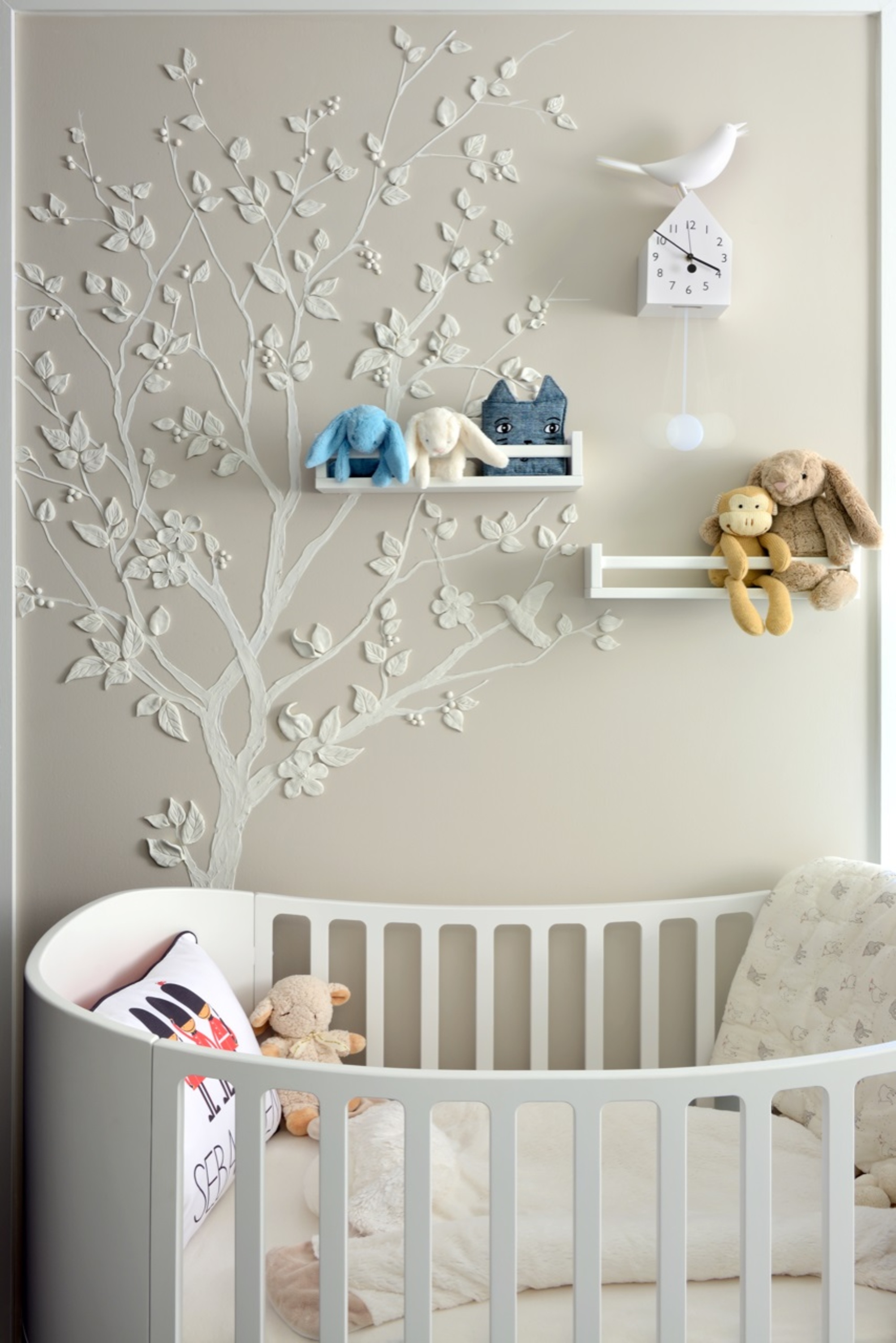
This might be a nursery room for now, but your baby will grow at a rapid rate, and before you know it, the room will evolve into a child's bedroom. Really think about the decor and design of the space and don't go too babyish with those strong nursery themes or you'll only be redesigning a couple of years down the line.
'If you want to bring some character to a nursery, wall murals, wall stickers or framed artwork can be a more practical option - you can add colour and interest without adding too much ‘stuff’ to the space,' says Agata.
4. Bright or dark colors
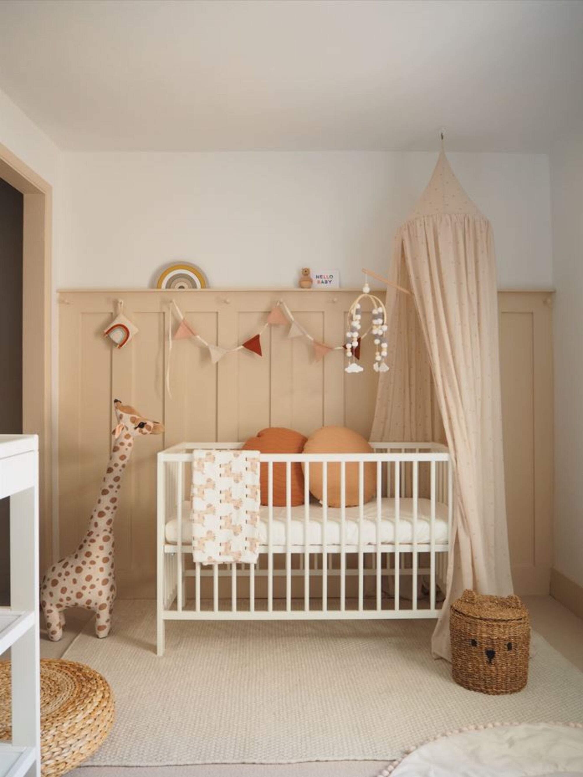
In terms of colors, a neutral color scheme is popular for nurseries. Neutrals are calming, soft, peaceful and encourage sleep. 'A nursery should have a calm atmosphere as the baby will spend much time sleeping in there, plus it needs to be relaxing for the parents to be able to sleep during those early hours of the morning,' reminds Medina King, creative director at MK Kids Interiors.
'I would work with light and soothing pastel shades of any color, including shades of grey,' says Svetlana Tryaskina, principal designer at Canadian design house, Estee Design. 'Stay away from dark or bright primary colors that can look too harsh and overwhelming in the nursery.'
Another thing to consider is how to create a neutral nursery through color. Tones like beige, grey, whites and creams don't denote any specific gender and will help your child grow up in a space where they don't feel bound to any societal stereotypes.
5. Unsecured freestanding furniture
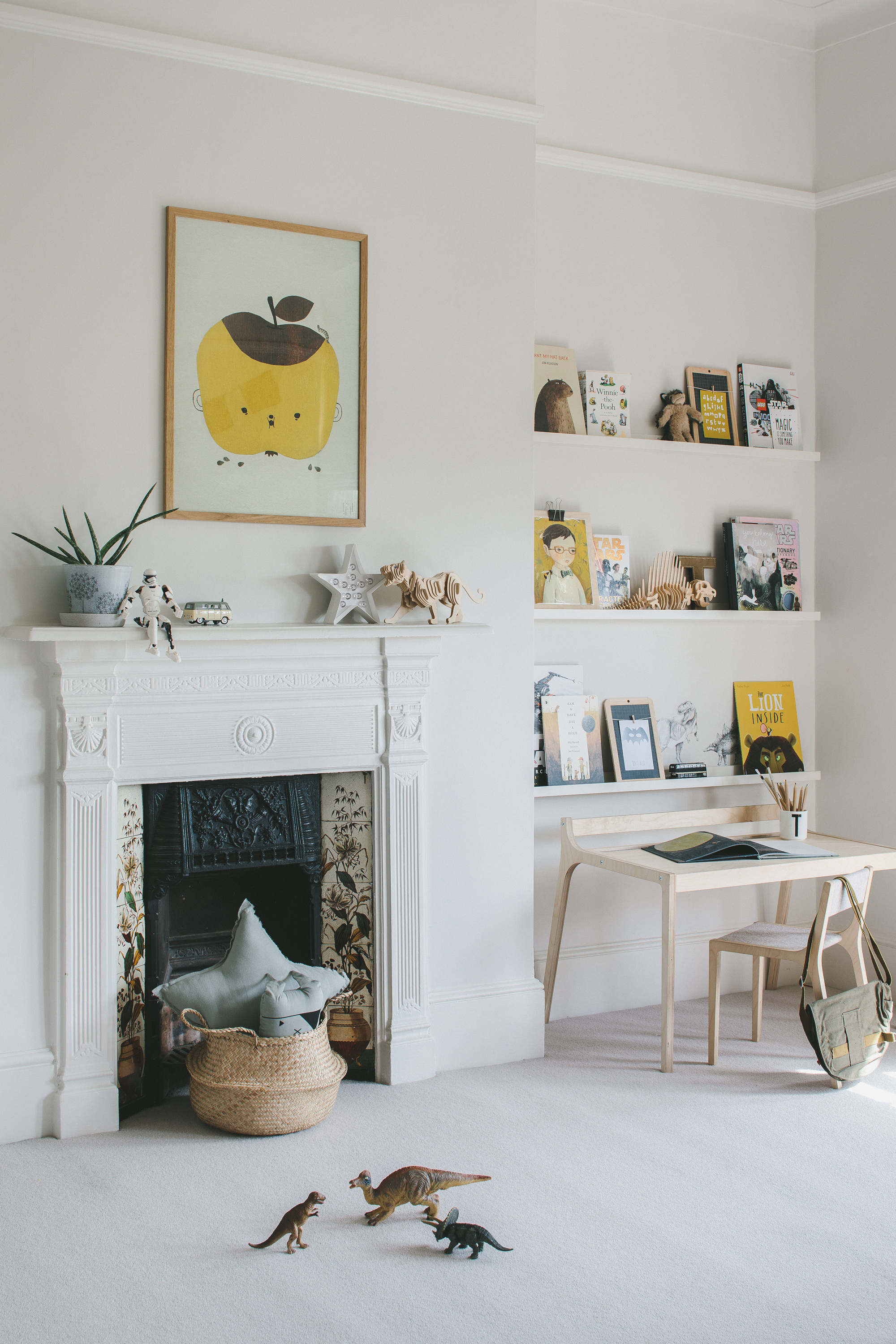
Consider the free-standing furniture in your nursery, is this likely to topple over? Always keep on the lookout for potential safety hazards when going through the design process.
'Never put wobbly furniture like a side table, stool or shelving unit. Make sure all the pieces are sturdy and can support the little hand,' says Svetlana of Estee Design.
'I would avoid placing a standing bookcase in your nursery and alternatively create a custom built-in,' adds Upper West Side interior designer Jennifer Hunter.
'With a built-in bookcase you have shelving options for all your children's books in addition to creating concealed storage for all their toys. Having custom built-ins is the safer option to avoid furniture from tipping over from curious-minded children,' says Jennifer.
6. Floor lamps
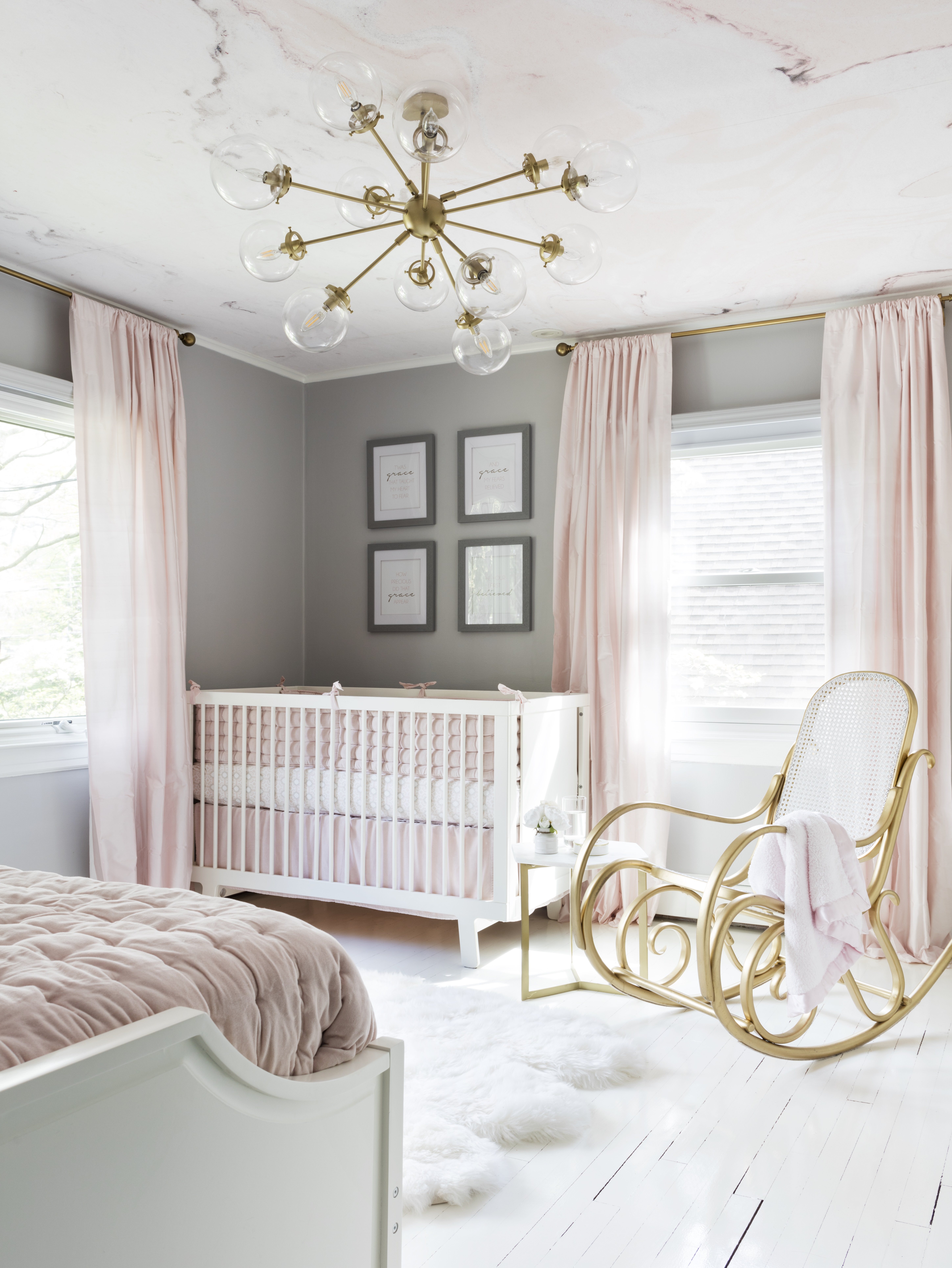
Think carefully about how you light your nursery. 'I always lean away from using floor lamps in a nursery,' says Jennifer. 'I like to leave the floor space open and clean. Young children love to explore so as a safety precaution to avoid children climbing on furniture I shy away from these lighting options in my design.'
Instead, a statement light fixture or wall sconces can be a real interesting feature, are out of the way of curious crawling babies, functional, and can even create a mobile-like focal point for your baby to enjoy looking at. Alternatively, fairy lights fixed to the wall can create a peaceful glow and provide soothing light.
'Flashing lights should not be used in a nursery,' says Medina. 'Lighting needs to be soft and dimmable if possible, the atmosphere of a nursery is about promoting sleep.'
7. Garish wallpaper
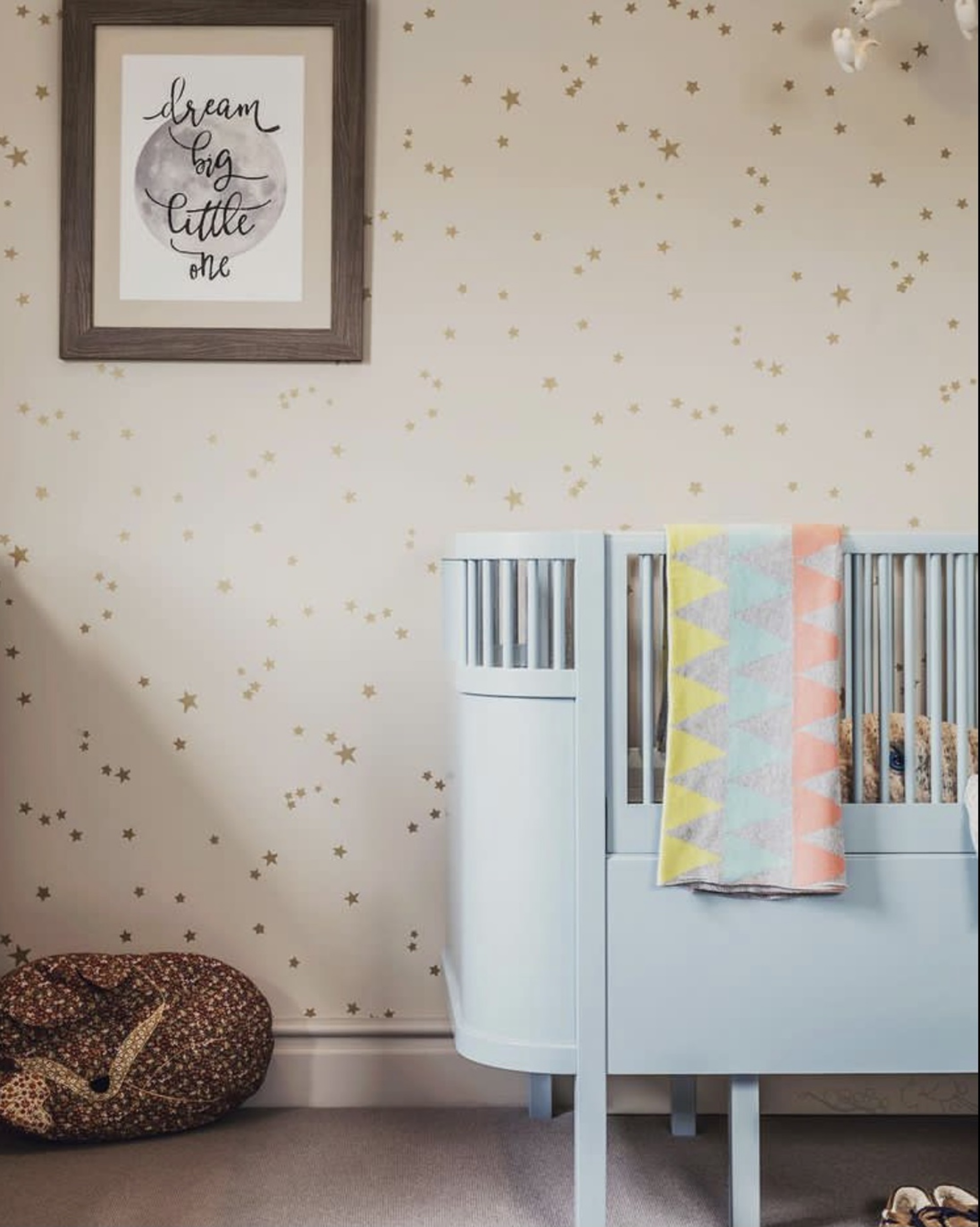
There is a whole world of child-friendly wallpapers out there to pick from, but don't go for something too garish. A subtle floral print, or in this instance a wallpaper with gold stars will soothe your child gently to sleep, while giving some interest to a spare wall.
'The clients wanted a calming but interesting baby boy nursery so we wanted to use Whimsical Stars by Cole and Son - the perfect wallpaper choice,' explains Fiona Parke of Johnston Parke Interiors, who designed this room.
'We tend to chose wallpapers and fabrics that can grow with the child and then use accessories and art for the pops of color and fun in the room.
'Don’t do bright colored walls or wallpaper in a nursery,' warns Fiona 'as they can over stimulate and energize young children minds. Stick to calm colours and tonal patterns in a nursery for a soothing effect.'
8. An uncomfortable chair
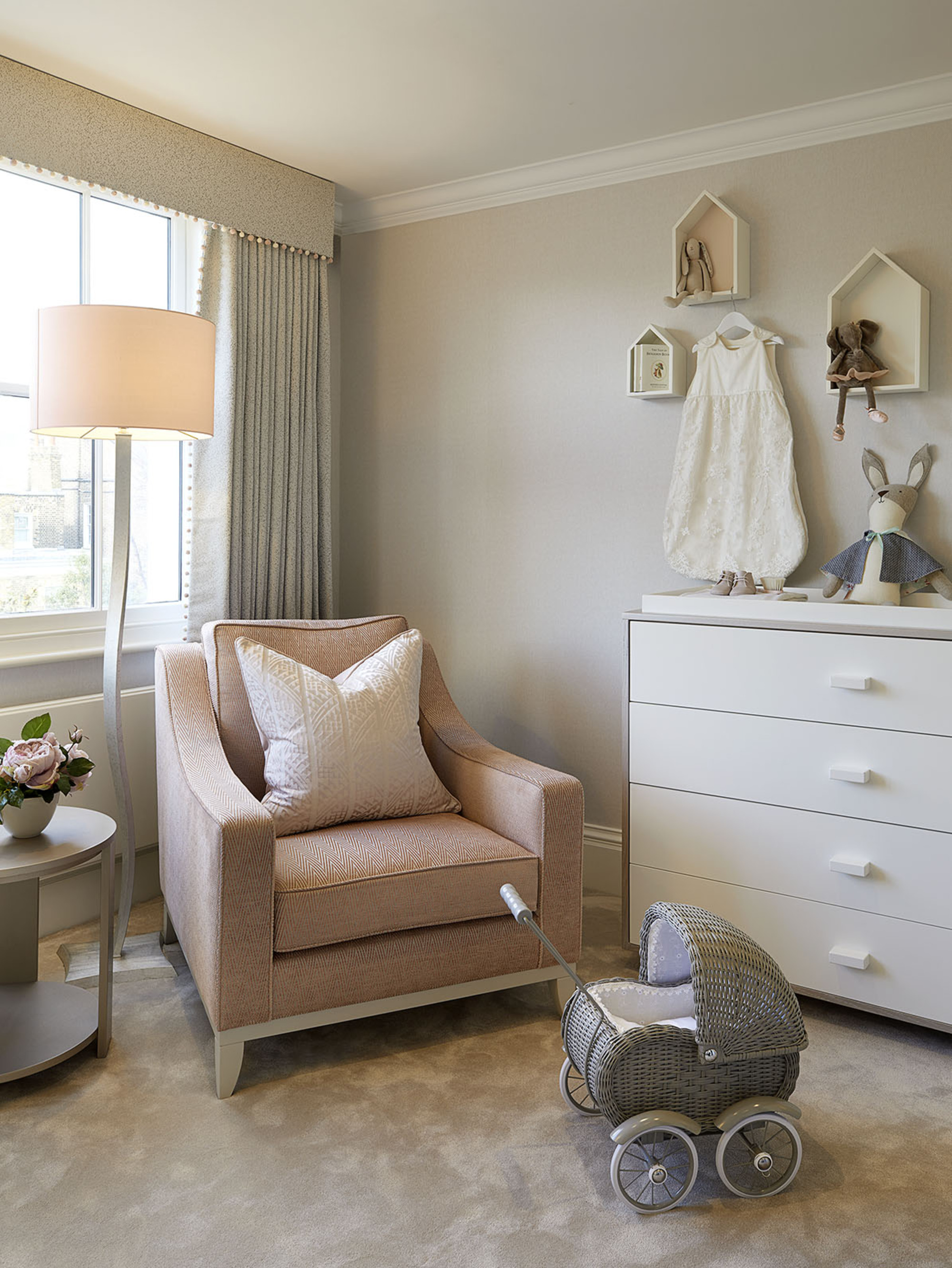
Don't underestimate the importance of a chair in the nursery. A wooden, angular chair might look like a nice statement for a nursery, but if it's not comfortable, it will impact you and therefore your baby. Creating a nursery is also about creating a cozy and relaxing space for the parents to relax while nursing and soothing your baby into a deep sleep.
Consider a rocking chair with supporting arms, think about cozy fabrics like bouclé or velvet for softness against you and your baby's skin. A footstool is a good addition too, giving you space to rest your legs out, and think about how the chair supports the mother when breastfeeding.
9. Think about curtains
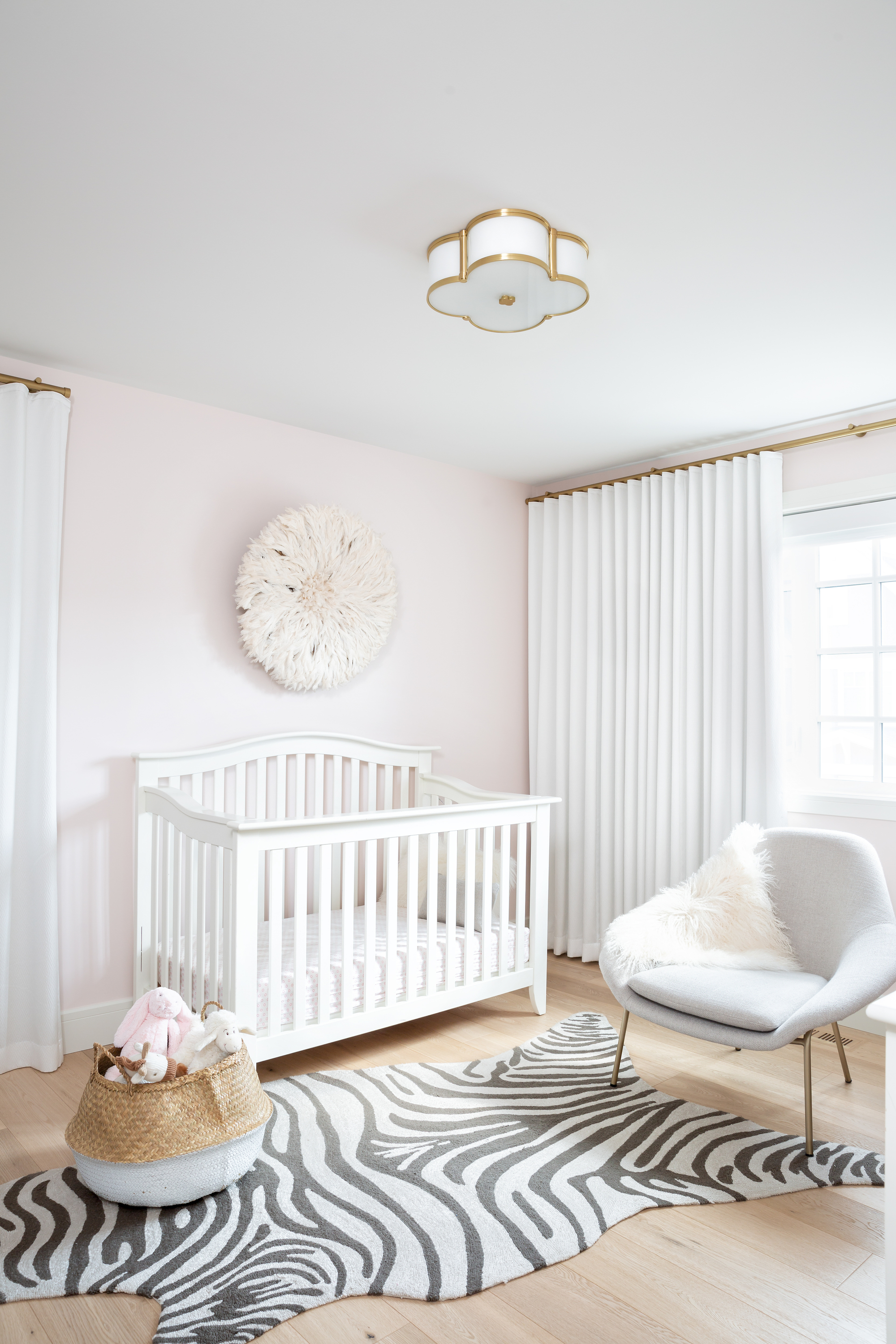
Think carefully about how natural light is blocked from the window. Typically light control is the main concern when sourcing or designing window coverings for any nursery. 'Some parents often gravitate towards inset fabric studio shades or roman shades as they are clear off the floor and out of reach from little hands, however they do not provide as much black-out as a more traditional drapery installation would,' says Alana Dunn of Reena Sotropa In House Design Group. 'With this in mind I chose ripplefold, black-out lined drapery to maximize light control in the space.'
'Knowing that custom window coverings are an investment in any space, when it came to the overall aesthetics of this room I kept the fabric selection for the drapery classic and neutral. This way as the little lady who will grow up in the space changes he personal taste, her window coverings can remain the same.'
What colors should be avoided for a nursery?
Color is a huge consideration when designing your baby's nursery. Garish colors can be too bright and cause stress to a new born. 'I never use yellow on the walls in a nursery,' says Natalia Miyar, 'it can be quite a stressful shade for a child.' Red has been proven to be quite a stressful shade for a child too.
When babies have just been born, they can see little, and colors they can make out are black, white and grey. Keep your scheme pale and relaxed with neutrals, and try to go gender neutral, avoiding those stereotypical shades of pink and blue to denote your baby's gender.
Be The First To Know
The Livingetc newsletters are your inside source for what’s shaping interiors now - and what’s next. Discover trend forecasts, smart style ideas, and curated shopping inspiration that brings design to life. Subscribe today and stay ahead of the curve.

Former content editor at Livingetc.com, Oonagh is an expert at spotting the interior trends that are making waves in the design world. She has written a mix of everything from home tours to news, long-form features to design idea pieces, as well as having frequently been featured in the monthly print magazine. She is the go-to for design advice in the home. Previously, she worked on a London property title, producing long-read interiors features, style pages and conducting interviews with a range of famous faces from the UK interiors scene, from Kit Kemp to Robert Kime. In doing so, she has developed a keen interest in London's historical architecture and the city's distinct tastemakers paving the way in the world of interiors.
-
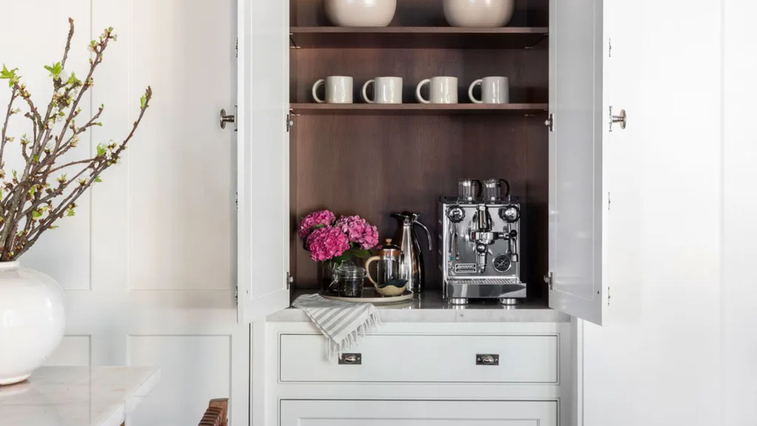 Turns Out the Coolest New Café is Actually In Your Kitchen — Here's How to Steal the Style of TikTok's Latest Trend
Goodbye, over-priced lattes. Hello, home-brewed coffee with friends. TikTok's 'Home Cafe' trend brings stylish cafe culture into the comfort of your own home
By Devin Toolen Published
-
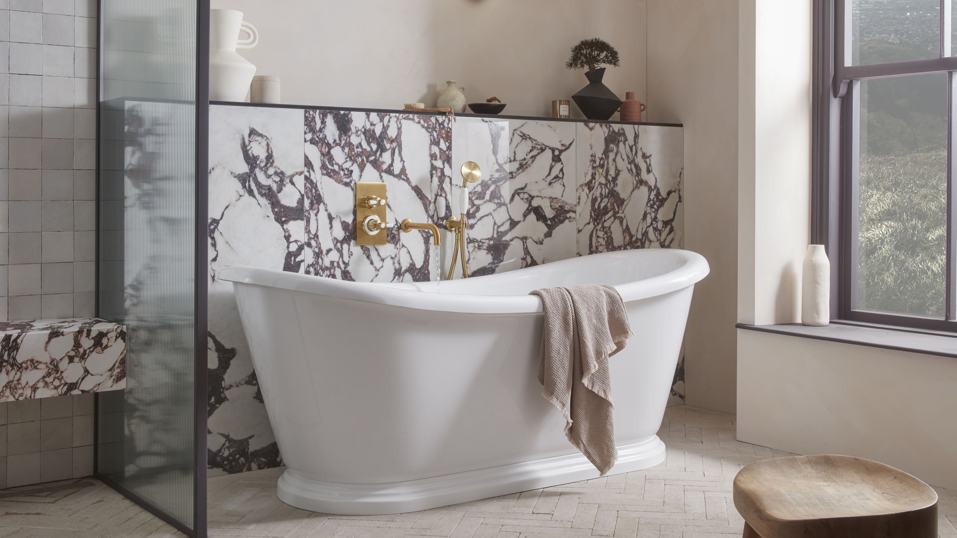 5 Bathroom Layouts That Look Dated in 2025 — Plus the Alternatives Designers Use Instead for a More Contemporary Space
For a bathroom that feels in line with the times, avoid these layouts and be more intentional with the placement and positioning of your features and fixtures
By Lilith Hudson Published