

We all know a 'morning person' who rises and shines without the slightest grumble. (I, incidentally, am not one of them.) But even those people can struggled to shake of the bedcovers on a cold, dark day — which is where decorating with wake up colors can help.
"Research shows that the best thing we can do for ourselves when we wake up is to get outside in the sun because it sets our circadian rhythm, increasing our mood and energy levels," explains Daniela Araya, principal designer and color consultant at Daniela Araya Color & Design Consultancy. "But since stepping outside first thing isn’t always realistic, wake up colors can play a powerful role in setting the tone for the day."
So, what are these wake up colors? We asked a range of color experts and designers who know a thing or two about color psychology in interior design for the shades they'd select to help you wake up on the right side of bed. Here's what they shared.
1. Sunshine Yellow

Opening your eyes to a yellow painted ceiling is always going to be the best way to help you wake up.
It makes sense that the colors that help people wake up are the shades you often see in nature during the early hours of the day. "Yellow is reminiscent of the sun and radiates warmth and positivity — perfect for a bedroom," says Daniela Araya. "While an all-yellow bedroom might be a controversial choice, you can use it in small doses throughout the room to introduce that feel-good mood without making the space feel overwhelming."
In many cases, positive colors that make you feel good, will help with your alertness, too. "Warm golden yellow is a cheerful color that can evoke feelings of happiness and energy," says Ali Lees, a UK-based color stylist at Inspired Styling. "Use it for a feature wall in the bedroom or bathroom to help you wake up with a happy glow."
If you are keen to stick to a subtler palette, you can still embrace yellow in your space. "Light shades of yellow can be uplifting and be that gentle push needed in the morning — they would be a great addition in the kitchen, whether as a kitchen cabinet color or wall color," says Lisbeth Parada, an interior designer at Dutch Boy Paints. "Intense yellows can be used as an accent on a home office setup or in furniture pieces."

Price: £5.50/sample

Daniela Araya is a New York-based interior designer and color consultant. Offering color consultations and workshops for homeowners, she believes in the power of color to make our homes not only look good, but feel good.
2. Warm Orange

Bright orange underfoot in an ensuite will make that morning get-ready feel a little easier.
As another color often seen in a sunrise, the warmth of orange will wake you up more gently compared to some cooler shades that feel more like plunging into an ice bath. "Orange carries a vibrant, motivating quality that can infuse energy into any room," explains Lisbeth Parada. "Consider earthy oranges, like terracotta or coral, to bring in a grounded feeling — or go bright orange in decorative elements to bring in a sense of vitality."
While decorating with orange can feel a bit daunting, particularly for those with a preference for a more muted and neutral schemes, there are plenty of ways to introduce this shade that won't seem so overwhelming. Placement matters. Pick places where you generally spend your morning — your bedside table, kitchen, bathroom, vanity corners, etc.
"Little accent items, such as ornamental bowls, artwork, or even a nicely painted cabinet, can brighten and define a room," continues Elissa. "Painting the wall behind a desk or in a reading nook will help you face morning chores with fresh enthusiasm if you want something more substantial."

Price: £5.99/sample
3. Refreshing Blues

To set a more relaxing tone, a soothing blue will bring a freshness to your morning.
While warm, vibrant shades such as yellow and oranges are perfect wake up colors, certain shades of blue can also work really well. "Blue is the perfect color to incorporate into your home to help you wake up," advises Micah Abbananto, principal designer and founder of interior designers Micah & Co. "It can calm and recharge at the same time — that must be why the skies are blue."
Considering being outside is the best thing you can do in the morning, creating a home that feels like the outdoors must be the next best thing. "A light blue paint color keeps the space feeling light and open making your mornings feel brighter and more refreshing," says Micah. "If you’re not ready to commit to paint, layering in blue-toned bedding, drapery, or an upholstered headboard can create the same soothing effect. It’s about designing a space that naturally helps you wake up feeling rested, clear-minded and ready for the day ahead."
Decorating with teal, vibrant aqua, and blues with undertones of fresh green tend to be the best wake up colors. "Turquoise is refreshing and invigorating and can also stimulate creativity," says Ali Lees. "It’s cool blue tone is perfect for the bathroom, so opt for luxurious turquoise towels to put you in the right mood after a morning shower."

Price: £5.95/sample
4. Fiery Reds

Red in a kitchen will make you up almost as much as your first coffee of the day.
While decorating with red is something that needs to be carefully considered in the home, this striking shade also works as a wonderful wake up color, especially when used in its most fiery shades.
"Scarlet is vibrant and energetic," explains Ali Lees. "As it is a bold choice, use it lightly in home accessories." While red kitchen ideas certainly work, so do smaller touches in your morning routine, like a red toaster or coffee machine.
"The kitchen is a good place to experiment with wake up colors," agrees Daniela Araya. "Red is known to be stimulating and can even boost appetite, making it a great choice for a cheerful breakfast or coffee nook to start your day in."

Price: £5.95/sample
FAQs
What Color Is Good for Waking Up?
It is important to remember that you won't always want your bedroom color ideas to wake you up — being surrounded by zingy colors in the morning is one thing, but it might not be what is needed as you try to fall asleep at night.
"For homeowners looking to create a morning-friendly environment color can be a powerful tool," says Lisbeth Parada. "Warm tones, like orange and yellow, are known for their ability to stimulate energy, boost mood and encourage alertness. These hues work particularly well in spaces where people begin their day, such as kitchens, entryways and home offices."
But in the bedroom itself, it can be best to stick with shades that allow you to gently make the transition from night to day. "For those who prefer a revitalizing approach, consider shades in the cooler spectrum that add freshness, like blues, greens, and purples," says Lisbeth Parada. "Consider these shades with warm undertones, like a warm blue-green or a light lavender and use them in spaces like a bedroom or bathroom."
What Color Wakes You Up the Fastest?
When you need to wake up pronto, surrounding yourself with certain shades can really help. Focus on using them in those areas of the home that you are likely to head straight for after stepping out of bed as opposed to in the bedroom itself — such as for your bathroom color ideas.
"A well-selected palette may immediately sharpen your senses," says Elissa Hall. "I find that brighter colors — such as sunny yellow, coral or a clear teal — have an unexpectedly big impact. Lighter, warmer hues inspire the eye and the intellect, therefore providing a sense of optimism that breaks through any early morning grogginess."

-
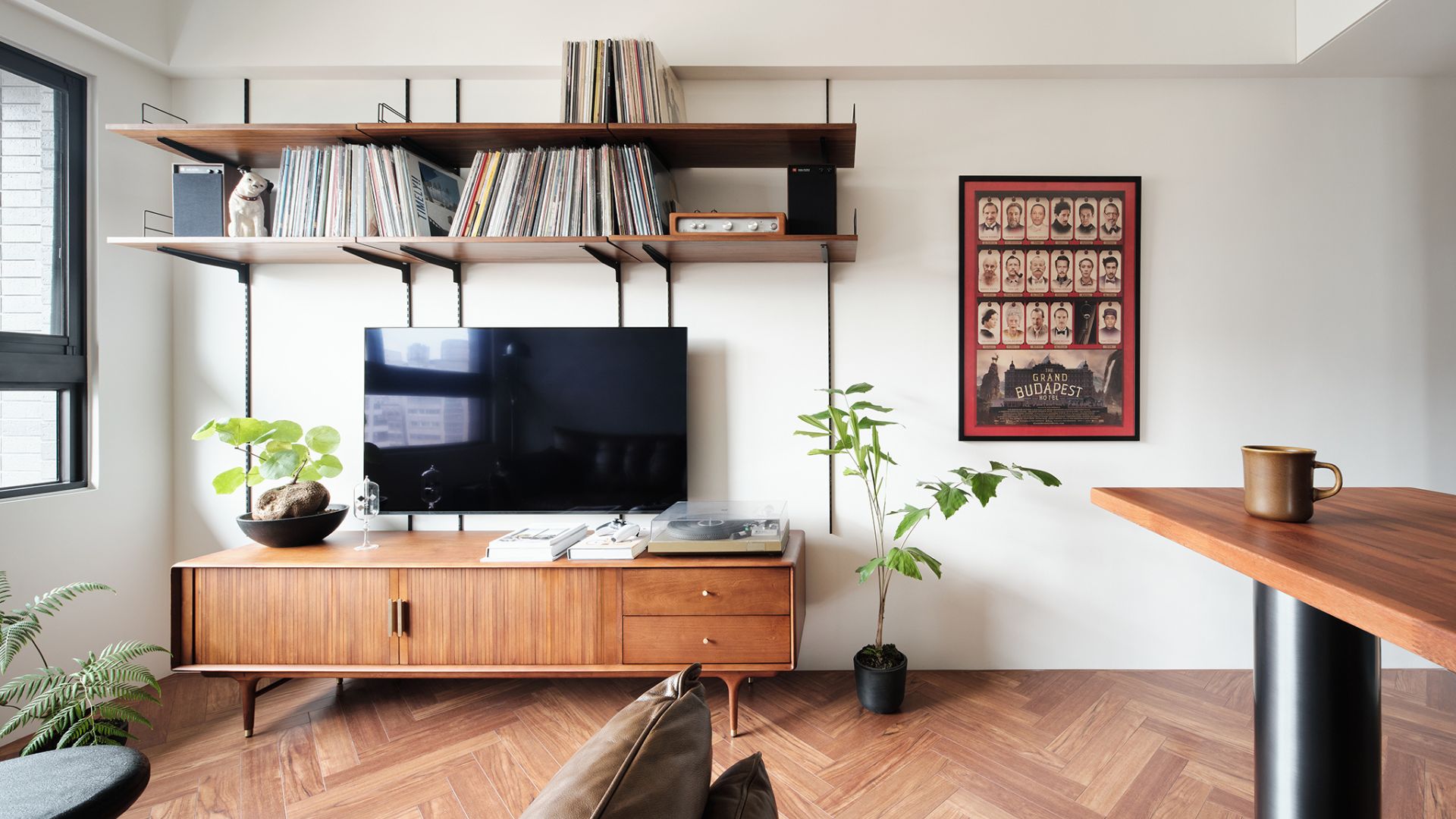 I Asked Vinyl Experts — What's the Best Way to Organize Your Record Collection?
If you fancy yourself a vinyl record collector, it's only right that you learn how to organize them too. Here are five smart tips from the experts themselves.
-
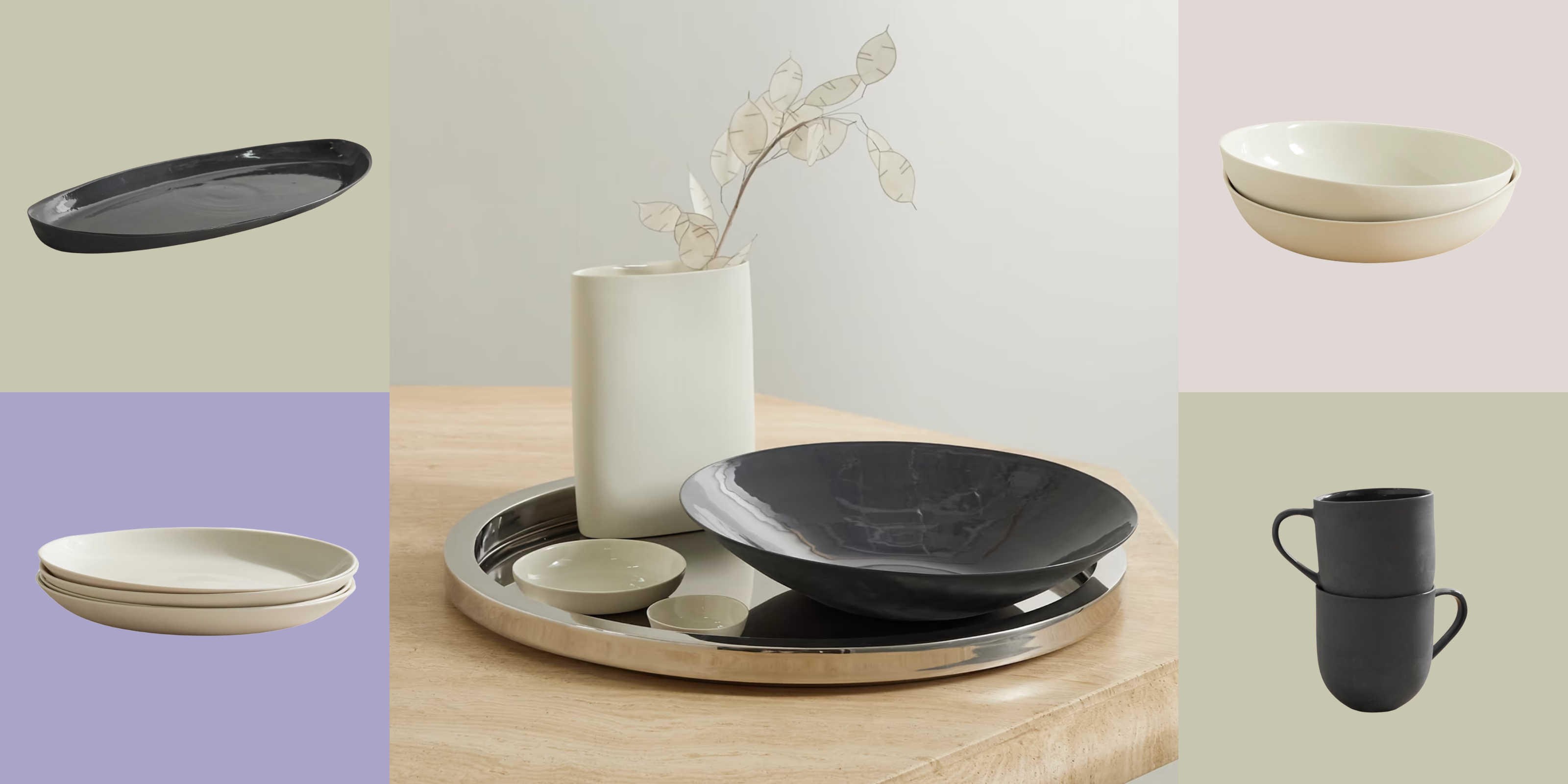 Turns Out, Sustainable Design Can Be Chic, and Net-a-Porter's 'Net Sustain' Curation Is Proof — Here's What I'm Shopping
From the Net Sustain collection, Mud Australia's homeware is not only design-oriented, but eco-focused, too


-
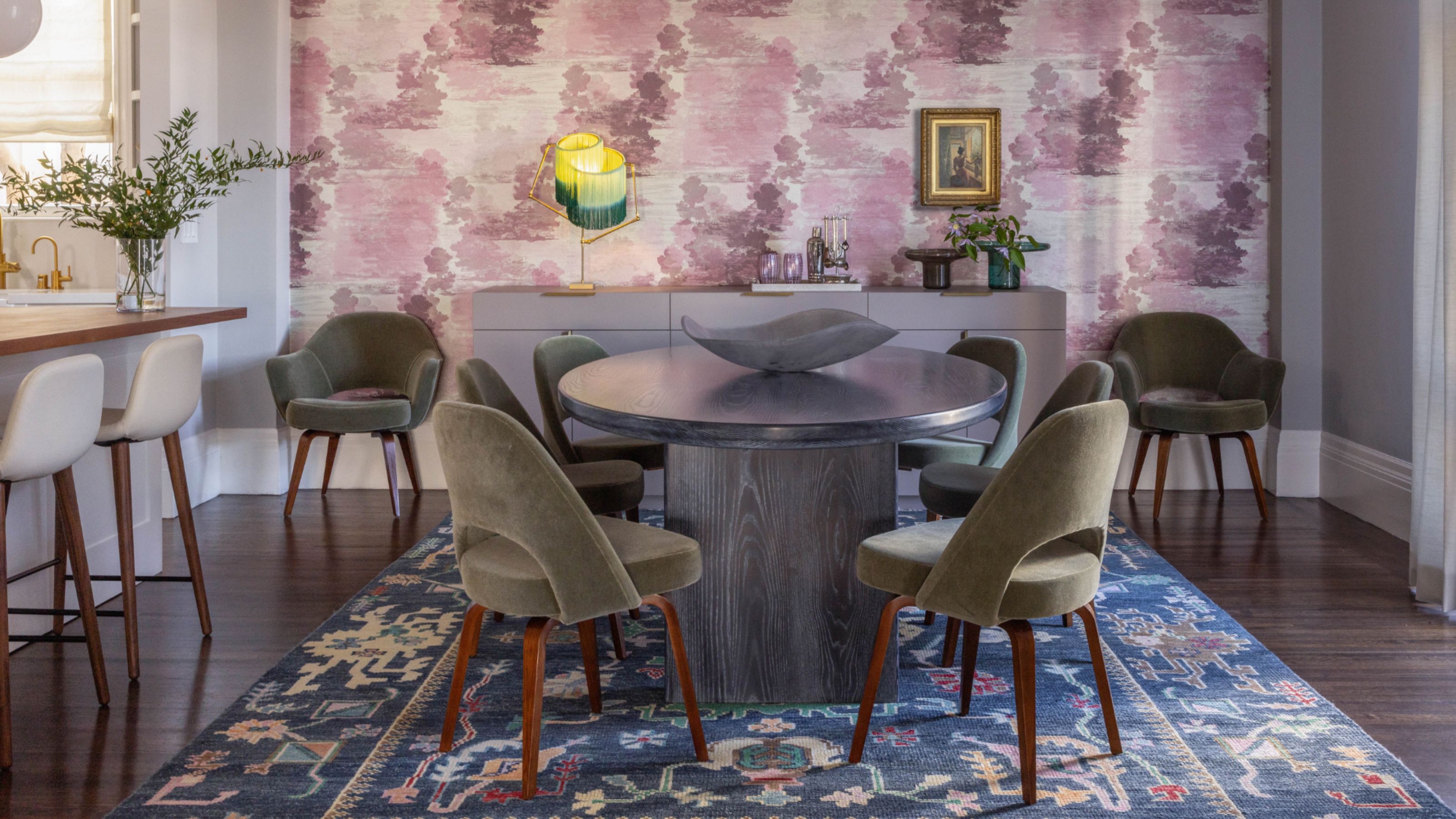
 Amethyst, Heather, Pansy, Plum — Turns Out Decorating With Purple Opens You Up to a World of Possibilities
Purple certainly isn't a color for the faint hearted, it's a shade that can smell your fear. Here's how to conquer it through your interiors
-
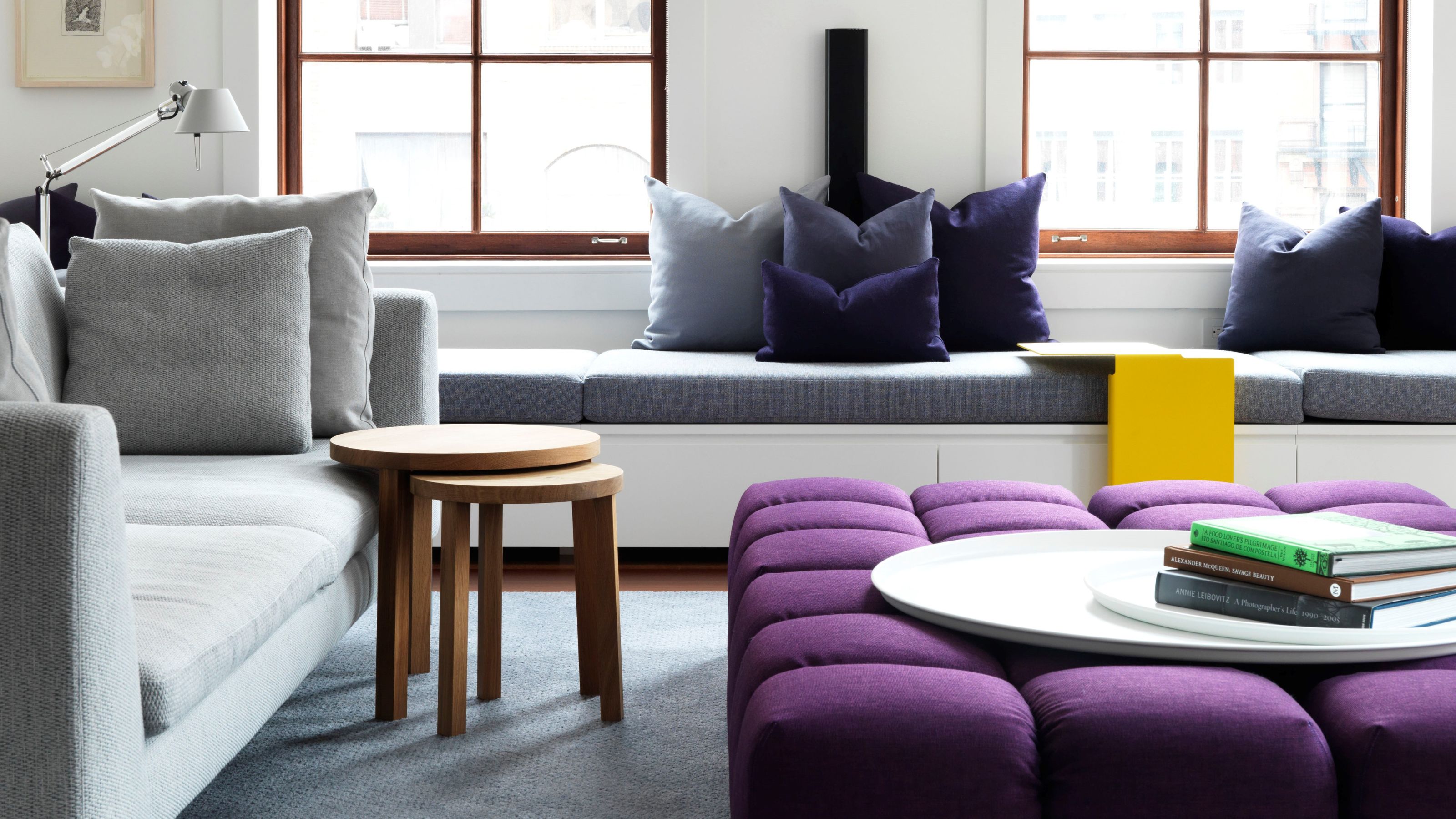
 The Combination You Weren't Expecting to Love — 8 Blue And Orange Living Room Ideas That Feel Surprisingly Elevated
A blue and orange scheme for living rooms may sound jarring, but these spaces prove they're striking, vibrant, and certainly unforgettable
-
 Smeg Says Teal, and We’re Listening — The Kitchen Shade of the Year Is Here
Designers are already using the soft, sea-glass green everywhere from cabinetry to countertops
-
 Do Yellow and Purple Go Together? Designers Reveal How to Make This Unexpected Pairing Feel "Totally Intentional"
In an era where unexpected combinations have become cool, we've done a deep-dive to discover how to pair yellow and purple in a space
-
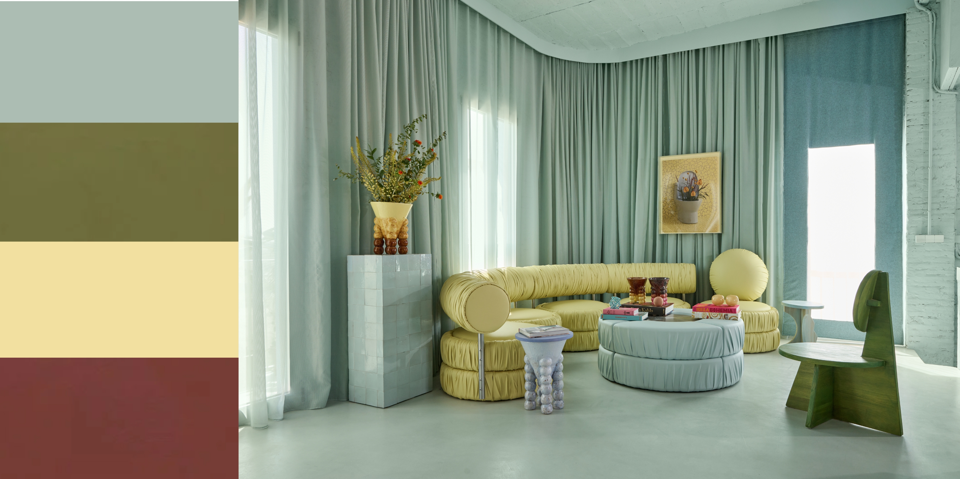 5 Unexpected but Seriously Stylish Spring Color Palettes to Shake Up the Season — "It's Pastel, but Punchy"
Spring color palettes are notorious for their use of pretty pastels, but that doesn't mean they have to lack variation
-
 The 'Red Table Trick' Is the Easiest and Most Expensive-Looking Trend to Hit 2025 So Far
A red dining table makes a seriously stylish statement; the beloved pop of red trend just got an bold and expensive-looking upgrade
-
 Everyone's Going Crazy for This One New Shade From Farrow & Ball Online — So What's the Big Deal With 'Scallop'?
It's a classic beige, but with a hint of blush — and it's the shade we're expecting to see in every minimalist's home this year
-
 4 Bathroom Colors That Are Going Out of Style in 2025 — Don't Say We Didn't Warn You
If you're redecorating your bathroom this year, our design experts suggest you avoid these outdated colors


