Wallpaper mistakes to avoid – 7 of the most common errors and how to solve them
Considering wallpaper for your scheme? From the most frequent DIY mishaps to the potential pitfalls when choosing a design, here's what you need to know
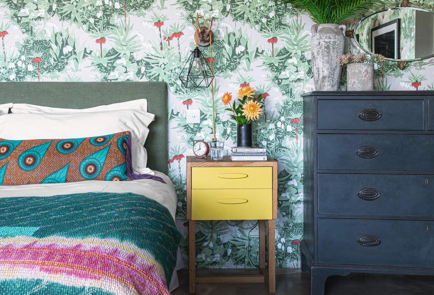

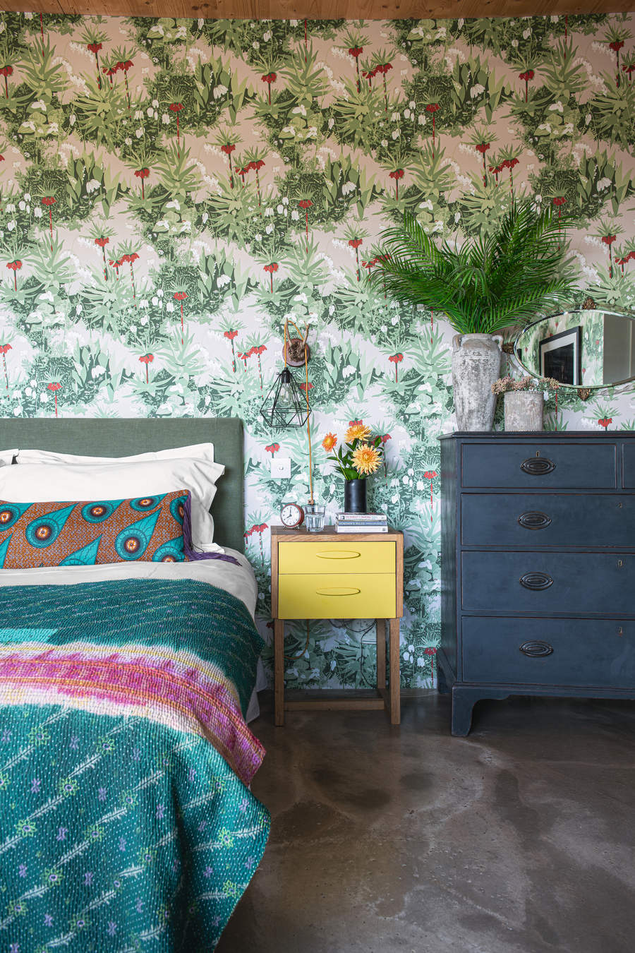
Whether you're DIYing or calling in the professionals, there's more than one way a mistake can be made when wallpapering. These aren't just issues that can occur while hanging the wallpaper, but design mistakes that specifically relate to using pattern and print on your walls.
While you may have set your heart on a specific wallpaper, it may not be the best for your room in terms of scale, for example. Similarly, before buying it, you need to measure the room correctly and take its dimensions and even corners into account so you have the right quantity of rolls at your disposal. Next comes installation. You need the right tools to cut and pastes the wallpaper.
Whether you're looking at bedroom wallpaper ideas, or for a hallway, living room or bathroom, there are some pitfalls you're likely to encounter in any room. We've polled the experts for the mistakes they come across most often, and how to problem solve them and nail wallpapering the first time around.
7 wallpaper mistakes to avoid when decorating
'When looking to add a new wallpaper, it is key to try out a sample at home on the wall in the space that you plan to use it,' says Philippe Desart, managing director at Arte. 'This will allow you to have a sense of light, reflection, and scale of the design, and to see how it changes from day to night, as well as have an overall view of how the color, pattern, and texture will work with your existing pieces.'
1. Not pre-planning your wallpaper edges
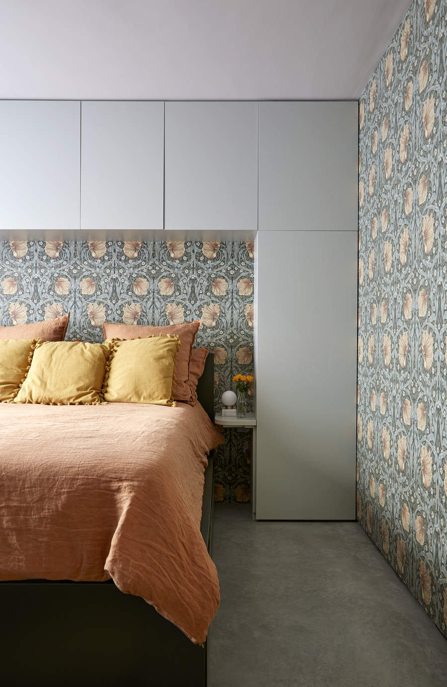
'It's important to consider the start/stop points of wallpaper and where it dies off,' says Janelle Burns, lead interior designer at Maestri Studio. 'For instance, if you're using a grasscloth wallcovering you should look at all the room's openings and outer corners.
'If you have any room openings that aren't cased in trim, you may want to do that first so the paper can die into trim rather than live as an exposed straight edge along the corner,' Janelle adds. 'Grasscloth, in particular, can eventually start to fray at exposed edges, especially in a household with pets, children, or otherwise higher traffic areas where it's bound to be brushed up against from time to time.'
When wallpapering a whole room, you also need to consider your starting point carefully because one corner will potentially not pattern match. 'Consider how you use the space, and place that awkward corner out of your line of vision,' says Ruth Mottershead, creative director at Little Greene. 'Behind the door is often a good place to start and finish as it ensures the wallpaper looks its best whenever you enter the room.’
2. Misjudging the quantity of wallpaper needed
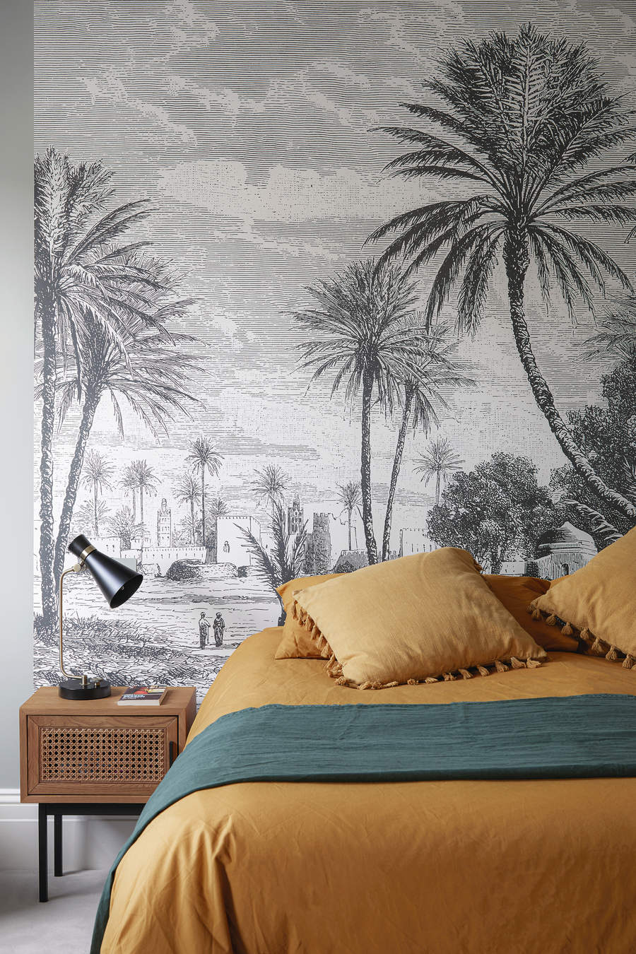
If you incorrectly measure your room, you can easily end up underestimating your wallpaper needs, leading to a delay in your design job. For the easiest solution, you could simply try out an online tool, where you can feed in your room/wall dimensions and it will tell you how much paper you need. Although be warned, these aren't always foolproof.
Otherwise, measure the walls from the ceiling down to the floor and across each wall to ascertain its height and width. Multiplying the two will give you its square footage. If you're going for more than one wall, remember to multiply each wall's dimensions for the final number. If any areas won't have the wallpaper, it can be taken away from your final square footage count.
Even after measuring your walls, you could end up ordering more or fewer rolls than you need. Ideally, if it’s an intricate pattern, you’ll want to order 25% more. If it’s a simple, repetitive pattern, 15% extra should do. Also, it's smart to have an extra roll at hand for the future as the wallpaper goes through its wear and tear.
Keep in mind while using wallpaper to make a statement. 'One wallpaper on one feature wall is so yesterday; go bold or go home,' says Shonali Mahajan, founder of Studio Wodehouse. 'Applying wallpaper on all walls makes the room feel more holistic and also more luxurious.'
3. Not prepping the walls beforehand
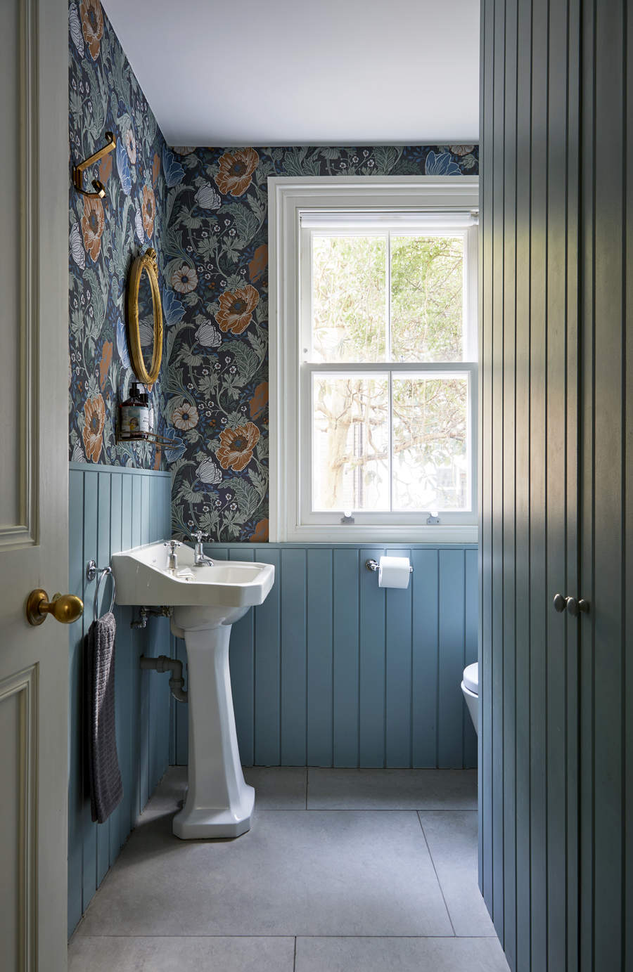
Sure, wallpaper can be a fix for unsightly walls, but not without prep work. Before you begin work, you need to sand uneven finishes, and blotches and scrub the wall to make it clean. Cover it with primer. Otherwise, if all this prepping work sounds too tedious, choose lining paper that will give your walls an even base.
Whether it's your living room wallpaper or any other space in the house, if you are truly struggling, there's no harm in getting professional help. 'You could get the installing agency to measure the quantity after showing them the wallpaper you intend to use and also the check the leveling of the wall to avoid crumples, bubbles, and bumps while installing the wallpaper,' explains Shonali.
4. Choosing the wrong scale of pattern on the wallpaper
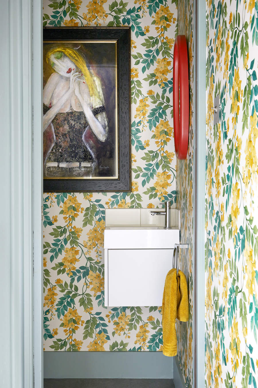
While the latest wallpaper trends feature lots of pattern and print, there's certain consideration that needs to be given to the type and scale of prints.
When it comes to small spaces, if prints are your thing, then ideally smaller ones will help give the room a smart, neat, and decorated look without overwhelming. While this isn't a rule of thumb, largely, tiny areas do better with small to medium-sized prints.
If you're wallpapering a corner or an alcove so that it looks neat, without pulling too much attention towards it, then too, it's best to choose a smaller print.
However, the opposite is true for larger spaces. 'Wallpaper mistakes are typically made with pattern scale,' says Kellie Burke, founder, and principal designer at Kellie Burke Interiors. 'When searching for a large room, try to find a larger scale pattern. The small patterns tend to pixelate in a space rather than stand out, and they can blend into an overall different color.'
5. Hanging the paper at the wrong level
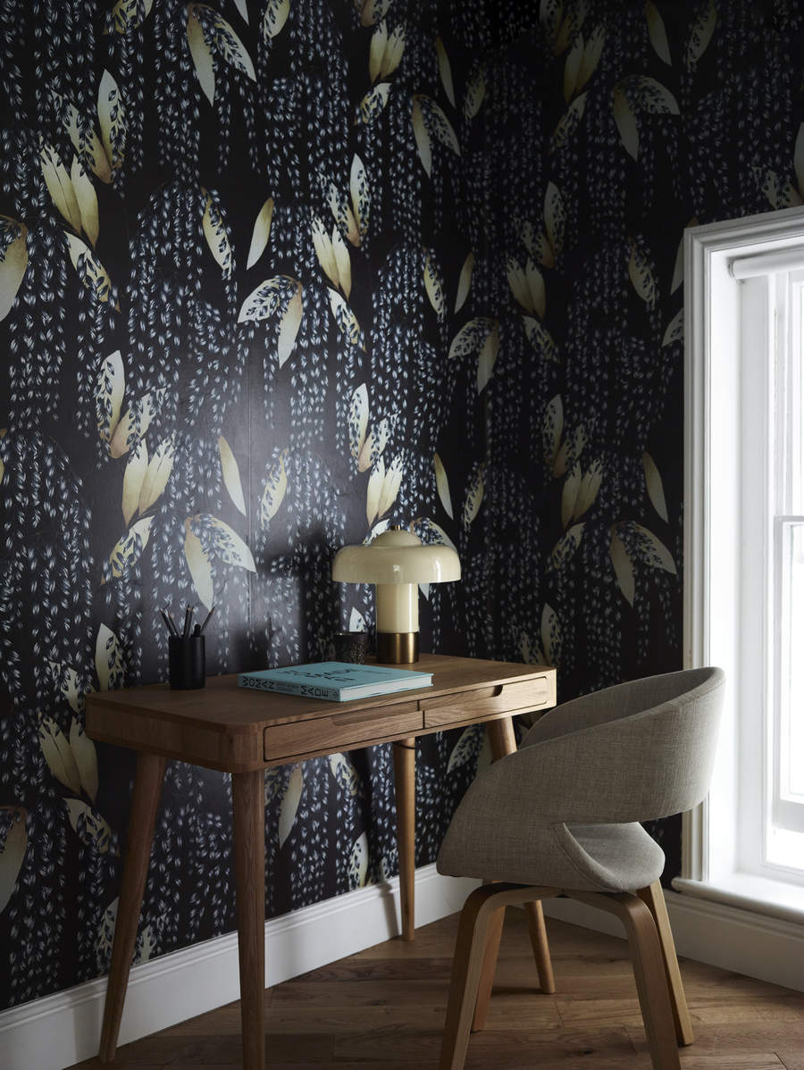
Before you indulge in creative wallpaper ideas, first learn the important lesson on how to install it right.
'One of the most important considerations would be to make sure your wallpaper is accurately matched at eye level as this is the most common viewing point,' says Little Green's Ruth Mottershead. 'Rather than matching your paper at the top of the wall, ensure the pattern fits together in the middle of the wall – this way any slight imperfections which can occur with traditionally printed paper are not in the line of sight.'
'Also make sure you use a plumb line to hang your first drop – this will ensure the wallpaper is hung straight. Do not try to hang wallpaper by eye,' says Ruth.' Always ensure you start by hanging your first drop of wallpaper in the middle of the wall and work your way to the corners. This will make sure your design is centralized and balanced correctly on the wall.'
6. Using the incorrect tools
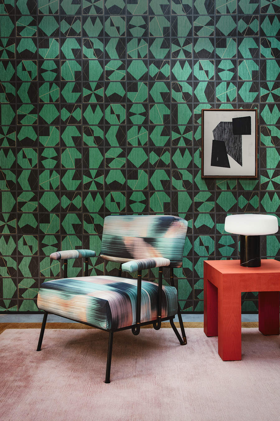
Installing wallpaper can be a fun weekend project, but before you jump right into it, ensure you have all the right tools at your disposal.
You will need a lining paper or primer, paste, and plastic smoother as you apply the wallpaper so it doesn't get bubbles. If an air bubble does arise, you can cut a slit on the side of the blister with an X-Acto knife, and add paste with a glue syringe. Then press the paper back down, and be sure to clean off the extra adhesive.
'Always use a sharp Stanley knife to trim the top and bottom of the paper as scissors can cause jagged edges causing a messy finish,' says Ruth. 'Always use a good quality, light grade, traditional tub paste. This will allow for movement of the paper on the wall, to accurately match the pattern and it will make hanging easier.'
7. Not taking awkward room corners into account
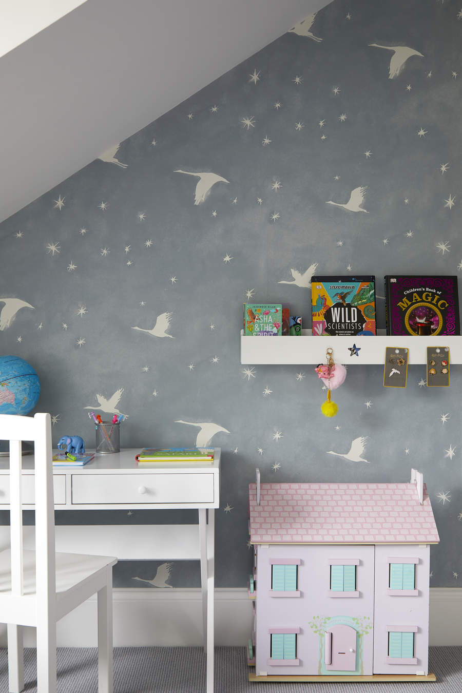
Perhaps the biggest mistake people make while buying or installing wallpapers is thinking of their room as a square. Of course, things would be far easier if all corners were perfectly, but that rarely is he case. When wallpapering small spaces, such as hallway wallpaper, there's a good chance you will discover angles that are awkward or pushed into a corner. The loss of continuity will be easy to spot even if small errors are made.
'When applying on doors and cupboards make sure you have a profile edge to protect the wallpaper from fraying at the edges,' says Shonali.
Is it okay to overlap wallpaper?
If you're still wondering about how to wallpaper, one thing to keep in mind is to avoid overlap; instead, the seams should be pasted tightly together and smoothed down well.
Vinyl wallpapers cannot even be overlapped, as they will not stick to one another. It's best to get a vinyl-over-vinyl paste, or end-match the wallpapers to avoid overlap altogether.
How do you fix mistakes while hanging wallpaper?
If your wallpaper develops bubbles or blisters, cut a small slit along the side of the air bubble, insert a glue injector into the slit and add a bit of seam adhesive inside. Press down and remove any excess. Gently flatten the bubble.
If the edges start curling up at the seam, dampen the area with warm water, lift the edge and apply wallpaper adhesive under it. Flatten the seam with light pressure and a soft cloth. Wipe away excessive glue.
If you're worried about tears or rips on your wallpaper while cutting it to size, steer clear of dull blades and use a sharp-bladed knife instead. This will give the wallpaper a neat cut.
Be The First To Know
The Livingetc newsletters are your inside source for what’s shaping interiors now - and what’s next. Discover trend forecasts, smart style ideas, and curated shopping inspiration that brings design to life. Subscribe today and stay ahead of the curve.

Aditi Sharma Maheshwari started her career at The Address (The Times of India), a tabloid on interiors and art. She wrote profiles of Indian artists, designers, and architects, and covered inspiring houses and commercial properties. After four years, she moved to ELLE DECOR as a senior features writer, where she contributed to the magazine and website, and also worked alongside the events team on India Design ID — the brand’s 10-day, annual design show. She wrote across topics: from designer interviews, and house tours, to new product launches, shopping pages, and reviews. After three years, she was hired as the senior editor at Houzz. The website content focused on practical advice on decorating the home and making design feel more approachable. She created fresh series on budget buys, design hacks, and DIYs, all backed with expert advice. Equipped with sizable knowledge of the industry and with a good network, she moved to Architectural Digest (Conde Nast) as the digital editor. The publication's focus was on high-end design, and her content highlighted A-listers, starchitects, and high-concept products, all customized for an audience that loves and invests in luxury. After a two-year stint, she moved to the UK and was hired at Livingetc as a design editor. She now freelances for a variety of interiors publications.
-
 Does Anyone Decorate With Wall Clocks Anymore? We Asked Designers For Their Thoughts — Timeless or Time to Go?
Although they've been around for centuries, their presence in interiors divides designers. So, are wall clocks our of style? Let's discuss
-
 Take a Pitcher, Make It Last Longer — This Is the Crucial Thing Your Spring Table is Missing
For spring tables with style, meet the warm-weather staple that keeps drinks flowing (and the host seated)