What Color is Amber? Plus 5 Ways To Introduce This "Honeyed" Hue Into Your Home
While it can be hard to define this sunshine shade, design experts all agree on one thing: it adds instant warmth to any space
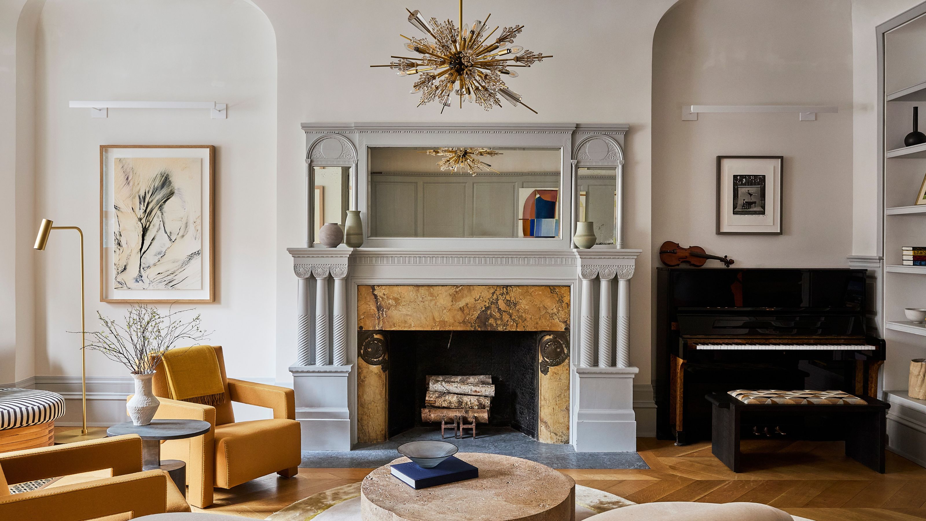

Color has the capacity to turn any house into a home. But none more so than warming shades like marigold yellows, soft browns, or any other hue you'd expect to see in a sunset. One of our favorite colors for this is amber — it infuses a space with personality, whether it's part of a pattern or applied in a more monochrome way. And it's beloved by interior designers, too.
But what color is amber? "Amber isn't refined to a specific shade, it encompasses an array of hues, all warming, honeyed, and magnetic," explains Livingetc's color expert Amy Moorea Wong. "It’s a seductive, come-and-touch-me tone that draws you in and makes you want to wrap it around yourself."
Below, we've broken down this popular paint color idea in more detail, and asked interior designer Paris Forino for her best styling advice when using this honey-like hue in your home. So, what color is amber? Here's what you need to know.
Amber: Explained
"To the eye, amber hovers somewhere between gold and yellow, but more officially between orange and yellow on the color spectrum," explains color expert Amy Moorea Wong. "It makes you think of the alluring pieces of golden orange-y brown fossilized tree resin we’ve turned into pieces of jewelry since the stone age — where its name comes from."
The color amber is made using a combination of yellow pigments mixed with brown or orange, Amy continues. "There's no exact recipe, but it should be rich, radiant, and warm — a color that makes the home feel cozy."
How Can I Style Amber?
New York-based interior designer Paris Forino says, "Color unequivocally sparks pure joy," and amber is a sunny shade that makes that abundantly clear. It's a cozy paint color that particularly shines when the weather is gray outside, and even one small amber accent — a sofa, piece of décor, or even artwork — can add ample warmth to any space.

Paris Forino is a highly-esteemed interior designer based in New York City, and the founder and principal at eponymous design studio, Paris Forino. With work spanning high-end residential, as well as large-scale commercial developments, Paris has become known for her clever use of color in design, clean lines, and "approachable elegance."
Now you have a better understanding of what color amber is, here are some of Paris' favorite ways to incorporate amber into your home.
1. Add Amber Accents to Keep Things Cozy

This bedroom by Paris Forino achieves an amazing feat: it looks and feels cozy, without any clutter. This effect is primarily down to the amber accents within the space — the surprising blue and yellow color palette feels balanced yet warm.
“A myriad of colors play together through the upholstery, wallcovering, area rug, and accessories to keep the energetic and joyful throughline going strong,” explains Paris.
It also complements the mixed patterns in this space. Both the stripes and floral prints pop against the amber backdrop. Soft blankets in an amber tone almost make a great accessory, to tie together the space.
2. Be Inspired By Natural Materials

Paris describes how this bathroom showcases a softer amber color, which shows up in the natural tones of the wood grain. The trim color around the doorway perfectly complements the wood bathroom, while the marble sink creates a cool contrast. Even the subtle pattern in the wallpaper on the walls outside nods to the touches amber with its base color.
3. Tie It Together With a Trim

The use of the color amber in this entryway by Paris is soft and subtle. The designer explains how the simple patterned wallcovering and painted trim infuse the whole space with the shade, without the need to shout. The warm color scheme also complements the wooden doors, adding further depth and coziness.
To style the space, Paris chose a statement piece of art with mixed metals — some cool, some warm — to create a look that feels both on trend, but timeless. Here, mixing industrial décor with classic designs pays off.
4. Infuse a Space With the Feeling of Sunshine
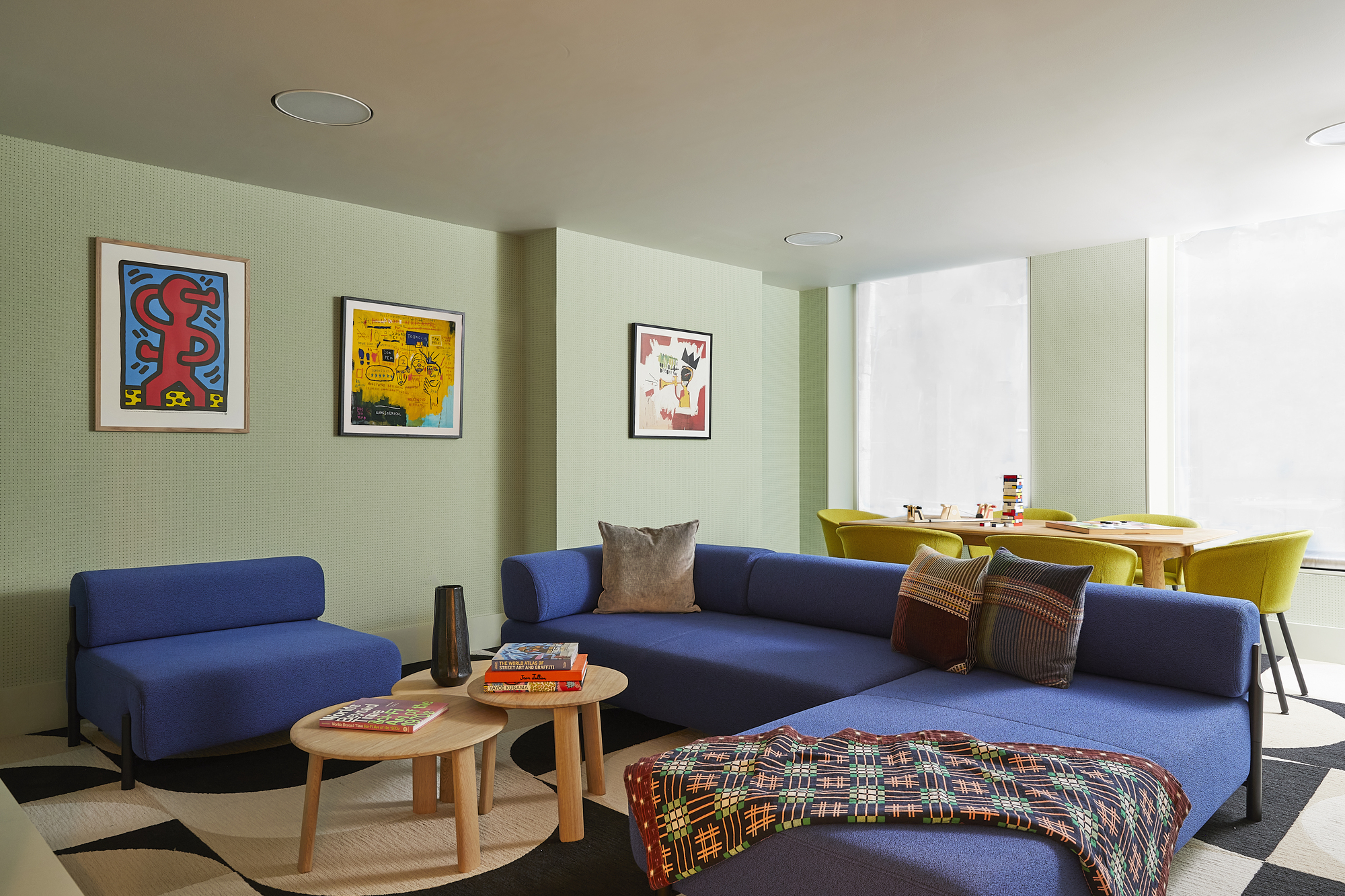
Paris explains how she used pops of yellow-ish amber tones in this colorful living room in a Tribeca family home to add "happiness, energy, and warmth" to the space.
"Whether it's in the chair upholstery, or styled in the art or throw blanket, I was drawn to the sunniness it infused into the interiors, contrasting the bold blue sofa and neutral, geometric area rug,” she adds.
This works in playrooms and grown-up living rooms alike. Wall art with touches of amber are a great way to test out the color if you’re skeptical, and it’s an easy way to let the 'sunshine' in to any room.
5. Make a Bright and Bold Color Statement

While not one of Paris' designs, the New York designer shared that one other way to use the color amber in your home is by making "a playful and bright" statement with a yellow kitchen.
Opting for a browner amber tone lends itself a more vintage-inspired look, and ensures the bold color statement will sit well with other common kitchen finishes such as warm brass and rich timber tones.
FAQs
What colors go with amber?
Trina Rogers, a color expert and owner of Five Star Painting in Temple, explains that the warm golden and yellow-orange tones of amber means it's a color that pairs beautifully with rich blues and jewel-tones like teals, forest greens, and luxurious deep purple shades.
“The striking contrast between these cool colors and the warmth in amber creates an inviting and sophisticated space within your home," she adds. "If you prefer a softer amber color palette, pair it with warm whites or soft yellows.”
Once you know what color amber is, you'll no doubt start to see it appearing in a number of interior designer's schemes. It's an easy color to approach in interiors — much easier than some other shades of yellow — and has had somewhat of a resurgence lately with both a rise in popularity of colored glassware and warm '70s style.
Be The First To Know
The Livingetc newsletters are your inside source for what’s shaping interiors now - and what’s next. Discover trend forecasts, smart style ideas, and curated shopping inspiration that brings design to life. Subscribe today and stay ahead of the curve.

Caroline Reinstadtler is a Brooklyn-based writer for publications including Bustle, Elite Daily, and Livingetc. In 2021, she graduated from NYU’s Tisch School of the Arts, and she's been writing ever since. She is passionate about style and design, and her Pinterest boards are somewhat of a big deal. Her editorial experience has brought her all over New York City, meeting renowned interior designers and being inspired by so many beautiful homes. She believes homemade art and meaningful memories are the best parts of any space. She also writes original music, which has been performed at Caveat, Bowery Electric, Heaven Can Wait, and more.
-
 The Weighted Blanket That Doesn’t Make You Sweat (and the Eye Mask to Match)
Luxury has weight. And apparently, volcanic minerals
By Julia Demer
-
 What Is Biophilic Interior Design? I'm an Actual Biophilic Designer, and This Is How to Apply It to Your Home
A biophilic designer explains the core principles of this practice, and the easy ways you can apply it to your home's design
By Marianna Popejoy
-
 What Does the Color Yellow Mean in Interior Design? A Color and Design Psychology Expert Explains
Whether you love or hate it, yellow always seems to elicit a strong reaction from people — here, we explain why
By Karen Haller
-
 Should a Living Room Be Painted Dark or Light? We Asked Design Experts to Settle The Age-Old Debate
The color of your living room can completely shift the mood of your entire home, so the question remains: should you go light or dark...?
By Devin Toolen
-
 10 Yellow Bathroom Ideas That Vitalize Your Mornings and Look Unexpectedly Sophisticated While Doing So
Yellow is a color that by its very nature is energetic and full of life, and these designers have proved it's ideal for a bathroom
By Oonagh Turner
-
 It's a Color Symbolic of Dreams, so These Purple Bedroom Ideas Almost Guarantee a Good Night's Sleep, Right?
Not always an obvious choice for the bedroom, these designs prove that purple has restful and calming qualities, making it perfect for the bedroom
By Oonagh Turner
-
 I'm Sorry, But You Need to Know About 'Advancing and Receding Colors' If You Want to Get Your Home's Decorating Scheme Right
While some colors tend to pop and reach forward in a room, others draw back. Here, a color expert helps define these palettes and how to use them
By Olivia Wolfe
-
 Amethyst, Heather, Pansy, Plum — Turns Out Decorating With Purple Opens You Up to a World of Possibilities
Purple certainly isn't a color for the faint hearted, it's a shade that can smell your fear. Here's how to conquer it through your interiors
By Amy Moorea Wong
-
 Here's Why Decorating With Mustard Yellow Helps Fill Your Interiors With a Sense of "Confident Calm"
There is so much more to decorating with this turmeric-tinted sauce-wiggled-on-a-hotdog not-quite-yellow shade than meets the eye
By Amy Moorea Wong
-
 The Combination You Weren't Expecting to Love — 8 Blue And Orange Living Room Ideas That Feel Surprisingly Elevated
A blue and orange scheme for living rooms may sound jarring, but these spaces prove they're striking, vibrant, and certainly unforgettable
By Camille Dubuis-Welch
