

From carnival apples to cupcakes and brownies, caramel is a timeless treat. However, it signifies good taste in more ways than one. This light brown color has gold undertones that brighten up any room. Like your favorite coffee shop latté, the color caramel makes you feel warm from the inside, out.
Culinary hues are nothing new. There's cherry red and mustard yellow, and trend forecasters have even suggested that vegetal colors will be everywhere this year. These familiar — and natural — colors bring a fun, lived-in feel to your space. And because caramel is more muted, it works particularly well for the color-averse.
You can use it as a neutral that’s never boring or bland. Below, we break down what color caramel is, and some of the ways designers like to decorate with this brown in their interiors.
Caramel: Explained
So, what color is caramel? “On the color scale, it lies among the lighter browns, with influence of yellows and oranges,” says interior designer and color expert Madison Hughes — “It's like sugar cooked down to the perfect gooey texture.” And whether you’ve got a sweet tooth or not, it’s a stunning addition to any space.

Price: £5.95/sample
How Can I Style Caramel?
Interior designers tend to love the color of caramel. Its versatility and timeless style are unmatched. Whether you play with texture or mix and match materials, there are so many ways to use this shade.
Below are some of the best.
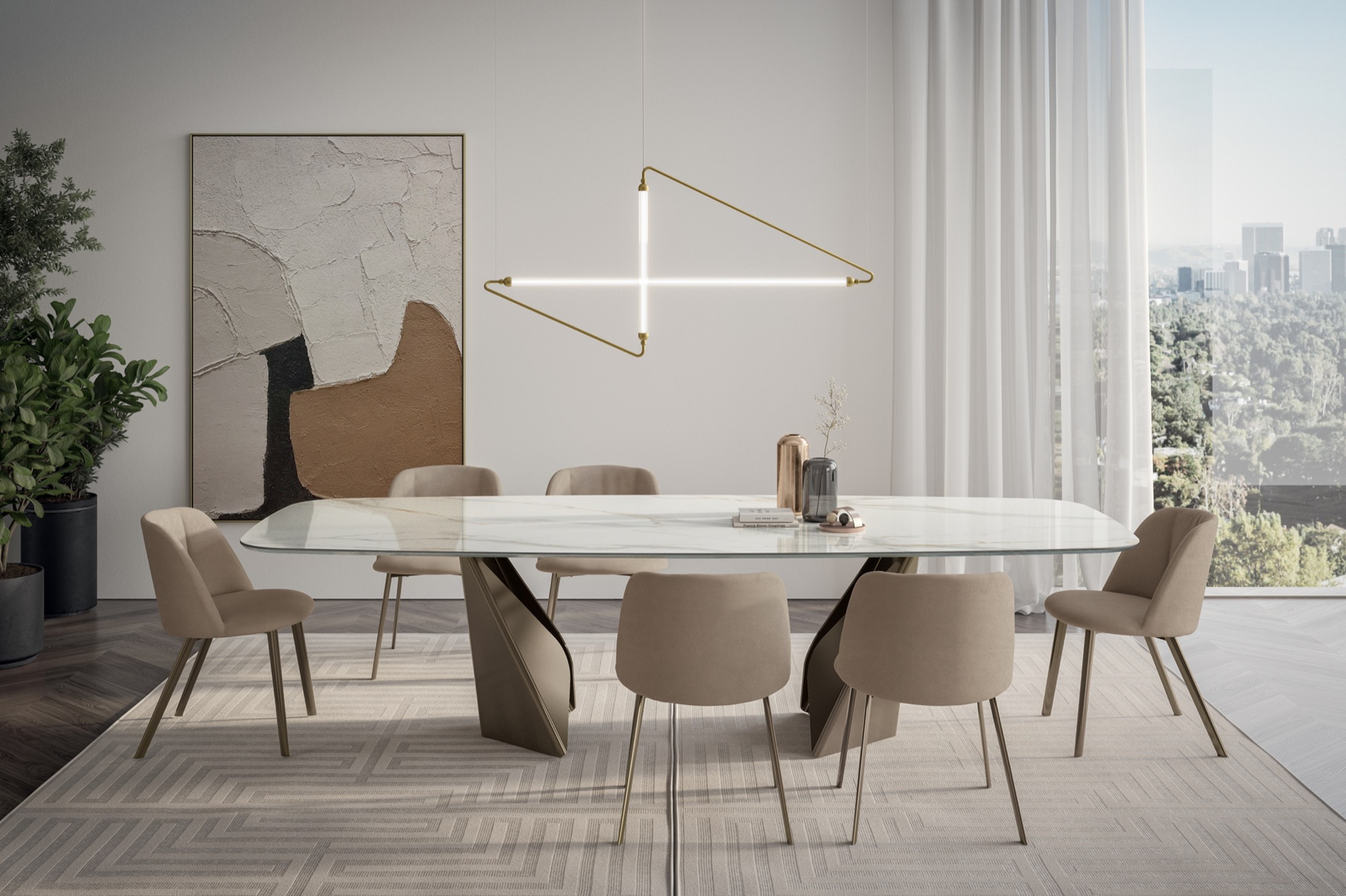
1. Make Guest Feel Welcome

The color caramel radiates warmth, making it the perfect tone to greet guests in your entryway.
Thanks to its warm and cozy qualities, caramel is one of the best colors for entryways, helping to set the tone for the home.
"I selected a golden caramel hue to grace the entry points, which greets visitors upon arrival," explains interior designer Alessandra Smith, of the space shown above. "This inviting color not only welcomes guests with a sense of warmth, but also reflects the richness and grandeur of the home's heritage."
2. Soften a Darker Color Palette

The caramel wall and ceiling color help to lift the eye and visually brighten and lighten this moody room.
Interior designer Alessandra Smith used a warm, gooey caramel color to employ the 'sandwich' method in this retro-style living room. A caramel-colored floor rug and wall paint flank the black-stained timber panelling, providing an easy spot for your eye to rest, and softening the overall look of the space.
Where a white paint would have appeared too jarring next to the black details, a warm caramel color ensures the space feels light and airy, while also warm and enveloping.
3. Embrace Caramel Tones Through Wood Finishes

Natural honey and caramel-toned wood finishes are a subtle way to introduce the color into a space.
Caramel colors can often be found through natural materials, and namely in honey-toned woods. In this modern kitchen, Laura Marion, founder and principal architect of Flight Architecture, says she found her inspiration from Japanese tradition, where forms, spaces, and colors are "understated, rooted in the natural world, and showcase light and balance overly shiny things."
"For the cabinetry and flooring, we chose this rich white oak with a range of caramel colors to add warmth which grounds the otherwise pure and modern space," she continues. "It also adds interest and depth without adding complexity. We used the same caramel tones for every fixed finish throughout the home, punctuated by changes in geometry, not color."
4. And Through Your Décor Choices

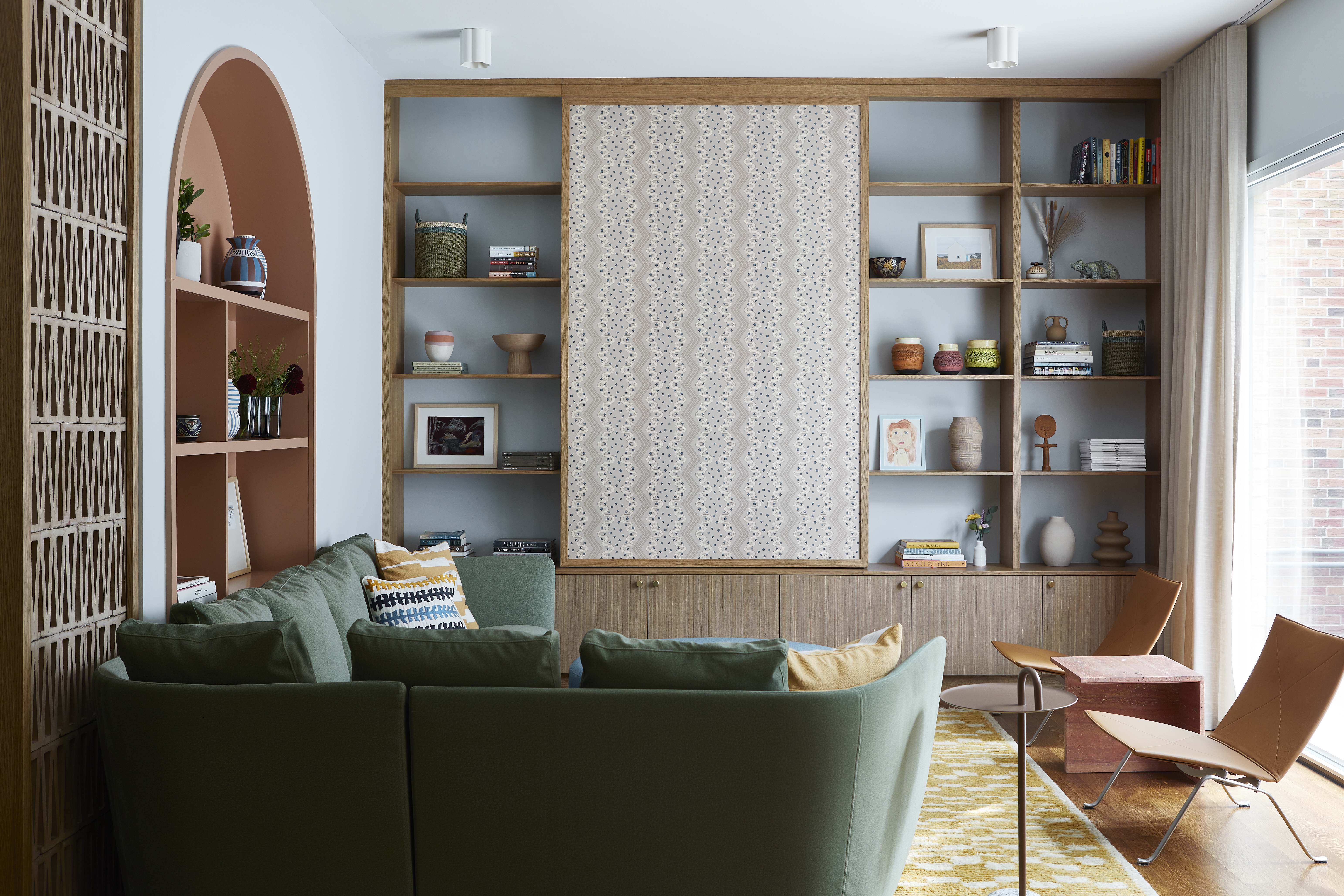
Caramel-colored décor complements the other natural wood tones in the space, adding to the sense of warmth.
Caramel looks wonderful when introduced through your more permanent fixtures and finishes, but it works just as well when styled through your décor — reflecting the soft glow of sunlight during the warmer seasons, or making a space feel cozier when it's cool outside.
"The caramel tones were intentionally chosen to introduce warmth and depth to the space," explains Christine Stucker, the principal designer at Stewart-Schäfer of the cozy living room shown above. "They complement the natural wood elements and neutral palette, creating a sense of cohesion and understated luxury. Through the décor and throw pillows, these hues add a tactile softness that makes the home feel inviting, grounding the modern design with a touch of warmth and familiarity.”
5. Add a Bit of Glamour with Caramel

Though an unexpected carpet choice, the caramel tones pick up the gold accents in this space, adding to the sense of luxury.
But of course, caramel can be used in a range of interior styles, and thanks to its closeness to shades of glitzy gold, often helps imbue a space with a sense of glamour and grandeur, as seen in this living space by Australian-based studio, Tennille Joy Interiors.
Its blush pink walls and caramel-colored carpet may be an unexpected combination, but it's a shade that works well as a dominant color in a space, explains designer Tennille Joy Burnup. "It can serve as a sophisticated neutral base and add warmth to a color scheme, and it pairs particularly well with gold accents for a luxury aesthetic," she adds.
FAQs
What Colors Go With caramel?
“Due to the nature of its muted warmth, caramel pairs naturally with earth tones,” says Madison Hughes. “Sage, goldenrod, taupe, terracotta, chocolate brown, and especially dusty blue can create a unified palette.”
For this reason, natural materials, like brick, wood, and stone, often look great when paired with caramel. However, you can also try a bolder color, too. Shades that are bright and warm, like zesty orange or a hot pink, work beautifully.
Once you know what color caramel is, it's easy to see how to use it in your own home. Its cozy warmth is a welcome addition, and it even looks great as an accent hue; try a caramel chair or lamp, and you’ll see what we mean.

-
 My 10 Favorite Designs at Milan Design Week 2025 — Out of the Hundreds of Pieces I Saw
There is a new elegance, color, and shape being shown in Milan this week, and these are the pieces that caught my eye
-
 Iridescence Is Chrome’s More Playful, Hard-to-Define Cousin — And You're About to See It Everywhere
This kinetic finish signals a broader shift toward surfaces that move, shimmer, and surprise. Here's where to find it now


-
 Here's Why Decorating With Mustard Yellow Helps Fill Your Interiors With a Sense of "Confident Calm"
There is so much more to decorating with this turmeric-tinted sauce-wiggled-on-a-hotdog not-quite-yellow shade than meets the eye
-
 5 Problems With Painting Your Walls White That No-One Ever Talks About (Until Now)
White is the easiest neutral to work with...right? Interior designers explain why this shade is actually more complex than it may seem
-
 5 Mistakes That Are Making the Blue Details in Your Room Feel Old-Fashioned — And How to Rectify Them
Blue is a timeless shade, no doubt, but use it in the wrong space or in the wrong way, and it can make a space feel, well... a bit blue
-
 5 of the Best Navy Blue Paint Colors That Designers Love — And How to Use Them
Navy blue has timeless appeal and can feel both modern yet classic, but what are the designers' favorite paints?
-
 Should Your Carpet Be A Darker Color Than Your Walls? How to Make This Bold Look Work
Not every room can get away with a carpet that is darker than the walls; Designers share when and where this combination works best
-
 What Actually Is Yves Klein Blue? A Short History of This Iconic Color, and How to Decorate With It
Explore “the most perfect expression of blue” and how to free this pigment in your home
-
 Do Pink and Green Go Together in Interiors? A Professional Color Consultant's Verdict
How to make pink and green color combinations work for more contemporary interior schemes
-
 The 'Grown-Up' Way to Decorate With Light Blue — This Shade Shouldn't Just "Be Resigned to the Baby's Room"
We explore how to bring the lighter intonations of blue into your home in a contemporary and thoughtful way


