

Not a lot of people actually know what color chartreuse is. There’s a common misconception it's a shade of pink, when in fact, it's a zesty hue that sits somewhere between green and yellow — and derived its name from the French liqueur that goes by the same moniker.
This bold, bright shade is certainly not one for the shy, and will add plenty of pizzazz to any space. It's well documented that the color green can make you happier and have a powerful effect on your mood, so if you're looking to curate a space that will energize you, you really can't get better than chartreuse.
Here, we break down everything you need to know about the color chartreuse, including ways to style it in your space.
What Is Chartreuse?

So what color is chartreuse, exactly? Arianna Barone, color marketing manager for Benjamin Moore, explains that chartreuse is an "acidic saturated color family" that, as previously mentioned, "blends yellow and green."
“It can be more vibrant, like Eve Green 2024-20 and Eccentric Lime 2027-30, or more earthy, like Savannah Green 2150-30 and Anjou Pear AF-425," she adds, referencing specific paint shades from Benjamin Moore's range. "It brings zest and contrast to any palette as an exciting statement of color.”
If you’ve got a flair for the dramatic, this is the hue for you.

Price: $5.99/paint sample pot; $2.50/color swatch; $5.95/peel and stick sample
How Can I Style Chartreuse?
Once you know what color chartreuse is, the next challenge is knowing how to actually use it in your space. When done well, it can make your space feel "lively and inviting," says interiors expert and creative director of PaintVibe.com, Vanessa Carter.
Designers love using chartreuse for its eye-catching elegance and chic, cosmopolitan edge. Below, we've shared a few of the ways they recommend styling it.
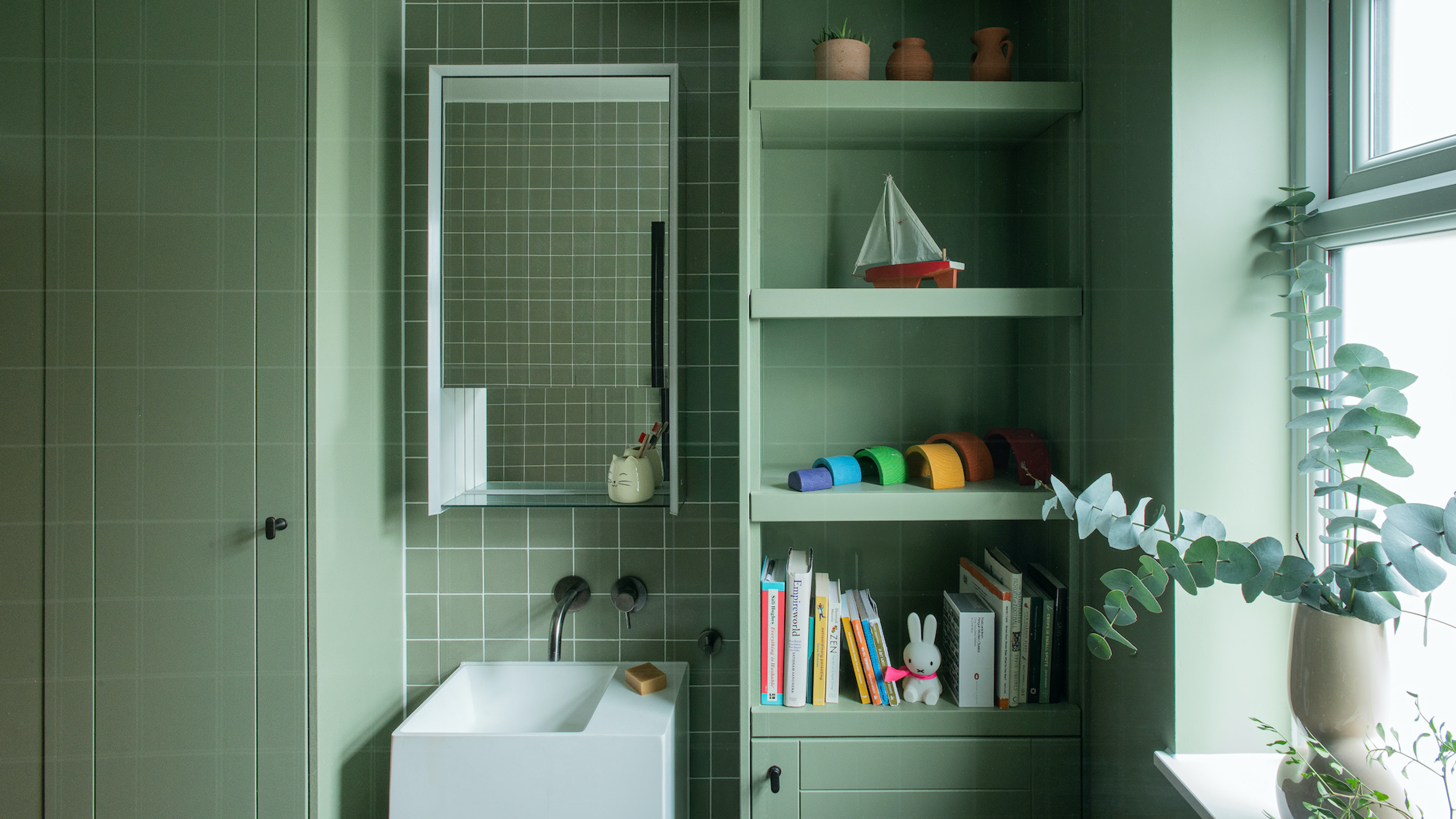
1. Create a Jewel-Box Effect in Small Spaces

When it came to choosing a color for this small bathroom, interior designer Roger Higgins, principal of R Higgins Design, opted for an opulent and high-gloss chartreuse. The bold hue contrasts with the marble sink, adding definition and crispness to the space, while its warm yellow undertones softly complement the brass faucet and lighting.
"I love bringing personality and flair to small, jewel-box spaces,” he explains of the decision. “It’s a perfect way to enjoy vibrant hues without overwhelming the high-traffic areas of your home. For even more drama, consider adding a lacquer finish to the walls to give them depth and shine.”
2. Cocoon Your Space in Color

But that's not to say you can't use a bold shade like chartreuse in bigger spaces. “Bold colors like chartreuse create a striking focal point,” adds Roger. But to ensure it doesn't feel too contrasting, the designer suggests committing completely, and color-drenching your entire space in the hue.
In order to add definition in the space, Roger layered in plenty of texture — a grasscloth wallpaper, velvet accent chair, fresh foliage. The finished result looks cohesive and cocooning, but not too matchy-matchy.
3. Mix with Complementary Shades

The best way to make a statement with a color like chartreuse, is to find other shades that complement it and truly make it sing. And that's exactly what interior designer Regan Baker did with the pantry of this Southern Californian home.
"Our client loved the 'grandma chic' aesthetic and enjoyed the vintage feeling of chartreuse, which also works alongside the '20s era style seen throughout the home," she explains. "She also gravitated towards a chartreuse paint as it complemented the Hygge and West wallpaper we decided on. She likes green and blue shades in general, and we felt the brighter pop of color would be a fun mix. It also creates a sense of color-blocking alongside her collected objects."
4. Lean in to the Unexpected Nature of Chartreuse

Chartreuse is bound to be an unexpected color in most interiors, so what better way to incorporate the color than by leaning into this element of surprise with how you choose to style it.
London-based interior designer Tatjana von Stein did exactly that in this space, by opting for a punchy charteruse as the ceiling color. Not only does it fill the space with a sense of warmth, but it also ties together the warmth of the wooden finishes in the room, giving the overall design a more cohesive and balanced aesthetic.
FAQs
What Colors Go With Chartreuse?
Unlike many other shades of yellow or green, chartreuse is unequivocally not a neutral. However, that doesn't mean it has to be the only color you commit to in your space. Benjamin Moore's Arianna Barone says she recommends pairing chartreuse with deeper grounding hues like navy brown (Hale Navy HC-154) or a more jewel-toned teal (Pacific Sea Teal 2049-10).
"For a softer look, bring in more neutral hues with hints of warmth," she adds, referencing Overcast OC-43, a calming off-white, or Carrington Beige HC-93, a light, warm neutral.
In terms of complementary textures, interior designer Regan Baker adds: "Chartreuse goes really well with warm brass and wood tones, often seen in fixtures and flooring. It ties everything together and feels fresh."

When you’ve got expensive taste, decorating can be costly. But luxurious colors like chartreuse are a great way to show off your style without needing to spend a fortune.
Plus, being brave enough to showcase bold colors like this in your home is a true sign of style — who said Brat green couldn't be chic?

-
 10 Small Bathroom Storage Ideas That Will Cull Clutter and Keep Even Tiny Spaces Feeling Calm
Unlock the storage potential hidden in your small bathroom and squeeze stashing space from every corner
-
 6 Flower Trends That Will Introduce Lushness, Life, and a Little Luxe to Your Interiors in 2025
These are the fresh blooms florists and designers are favoring this year, plus how to arrange them for a striking look that fills your home with joy


-
 Should a Living Room Be Painted Dark or Light? We Asked Design Experts to Settle The Age-Old Debate
The color of your living room can completely shift the mood of your entire home, so the question remains: should you go light or dark...?
-
 10 Yellow Bathroom Ideas That Vitalize Your Mornings and Look Unexpectedly Sophisticated While Doing So
Yellow is a color that by its very nature is energetic and full of life, and these designers have proved it's ideal for a bathroom
-
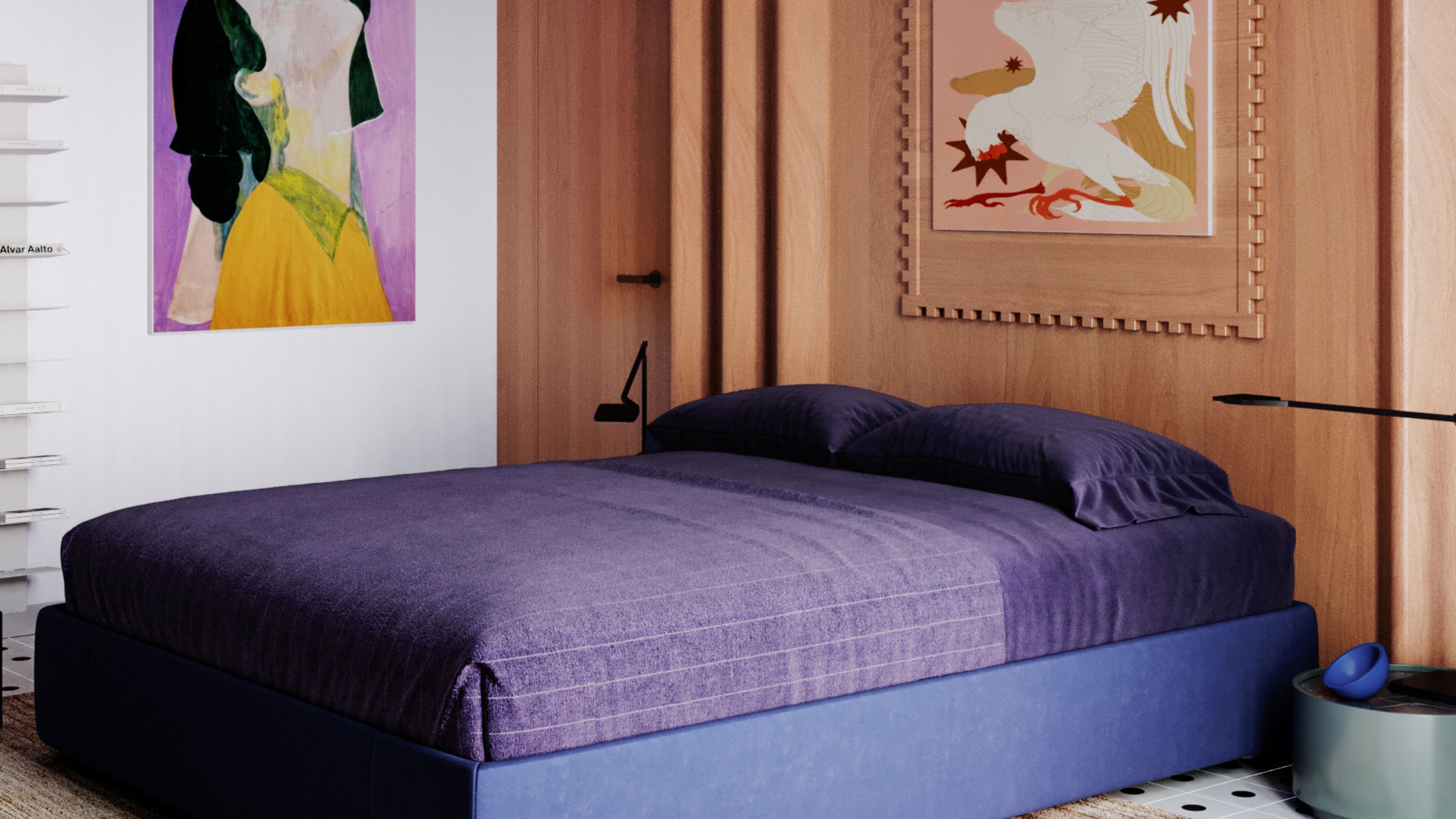 It's a Color Symbolic of Dreams, so These Purple Bedroom Ideas Almost Guarantee a Good Night's Sleep, Right?
Not always an obvious choice for the bedroom, these designs prove that purple has restful and calming qualities, making it perfect for the bedroom
-
 I'm Sorry, But You Need to Know About 'Advancing and Receding Colors' If You Want to Get Your Home's Decorating Scheme Right
While some colors tend to pop and reach forward in a room, others draw back. Here, a color expert helps define these palettes and how to use them
-
 Amethyst, Heather, Pansy, Plum — Turns Out Decorating With Purple Opens You Up to a World of Possibilities
Purple certainly isn't a color for the faint hearted, it's a shade that can smell your fear. Here's how to conquer it through your interiors
-
 Here's Why Decorating With Mustard Yellow Helps Fill Your Interiors With a Sense of "Confident Calm"
There is so much more to decorating with this turmeric-tinted sauce-wiggled-on-a-hotdog not-quite-yellow shade than meets the eye
-
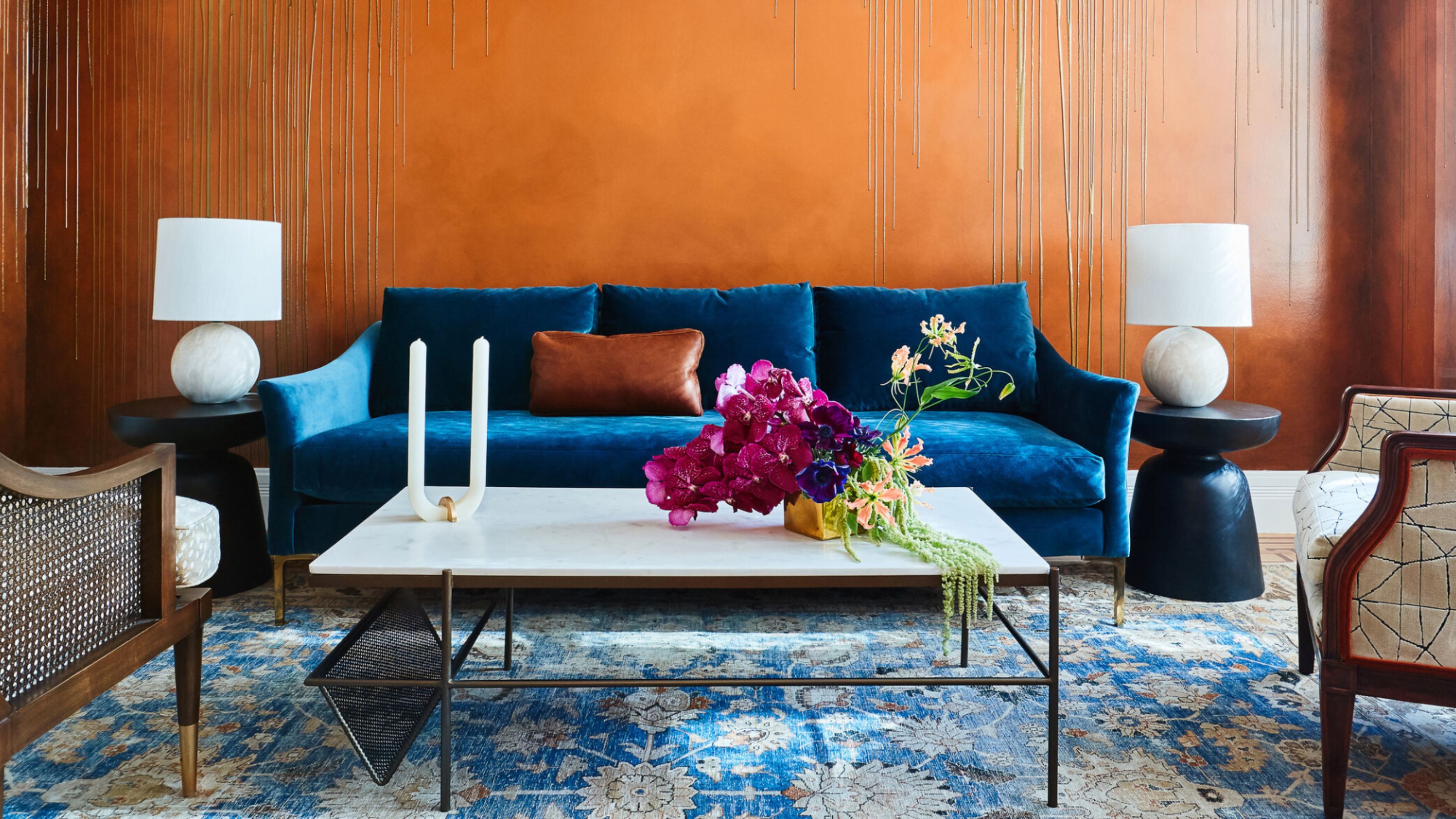 The Combination You Weren't Expecting to Love — 8 Blue And Orange Living Room Ideas That Feel Surprisingly Elevated
A blue and orange scheme for living rooms may sound jarring, but these spaces prove they're striking, vibrant, and certainly unforgettable
-
 Smeg Says Teal, and We’re Listening — The Kitchen Shade of the Year Is Here
Designers are already using the soft, sea-glass green everywhere from cabinetry to countertops


