

Blue may be a universally beloved color for interiors, but it encompasses a vast number of different hues and tones, and that includes the highly complex, hotly-debated, and hard-to-define shade, indigo.
But what color is indigo? Turns out, that's a big question. A mix of blue and purple — and affectionately known in the Livingetc office as 'blurple' — indigo sits on the color spectrum directly between blue and violet. Its close proximity to both tones has been the cause for heated debate over how to accurately define it, with some questioning whether it's actually different enough from either shade to warrant its own spot on the spectrum.
Architectural color expert Amy Krane says that, simply put, indigo is both blue and purple. "It is a deep blue tinged with purple," she says. In our interiors, it can swing either way, depending on the paint shade you choose, the natural light in the space, and what you choose to style around it. But, that's the beauty of indigo. It's neither here, nor there. It shifts throughout the day, adding movement and making a room come alive.
Below, I dive into this contentious color trend even more, understanding its nuance, and how (and why) designers like to work with it in their interior projects.
Indigo: Explained
For most of us, the first time we would have learned about indigo would have been in school, when we were taught color theory and the acronym for the colors of the rainbow: ROYGBIV. Of course, here, the 'I' stands for indigo.
But its history runs much deeper. "The color indigo originally came from plants used for dyes before synthetic dyes were developed," architectural color consultant, Amy Krane, tells me. "One source of it is the plant Indigofera Tinctorial. This plant came to the US by enslaved people who used it as a fabric dye in West Africa. It was grown in other regions of the world as well and became associated with quality and luxury until it was grown in the Carolinas which became a cheaper source of the dye."
The complexity and elusiveness of indigo immediately piques my curiosity, and I'm not alone. "With both the calm of blue and the mysterious, regal quality of violet, indigo has a personality all its own," adds Lauren Battistini, a color expert and founder of LFB Color.

Price: £1.50/peel-and-stick sample

Amy Krane is an architectural color consultant at Amy Krane Color. She was trained at the International Association of Color Consultants North America and is also the host of the podcast, Lets Talk Paint Color. Her expertise allows her to help people understand the emotional, psychological, and physiological effects color has on us.

Lauren is a color expert, chief color strategist, and founder of LFB Color Consulting. The Houston-based company provides color consulting for both residential and commercial projects. Lauren has certifications in color consulting and as a color expert and color analyst.
How Can I Style Indigo in My Home?
Though there may be some debate over the 'true' shade of indigo, therein lies its magic. Just like when it comes to the colors that go with blue, or what colors go with purple, there are a few different ways to go about styling indigo in your interiors. A world of bold design is at your fingertips.
Below, discover six ways interior designers have styled different shades of indigo, and why they love working with this hard-to-define color.
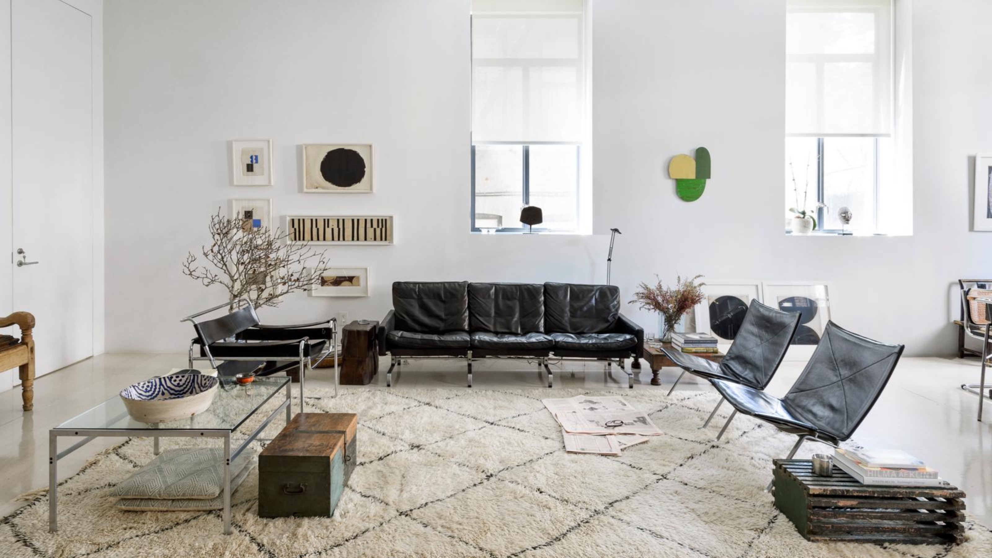
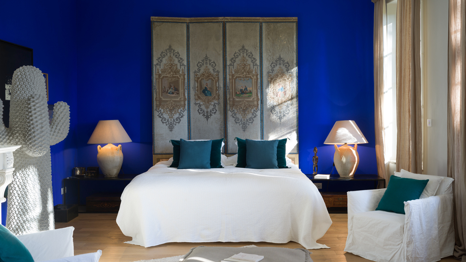
1. Create an Enveloping and Moody Feel

Pairing a darker indigo with violet and purple pieces gives the shade a moodier aesthetic.
Indigo is a strong color to introduce into any room, its boldness begs to be embraced, while the undertones are surprisingly calming. Dark living rooms and moody sanctuaries are the ideal backdrop for this shade.
Amy says, "It is a powerful and beautiful color for walls. Because it can appear overpowering, I would use it in a dark room which will keep the overall look more sedate, creating a snug atmosphere." And don't be afraid to color drench with indigo; the more you lean into the drama, the more satisfying the final look will be.
Think of it as you would any other dark color trend, like navy blue, oxblood red, or mocha brown, but with a slightly more colorful twist.
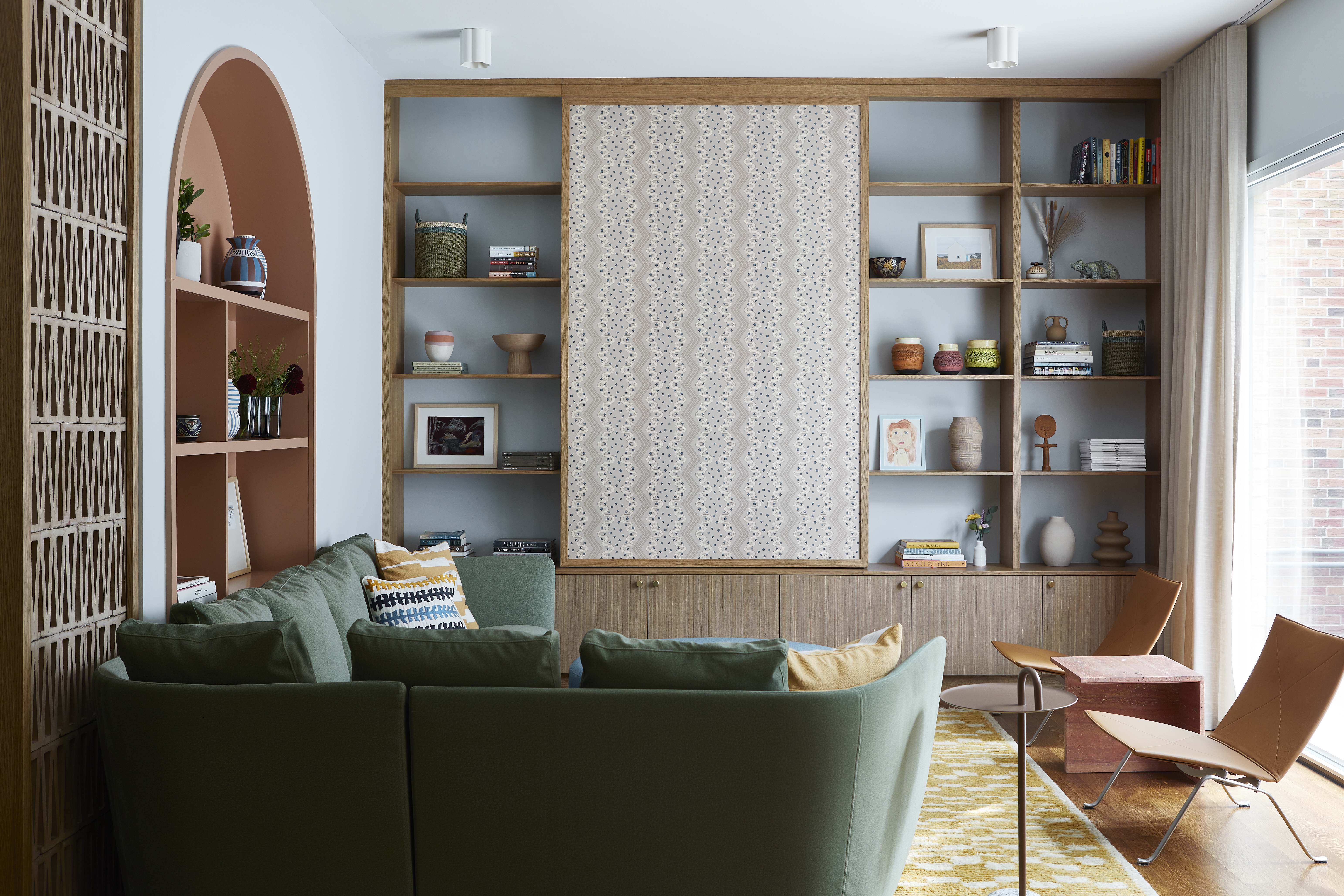
2. Play with Patterns

This living room combines the bold, playful side of indigo with its more traditional roots.
Wallpapers, upholsteries, and textiles are some of the more creative ways to dive into the indigo trend. When using this color in a pattern, the pops of brightness evoke a rich, artistic atmosphere while maintaining a grounding, calming effect.
"Indigo is a stronger, more pigmented alternative to navy blue décor trend for those who want to pack more punch in their décor choices," says Lauren.
As for styling, Ippolita Rostagno, founder and creative director of Artemest, reflects on the room shown above, recommending you, "Stick to vintage or antique furniture with dark wood and plush, jewel-toned upholstery. Incorporate gold or brass accents for warmth, and keep the décor minimal to let the wallpaper shine."
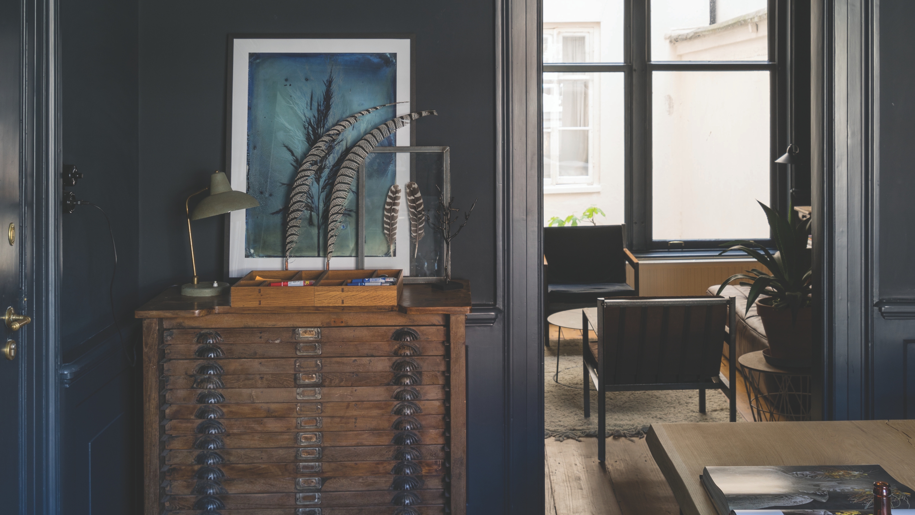
3. Introduce Indigo Through Art

The indigo within the artwork is complemented by the teal color on the walls, making it a subtle yet effective use of the color.
If you want to ease your way into using indigo in your interiors, incorporating it through your choice of artwork is always a good place to start. Moody hues like indigo are a great accent choice for at-home offices, studies, or libraries.
"The deep tone helps set the mood for the kind of activities you’ll be doing, and make it feel extra cozy," says Lauren. "Since indigo pairs well with brown shades, it’ll fit right in with most wooden desks, brown leather armchairs, stools, etc." .
4. Add Warmth to a Bright Bedroom

Dark, rich tones of indigo can help anchor a space, giving it a feeling of warmth and security.
This seductive dark color scheme created by Heather Hilliard is hard not to fall in love with. The inky shades of blue and purple feel reminiscent of a night sky. The ceiling and large windows work to reflect some light into this room but this is a design that really embodies its dark minimalism.
"This client’s bedroom is on the 57th floor of a building in NYC, but while the views are incredible, the sky is often white or gray in the winter," reveals San Francisco-based interior designer Heather Hilliard. "We wanted to bring a feeling of warmth into the room. The idea here was to envelop the room in rich deep blues, violets, and aubergine. The wallpaper is a paper-backed wool, the custom bed is upholstered in a soft Claremont violet velvet and the rug is a custom inky blue silk. When the blackout curtains are closed, the room feels like a cocoon."
"Room-size area rugs or wall-to-wall carpets make the room feel larger and every inch of the floor is soft underfoot," Heather adds. "The dark and minimal palette is soothing. I find minimalist interiors are successful when the textures, colors, and materials are in harmony."
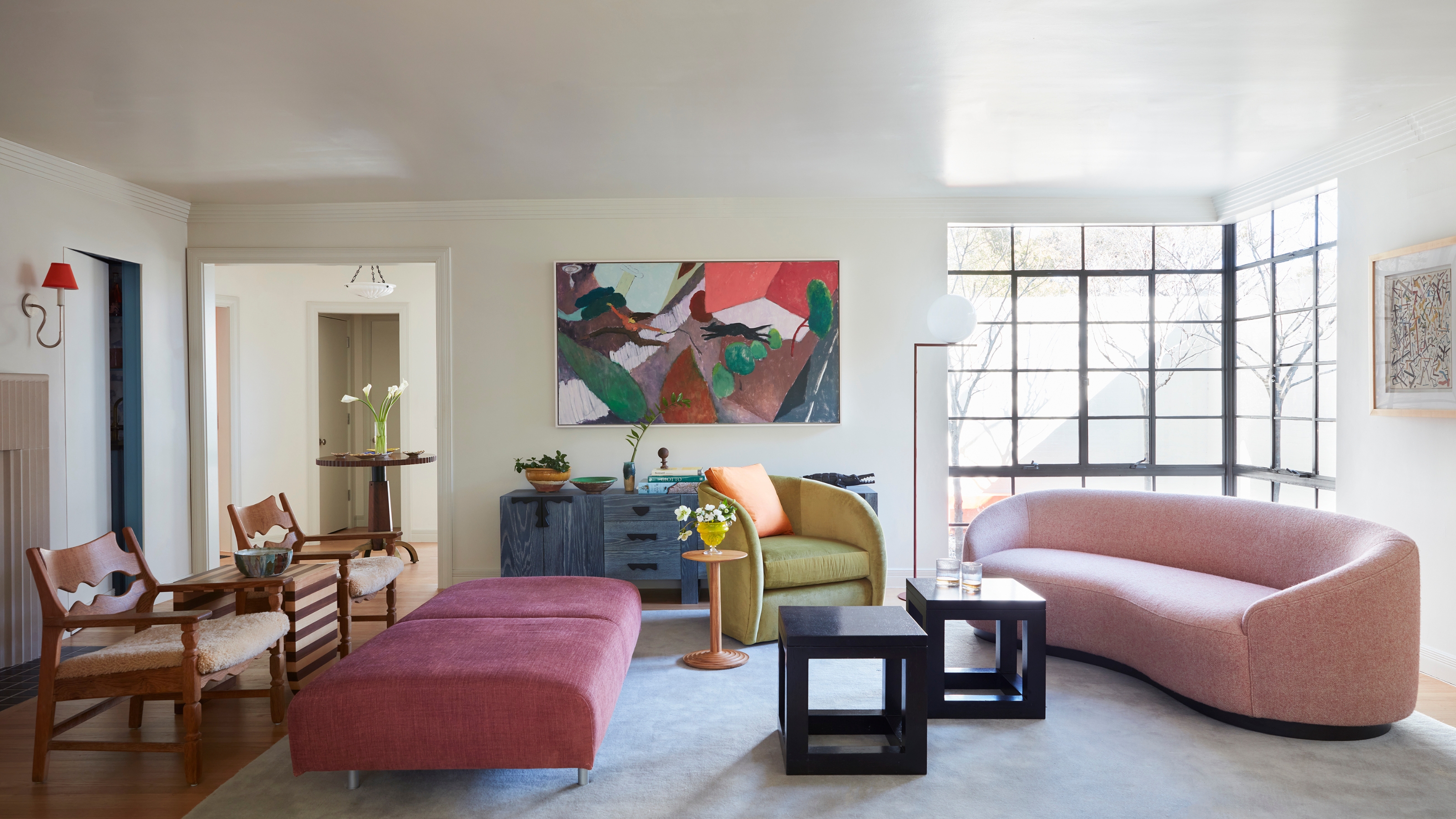
5. Lean into Indigo's Violet Tones

The sofa in this living acts as a fun pop of color and leans into the purple hue of indigo.
Here's where it starts to get hard to explain what color indigo is. But the benefit of an in-between shade is that you have room to play. For a more relaxing take, lean into indigo's more violet hues, like in this living room suite shown above.
Shirley Meisels, a Canadian interior designer and founder of MHouse Inc, says, "Whether it’s in pillows, upholstered chairs, or as a bold feature wall, it instantly elevates the space. I love using metallics and earthy tones together with deep hues like indigo — the perfect balance between luxe and laid-back."
Against a minimalist living room, an indigo-colored sofa or accent chair will become a stand-out piece in the room.
6. Lean Into Indigo's Blue Tones

This room leans into indigo's bright side as the light makes the blue pop on the walls.
On the other hand, you can also opt to lean into indigo's blue side. The bright and bold color of the dining room above demonstrates how big of a part lighting can play in how this color appears.
French interior designer, Capucine de Cointet, says, "Every object and every work of art was enhanced by this indigo blue. At night, the color absorbs light, creating an effect of mystery and elegance." The shadows make the deep alluring purple tones stand out, while direct light causes the color to look more cobalt blue.
Capucine adds, "To enhance the space, artificial lighting should be directed towards furniture, paintings, and objects, to highlight volumes and reliefs." Although intense, this color transmits its luminosity to everything around it, and will make the room feel playful rather than overwhelming.
FAQs
What Colors Pair Well With Indigo?
As a saturated shade, indigo is a color that goes with white, black, and neutral shades. "A pure or strong off-white and a deep black work well as neutrals to anchor indigo," says Lauren.
"Other hues on the color wheel that complement indigo nicely are vivid reds, fuchsias, hot pinks, oranges, and yellows," adds Lauren. These colors are all in the complementary color range of blue and purple, so will make for a harmonious contrast.
The key to combining colors like indigo is to always keep the chroma, or intensity, of the colors consistent. "The rule of thumb for novices is to mix pigmented colors (high chroma) with other pigmented colors, and to combine muted (low chroma) colors with others of equally low chroma," says Lauren. Whichever variation of indigo you choose to go with should try to follow this color theory.

-
 12 Essentials Every Cool, Collected Spring Host Needs — And You’ll Never Guess Where They’re From
Guests will think you thought of everything, you just knew where to shop
-
 Smeg Says Teal, and We’re Listening — The Kitchen Shade of the Year Is Here
Designers are already using the soft, sea-glass green everywhere from cabinetry to countertops


-
 5 Problems With Painting Your Walls White That No-One Ever Talks About (Until Now)
White is the easiest neutral to work with...right? Interior designers explain why this shade is actually more complex than it may seem
-
 5 Mistakes That Are Making the Blue Details in Your Room Feel Old-Fashioned — And How to Rectify Them
Blue is a timeless shade, no doubt, but use it in the wrong space or in the wrong way, and it can make a space feel, well... a bit blue
-
 5 of the Best Navy Blue Paint Colors That Designers Love — And How to Use Them
Navy blue has timeless appeal and can feel both modern yet classic, but what are the designers' favorite paints?
-
 Should Your Carpet Be A Darker Color Than Your Walls? How to Make This Bold Look Work
Not every room can get away with a carpet that is darker than the walls; Designers share when and where this combination works best
-
 What Actually Is Yves Klein Blue? A Short History of This Iconic Color, and How to Decorate With It
Explore “the most perfect expression of blue” and how to free this pigment in your home
-
 Do Pink and Green Go Together in Interiors? A Professional Color Consultant's Verdict
How to make pink and green color combinations work for more contemporary interior schemes
-
 The 'Grown-Up' Way to Decorate With Light Blue — This Shade Shouldn't Just "Be Resigned to the Baby's Room"
We explore how to bring the lighter intonations of blue into your home in a contemporary and thoughtful way
-
 How to Decorate With Farrow and Ball's 'Railings' — The Secret to Making This Classic Paint Color Work in Your Home
Not quite black, not quite blue, the beauty of this paint shade lies in a refined middle ground. But how should you use it in your rooms?


