

I've never been afraid of experimenting with color when it comes to interior design, but maybe my degree in fine art softened me to stark saturations. I will admit, though, that certain colors are more intimidating to incorporate than others. And at the top of that list is one bright and bold berry shade: magenta.
One of the reasons it is so hard to work with is that it's not completely obvious what color magenta is. Known for its vibrancy and proximity to hot pink, the shade encompasses a more complex variety of undertones. "It’s a vibrant reddish-purple that can range from playful and daring to deeper, more sophisticated tones that frame a space beautifully and add a strong personality," says Maye Ruiz, founding partner and creative director of MAYE — an interior design and architectural studio based across Mexico and the United States.
But before you discount this difficult paint color idea — and not forgetting that Pantone even named it its Color of the Year back in 2023 (though their shade, called 'Viva Magenta', leaned much more reddish than pink) — I asked color experts and interior designers for their thoughts on the shade and, as it turns out, a bit of bravery can really pay off. Here's what they said.
Magenta: Explained
In terms of color theory, magenta sits on the wheel somewhere between red and blue. "Magenta is a color from the red-purple color family that appears as a purple-ish hot pink," explains Amy Krane, a New York-based architectural color consultant at Amy Krane Color.
But to the eye, magenta can come across as much more intricate and sophisticated. "When I think of magenta, I think of boldness — a color many find intimidating," adds interior designer Maye Ruiz. "It’s also complex; it’s not quite purple, pink, red, or violet… it exists somewhere in between."
It can also be defined as an energetic color that is warm in nature despite having faint undertones of typically cooler colors like blue and purple. This contrasting mix of bold saturation and moody shadows gives magenta its alluring depth. Think of juicy raspberries, tropical flowers, and bright purple-pink radishes.
Shades that fit this category range from lighter to darker variations, but a true middle-ground magenta can be see in the swatch from Little Greene, below.

Price: £5.50/sample
How Can I Style Magenta?
Magenta in home design is certainly a bold choice that's guaranteed to shake things up. "It brings a lot of personality — it’s impossible to go unnoticed," says Maye. "It also adds depth, energy, and, most importantly, drama. Whether used in a more saturated, vibrant hue or in a deeper shade leaning towards burgundy, it makes a statement."
So, now we know what color magenta is, how should you style it in your home? Here's what designer's recommend.
1. Add Subtle Pops of Magenta for a Playful Twist

Magenta-colored furniture is a fun and non-committal way to embrace this color.
When working with such a bold color, sometimes the best way to dip your feet in is by incorporating accent pieces and décor. "Because it is quite intense, it’s best used in small doses," says Amy.
"For our Casa Coa project (shown above), we used a very dark magenta, almost burgundy throughout the home, to frame the project," explains Maye. "It was the final touch that brought cohesion to the different color palettes, perfectly bridging the pinks and greens, yellows, and oranges."
The magenta-stained table and dining chairs, while bold on their own, feel harmonious with the room's overall bright color scheme. Magenta's bold hue also actually helps make other colors pop, too, especially when it's paired with colors that go with pink, like green, and other analogous colors such as orange and red.
2. Color-Drench Your Space in Magenta

Color-drenching works best when done with a bright and bold color like magenta.
While a moment of magenta here and there is the stylish and safe route, nothing embraces the bold personality of the shade quite like a color-drenched room. 'Go big or go home', as they say.
However, the key to getting it right is to maintain balance in your interior design. The monochrome décor in the home office shown above is evenly arranged throughout the room, giving the eye a number of soothing places to land, ensuring the magenta feels less overwhelming.
Emily Kantz, a color marketing manager at paint brand Sherwin Williams, says, "When paired with the right color combination, minimalist furniture, and funky wall art, the color magenta creates a beautiful and unique space."
3. Create Movement with Magenta-Infused Patterns

Magenta has an inherent playfulness to it, so embrace that.
Pattern-drenching is another unique way to embrace magenta, and can create elevated moments of whimsy. Perhaps a creative backsplash or a pink bathroom idea covered in magenta checker-board tiles?
"I recommend adding it to an accent wall in a space where homeowners want to exude energy for their guests, like a kitchen, dining room, or half-bath," says Sherwin-Williams' Emily.
"I’ve used a magenta shade on a powder room ceiling with patterned wallpaper on four walls which was plum and pink," adds Amy Krane. "Because it was in a windowless room and painted on a plane not receiving any direct light, the color was more tame."
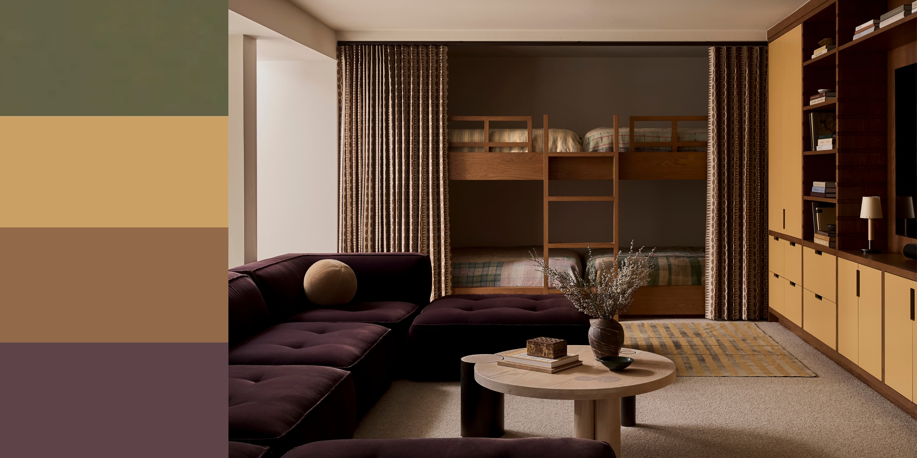
4. Balance the Bold with Natural Hues in the Bedroom

A bedroom can still be a place for color, it's just about how you layer it.
There is no need to shy away from magenta if you are someone who typically embraces a more minimalist bedroom style — magenta can be quite an enriching accent that is surprisingly calming when paired with earth tones.
For example, olive green paint has a warm undertone that brings out the soothing warmth of magenta. Pair this color combination with natural materials, like a rattan headboard or wooden bedside table, and you will have a visually stunning sleep sanctuary.
FAQs
What Colors Go With Magenta?
The most important aspect of decorating with magenta is knowing what colors to pair with it. Color expert Amy Krane recommends sticking to colors that will enrich magenta without competing for the spotlight.
Charcoal gray, taupe, and olive green are a few ideal colors to get you started. "They help to balance out the boldness of magenta's saturation," she explains. "Since magenta leans into a deeper shade that can easily morph into red tones, like burgundy and maroon, any neutral with a green undertone will be your friend."
"It also pairs well with a classic black and white color combination, providing that instant pop of visual interest," adds Emily.

Magenta can form a surprisingly relaxing backdrop in a home if you know how to complement it.
Magenta is a color that embraces joy and exudes personality in a home. Not to mention, it falls perfectly in line with today's interior design trends — a little bit retro, a little unexpected, and absolutely fun.
Though intimidating at first, once you have a better understanding of what color magenta, you'll realize why it's a designer favorite.

-
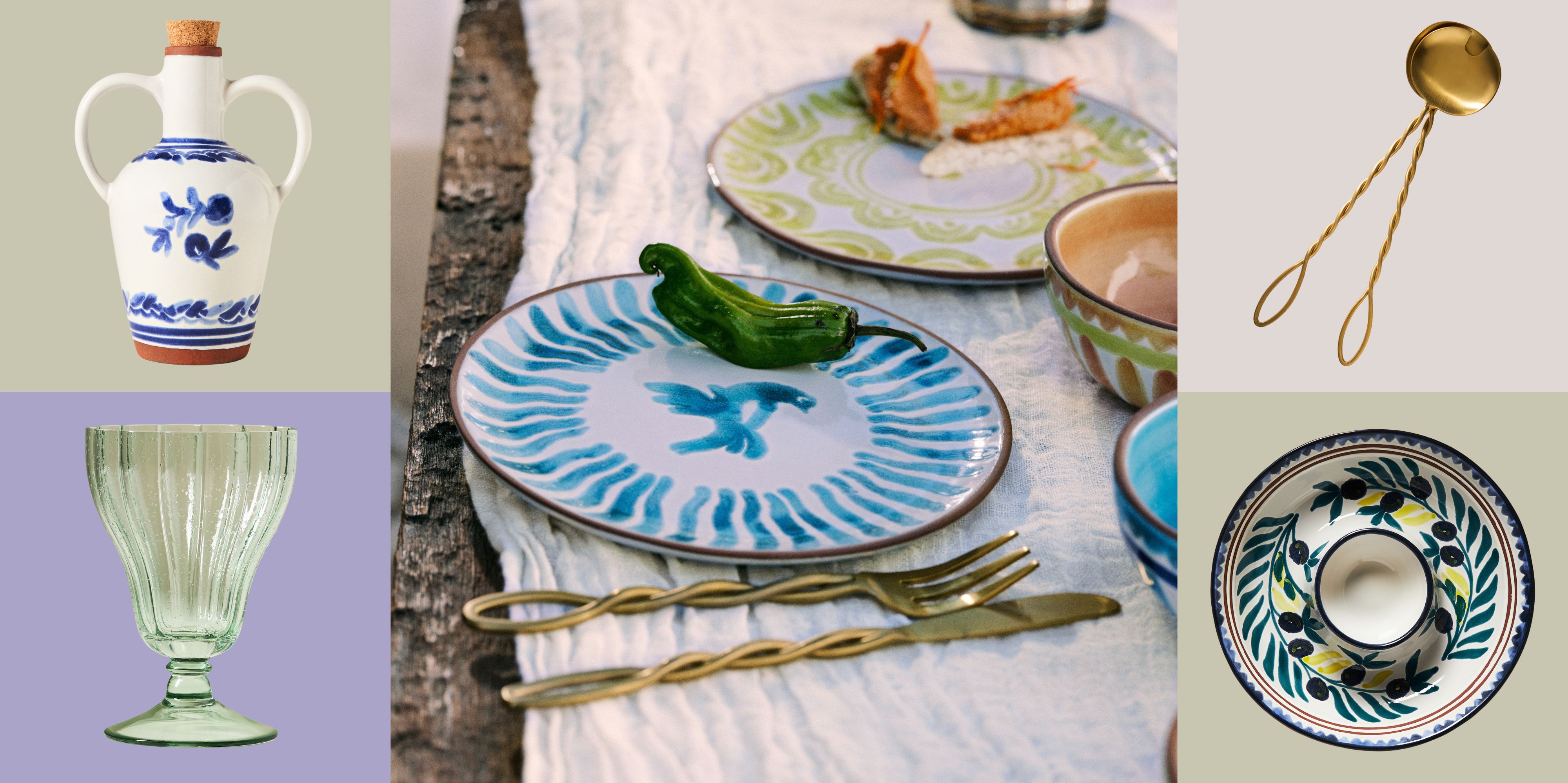 Tableware for Talkative People — The Mediterranean Dish’s Anthropologie Collab Was Made for Socializing
Mediterranean in both style and spirit, the joyful, pattern-forward collection brings the color, craft, and conviviality of Suzy Karadsheh’s cult-favorite brand to the spring table
-
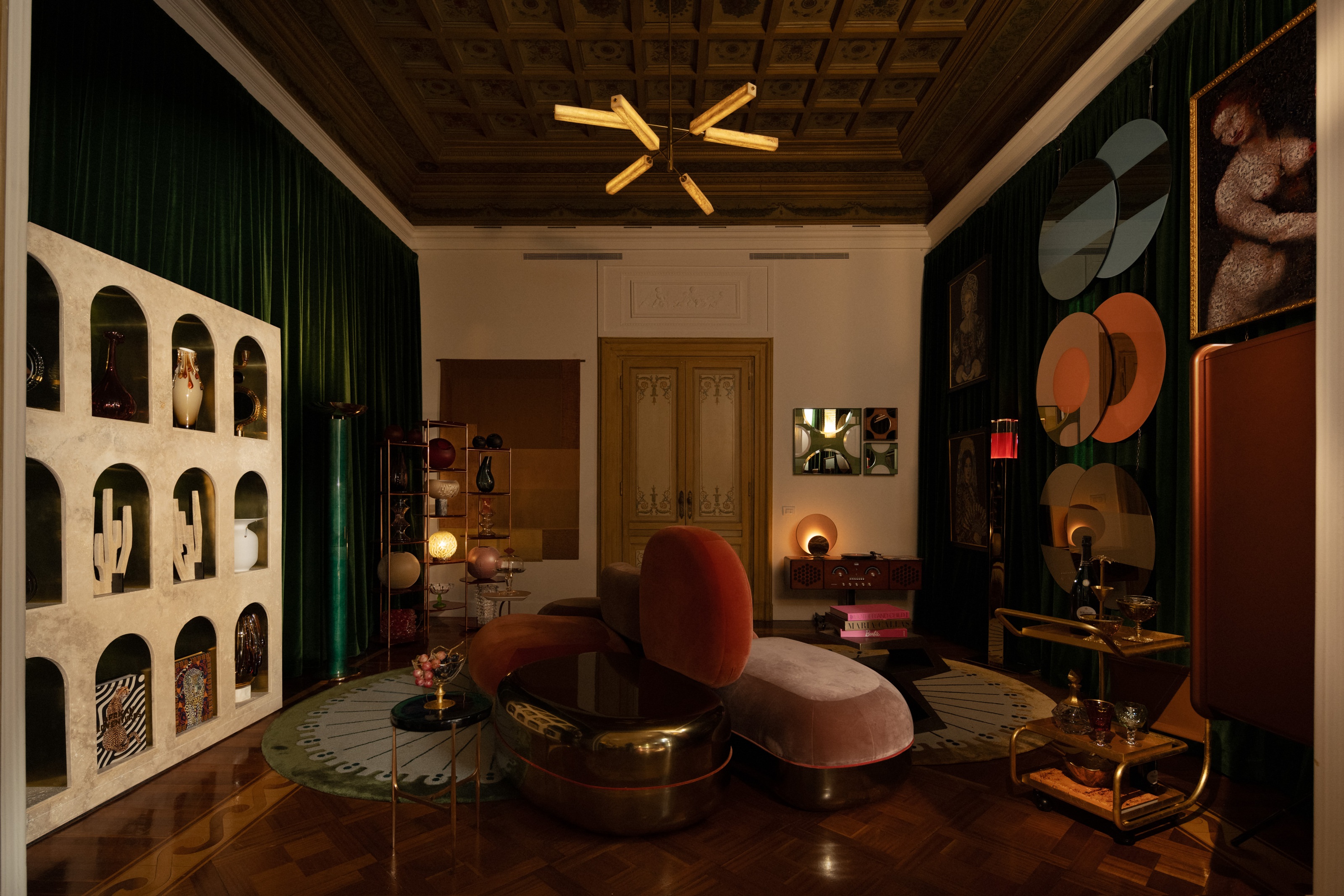 7 Ideas to Steal From Milan Design Week's 'Apartments' — Rooms Decorated by the World's Best, and Most Creative, Designers
At Milan Design Week, some of the most exciting showcases of design are delivered in beautifully decorated apartments, conceived to push the boundaries of design today


-
 The 'Red Table Trick' Is the Easiest and Most Expensive-Looking Trend to Hit 2025 So Far
A red dining table makes a seriously stylish statement; the beloved pop of red trend just got an bold and expensive-looking upgrade
-
 5 Mistakes That Are Making the Blue Details in Your Room Feel Old-Fashioned — And How to Rectify Them
Blue is a timeless shade, no doubt, but use it in the wrong space or in the wrong way, and it can make a space feel, well... a bit blue
-
 Everyone's Going Crazy for This One New Shade From Farrow & Ball Online — So What's the Big Deal With 'Scallop'?
It's a classic beige, but with a hint of blush — and it's the shade we're expecting to see in every minimalist's home this year
-
 5 of the Best Navy Blue Paint Colors That Designers Love — And How to Use Them
Navy blue has timeless appeal and can feel both modern yet classic, but what are the designers' favorite paints?
-
 4 Bathroom Colors That Are Going Out of Style in 2025 — Don't Say We Didn't Warn You
If you're redecorating your bathroom this year, our design experts suggest you avoid these outdated colors
-
 Should Your Carpet Be A Darker Color Than Your Walls? How to Make This Bold Look Work
Not every room can get away with a carpet that is darker than the walls; Designers share when and where this combination works best
-
 70s Color Palettes That Work for 2025 — 4 Designer-Approved Color 'Recipes' That Feel Modern Enough for Homes Today
It's time to bring out your paisley print and disco shoes — the golden yellows, olive greens, and deep purples of 70s color palettes are making a comeback
-
 "It's Akin to a Shot of Caffeine" — 4 Ways You Should Be Decorating With Cobalt Blue to Wake Your Home Up
Experts reveal everything you need to know to decorate with this powerful shade in the home


