

When I think of the color slate, I think of the sleek stone, one that's a little rough around the edges, and perfect for adding a cool, moody edge to an interior. But there are so many other ways to introduce this in-between color than through the stone finish. In fact, slate can be an exceptionally elegant shade to use in a space. But you might be asking yourself: what color is slate, exactly? And it's a good question.
"Slate is a sophisticated, muted tone that sits between gray and blue," explains Emily Kantz, a NCIDQ-certified designer and color marketing manager at Sherwin Williams. "It can have a cool and calming effect, and can vary in intensity from light and soft to deep and dramatic."
Though you may wince at the idea of decorating with gray (yes, the 'millennial gray' phase from the 2010s still haunts many of us), slate's deep blue undertones give this paint color a bit more complexity than what might originally meet the eye. It turns out, the color slate is far from the boring gray we all fear, and actually, it can make for an elegant and luxurious accent in interiors.
Below, we've answered the question around what color is slate, and provided some interesting ways to include it in your interiors.
Slate: Explained
Lauren Battistini, a color expert and founder of LFB Color, explains that, "Slate is a color that many experts define in several nuanced ways, but uniformly, we can categorize it as a mid-tone gray with a hefty dose of blue. There are various tones of slate found in nature, some even with a hint of green or purple."
The most widely understood definition of slate is a mid to deep-toned blue-gray. In interiors, you can use variations of slate to meet different moods and aesthetics. Slate can be a lighter pigment with a calming effect, or you can pick a shade that leans more blue than true gray for a bit of drama and playfulness.
Whichever iteration of slate draws your eye, Shirley Meisels, a Canadian interior designer and founder of MHouse Inc, says, "Slate is the perfect blend of cool and sophisticated — moody, versatile, and just a touch edgy."
"Its earthiness is reminiscent of weathered stone or stormy skies and provides the ideal foundation for bold, layered palettes," adds Shirley. "This color can shift with light, appearing deep and dramatic in shadows, then soft and refined in sunlight, creating a dynamic feel in any room."

Price: £5.50 per sample
A classic slate gray that makes a dark, moody backdrop for your decorating scheme.
How Can I Style Slate?
When it comes to colors that go with gray in this slate tone, the perfect complements are warmer colors like burnt orange and terracotta, balancing them with its cool blue undertones. But Lauren Battistini warns to be careful with how you use it in your home, adding: "With the global shift in neutrals from the cooler grays of years past to the cognacs, soft browns, and overall warm neutrals today, I believe that slate as a gray décor color is going to be used more sparingly, especially because it is such a cool, blue-gray."
So how should you use the color slate in your home? Below, designers share their tips and tricks.
1. Dramatically Drench Your Walls in Dark Slate

Avoid using a color like slate for a feature wall, and drench the room in it instead.
Slate gray as a living room paint color can be an elegant and easy way to experiment with the shade. And while color-drenching a room may feel overwhelming, as a backdrop, the color slate will anchor a space and allow for complementary colors to really pop against it.
"I appreciate the historical connection that slate has with traditional design styles," adds Emily Kantz from Sherwin Williams. "These slate tones pair beautifully with creamy whites and warm neutrals, enhancing the richness of deeper wood tones commonly found in traditional designs."
2. Incorporate Slate Flooring

You can't get much more slate colored than slate flooring, after all.
"The color slate comes from the natural stone by the same name," explains Amy Krane, a color architect and founder of Amy Krane Color. Not only is it a timeless flooring material, but including the finish is a natural and easy way to incorporate the color into your home.
Not to mention the rough stone will add subtle texture to the room it is in. A mudroom or entry would be ideal for a slate floor, as it's quite hard-wearing, and from there you can mix in other textures through furniture and décor.
"Linen upholstery and leathers add warmth and sophistication," recommends Shirley. "To finish the look, choose a bold patterned rug in muted colors — think subtle geometric shapes that can add interest without overpowering the space. Any time I use slate in a space, the final look is cool, edgy, and effortlessly timeless."
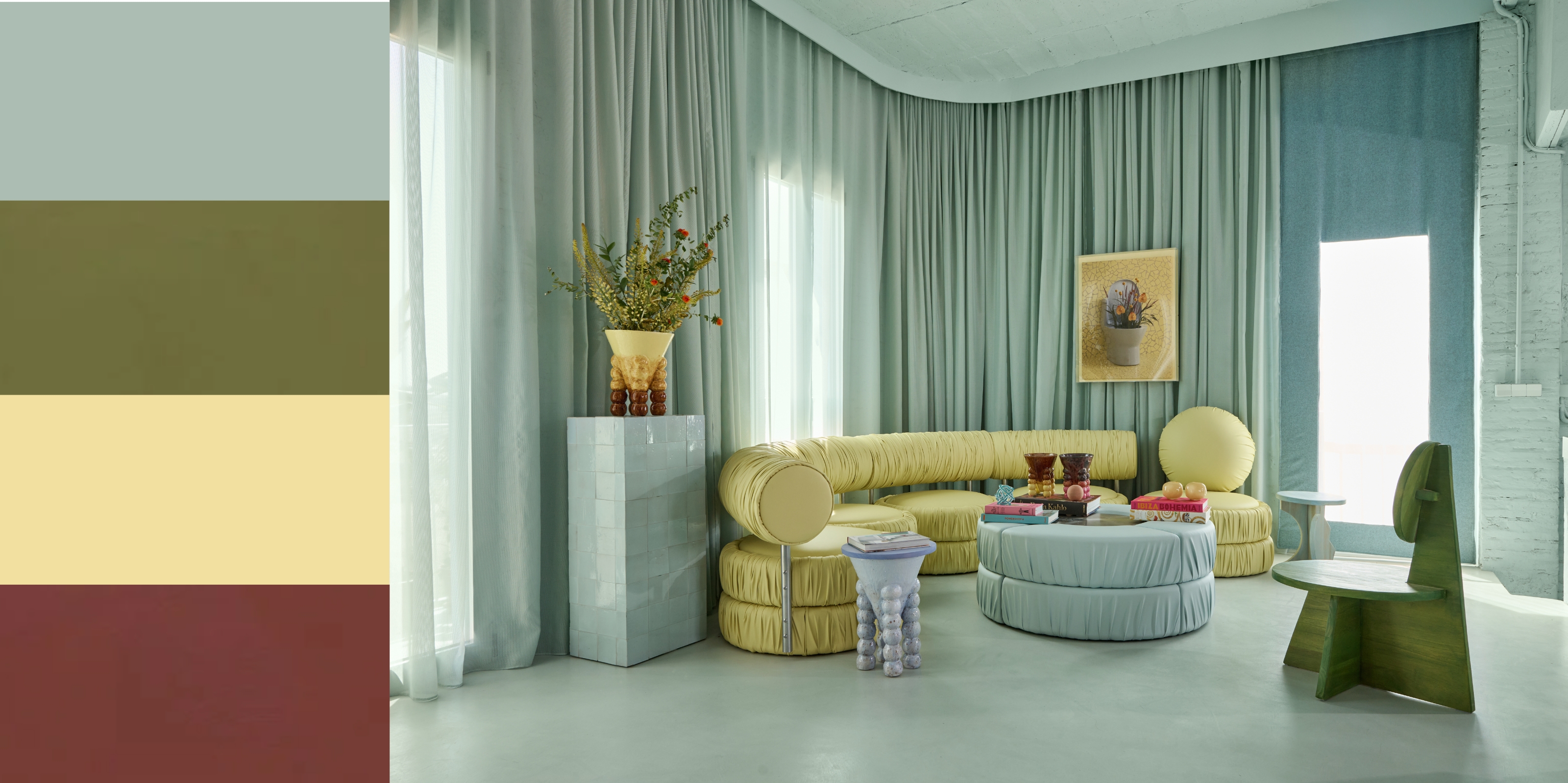
3. Slip Slate Accents Throughout a Room

Let the eye follow the chic blue-gray shade by dotting it around a space.
Slate gray tones are a great cozy living room idea, especially when styled alongside a fireplace. "The cool, sophisticated hues of slate can create a cozy yet elegant atmosphere, making the space feel inviting and refined," says Emily.
In the living room shown above, a serene slate color with a more blue undertone is dotted throughout the space. The matching sofa, fireplace, and door on the back wall create visual balance throughout the room, that is warmed by the other natural colors and materials.
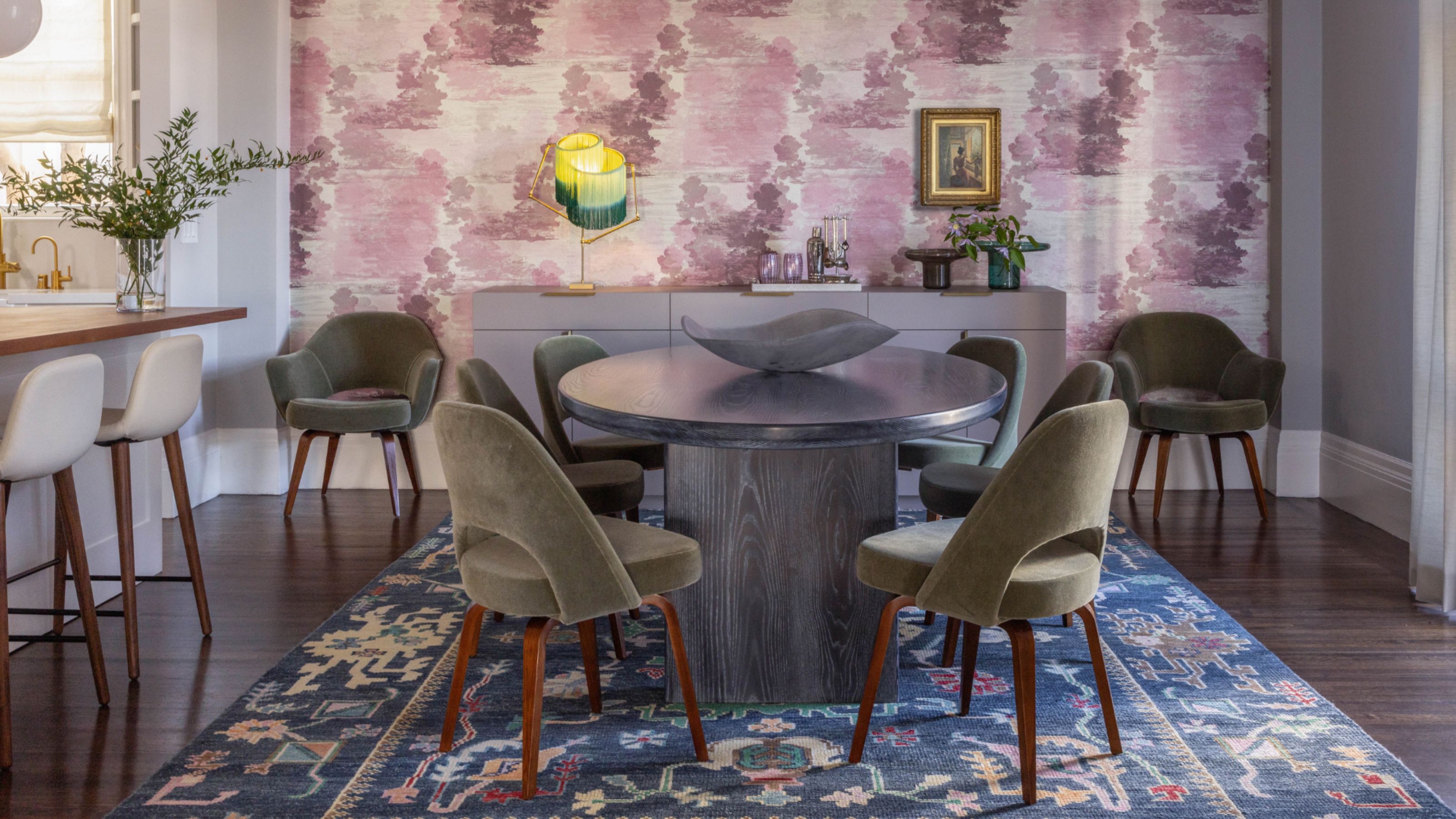
4. Warm Slate Up With Wood Tones

The blue undertone in the slate gray pantry pops from being paired with the warm wood walls of the kitchen.
"For a kitchen color idea or dining room, slate tones bring just the right amount of drama, especially when paired with warmer metals like brass or copper," says Emily. In this case, it is the warm, orange-toned wood that emphasizes the dramatic blue of the slate pantry color.
"Pair it with crisp whites for a sharp contrast, warm woods, and rusty colors for a rich look, and muted earth tones to ground the space in a modern, natural vibe," says Lauren.
FAQs
What Colors Go With Slate?
The blue undertone of slate will be the main component to pull from when finding the right colors to go with this shade. As a very neutral color, slate gray pairs with so many colors well. "Think of mustard yellow, burnt orange, or cornflower blue combinations, to name a few," says Amy Krane.
As for specific paint shades to go for, Amy recommends Benjamin Moore’s Ambler Slate and Charcoal Slate. All of which lean more true gray in their pigment, making them the perfect choice for pairing.
"We architectural color experts try to incorporate a balance of both cool and warm tones in most color schemes, so my suggestion is to meld slate with warm browns and creamy off-whites," adds Lauren.
Once you have a better understanding of the color, you will see how slate can offer a touch of sophistication and timelessness to any space.

-
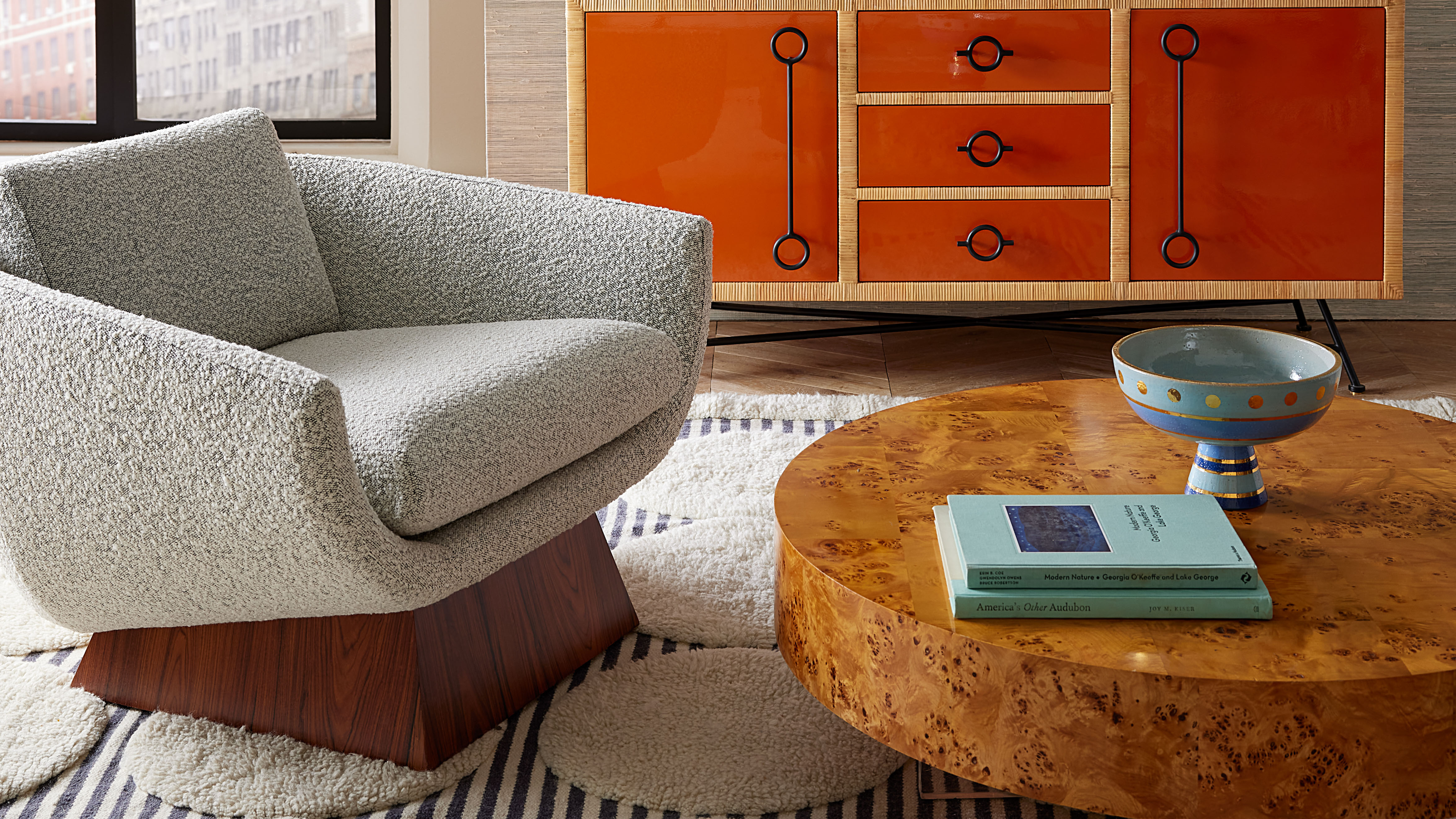 Burl Wood Decor Is 2025’s Most Coveted Comeback — Here’s How to Get the Storied Swirls for Less
Irregularity is the ultimate luxury, but you don’t need an antiques dealer to find it
-
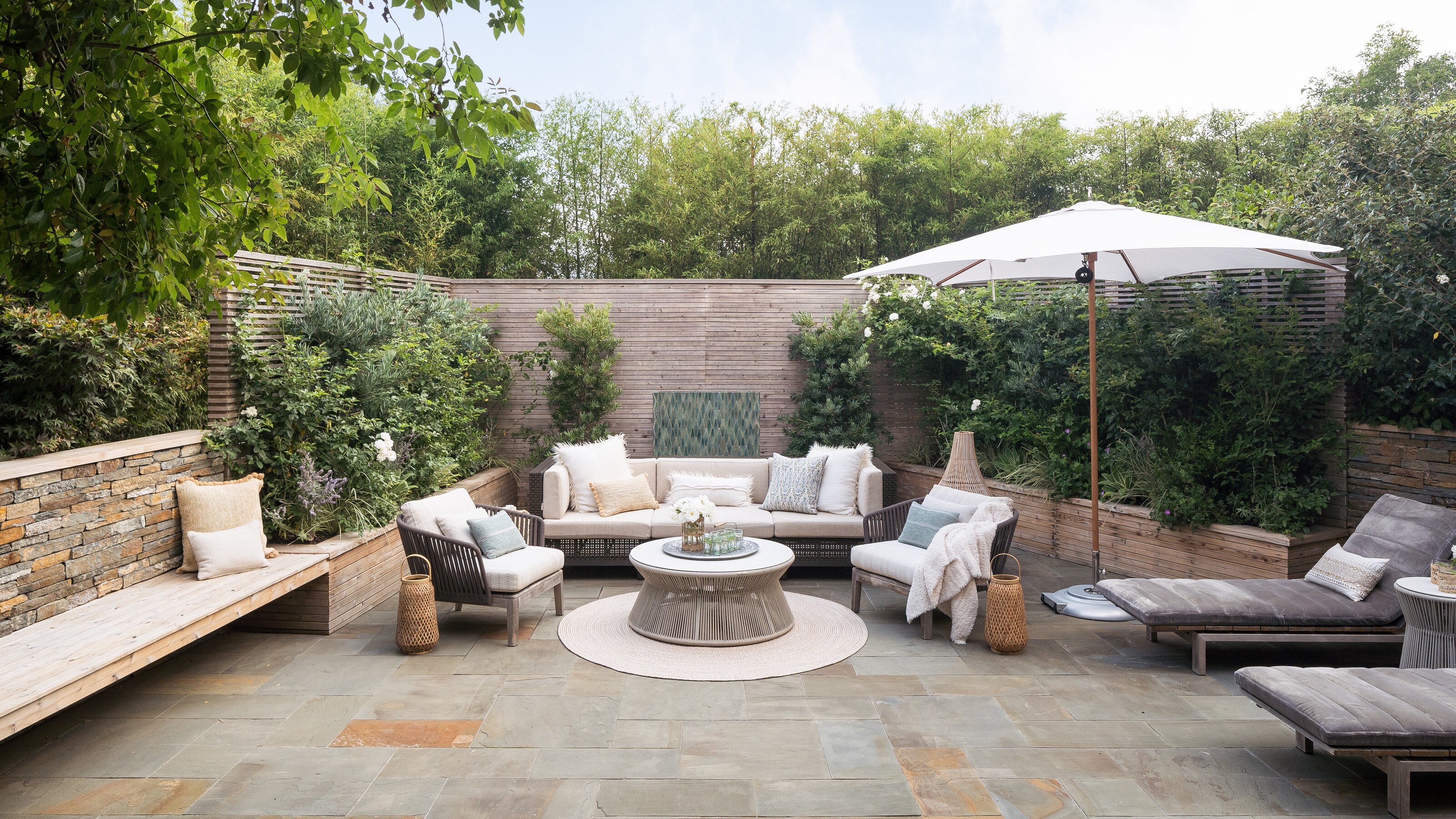 5 Garden Features That Instantly Add Value to Your Home — While Making Your Outdoor Space More Practical, too
Get to know all the expert tips and tricks for making your backyard a standout selling point for your home.


-
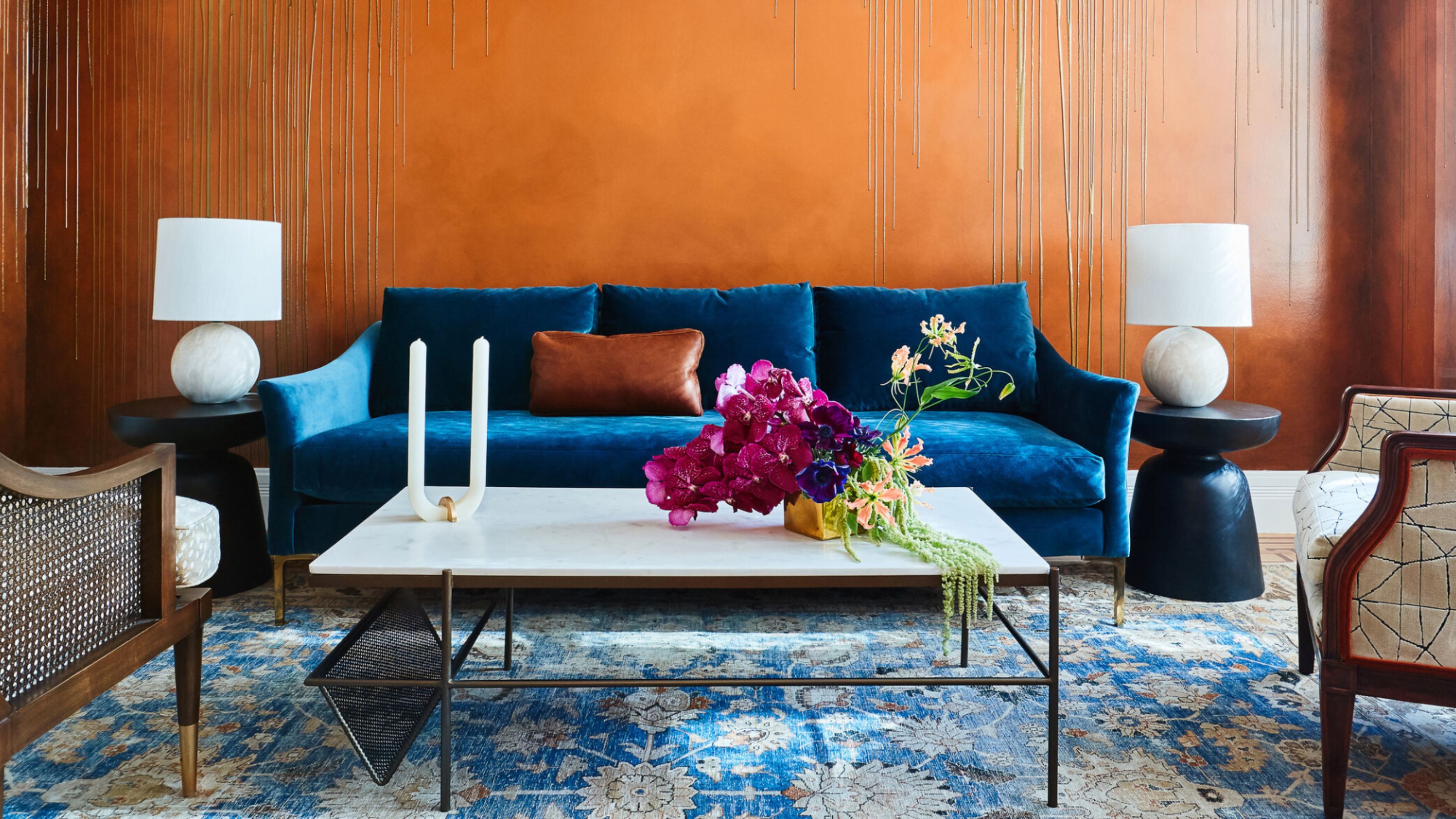 The Combination You Weren't Expecting to Love — 8 Blue And Orange Living Room Ideas That Feel Surprisingly Elevated
A blue and orange scheme for living rooms may sound jarring, but these spaces prove they're striking, vibrant, and certainly unforgettable
-
 Smeg Says Teal, and We’re Listening — The Kitchen Shade of the Year Is Here
Designers are already using the soft, sea-glass green everywhere from cabinetry to countertops
-
 Do Yellow and Purple Go Together? Designers Reveal How to Make This Unexpected Pairing Feel "Totally Intentional"
In an era where unexpected combinations have become cool, we've done a deep-dive to discover how to pair yellow and purple in a space
-
 5 Unexpected but Seriously Stylish Spring Color Palettes to Shake Up the Season — "It's Pastel, but Punchy"
Spring color palettes are notorious for their use of pretty pastels, but that doesn't mean they have to lack variation
-
 5 Problems With Painting Your Walls White That No-One Ever Talks About (Until Now)
White is the easiest neutral to work with...right? Interior designers explain why this shade is actually more complex than it may seem
-
 The 'Red Table Trick' Is the Easiest and Most Expensive-Looking Trend to Hit 2025 So Far
A red dining table makes a seriously stylish statement; the beloved pop of red trend just got an bold and expensive-looking upgrade
-
 5 Mistakes That Are Making the Blue Details in Your Room Feel Old-Fashioned — And How to Rectify Them
Blue is a timeless shade, no doubt, but use it in the wrong space or in the wrong way, and it can make a space feel, well... a bit blue
-
 Everyone's Going Crazy for This One New Shade From Farrow & Ball Online — So What's the Big Deal With 'Scallop'?
It's a classic beige, but with a hint of blush — and it's the shade we're expecting to see in every minimalist's home this year


