What color should you paint an archway between rooms? Our experts finally solve this decor dilemma
When you've got an archway between two rooms, what color should you paint it? We ask designers to get an answer to this question once and for all
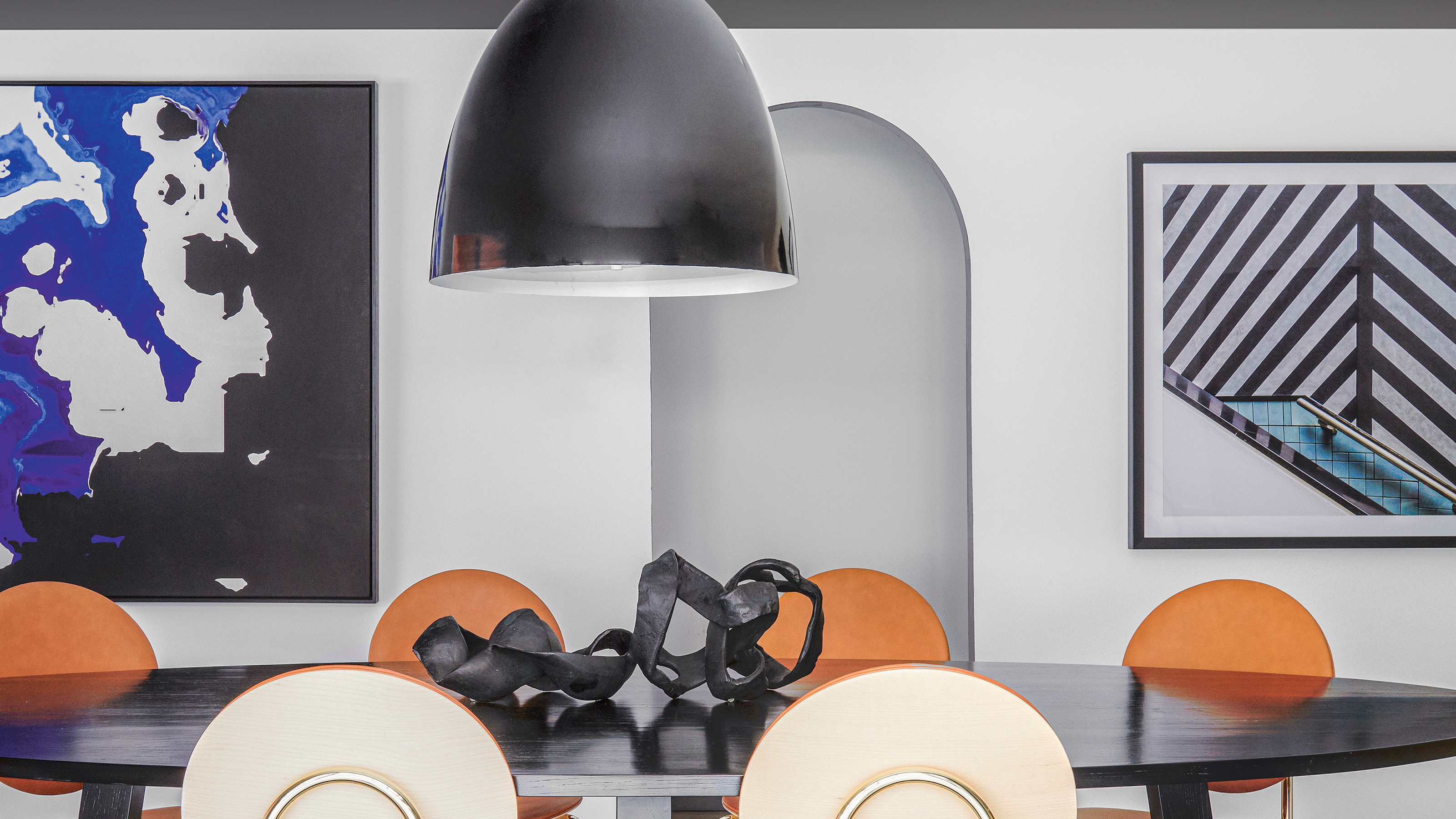

Whether you've built an archway into a renovation or new house, or it's an inherited architectural feature of your home, there's always one big question - what color should I paint it?
In some instances, the answer is clear, yet sometimes it can be tricky decision to make, especially when an archway marks a clear shift in the interiors of adjoining rooms. 'After all, an archway or threshold is the perfect point to change direction in your color and materials scheme,' says interior designer Nicholas Kaiko.
To find a solution, once and for all, to this answer, we've asked some interior designers for how they approach paint ideas for an archway. However, this advice also applies to any transitional spaces between rooms, whether they're arched or not, meaning it's a good piece of advice to have in your back-pocket when it comes to decorating your home.
What color should you paint an archway?
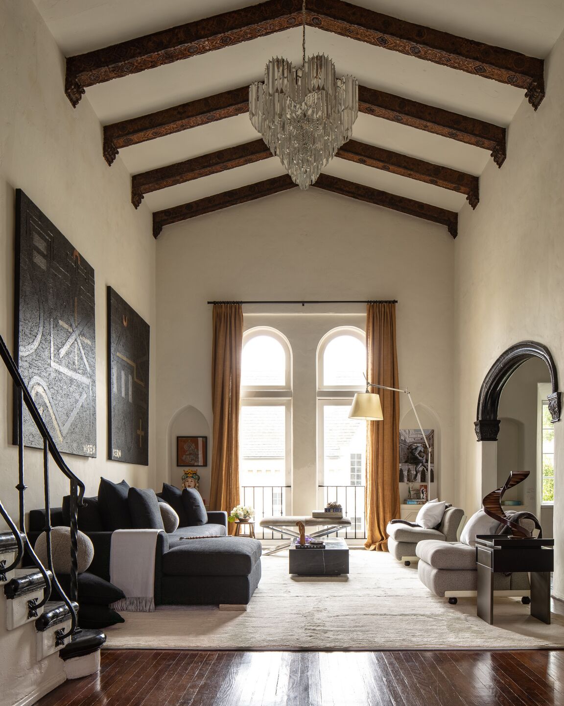
The answer to this question depends on how you feel about the archway. 'When an arch or a series of arches are redundant or a repetitive house standard, I like them to disappear,' says interior designer Davide Casaroli. In a home where you've painted all rooms the same color, for example, keeping the arches the same color allows their form to subtly inform the design of the space, rather than drawing attention to themselves.
However, sometimes you want an arch to make a statement. 'When and where we want a different experience I like to add color and create a moment,' Davide tells us. 'It’s a nice way to frame the room using a contrast between the wall and the arch. The color itself is not just a feature, it’s more than that. It becomes a perimeter, or a gate, to the design in the room.'
What about an archway between rooms painted two different colors?
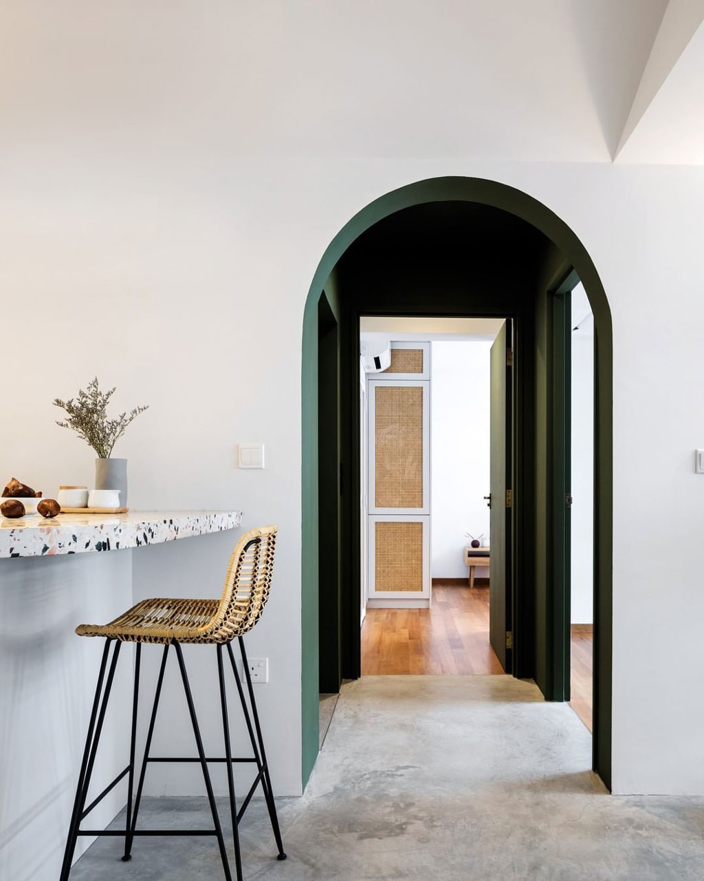
Sometimes, you might choose to paint adjacent rooms separated by an archway different colors. In that instance, what color would you paint the archway reveal to help the different rooms run together? 'Personally, I would chose a color that can work for both palettes,' says Davide Casaroli. 'As a designer I like to chose different colors that work together to begin with - especially, in a open space without doors.'
If you'd prefer to extend one of the colors you're using onto the reveal, consider which viewpoint is going to be seen more regularly, and how the archway interacts with the rest of the architecture. It's always better to create a natural break for paint at a corner if possible. This apartment hallway, for example, has walls that align with one side of the archway, making it an easy choice to paint in this deep green.
What contrast color should I choose?
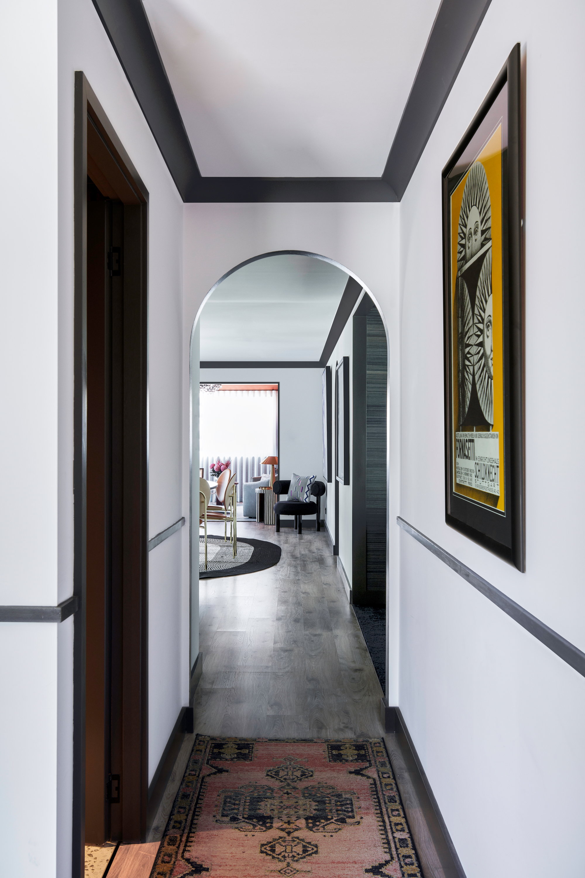
'Paint is the easiest way to create this break from one color in a room to the next, but don’t over complicate it,' says interior designer Nicholas Kaiko of Kaiko Designs. 'White, black, and grey are perfect to provide relief.'
'Be consistent,' he suggests. 'If your skirtings, door trims and architraves are white, keep your archway white and likewise if they are grey.'
Davide Casaroli agrees. 'Black and white together are extremely sophisticated and harmonious. The contrast they achieve is beautiful and it works well with many different design decision. Black and white work well with beiges with greys, with greens, with pinks, with brass, with silver.' Truly a choice that can work for any color scheme.
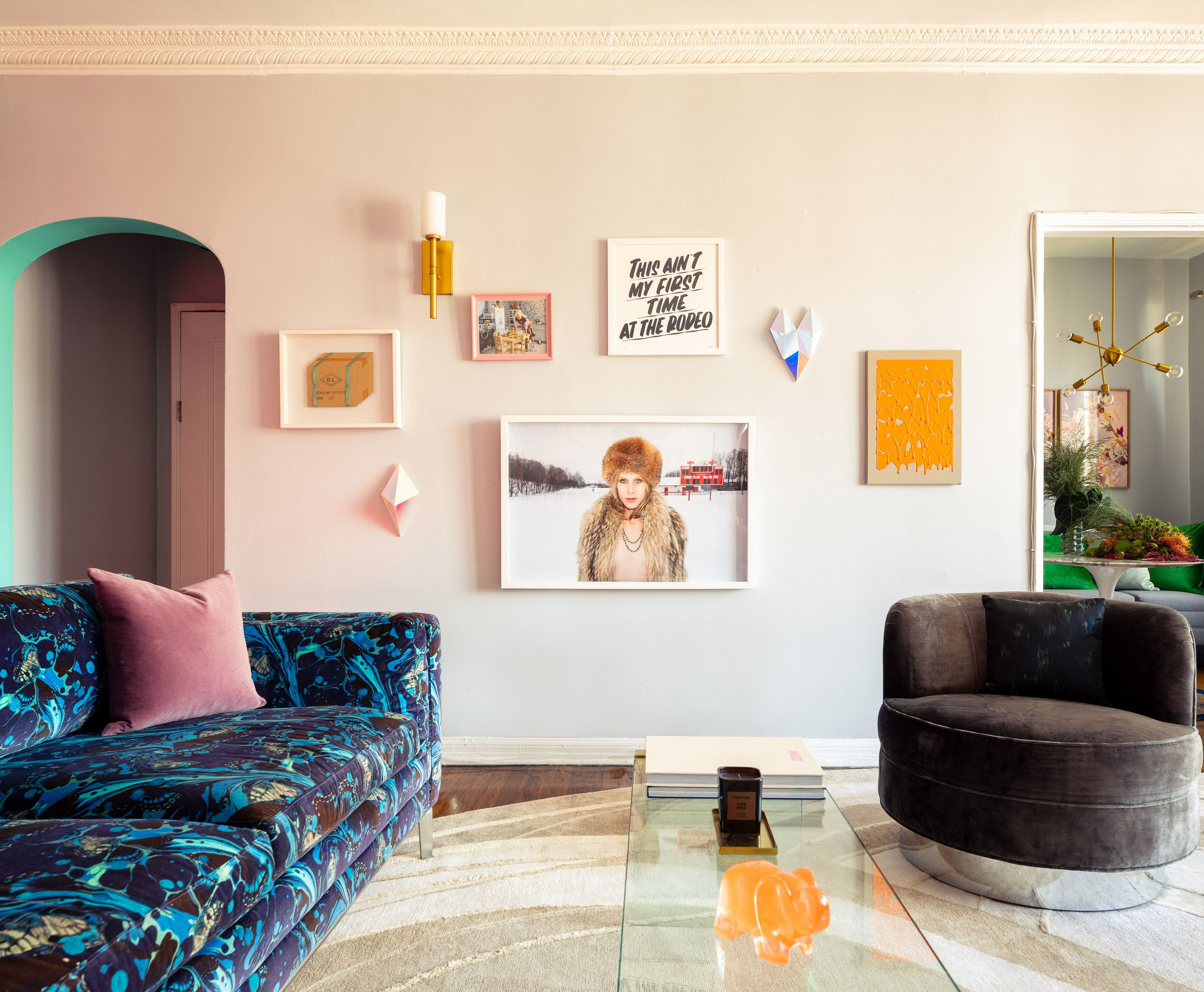
Yet, an archway does provide a canvas to do something more creative with color, too. For those looking to be bolder in their design, why not use an archway reveal to introduce a statement paint shade.
In this colorful living room designed by Davide, a bright turquoise brings some levity to the archway to the dark apartment entryway. 'The aquamarine arch was a way for me to frame in the small 1928 entry, giving it its own moment,' he explains. 'The colorful arch works in our favor, it starts a cadence since the moment you walk in. When you're in the living room, you see the arch as a feature and it helps connecting the architecture to the furniture, especially the Mathew Williamson on the sofa.'
Be The First To Know
The Livingetc newsletters are your inside source for what’s shaping interiors now - and what’s next. Discover trend forecasts, smart style ideas, and curated shopping inspiration that brings design to life. Subscribe today and stay ahead of the curve.

Luke Arthur Wells is a freelance design writer, award-winning interiors blogger and stylist, known for neutral, textural spaces with a luxury twist. He's worked with some of the UK's top design brands, counting the likes of Tom Dixon Studio as regular collaborators and his work has been featured in print and online in publications ranging from Domino Magazine to The Sunday Times. He's a hands-on type of interiors expert too, contributing practical renovation advice and DIY tutorials to a number of magazines, as well as to his own readers and followers via his blog and social media. He might currently be renovating a small Victorian house in England, but he dreams of light, spacious, neutral homes on the West Coast.
-
 5 Things You Should Never Buy From a Thrift Store, According to People Who Know About Antiques
It may look like treasure, but it may also just be trash. Here is how to know what to avoid while thrifting, and what to look for instead
By Olivia Wolfe Published
-
 7 Pantry Organization Mistakes That Are an Organizer's Worst Nightmare
Get that Pinterest-perfect pantry by avoiding these certified organization faux pas
By Amiya Baratan Published