What is an analogous color scheme? Designers on how to create this cohesive palette
Discover what an analogous color scheme is and how to use it in your own home in a modern way
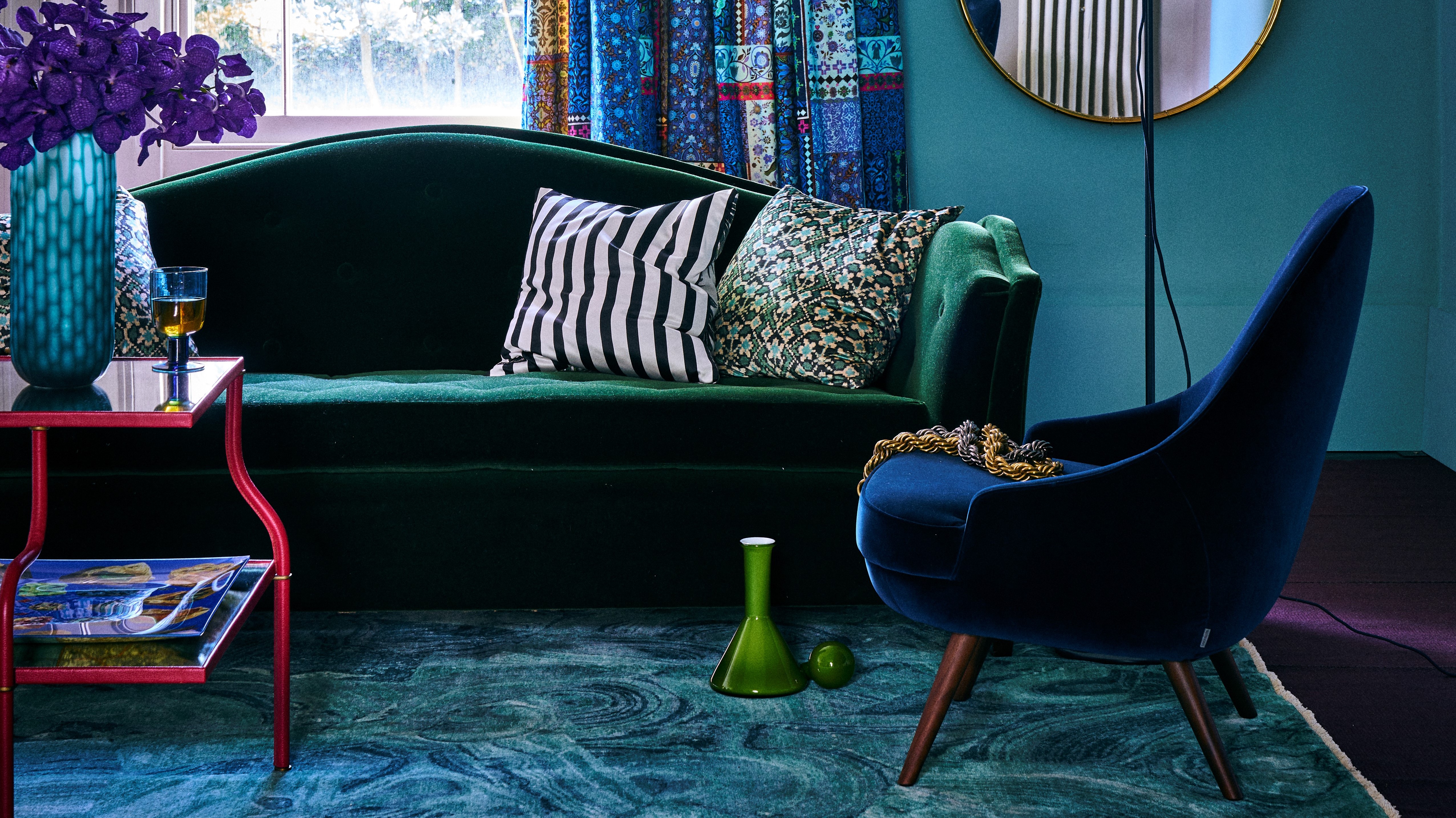

An analogous color scheme is a way of curating a palette that stems directly from color theory. It is a way of using the wheel to group colors together based on their positioning on the wheel.
It can be a useful tool to adopt when planning the colors to put together in your home, helpful in figuring out what colors work with each other, and can really help create a monochromatic or cocooning feel or give a real sense of vibrancy to a space. 'Analogous color schemes sound intimidatingly technical, however, they are simple,' says YesColours co-founder and creative director, Emma Bestley.
'When looking for an elevated feeling, an analogous color story is a sure-fire way to create a luxury look,' adds Tracee Murphy, CEO and principal designer at Trade Mark Interiors. But how exactly do you use color theory to create an analogous palette?
As content editor on Livingetc, Oonagh has written extensively on the topic of color theory, exploring interior design decorating rules related to color, and interviewing interior designers along the way, finding out how and why a certain color can evoke a certain mood and what color brings to a room.
What is an analogous color scheme?
An analogous color scheme involves three hues that are positioned next to each other on the color wheel. Different to a monochromatic color scheme, the approach is typically composed of one dominant color - like a primary or secondary color, often called the 'mother' color, then a supporting color which is a secondary or tertiary color, and a third color that is a mix of the two first or an accent in a similar tone.
'An analogous color scheme is all about taking colors which are together on the color wheel,' explains Emma of YesColours. 'You just take a small slice out of the wheel, usually about 3-4 colors. Think of it as color 'neighbors', such as reds, oranges and yellows, or blues violets and purples.'
The impact of using aesthetically similar colors is a harmonious scheme where color helps to visually tie a room together. 'The benefit of using this type of color story is the way it makes us feel, which is calm and composed,' adds Tracee from Trade Mark Interiors.
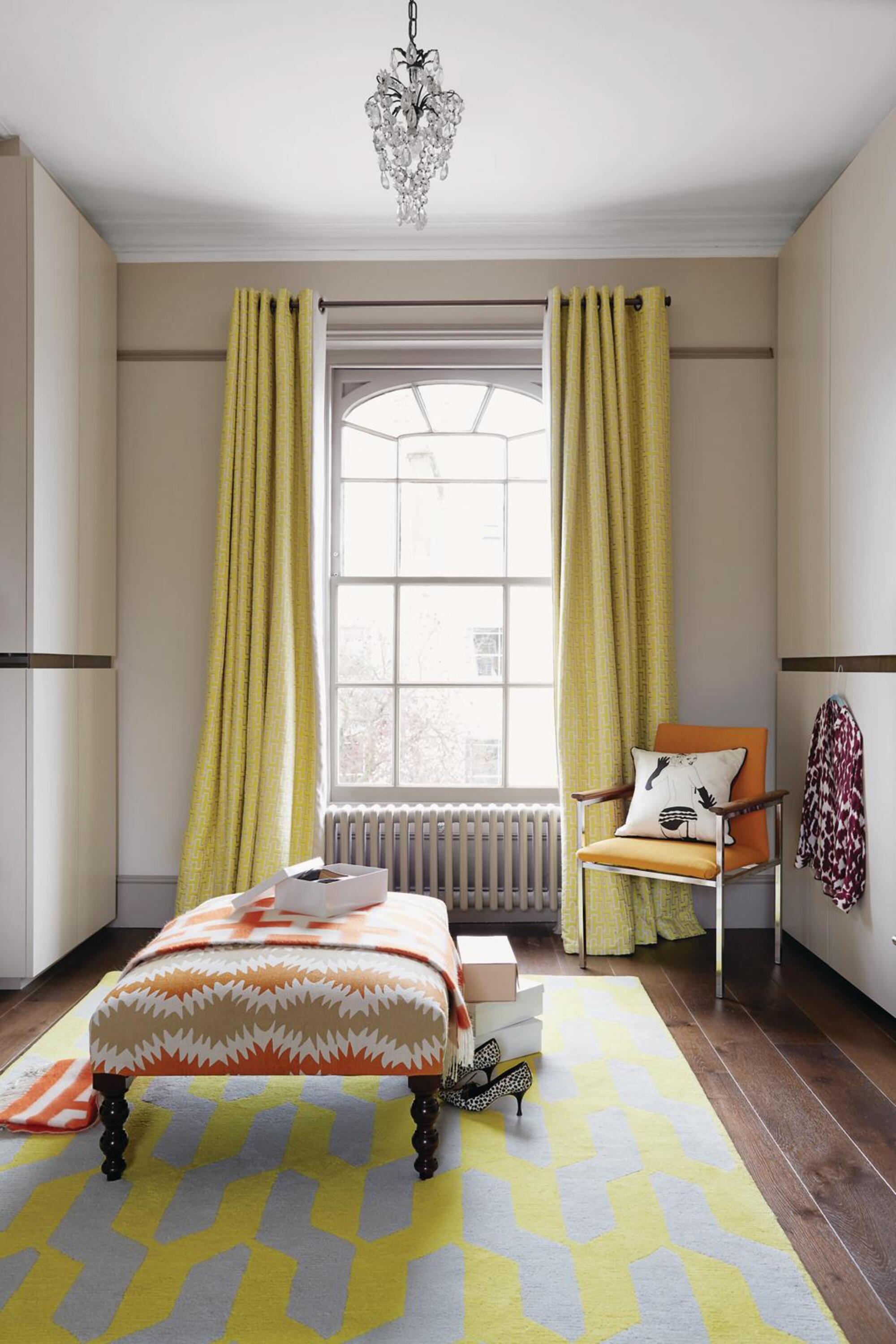
The color psychology behind this theory is that an analogous story often relates to how we see things in nature, like the variation in color of plants, terrain, water, and flowers. Studies have shown being in nature has a soothing and revitalizing feeling on the body, so it's about replicating this in the home.
'In the natural world, you just have to look at a sunset and enjoy the red seeping into the orange and yellow peachy hues,' says Emma from YesColours. 'Or, a peacock with its incredible indigo, teal and green feathers. It’s naturally pleasing to the eye.'
How can I use an analogous color scheme?
So how do you adopt an analogous color scheme in our own home? Think about using soft furnishings and textiles to create your analogous mood. 'This analogous way of decorating is best suited to a room where you wish to layer multiple textures and accessories,' says Emma.
Emma also advises being mindful of proportions and dimensions. 'If you're looking for guidance, the 60-30-10 rule is a great rule of thumb to help ensure balance.' This rule dictates that when you're dividing up color, 60 percent of the scheme should be one color, 30 percent should be a second color, and 10 percent should be a third accent color.
'Think about using the main color - or 60 percent of the space - on the walls or large furniture. 30 percent will be your accent features like rugs, bedding, chairs, and 10 percent is the art, accessories and cushions.'
Where in the house to use an analogous color scheme
An analogous colour scheme can work well in both small and large-scale rooms. 'In a large room, the colour scheme can accentuate the space, projecting coordination and interior flair,' says Ian Cameron, creative director at Cameron Design House. 'Whilst in smaller rooms an analogous colour scheme can prove creativity and adds visual interest to the space.'
Cool color groupings
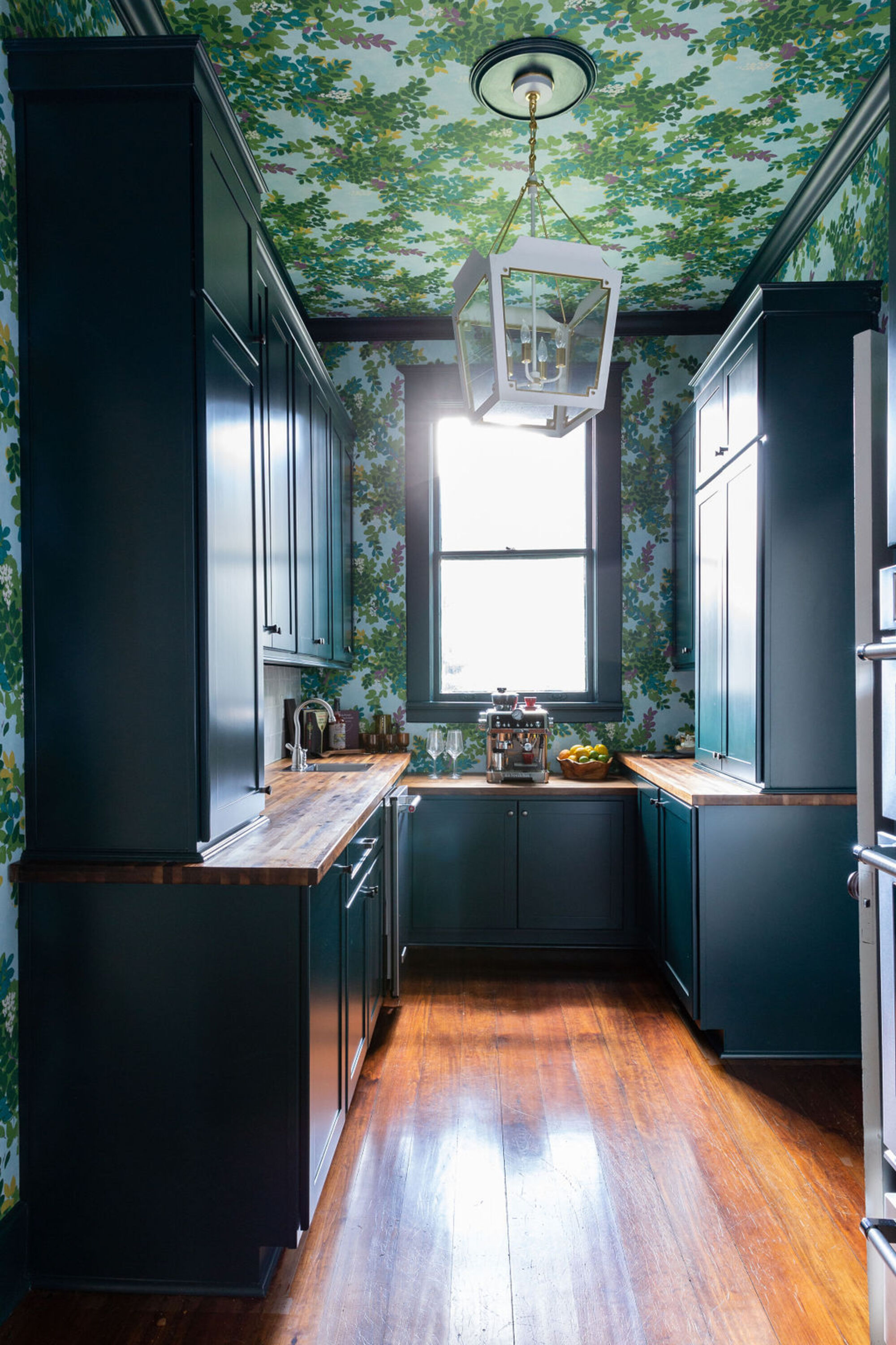
One main analogous color grouping that is often seen in interior design is the use of blues, greens, purples and teal shades - cool colors that sit on the cooler side of the color spectrum.
'Naturally, people tend to associate stereotypically cooler tones to be more relaxing (think of green rooms), and warmer tones to feel more energetic,' explains Cigal Kaplan of the eponymous interior design studio. 'This is the same reason why some fast food establishments paint their rooms in warm colours - they want people in and out in a short amount of time. Blues and greens also remind us of nature, which is particularly popular at the moment - we only need to look at the current trend of biophilia to show this.
'In addition, warmer colours, while being inspiring and exciting, are often associated with danger - again, in the natural world the most dangerous animals and plants are often brightly coloured. For this reason, we'd recommend putting cooler tones in your home if you'd like to go with an analogous scheme.'
This example is from Maggie Clarke Interiors. ' I love using analogous color schemes,' says Maggie. 'I love using deeper, moodier hues in an analogous color scheme such as violet, indigo, and teal. These colors work well in a bar or butler's pantry because they set the mood for relaxing and having fun. Carrying the color to the ceiling can enhance that vibe even more.
Warm color groupings
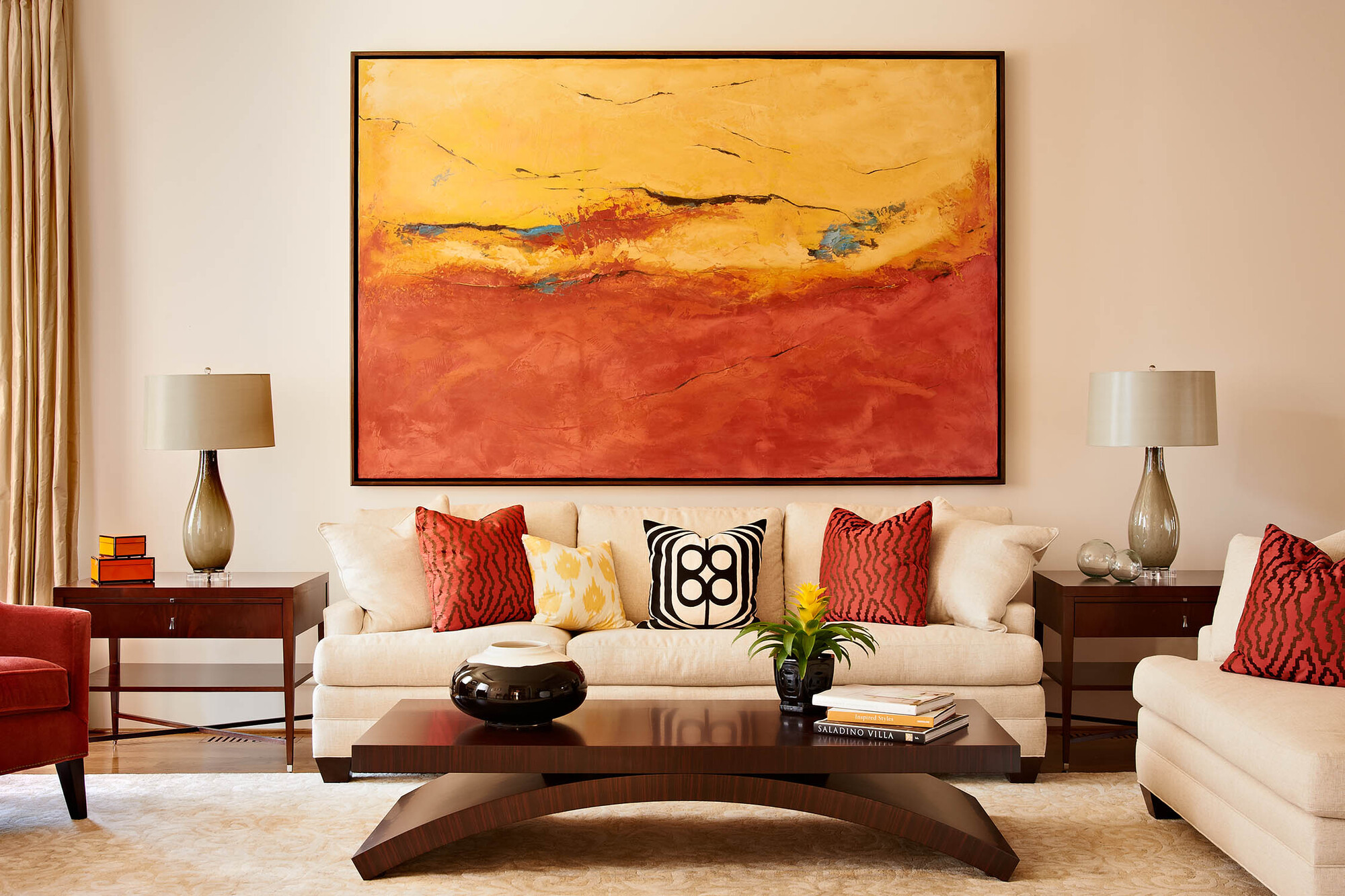
In this example of an analogous color scheme, interior design studio, Design Lines Signature has used reds, yellows and oranges to create an analogous living room. The use of color is heavily influenced by sunsets and found in nature, giving the room a warm color scheme and coziness.
'While using both yellow and orange together in a room may not be the most obvious color palette choice - the fact that these two warm and rich colors sit next together on the color wheel means they’re an almost fool-proof combo,' explains Judy Pickett of Design Lines Signature.
'The trick is to ensure both colors are similar in tonality - here you see richer versions of these colors paired together, which creates a sense of cohesion. We love to play with color in our projects where we can and using analogous colors is a wonderful way to create visual harmony in a space.'
What is the difference between monochromatic and analogous color schemes?
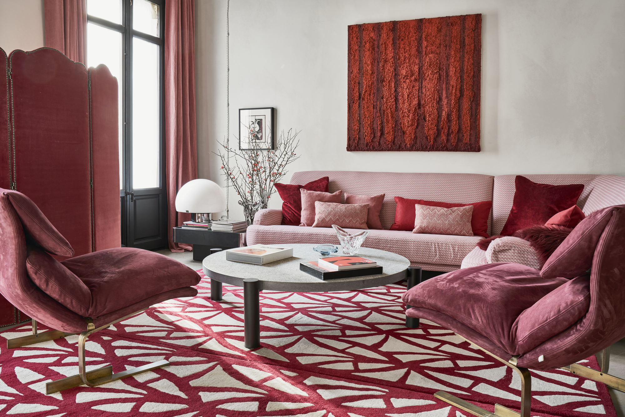
Where an analogous color scheme is a group of three colors that are next to each other on the color wheel, a monochromatic color scheme is comprised of tints and shades of the same color. In this example from Jaime Beriestain, the monochromatic look comes from the different tones of red - pinks, burgundies, cherry reds and a pop of deep red - all different tones of the primary color red.
Be The First To Know
The Livingetc newsletters are your inside source for what’s shaping interiors now - and what’s next. Discover trend forecasts, smart style ideas, and curated shopping inspiration that brings design to life. Subscribe today and stay ahead of the curve.

Former content editor at Livingetc.com, Oonagh is an expert at spotting the interior trends that are making waves in the design world. She has written a mix of everything from home tours to news, long-form features to design idea pieces, as well as having frequently been featured in the monthly print magazine. She is the go-to for design advice in the home. Previously, she worked on a London property title, producing long-read interiors features, style pages and conducting interviews with a range of famous faces from the UK interiors scene, from Kit Kemp to Robert Kime. In doing so, she has developed a keen interest in London's historical architecture and the city's distinct tastemakers paving the way in the world of interiors.
-
 Silver Linings — The Best Chrome Tableware Might Be Hiding on Wayfair
Once reserved for legacy names and high-concept galleries, the silver revival is finally accessible — here’s where to find the good stuff
By Julia Demer Published
-
 How Much Does an Extension Cost in 2025? Renovation and Design Experts Break Down Your Budget
Explore how much different types of extensions cost in 2025 to budget for your project accurately
By Amy Reeves Published