What even is a dado rail? How to use this often overlooked wall decor to elevate any home
Dado rails so often get disregarded over other types of molding, but we think they hold the power to elevating your interiors
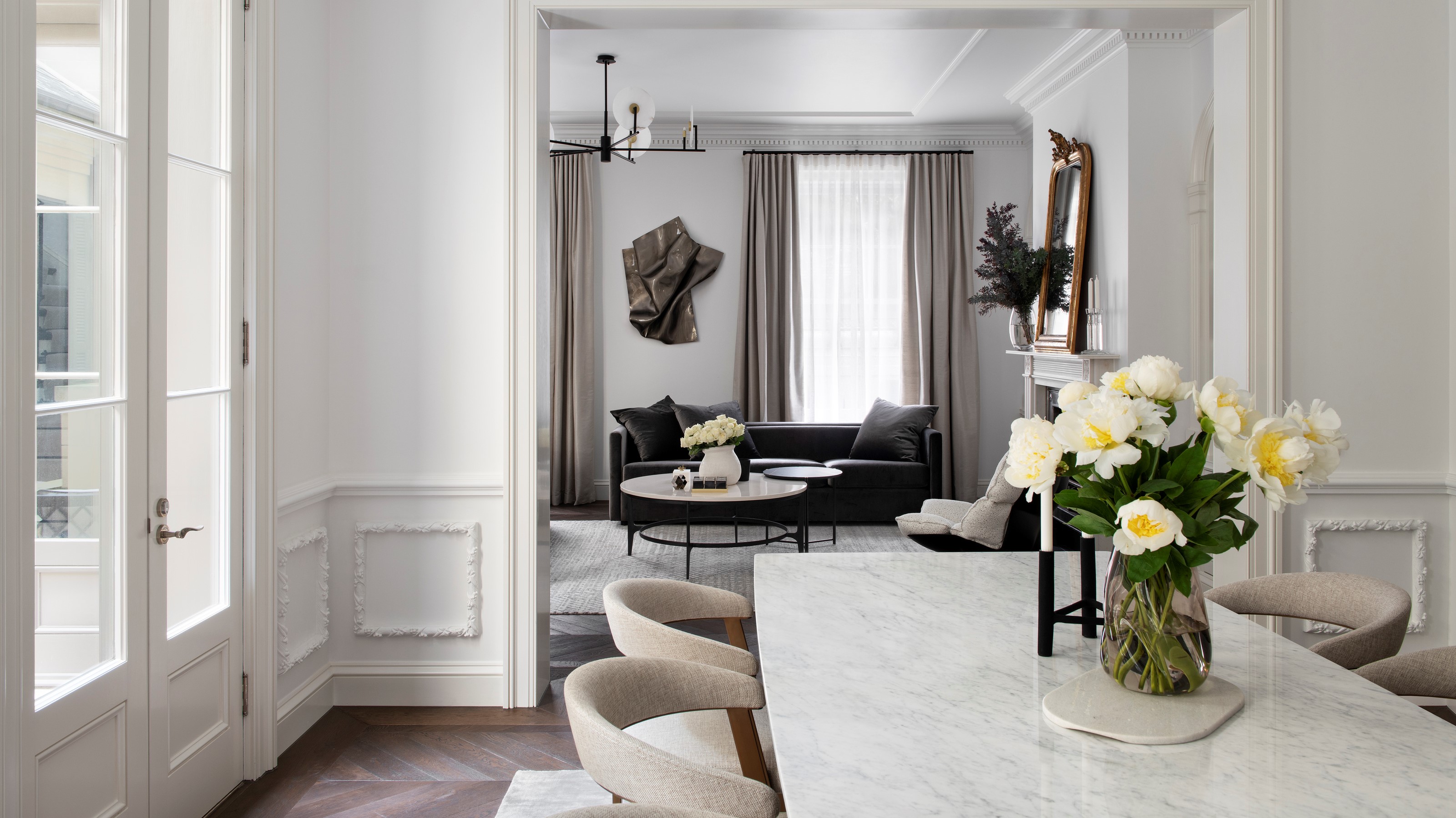

Dado rails – the horizontal molding spanning the lower part of a wall – are an architectural detail that can easily go unnoticed. But these oft-unloved features come with a host of design benefits that are there to be embraced.
They create a welcoming first impression, add texture to the space without sacrificing precious square footage, divide walls to give you the freedom to get creative with wall paint, and provide a canvas to experiment with color. They have a historical feel and elegance to them, but you can find dado rails even in modern interior design, and more and more contemporary homes are having them fitted as a tasteful feature to add character.
There’s more to these subtle decorative moldings than meets the eye – here’s why dado rails have serious aesthetic potential.
What even is a dado rail?
The historical significance of the dado rail means they are typical of period homes, originally used to cover and protect the lower part of the wall from scuffs and marks. Their use has filtered down over the course of architectural history, meaning you’re likely to spot them not just in period properties, but in modern homes as well, as homeowners look to give their contemporary build a bit of character. In terms of the main rooms they're found in, you'll find a dado rail in your entryway, stairway or reception room.
‘Dado rails are a classical architecture feature and were originally incorporated into interior schemes to protect walls and their surface treatments from being damaged by furniture as it used to be common practice in formal, high-status rooms to place furniture against the walls when it wasn't in use,’ says global interior designer, Naomi Astley Clarke.
‘Nowadays, dado rails are principally used as decoration, and I find that they are a good way to add proportion to a room and that they can be a clever mechanism to break up large wall spaces.’
They are different to typical wall paneling too, and shouldn't be confused with wall molding. ‘You quite often see the two together, as a dado rail can act as the finishing touch as a top list of the panel. However, you can choose to use dado rails only, creating a more minimal expression.’ says interior architect at Danish design brand, ferm Living, Lisbeth Raulund Breinhild.
How high should they be?
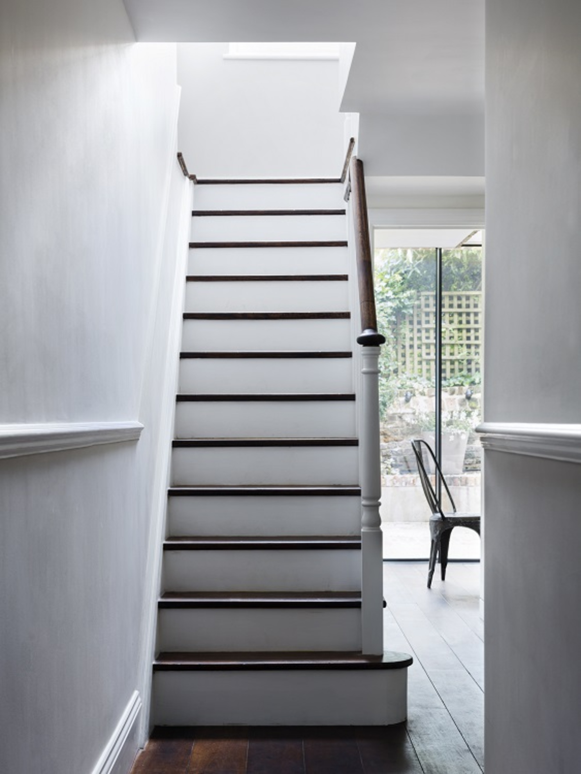
Originally, the height of the dado rail was derived from the measurements of a classical column – about one-fifth of the height of the room. As the proportions of our homes have changed, today this works out to be around a third of the way up a wall.
Anywhere between 900mm and 1100mm is a good basis for measurement. Naomi recommends looking at the height of the furniture in the room for inspiration.
‘The point at which your living room sofa brushes the wall should determine the height of the rail,’ says Naomi. But don’t ignore the importance of the ceiling height – it’s all about proportion.
Stairs are another question altogether. ‘You want to pay particular attention when adding in dado rails to the stairs of a period property as the skirting board might run at a curve, so getting the angle of the dado rail to align consistently can be more tricky,’ advises Charu Gandhi, founder of architectural studio Elicyon.
‘We would ensure the angle aligns using a CAD drawing on a computer.’ Get it right, and your dado rail will sit so perfectly in proportion to your room that you won’t really notice it’s there.
How decorative should my dado rail be?
Your dado rails should also make sense in the broader context of the room. Dado rails can be more of the plain variety, or more ornate and floral, with decorative wall paneling underneath. ‘It's vital to harmonize their profiles with the other period features to avoid them still feeling out of place,’ says Uwe Schmidt-Hess, architect and designer at Patalab Architects.
‘For example, an ornate dado rail would be at odds in rooms without crown molding or taller more profiled skirting board.’
Proportions aside, dado rails have aesthetic appeal. More contemporary dado rails allow them to act as a small ledge – ‘Great for displaying decorative objects or paintings in an informal manner,’ says Uwe.
How to paint your dado rail
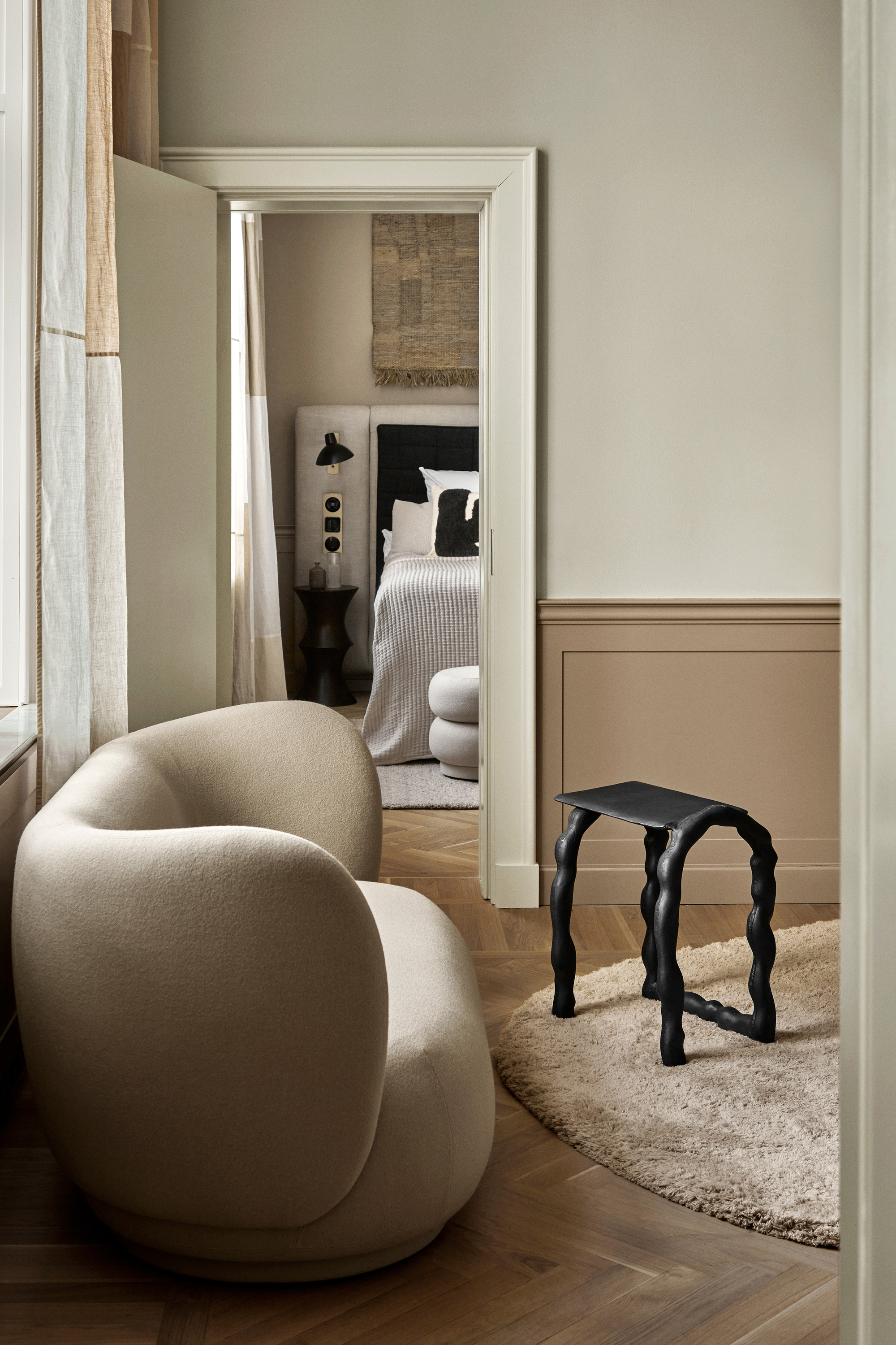
You might want to go for a subtle difference in wall paint color between above and below your dado rail. This can give a focus to the wall and stress the dado rail as a design element. Going darker under the dado rail with a lighter color above is usually the order to do it, hiding any scuffs and marks that might show up on the lower part of the wall.
Think off-white paired with light pink, two slightly tonally different shades of beige, or even different material, with shiplap paneling under the rail for added texture. You might want to go for a monochromatic color scheme too. ‘If you decorate walls, skirtings, dado rails, picture rails, and molding in the same color, you emphasize the texture of the wall further,’ says Uwe.
Think about painting the rail itself in a different finish. ‘At Elicyon, we like to finish the dado rail with the same color or tone as the wall but in a different finish to create contrast,’ says Charu. ‘For example, the top half of the wall can be decorated in a pale green color and the bottom half in a darker green, both in a matt paint; the dado rail can be in a shade of green but in a high gloss finish.’
Charu is also thinking of going one step further. ‘I’m keen to design a room where we wrap the wall and dado rail in a fabric finish,’ she says. ‘I have a vision of how that will look – but I’m waiting for the right room to do it in!’
Be The First To Know
The Livingetc newsletters are your inside source for what’s shaping interiors now - and what’s next. Discover trend forecasts, smart style ideas, and curated shopping inspiration that brings design to life. Subscribe today and stay ahead of the curve.

Former content editor at Livingetc.com, Oonagh is an expert at spotting the interior trends that are making waves in the design world. She has written a mix of everything from home tours to news, long-form features to design idea pieces, as well as having frequently been featured in the monthly print magazine. She is the go-to for design advice in the home. Previously, she worked on a London property title, producing long-read interiors features, style pages and conducting interviews with a range of famous faces from the UK interiors scene, from Kit Kemp to Robert Kime. In doing so, she has developed a keen interest in London's historical architecture and the city's distinct tastemakers paving the way in the world of interiors.
-
 Turns Out the Coolest New Café is Actually In Your Kitchen — Here's How to Steal the Style of TikTok's Latest Trend
Goodbye, over-priced lattes. Hello, home-brewed coffee with friends. TikTok's 'Home Cafe' trend brings stylish cafe culture into the comfort of your own home
By Devin Toolen Published
-
 5 Bathroom Layouts That Look Dated in 2025 — Plus the Alternatives Designers Use Instead for a More Contemporary Space
For a bathroom that feels in line with the times, avoid these layouts and be more intentional with the placement and positioning of your features and fixtures
By Lilith Hudson Published
