

Tiles play a vital role in the composition of our kitchens, yet they often end up as an afterthought in our designs. Cabinets, countertops, and appliances all come before tiling on the list of priorities during a kitchen renovation, but without careful thought and consideration, your tiles can end up looking cheap and cut-rate.
Keeping up with the latest kitchen tile trends is only half the solution. You also need to choose the right size, color, grout, and layout pattern (among other things) to ensure your kitchen feels fresh and current. Then there's also the matter of durability to consider, especially in kitchen floor tiles, because nothing will make your tiles look cheaper and more uncared for than cracked, scratched, or worn stoneware.
You don't need to invest in a fresh set of luxury tiles every few years to keep your kitchen chic and contemporary, however. The secret to avoiding tired tiling is all down to the finishing touches and some intentional choices regarding style and layout. Keen to learn more? Here are the common mistakes that are dragging your kitchen down and making your space look cheap.
1. A Lack of Texture

DO INSTEAD: Choose a tile with texture to add subtle variation and bounce light around your kitchen beautifully
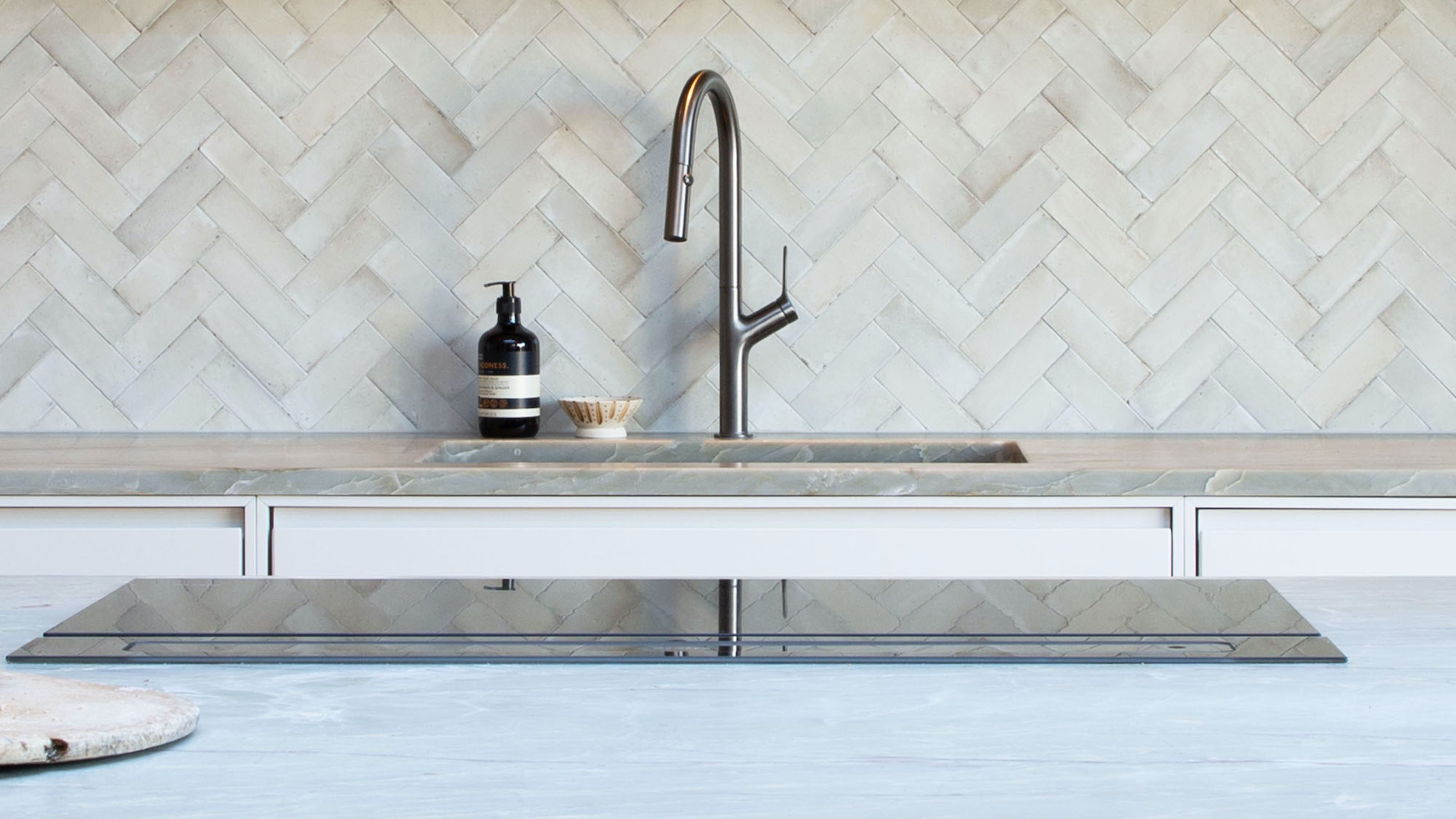
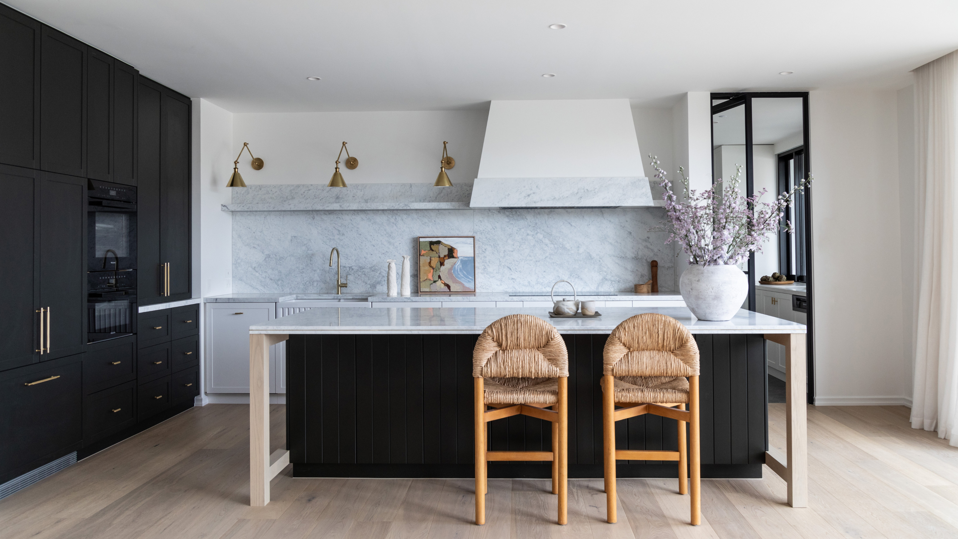
The best kitchen tile ideas incorporate texture to add depth and variation to the design. While flat, high gloss tiles have their place, artisanal textured tiles always look more high-end, whether for use on walls or the floor.
"The key to achieving a truly realistic finish lies in selecting tiles with multiple face variations, nuanced textures, and irregular edges that mimic the charm of real stone," says Emma Hughes, Studio Manager at Clay & Rock. "Look for collections that feature a broad range of faces to avoid repetition during installation — carefully spacing similar faces apart for a more natural, organic layout."
Lee Thornley, Founder of Bert & May, says that even the most expensive tiles can look flat if they don’t bring a bit of texture to a design. "An overly uniform finish can feel a bit lifeless," he says. "Instead, try something with variation – zellige tiles are a favorite because they reflect light in unexpected ways and add instant charm. Their uneven, unique texture creates depth, which helps the space feel more layered and considered." Mixing matt and gloss finishes can also have a similar effect.
2. The Wrong Proportions

DO INSTEAD: Find a tile that's perfectly proportioned to your space, and make sure a backsplash stretches high enough up the wall
The right sized tile can make or break your space. Proportions can have a huge impact on how the room feels, especially in the case of kitchen floor tiles where they have an illusory effect. Choose a tile that's too small, for example, and you run the risk of making your kitchen look too busy, especially in a kitchen that's already on the smaller side.
Too many "breaks" will lead to too many grout lines, which makes your kitchen look cheap and unconsidered (especially when the grout inevitably becomes dirty and discolored). "Choosing large format rectified tiles contributes to a polished finish with minimal grout lines, featuring corrected edges that create a clean, precise appearance," explains Maria D Arráez, Director of Tile of Spain UK. "This makes them ideal for seamless and contemporary designs."
Bert & May's story started in Spain in 2004 when founder Lee Thornley left London to build his award-winning boutique hotel, Casa La Siesta, in Cadiz. As a result of his painstaking work on the interior of this sensitively restored country house, Lee found that he had a natural talent for sourcing reclaimed materials and rare antique fittings. He also discovered that this architectural salvage was much sought after by interior architects and designers and from here, a new project was born.
3. Unfinished Edges

DO INSTEAD: Make sure the seams of your tiles look polished with edge detailing or a trim finish (seen here with a built-in shelf lip)
Small details play a vital role when tiling a kitchen, so you shouldn't cut any corners when decorating with tiles. The minutiae of tile edges might not seem important, but this tiny feature is the secret to a more polished look. Be it bullnose or beveled, or even a listello trim, it's vital you factor finishing touches into the equation. Fail to do so and your kitchen tiles will look cheap and rushed. It's like choosing beautiful cabinets and then forgoing the hardware to match.
"A common issue is not ordering enough tiles to cover the full splashback or wrap a corner properly," says Carly Allison, Head of Product Design at Fired Earth. "This can result in awkward breaks or unfinished edges that cheapen the overall look."
4. Watermarks

DO INSTEAD: Clean gloss tiles frequently to keep them shiny and bright, or choose lower maintenance options like matt
It might sound obvious, but tiles with watermarks will instantly downgrade your kitchen. To avoid cheapening the appearance of your tiles, you need to give thought to the finish. "Glossy finishes tend to accentuate watermarks and smudges, leading to the need for more frequent cleaning," says Maria. "Instead, opt for matt finish tiles to help keep tiles free from watermarks, making them particularly suitable for areas like the sink and behind the cooker."
The same goes for scratched, broken, or scuffed tiles, too. It really is worth splurging a bit more for better quality materials and doing your research on the most durable kitchen flooring finishes to prevent these kinds of imperfections.
María Dolores Arraez is the head of Tile of Spain at the Spanish Embassy's Commercial Office in London. She is responsible for the promotion of the Spanish ceramic tile industry in the UK and supports the Tile of Spain members in their export strategies to the UK.
5. The Wrong Grout

DO INSTEAD: Plan your grout as part of your tile design, and don't rely on default white
Discolored grout, or the wrong colored grouting, is a surefire way to make your kitchen look cheap and uncared for. "When aiming for a sophisticated kitchen design, grout lines can often detract from the overall look," says Maria. "For instance, colored grouts like grey or beige are easier to maintain compared to bright white options."
Colorful tile grout ideas are a great way to rectify this, and they can look really stylish too. "To achieve a polished, high-end aesthetic, consider grout as part of your overall palette," says Emma. "Matching or subtly complementing it with surrounding paint colors, cabinetry, or accessories can tie the entire space together, creating a more cohesive and considered design." Consider matching your grout to the shade of your cabinets, as shown above, or choose a high-contrast color that feels punchy and modern, such as pale pink tiles with black grout lines.
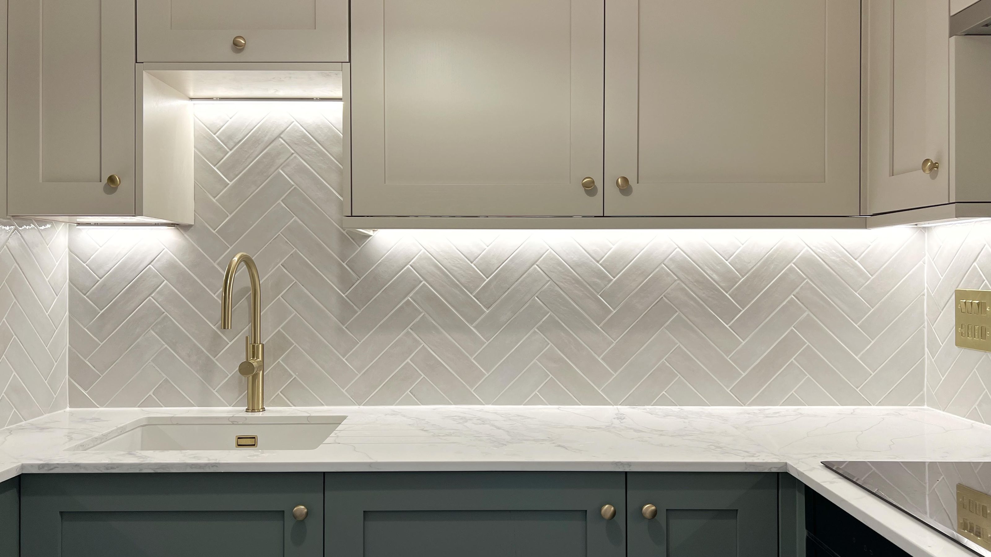
6. Fleeting Tile Trends

DO INSTEAD: Opt for a timeless style and layout, like a classic zellige tile in a herringbone pattern
Whether you're reinventing your kitchen backsplash or looking for a timeless floor tile design, try not to get sucked in by short-lived trends. The best tile ideas are timeless enough to endure for decades to come, while fleeting fads look tired in a matter of years, dating your kitchen and making it look cheap.
"When investing in a new kitchen, longevity is key," Emma emphasizes. "A design that feels current yet classic ensures your space remains stylish for years to come without the need for constant updates. Natural materials, such as stone and terracotta, offer enduring appeal thanks to their organic textures and heritage charm. Equally important is how tiles are laid: opting for time-honored patterns like herringbone brings structure and elegance to a room, with a design lineage that spans centuries."

Quantity: Box of 20
Color: Green

Color: Claret

Quantity: Box of 50
Color: Navy Blue
FAQs
How Can I Make my Kitchen Tiles Look Better?
Besides avoiding the mistakes above, be inventive with your kitchen tile ideas for a space that looks more high-end. You can't put a price on individuality, so — typically — the more unique your design, the better.
"Few design elements evoke luxury quite like the artistry of hand-painted detail," suggests Emma. "Patterns born from hand-drawn or painted origins carry an inherent sense of craftsmanship and heritage, instantly adding depth and character to a space." Delft tiles, for example, with tiny hand-patterned illustrations that speak to your personality, will tell a story and imbue your kitchen with character.
"For those drawn to pattern but keen to maintain a refined, premium aesthetic, nature-inspired designs offer the perfect balance," Emma continues. "Understated botanical or floral motifs bring subtle movement and visual interest without overpowering the space — and, crucially, they’re far less likely to date than trend-led prints."
You don't need luxury tiles in order for your kitchen to look high-end. An elegant and timeless design — be it wall, floor, or even countertop tiles — will pair a classic style with a time-honored layout while also taking the finer details into account. There's more than meets the eye with tiles, but with enough thought and intention, yours will feel refined, sophisticated, and far from cheap.

-
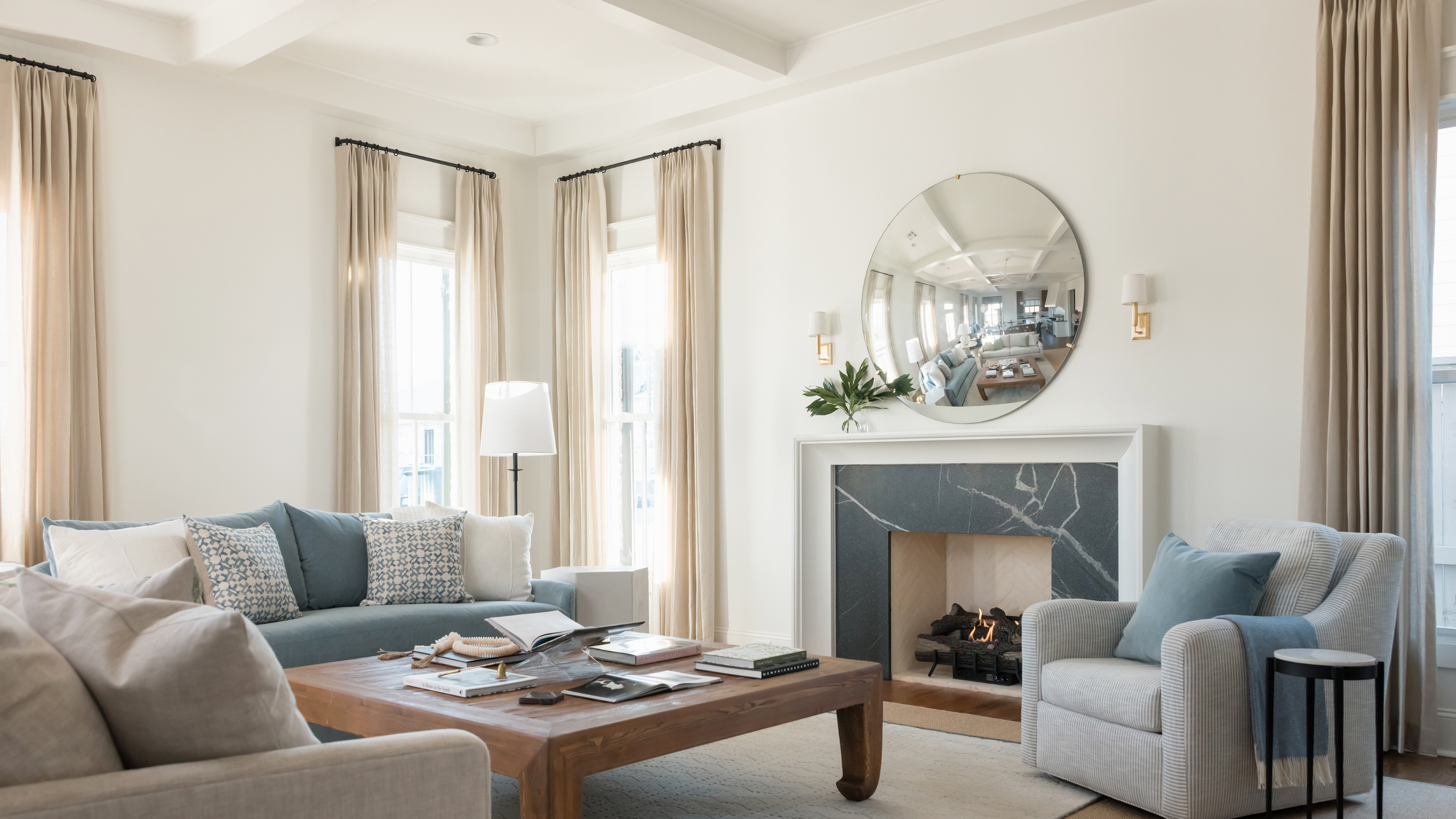 Should a Living Room Be Painted Dark or Light? We Asked Design Experts to Settle The Age-Old Debate
The color of your living room can completely shift the mood of your entire home, so the question remains: should you go light or dark...?
-
 3 Things I Wish I Knew Before Renovating My Small Kitchen — Number One? Always Be Prepared...
After taking on my own small kitchen project recently, here are the main takeaways I've learned for the next time I renovate one


-
3 Things I Wish I Knew Before Renovating My Small Kitchen — Number One? Always Be Prepared...
After taking on my own small kitchen project recently, here are the main takeaways I've learned for the next time I renovate one
-
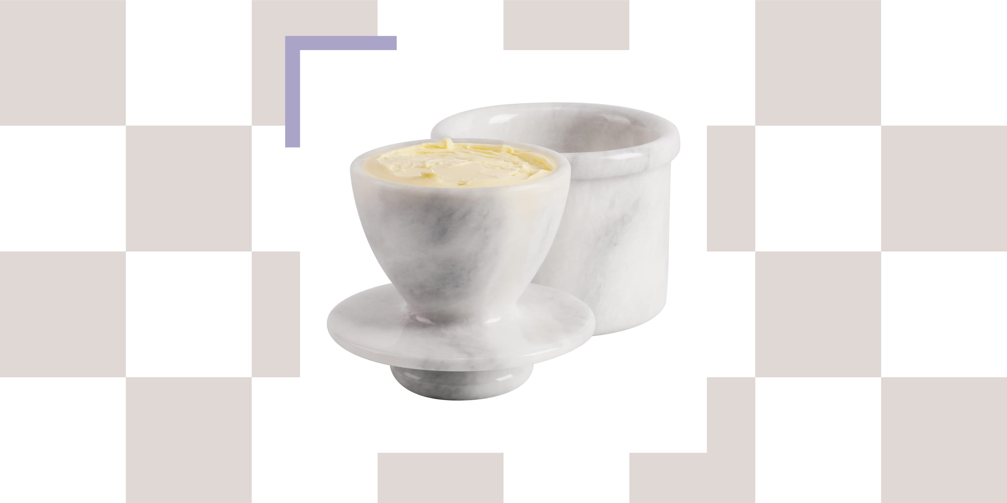 Good Cooks With Even Better Style Are All Putting 'Butter Bells' on Their Kitchen Counters — Here's Why
The French way of storing butter will guarantee soft, spreadable deliciousness at any given moment. I present to you, the butter bell.
-
 7 Kitchen Tap Mistakes You’re Making That Can Make Your Space Look Outdated — And What to Do Instead
Could it be that your choice of kitchen tap is causing your kitchen to look old-fashioned? Here's what the experts say
-
 3 Kitchen Island Measurements That the Best Designers Always Use When Planning Spaces
Your cheat-sheet guide to getting clued up on all the basics of island measurements, straight from the experts.
-
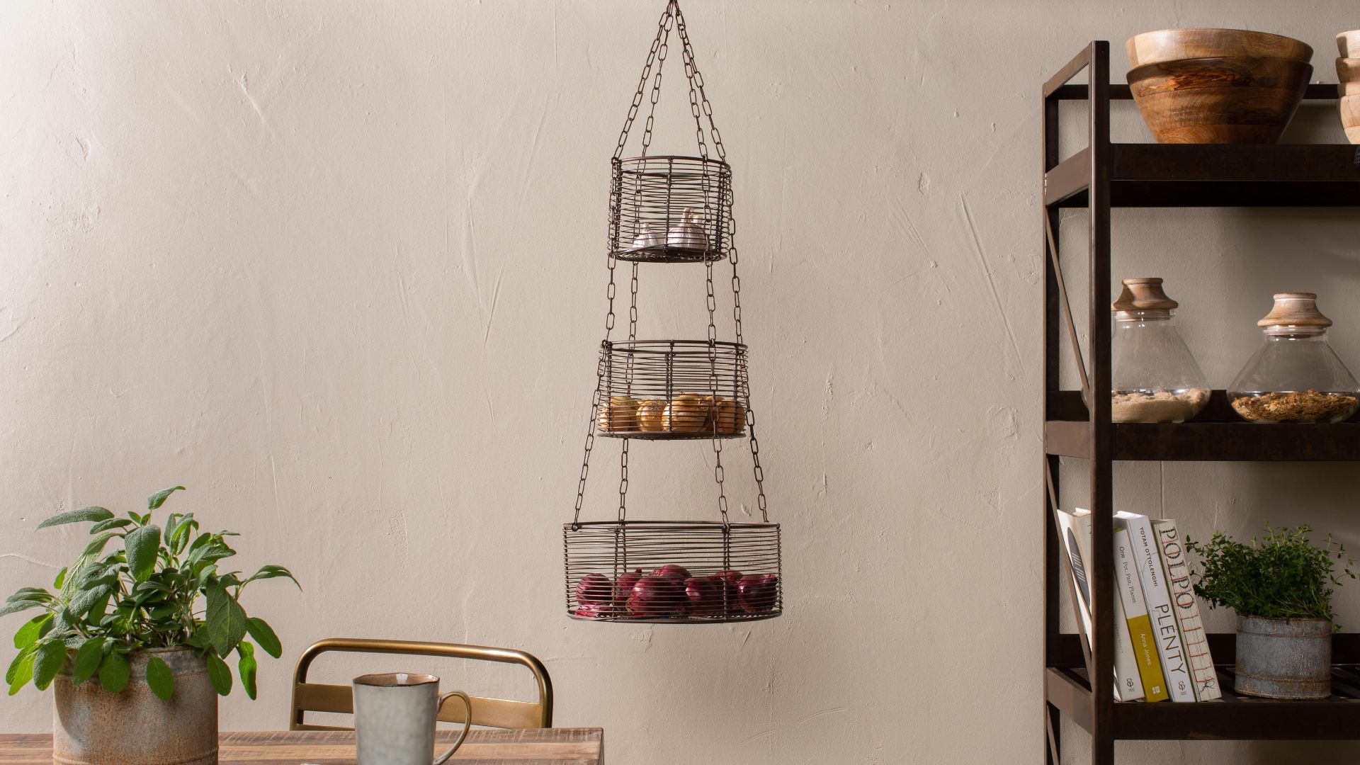 These Hanging Kitchen Baskets Have a Cool, Casual Energy That Give Your Produce Storage Serious Style
There are a couple of popular produce items that just aren't meant to be refrigerated. In that case, this hanging basket display is the perfect alternative.
-
 10 Hidden Kitchen Socket Ideas That Disguise Eyesores and Make Backsplashes Look More Minimalist
Discover innovative ways to hide those ugly outlets and claim a sleek, clutter-free space
-
 Smeg Says Teal, and We’re Listening — The Kitchen Shade of the Year Is Here
Designers are already using the soft, sea-glass green everywhere from cabinetry to countertops
-
 5 Problems With Boiling Water Taps That No One Ever Talks About — And How to Troubleshoot Them
We got our experts to spill the beans on the truth behind these kitchen staples


