What is the "Kitchen Work Triangle"? Designers Explain This Almost 100-Year-Old Design Rule
The kitchen work triangle is an idea that's focused on improving ergonomics and workflow in your cooking space. Here's what you need to know about it

The Livingetc newsletters are your inside source for what’s shaping interiors now - and what’s next. Discover trend forecasts, smart style ideas, and curated shopping inspiration that brings design to life. Subscribe today and stay ahead of the curve.
You are now subscribed
Your newsletter sign-up was successful
The "kitchen work triangle" isn't a new idea — in fact, it's a concept that dates back to as early as the 1920s according to some design historians. This layout concept is one that any kitchen designer will be familiar with, that's all about making your workflow around the kitchen when cooking as easy as possible.
When you're designing a kitchen yourself, though, it can be easy to overlook, and you may find yourself regretting your kitchen's layout if you don't keep at least some of the tenets of this design rule in mind — though not all designers prescribe to the work triangle in a modern kitchen.
Want to know more? We asked kitchen experts for the lowdown on this classic layout trick.
Article continues belowWhat is a kitchen triangle?
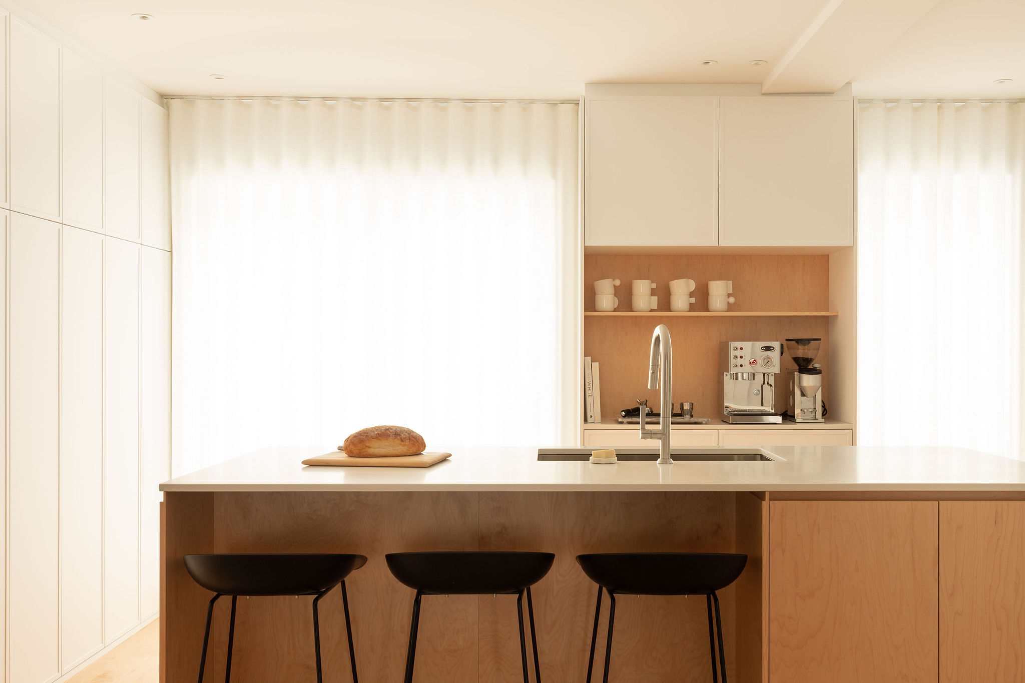
'A kitchen triangle refers to the space between the three main work areas in a kitchen — the sink, the stove, and the refrigerator,' says Ashley Macuga, founder of Collected Interiors. 'Typically these appliances are arranged in a 'triangular' layout to maximize functionality in the kitchen. The idea is to minimize the obstacles between these areas, allowing for optimal circulation and easy access to the essentials while cooking.'
With the triangle, two points in the kitchen form a straight or relatively straight line, without being blocked by the third point in the triangle. This ensures an unimpeded workflow. If you're remodeling a kitchen and want to ensure it is the most ergonomic space, you could consider this concept.
What should you keep in mind before designing a kitchen triangle?
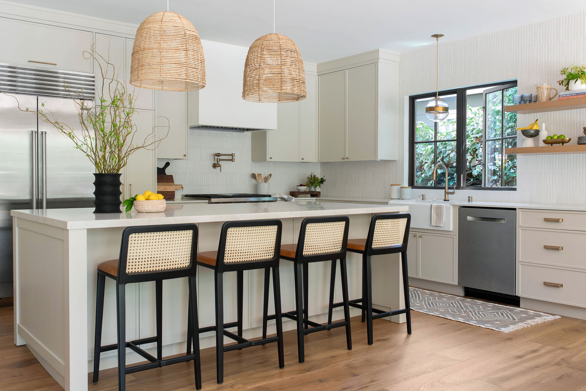
The kitchen triangle is definitely a key consideration, but it must be balanced with other considerations too. Ashley elucidates them:
Kitchen Access Points: When we are looking at a kitchen layout, we are also considering how the dwellers will be entering the kitchen looking for snacks. Our goal is to try and work the refrigerator and pantry on the outside points of a kitchen so that snacks can be easily accessed without entering into the center of the kitchen where meal prep is likely underway. The goal is to allow kids to get their goldfish, and then be on their way.
The Livingetc newsletters are your inside source for what’s shaping interiors now - and what’s next. Discover trend forecasts, smart style ideas, and curated shopping inspiration that brings design to life. Subscribe today and stay ahead of the curve.
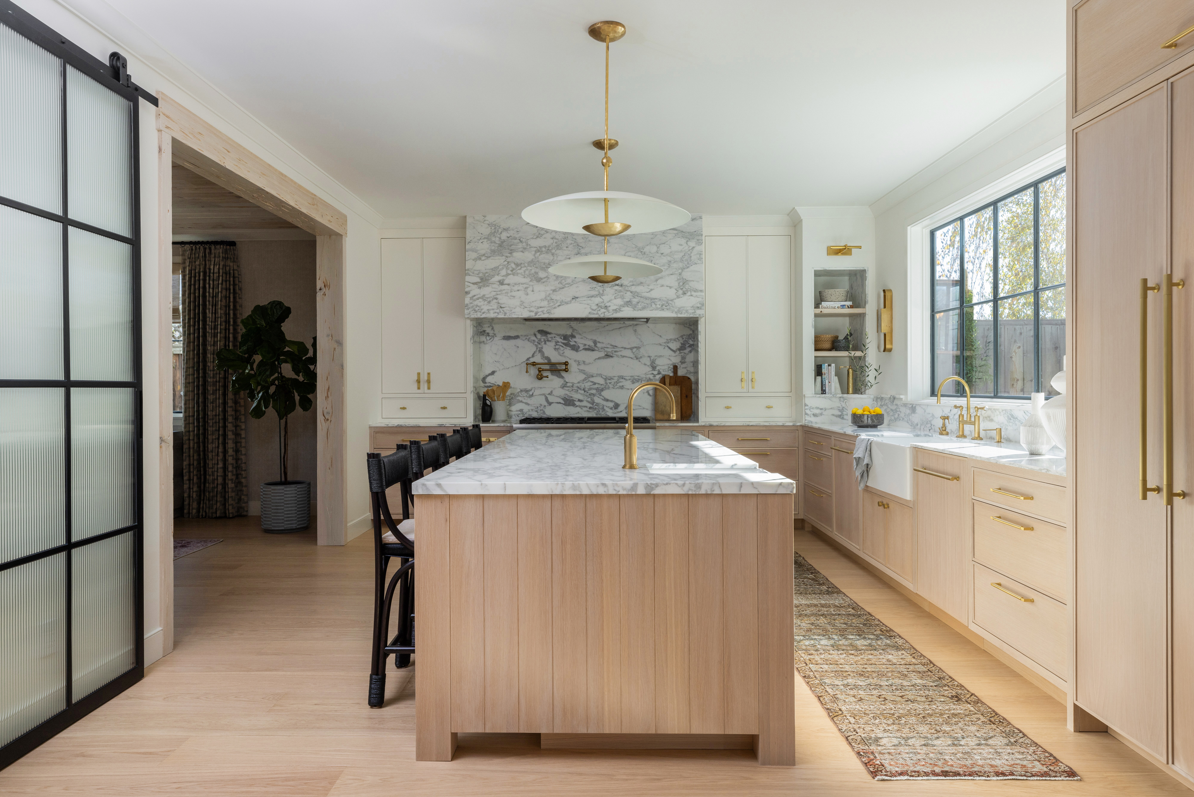
Center Points: Kitchen hoods and ranges have undoubtedly become a design statement in any kitchen, helping to establish visually the aesthetic of the broader space. When laying out a kitchen, it’s important to first establish where the design center point is going to be of the room, anchoring the kitchen hood and the kitchen island at the center. We then work the kitchen triangle from there. Functionality is important but must be balanced with visual design priorities too.
Prep sink: Having a prep kitchen sink positioned near a refrigerator reduces the need to move back and forth between different areas of the kitchen, saving time and effort during meal prep. This can be especially useful when you're multitasking or working on multiple dishes simultaneously.
What are the pros of the kitchen work triangle?
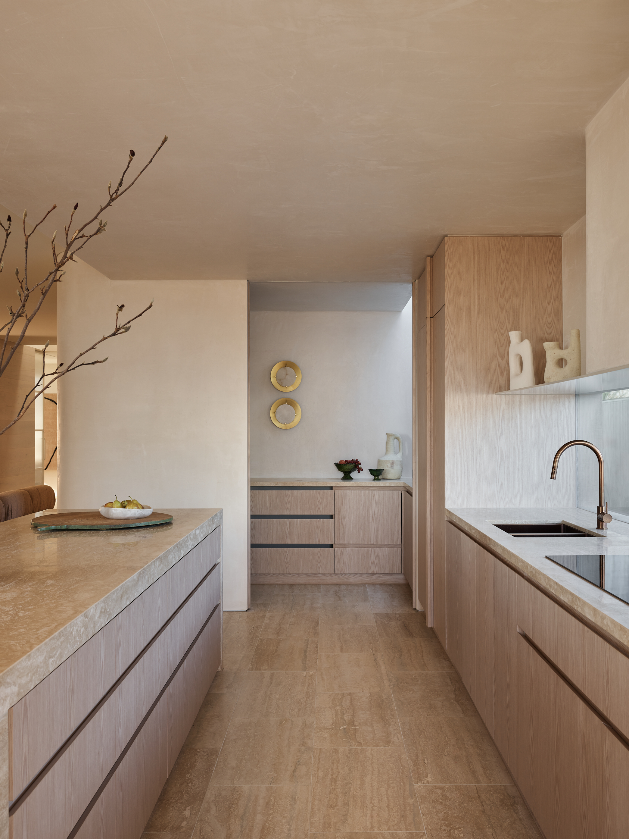
'The kitchen triangle, or 'work triangle' was developed by the University of Illinois School of Architecture in the early 20th century,' says Meredith Owen of Meredith Owen Interiors. 'The researchers discovered the importance of arranging the stove, sink, and refrigerator in a triangular layout to optimize workflow and efficiency in the kitchen. Most designers and architects still use the work triangle when designing kitchens today. The organization of the kitchen in this manner helps with efficiency, safety, functionality, and workflow.'
'The key thing to remember is that the triangle reminds us to think about how each appliance's function connects to the next one,' says Jane Lockhart, founder of Jane Lockhart Design. 'Generally, we have several main tasks in the kitchen including cold prep, baking, hot cooking, and cleanup. Each of these tasks needs a separate area for work and should maintain separation from the other tasks. This is the benefit of understanding that the triangle rule provides the concept of separate points within our kitchens.'
'It ensures your layout of high-use zones in the kitchen are easily accessible and just a few short steps from one another,' says Laura Williams, founder of ATX Interior Design.
The kitchen triangle can also contribute to a more spacious-feeling kitchen, as all zones are located in separate locations, allowing the user to move around easily. Amongst the best kitchen layouts to try this concept in are closed kitchens or U-shaped kitchens.
What are the drawbacks?
'Realistically speaking, the triangle isn't really relative these days, as it was developed in the 1940s when we really only had a few kitchen appliances in our homes,' says Jane. 'Today as a standard, we have a microwave, dishwasher, large fridges and freezers, wall ovens, etc.'
'The biggest disadvantage of the cooking triangle is if there are multiple cooks working together in the kitchen, and it could force them to step on each other's toes a bit,' adds Laura.
This concept may not work well in small kitchens or galley kitchens. Kitchens that have peripheral areas such as kitchen island sinks cooktops or peninsula countertops are also not addressed with the kitchen triangle.
The ideas of the kitchen work triangle aren't to be discarded entirely, however. In the modern age, you may need to adapt your thinking for a layout that reflects contemporary living and what kitchens look like now.
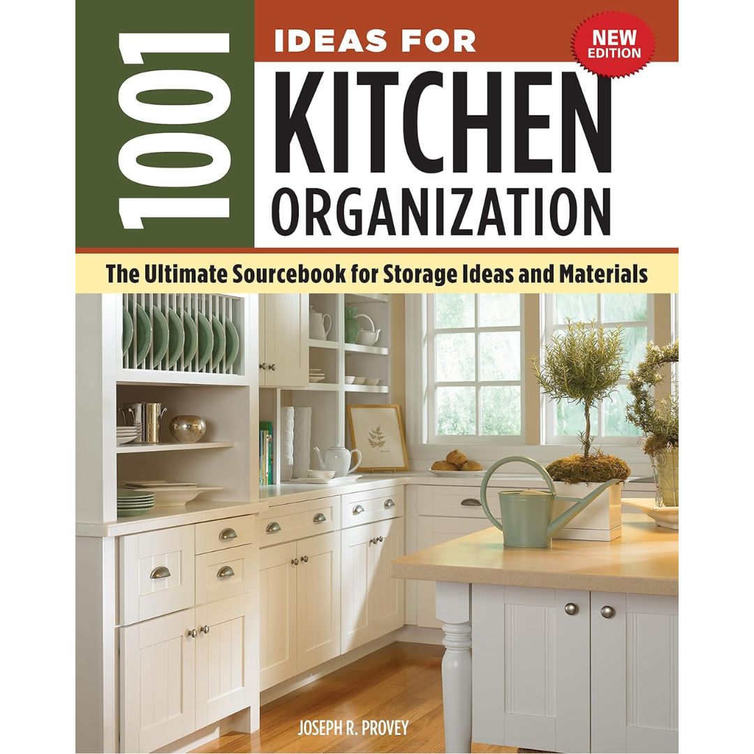
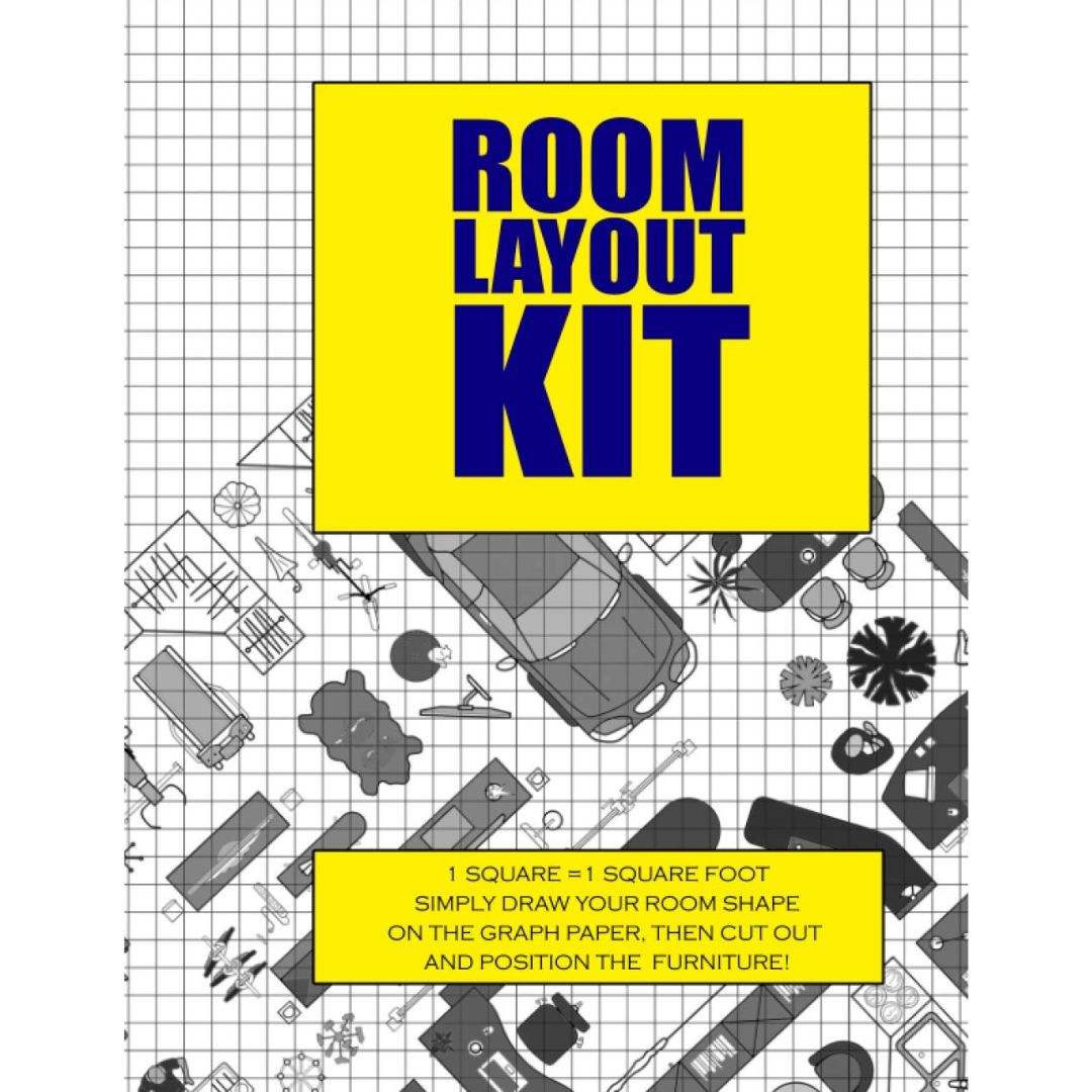
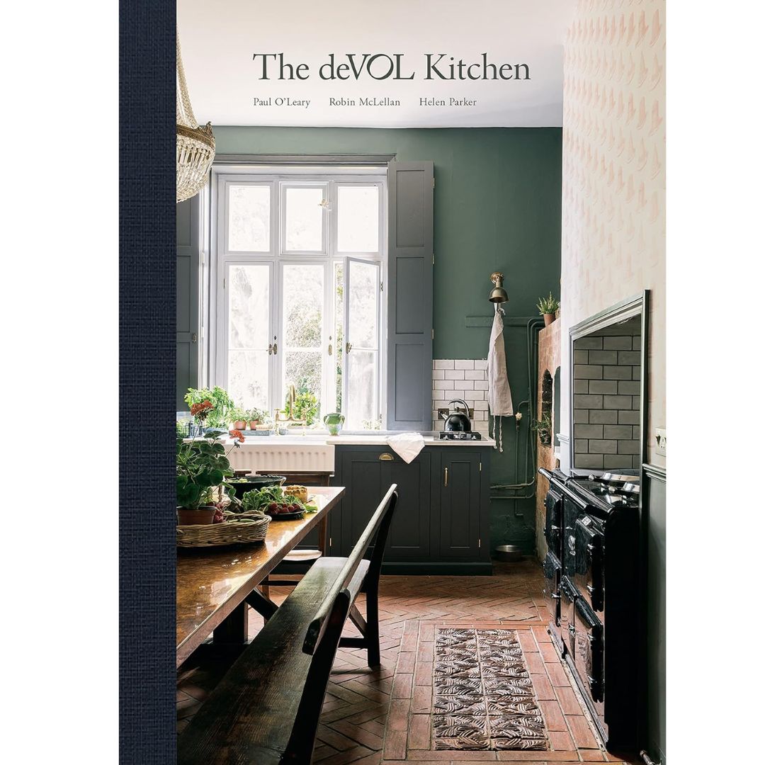
3 kitchen layout books to refer to

Aditi Sharma Maheshwari started her career at The Address (The Times of India), a tabloid on interiors and art. She wrote profiles of Indian artists, designers, and architects, and covered inspiring houses and commercial properties. After four years, she moved to ELLE DECOR as a senior features writer, where she contributed to the magazine and website, and also worked alongside the events team on India Design ID — the brand’s 10-day, annual design show. She wrote across topics: from designer interviews, and house tours, to new product launches, shopping pages, and reviews. After three years, she was hired as the senior editor at Houzz. The website content focused on practical advice on decorating the home and making design feel more approachable. She created fresh series on budget buys, design hacks, and DIYs, all backed with expert advice. Equipped with sizable knowledge of the industry and with a good network, she moved to Architectural Digest (Conde Nast) as the digital editor. The publication's focus was on high-end design, and her content highlighted A-listers, starchitects, and high-concept products, all customized for an audience that loves and invests in luxury. After a two-year stint, she moved to the UK and was hired at Livingetc as a design editor. She now freelances for a variety of interiors publications.
