What Color is Replacing Green? Designers are Choosing This Soothing, Nature-Inspired Hue Instead
If you're over green in interiors this new favorite is as equally soothing, feels even fresher, and it's getting designers excited
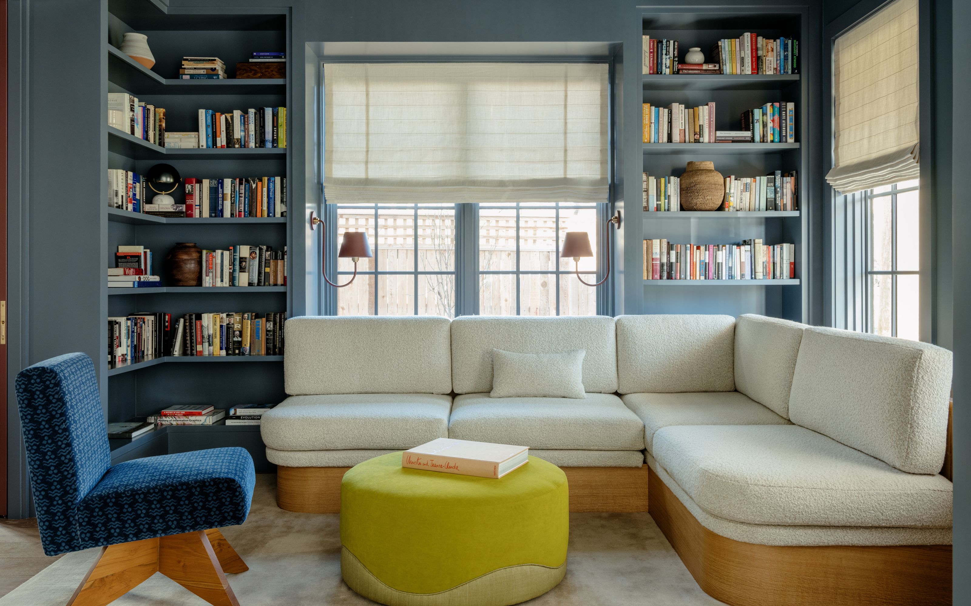
Green has been a trending shade for some time now, with many designers linking this to its natural, calming feel. (Some even went as far as calling it a new neutral.) Most of us will feel relaxed and comfortable living with green, so its popularity has increased from using it in living spaces and home offices to the likes of kitchens and bathrooms, too. Really, there's not one space in our homes where we’d find green unsuitable.
But sometimes we can have too much of a good thing. You might feel you’re a bit over the color green by now, wondering what alternative is out there that will still have the same soothing properties. Well, you needn’t look any further, because designers have now started to shift their attention towards blue, another nature-inspired color that is both calming and sophisticated, with the added advantage of being a classic, too. Here, experts reveal why the blue color trend is replacing green, how to use it, and what shades will look just right in your home.
Why is blue replacing green?
As far as color trends go, we’ve probably exhausted all shades of green. From the very popular sage to lighter off-whites with green undertones, or dark, bold greens to accent kitchens, we’ve seen it all. We loved the nature-inspired element but need a fresh perspective.
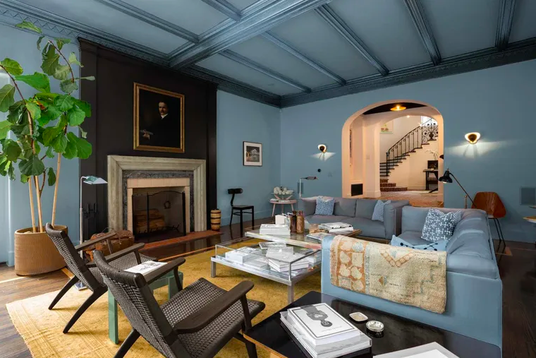
Enter blue. ‘Blue is one of the most universally loved shades globally,’ explains Benjamin Moore expert Helen Shaw. ‘It’s associated with attributes such as trust and responsibility and when used in the home it instantly creates a soothing and harmonious atmosphere due to its connection to the natural world.'
Of course, blue is a great color that goes with green and, likewise, it's also very versatile. We can already see various tones such as pale blue developing into stand-alone trends for 2024. 'While green took over the first half of the decade, nature-inspired colors will continue to be on top,' says Emily Kantz, color expert at Sherwin-Williams. 'However, we’ve seen a shift in homeowners going from neutrals and earthy tones, which pair very well with green, into more white and light tones, which pair best with blues, which will be the color that replaces it. This is why we chose Upward SW 6239, a light and airy blue, as our 2024 Color of the Year!'
‘Blue offers many possibilities, from the subtle and serene to the bold, moody, and dramatic,’ Betsy Smith, color expert at Graphenstone tells me. ‘It creates a grown-up backdrop that complements both hard and soft surfaces. As an adaptable color, it can transition between day and night and flex from the snug and relaxed to the more formal, making it a versatile choice for living rooms,’ adds the expert.
How do you decorate with blue?
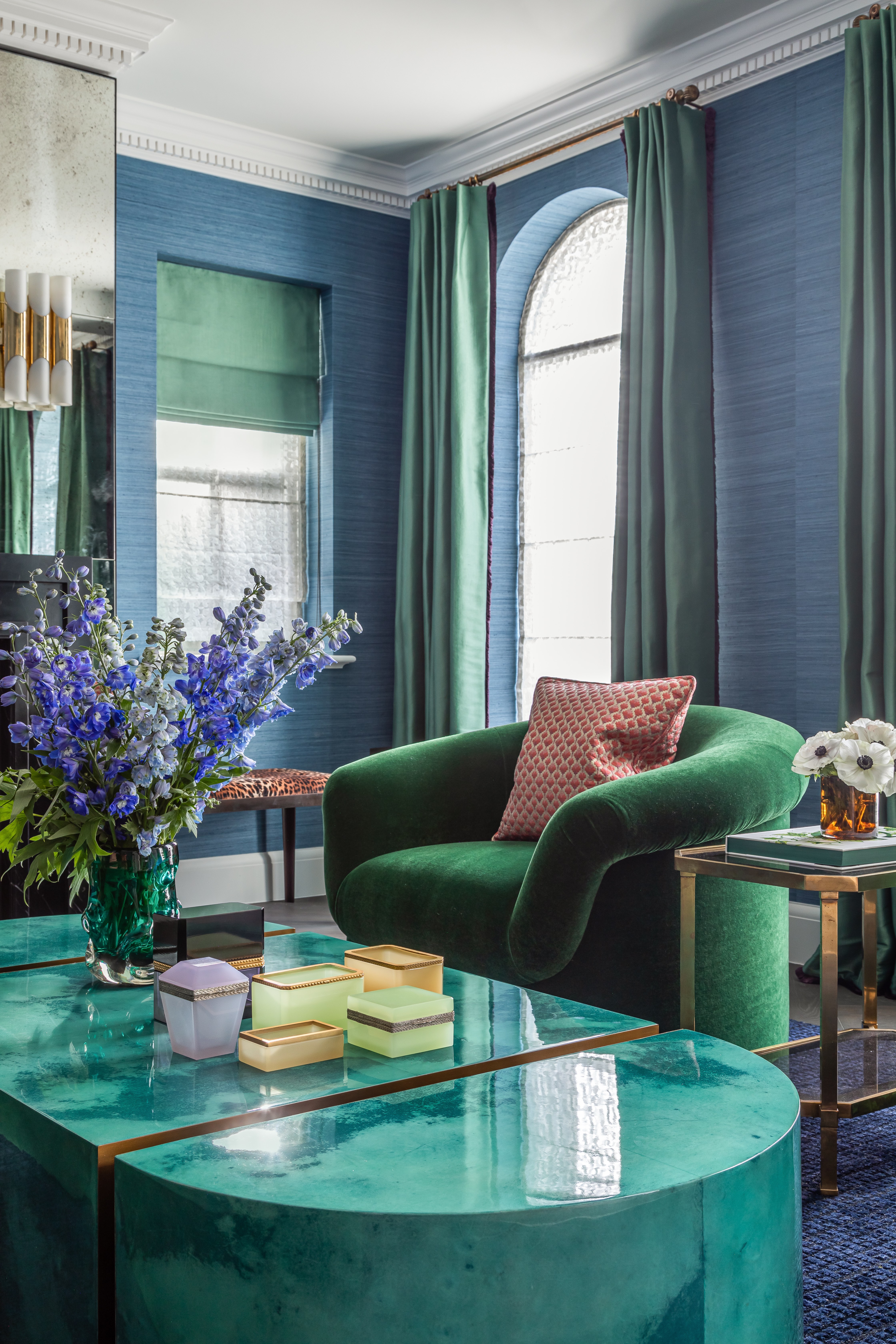
Like green, there are a myriad of blue tones to pick from, and a successful interior scheme depends on choosing the right one for your space. ‘Decorating with blue is an all-time interior classic - its familiarity means many of us are more than confident to use it in all its glory,' says Helen. 'When using blue in your home, opting for a warmer mid-tone such as Blue Nova 825 will instantly evoke a sense of comfort and reassurance which is often key.'
Helen goes on to say that blues with this depth of color work well in all rooms in the house. 'In south-facing spaces they work to balance the intensity of sunlight, while in north-facing rooms, they will provide a warm and cozy feeling,' she says, 'particularly when paired with natural materials of rich terracotta accessories'.
When mixing blue with other styling elements, natural textures and materials are a fail-proof combination. ‘Blues are particularly good at accentuating natural textures and materials, making them feel rich and luxurious or relaxed and cozy,’ Betsy tells us. ‘Blue can create a wonderful backdrop, elevating the character of surfaces and layered fabrics so it’s a great choice for living rooms where spaces fuse different surfaces and need to feel welcoming and relaxed.' With so many colors that go with blue the opportunities to experiment really are endless.
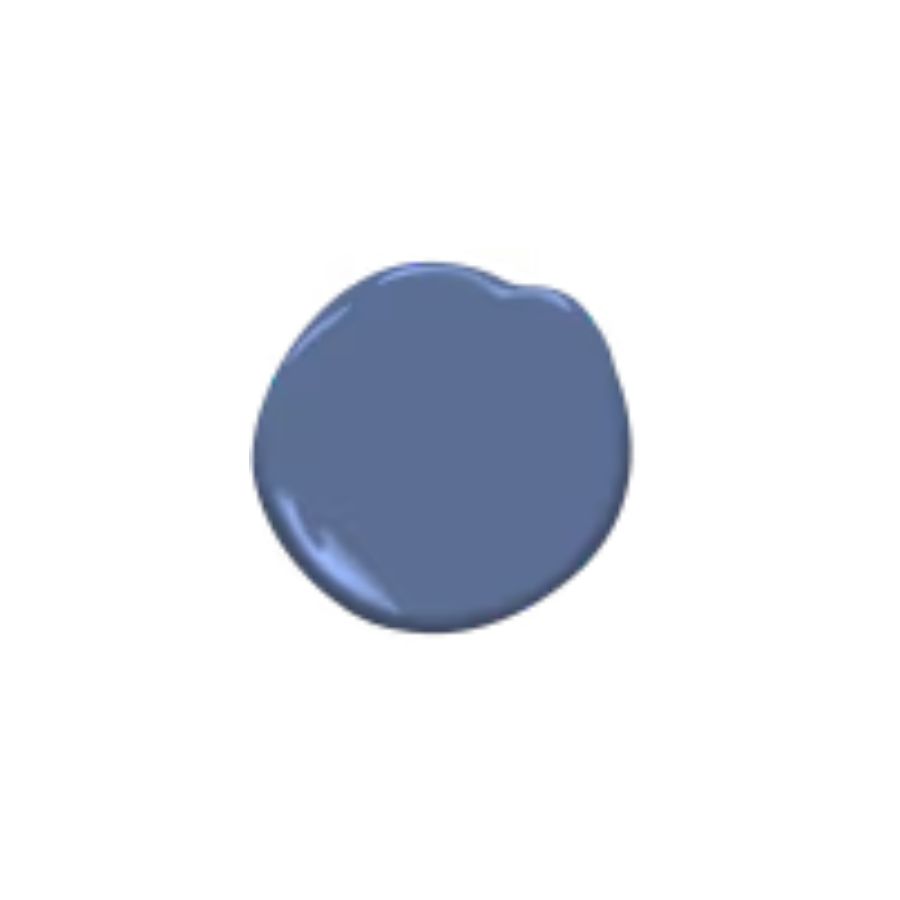
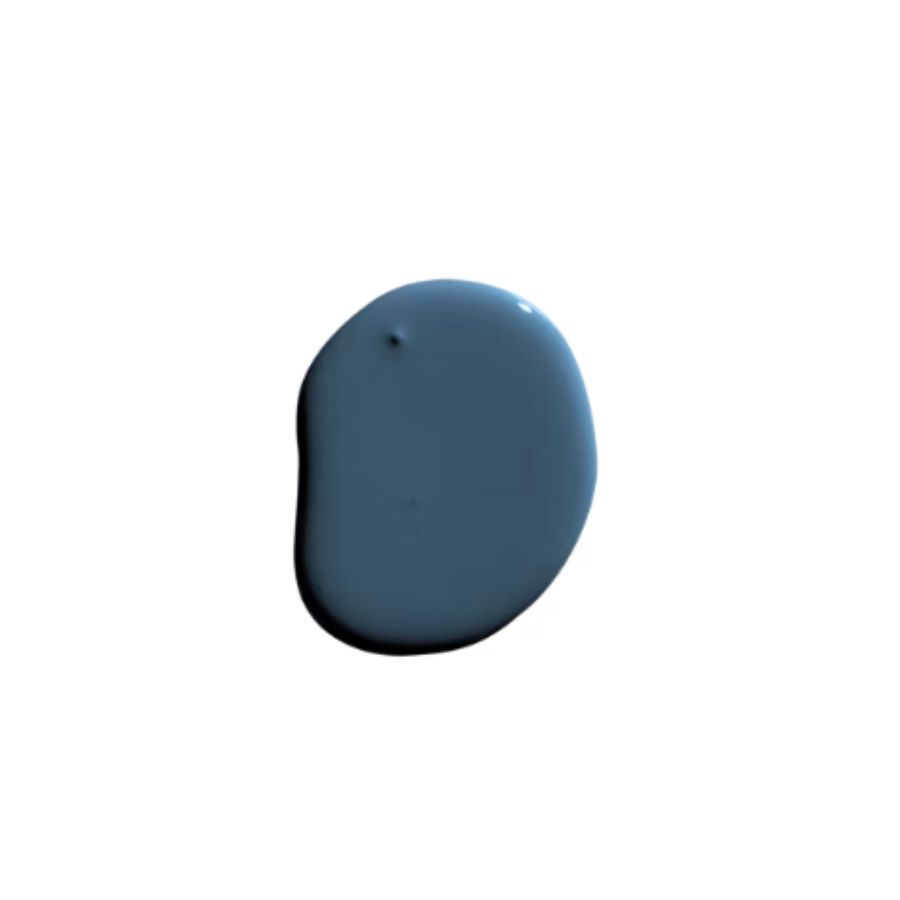
Price: $81.99/ 1 gallon of ADVANCE Interior Paint
This sophisticated tone is a mix of blue and violet, and will create a very comfortable feel in a bedroom or living room.
Try this trick to keep your blue painted walls from looking too dull
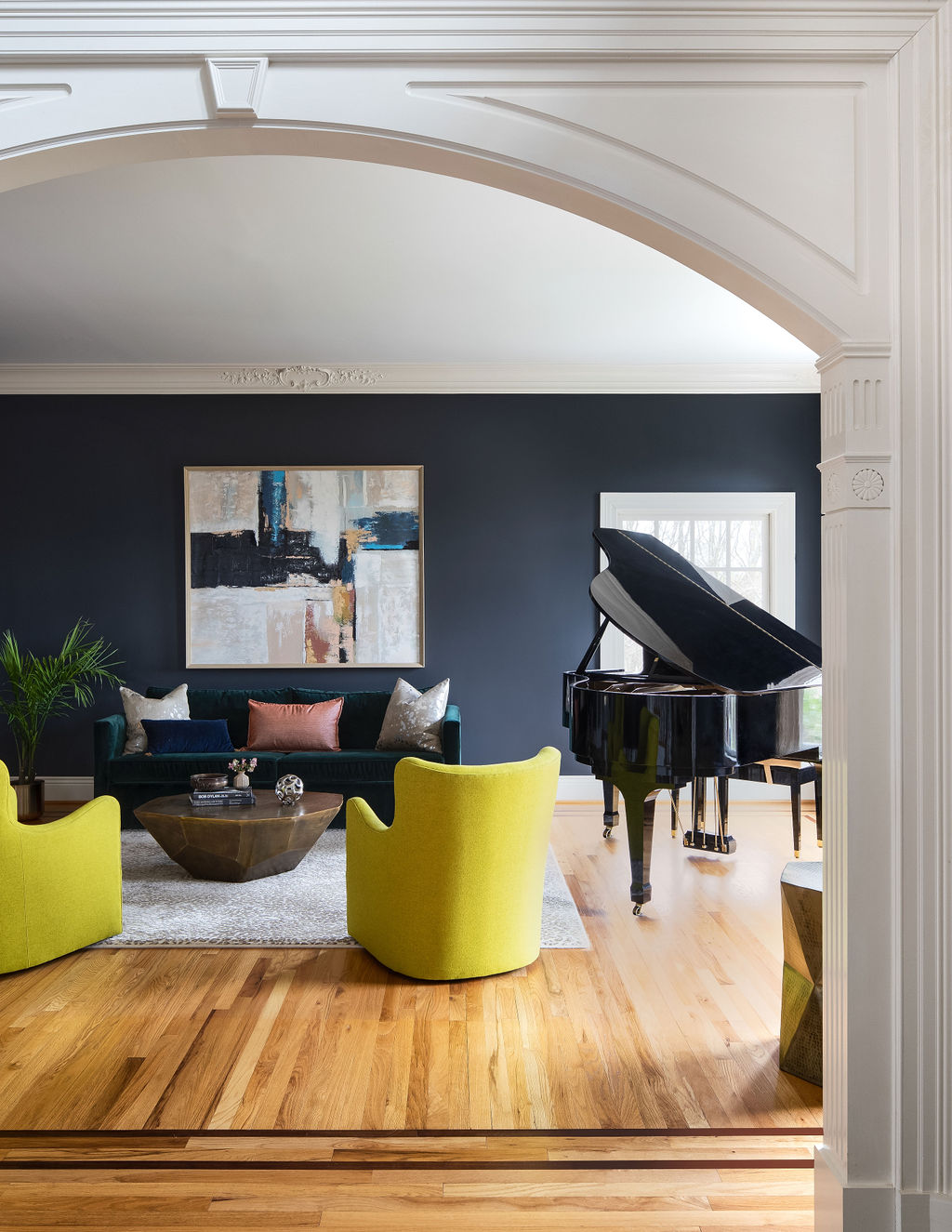
When decorating with color it’s important to bring it to life using texture, a variety of tones, and different accents to avoid a monotonous look. ‘To prevent mid-tone blues from looking dreary or cold, consider introducing different paint finishes,' advises Betsy. 'Satin and gloss finishes will reflect and bounce the light around, adding life and another dimension to gray, preventing it from feeling flat and dull.'
Additionally, Betsy urges us to avoid cheap paints that have a plasticky appearance and look like an artificially applied surface. 'Do pay attention to the preparation and finish of the walls being painted,' she says. 'Blues are understated and have a quiet elegance, so a good quality finish is essential for setting the tone for everything within the room.'
To reduce the risk of an overly cold wall, think about decorating your blue walls with art to add interest, too. ‘Colored art will have extra brilliance against dark blue it will look vibrant, and this is an effective way to create a focal point in a room that lacks scale, architectural features, or a view,’ Betsy says.
And if you’re not ready to let go of green, choose this shade
While blue’s popularity is undoubtedly increasing, you might not be sure if it's the right color for you. If you still prefer the more earthy tones of green, architect Sondra Zabroske has you covered. ‘I’m not over green, but I have noticed that I've moved away from more punchy gem tones and have been gravitating closer to earth tones,' she says. 'I've been loving greens which are muddier or khaki in appearance – like Sherwin-Williams Evergreen Fog, or Benjamin Moore's Fieldstone 1588.'
Our top picks for a blue palette
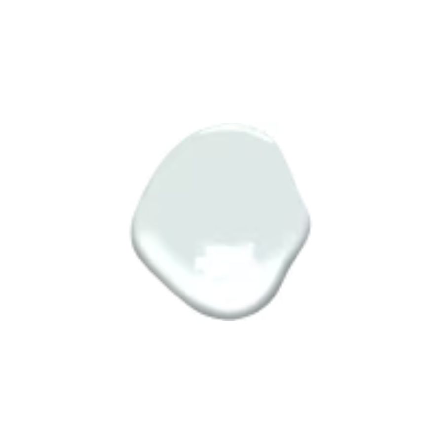
Price: $81.99/ 1 gallon of ADVANCE Interior Paint
Pale blue is on trend for 2024, and this color is so fresh it will look uplifting for spring in a hallway or living room.
Be The First To Know
The Livingetc newsletters are your inside source for what’s shaping interiors now - and what’s next. Discover trend forecasts, smart style ideas, and curated shopping inspiration that brings design to life. Subscribe today and stay ahead of the curve.
Raluca formerly worked at Livingetc.com and is now a contributor with a passion for all things interior and living beautifully. Coming from a background writing and styling shoots for fashion magazines such as Marie Claire Raluca’s love for design started at a very young age when her family’s favourite weekend activity was moving the furniture around the house ‘for fun’. Always happiest in creative environments in her spare time she loves designing mindful spaces and doing colour consultations. She finds the best inspiration in art, nature, and the way we live, and thinks that a home should serve our mental and emotional wellbeing as well as our lifestyle.
-
 Turns Out the Coolest New Café is Actually In Your Kitchen — Here's How to Steal the Style of TikTok's Latest Trend
Goodbye, over-priced lattes. Hello, home-brewed coffee with friends. TikTok's 'Home Cafe' trend brings stylish cafe culture into the comfort of your own home
By Devin Toolen Published
-
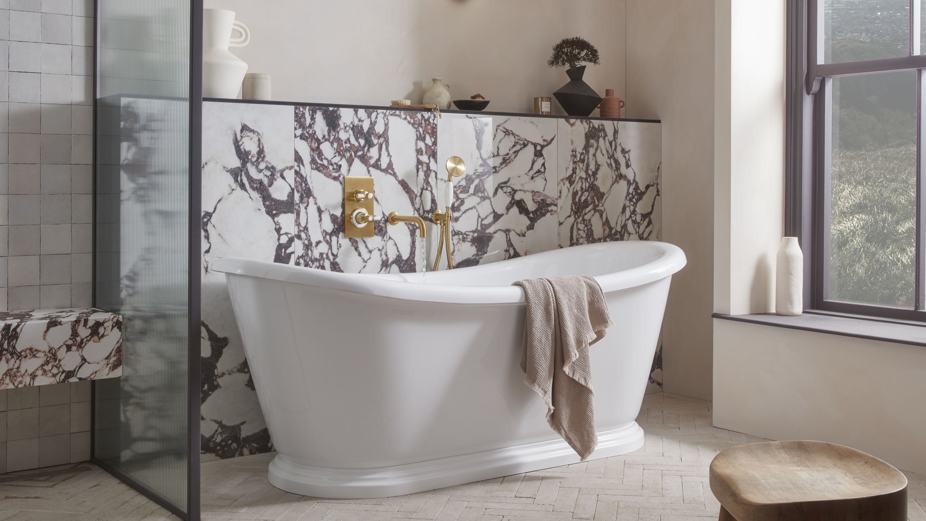 5 Bathroom Layouts That Look Dated in 2025 — Plus the Alternatives Designers Use Instead for a More Contemporary Space
For a bathroom that feels in line with the times, avoid these layouts and be more intentional with the placement and positioning of your features and fixtures
By Lilith Hudson Published

