

When it comes to painting your rooms in 2025, if Pinterest is anything to go by, it seems like there is pretty much only one way to do it: drenching. And while, yes, coating your walls, trim, and ceiling in the same shade adds a certain je ne sais quoi when it comes to color, is there ever a time when doing so is a bad idea? Absolutely.
Layouts and lighting schemes have a huge influence on the way bold paint colors interact in a space. Sometimes painting in a monochromatic palette translates as cozy and chic, but other times it can end up feeling completely overwhelming. And depending on the style of your home, sometimes designers err against ever painting your ceiling and walls the same color.
So to drench or not to drench? I put the question to interior designers, and they identified the four instances below, when you should steer clear of the matching method.
1. When You Want to Make a Statement of Your 'Fifth Wall'

DO INSTEAD: Find a painted ceiling idea that makes an unexpected statement in your space, giving it a more design-forward edge.
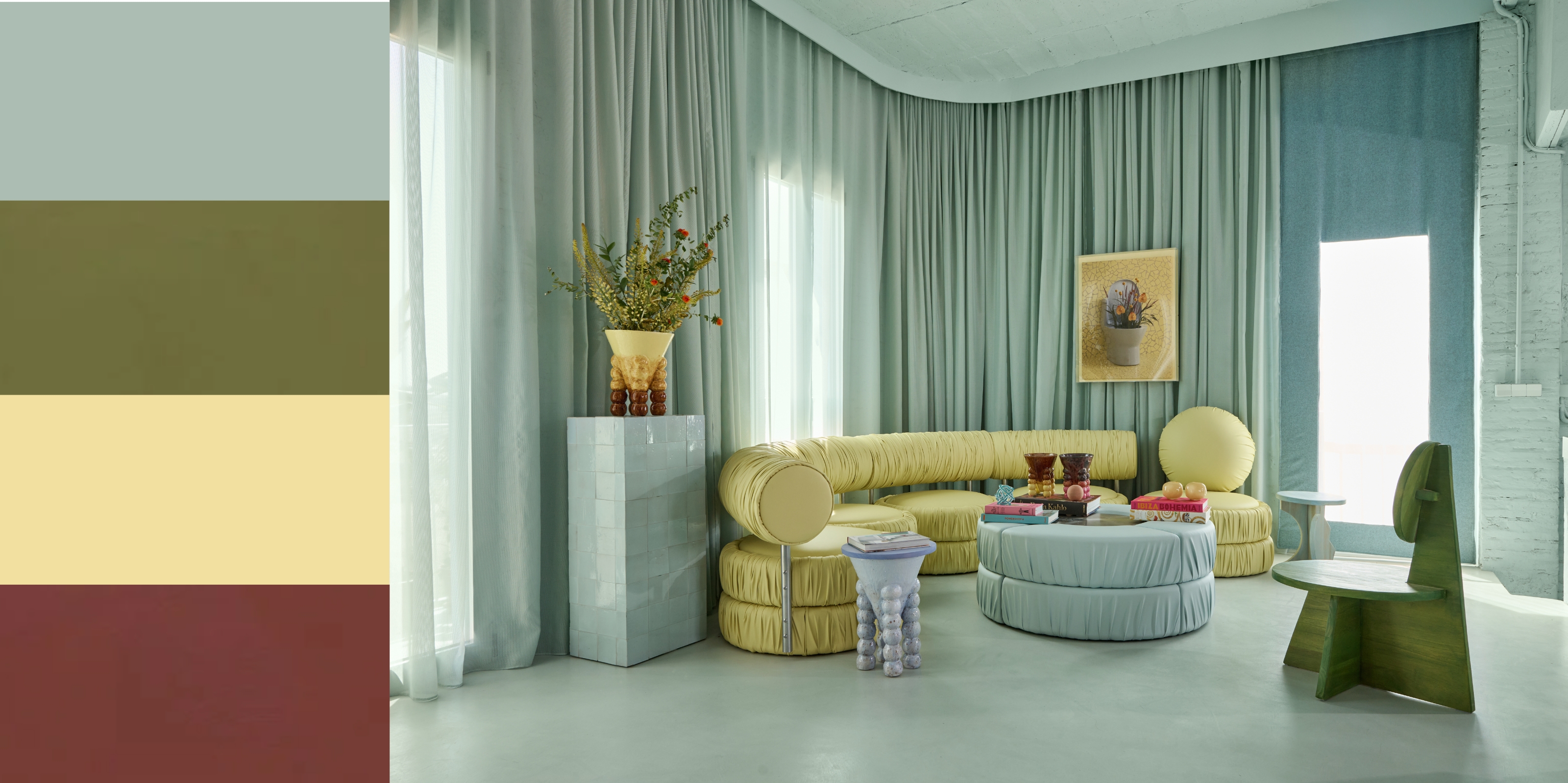
While color drenching certainly has a refined appeal, when it comes to the ways we're using color in our spaces lately, there is another approach that's been gaining traction, and it's not so conducive to a one-tone palette. It's making a statement of our ceiling (or the 'fifth wall') — arguably the new way to do an 'accent wall'.
"It's a brand-new surface, sprung as if from nowhere, just when we thought we’d counted them all," says Livingetc's color expert, Amy Moorea Wong. Choosing a monochromatic color scheme means you lose a big opportunity to accentuate your room's uniqueness. Looking for a modern living room idea that shows off your favorite colors and aesthetics? Using your ceiling means a "20 percent increase of the wall space you previously had to do what you want with, and that sounds like a too-good-to-waste opportunity to me" adds Amy.

When it comes to color, Amy Moorea Wong, Livingetc's resident color expert, never shies away. She's been writing about the power of pigment for as long as she can remember, in numerous design publications, as well as her own book, Kaleidoscope: Modern Homes in Every Colour. So when it comes to choosing colors for your home, she has to ask the question: why would you just pick one?
2. When You're Working With a Room With Low Light

DO INSTEAD: In a dark room, like this plum living room, a light-colored ceiling helps make the room feel taller and less confined.
Dramatic color palettes are one of the biggest interior design trends of the moment. Something about an oxblood red or deep forest green instantly transforms a room into an elegant living space.
But, a moody palette can quickly become constricting when not executed properly. "It’s best to avoid paint-matching with dark hues on walls and ceilings in rooms that receive little to no natural light," says Washington, D.C.-based interior designer Elana Mendelson. "If a room already feels too dark, drenching it in a dark color as well could make it feel more like a cave than cozy."
This doesn't mean you have to completely ditch your deep and dark dreams altogether, though. To brighten a dark room with paint, try a shade on the ceiling that's just a shade or two lighter than the walls. This will create dimension and will once again, make the ceilings feel taller and less confining.
Alternatively, if you want to embrace the cozy, cocooning feel in your dark room, a double-drenching paint technique might help appease the unwanted confining effect. That way the different colors you choose for your walls and ceiling are repeated around the room. Georgina Wilson, founder and principal architect at Georgina Wilson Associates, says, "a less-used space like a library, office, or study with a cozy vibe, this is where I’d suggest doing this."
3. When You're Painting an Open-Concept Room

DO INSTEAD: Help zone an open-plan layout using different paint colors on different surfaces.
When attempting to color-drench an open-concept floor plan, where do you start and where do you stop? But furthermore, it's unlikely you're going to achieve the technique's signature enveloping feel in a wide open space, and instead, run the risk of the room feeling flat and one-dimensional.
"There are practical ways to cope with the room’s size, layout, and orientation, so don’t feel penned in," says Amy Moorea Wong. Painting the ceiling a slight darker color than white (something like a dusty pink, light blue, or a soft tan) can help bring the room in slightly and make your open concept feel cozy.
Choosing different colors for your ceilings and walls also help you "create character by zoning some of the elements within the open plan," adds paint color expert and Farrow & Ball brand ambassador, Patrick O'Donnell.

Patrick O'Donnell is the Brand Ambassador and the face of Farrow & Ball on social media. Patrick has an ISVA Fine Art & Chattels qualification and studied specialist paint decoration at the Leonard Pardon School. Patrick has been with Farrow & Ball since 2012. Over that time, he’s worked in showrooms for the brand and helped design personal homes.
4. When the Room Has Architectural Details

DO INSTEAD: Even though the blush pink walls and white ceiling are very similar in shade, the subtle difference allows the molding to be seen. Thus the traditional character of the home stands out.
Having a home with gorgeous crown molding is a modern-day luxury, and the details should be celebrated instead of hidden or left unnoticeable. "When a room has great architectural details — like crown molding or beams — you want those to pop, not disappear into a single color," explains interior designer Jodi Peterman, of Elizabeth Erin Designs. In past incarnations of drenching with color, matching trim to walls and ceilings is something we saw a lot of — but in hindsight, this can actually read a little flat.
"As I always tell my clients, 'contrast is what gives a space depth'," she adds. "When everything is one color, you risk losing the dimension that makes a room feel dynamic and intentional."
But that's not to say your ceiling and trim need to be different colors. A good rule of thumb here is to think about which aspect of the room you want to highlight, and go from there.
As always, there is a time and place for everything. "I’m not saying we all need pistachio-colored ceilings next to peach walls or a cerulean and cherry combo," says Amy, but "let’s start entertaining the idea of something other than white up there, and that there is another option if you decide you’re over color drenching."

-
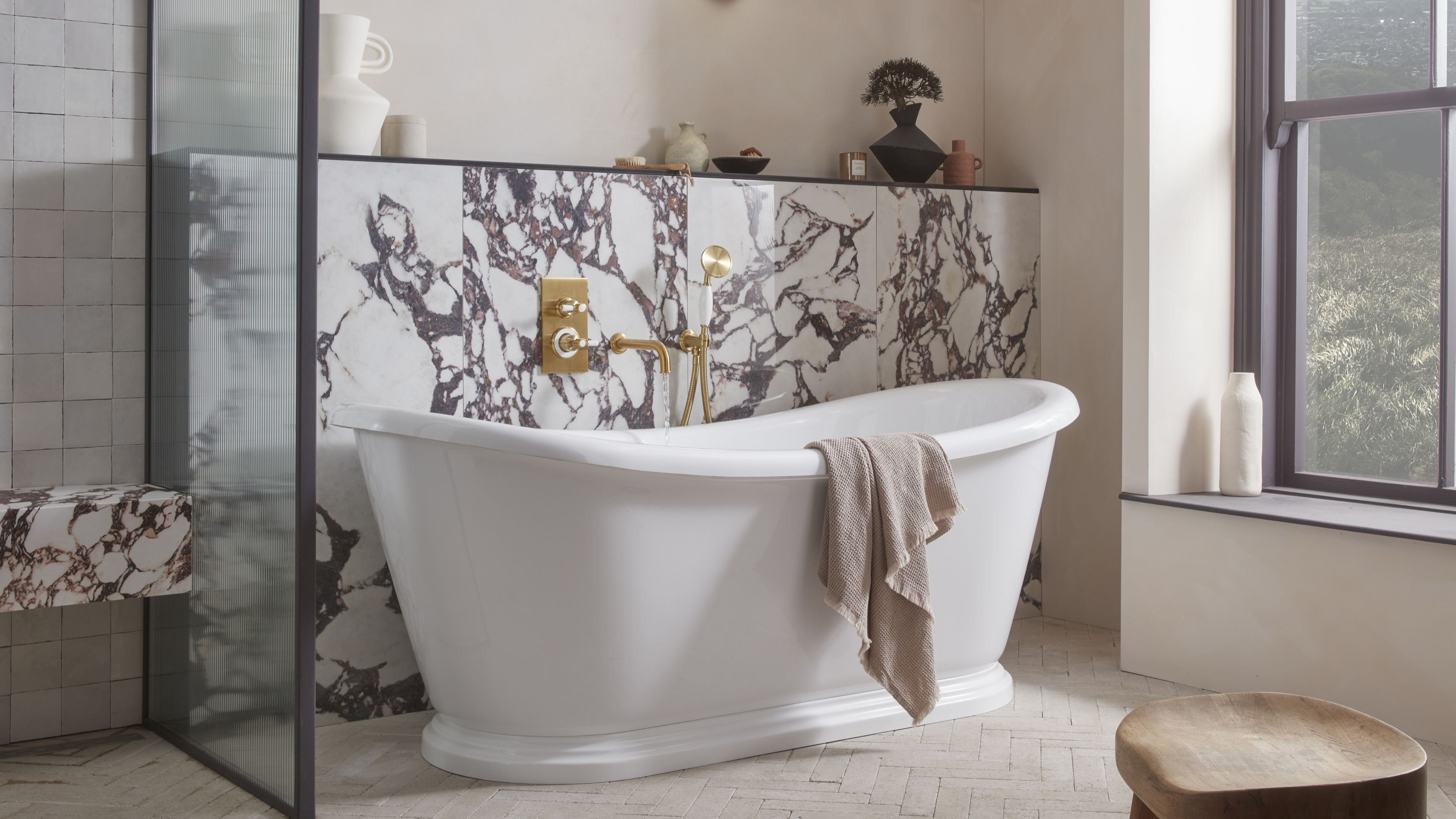 5 Bathroom Layouts That Look Dated in 2025 — Plus the Alternatives Designers Use Instead for a More Contemporary Space
For a bathroom that feels in line with the times, avoid these layouts and be more intentional with the placement and positioning of your features and fixtures
-
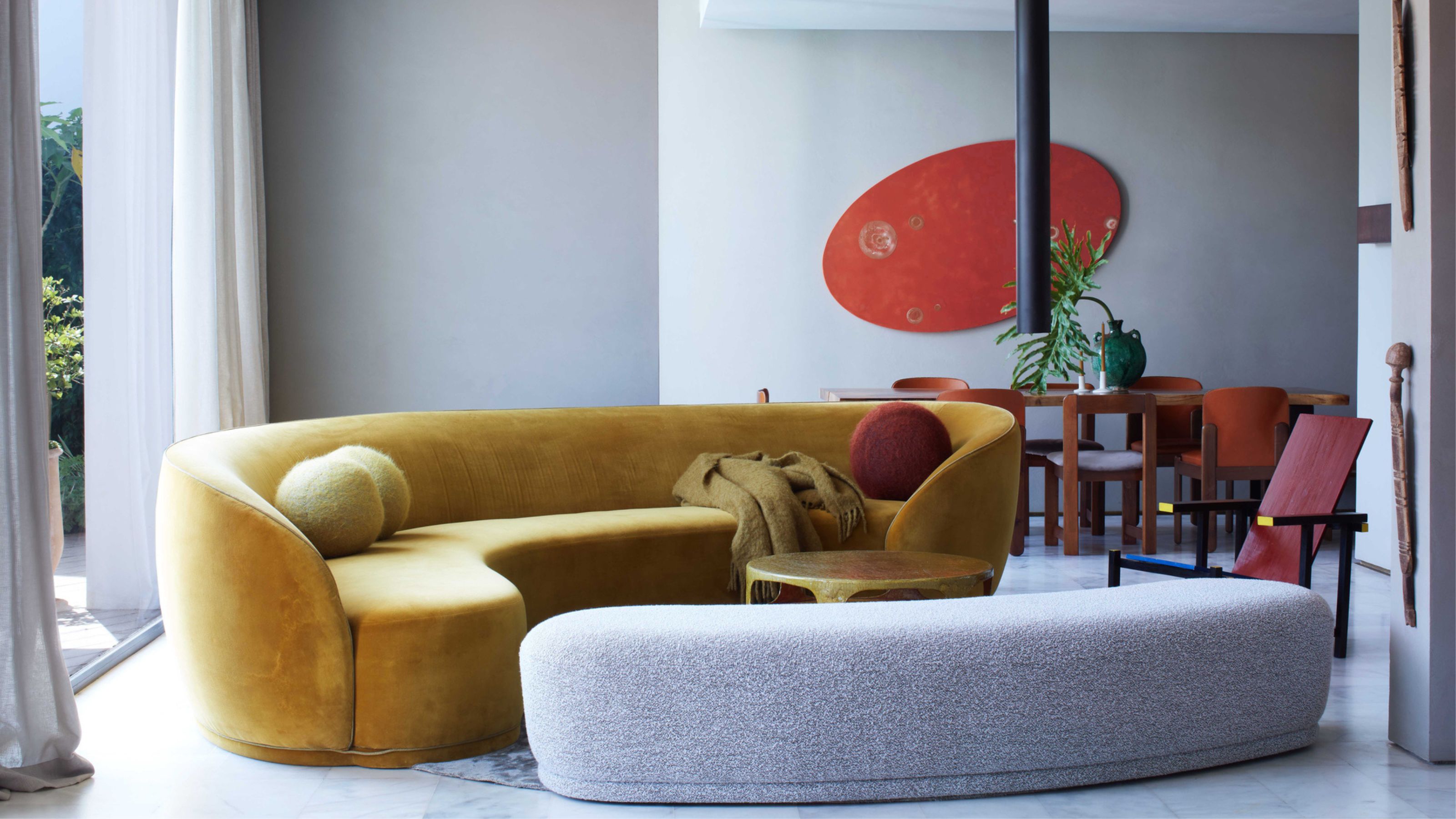 Why Decorating With Mustard Yellow Helps Fill Your Interiors With a Sense of "Confident Calm"
There is so much more to decorating with this turmeric-tinted sauce-wiggled-on-a-hotdog not-quite-yellow shade than meets the eye


-
Here's Why Decorating With Mustard Yellow Helps Fill Your Interiors With a Sense of "Confident Calm"
There is so much more to decorating with this turmeric-tinted sauce-wiggled-on-a-hotdog not-quite-yellow shade than meets the eye
-
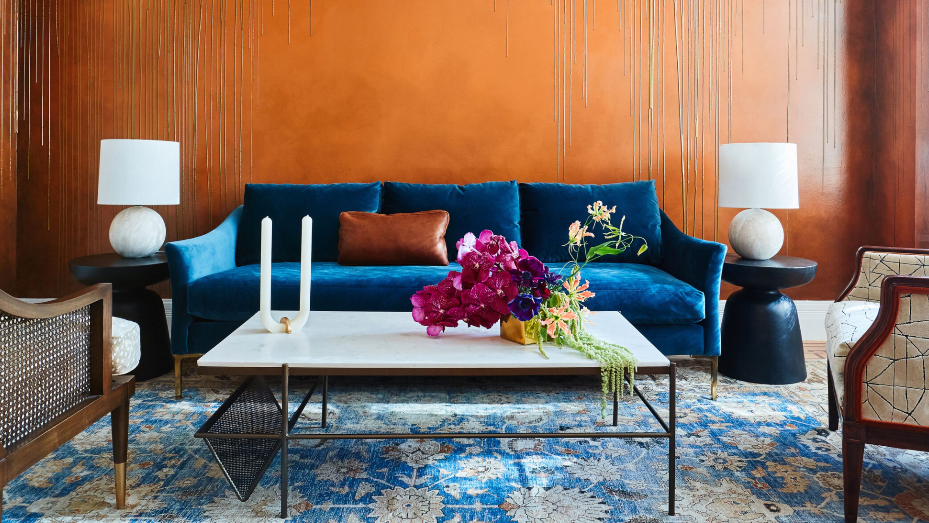 The Combination You Weren't Expecting to Love — 8 Blue And Orange Living Room Ideas That Feel Surprisingly Elevated
A blue and orange scheme for living rooms may sound jarring, but these spaces prove they're striking, vibrant, and certainly unforgettable
-
 Smeg Says Teal, and We’re Listening — The Kitchen Shade of the Year Is Here
Designers are already using the soft, sea-glass green everywhere from cabinetry to countertops
-
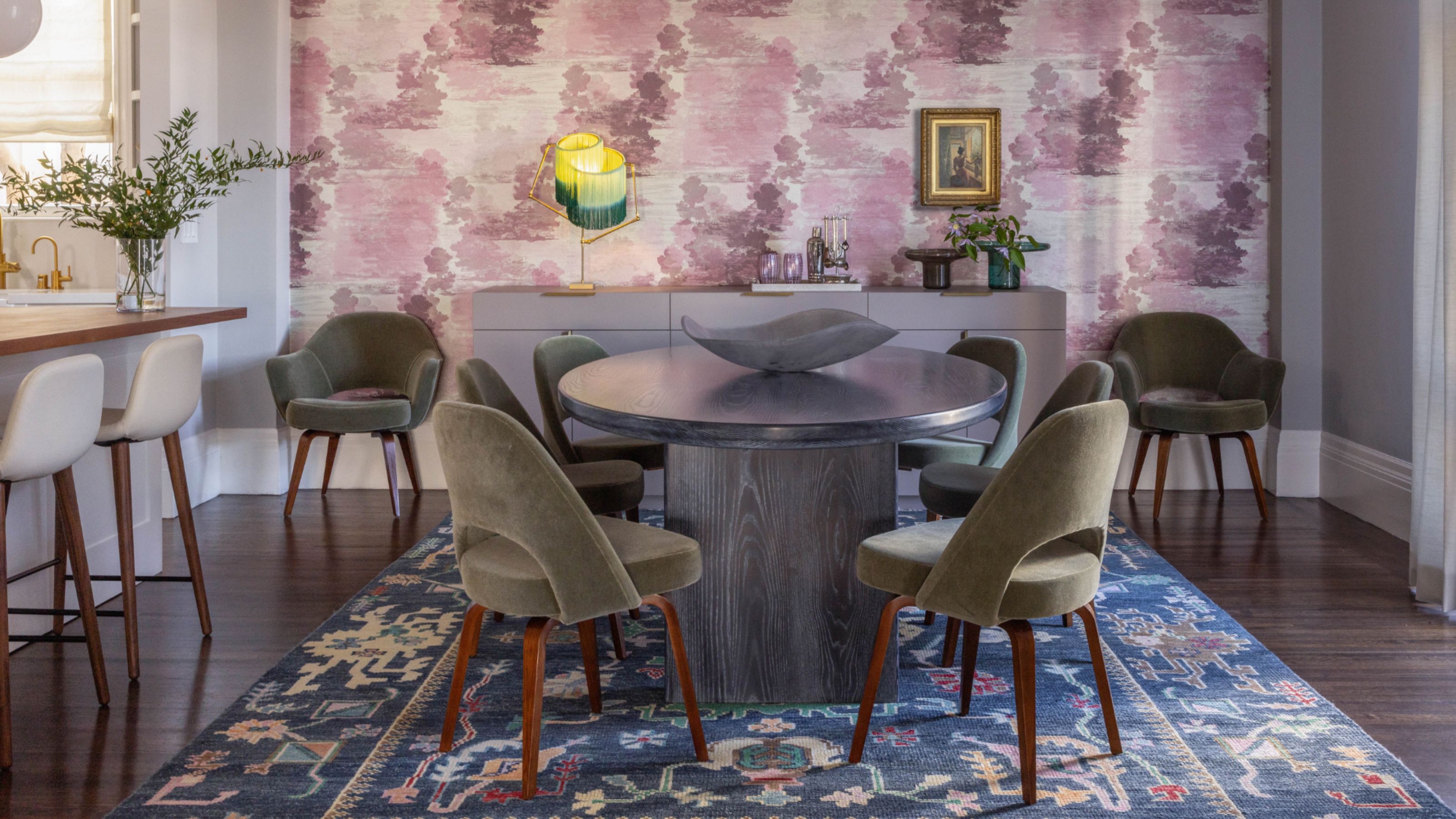 Do Yellow and Purple Go Together? Designers Reveal How to Make This Unexpected Pairing Feel "Totally Intentional"
In an era where unexpected combinations have become cool, we've done a deep-dive to discover how to pair yellow and purple in a space
-
 5 Unexpected but Seriously Stylish Spring Color Palettes to Shake Up the Season — "It's Pastel, but Punchy"
Spring color palettes are notorious for their use of pretty pastels, but that doesn't mean they have to lack variation
-
 5 Problems With Painting Your Walls White That No-One Ever Talks About (Until Now)
White is the easiest neutral to work with...right? Interior designers explain why this shade is actually more complex than it may seem
-
 The 'Red Table Trick' Is the Easiest and Most Expensive-Looking Trend to Hit 2025 So Far
A red dining table makes a seriously stylish statement; the beloved pop of red trend just got an bold and expensive-looking upgrade
-
 These New 'Sensory-Conscious' Paint Colors Have a Secret Undertone That Makes Your Home Feel So Much Calmer
Graham & Brown and The Sensory Home have teamed up to deliver a range of colors that are soft in saturation and create calm, secure, and balanced rooms


