Should You Always Paint a Ceiling White? Designers Share When to Break This Classic Decor Rule
We asked design experts to weigh in on when to skip a white ceiling and explore alternative schemes to bring added style and personality to your space. Here's what they said
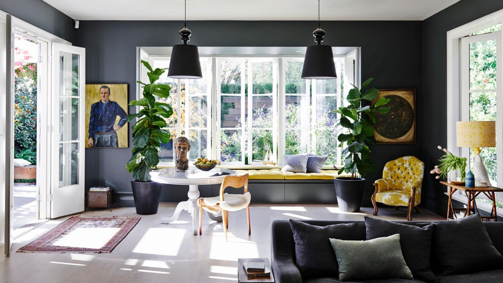

Lola Houlton
For most of us, painting the ceiling anything but white is a bold design choice that's so easy to get wrong. Choose the right alternative to a white ceiling and the results can be beautifully impactful. Make the wrong choice and your space can feel smaller, darker and unbalanced.
So, it's understandable that most of us play it safe. But does a ceiling always need to be white, or could we be a little bolder with our ceiling colors? And, if so, how do we get those painted ceiling ideas right?
We spoke to interior designers and paint experts, who are most definitely of the opinion that white shouldn't be the default color for a ceiling. Here, we discover when to play it safe with a white ceiling, and when to take the leap into something more daring.
When should you definitely paint a ceiling white?
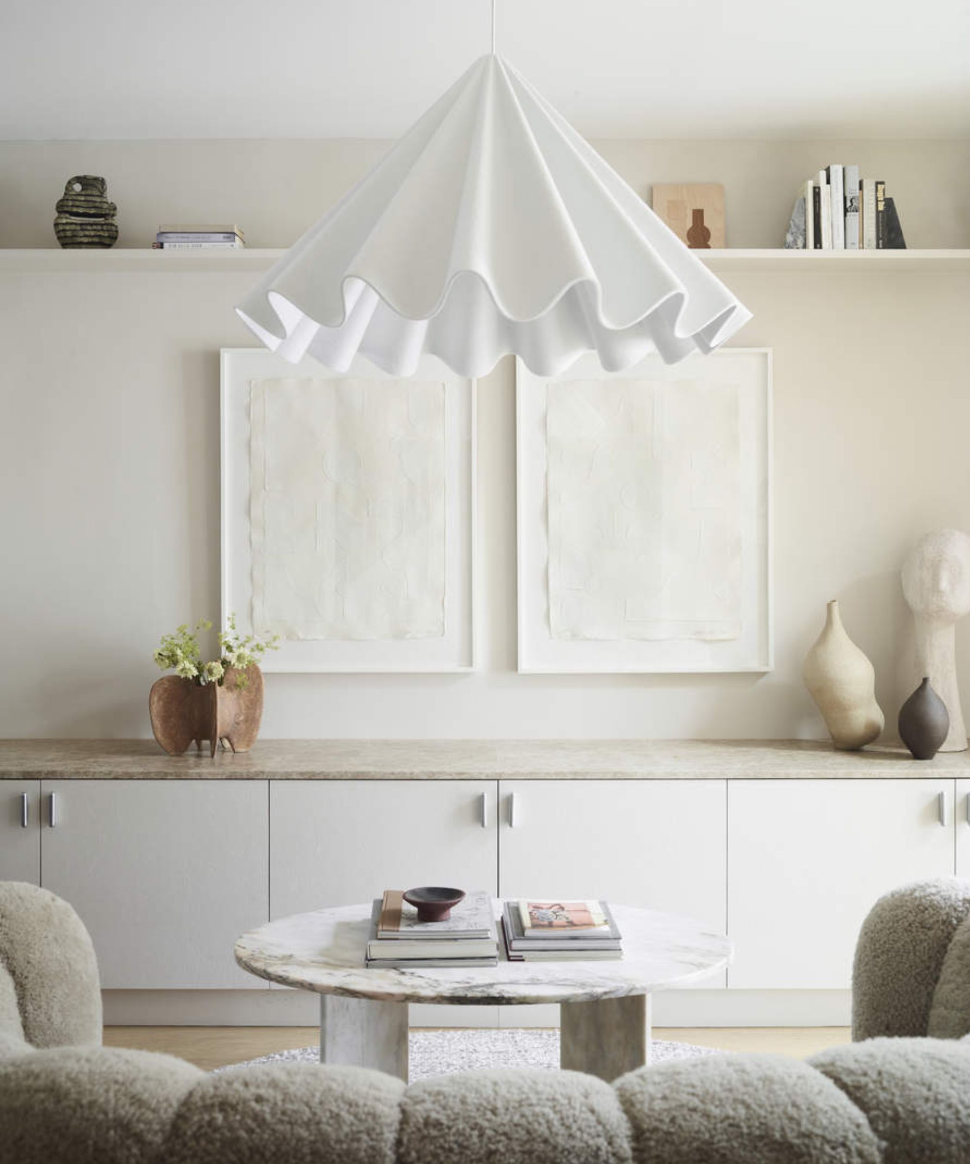
Choosing when to paint your ceiling white ultimately comes down to the following:
1. The composition of your space and the overall atmosphere you want to create. "Consider your room's dimensions, architectural features, and what atmosphere you are trying to create," says Livingetc's content director Lucy Searle. "White ceilings will make a room look taller, will highlight architectural detailing, and make the room feel cooler in terms of the warmth of the light that's given off, which may be exactly what you are going for."
2. Your room's natural light and function. "This will help you determine when to paint a ceiling white, and when not to," continues Lucy. "If your room suffers from poor daylight, perhaps it's east- or north-facing, you may find that painting the ceiling white will help bounce light around most effectively. And, if it's a room where good natural light is a must, perhaps in a kitchen, then a white ceiling might be the most practical decision."
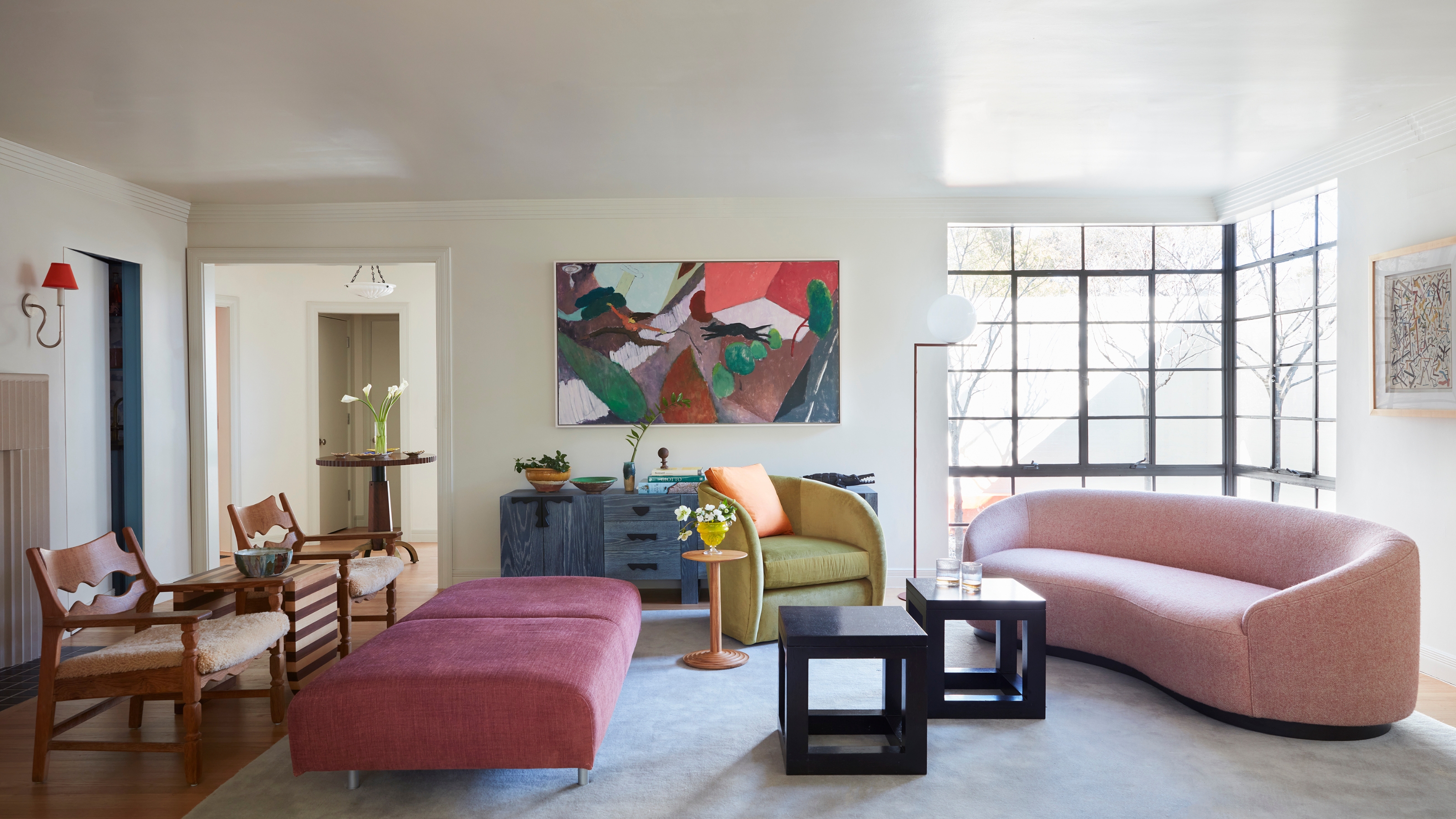
3. The rest of your room's decor scheme. "There is absolutely no reason why a ceiling should always be painted white," says Lisa Marconi, owner of interior design studio DesignLed. "I like to consciously think of the ceiling as the fifth wall: that way it encourages clients to think about what shall we do with it, in the same way you would a wall. Sometimes that will mean leaving it white, but it’s important you actually choose that as a design decision, rather than just defaulting to it. For instance, if it’s a busy room with a lot of pattern and color elsewhere, it’s probably best to leave the ceiling white."
What are the downsides to not painting a ceiling white?
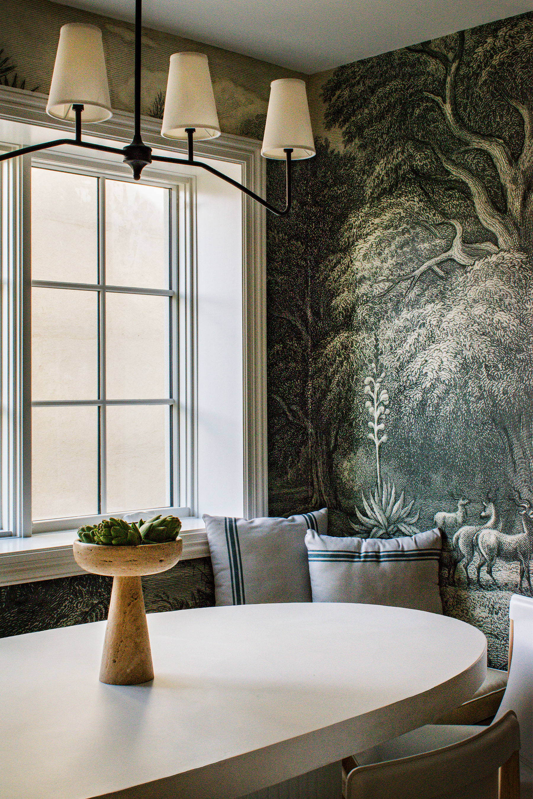
"When it comes to painting the ceiling, it's very, very rare that we use color for ceilings in our projects," says Emma Deterding, founder and creative director of Kelling Designs. "The reason for this is that although a colored ceiling may look gorgeous now, time will show that they really date a room. After all, would you really want a pink ceiling in five years’ time?"
Instead, Emma tends to choose an off-white color in her schemes — thanks to its ability to give a greater feeling of height, light, and space to a room. "We tend to use warmer tones of off-whites as opposed to white, as they bring a warmth and coziness with them that help create a calm and relaxed feeling," she adds.
"White ceilings still have a place within the home — they offer a classic and fresh look and complement numerous design schemes, and they can make a room feel taller," says Emma Bestley, co-founder and creative director of YesColours. "Remember to ensure that the white ceiling echoes somewhere else in the room — for example, the paintwork on the windows and doors."
And of course, there are also practical considerations when you're choosing a ceiling color. Irene Gunter of interior design studio Gunter & Co says: "It is worth considering that the majority of elements that get added to a ceiling, such as smoke detectors, air conditioning grilles, and downlights, are white. So, if you do decide on a different color, you’ll need to factor in trim-less downlights and air conditioning grilles, and perhaps fitting a smoke detector in an adjacent room. Without doubt, a non-white ceiling takes more planning."
What are the benefits of not choosing white for a ceiling?
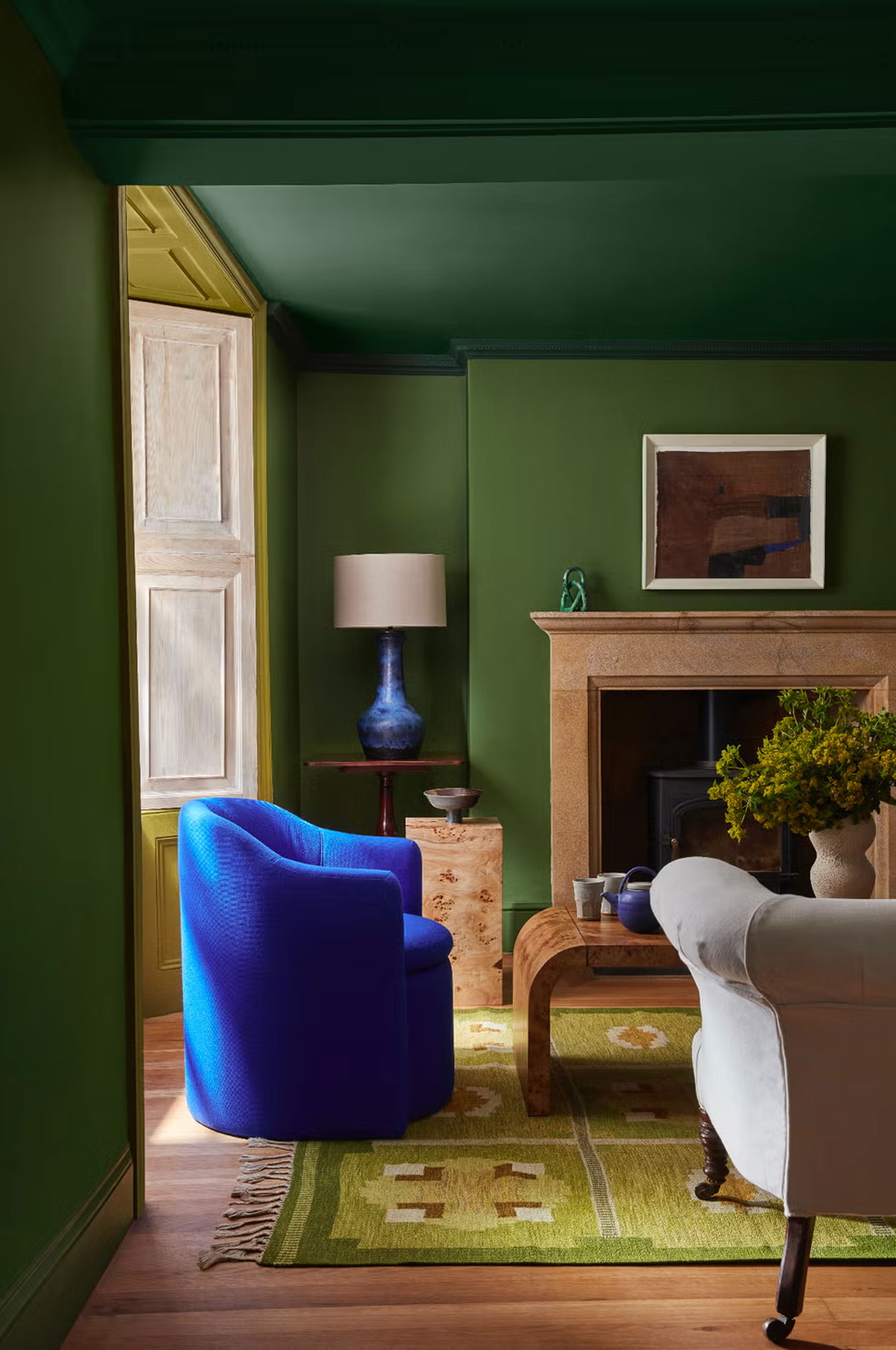
However, there are plenty of instances where painting your ceiling in a color other than white is a better choice.
"White ceilings have been the default choice for a long time, but there’s a subtle art to knowing when to break this rule," says Malak Bellajdel, founder of Malak Bellajdel Designs and consultant for Metal Plex.
"There is no right or wrong answer as to what color a ceiling should be painted; it all depends on the room and your preferences," agrees Helen Shaw, director at Benjamin Moore. "White can definitely give the illusion of a higher ceiling, but don't be afraid to deviate from the norm and step outside your comfort zone. Adding a deeper color, for instance, can create a cozy, cocooning atmosphere perfect for a snug whilst a pop of bright color on the ceiling of a bathroom or kids' room will be eye-catching and vibrant without being overbearing."
Malak Bellajdel advises using paint tricks for low ceilings when considering color choices: "Always think about your ceiling height first. In a room with a ceiling under 8 feet, I actually prefer using a soft cream or pearl tone instead of stark white. These shades are a bit warmer, so they create some depth without feeling like they’re weighing down the space."
Aaron Markwell, color lead at COAT Paints says painting your ceiling in another shade is about considering contrast. "Often, when using darker colors on walls, the same color or a complementary neutral are much better at softening the edges of the room and reducing contrast, which makes a room feel calmer," he adds. "This also helps the room feel taller, as your eye isn't immediately drawn to the contrast line with the white."
When should you use color on a ceiling instead of white?
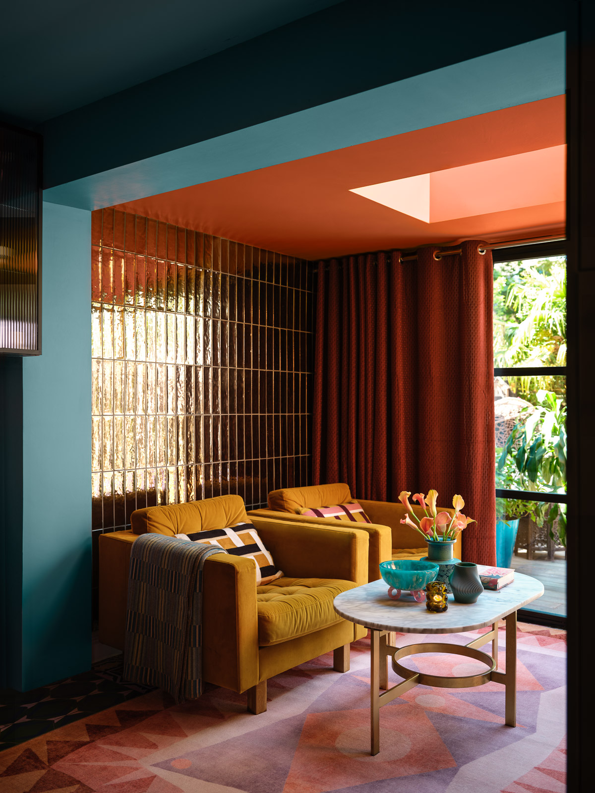
While there are clearly benefits to painting your ceiling white, there are just as many to choosing color instead. This is when experts consider more adventurous ceiling decorating ideas over white ones.
1. To make your scheme feel more pulled-together
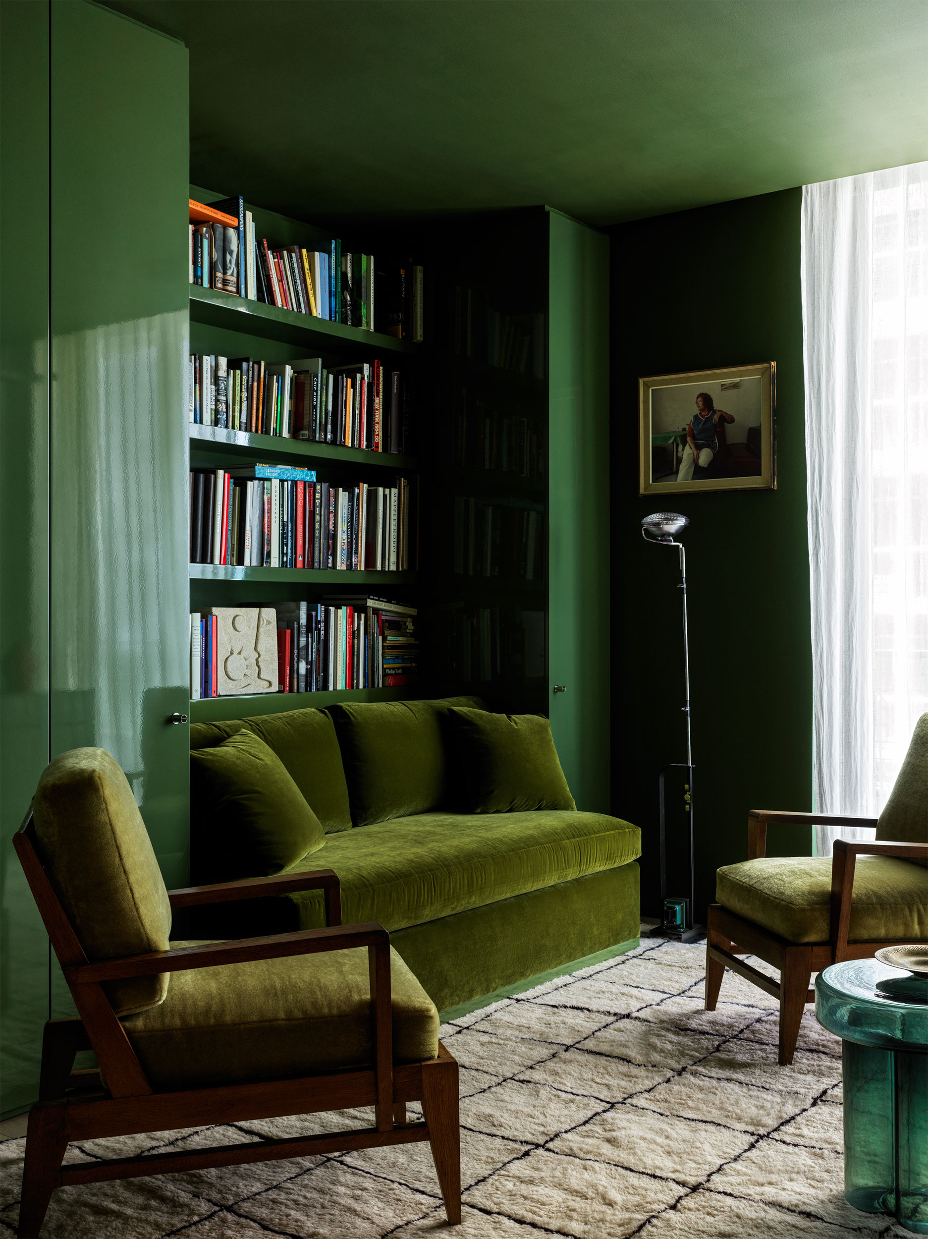
Painting the ceiling in a hue that echoes the walls, transitions naturally from them, or draws from other elements in the room can visually tie the space together, creating a unified and harmonious feel. This approach is particularly effective in spaces where a standard white ceiling might feel out of place. For example, in rooms with darker walls, a stark white ceiling can create a jarring contrast that disrupts the flow. Instead, opting for a ceiling color that complements the walls enhances the room's cohesiveness and intentionality.
And the best ceiling color in this case might be easier to find than you think. One effective option is choosing a ceiling color that is a lighter or desaturated version of the wall color. This avoids the harsh division that a white ceiling might create, especially in rooms with moody or deep wall tones. For instance, in rooms with dark walls, a soft, muted version of the wall color keeps the space balanced and seamless. With patterned rooms, drawing one of the colors from a patterned wallpaper or upholstery creates a polished and cohesive look.
Alternatively, for a more striking and immersive effect, consider color drenching by painting the ceiling the same color as the walls — a unified palette.
If your room has patterned wallpaper or upholstery, choosing one of the colors from the pattern for the ceiling creates a polished and cohesive look. Doing this can be a thoughtful way to make the ceiling an integral part of the scheme rather than just defaulting to white.
2. To add depth and warmth
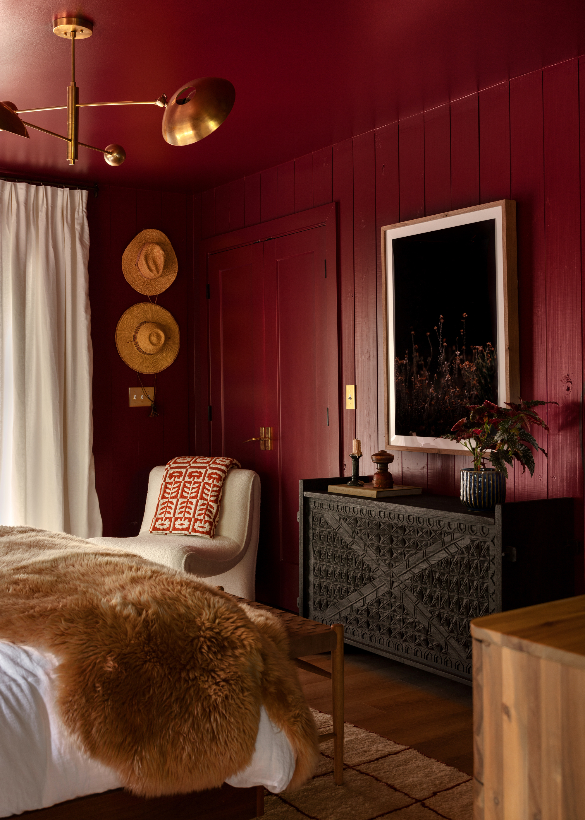
Painting a ceiling in a soft, warm color — such as blush, terracotta, taupe, olive, or even a muted red — can infuse a room with depth and a cozy ambiance without overwhelming the space or clashing with existing decor.
Nicole Saunders, interior design specialist, and the founder of The Design Build Vault says: "My suggestion is to use earth tones that create a cozy, grounded feeling. These shades are especially effective in rooms with warm lighting and wood accents, enhancing the organic, comforting aesthetic."
She adds, "Go for a matte finish to avoid harsh reflections and achieve a warm, inviting atmosphere." A matte finish not only softens the lighting but also enhances the warmth of the color, making the space feel more serene.
3. To highlight architectural details
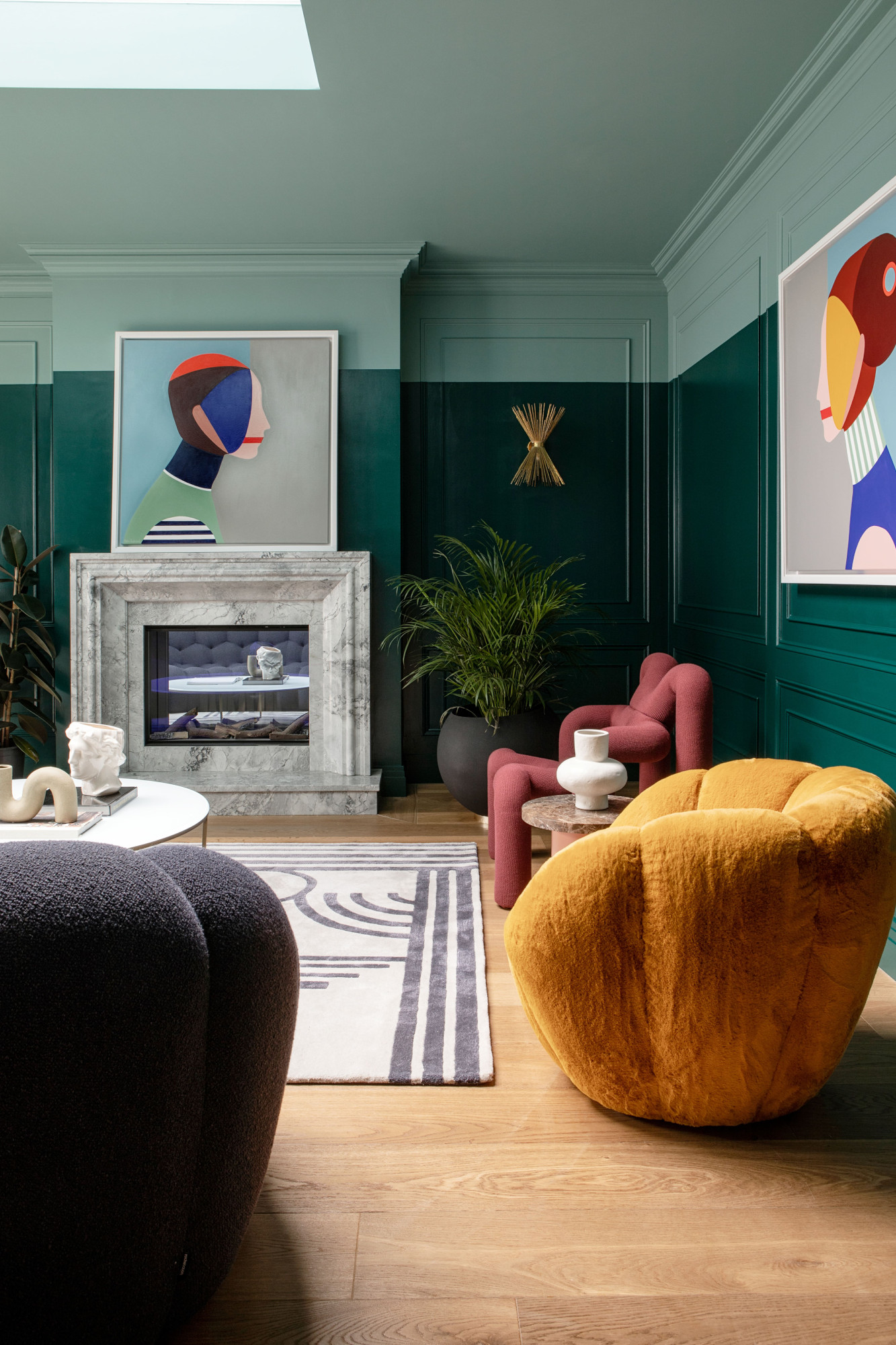
For ceilings with interesting architectural features, opting for color instead of traditional white can transform these elements into striking focal points.
Lisa Marconi says, "A painted ceiling can be great as a way to highlight beautiful moldings. If you’re lucky enough to have a house with gorgeous detail around the ceiling — picture rails, ceiling roses, ceiling detail — then painting above the picture rail and bringing it over the ceiling is a great way to draw the eye up to all that gorgeous detail. This works well to highlight paneling detail as well."
Nicole Saunders suggests going bold when choosing colors to accentuate architectural elements: "If your ceiling has exposed beams or decorative molding, paint the ceiling in a contrasting shade to make the architectural details stand out. For instance, white beams on a navy ceiling create a striking and timeless look. This approach works best in rustic or traditional interiors. I often like to use black paint for the beams, as it adds drama and depth to a room."
To further emphasize textures and intricate details, consider using high-gloss paint on the ceiling. The reflective surface adds dimension and enhances the play of light, particularly in rooms with elaborate molding or woodwork.
4. To add visual interest
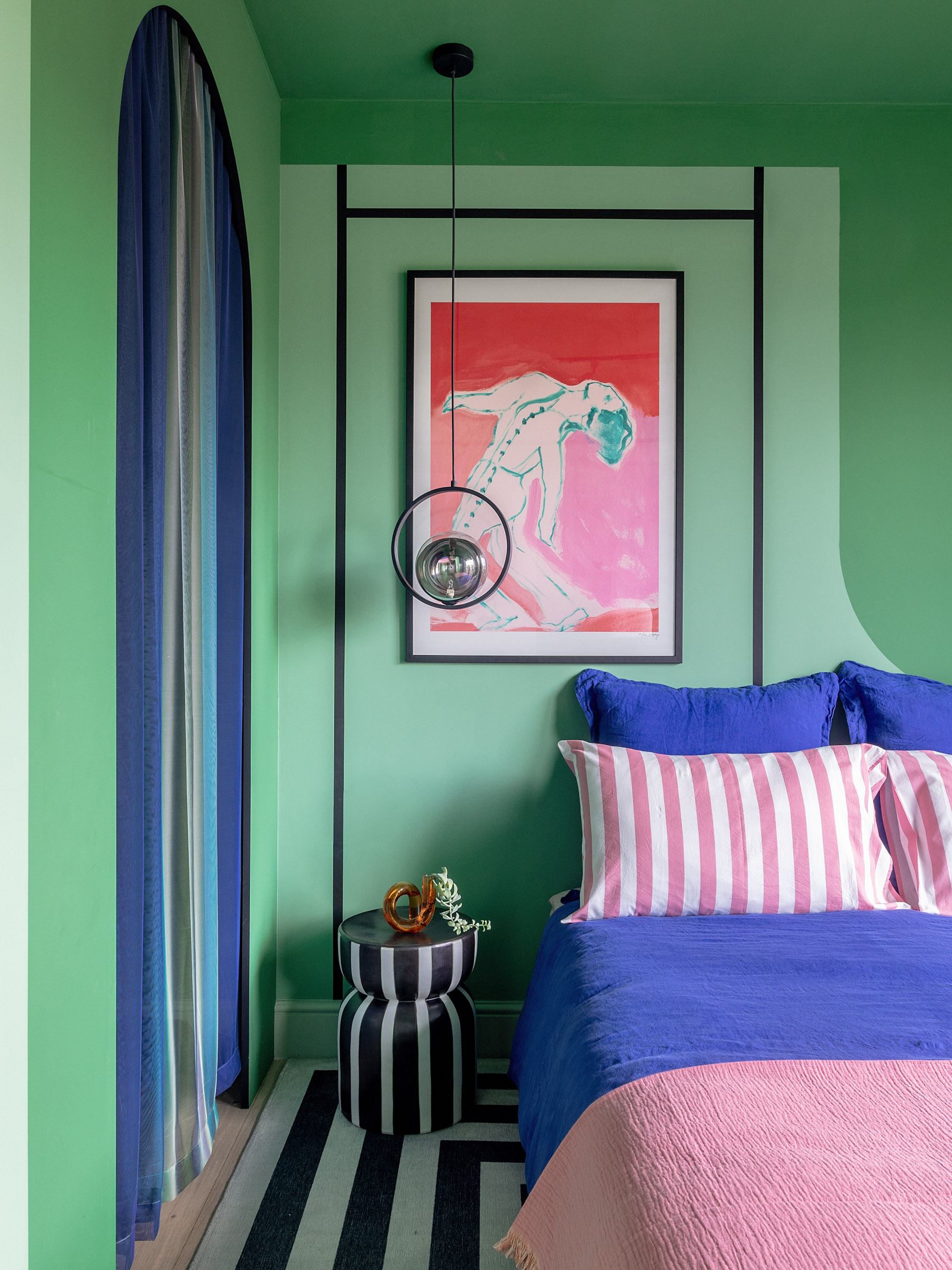
Painting a ceiling in a bold color rather than white can completely transform a room, infusing it with energy, depth, and personality. Often overlooked, the ceiling becomes a standout feature, adding drama and character.
Whether you opt for a rich jewel tone, a vibrant primary color, or even a textured or patterned finish, a bold ceiling is an opportunity to express your unique style and make a statement.
The right bold ceiling color can set the mood of the entire room. Warm colors, such as rich reds, oranges, and yellows, create energy and warmth, perfect for dining rooms or social spaces. Cool colors, such as deep blues or greens, add a calming, serene effect, ideal for bedrooms or bathrooms. In smaller, more dramatic spaces like powder rooms or entryways, darker ceiling colors such as navy blue, charcoal, or deep green can create a sense of grandeur and sophistication. A bold ceiling color also offers a way to introduce character to a room without committing to dark walls. This is especially useful in spaces with ample natural light, where a striking ceiling color can stand out while the light keeps the room feeling bright and open.
By tying the ceiling color into other design elements, such as rugs, drapes, or accent pieces, you can ensure that the ceiling complements the overall scheme, maintaining harmony while adding character throughout the space.
Ultimately, Malak Bellajdel says, "It’s really important to understand that your ceiling color should respond to your space’s unique characteristic rather than following a one-size-fits-all rule."
5. To create a cocoon-like space
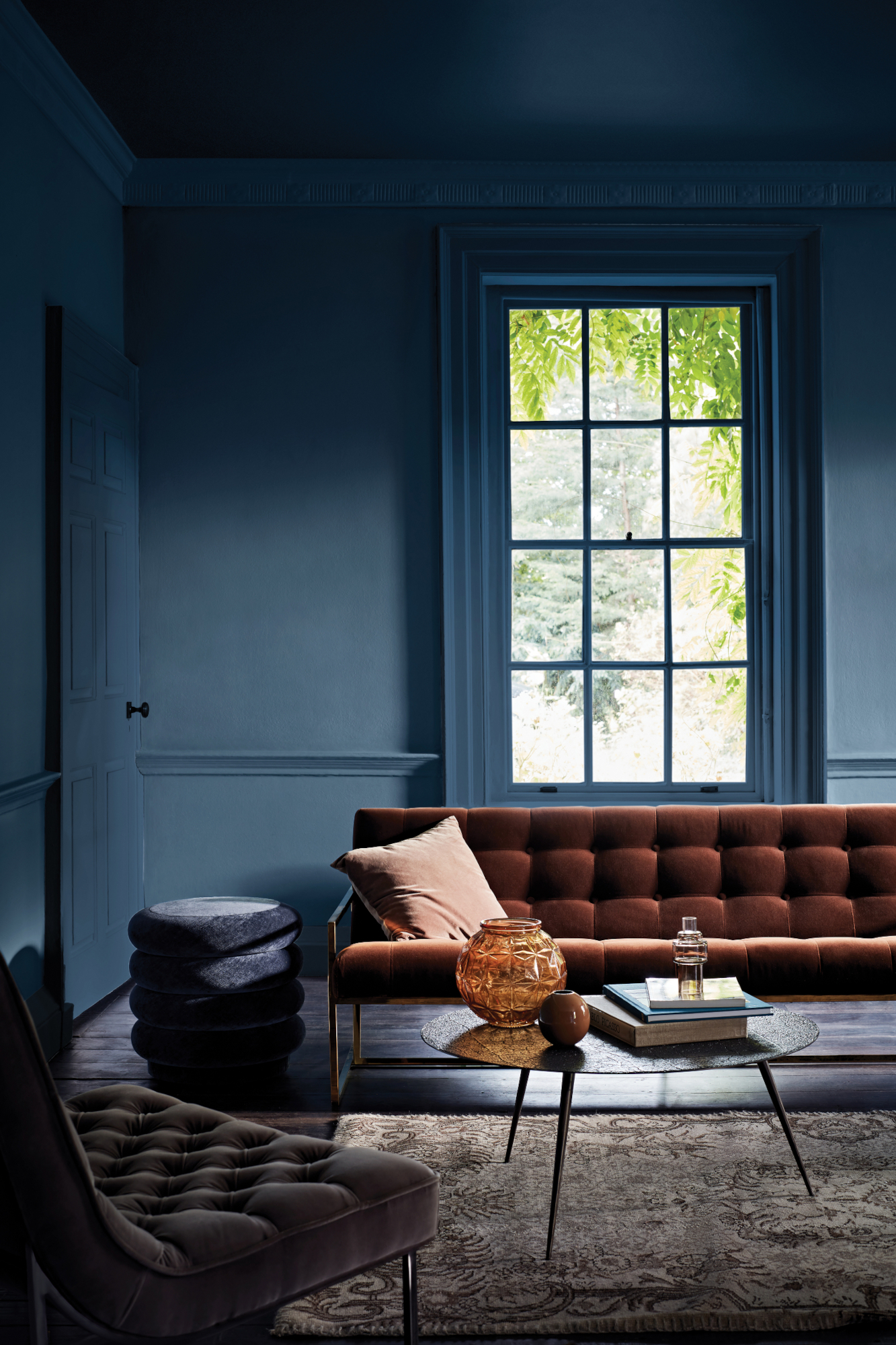
A white ceiling rarely lends itself to a truly cozy space — so instead, look to darker colors to create this effect. "I like to paint a ceiling in a contrasting color when we’re trying to make a room cozy or cocoon-like — especially when we’re using darker colors," says Lisa Marconi. "It just creates that wonderful feeling of being enveloped by a room."
She's also a fan of color drenching — the popular all-over paint technique that creates the ultimate intimate feeling in a space. "Sometimes we’ll just go the whole hog and envelop the room in the same strong shade!"
Alternatively, use color contrast to add a playful touch to your scheme. "Try something a little different by using a really bright color on the ceiling so the color visually spills onto plain white walls below," says Justyna Korczynska, senior designer at Crown Paints. "Alternatively, play with tones to suit your palette. A dark turquoise, for example, on the ceiling would partner suitably with mid and paler tones for the walls."
Malak Bellajdel advises, "For rooms with high ceilings, I suggest using the wall color on the ceiling, but at 50% strength. This technique is great for grounding the space and it creates a cocoon-like feeling that works well, particularly in bedrooms or intimate setting areas."
This approach works wonderfully in bedrooms or areas where you want to foster a cozy, cocoon-like environment without sacrificing the space's airy feel.
6. To incorporate texture into your space
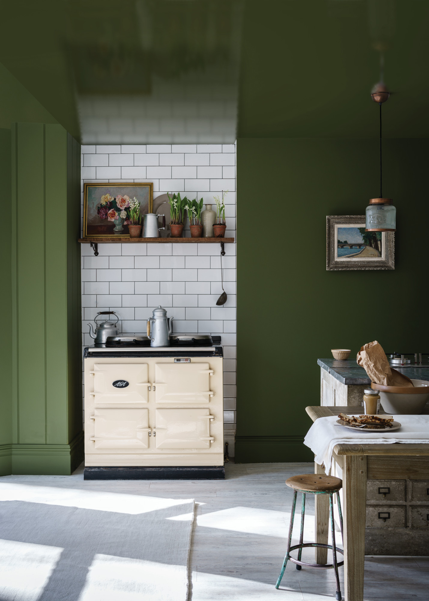
If a white ceiling feels a little flat, incorporating color with a textural paint finish is a way to lift your scheme — and add a little pizzazz. "The ceiling can be a great place to add some glam," says Lisa Marconi. "Using a lacquered finish creates instant wow and is great if you feel having a finish like that on the walls would be too much."
A bolder alternative, if you want a truly show-stopping scheme, is to opt for a metallic finish. A brushed gold paint effect will act as a reflective surface, bouncing light around the room, and adding an element of glamor to the space.
Malak Bellajdel adds, "Textured ceilings benefit from colors with gray undertones rather than pure white. The slight pigmentation helps mask any imperfections while keeping it architecturally interesting. For example, you can use a pale gray-blue on a textured ceiling and watch it transform an eyesore into a design feature."
7. To play with painterly effects
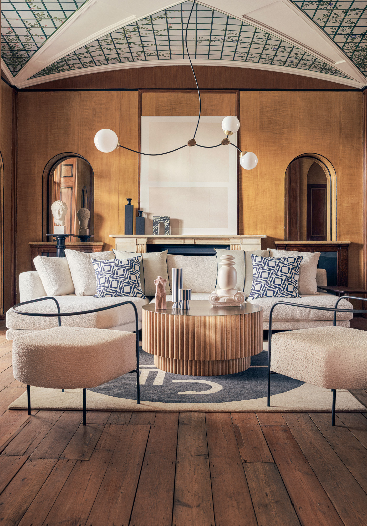
"Another beautiful take on a creative ceiling is to play with painterly effects," says Emma Deterding. "Decorative paint finishes have really come along and are often the crème de la crème or the biggest cheat!" She uses the example of marble columns in stately homes — "which you would expect to be stone but have actually been painted to look like stone."
How to bring this effect into your own home? "A talented decorative painter can create a bespoke finish that can not only transform a room but set the tone and texture for the space," Emma adds. "They are true magicians with color and can see and combine many different shades within the effect — something that is just so standout and unique. The same process can be easily applied to the ceiling, whether you create a beautiful mural, a paneled ceiling, or even a starry night sky."
8. To create a playful design for a kids’ room
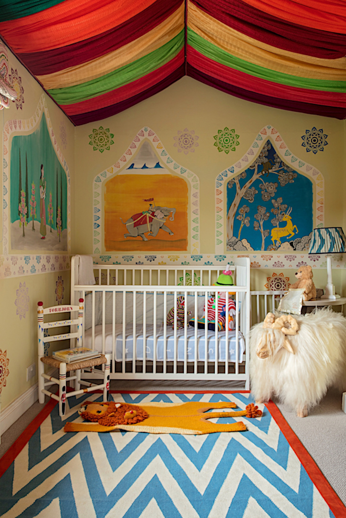
While Emma Deterding tends to steer away from colorful ceilings, the one place she will make a statement overhead is in a kid's room. "The ceiling is an area of a room that can often be overlooked, but with some clever design tricks, you can make a real statement from above," she says.
"For instance, in a child's bedroom, you can create a really fun tent-like ceiling with fabric. Once you've established the theme of the bedroom, be it fairytale, circus, or jungle, you can then pick fabrics in colors and prints to suit and hang from the center, draping out to the sides to add drama and coziness."
For Emma Bestley, this playful touch need not be limited to one room. "Play with patterns to create zones within a room," she says. "Checkerboard, for example, works beautifully — a classic pattern that adds a little grandeur. If you're hand-painting, patterns can be scaled accordingly to suit your chosen room."
So, clearly, the answer is that you shouldn't always paint a ceiling white, with caveats.
"If you plan to make the departure into a more fun option for the fifth wall it should definitely be planned with the rest of the interior of the room and how it relates to surrounding rooms," says Pattie Kelly, certified interior decorator and president of Inspired Home Interiors.
Consider the ceiling not as an isolated feature but as part of a larger design story. A bold ceiling choice can transform a room, but it must align with the overall aesthetic to feel cohesive and intentional.
Ultimately, the decision to paint a ceiling anything but white comes down to personal preference and how well it serves the space’s purpose. Whether bold, subtle, or classic, the right ceiling choice can unify a room’s design, add a layer of interest, and reflect your style.
Be The First To Know
The Livingetc newsletters are your inside source for what’s shaping interiors now - and what’s next. Discover trend forecasts, smart style ideas, and curated shopping inspiration that brings design to life. Subscribe today and stay ahead of the curve.

Ellen is deputy editor of Livingetc magazine. She works with our fabulous art and production teams to publish the monthly print title, which features the most inspiring homes around the globe, interviews with leading designers, reporting on the hottest trends, and shopping edits of the best new pieces to refresh your space. Before Livingetc she was deputy editor at Real Homes, and has also written for titles including Homes & Gardens and Gardeningetc. Being surrounded by so much inspiration makes it tricky to decide what to do first in her own flat – a pretty nice problem to have, really. In her spare time, Ellen can be found pottering around in her balcony garden, reading her way through her overstacked bookshelf or planning her next holiday.
- Lola HoultonNews writer
-
 Turns Out, Sustainable Design Can Be Chic, and Net-a-Porter's 'Net Sustain' Curation Is Proof — Here's What I'm Shopping
From the Net Sustain collection, Mud Australia's homeware is not only design-oriented, but eco-focused, too
By Devin Toolen
-
 Before and After — How This Jewel-Box Bathroom Made the Most of Its Proportions With Maximalist Design and a 'Soaking Tub'
This design offers a masterclass on creating a luxurious bathroom that is equally playful and elegant.
By Maya Glantz
-
 Amethyst, Heather, Pansy, Plum — Turns Out Decorating With Purple Opens You Up to a World of Possibilities
Purple certainly isn't a color for the faint hearted, it's a shade that can smell your fear. Here's how to conquer it through your interiors
By Amy Moorea Wong
-
 Here's Why Decorating With Mustard Yellow Helps Fill Your Interiors With a Sense of "Confident Calm"
There is so much more to decorating with this turmeric-tinted sauce-wiggled-on-a-hotdog not-quite-yellow shade than meets the eye
By Amy Moorea Wong
-
 5 Problems With Painting Your Walls White That No-One Ever Talks About (Until Now)
White is the easiest neutral to work with...right? Interior designers explain why this shade is actually more complex than it may seem
By Olivia Wolfe
-
 5 Mistakes That Are Making the Blue Details in Your Room Feel Old-Fashioned — And How to Rectify Them
Blue is a timeless shade, no doubt, but use it in the wrong space or in the wrong way, and it can make a space feel, well... a bit blue
By Kelly Hushin
-
 5 of the Best Navy Blue Paint Colors That Designers Love — And How to Use Them
Navy blue has timeless appeal and can feel both modern yet classic, but what are the designers' favorite paints?
By Oonagh Turner
-
 Should Your Carpet Be A Darker Color Than Your Walls? How to Make This Bold Look Work
Not every room can get away with a carpet that is darker than the walls; Designers share when and where this combination works best
By Olivia Wolfe
-
 What Actually Is Yves Klein Blue? A Short History of This Iconic Color, and How to Decorate With It
Explore “the most perfect expression of blue” and how to free this pigment in your home
By Camille Dubuis-Welch
-
 Do Pink and Green Go Together in Interiors? A Professional Color Consultant's Verdict
How to make pink and green color combinations work for more contemporary interior schemes
By Olivia Wolfe