Before & After: See a jaw-dropping farmhouse transformation
This dated property received a dramatic transformation – without impacting the existing footprint of the house.
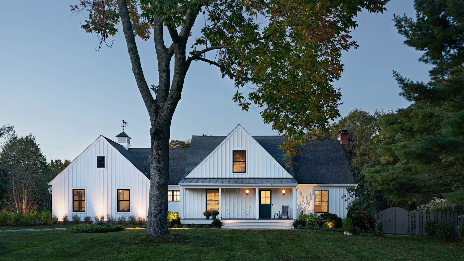

Architect Jill Porter completely transformed this colonial 80’s home in Verbank, New York, into a modern farmhouse.
Seeking a country getaway from NYC, the owners were drawn to this rural property as it has beautiful acreage, a pond, and privacy. The house, however, was in dire need of work. Not only was it dowdy and dated, but the home’s interior layout left the kitchen and dining room divorced from the beautiful grounds.
The owners asked Jill Porter to help them transform their dated home into a modern farmhouse, including an exterior makeover with a modern farmhouse feel, and a new interior imbued with sunlight and design-rich finishes: bold and elegant materials, colours, and patterns.
Mindful of the overall budget, any changes needed to be surgical, as the owners didn't want to enlarge or alter the existing footprint of the house.
It's a dramatic transformation – without impacting the existing footprint of the house.
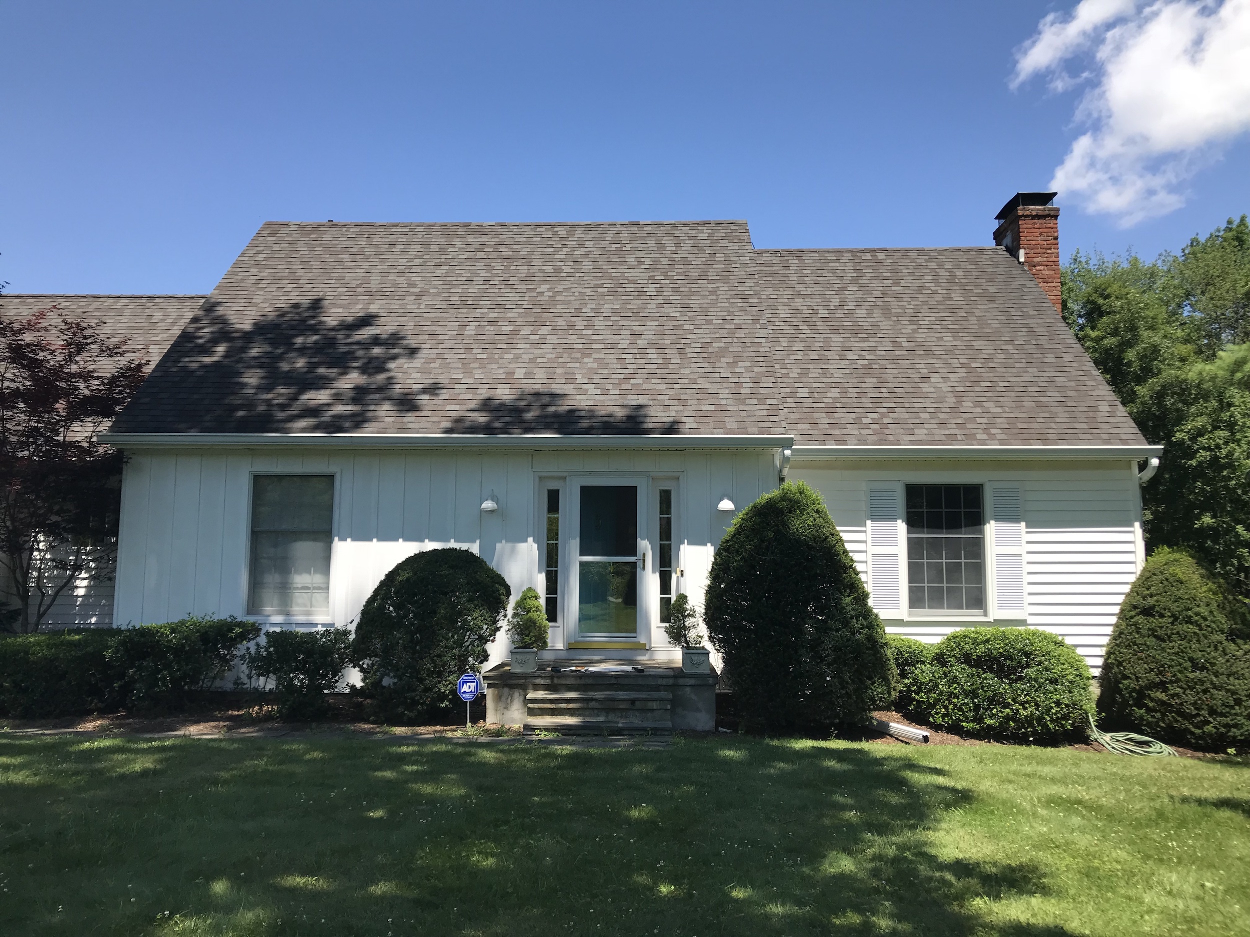
FRONT EXTERIOR - BEFORE
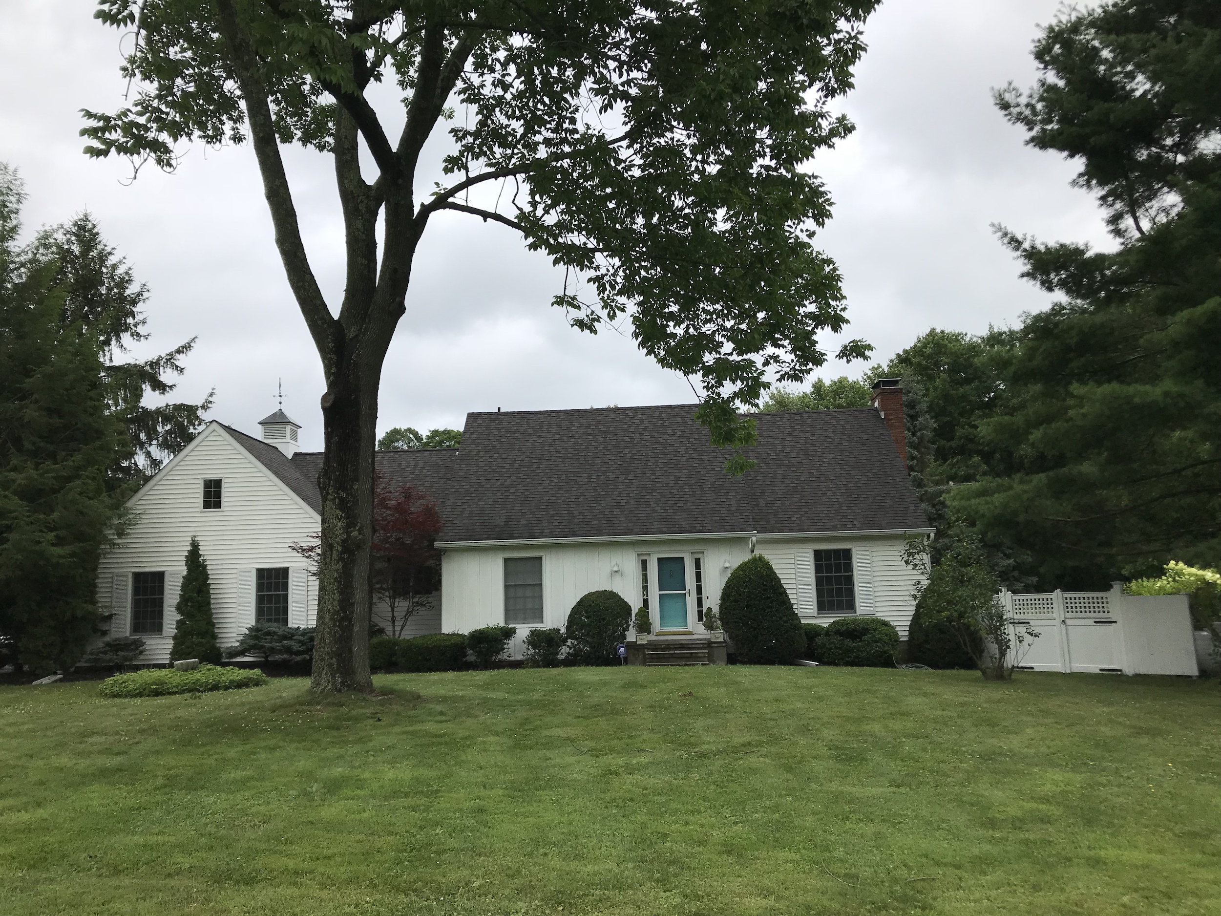
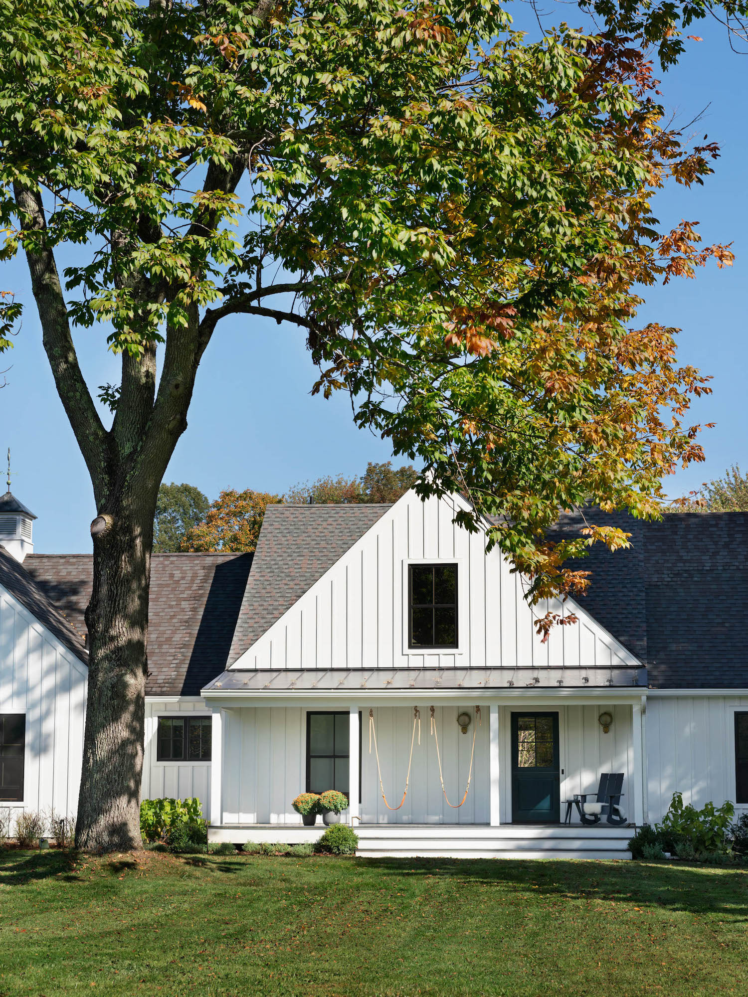
Jill porter first considered the proportions and volumes of the front elevation, as the front entry was dwarfed by the long roof. To this end, they broke up the existing roof line with an a new entry porch and gable roof.
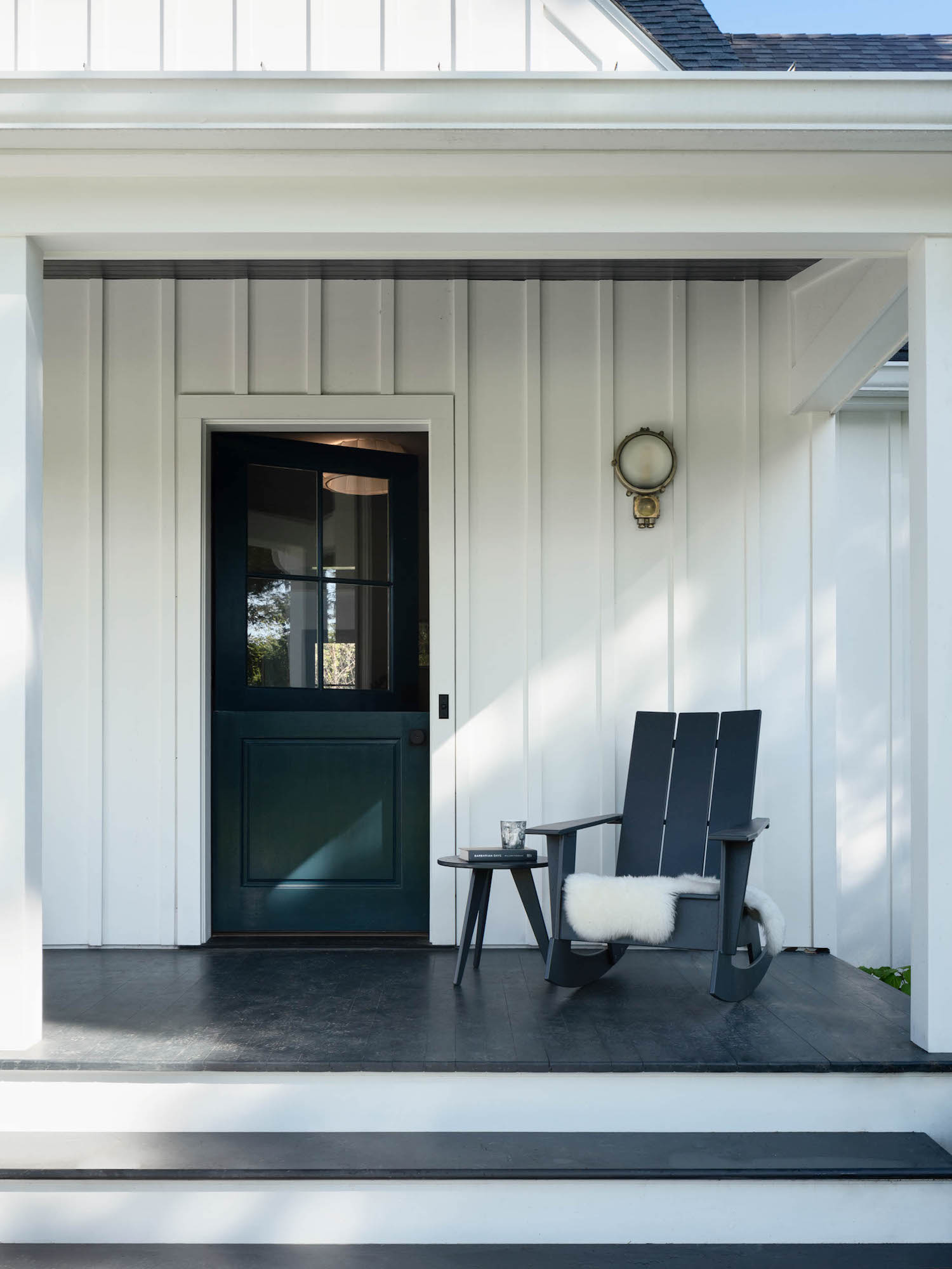
FRONT EXTERIOR - AFTER
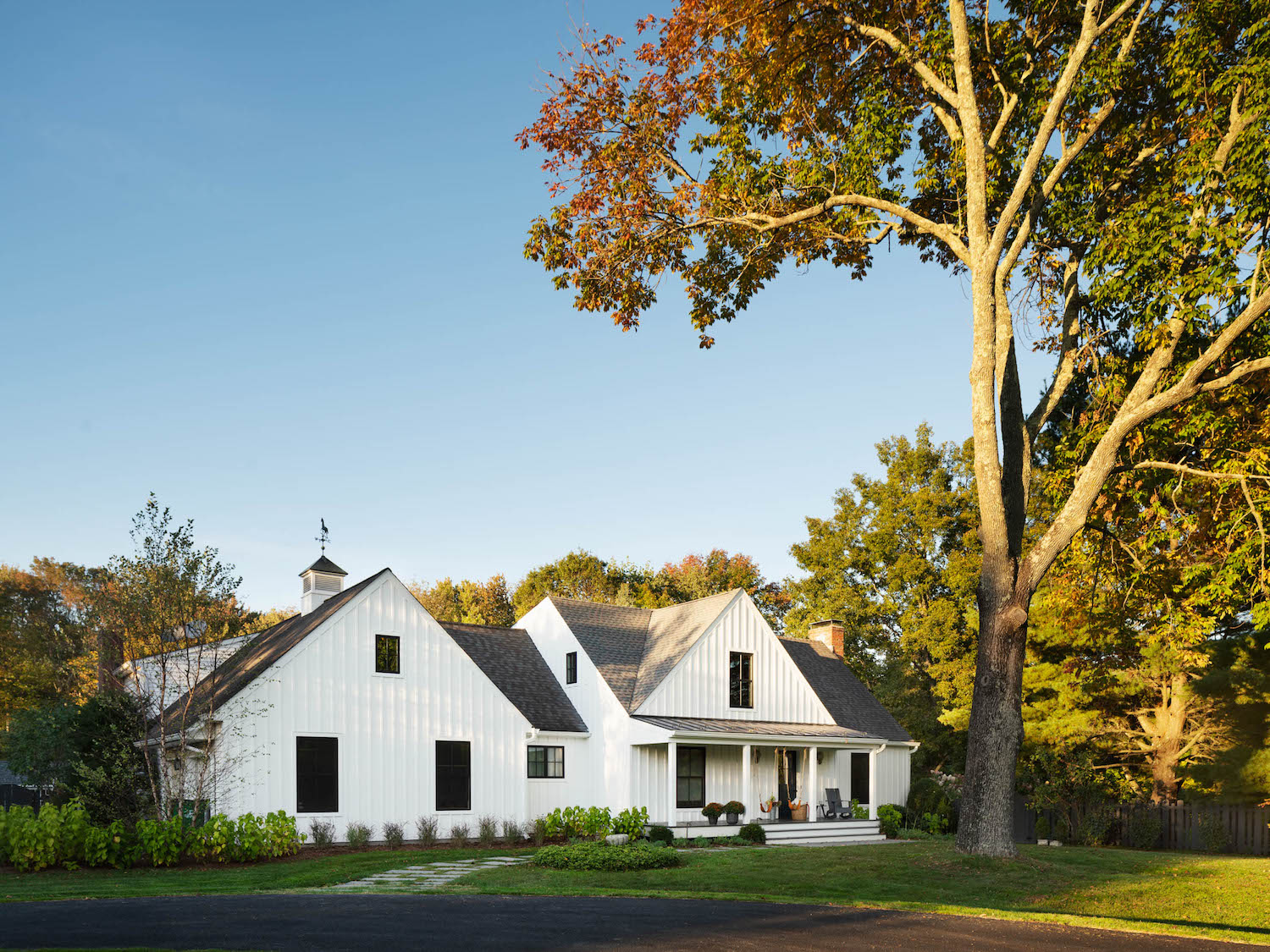
Although the change was limited to the entry, the new entry proportions changed the complexion of the whole front facade. New board and batten siding, black windows, and vintage lights provided the finishing touches, giving the home a crisp, modern farmhouse feel.
Be The First To Know
The Livingetc newsletters are your inside source for what’s shaping interiors now - and what’s next. Discover trend forecasts, smart style ideas, and curated shopping inspiration that brings design to life. Subscribe today and stay ahead of the curve.
REAR EXTERIOR - BEFORE
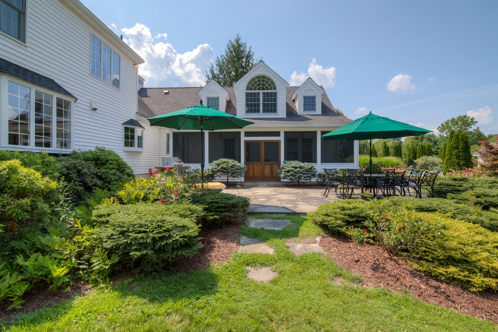
The back side of the house was nothing short of awful, due mostly to an ill-conceived addition. Oversized dormers sat on top of a screened-in porch, unusable due to it’s long, skinny proportions. The kitchen had no access to the exterior, nor broad views of the beautiful grounds. And the closest bathroom to the pool and patio required a walk through the screened-in porch, family room, and kitchen — a long trip for wet feet!
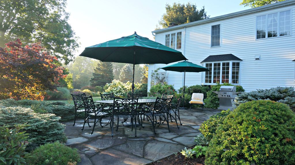
REAR EXTERIOR - AFTER
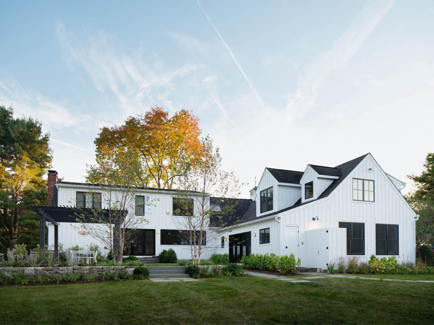
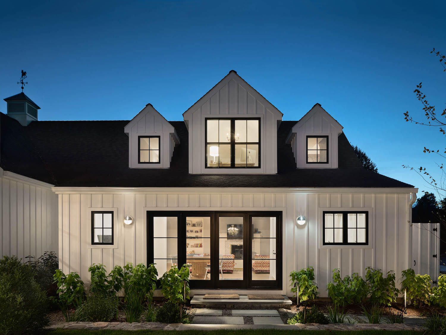
Changes to the back facade went hand-in-hand with the changes to the interior layout. The interior spaces were shifted and reconfigured, allowing space for a new mudroom / boot room, as well as a new bathroom with access to the outdoor patio and pool.
And what was the porch is now an open-plan family room with floor-to-ceiling glass doors and windows, connecting the interior space with the gorgeous grounds.
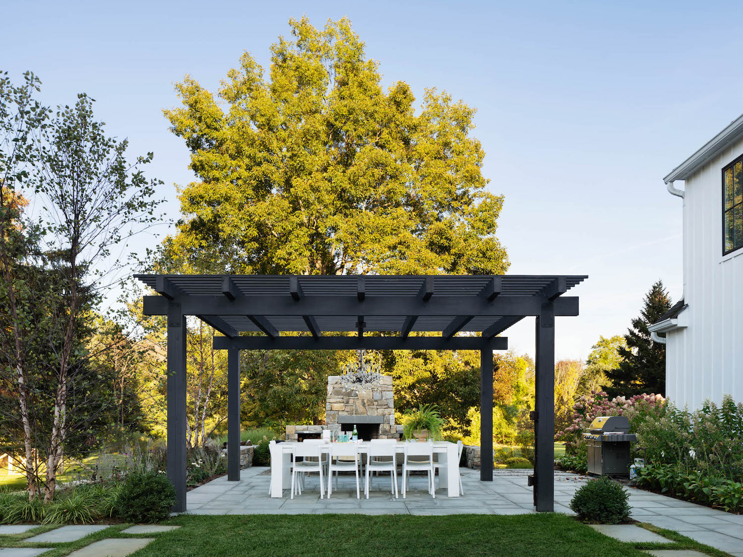
The landscaped garden and outdoor kitchen got a fresh facelift too.
BOOT ROOM
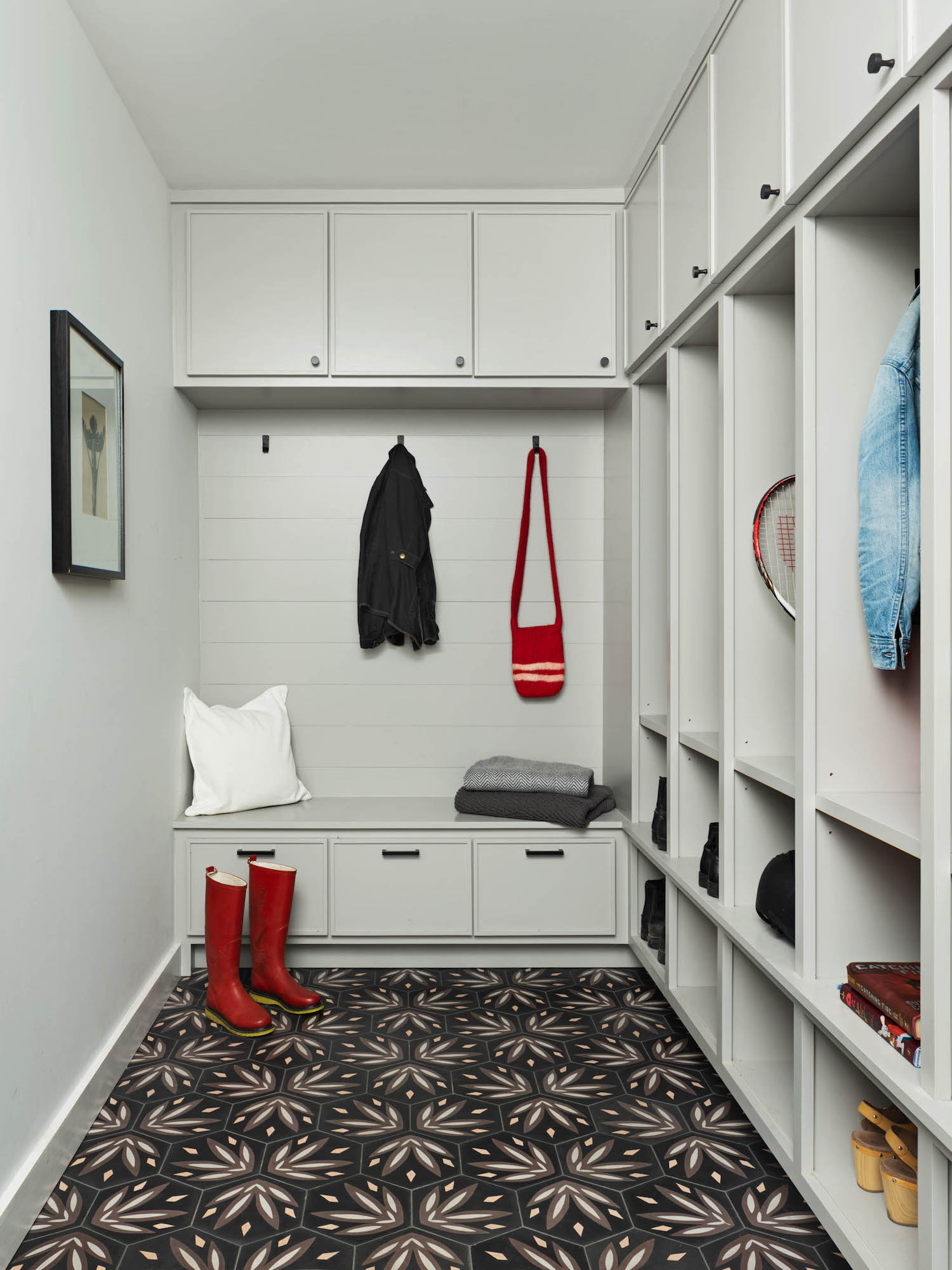
Each space has it’s own feel, and the patterned floor tiles in the boot room conceal the mess inevitably left by a family with kids and pets.
PORCH - BEFORE
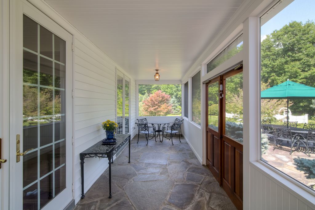
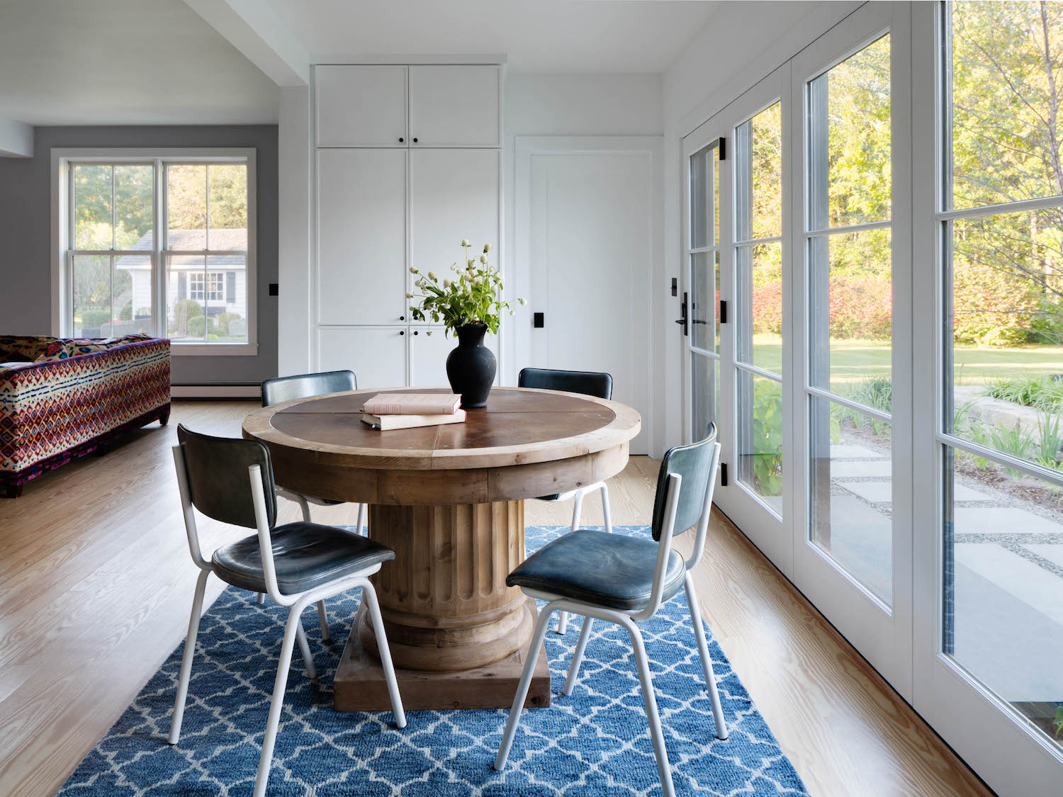
PORCH - AFTER (NOW FAMILY ROOM)
Long arrays of windows and doors were added to the dining room, kitchen, and former screened-in porch – which is now part of the family room.
The new windows and doors firmly establish a relationship between the interior and exterior, frame views of the property, and wash the interior with sunlight.
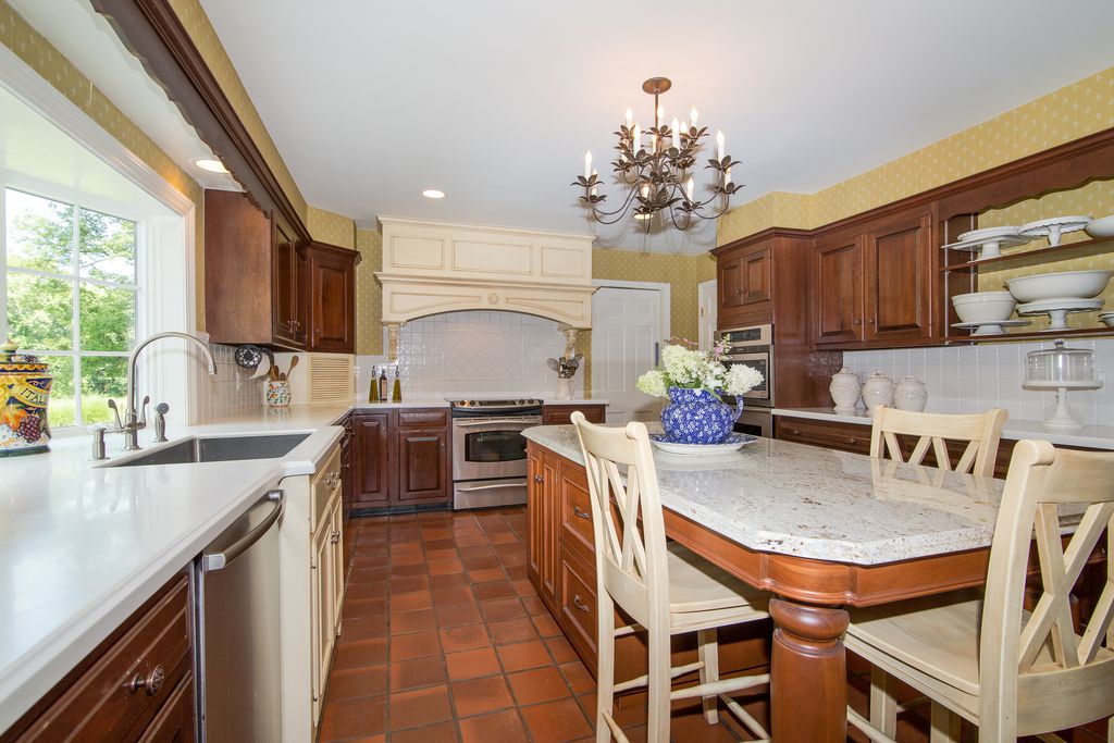
KITCHEN - BEFORE
The old kitchen was perhaps the most dated of all, featuring glossy brown wood cabinetry and a matching brown tiled floor.
KITCHEN - AFTER
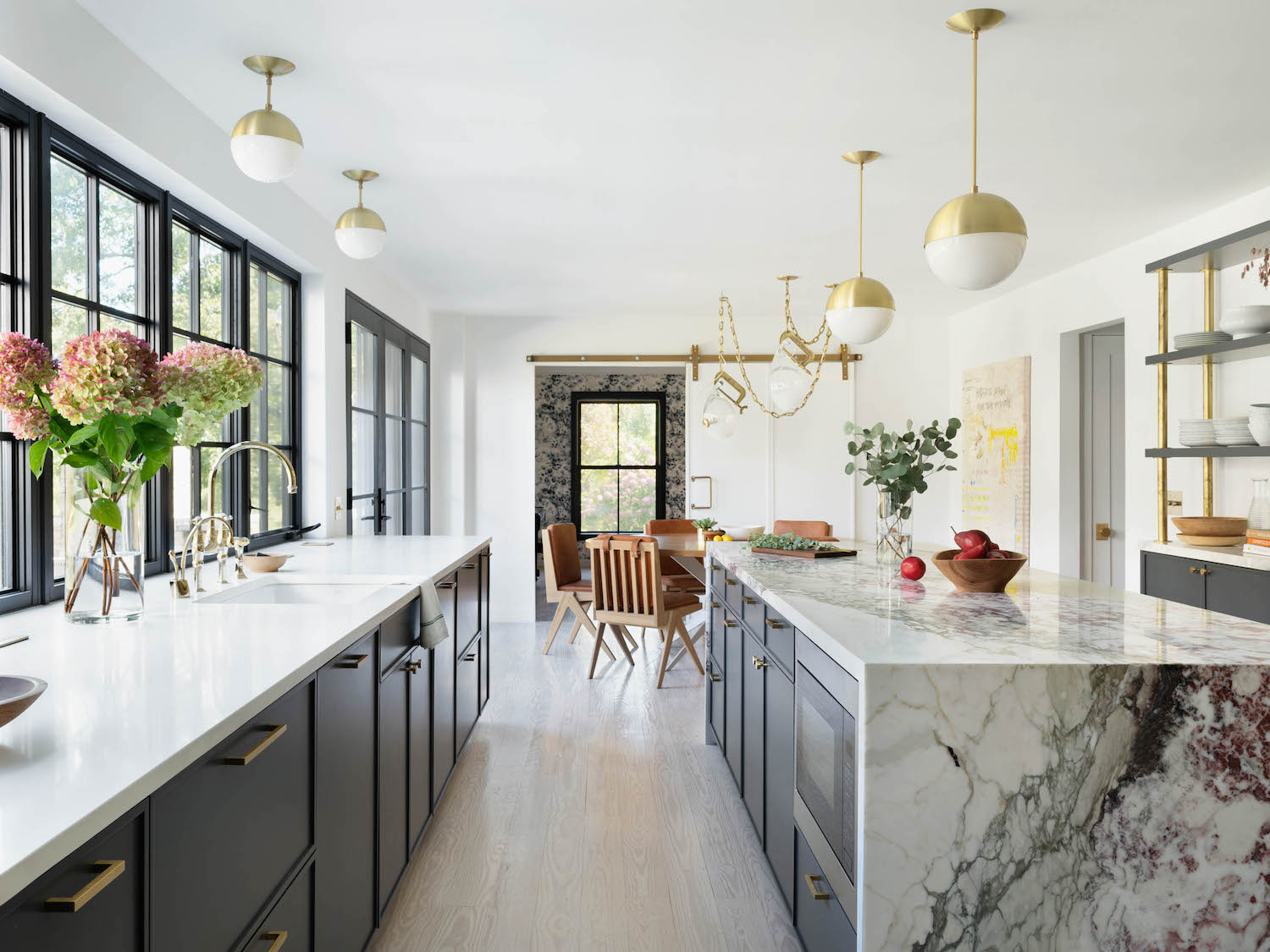
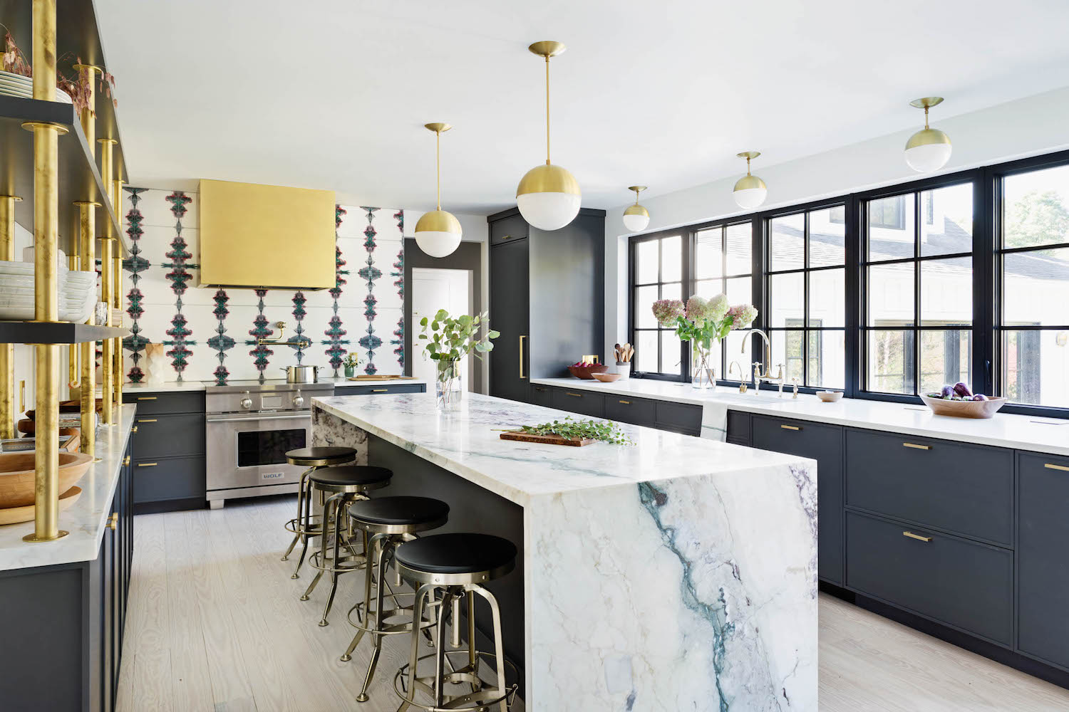
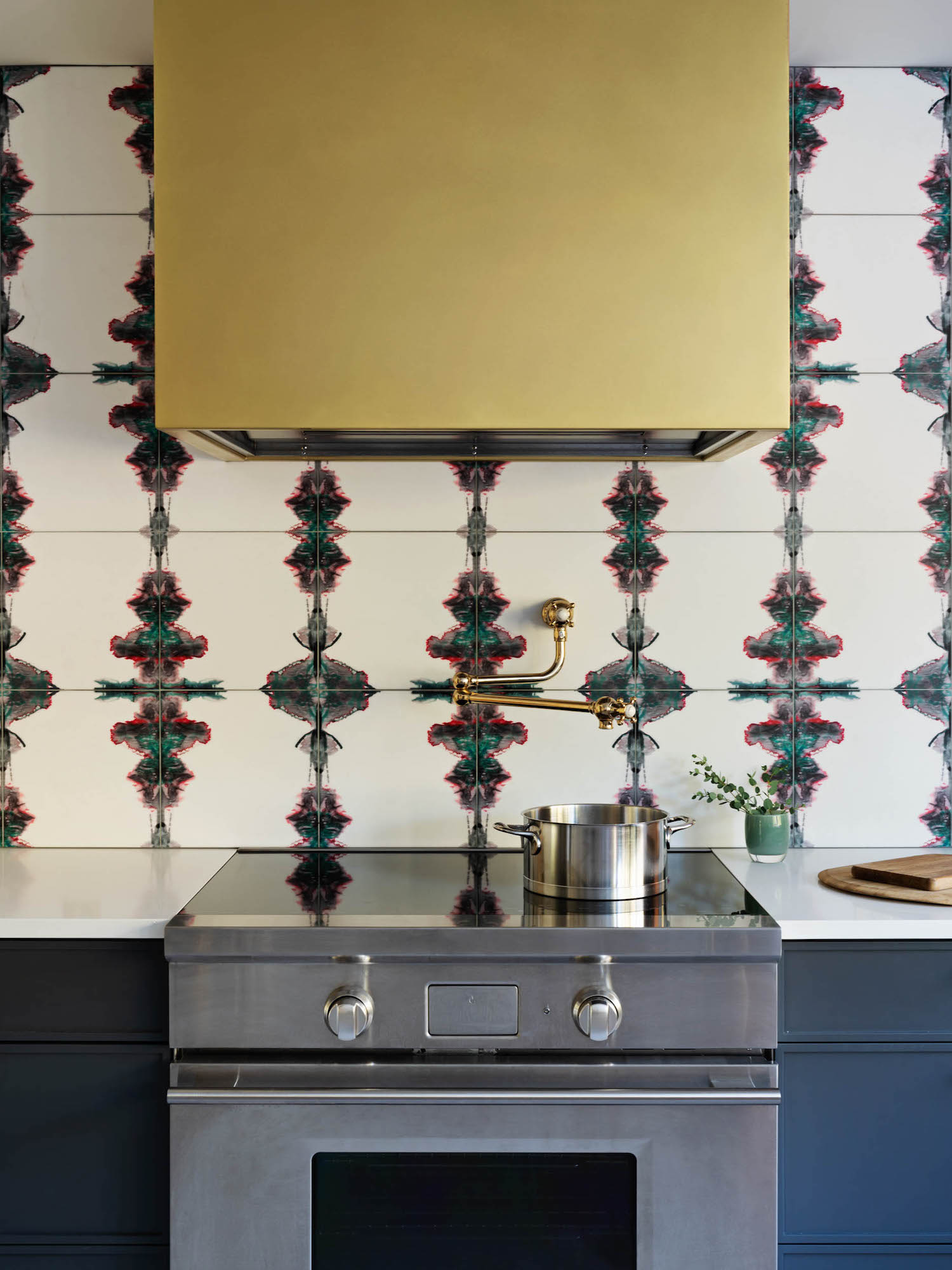
The focal point of the renovation work, the kitchen is a joyful space marked by rich and natural materials: custom brass hardware and range hood, marble tiles with hand lithographed patterns, gorgeous slabs of Breccia Capraia stone, and white oak furniture.
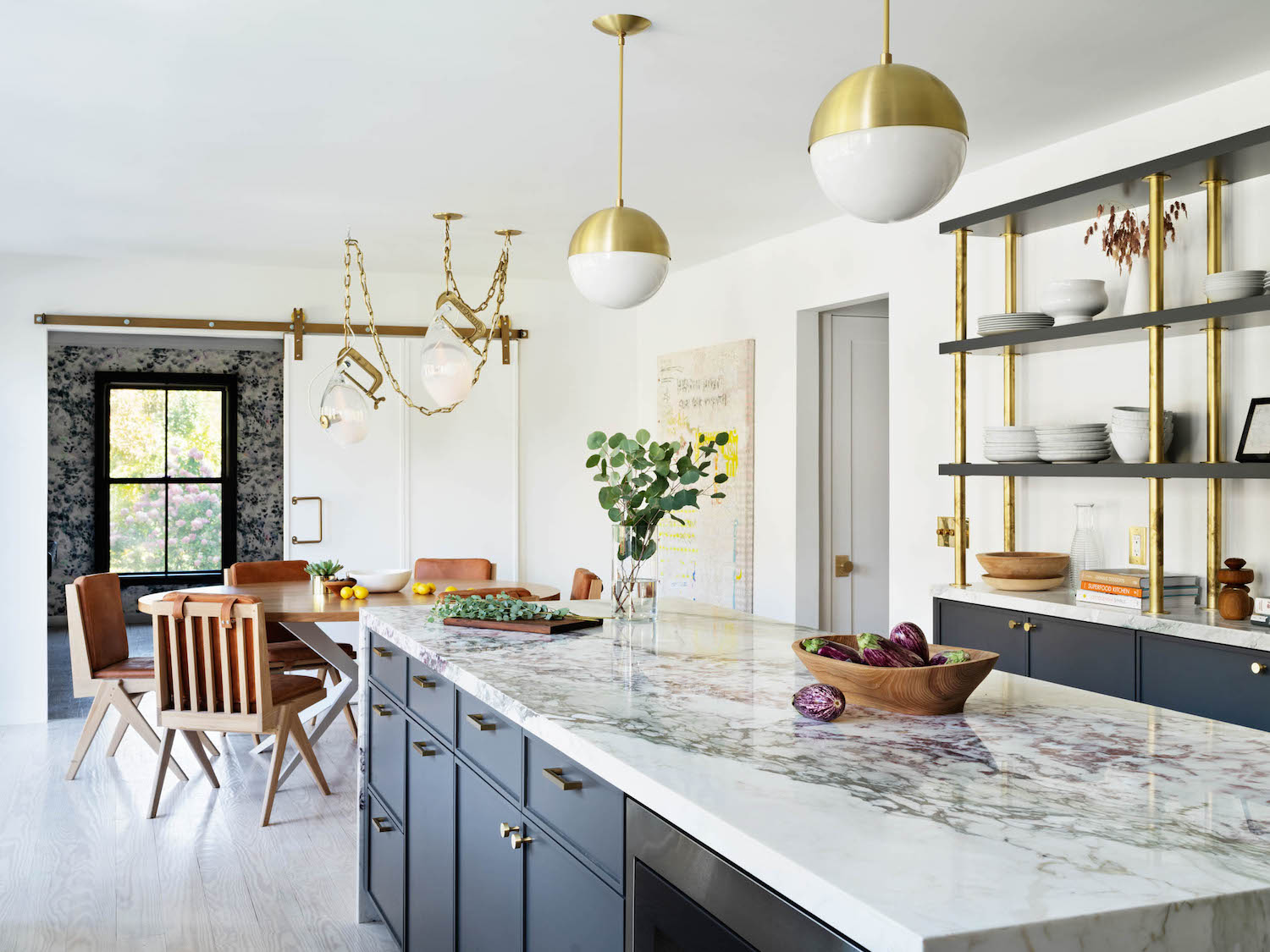
Upper cabinets were completely eliminated to maximise windows and sunlight, and to give the space an airy feel.
Where there is upper storage, Jill opted for open shelving with custom brass supports — not only beautiful, but family friendly, as the open shelves provide easy access to everyday plates and glasses.
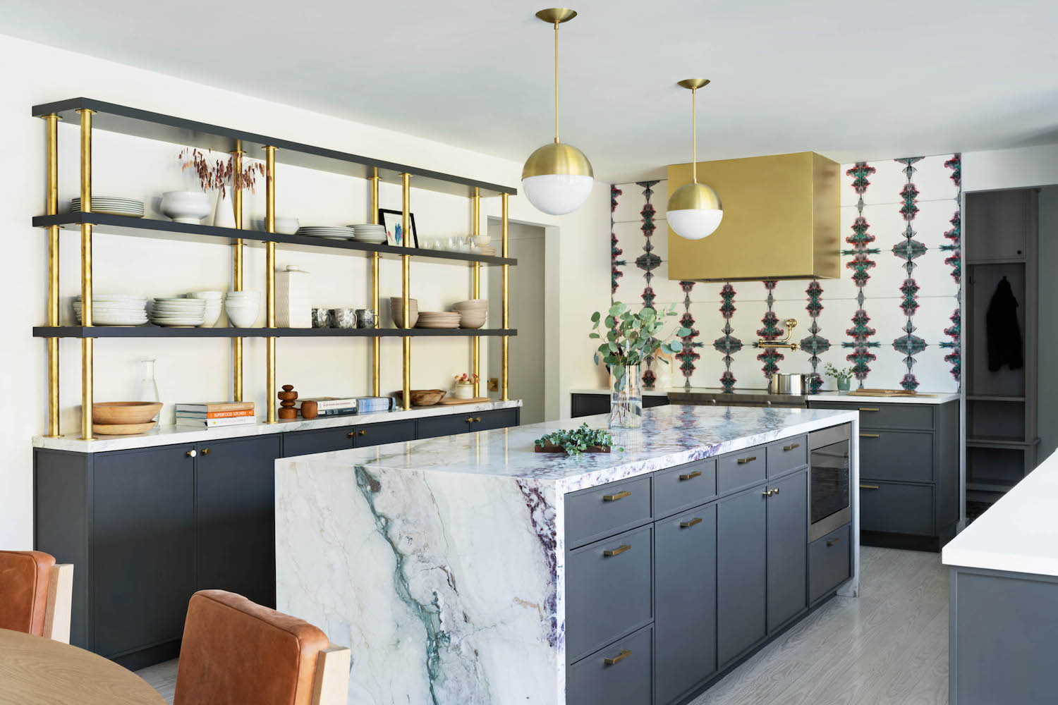
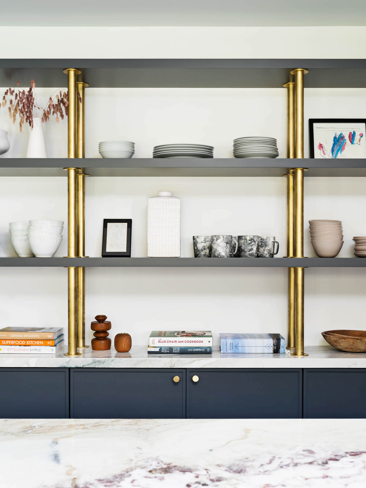
A brass extractor hood and statement splash-back tiles add the finishing touch.
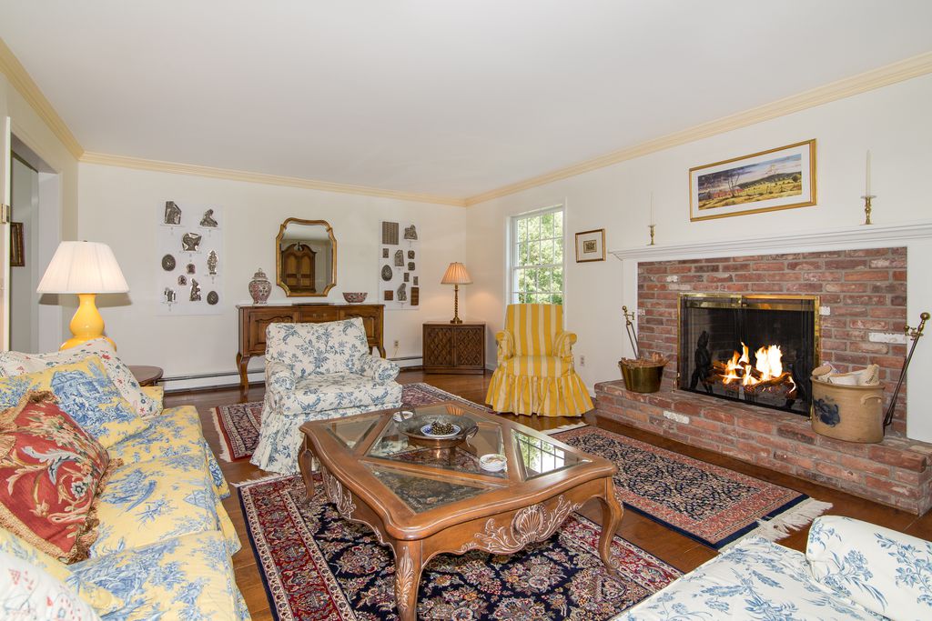
LIVING ROOM - BEFORE
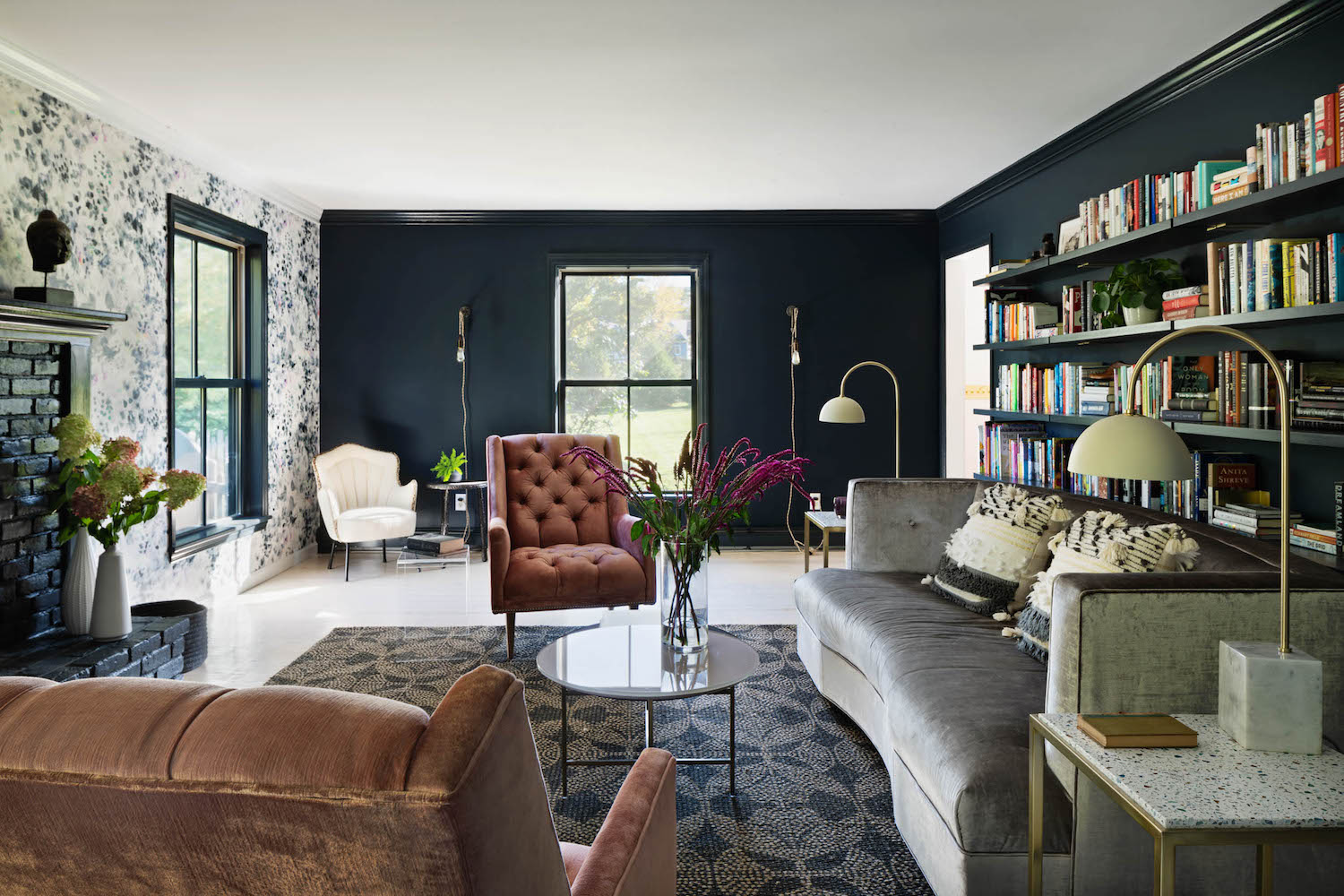
LIVING ROOM - AFTER
In the living room, Jill tried to invoke a farmhouse feel without relying on nostalgia, instead drawing from a palette of modern and bold materials.
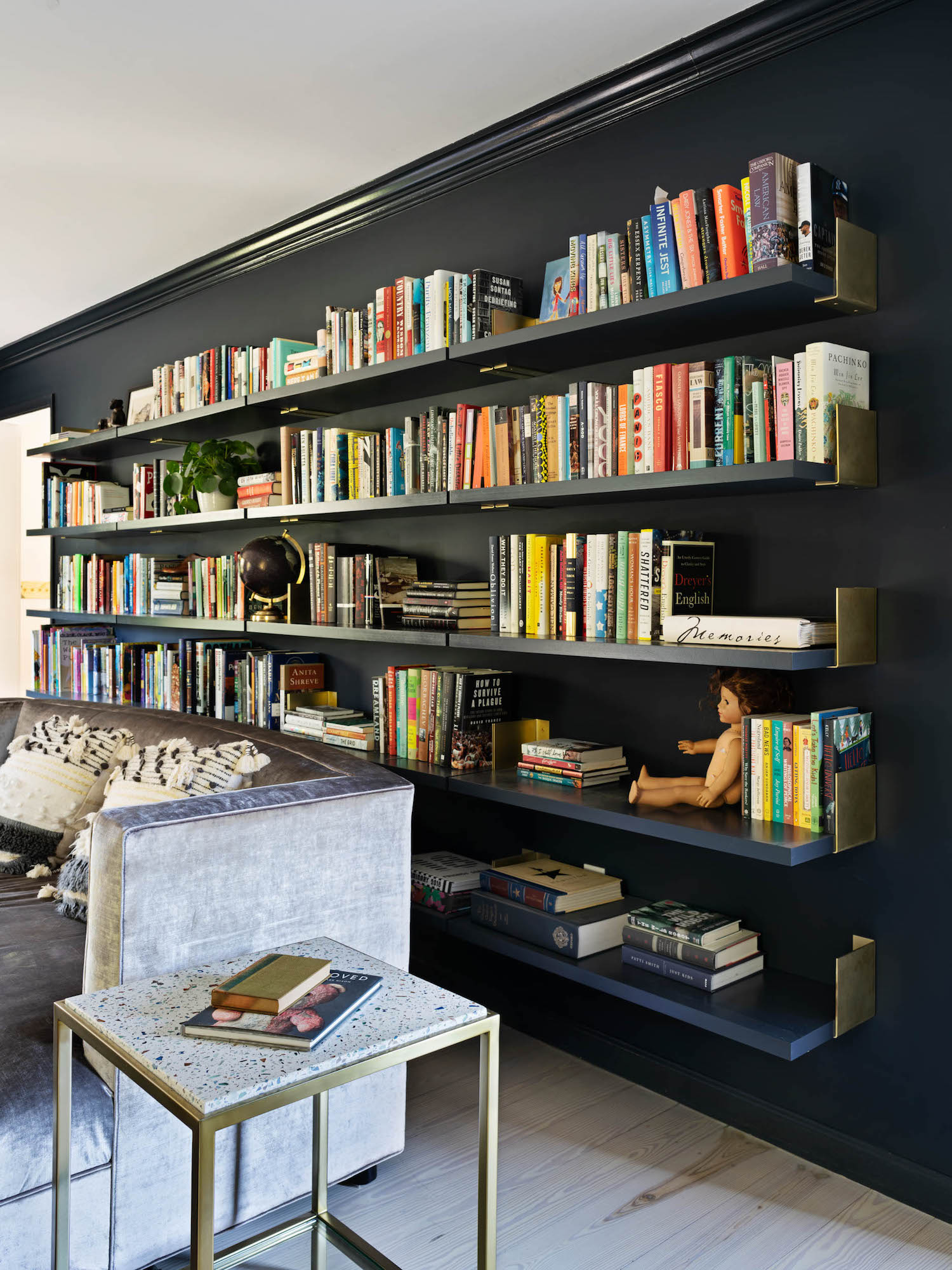
A highlight is the bookshelves which house the owners’ large book collection. Jill designed new shelves — almost 13’ long — with custom brass brackets. The brackets were conceived as a folded piece of paper, and function as both bookends (giving structure and order to the long array of books), as well as the bookshelf’s primary form of support.
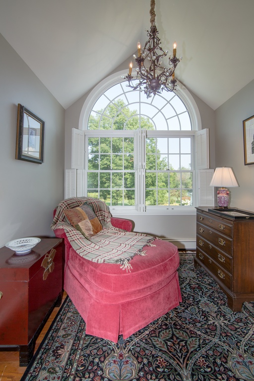
SNUG - BEFORE
SNUG - AFTER (NOW HOME OFFICE)
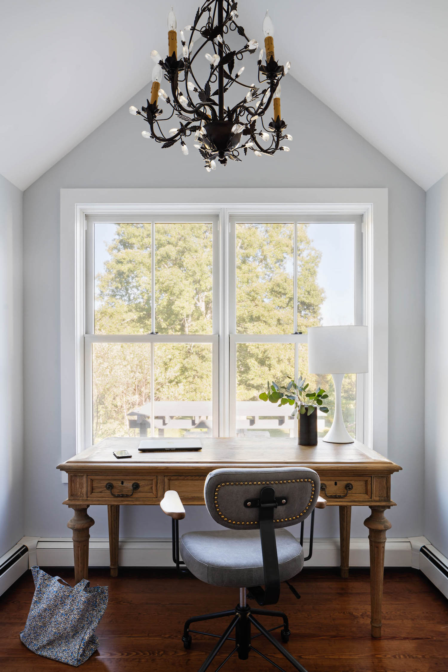
All of the interiors were designed for family living – neither fussy nor precious, but designed with an eye towards colour, pattern, and whimsy.
BATHROOMS
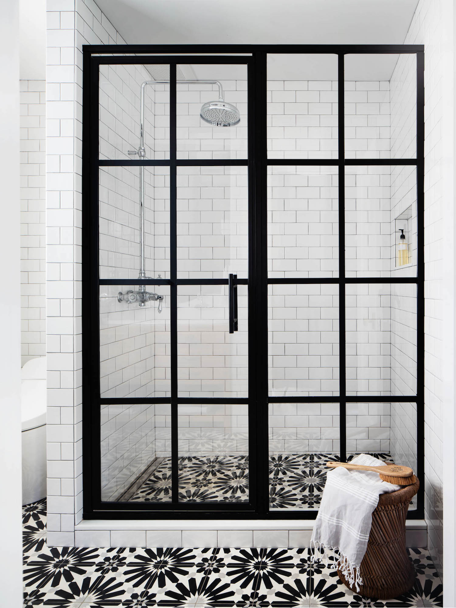
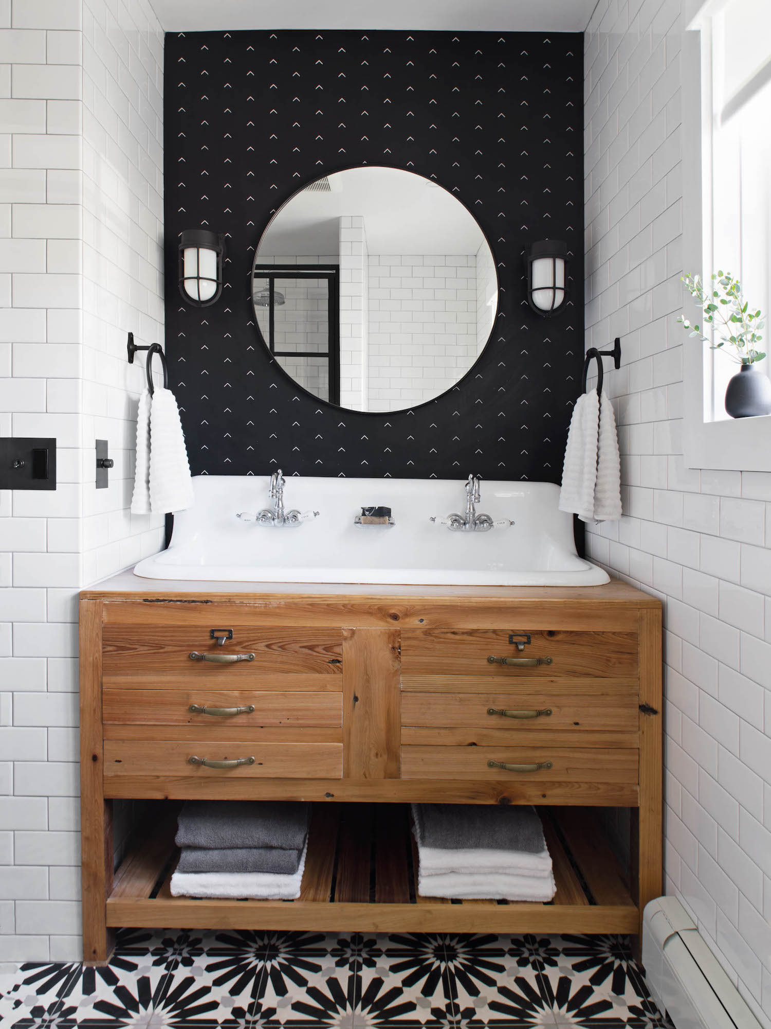
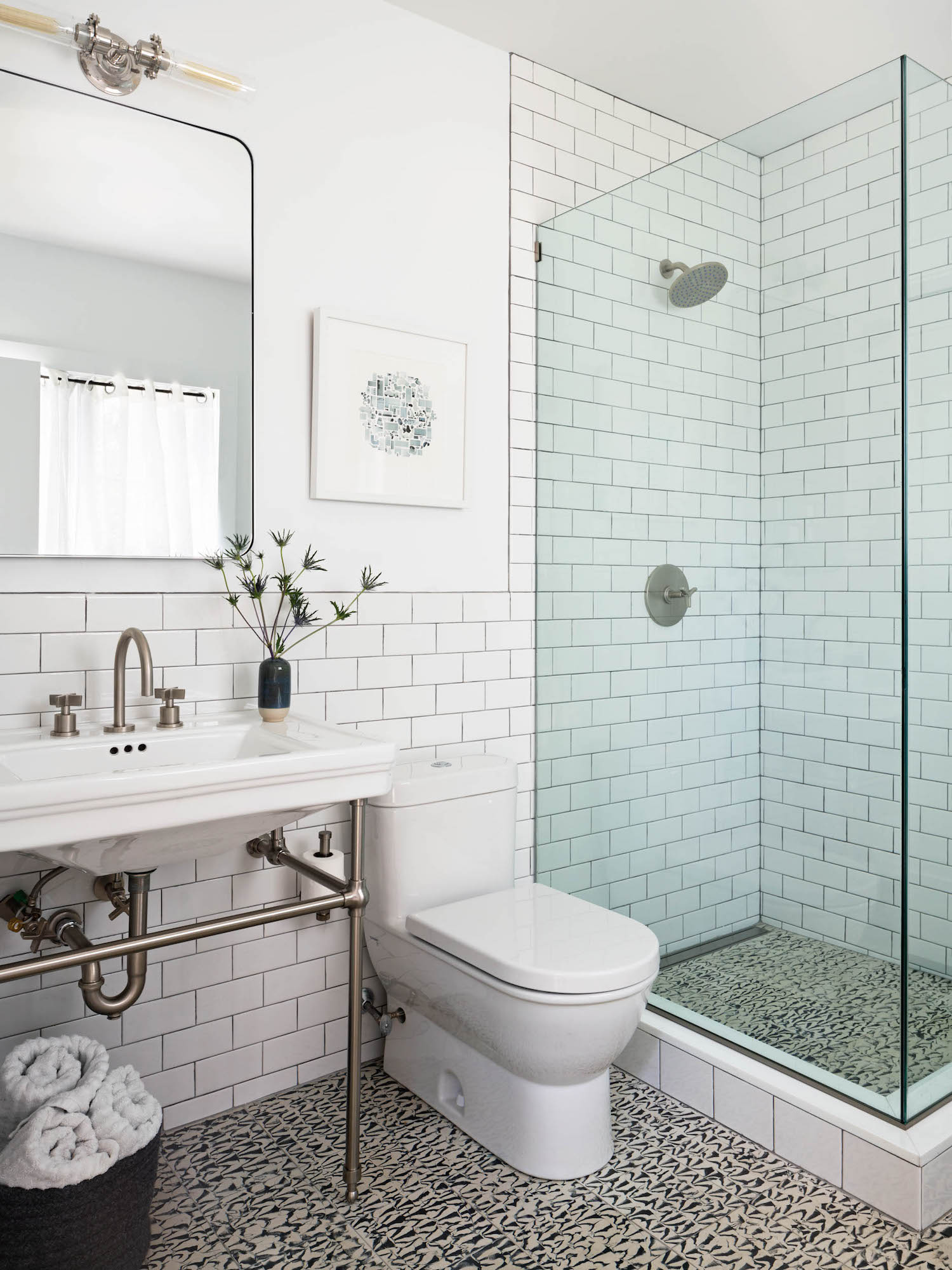
Jill Porter updated the bathrooms using a combination of high and low materials – for example affordable metro tiles for the walls, balanced with beautiful pattered concrete tiles.
BEDROOM
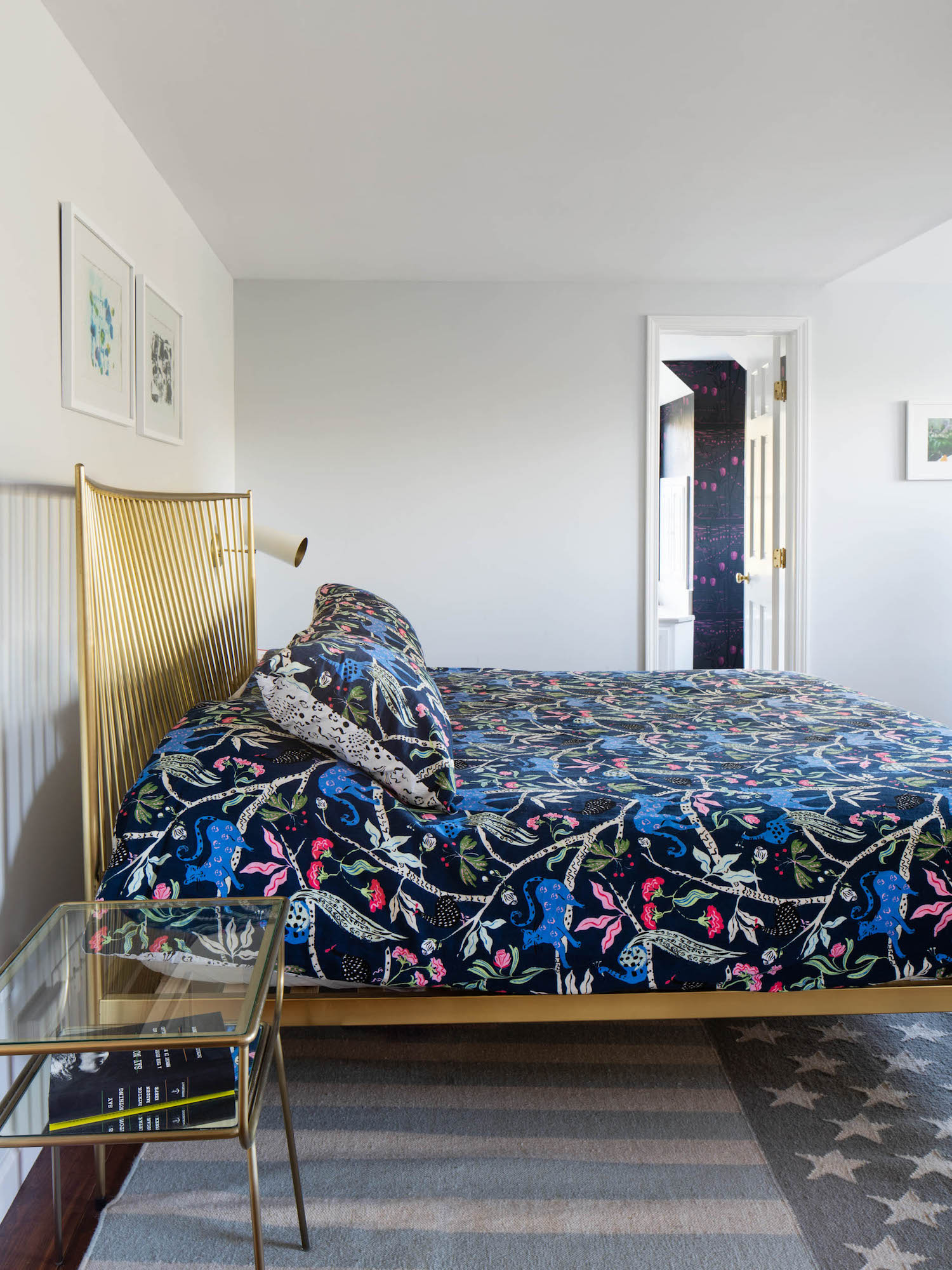
Bedrooms received a style update with relaxed furniture pieces, statement throws and layered rugs for added cosiness.
Architect: Jill Porter
Landscape architect: R Design
Builder: Ducillo
Structural engineer: Connolly Engineering, PLLC
Photographer: Amanda Kirkpatrick

Lotte is the former Digital Editor for Livingetc, having worked on the launch of the website. She has a background in online journalism and writing for SEO, with previous editor roles at Good Living, Good Housekeeping, Country & Townhouse, and BBC Good Food among others, as well as her own successful interiors blog. When she's not busy writing or tracking analytics, she's doing up houses, two of which have features in interior design magazines. She's just finished doing up her house in Wimbledon, and is eyeing up Bath for her next project.
-
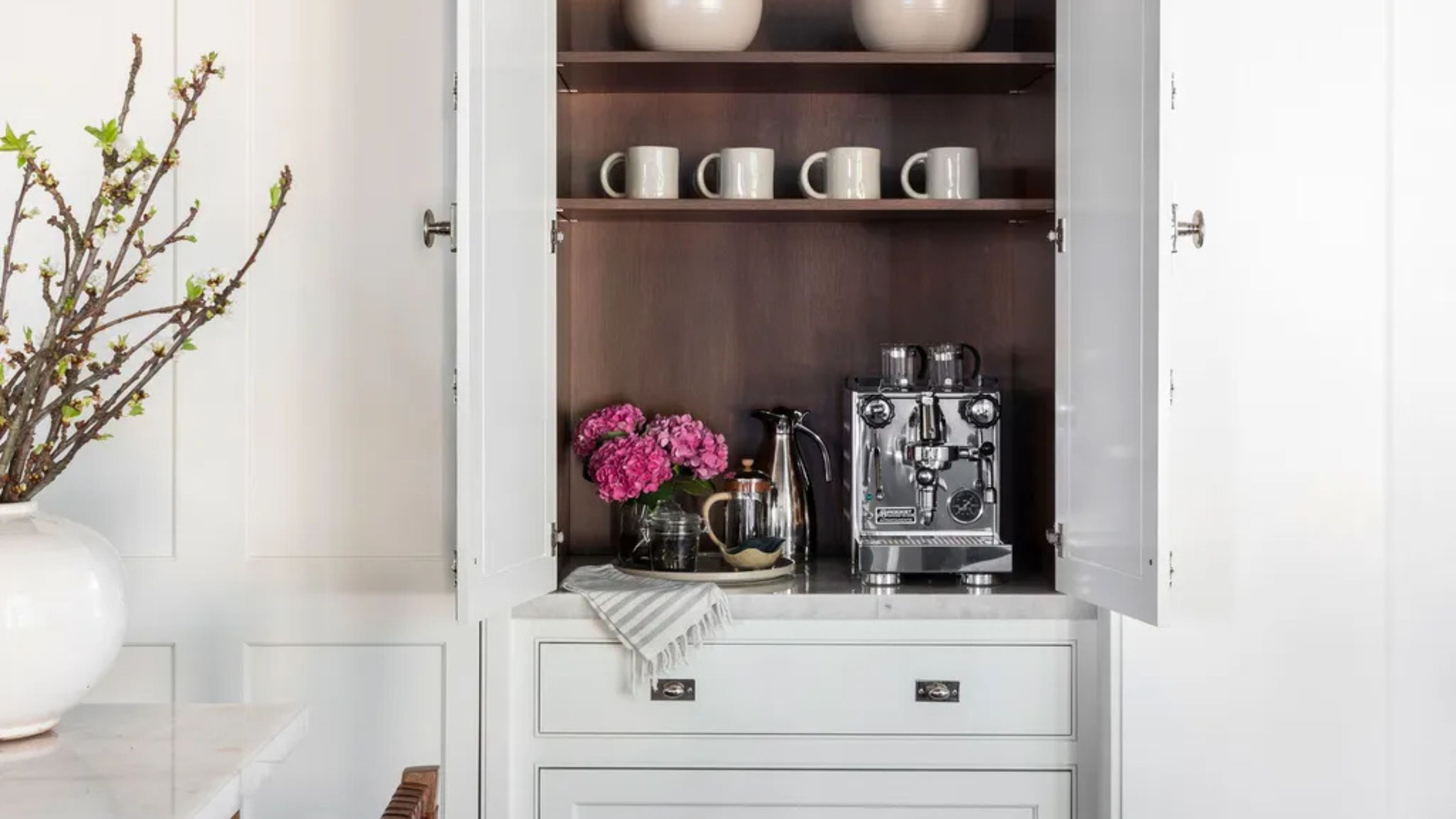 Turns Out the Coolest New Café is Actually In Your Kitchen — Here's How to Steal the Style of TikTok's Latest Trend
Goodbye, over-priced lattes. Hello, home-brewed coffee with friends. TikTok's 'Home Cafe' trend brings stylish cafe culture into the comfort of your own home
By Devin Toolen Published
-
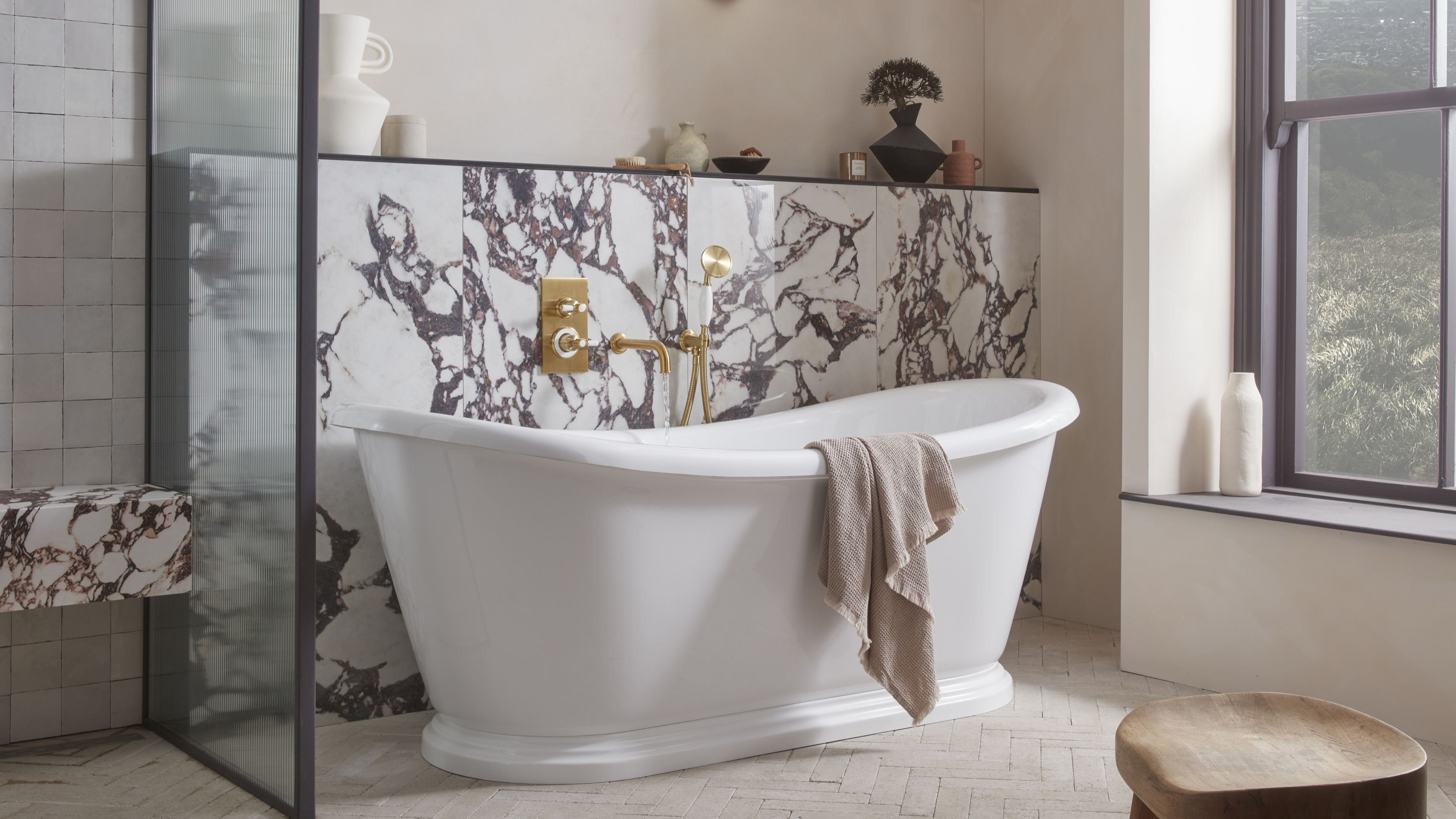 5 Bathroom Layouts That Look Dated in 2025 — Plus the Alternatives Designers Use Instead for a More Contemporary Space
For a bathroom that feels in line with the times, avoid these layouts and be more intentional with the placement and positioning of your features and fixtures
By Lilith Hudson Published