Before & After: a retro apartment is unrecognisable after a chic, modern makeover
All that remains of the old apartment is the floor-to-ceiling views over Boston's skyline...
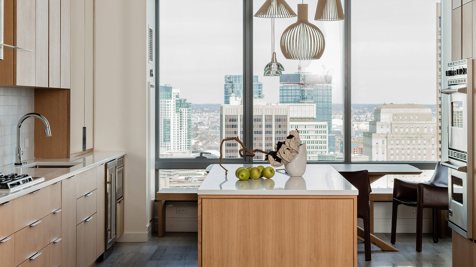

A tired and dated penthouse apartment has received a complete transformation and is now almost unrecognisable – all that remains is the floor-to-ceiling views over Boston's skyline.
The owners brought on designer Sashya Thind, founder of Ideate Design Studio (@id8designstudio), to help create a more open-plan layout, and a warmer interior scheme.
Ideate Design Studio gutted the property and reconfigured the layout, then gave it a more modern interior design with a warm colour palette.
Inspired by Scandinavian and Japanese interiors, the designers chose a warm white and oak wood palette, with touches of limestone and marble, to create a timeless, minimalism and airy feel throughout.
See Also: Before & After – See a jaw-dropping farmhouse transformation
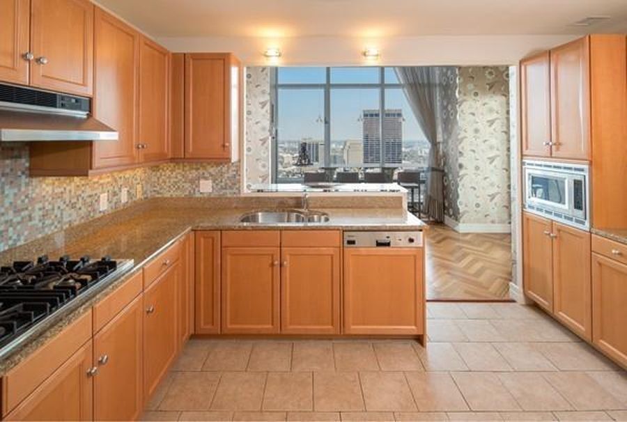
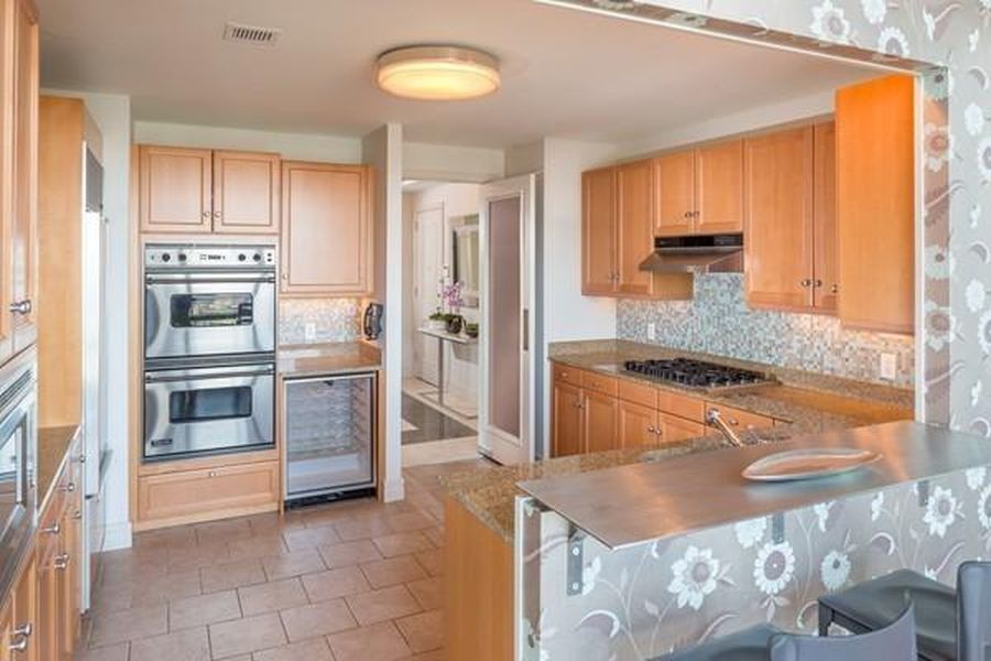
KITCHEN - BEFORE
Before, a dated, L-shaped kitchen was separate from the dining space beyond.
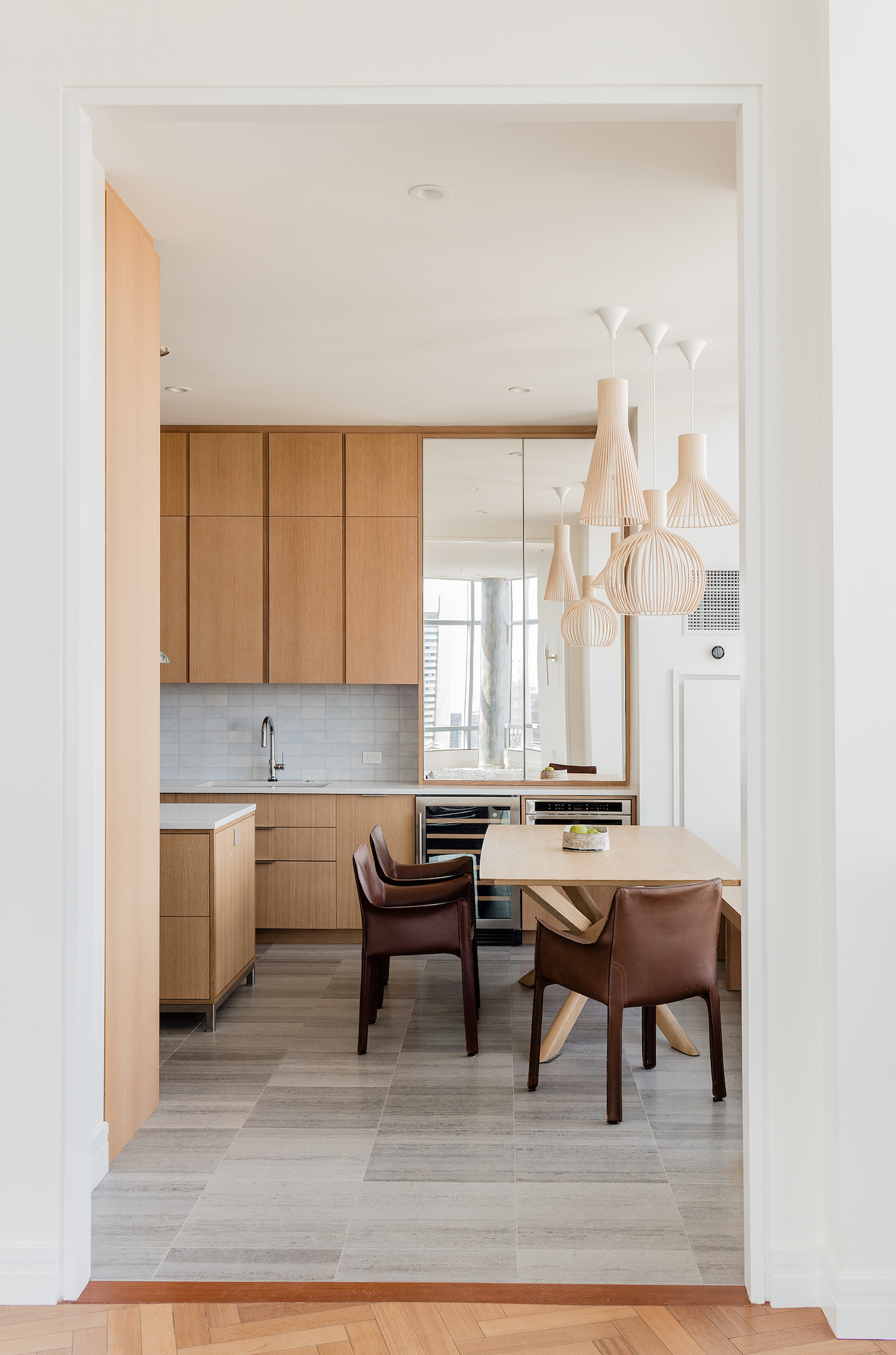
KITCHEN - AFTER
Now, a larger kitchen takes its place and carries right through to the end wall, thus making the most of the skyline views.
Be The First To Know
The Livingetc newsletters are your inside source for what’s shaping interiors now - and what’s next. Discover trend forecasts, smart style ideas, and curated shopping inspiration that brings design to life. Subscribe today and stay ahead of the curve.
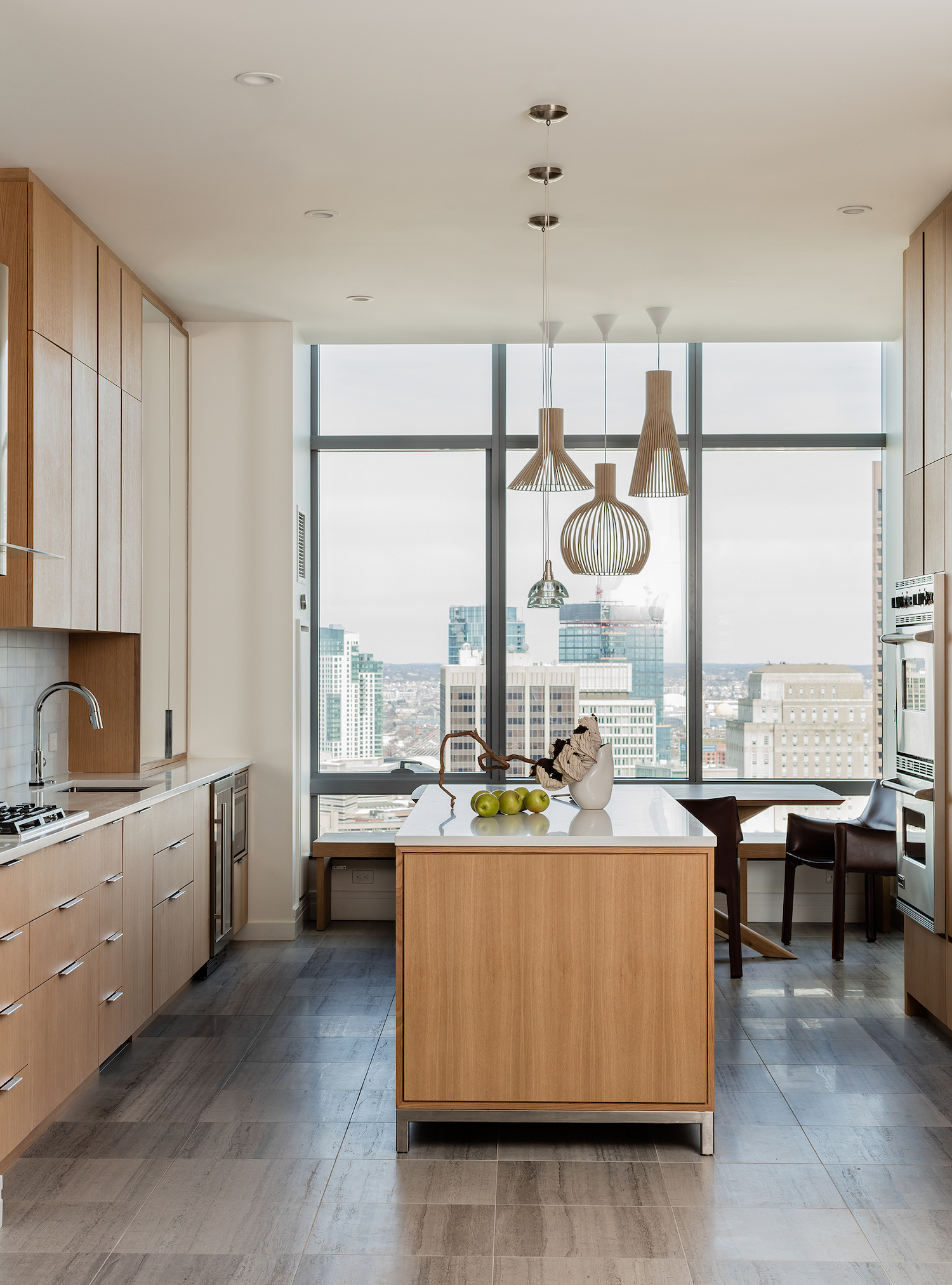
The new, open-plan kitchen incorporates a dining table that can seat six, while mirrored kitchen cabinet doors help to bounce light around, and break up the wood kitchen theme.
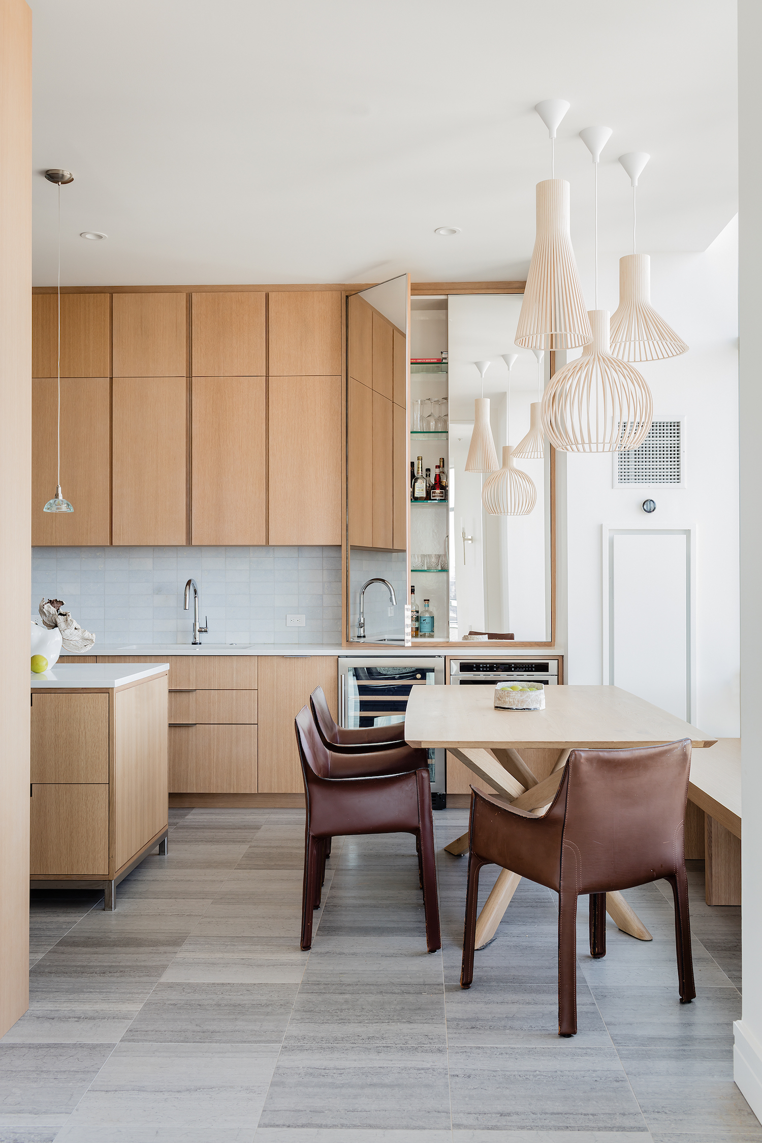
The kitchen now offers open plan living, more storage and tremendous, unobstructed 180-degree views over the Massachusetts State house, the Charles river and the Boston Common – the ultimate eat-in dining experience.
The kitchen island also incorporates plenty of kitchen storage.
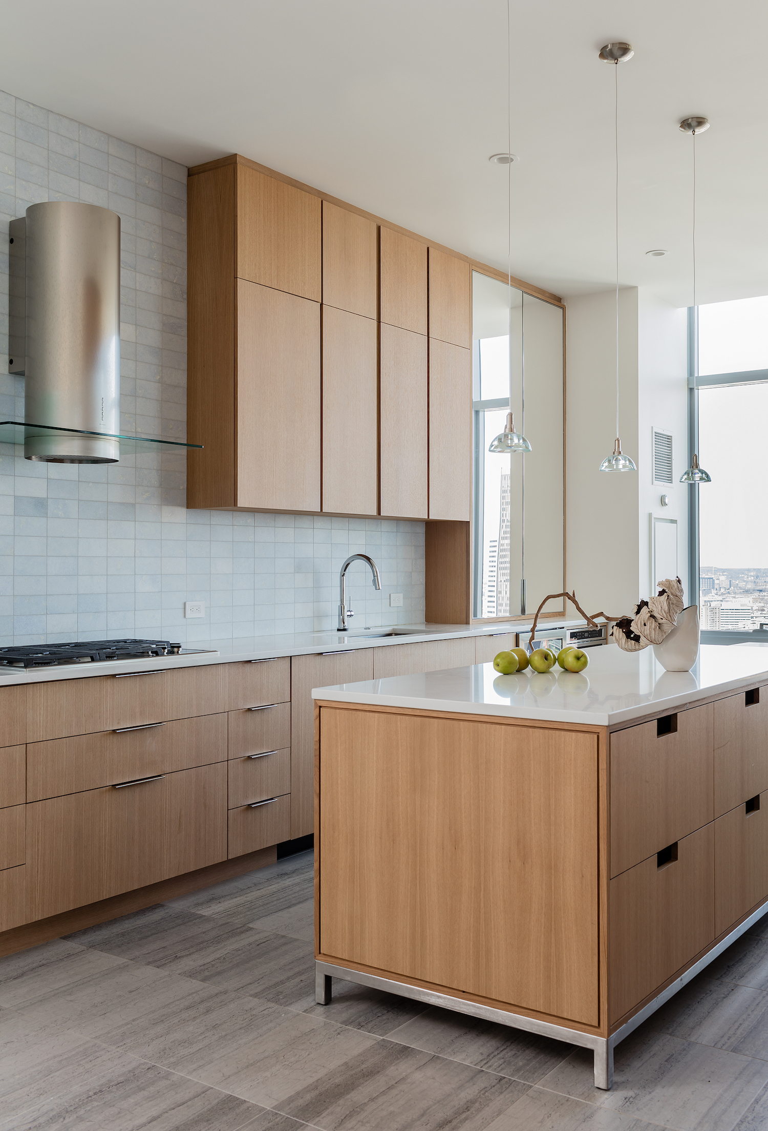
DINING AREA - BEFORE
Before, a dated, metallic wallpaper created a cold, harsh and unwelcoming environment.
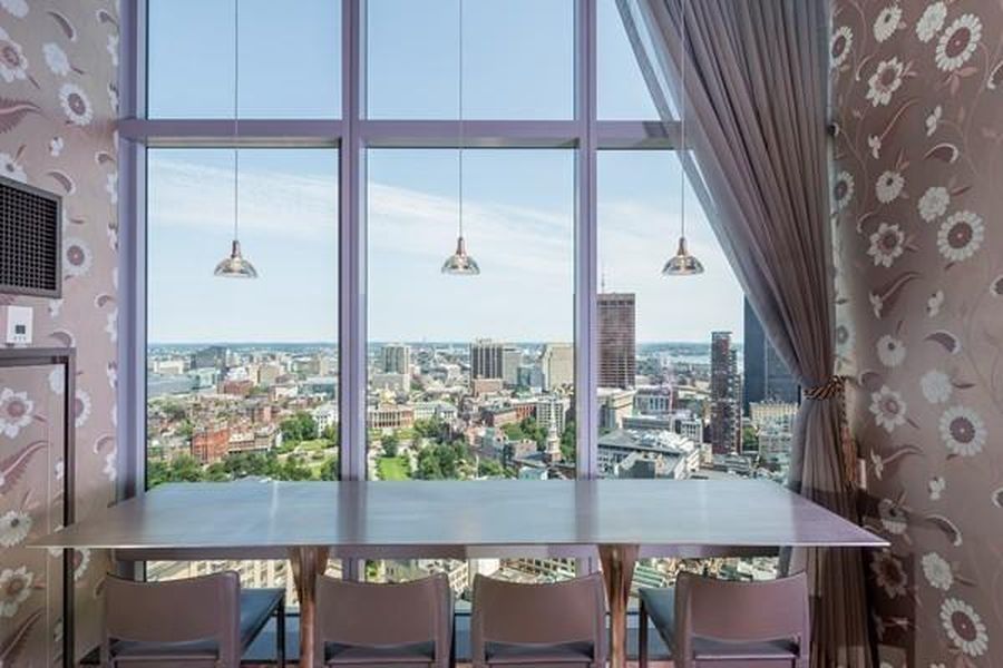
DINING AREA - AFTER
Now, warm woods make this light and bright space feel warmer and more welcoming.
A long, bespoke bench along the window's edge offers the residents and their guests uninterrupted views.
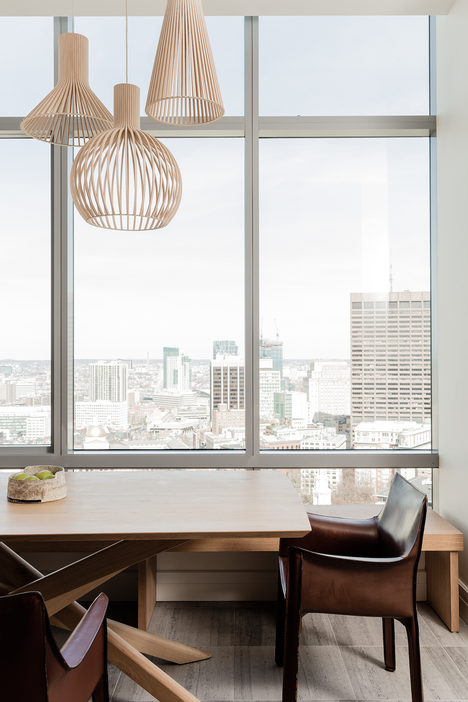
Design highlights include custom cabinetry, Bellini dining chairs, Ethnicraft dining table, Juniper and Secto lighting.
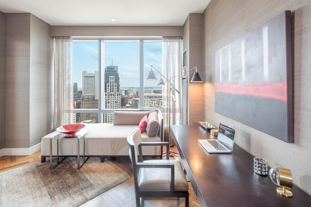
HOME OFFICE - BEFORE
The home office already featured a stunning parquet floor, but cried out for a fresh new look.
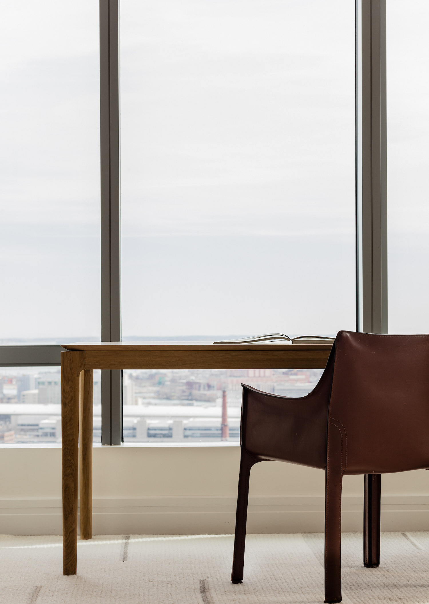
HOME OFFICE - AFTER
Now the home office features a more rustic scheme of woods and leather, to match the scheme in the dining area. The wood desk sits directly in front of the floor-to-ceiling windows, offering stunning views.
BEDROOM - BEFORE
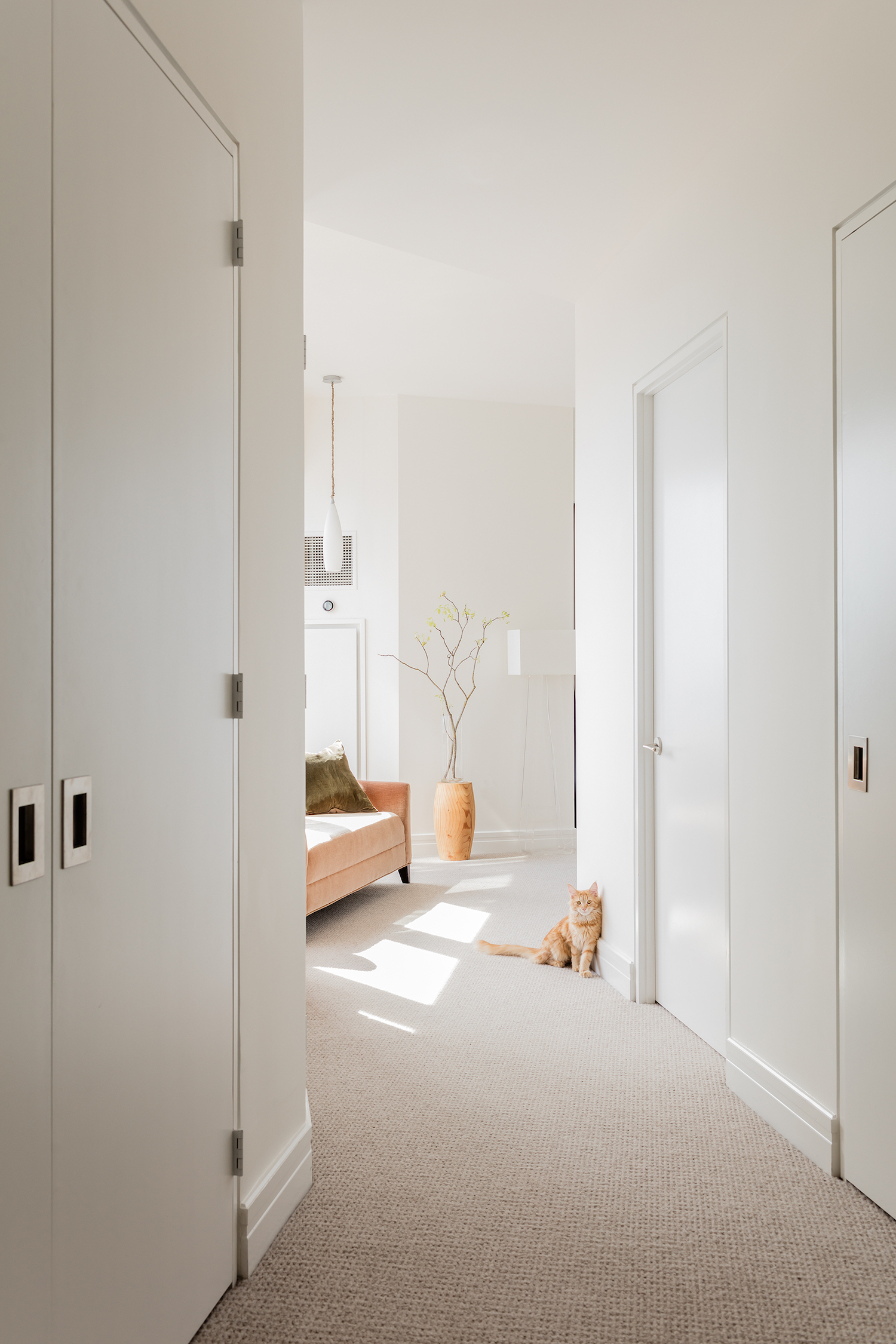
The bedroom featured an old, plush carpet, and vintage decor.
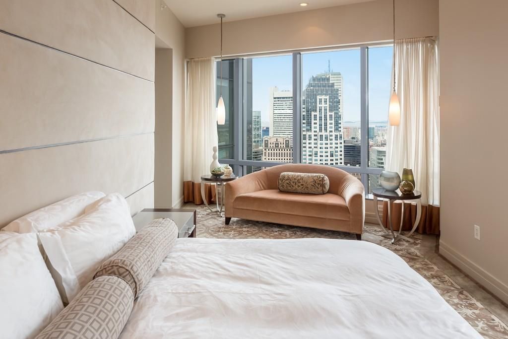
BEDROOM - AFTER
It now incorporates more storage, and lots of natural materials.
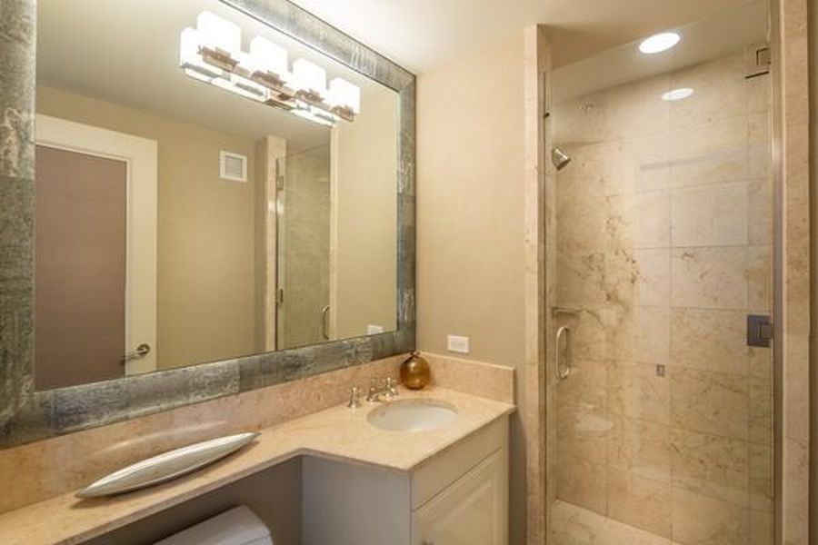
BATHROOM - BEFORE
The old, tired bathroom scheme featured a light brown colour palette and dated fittings.
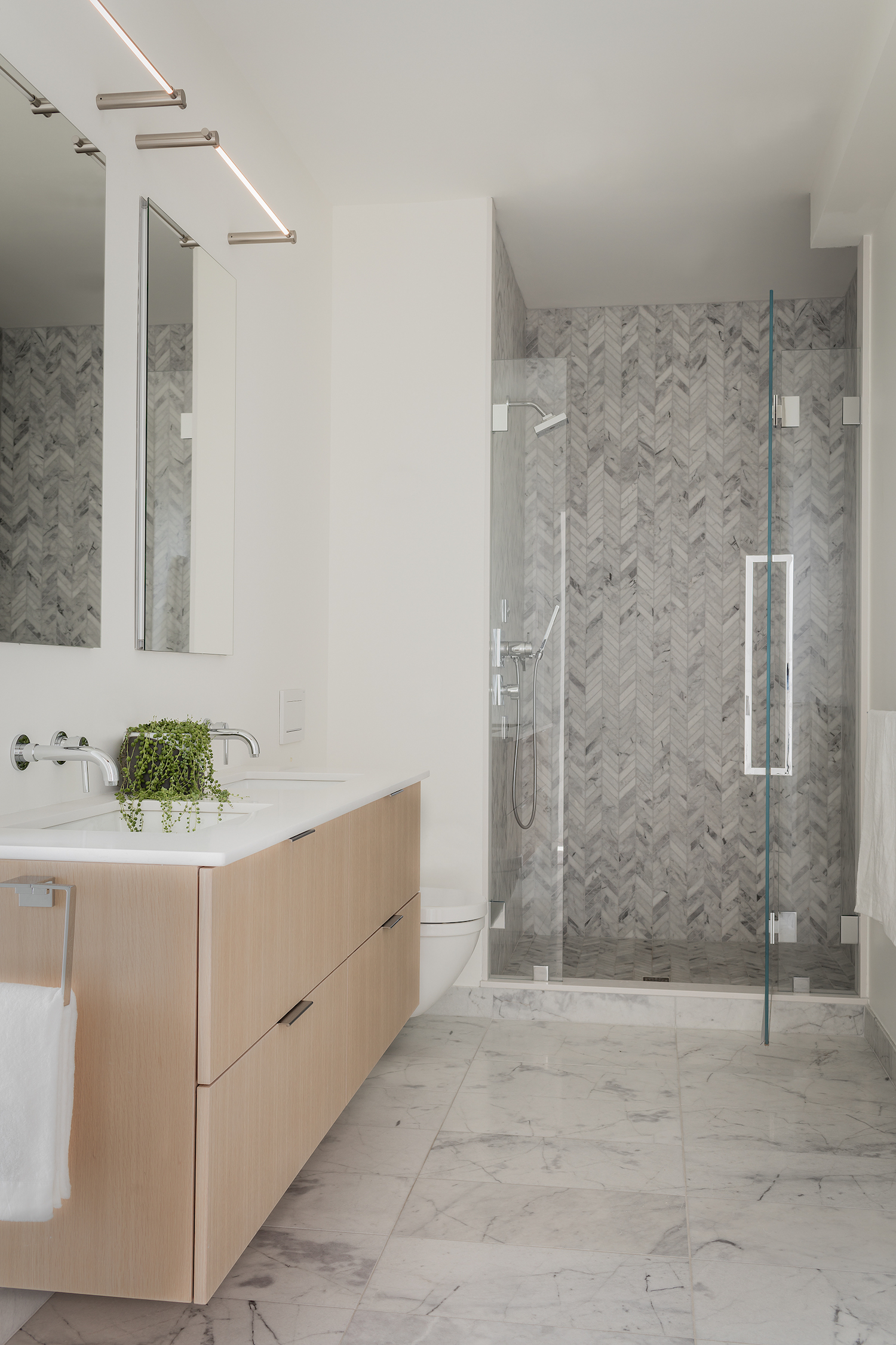
BATHROOM - AFTER
A lighter palette has given the bathroom a more spacious feel. Marble chevron tiles in the shower room complement the marble bathroom flooring, while his n hers sinks offer ample space for getting ready.
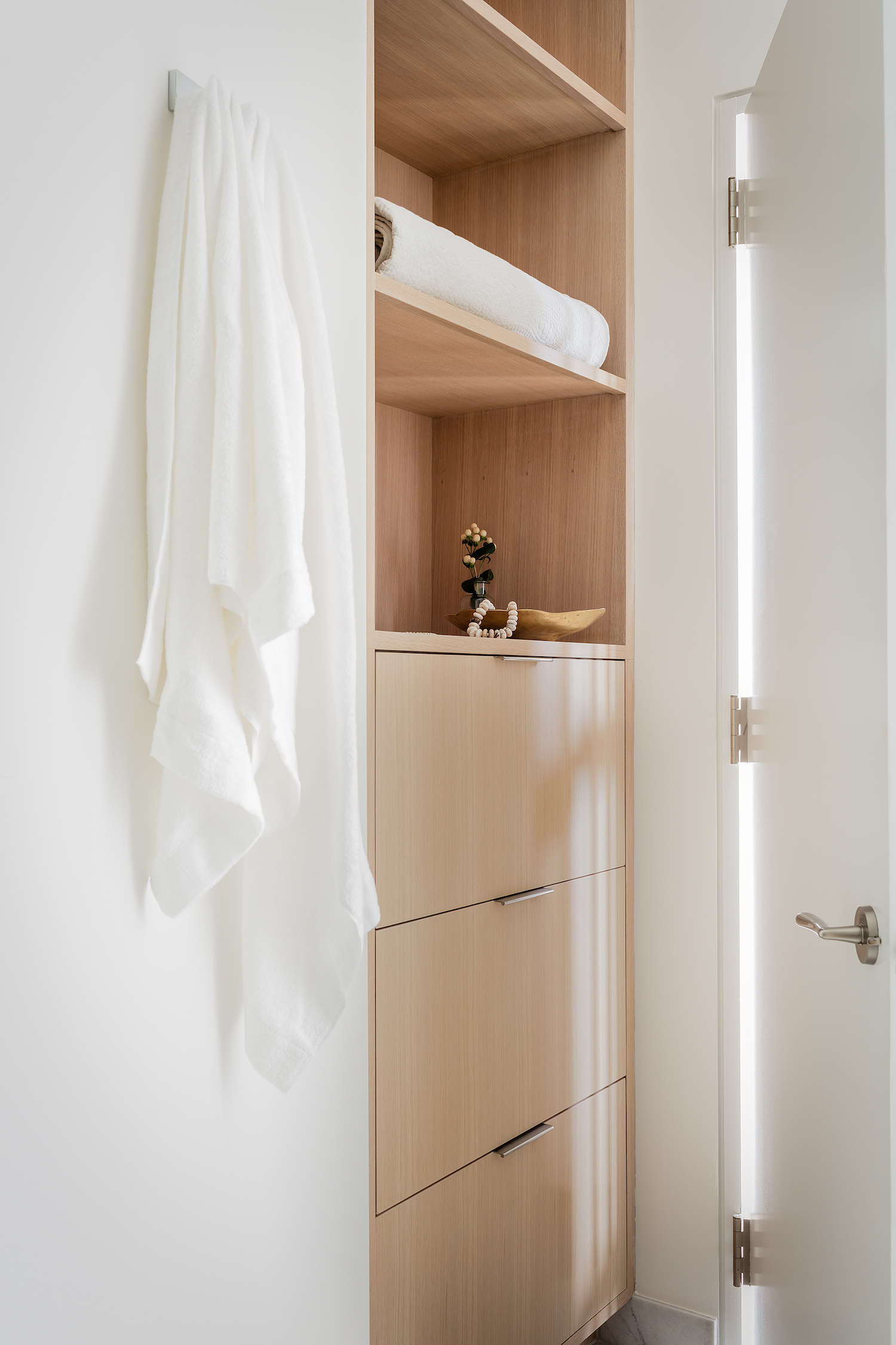
Built-in bathroom storage behind the door makes the most of unused space.

Lotte is the former Digital Editor for Livingetc, having worked on the launch of the website. She has a background in online journalism and writing for SEO, with previous editor roles at Good Living, Good Housekeeping, Country & Townhouse, and BBC Good Food among others, as well as her own successful interiors blog. When she's not busy writing or tracking analytics, she's doing up houses, two of which have features in interior design magazines. She's just finished doing up her house in Wimbledon, and is eyeing up Bath for her next project.
-
 These Are the Flower Crowns I’m Wearing This Spring (Spoiler: They’re Actually for My Door)
Coachella confirmed the comeback of flower crowns. At home, they just go by another name: the spring wreath
By Julia Demer
-
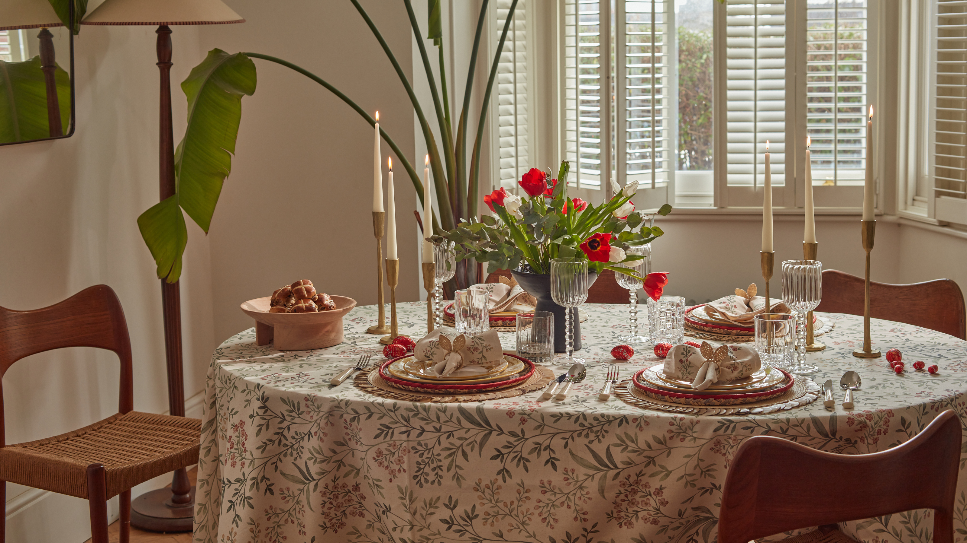 Bunny Ears, Be Gone — 7 Easter Table Styling Mistakes That Will Take Your Setting from Tawdry to Tasteful
From fussy floral displays that disrupt conversation to over-relying on tacky tropes, don't fall victim to these errors when decorating your Easter table
By Lilith Hudson
-
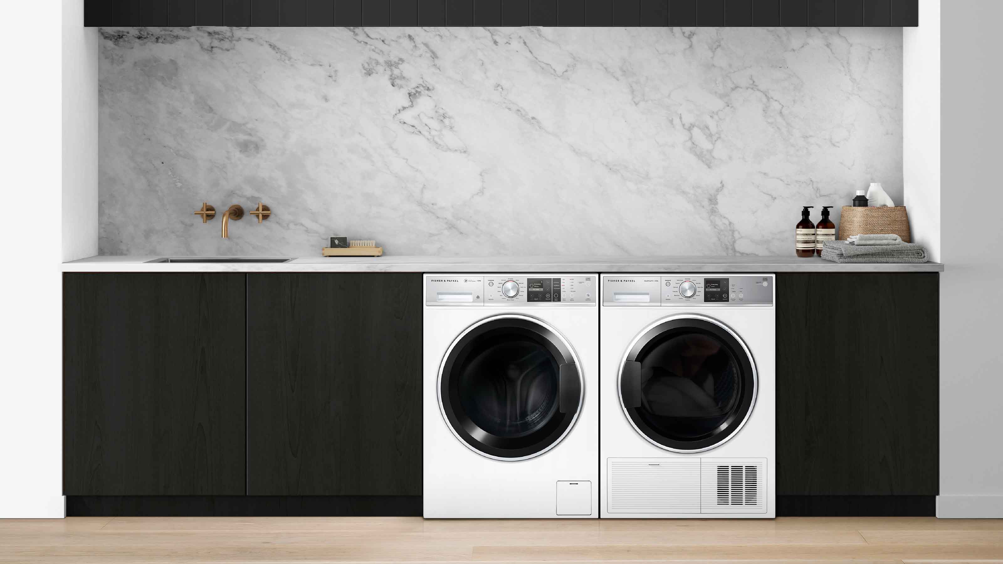 The simple way to a more sustainable and stylish life with Fisher & Paykel
This incredible new tech saves time, energy and has become the washing machine you need to know about
By Sponsored
-
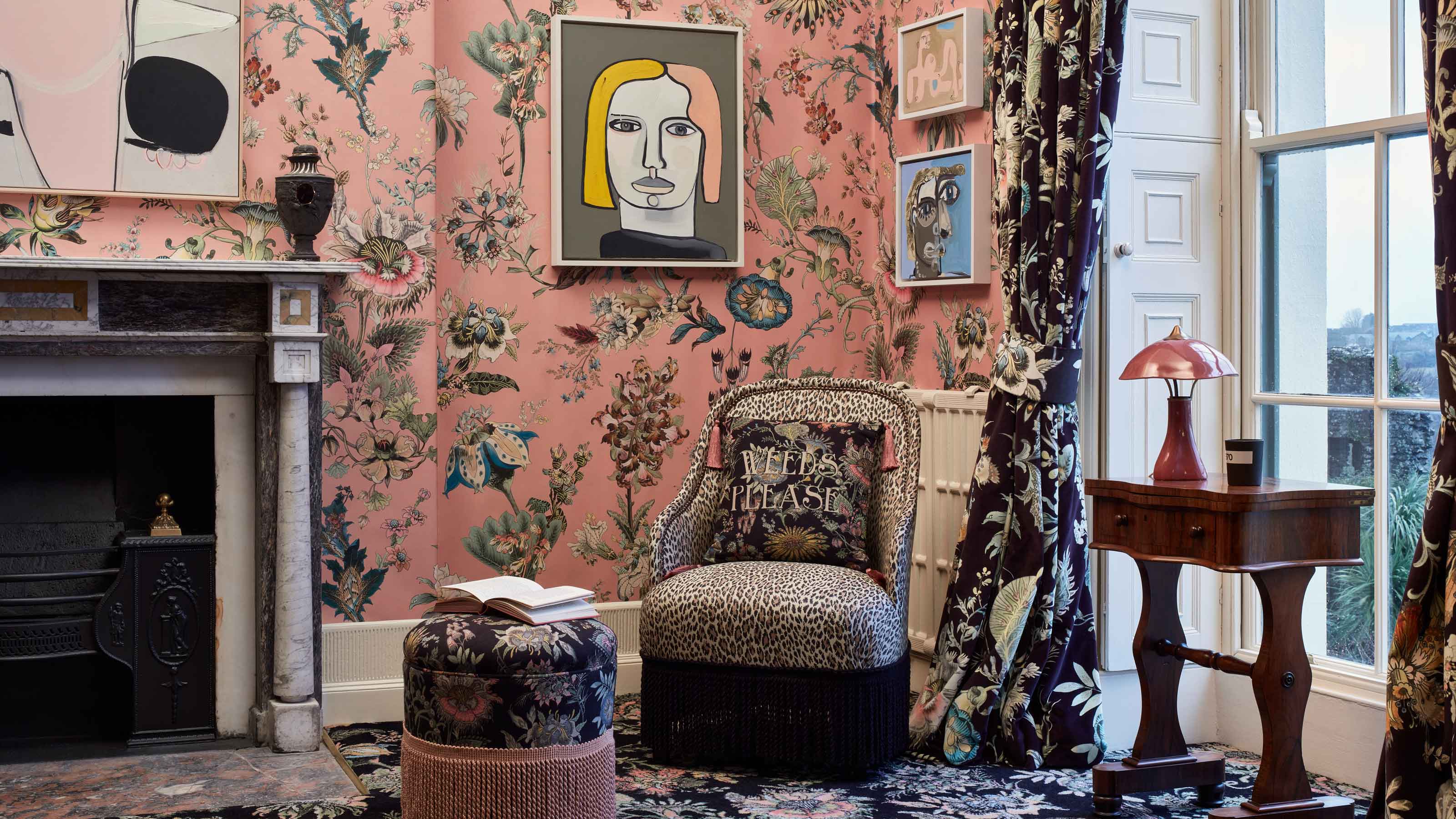 Forget Cottagecore - Flora Fantasia by House of Hackney is Cottage hardcore
House of Hackney's Flora Fantasia collection blends the romanticised rural aesthetic with riotous punk elements
By Jacky Parker
-
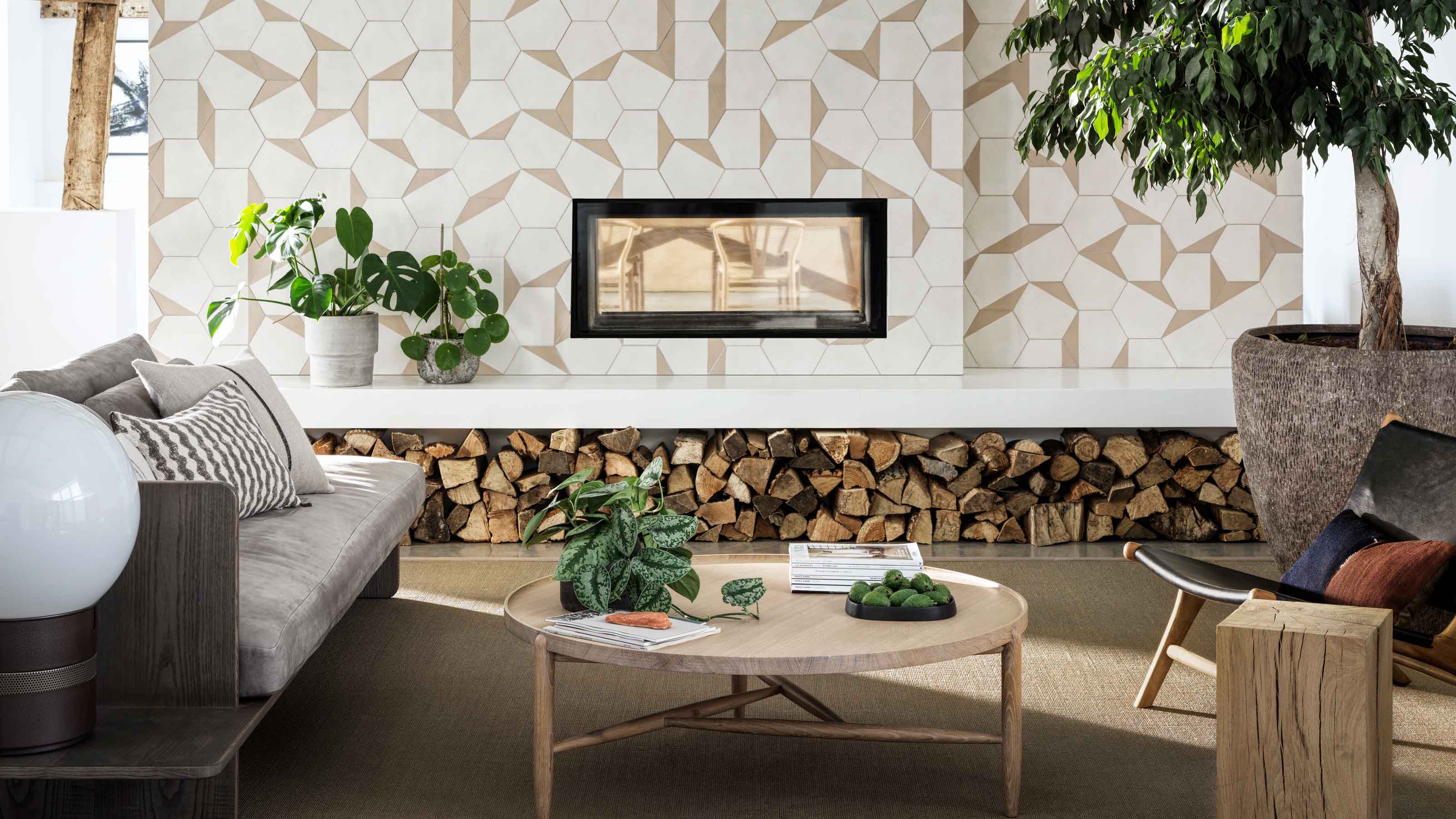 Bert & May's new hexagon tiles collection is tapping into one of this year's biggest micro trends
Tap into the microtrend for hexagon tiles and make myriad patterns with this new collection from Bert & May
By Jacky Parker
-
 Matthew Williamson’s tip for renovating a house on a budget is so simple, but incredibly effective
Renovating a house on a budget? See the savvy ways to control costs when managing an interior redesign
By Jacky Parker
-
 The fabulous new Matthew Williamson furniture collection is a cocktail of color and print
This decorative Matthew Williamson furniture is the beautiful result of collaboration with Roome London
By Jacky Parker
-
 Out & Out's new furniture collection is full of stylish storage solutions
This stylish storage will have your home organised in a jiffy - whatever its size
By Jacky Parker
-
 Explore Sandra Bullock’s former coastal chic home in Georgia
Sandra Bullock has just sold her beautiful island beach house, giving us a glimpse at her coastal-inspired interior style.
By Lotte Brouwer
-
 Stylish flat pack furniture - how this home design staple has suddenly got cool
Thought flat pack furniture was cheap and cheerful? FUZL Studio is proving otherwise with its new collection
By Jacky Parker