This architect's apartment is a trove of vintage finds, proving that Mid-Century decor can work in a contemporary setting
Vintage meets modern in this elegant SoHo loft and is a lesson in how to use mid-century decor in a contemporary space
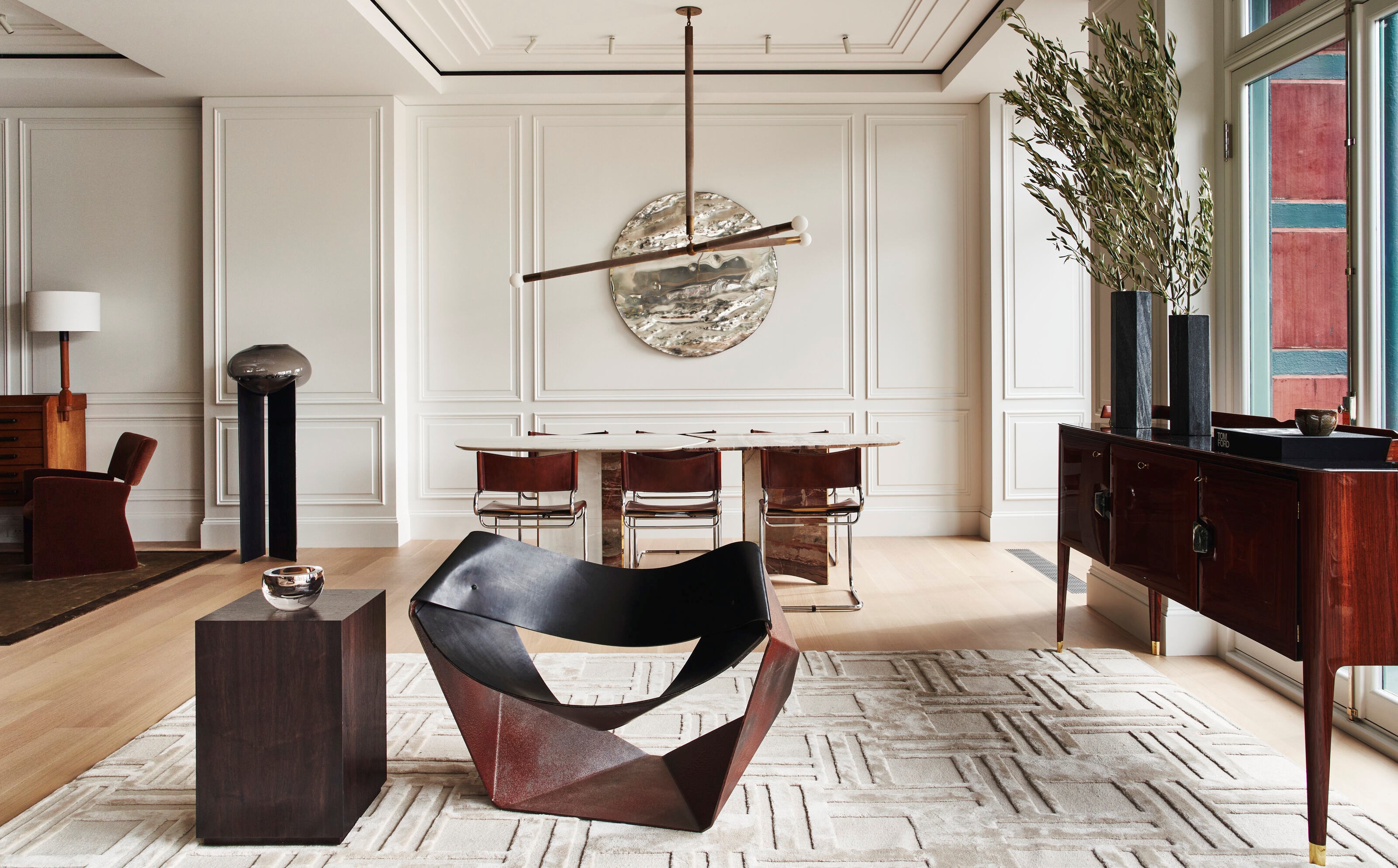

As the designer and homeowner of this Manhattan loft, Todd Raymond of the eponymous design studio was able to have real fun with the renovation of his own property.
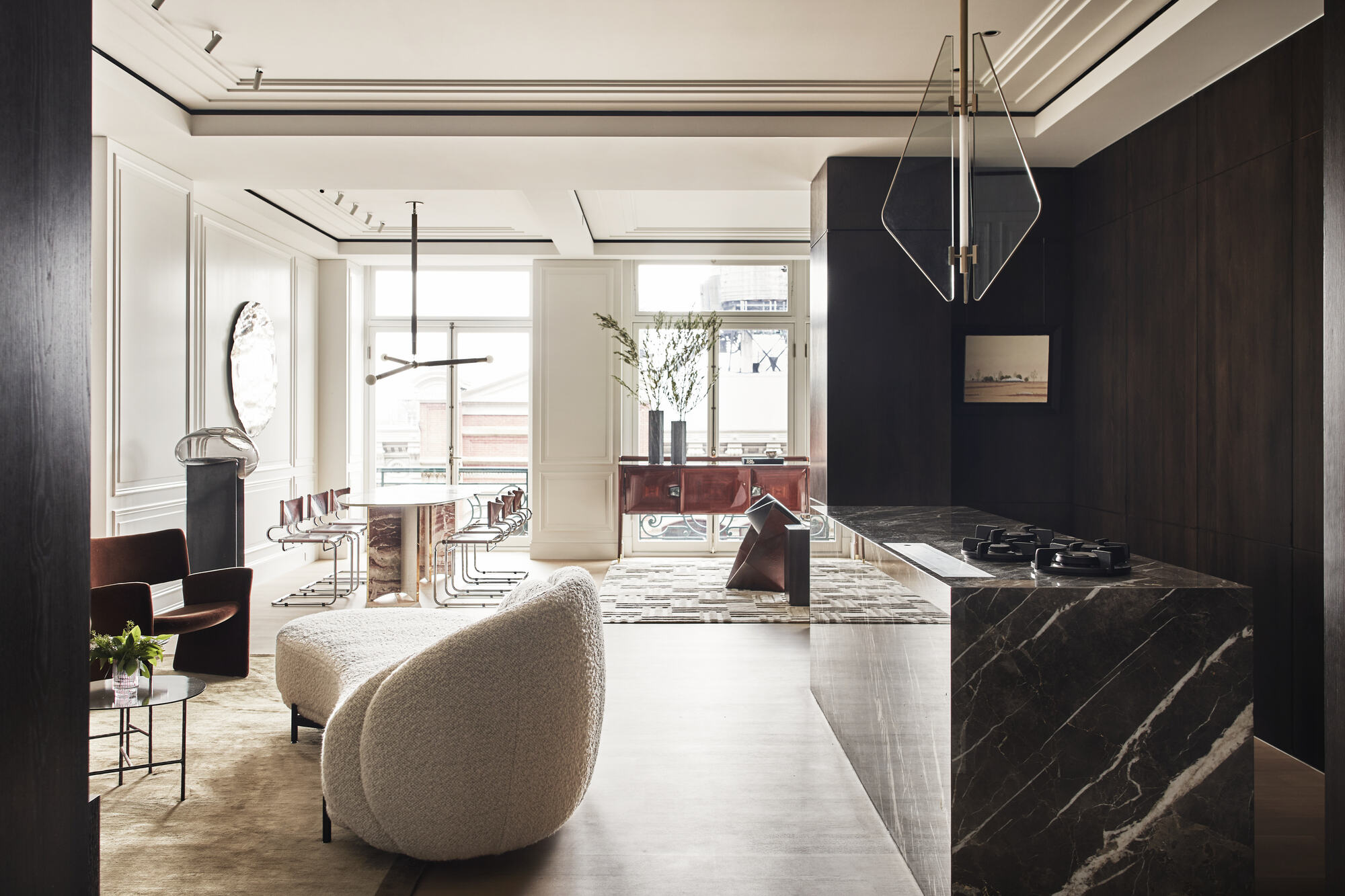
The idea was to keep the shell of the space aesthetically more 'traditional', with molding work, clever use of terrazzo, and all complemented by vintage furnishings, while the millwork in the kitchen, bathrooms and bar area keeps things modern and fresh.
Vintage pieces, such as a 1950s sideboard by Vittorio Dassi, a vintage 1960s Guillerme et Chambron cabinet integrated with light, a one-of-a-kind contemporary table purchased from a gallery in Madrid, and a woven raw flax linen tapestry pinned and executed by Todd himself above the primary bed are just some of the standout finds that makes this modern home a real treasure trove.
The result is a beautiful juxtaposition of styles - fuzing a contemporary setting with elegant hand-picked furniture and decor - a sentiment of what Todd loves best as an interior designer.
'My husband and I were aiming to achieve a sophisticated home layered with texture, with a focus on entertaining,' says Todd. 'We wanted our home to keep revealing itself as you proceed from room to room, and keep surprising with new materials and design features.'
Vintage finds
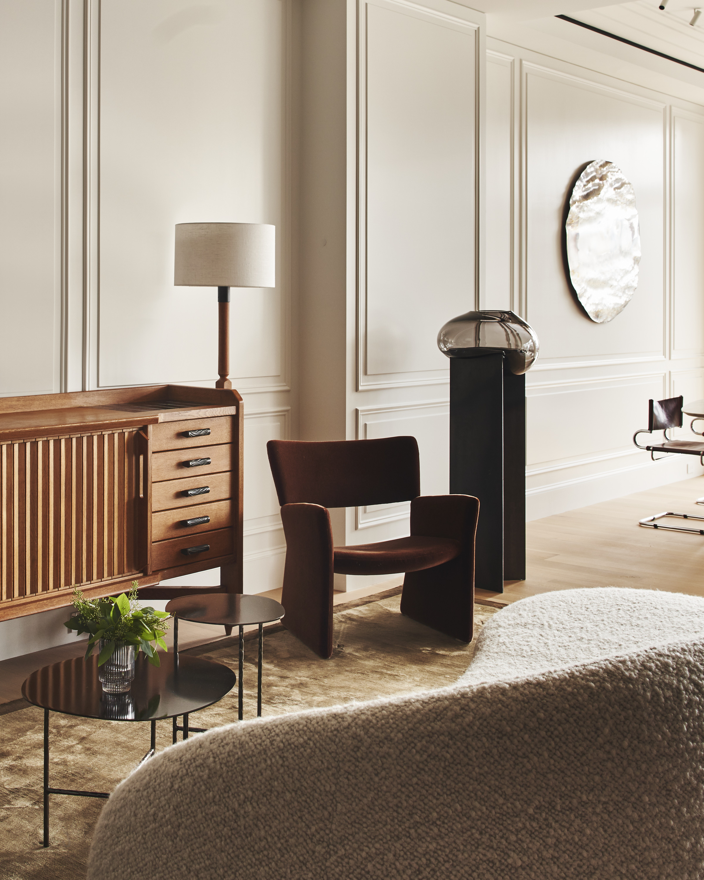
To curate a space that has almost a gallery feel, Todd aimed for the furniture to breathe, giving off an air of excess room in the loft, which involved a lot of spatial planning to get placement of the furniture just so.
'My favorite vintage piece we sourced for the project was the 1960s Guillerme et Chambron cabinet [above] in the TV room,' explains Todd. 'We wanted something vintage in this space as the chairs, living room wall art, and sofa are very modern.
Be The First To Know
The Livingetc newsletters are your inside source for what’s shaping interiors now - and what’s next. Discover trend forecasts, smart style ideas, and curated shopping inspiration that brings design to life. Subscribe today and stay ahead of the curve.
'So we needed something to counterbalance that. It also adds texture and depth to the space with the ribbed tambor doors, and it's quite a large and substantial piece, so it helps anchor that room.' At night, the space is lit with monopoint spotlighting, which further sort of enhances the ribbed wood and highlights the silk rug.
'It's a lot of texture going on, but I think the space wouldn't be as successful with a contemporary cabinet.'
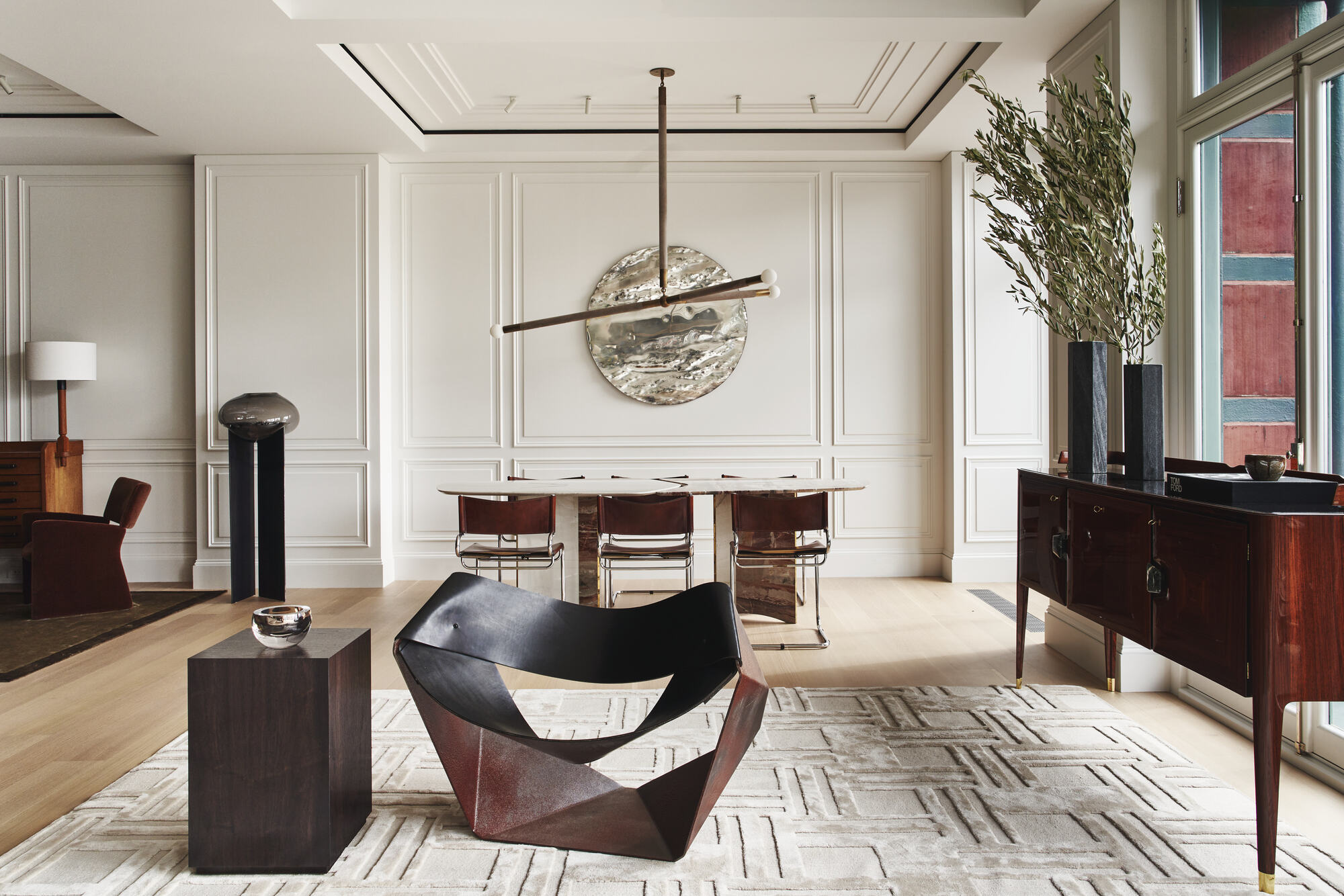
For Todd, a vintage piece has to help tell the story to the space for it to make sense, and the designer was greatly influenced by the shape of furniture, picking vintage pieces that share a similar shape or silhouette that is then echoed throughout the home.
'In our living room, for example, we chose a 1950s sideboard by Vittorio Dassi [above], which has this really angular green marble pulls and a boomerang-shaped frame. If you look closely, we've repeated this shape subtly throughout the spaces with pieces like the dining table, the chandeliers, and even the steel and rubber origami living room chair.'
The juxtaposition of hard and soft texture
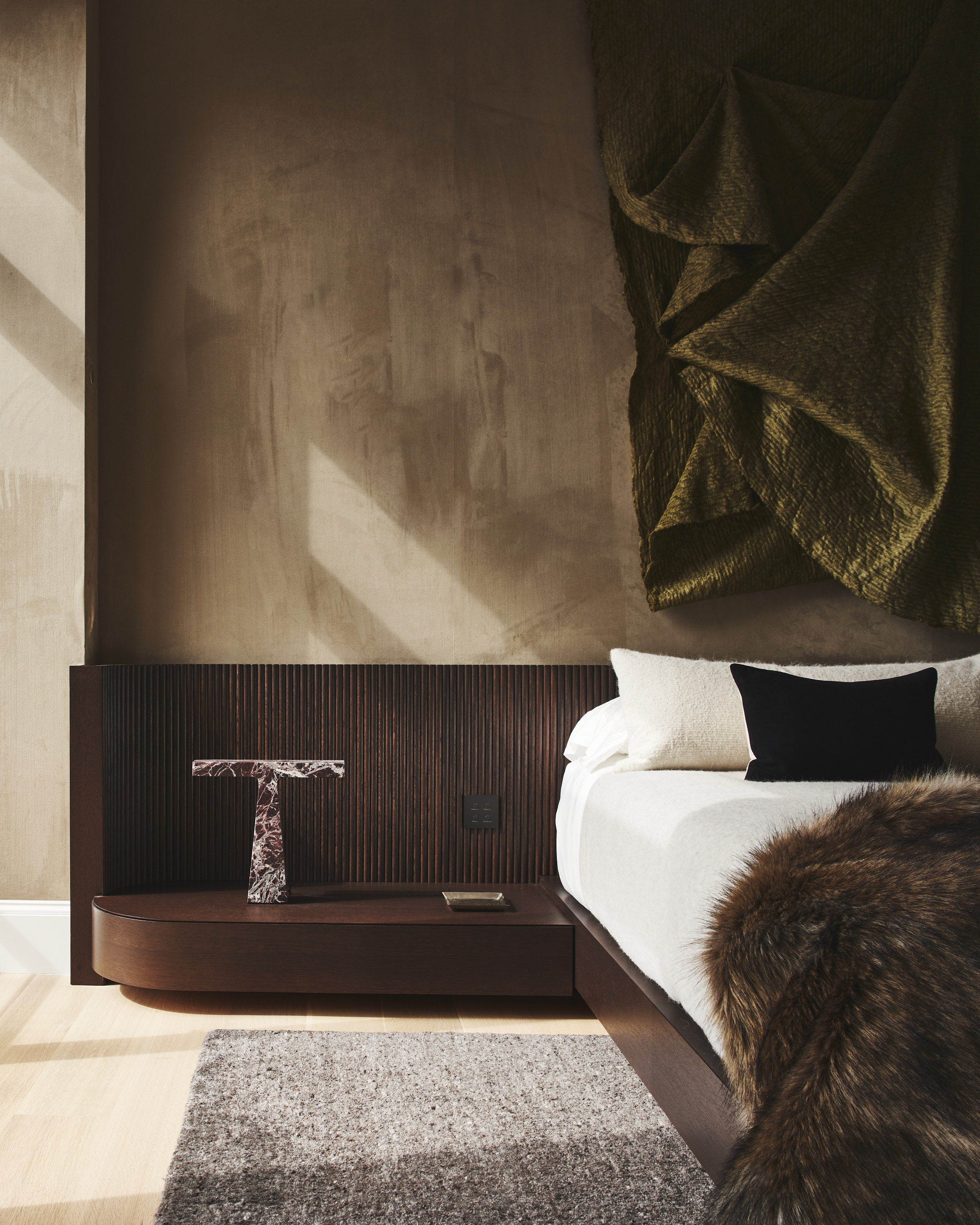
Texture is another important aspect to the loft, helping the space to feel cozy when it is vastly populated by a lot of hard material like marble and wood.
'The applied crown moldings on the walls help with texture, and we chose a dark chocolate wood for the millwork to help cozy up the space. We love brown as a neutral, and the graining of the wood helps soften the other white walls.'
The largest rug in the home, about 20' feet long, is the cream silk and wool living room rug. 'It anchors the space as any rug would, but even though it's not a bold color, the bold pattern helps cozy up the space and add dimension.'
In the bedroom, the walls are textured derived from a suede material. 'I wanted to soften this space slightly rather than white walls and make it more cocoon-like,' says Todd. 'Suede felt like the best option.' The room has an extra sumptuous feel with the addition of a high pile throw on the bed, and the ribbed in-built bedside table offers a sharp and dynamic contrast.
'My husband asked if we could do the residential version of a Tom Ford showroom - so we kept that in mind from a very macro-level while designing,' explains Todd. 'We chose fabrics that reminded us of tailoring and suits, for example, and hues and tones that played to that theme without getting carried away. We also played with high-gloss, lacquered surfaces, and mirrors but in a champagne hue to bring that touch of glam to the space.'
Shades of brown
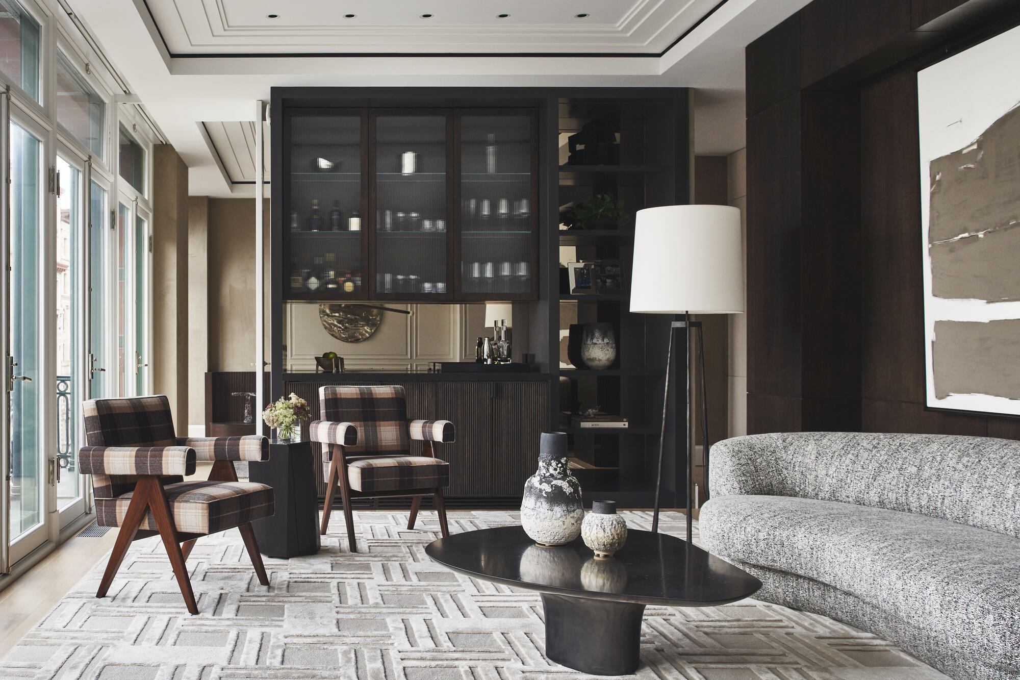
The home sports a dark color scheme, with a palette composed of dark browns, blacks, creams, and other neutrals popped with accents of green and cinnamon.
'Brown is one of my favorite neutrals because it's a color found in nature everywhere, and I think that is why it is timeless. The world will never get rid of it!' says Todd .
'We like to introduce colors in subtle and very saturated ways. For this project, we started with a dark, burnt cinnamon color as a jumping-off point, as I thought it paired nicely with the chocolate brown. At some point, we were considering purchasing the portrait artwork in the TV room with that gorgeous minty green color in it.'
'I thought I loved just how that hue was so bright and such a contrast to the dark chocolate, but I didn't want to make it such a prominent color in the home. So we went with green, but in shades darker, and chose more olive and sage hues with a greyer undertone to help create a sexier and sophisticated feel.'
Black has only been used in a few select places throughout the home, so the light-stained floors, the cream silk rug, and the lighter fabrics in the foreground of all the dark millwork help to make the use of black pop.'
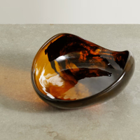
Leaf swirled resin bowl, Net-a-Porter
If you're looking to bring a little brown decor into your home, I love the look of this resin bowl by Dinosaur Designs, which has taken cues to nature and modeled this handmade bowl on the shape of a leaf.
Scentscaping
One interesting aspect of Todd's design is the in-built scentscaping whereby scent pumps through the HVAC system. The product is called AirAroma, and they are cartridges that connect to the system and pump out a scent based on chosen time and schedule, pumping out as little or as much as the homeowner wants. 'It's all about thinking four-dimensionally,' says Todd.
'A person experiences a room in so many ways, and the scent we chose helps create the mood we were going for. Our scent has notes of leather, citrus, and sandalwood.'

Former content editor at Livingetc.com, Oonagh is an expert at spotting the interior trends that are making waves in the design world. She has written a mix of everything from home tours to news, long-form features to design idea pieces, as well as having frequently been featured in the monthly print magazine. She is the go-to for design advice in the home. Previously, she worked on a London property title, producing long-read interiors features, style pages and conducting interviews with a range of famous faces from the UK interiors scene, from Kit Kemp to Robert Kime. In doing so, she has developed a keen interest in London's historical architecture and the city's distinct tastemakers paving the way in the world of interiors.
-
 My 10 Favorite Designs at Milan Design Week 2025 — Out of the Hundreds of Pieces I Saw
There is a new elegance, color, and shape being shown in Milan this week, and these are the pieces that caught my eye
By Pip Rich
-
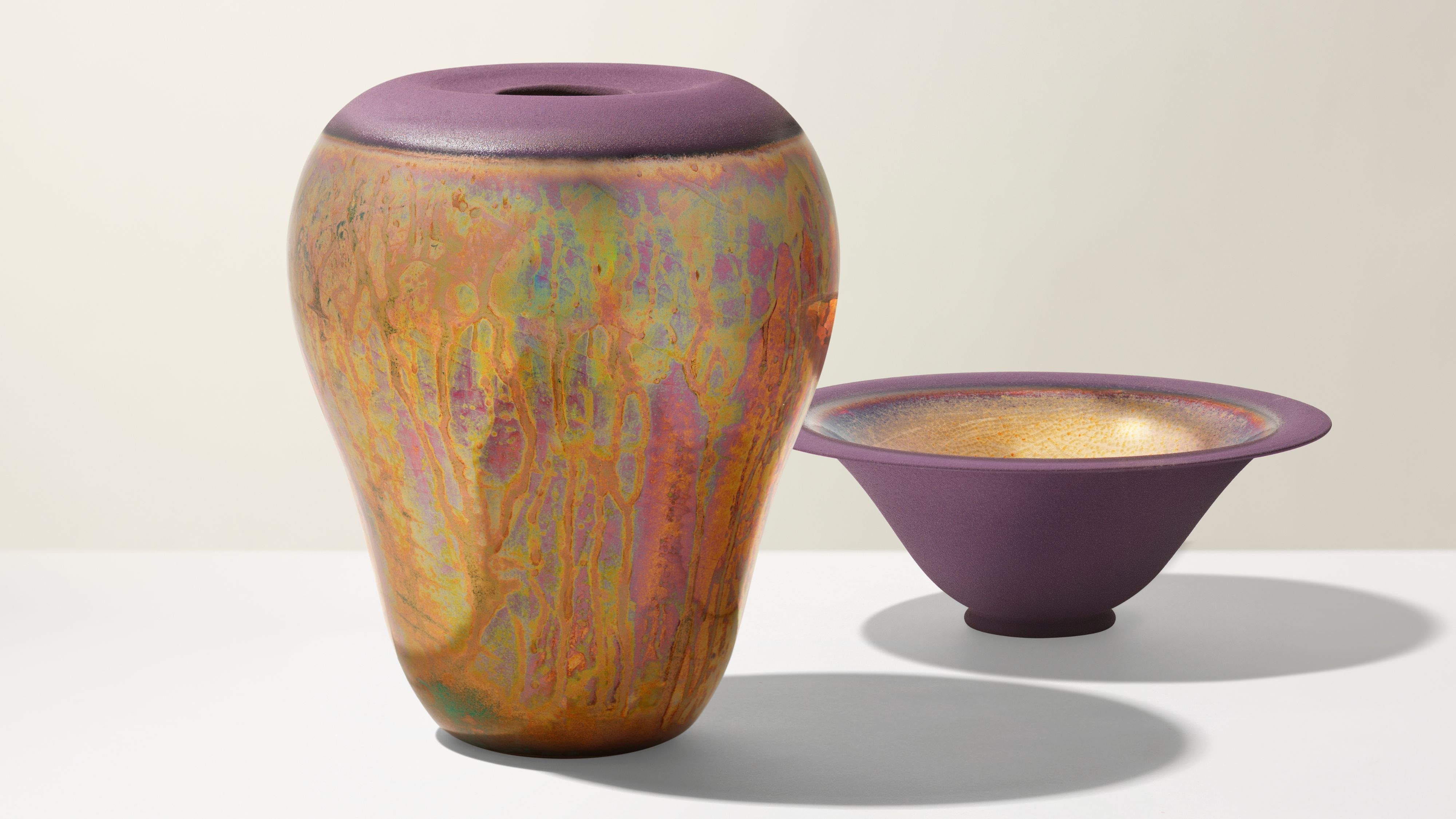 Iridescence Is Chrome’s More Playful, Hard-to-Define Cousin — And You're About to See It Everywhere
This kinetic finish signals a broader shift toward surfaces that move, shimmer, and surprise. Here's where to find it now
By Julia Demer
