This architect's apartment has become a testing ground for his favorite and most experimental ideas
With its moving partitions and creative room layouts, this architect's apartment in Tel Aviv is a showcase of his most creative concepts
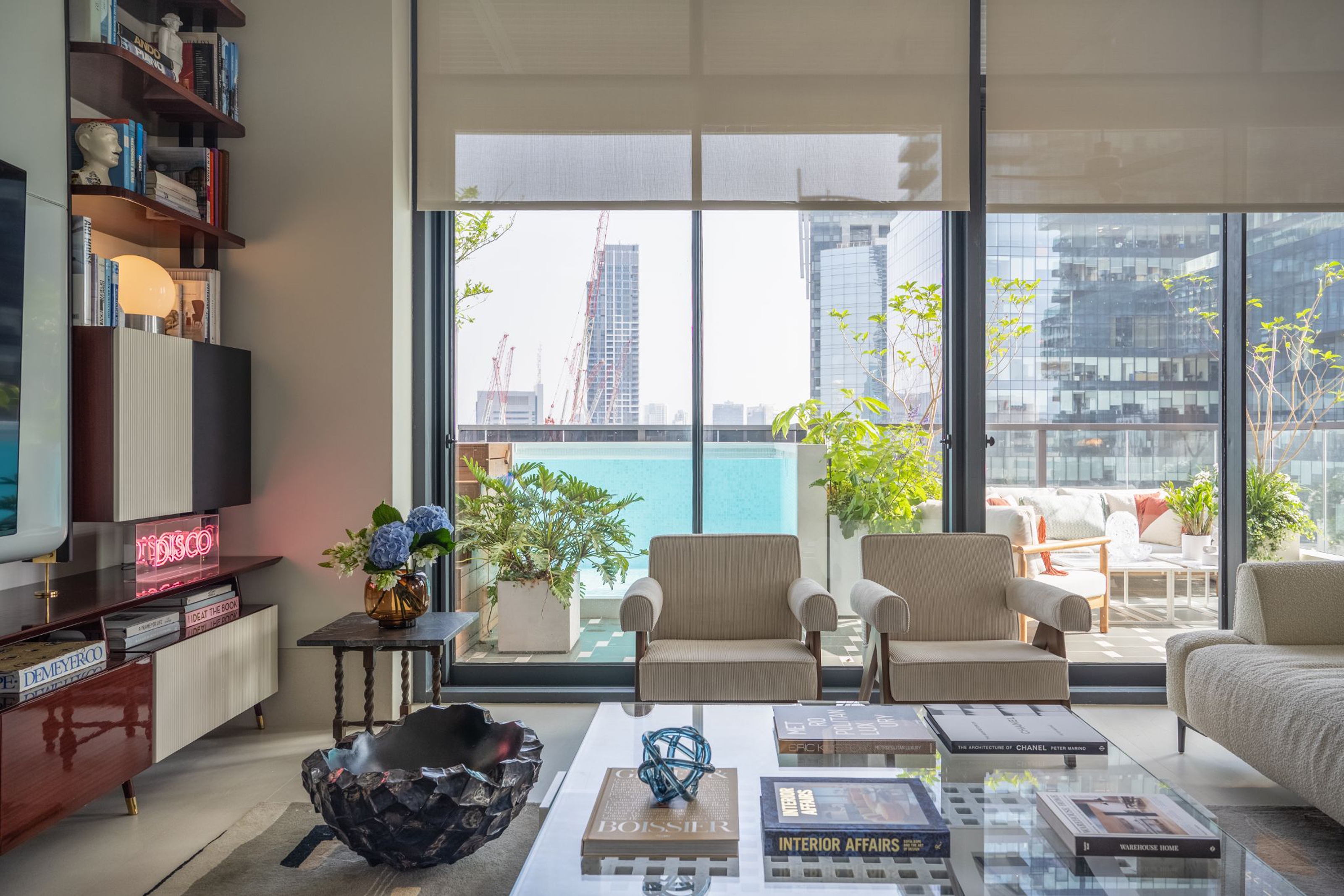

When you work in the design industry, your most exacting client is likely to be yourself. However, as Tel Aviv-based architect Oshir Asaban knows only too well, home also offers an opportunity to try out some of your more radical ideas in real life.
'As an architect, when you design a home for yourself, you want it to represent you with all the architectural elements you like, all the details you didn't implement for certain reasons with clients,' Oshir tells us. 'You want it to be a kind of showroom that you can bring clients to.'
His own apartment, which he lives in with his partner and a toy poodle called Brick, was an 'empty box' when they first bought it - just concrete perimeter walls and a gravel floor. This gave the architect the chance to fit out the interiors in its entirety, ensuring the very best use could be made of the space.
This has led to an apartment filled with interesting ideas and a flexible style of open-plan living that's perfectly suited to a modern home. Here, we explore his ideas in more detail.
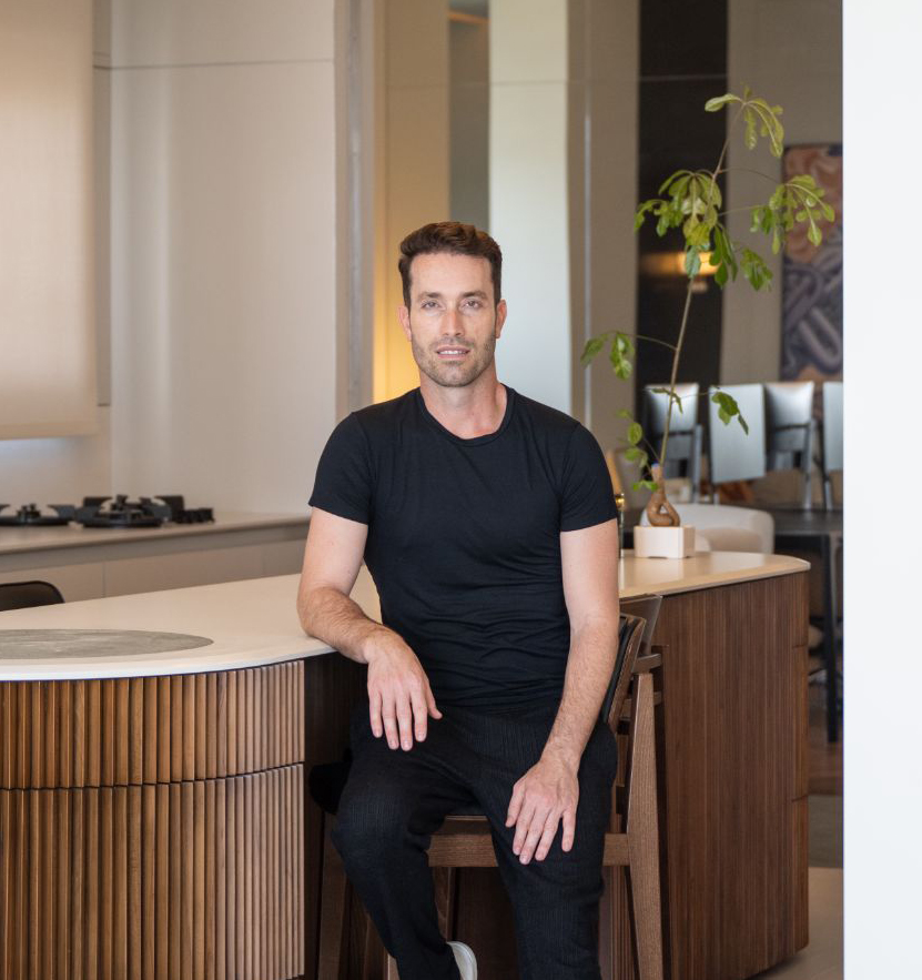
Oshir Asaban is an architect and founder of Studio Oshir Asaban. He specializes in architecture and interior design for hotels, residential and commercial projects. Here, he shows us around his penthouse apartment, with its terrace, a dreamy urban oasis.
Flexible living
Given the scale of the apartment, and that only two people are living in it, Oshir created sliding floor-to-ceiling room dividers that can make the space feel both open plan, or divide it into smaller intimate spaces, as required.
'The way we behave at home is that when one of us is working and the other is cooking, we want to be in eye contact with each other,' Oshir explains. 'So instead of standard doors, there are large partitions that move in the space like walls and allow to close the different areas when needed.'
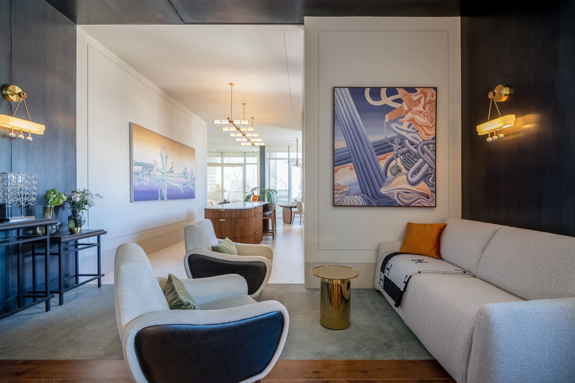
When these partitions are open, you have clear sightlines from the balcony at one end to the balcony at the other - a direct view of the entire length of the apartment.
Be The First To Know
The Livingetc newsletters are your inside source for what’s shaping interiors now - and what’s next. Discover trend forecasts, smart style ideas, and curated shopping inspiration that brings design to life. Subscribe today and stay ahead of the curve.
Light seeker
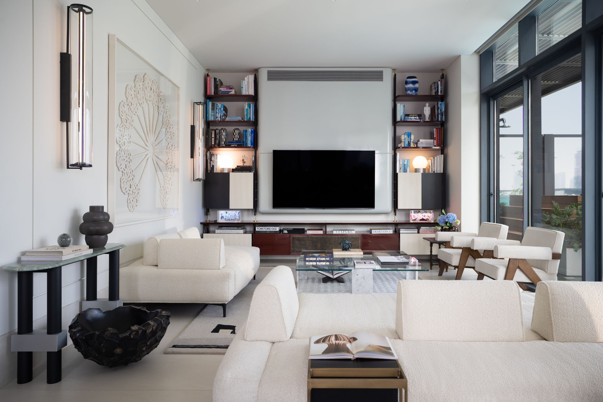
The apartment doesn't benefit from south and east facings, but while it might not get huge quantities of natural light during the day, a light, neutral color scheme ensures what it does get is well-utilized, while also providing a crisp backdrop for other decor choices.
Decorating the apartment with vast 10x3' floor tiles create a clean, bright look in the living room, with minimal visual breaks that help this flooring look almost like a solid installation. Furniture in light, textured textiles and white wall decor complement the natural yet luxe materials used throughout the space.
Going bespoke
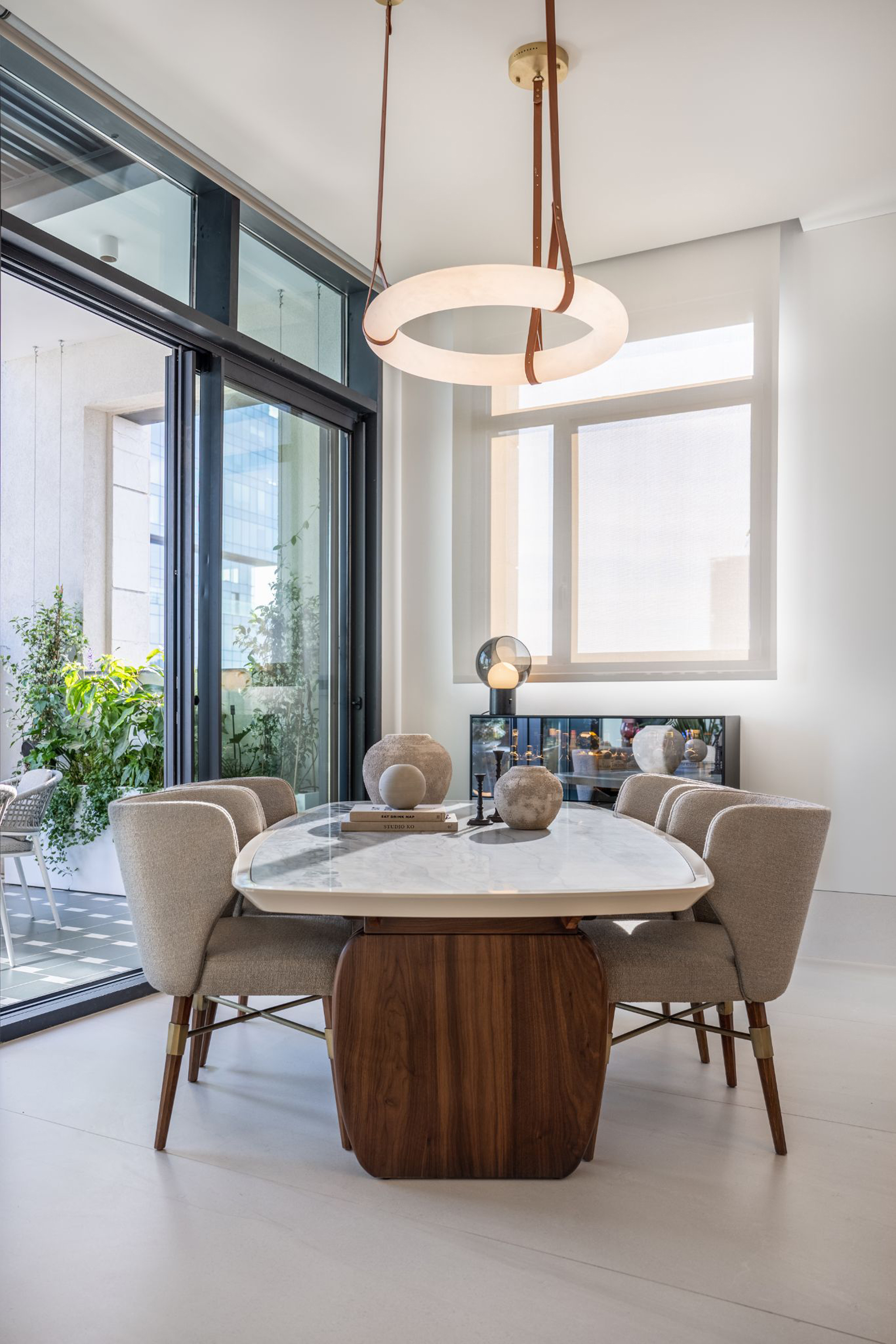
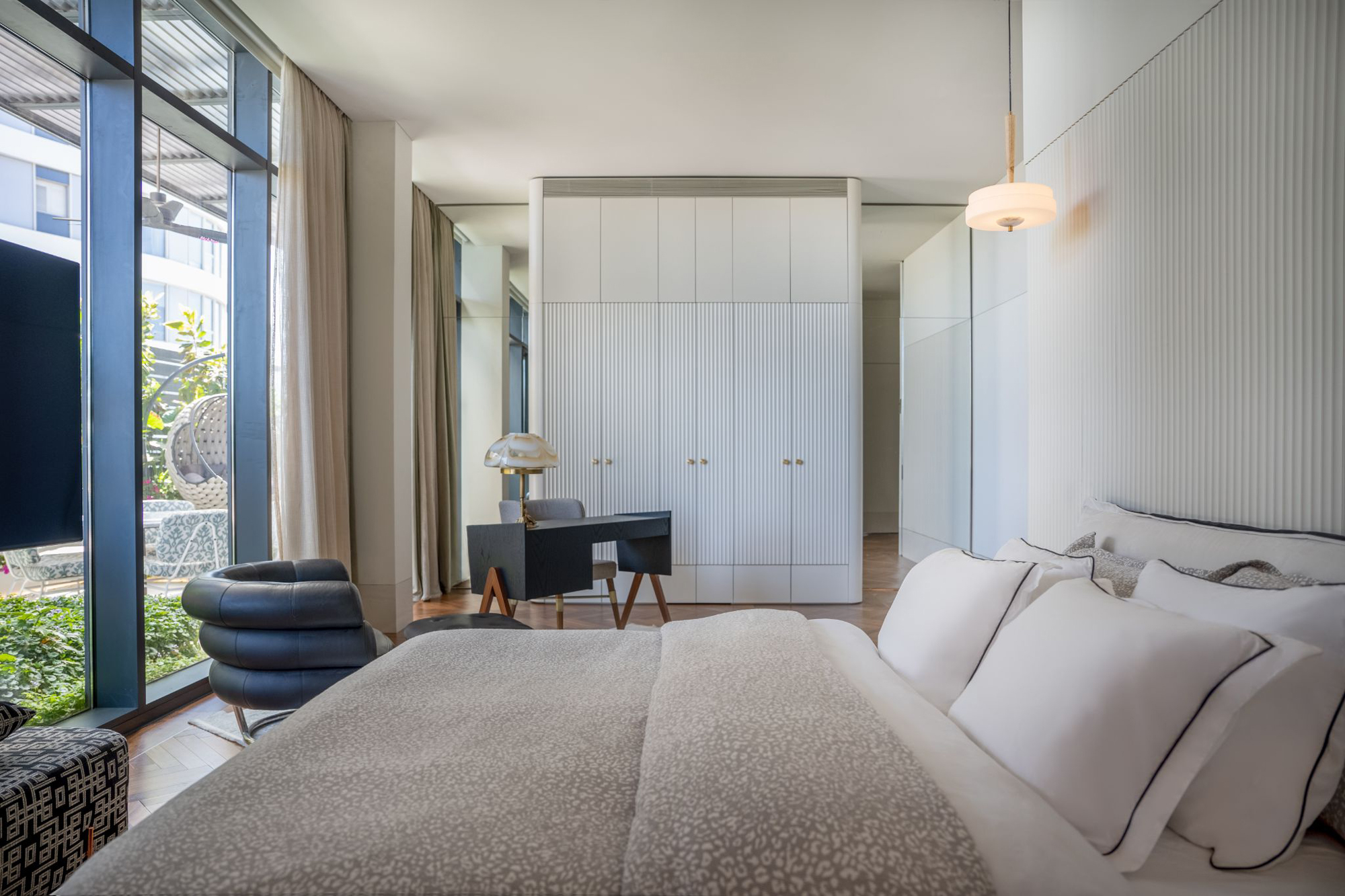
Not only did this apartment give Oshir to put his architectural ideas to the test, but many of the furnishings are his own bespoke designs, too. 'I really love mid-century design, so there are many custom-designed elements in this home such as the bookshelves in the living room, dining table, the desk in the bedroom and the dressers in the study that give the feeling of something that was not built today, something that was here even before we entered,' says Oshir.
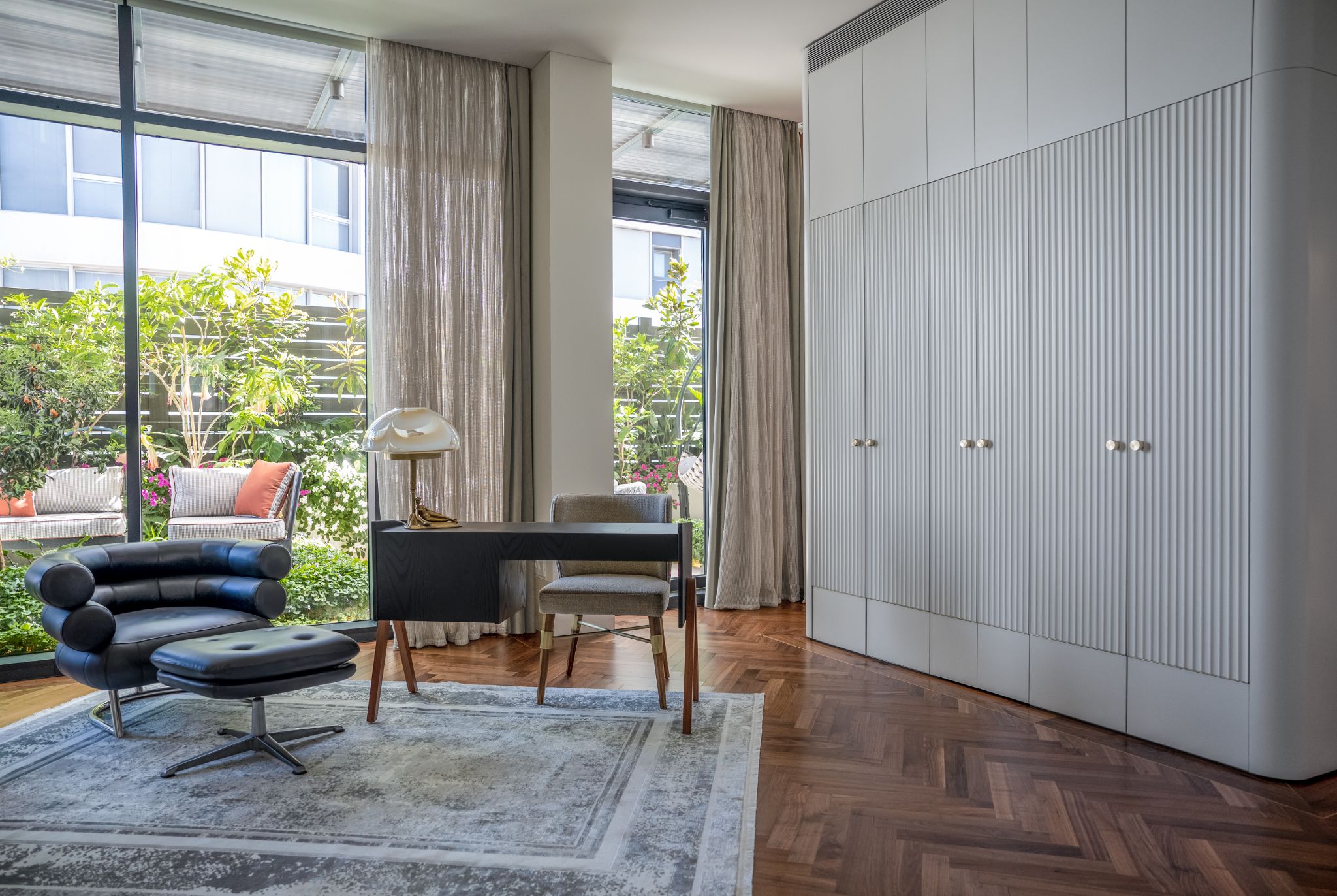
'Of course, we are no longer in the 50s, so some features have turned from modern to classic, including the frames on the walls, the high panel on the walls, the touches of brass, and the natural stone which is timeless for me.'
Urban oasis
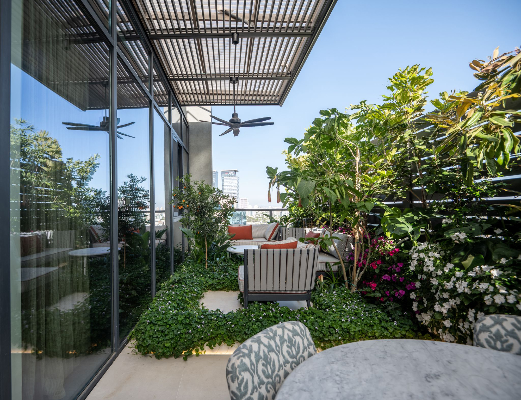
The apartment, which is a penthouse, has two large terraces, adding 1,000 square feet of outdoor space to the 2,000 square foot property. One runs along the more public areas of the apartment, while the other is situated along the main bedroom and bathroom, each with a different feel.
'We wanted to give the feeling of a private house and create a real garden there,' Oshir tells us. 'This is a place where you forget that you are in a tower and in the center of an urban area.'
'I divided the main balcony into three parts,' he continues. 'On the right and left I planned two large planters, with plants with stepping stones on them and garden furniture. In the center sits a round table, at a lower height than usual, to give a feeling of a less formal atmosphere. Along the entire balcony, there are tall planters that can accommodate larger trees.'
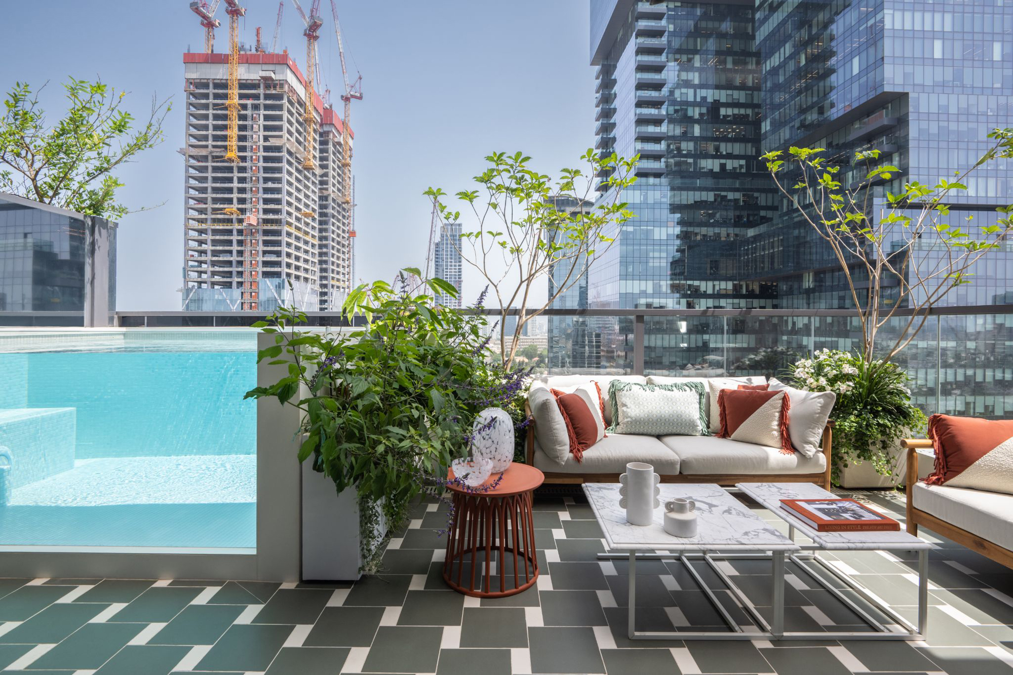
The outdoor area that adjoins the living area is paved with green and white tiles and furnished with rust tones to create a Mediterranean feel. The elephant in the room? The balcony's glass-sided plunge pool which brings a flash of blue to not only the terrace, but through the apartment's glazing, too.
More planting on this terrace helps to enshrine the idea that the property is a small house, not an apartment in a tower. 'Green vegetation can be seen from every corner of the penthouse, giving the feeling of being in a very private house,' Oshir says.
Material concerns
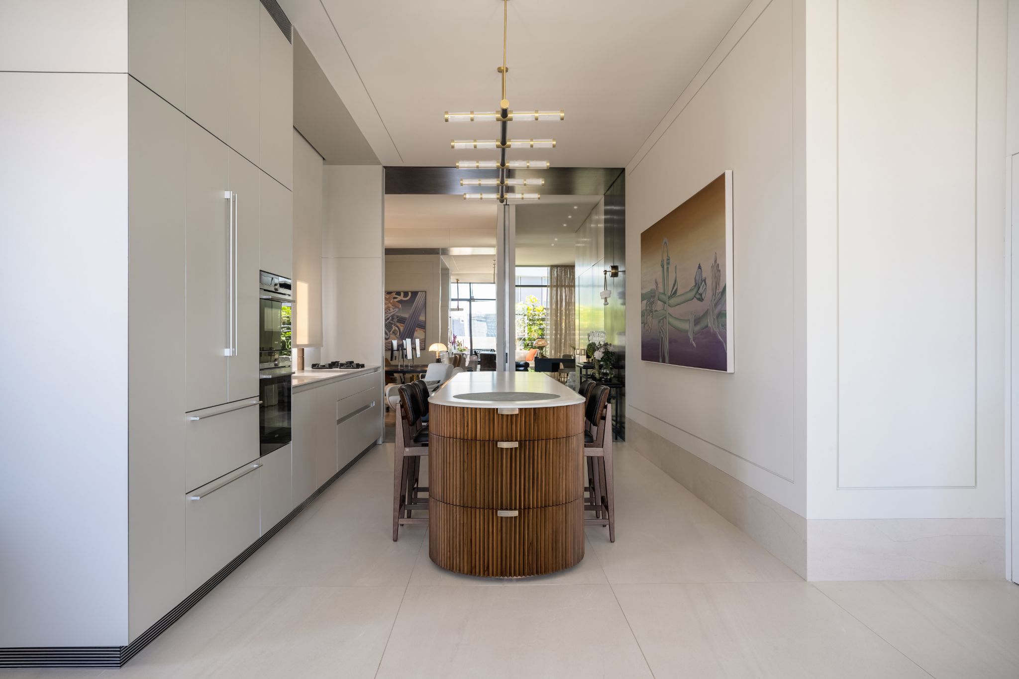
With such a simple color palette, materiality takes center stage in Oshir's design of this penthouse. Rich woods, such as American Walnut, have been used in many of the spaces, from the on-trend fluted and rounded kitchen island, to the bathroom vanity.
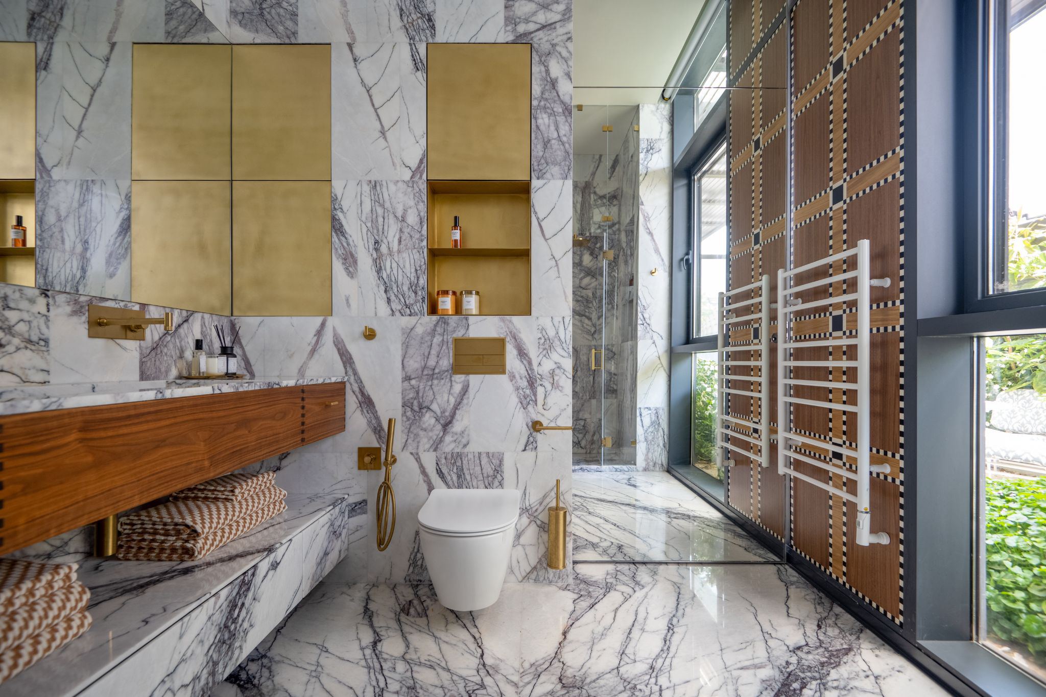
In the main bathroom, large-scale stone tiles and floor slabs have a lilac undertone and dramatic veining, introducing drama into this space. To round out the luxe feel of this modern bathroom, brass fixtures have been used, alongside inlays for the bathroom niches.

Hugh is Livingetc.com’s editor. With 8 years in the interiors industry under his belt, he has the nose for what people want to know about re-decorating their homes. He prides himself as an expert trend forecaster, visiting design fairs, showrooms and keeping an eye out for emerging designers to hone his eye. He joined Livingetc back in 2022 as a content editor, as a long-time reader of the print magazine, before becoming its online editor. Hugh has previously spent time as an editor for a kitchen and bathroom magazine, and has written for “hands-on” home brands such as Homebuilding & Renovating and Grand Designs magazine, so his knowledge of what it takes to create a home goes beyond the surface, too. Though not a trained interior designer, Hugh has cut his design teeth by managing several major interior design projects to date, each for private clients. He's also a keen DIYer — he's done everything from laying his own patio and building an integrated cooker hood from scratch, to undertaking plenty of creative IKEA hacks to help achieve the luxurious look he loves in design, when his budget doesn't always stretch that far.
-
 My 10 Favorite Designs at Milan Design Week 2025 — Out of the Hundreds of Pieces I Saw
There is a new elegance, color, and shape being shown in Milan this week, and these are the pieces that caught my eye
By Pip Rich
-
 Iridescence Is Chrome’s More Playful, Hard-to-Define Cousin — And You're About to See It Everywhere
This kinetic finish signals a broader shift toward surfaces that move, shimmer, and surprise. Here's where to find it now
By Julia Demer