Before and After: You Won't Believe the Transformation of this Once-Dated 60s Bungalow
Ceilings raised and walls torn down, this bungalow saw it all during a one-year renovation in which it became a stylish and bold home — now it embodies 'the new traditional'


Set in a friendly neighborhood in the desirable south west quadrant of Calgary, Canada, this bungalow is now a far cry from what it was when designer Alykhan Velji first bought it. Grand plans to transform the dated 60s property into a look that Aly calls 'The New Traditional' took one year to execute. Now a beautiful modern home, 'it feels warm, inviting and just perfect for us,' says Aly, who did the design himself and lives there happily with husband Jason.
A couple that loves to entertain and host, 'designing it for the way we live' was important to Aly. The original property had ceilings less than 8' high and partition walls splitting the property into smaller, boxier rooms. Making changes to a ceiling is no small undertaking, but grand plans for spacious, open plan living led Aly to design a 'cathedral style ceiling' adding height to the property to make it feel bigger and brighter.
When it comes to the interior design, Aly says 'the home is a study of my love in mixing textures, patterns and design style'. The old-fashioned interiors have been transformed and the bungalow now boasts bold wallpapers that bring tasteful joy to its rooms and various stones, panelling, and strong colors bringing texture and warmth to the home.
The Kitchen

Before Aly worked his magic on the bungalow, the closed floor plan and low ceilings made rooms like the kitchen feel dark and small. Wanting to take advantage of the two existing windows, Aly looked to bring more light into the room to make the kitchen feel like 'the focal point of the home'. Changing the design was a high priority too, with Aly wanting to get rid of the outdated cabinetry in favour of a more modern kitchen aesthetic.
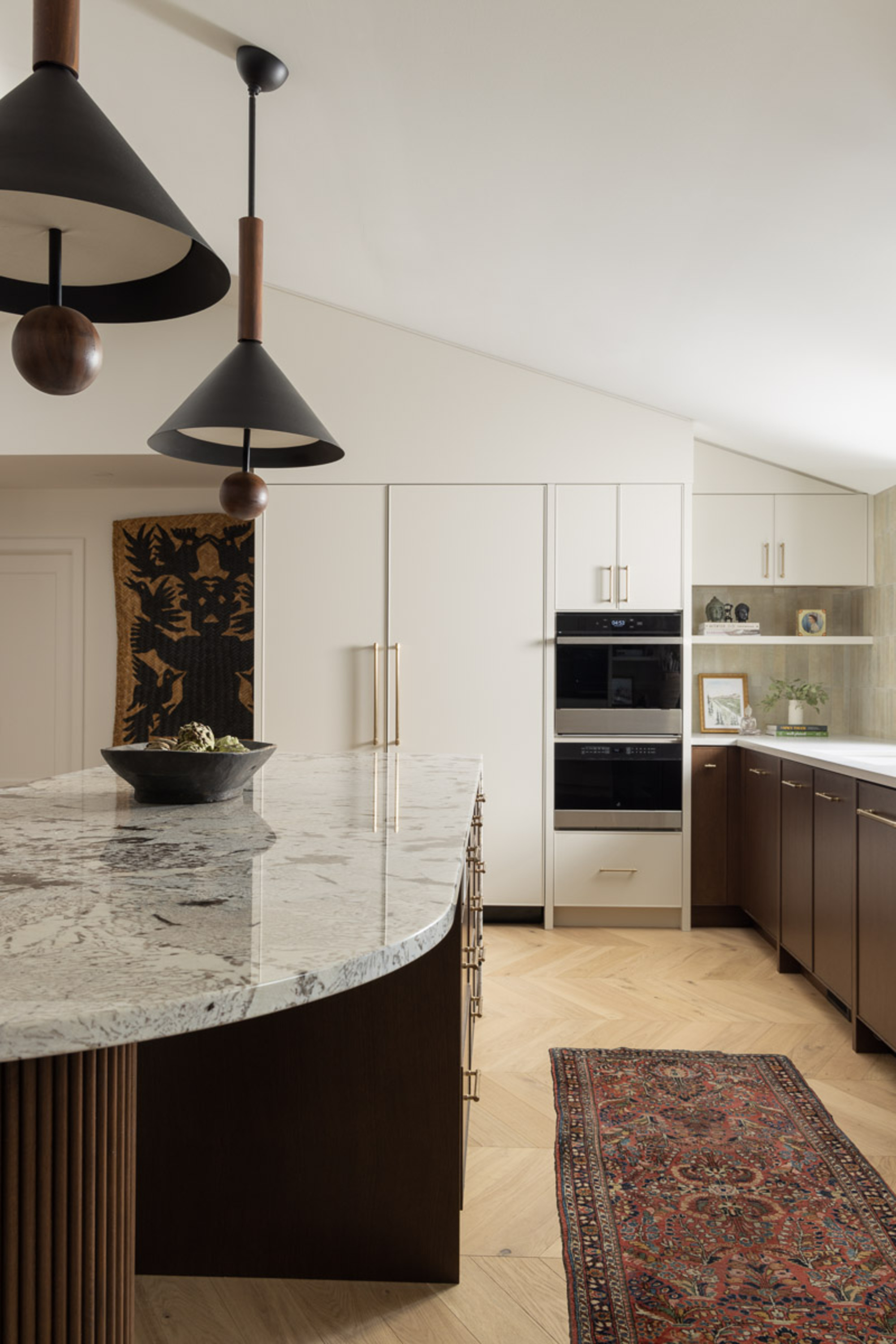
As regular hosts, a kitchen space that feels inviting and open was an important part of the brief. The kitchen island acts as a gathering space with seating all around for hosting informal get-togethers with friends. The granite kitchen countertop has a waterfall edge on one side allowing the stone choice to be showcased. 'I really love the look of this material because it was so variated but also very warm,' says Aly. An added bonus to the granite is its durability.
In pursuit of contrast and texture, the natural oak cabinets are a mixture of white and dark brown in color. 'I decided to add in full length cabinets on either side of the kitchen for symmetry, these go all the way to the ceiling and play up the angles,' says Aly.
'New Traditional' was the style brief for the new home, meaning that Aly could play around with the contemporary and the classic when it came to the interiors. As a nod to modern, 'the two overscaled pendants above the island also help to create a dramatic moment in the space and are a little unexpected,' says Aly.
Be The First To Know
The Livingetc newsletters are your inside source for what’s shaping interiors now - and what’s next. Discover trend forecasts, smart style ideas, and curated shopping inspiration that brings design to life. Subscribe today and stay ahead of the curve.
The Dining Room
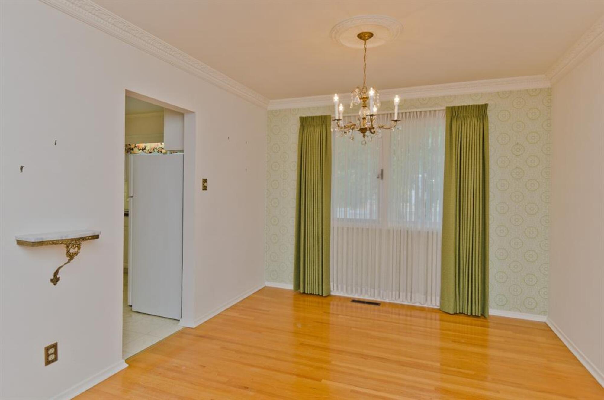
Similar to the kitchen, the dining room had low ceilings and an outdated look. The room can be seen from the new open plan kitchen and living area through an arched doorway and so it was important to Aly that it was an eye-catching space but one which flowed seamlessly with the style of the kitchen. Given their love of hosting, this room needed to be transformed into something pretty special for those more formal, longer dinners at home.
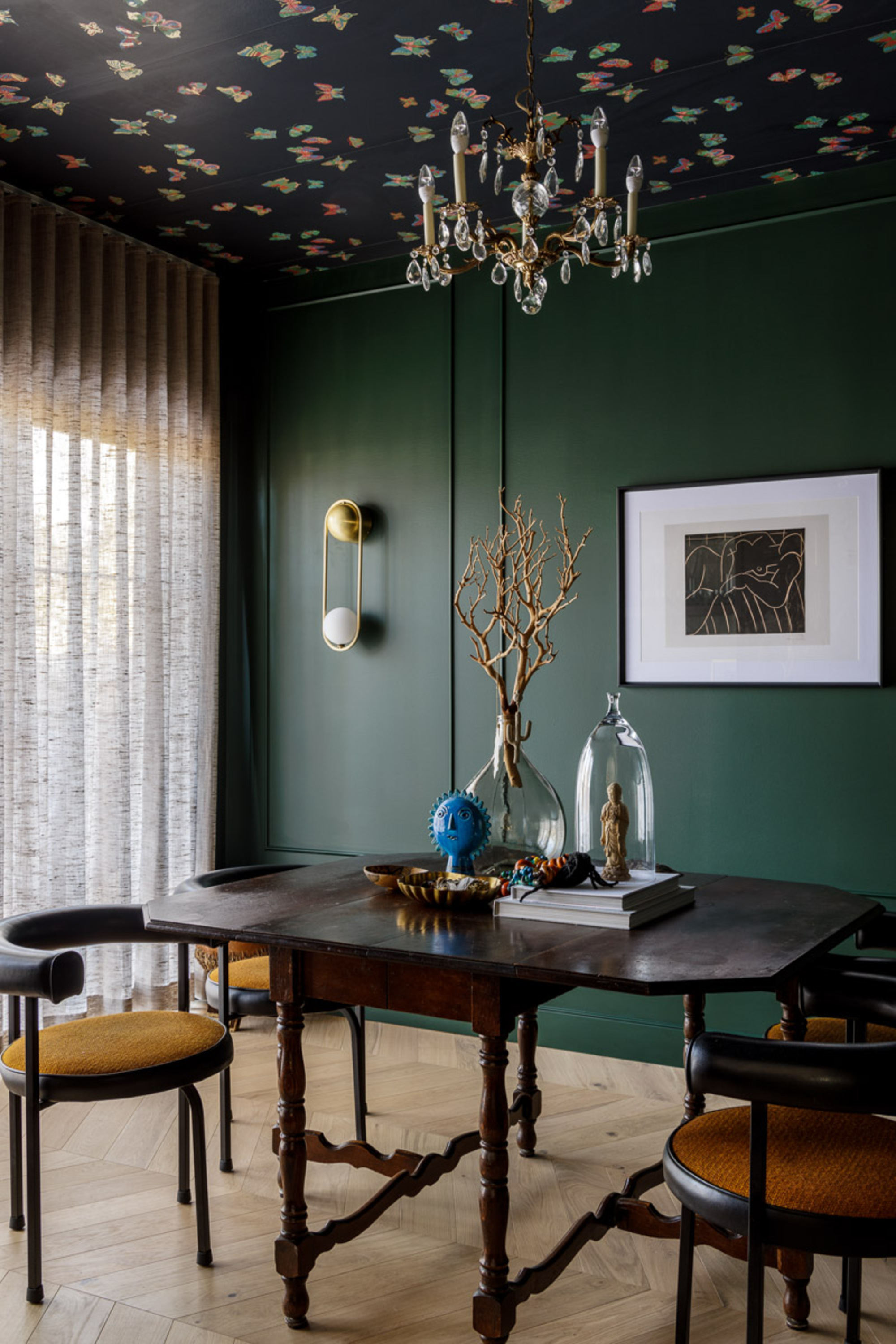
The dining room features distinctive dark green walls and follows the popular ceiling decorating idea of using wallpaper on what is often known as the fifth wall. 'I wanted to create a jewel of a space,' says Aly, who chose the dark green hue for the drama that it brings and the wallpaper for its 'whimsical' touch. Dark colored walls are a particularly good choice if you have a bright colored piece of furniture or bold artwork that you want to really 'pop' as the contrast allows the brighter shade to really stand out.
In keeping with the combination of old and new, the simple panel molding on the walls gives a traditional feeling which balances nicely with the combination of modern and old-school lighting.
The Principal Bedroom

Part of the renovation process involved turning two of the former bedrooms into one main principal retreat, made up of a bedroom and ensuite bathroom. The bedroom features a unique drapery across the wall behind the bed which acts as both a curtain and a distinctive design feature. 'As soon as I laid eyes on this fabric, I knew I had to have it,' says Aly. Going for a bold pattern can often feel like a daunting choice but choosing a warm colorway, like this drapery has, can soften the look, making it a great option for a statement wall.
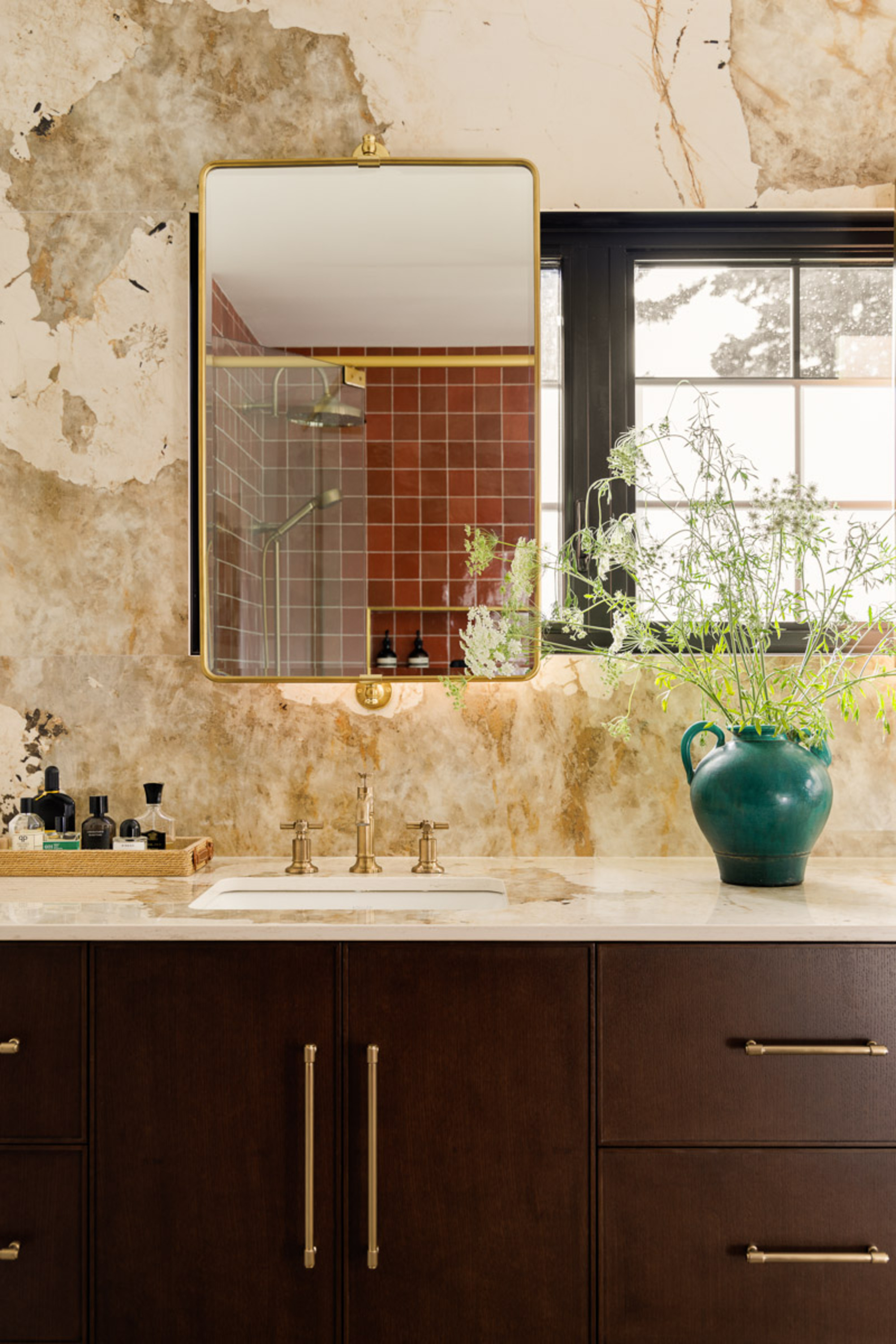
In the ensuite bathroom, the vanity area has a matching countertop and backsplash. Wanting to use the same material for both of these made decisions harder as the stone needed to be available in different thicknesses to suit the different surfaces. 'I came across this gorgeous Dekton product called Khalo which is inspired by Patagonia natural stone and I knew I had to have it,' says Aly. Not only can the thickness vary allowing it to work for both the countertop and backsplash, but it's a super durable material too, which is essential for any modern bathroom.
Natural light floods in through the windows which sit behind the mirrors making it the perfect place to get ready. Elsewhere in the bathroom, dark wood cabinetry contrasts the warmer colors used in the room to add depth to the space.
The Laundry Room
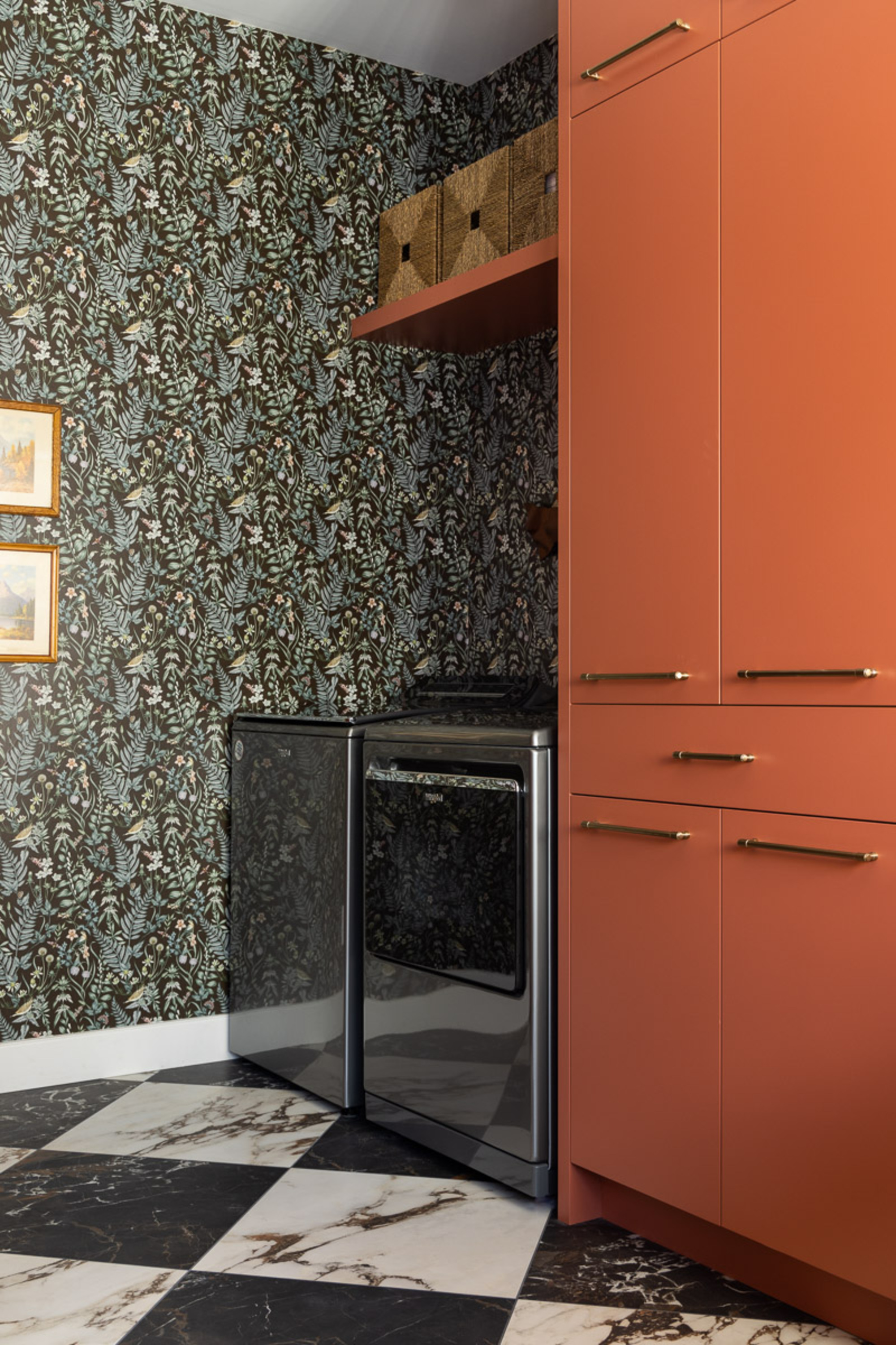
Arguably the most 'fun' room in the house is the one that we don't normally associate with that word - the laundry room. Making this space bold and exciting, however, is actually a genius way of helping you to feel that bit brighter when tackling those chores you don't want to do. 'It really helps to create a happy moment every time I look in and makes laundry a little more fun,' says Aly.
The room is multi-faceted, operating as a mudroom and a storage space as well as for laundry so making sure it was in keeping with the rest of the house was necessary given how much it is used. The dark Hygge and West wallpaper contrasts the brighter orange used for the storage cupboards. Aly's 'love of using wallpaper and working with patterns,' is embodied in the design choices he made for this dynamic nook of the residence.
The Living Area
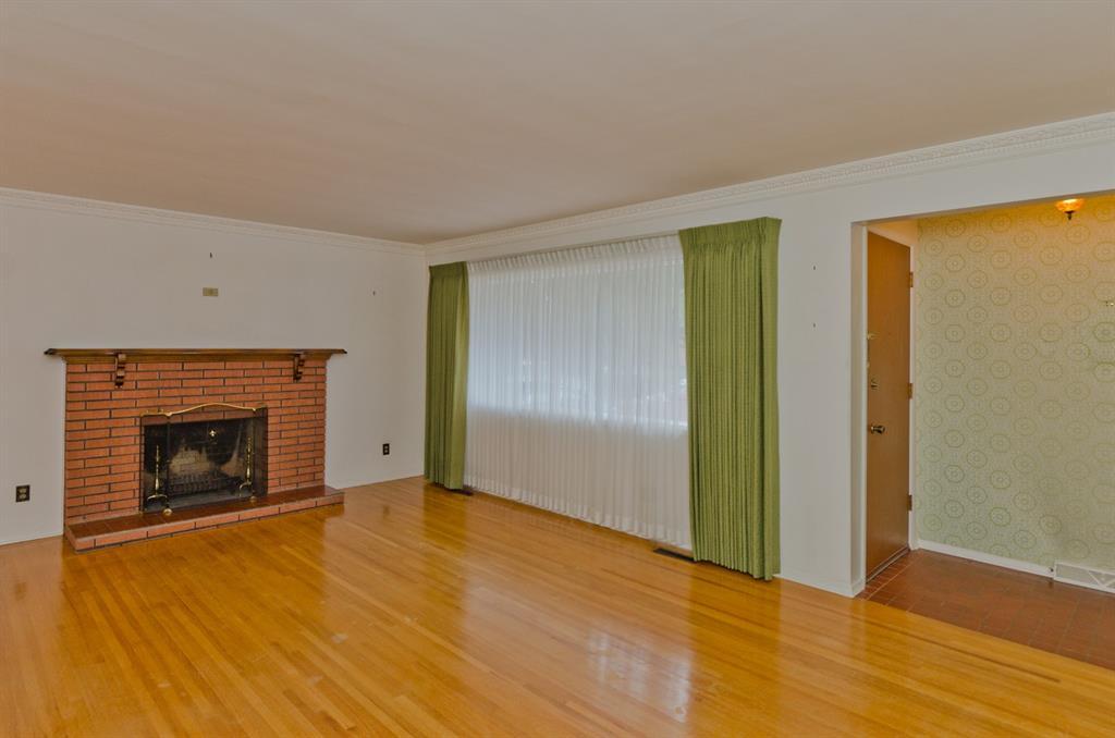
The original living room had a brick-clad fireplace as its main feature. A fireplace gives real heart to a room bringing a cozy and intimate feel. In fact, a wood burning fire was one of the new residents' must-haves when they were scouring properties. The brick cladding, however, provided a design challenge during the renovation as it couldn't be changed.
'I started to research some ideas of what we could do to clad the fireplace in and started conversations with a local concrete company,' says Aly. 'The fluted tiles are individually placed on the surround and the mantle and hearth were fully cast and placed on top.' Whilst concrete is a notoriously hard-looking material, the curved edges of the mantelpiece and the fluted detailing help to soften it.
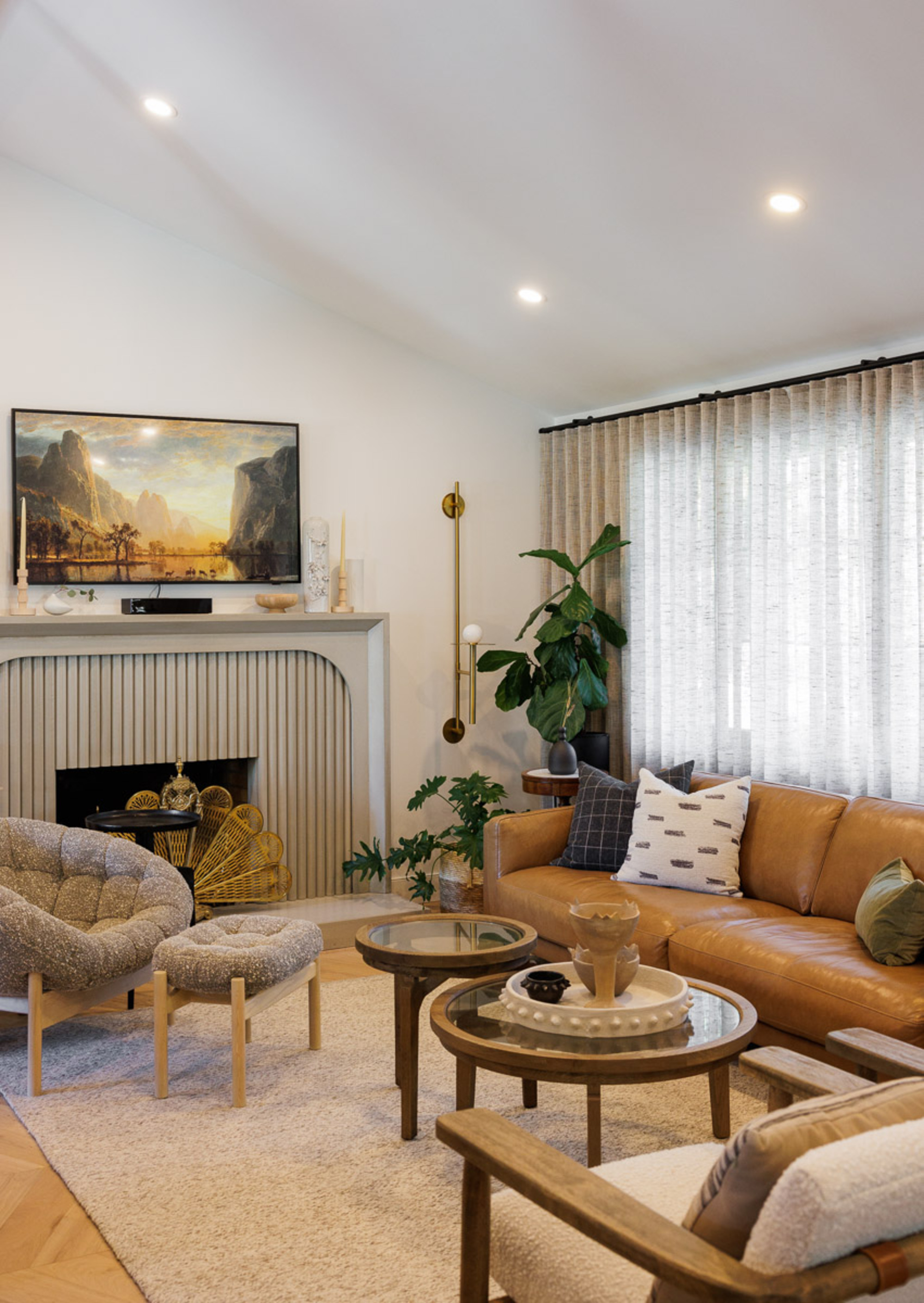
The new living room is completely unrecognizable from its former look. One of two big living spaces, this particular lounging space is directly adjacent to the kitchen and so benefits from the raised ceilings and a bright, airy feel. The furnishings were carefully chosen by designer Aly to create warmth and texture in the space which balances out the harder materials used throughout the house, such as the concrete fireplace and the granite of the countertop.
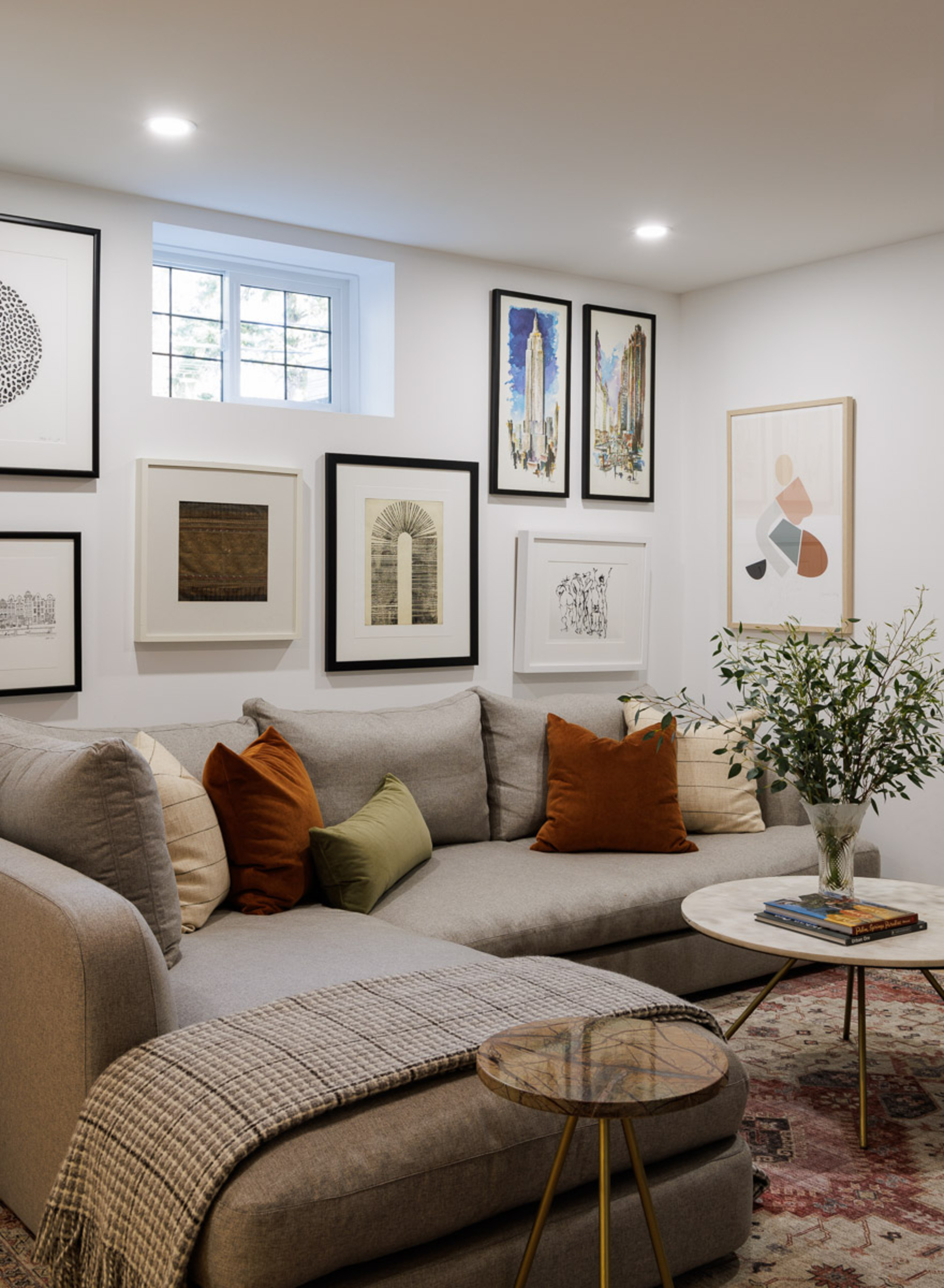
A second, cozier living area was put in during the transformation. Whilst open plan living areas come with a whole host of benefits, there is real value to a smaller, more snug corner for achieving ultimate relaxation. A second fireplace features in this room below a large television so that the couple have a place to put their feet up and chill out. The richly colored, velvet cushion ooze luxury and the dynamic frames break up the white walls. The patterned rug keeps warmth in the room making this the ultimate cozy space.
The Yard
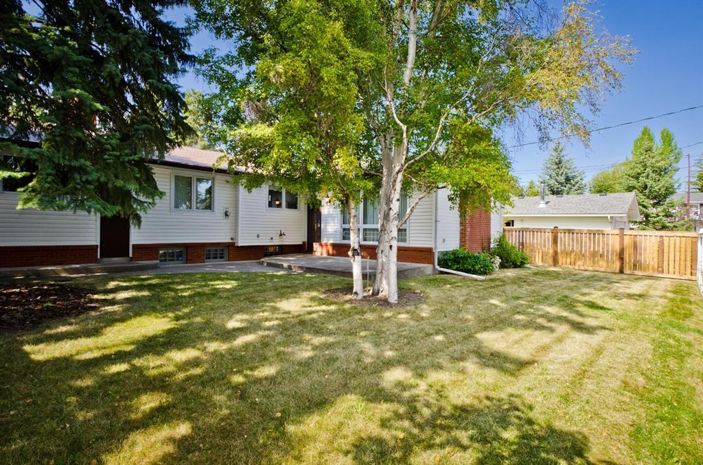
Before the backyard was landscaped during the renovation process, the bungalow property had a lawn sprawling across most of the outdoor space. Trees provided some much-needed shade for the garden but gathering spaces to host and sit down were lacking. Backyard overhaul plans were made with socialising and entertaining in mind and the space was carefully redesigned to make the most of the open layout of the yard.
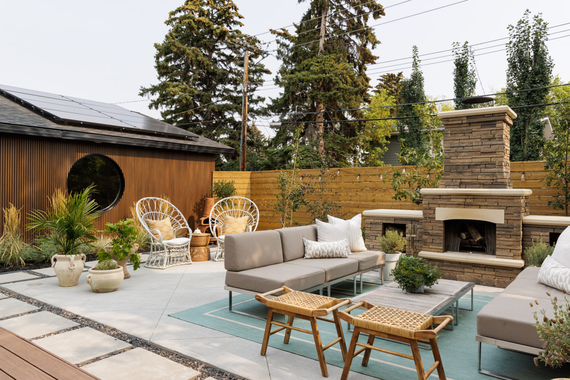
The garden was transformed from predominantly lawn to a sweeping patio with various lounging areas. The focal point is an outdoor fireplace with a large outdoor living set up by it. This space is the perfect getting-together area filled with comfortable, plush outdoor furniture. Year-round socialising is possible here thanks to the warmth of the wood burning fire and the festoon lights slung across the back fencing.
Other backyard highlights include two stylish sun loungers, perfect for lounging around on with a book and a cocktail in the summer months along with a dining table and parasol for long lunches with friends. The hard patio flooring has the potential to give a harsh look to the garden, but Aly's expert design choices on the furnishings adds texture and warmth to the space. An outdoor rug softens the flooring, with rattan chairs, sofa cushions and a wooden decking all offering up a soft contrast to the patio floor.
The Home Office
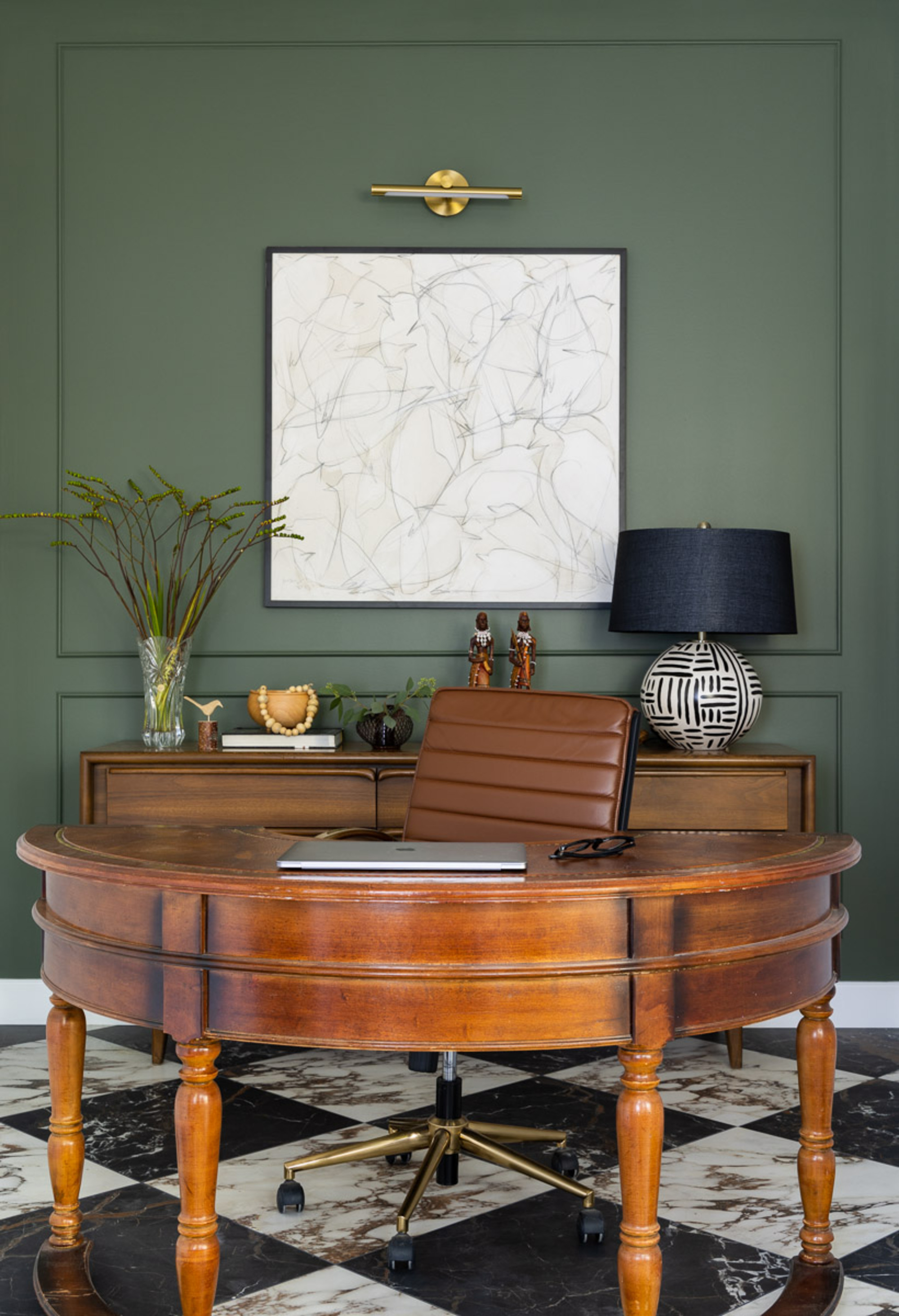
In a WFH world, having a designated home office is a great way of helping to separate your work life and home life, even when they both take place within the same building. Whether you have all the space in the world or are working with a small home office, it's important to get the room right given how many hours will be spent in there. As the renovation plans evolved, the home office in this property became smaller than expected. Aly worked around this by choosing a curved desk as the centre piece of the room. 'It helps to create flow in the space and the rounded table is a little unexpected and different,' he says.
The green walls are an ode to Aly's love of the color, which he says he likes to treat as a neutral. The distinctive modern lamp and artwork provide the 'new' to the desk's 'traditional' which is the theme running throughout the residence. The checkerboard flooring, also used in the entryway, stands out as a bold feature in the office, providing a fun aesthetic and showcasing Aly's love of pattern.

Imogen is a freelance writer and student on the Magazine Journalism master's degree at City, University of London following her Modern Languages degree at The University of Exeter. She has written for lifestyle and popular culture magazines as well as wellness and sports magazines. She has a long-standing interest in interior design and London architecture and is a firm believer in the power of bold wallpaper.
-
 My 10 Favorite Designs at Milan Design Week 2025 — Out of the Hundreds of Pieces I Saw
There is a new elegance, color, and shape being shown in Milan this week, and these are the pieces that caught my eye
By Pip Rich
-
 Iridescence Is Chrome’s More Playful, Hard-to-Define Cousin — And You're About to See It Everywhere
This kinetic finish signals a broader shift toward surfaces that move, shimmer, and surprise. Here's where to find it now
By Julia Demer