This Before and After Makeover of a Dated Wood Kitchen Now Feels Light, Bright and Modern
Kaminski + Pew transformed a dull and dingy kitchen in Philadelphia into one that is filled with sunlight and modern sensibilities

The Livingetc newsletters are your inside source for what’s shaping interiors now - and what’s next. Discover trend forecasts, smart style ideas, and curated shopping inspiration that brings design to life. Subscribe today and stay ahead of the curve.
You are now subscribed
Your newsletter sign-up was successful
There's nothing more satisfying than a well-designed, well-lit and spacious kitchen. After all, this is a room where you spend a lot of time in cooking and socializing. With a dream to have such an ideal space, the owners of this town home in the Society Hill neighborhood of Philadelphia reached out to architect studio Kaminski + Pew.
Their ask? 'A beautiful space that respects the character of the home and accommodates modern living,' say the founders, Kevin Kaminski and Alexis Pew. 'They wanted to have a meaningful connection between the garden and the kitchen too.'
With this brief in mind, the designers set out to give this modern home and its kitchen a complete reno. With a new open floor plan, a soothing color scheme, and an organic palette, the space is now synonymous with warmth, and wellness.
Before
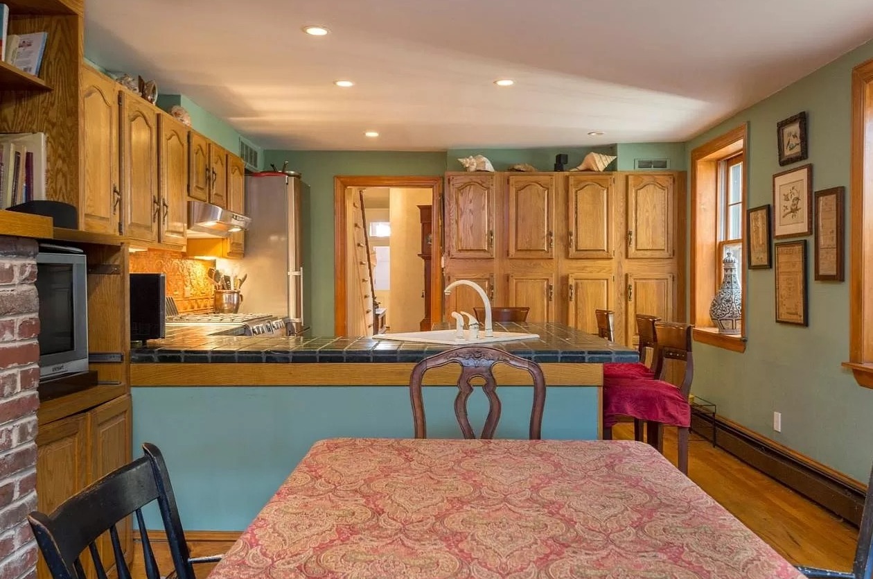
In the original floor plan, the kitchen was located in the middle of the home, bookended by a two-story cedar sunroom built in the 70s. The aim was to open up the kitchen to increase the sense of light and space. However, in reality, the designers made the house smaller by removing the sunroom and enlarging the masonry opening to pull more light into the kitchen.
'The kitchen is approximately 300 square feet and was originally built in 1830,' say Kevin Kaminski and Alexis Pew, founders of Kaminski + Pew. 'The home has experienced many different design styles over the years. Most recently the kitchen was served by unremarkable cabinetry and outdated appliances. For the reno, a dilapidated, two-story, wood sunroom was demolished to allow for better access to daylight from the kitchen. We also inserted a steel beam to pull more natural light into the modern kitchen and created a better connection to the garden. Daylight is very valuable in a town home like this!'
After
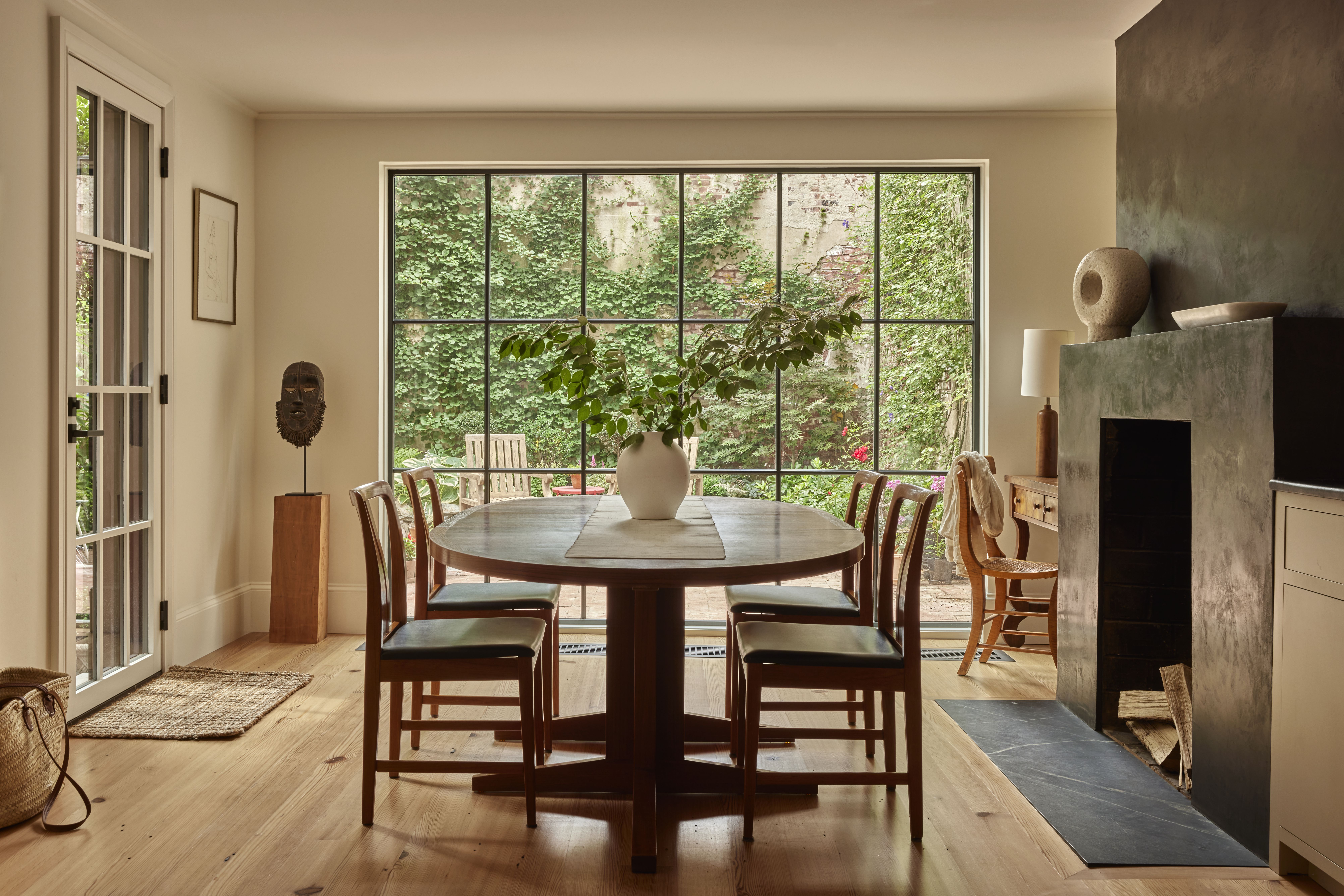
The transformation was quite dramatic, and the result was remarkable. The room seamlessly opens up to a dining room, and a garden beyond. 'The kitchen was designed as a gathering space of the home,' say Kevin and Alexis.
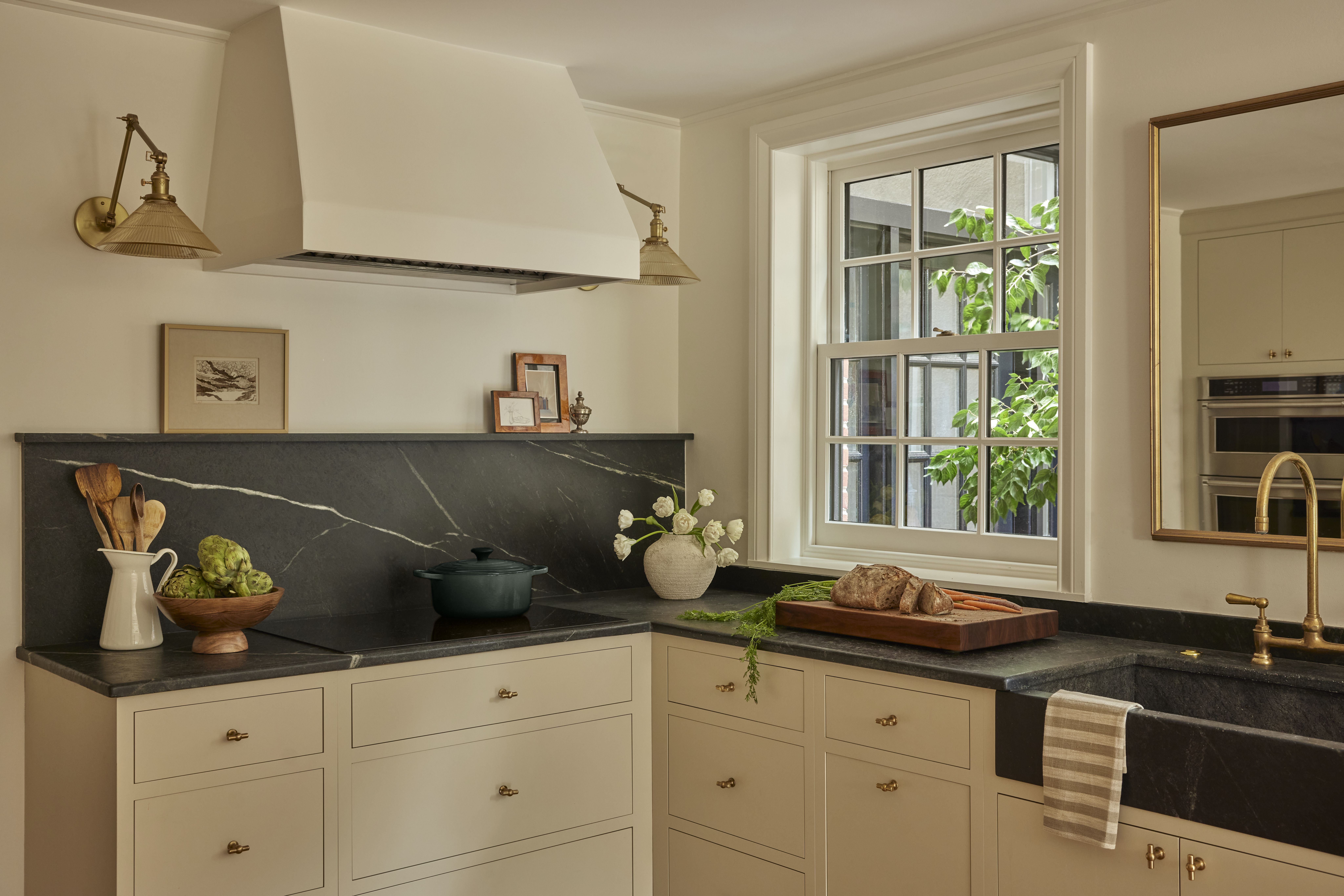
The material palette of this open plan kitchen is interesting, especially when it comes to the kitchen countertops. 'The kitchen is soapstone,' share the designers. 'We wanted to select a natural material that could stand up to a young family. We also wanted to create a bit of contrast with the millwork. The beauty and softness of soapstone is hard to beat.' The hardware, including the wall lights, add a bit of glitter to the otherwise muted scheme.
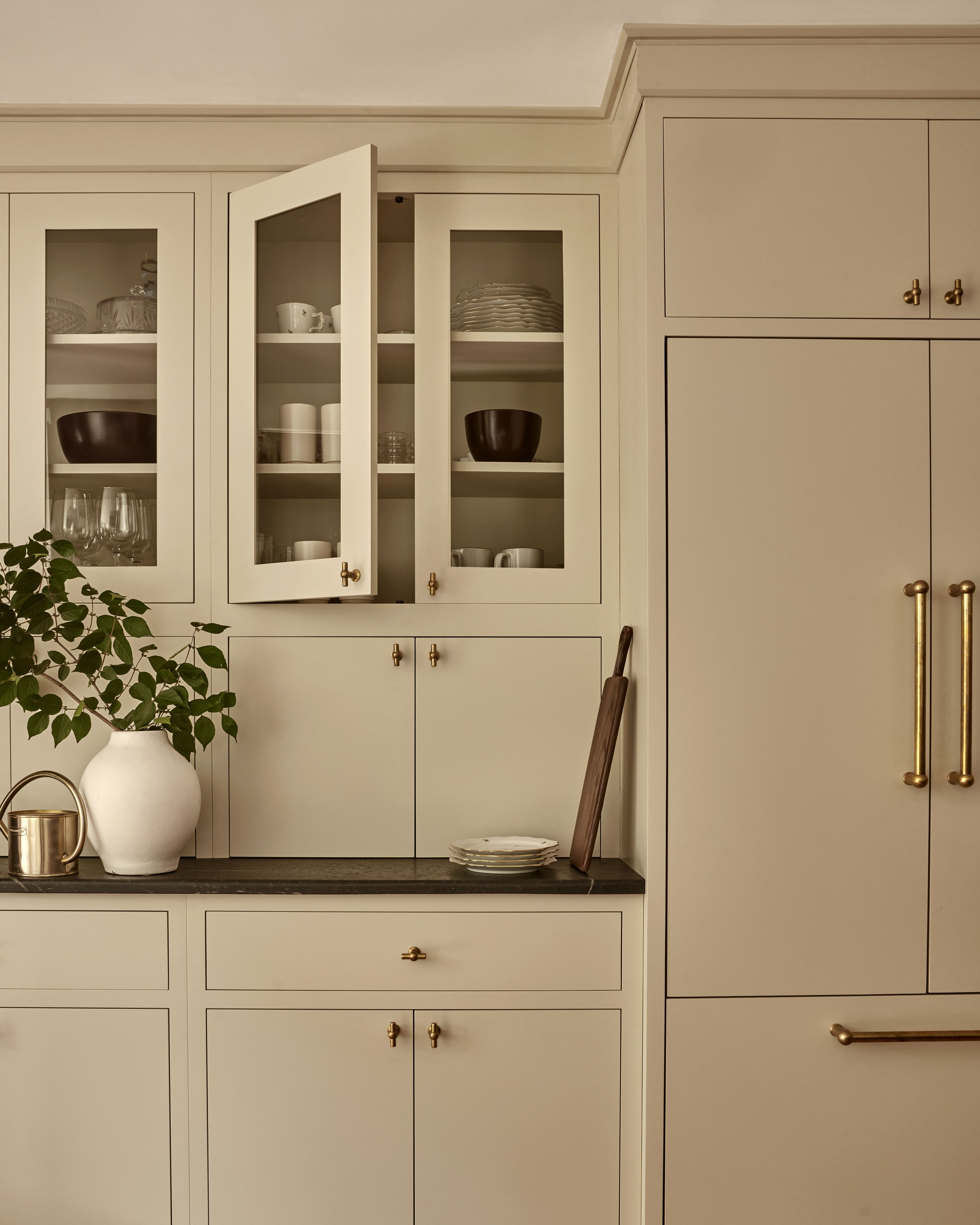
The kitchen cabinets are all awash in a relaxing, neutral tone that looks particularly soothing in natural light.
'The cabinets are Sherwin-Williams' Wool Skein,' say Kevin and Alexis. 'We wanted a warm neutral to feel fresh but soft — a color that treads the line of historic and modern. The cabinet hardware is unlacquered brass and was sourced from Corston.' The kitchen windows allow plenty of light through the day, ensuring the room is always bright.
'We added a plaster finish to create a clean, simple form that plays well with the kitchen cabinetry,' they say. 'We selected a deep smoky finish to balance the impact of the soapstone countertops.'

As for the dining room, the clean and sleek furniture, the fireplace, and a small work desk in the corner create the most relaxing setting. The kitchen flooring in wood further adds layering to the room's palette. 'The dining area adjacent to the wall has glazing to benefit from the natural light and views to the garden,' say Kevin and Alexis. 'Our goal was to create a calming backdrop for family mealtimes. In one corner, we tucked in a small study space to serve as a ‘command center’ for a busy young family.'
The space is the ideal spot for the family to congregate. 'We did face a few challenges while renovating,' confess the designers. 'The ceilings were relatively low but we still wanted to create a kitchen that felt spacious and elegant. Simple detailing and a large opening allowed us to create impact and the illusion of more space.'
Get the look
The Livingetc newsletters are your inside source for what’s shaping interiors now - and what’s next. Discover trend forecasts, smart style ideas, and curated shopping inspiration that brings design to life. Subscribe today and stay ahead of the curve.

Aditi Sharma Maheshwari started her career at The Address (The Times of India), a tabloid on interiors and art. She wrote profiles of Indian artists, designers, and architects, and covered inspiring houses and commercial properties. After four years, she moved to ELLE DECOR as a senior features writer, where she contributed to the magazine and website, and also worked alongside the events team on India Design ID — the brand’s 10-day, annual design show. She wrote across topics: from designer interviews, and house tours, to new product launches, shopping pages, and reviews. After three years, she was hired as the senior editor at Houzz. The website content focused on practical advice on decorating the home and making design feel more approachable. She created fresh series on budget buys, design hacks, and DIYs, all backed with expert advice. Equipped with sizable knowledge of the industry and with a good network, she moved to Architectural Digest (Conde Nast) as the digital editor. The publication's focus was on high-end design, and her content highlighted A-listers, starchitects, and high-concept products, all customized for an audience that loves and invests in luxury. After a two-year stint, she moved to the UK and was hired at Livingetc as a design editor. She now freelances for a variety of interiors publications.


