Before & After: This Maryland Home is a Lesson in Applying the Simple Scandi Style to a Contemporary Space
This riverside home features layered textures, Danish Mid-Century furniture, and a simple Scandi aesthetic
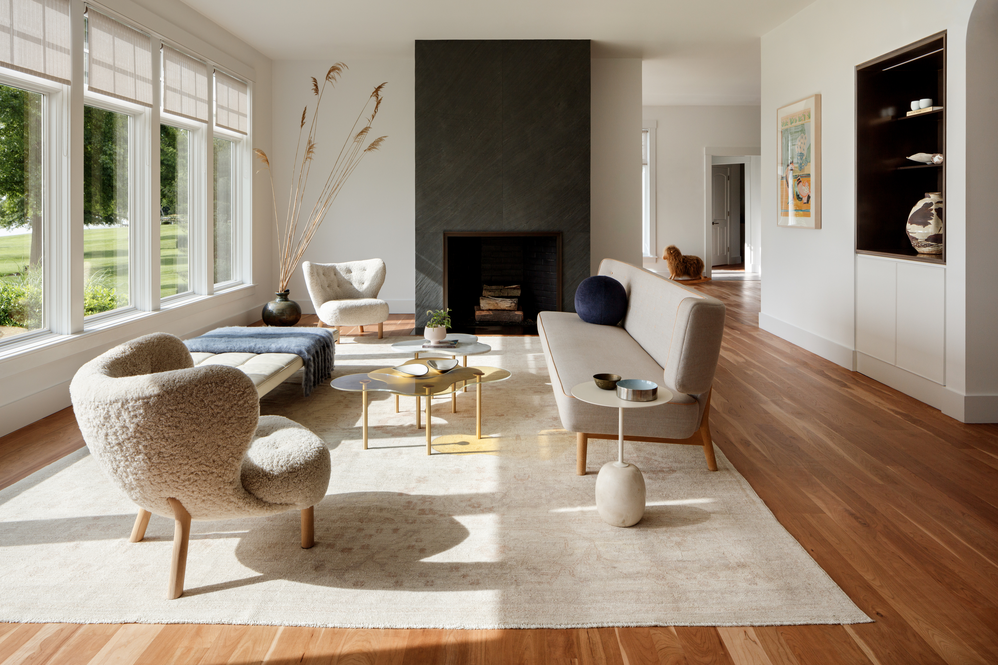

The Scandinavian design style is so far-reaching its influence can be found inside homes across the entire globe. Besides the pleasing neutral palettes, practical furniture, and use of organic materials, this iconic aesthetic carries with it a deeper design philosophy, one that pairs form and function for simple designs that serve our everyday needs. That's exactly what can be found inside this modern Maryland home, a space that combines the Scandi philosophy with of-the-moment trends for a space that feels calm, cozy, and welcoming.
The homeowners fell in love with this 1980s home along the Wye River but desired a more modern and simple interior to work with their existing mid-century roots. Being big collectors of vintage Danish mid-century modern furniture, they wanted a stylish home to display their pieces, and architect Colleen Healey and interior designer Kate Ballou brought that into reality.
The riverside home, located along the Eastern Shore of Maryland, makes the perfect case for why renovations should simplify our homes, not complicate them. The transformation moved no plumbing or structural elements but transformed the style and atmosphere of this 5,000-square-foot property for a contemporary, on-trend realization of the simple Scandi aesthetic. Here, we take a closer look inside the modern home to find out more.
Kitchen
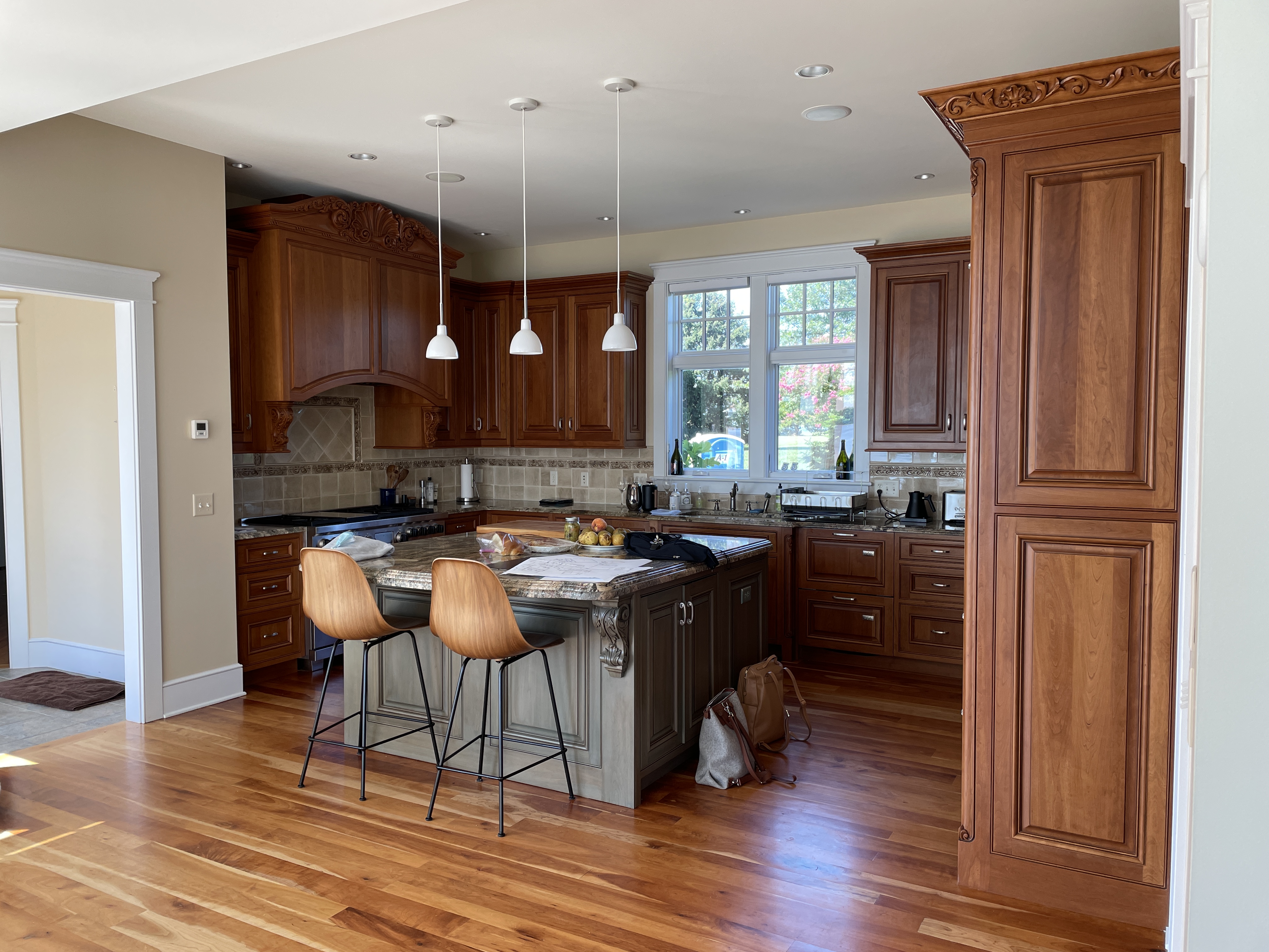
Kitchen before the renovation
Before the renovation, the kitchen featured a typical mid-century design with heavy wooden cabinetry and dated tiles. The homeowners wanted to modernize the space but retain some of their vintage furniture pieces, so designer Kate Ballou of the Washington, D.C. based firm Hendrick Interiors was hired to successfully pair iconic and accessible Scandinavian furniture alongside more exclusive collector’s pieces.

Kitchen after the renovation
After the design team worked magic, the black and white kitchen now has a striking contrastive look that's super contemporary, with the existing bar stools adding an element of warmth to the space.
'The space was so light and bright that introducing additional white surfaces seemed like it might lead to additional glare in the space,' explains Colleen Healey of Colleen Healey Architecture. 'Instead, the darker surfaces ground and help define the kitchen space even though it's part of a fairly open floor plan.'
With an emerging trend for black kitchens coming to the fore, the new space also feels seriously on-trend. 'We're seeing a trend for dark kitchens, especially in vacation homes where they get a lot of abuse from extended family and grandkids,' Colleen continues. 'The darker surfaces help to keep the cabinets looking clean. In this case, the surface material is a sprayed paint with some layered depth. It gives the cabinet some depth and visual texture without having to introduce another wood species into the space.'
Be The First To Know
The Livingetc newsletters are your inside source for what’s shaping interiors now - and what’s next. Discover trend forecasts, smart style ideas, and curated shopping inspiration that brings design to life. Subscribe today and stay ahead of the curve.
Living room / entryway
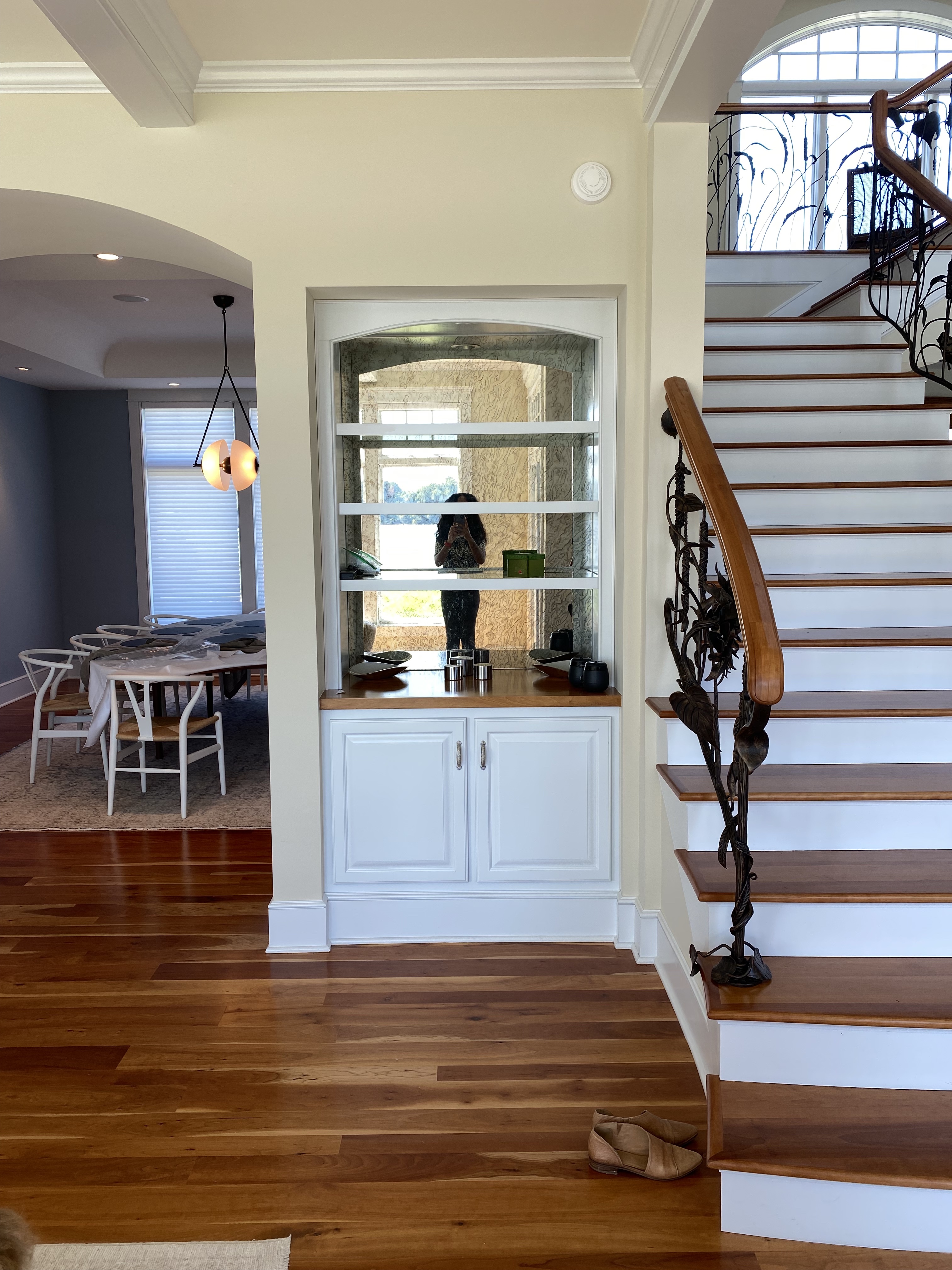
Entryway before the renovation
A large open-plan entryway with a sweeping staircase held a lot of potential, but the dated interior let the space down. That's where Colleen and her team stepped in, adapting the architecture with a delicate approach. They used subtle changes such as softening a rigid soffit into a built-out sculpted archway or removing decorative coffered beams to draw attention to the windows instead of the ceiling, making dramatic improvements to the overall cohesiveness of the house without the need for a drastic remodel.
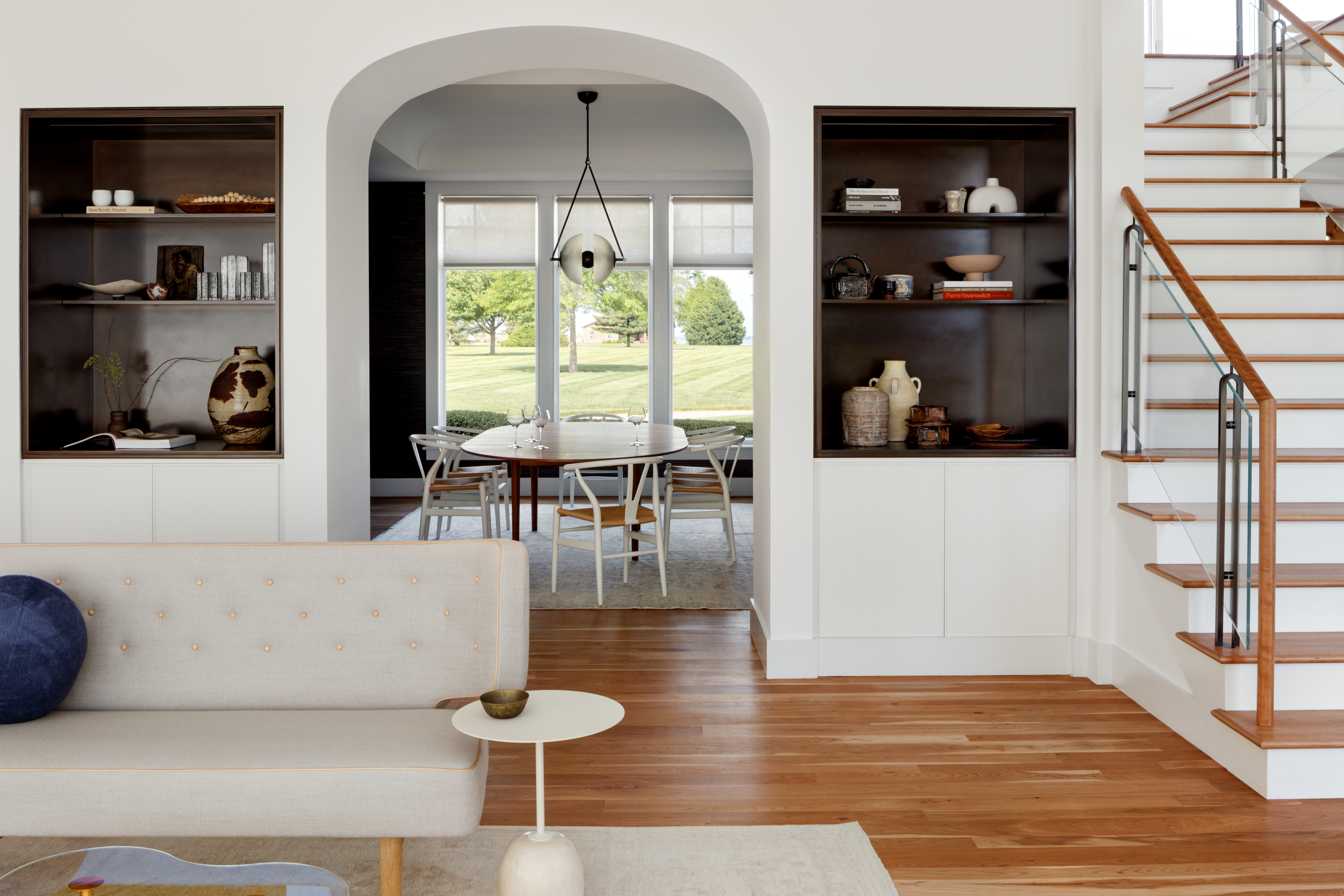
Entryway after the renovation
The details - small ones in the grand scheme of design - make a world of difference to the space. 'The original geometry of the arched dining room opening had that French country vibe which was more of a shallow arch,' says Colleen. 'By softening the edges of the opening and creating a true tangent, the threshold is more singular, rather than sides and top. A soft curve is more rooted in modernism and we are also seeing clients more drawn to shapes that are more natural and biophilic.'
This open-plan living room also best represents the Scandi style, featuring plush textures, clean lines, and organic shapes. 'Our clients love Scandinavian design and were excited to feature classic examples throughout their home,' says Kate. 'Many of these pieces are collectors' items, like the PK80 daybed which is upholstered in a stunning white leather. We wanted the room to remain airy, open, and not feel overfilled with large upholstered pieces. The sculptural nature of the Scandinavian pieces allows the eye to travel around the space and take in the beautiful river views.'
Bathroom
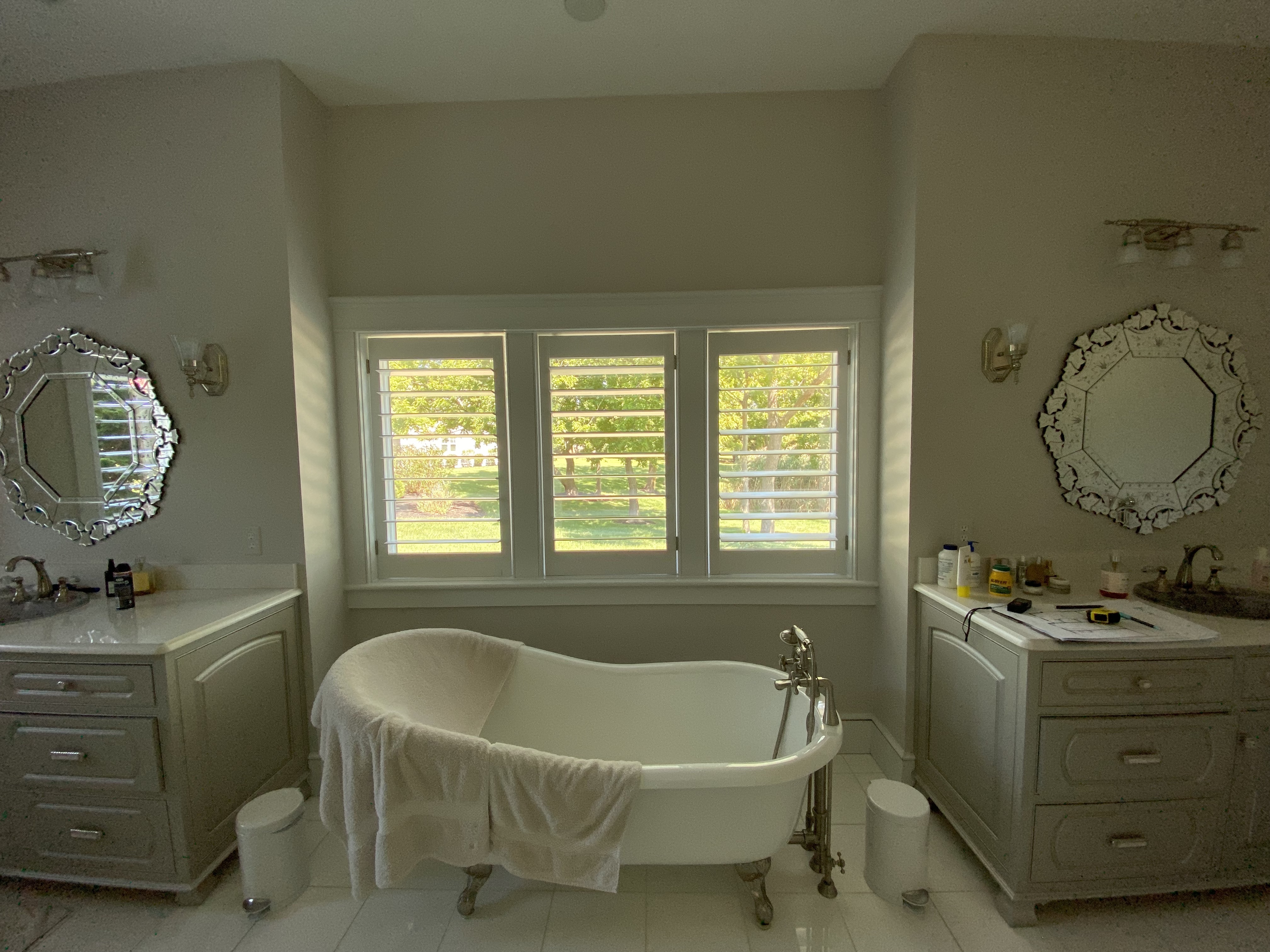
Bathroom before the renovation
The master bathroom boasted beautiful double vanities and a freestanding slipper bathtub, but the overwhelming use of white meant the space lacked any depth, dimension, or character. Jalousie blinds in the window also made the space feel dark and cavernous, despite the lofty ceilings.
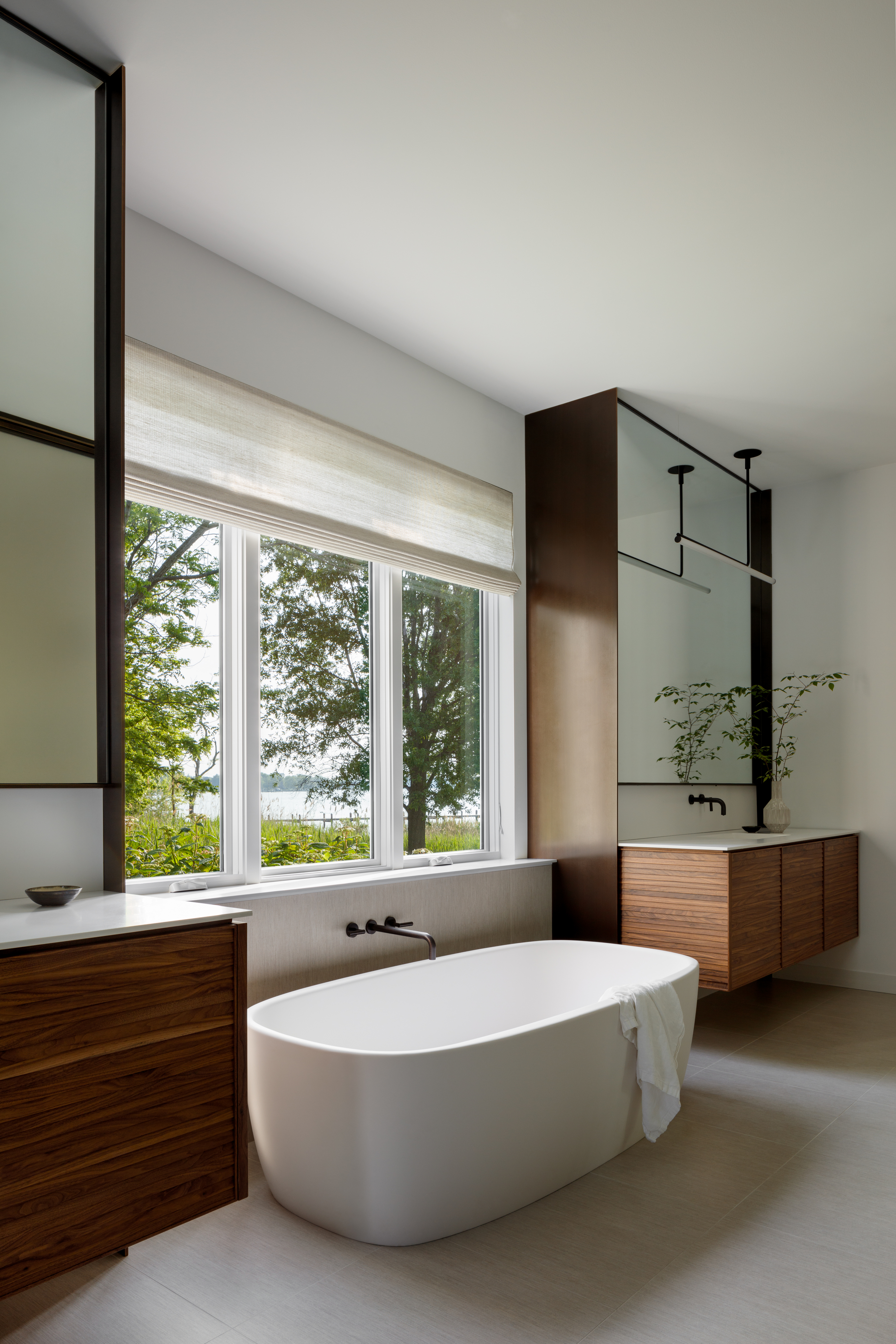
Bathroom after the renovation
Now, the new tub with wall-mounted taps is a far cleverer use of the space, helping the room to feel more cohesive and tying the two vanities together. The vanities flanking the windows now also feature wooded tones, sleeker lines, and are raised off the floor to allow for better airflow around the space.
'The original bathroom was all white and was lacking in a sense of hierarchy,' notes Colleen. 'With a small bathroom that wouldn't have been an issue, but with this large of a space (both long and tall), we felt that it was important to create zones while also making the space feel cohesive. The warm textured wood contrasts with the slim sleek lines of the bronze metal, and the rigid lines of the bronze frames at each vanity, the long wall of glass, and the mirror provide a framework of vertical lines that surround the more sculptural shape of the tub.'
Colleen goes on to explain that the planning and execution of bathrooms are always the most challenging due to the amount of hard surfaces coming together. 'Combine that with lots of movable parts and tight tolerances, and you get something that requires a lot of on-site coordination between trades,' she says.
Meanwhile, new blinds in the modern bathroom allow for so much more light. It's such a simple switch that has a huge impact. 'Roman shades or roller blinds are so much cleaner looking and let the view out the window be the focus, not the window treatment itself,' says Kate.
The rest of the new space

Highlights of the rest of the space include the airy breakfast room, situated within the kitchen, where Series 7 chairs - a household staple in Denmark - are paired with the coveted PP75 Stayed Table, making the chairs instantly feel more elegant. It also features a striking Bourgeois Boheme chandelier. 'We added the light fixture for some drama,' says Kate. 'The Woodnotes blinds also filter the natural light very softly.'
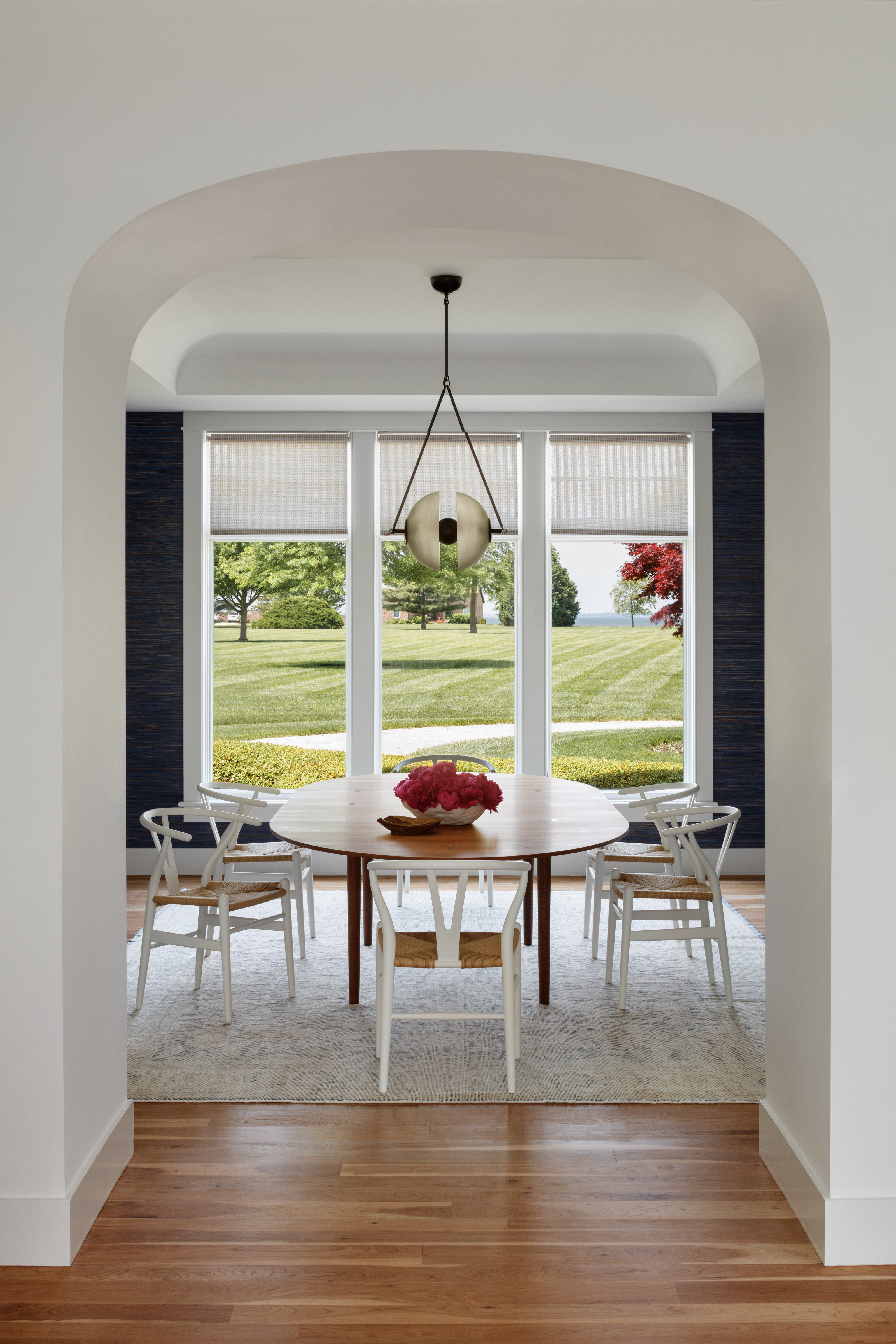
In the main dining room, the material palette retains some of the richer and warmer colors of the original French colonial style of the original interior, but uses materials like bronze and walnut in crisply detailed elements. 'The main changes we made in this space were adding the textural blue grasscloth, switching out the pendant chandelier, and selecting the Finn Juhl Coin table, Wishbone chairs, and antique wool Anatolian rug,' says Kate. 'The rug and grasscloth warm up the space by adding in color and texture.'
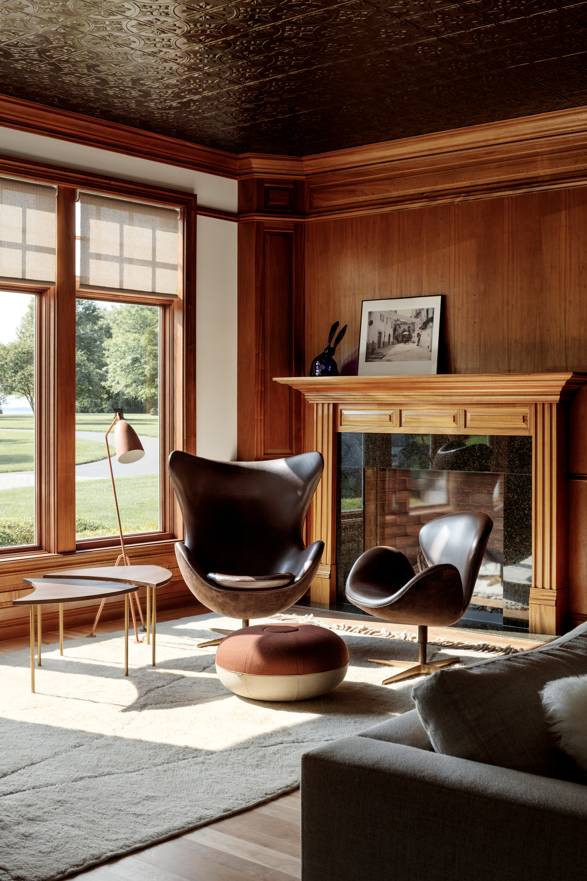
The spacious home also features a beautiful home library with an original tin tiled ceiling. 'Our clients loved the distinct feel it gave to the space, so we embraced it and kept the materials and colors for the furnishings very warm to connect back to the existing architectural details,' says Kate.
This room retained its original paneled moldings and millwork, providing a relaxing contrast to new crisp, Scandi interiors throughout the rest of the home. As Kate notes: 'The library is one of the few spaces that we kept almost entirely as it was when our clients bought the home. It has so much character and it lends perfectly to a cozy space to read or watch movies.'

The space has a timelessly classic feel about it, with wall-to-wall shelving that epitomizes the 'bookshelf wealth' trend. Compared to the pared-back style and Scandi influence seen elsewhere in the home, it's the perfect retreat for a quiet moment alone, or to host friends and family. It proves that even in homes with a distinct style and a modern aesthetic, variety is always the spice of life.
Get the look

Lilith Hudson is a freelance writer and regular contributor to Livingetc. She holds an MA in Magazine Journalism from City, University of London, and has written for various titles including Homes & Gardens, House Beautiful, Advnture, the Saturday Times Magazine, Evening Standard, DJ Mag, Metro, and The Simple Things Magazine.
Prior to going freelance, Lilith was the News and Trends Editor at Livingetc. It was a role that helped her develop a keen eye for spotting all the latest micro-trends, interior hacks, and viral decor must-haves you need in your home. With a constant ear to the ground on the design scene, she's ahead of the curve when it comes to the latest color that's sweeping interiors or the hot new style to decorate our homes.
-
 My 10 Favorite Designs at Milan Design Week 2025 — Out of the Hundreds of Pieces I Saw
There is a new elegance, color, and shape being shown in Milan this week, and these are the pieces that caught my eye
By Pip Rich
-
 Iridescence Is Chrome’s More Playful, Hard-to-Define Cousin — And You're About to See It Everywhere
This kinetic finish signals a broader shift toward surfaces that move, shimmer, and surprise. Here's where to find it now
By Julia Demer
