Before & after – see how this mid-century Vancouver home has been given a minimalist makeover
Clean lines, a neutral color scheme and organic materials have elevated this family home thanks to a huge renovation project
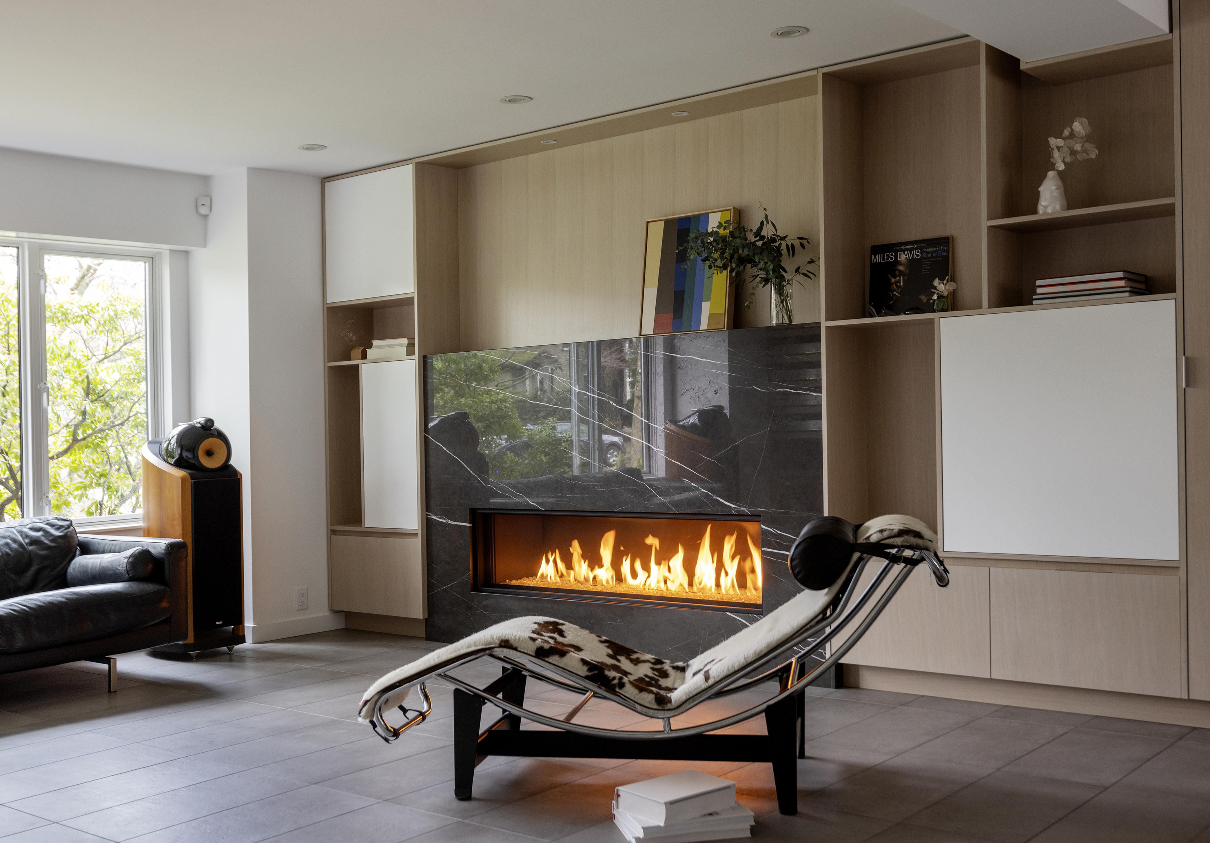

A Vancouver-based architecture firm has transformed this dated mid-century home into a modern, minimalist haven fit for family life.
Originally built in the 1940s, the floorplan was partitioned into many rooms, distinctive to the home's age. Noble Architecture aimed to completely transform the layout, with the goal of creating a more cohesive and functional space for large family gatherings, intimate dinner parties and day-to-day use.
Before the renovation, the closed floor plan made the rooms feel dark and claustrophobic. Despite the owners already having an eye for interior design, space wasn't maximized to its full potential which prevented the home from feeling inviting.
By opening up the floorplan, plenty of natural light has been injected into the interior to lift the space. Paired with the neutral color palette and a minimalist design, it now makes for a cozy and welcoming modern home.

Lilith is an expert at following news and trends across the world of interior design. She has an eye for appealing designs and interesting spaces which she regularly shares with readers through home tours, such as this one. After learning about the aims of the architects behind this project, she was keen to impart their lessons on maximizing space and brightening the home through design.
Before the renovation
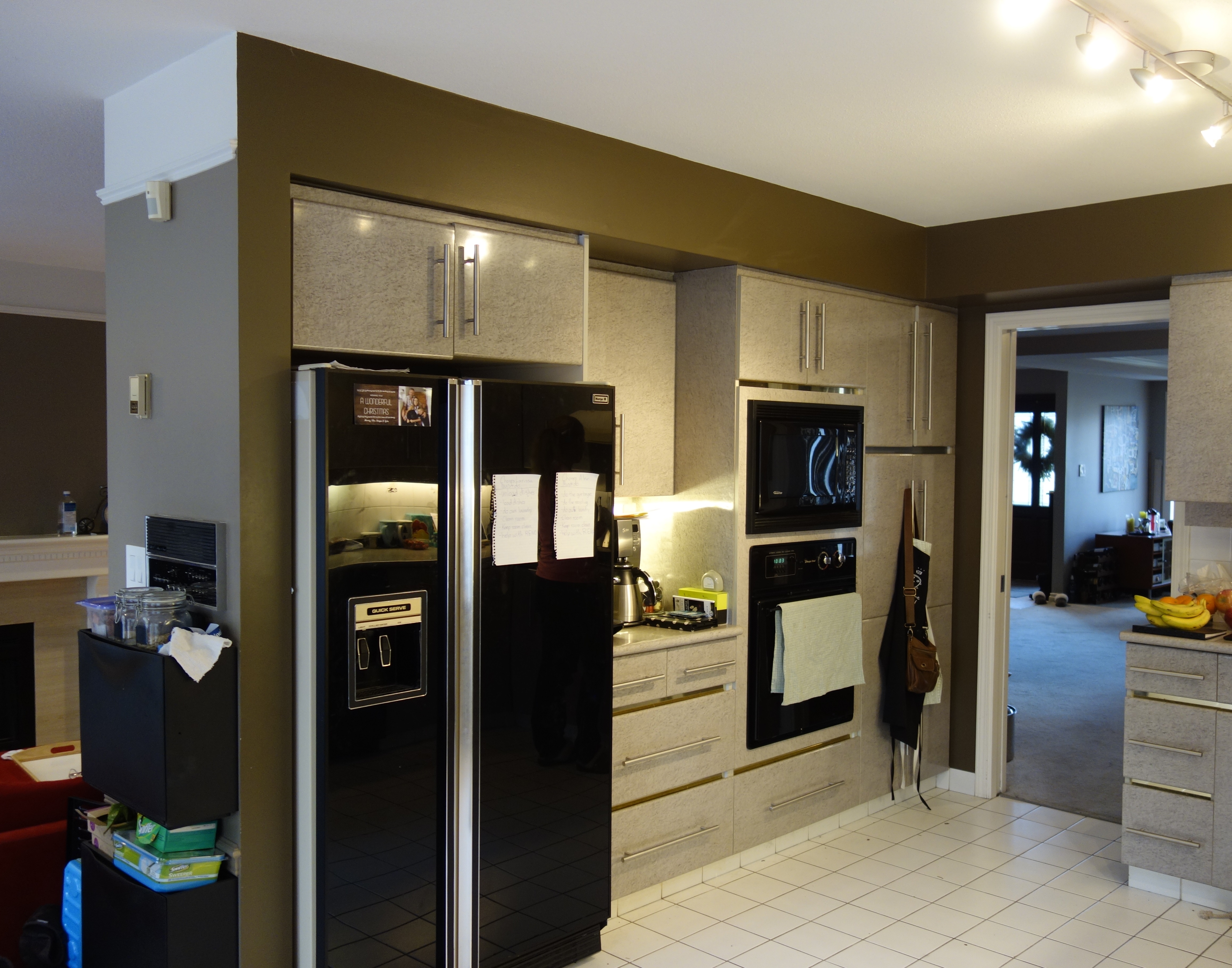
Before Noble Architects put their skills to the test on the West Vancouver home, the kitchen was drab and dark. Despite a relatively recent upgrade, the light grey cabinetry looked dated paired with the white kitchen floor tiles.
Olive green walls, also seen throughout the rest of the home, hinted toward a color scheme but other decor choices failed to tie in with the color. Meanwhile, the partitioned wall made the space feel cumbersome and limited natural light, something the designers were eager to change.
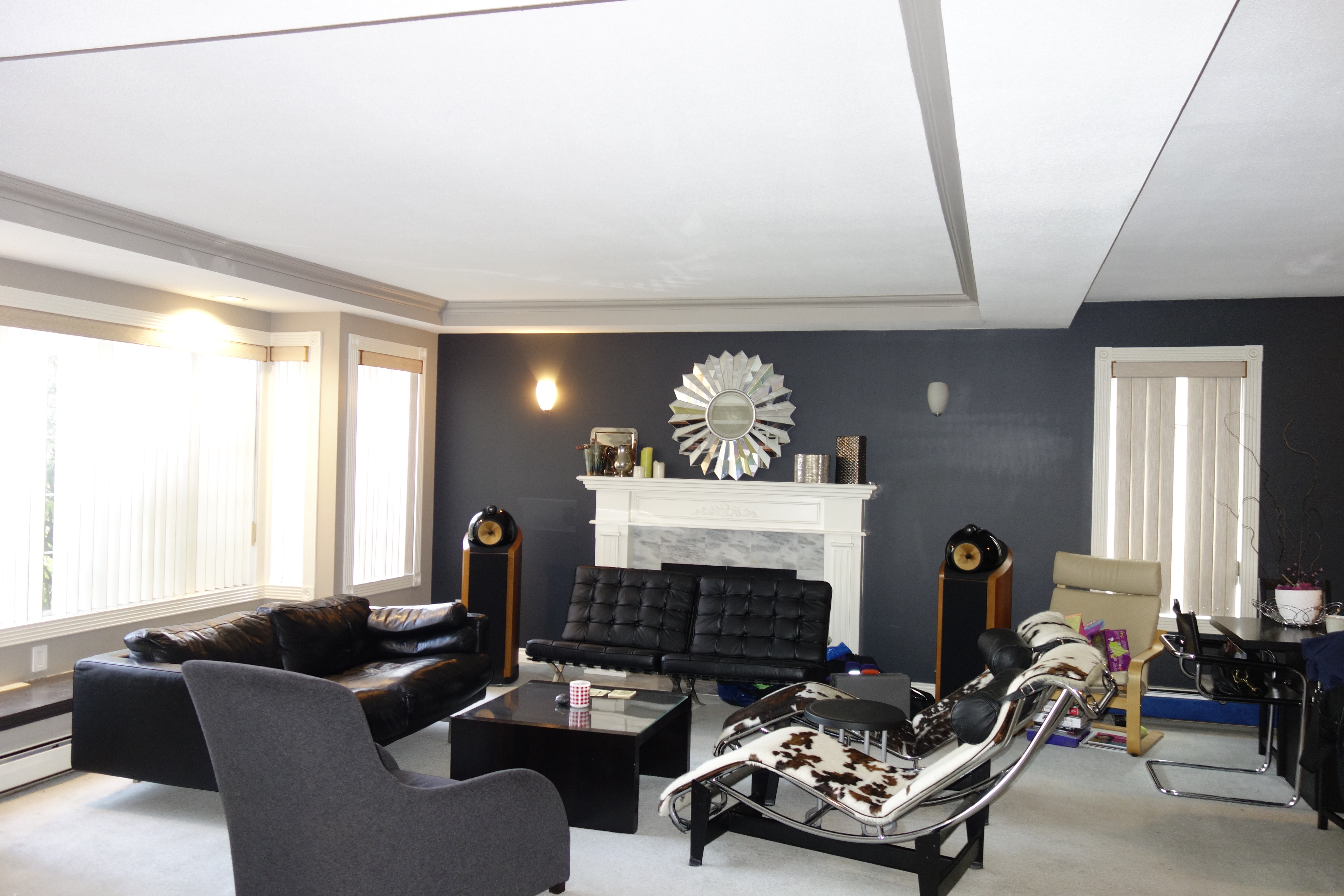
The living room displayed modern decor choices with timeless retro-style pieces, such as the cow print lounge chair. Although this made the space feel cozy and individual, it lacked any cohesion with the rest of the home .
Be The First To Know
The Livingetc newsletters are your inside source for what’s shaping interiors now - and what’s next. Discover trend forecasts, smart style ideas, and curated shopping inspiration that brings design to life. Subscribe today and stay ahead of the curve.
A grey accent wall made a distinct focal point in the room, but the color didn't complement the low light levels and made the ceiling feel unnaturally low.
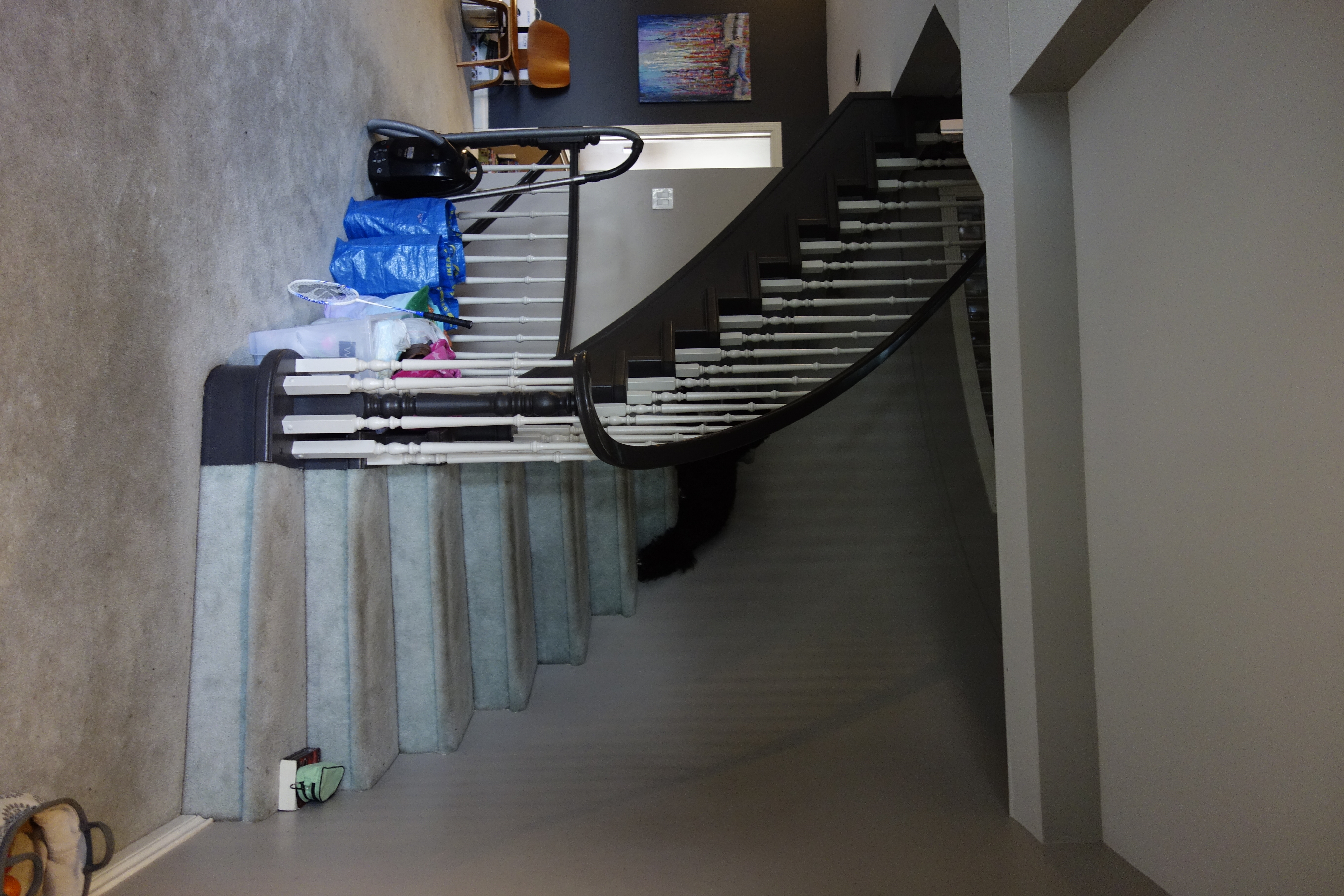
A curved staircase made for a unique feature in the home but design-wise, it didn't make much of a statement. The balustrade looked too traditional for such a modern space and needed a modern makeover.
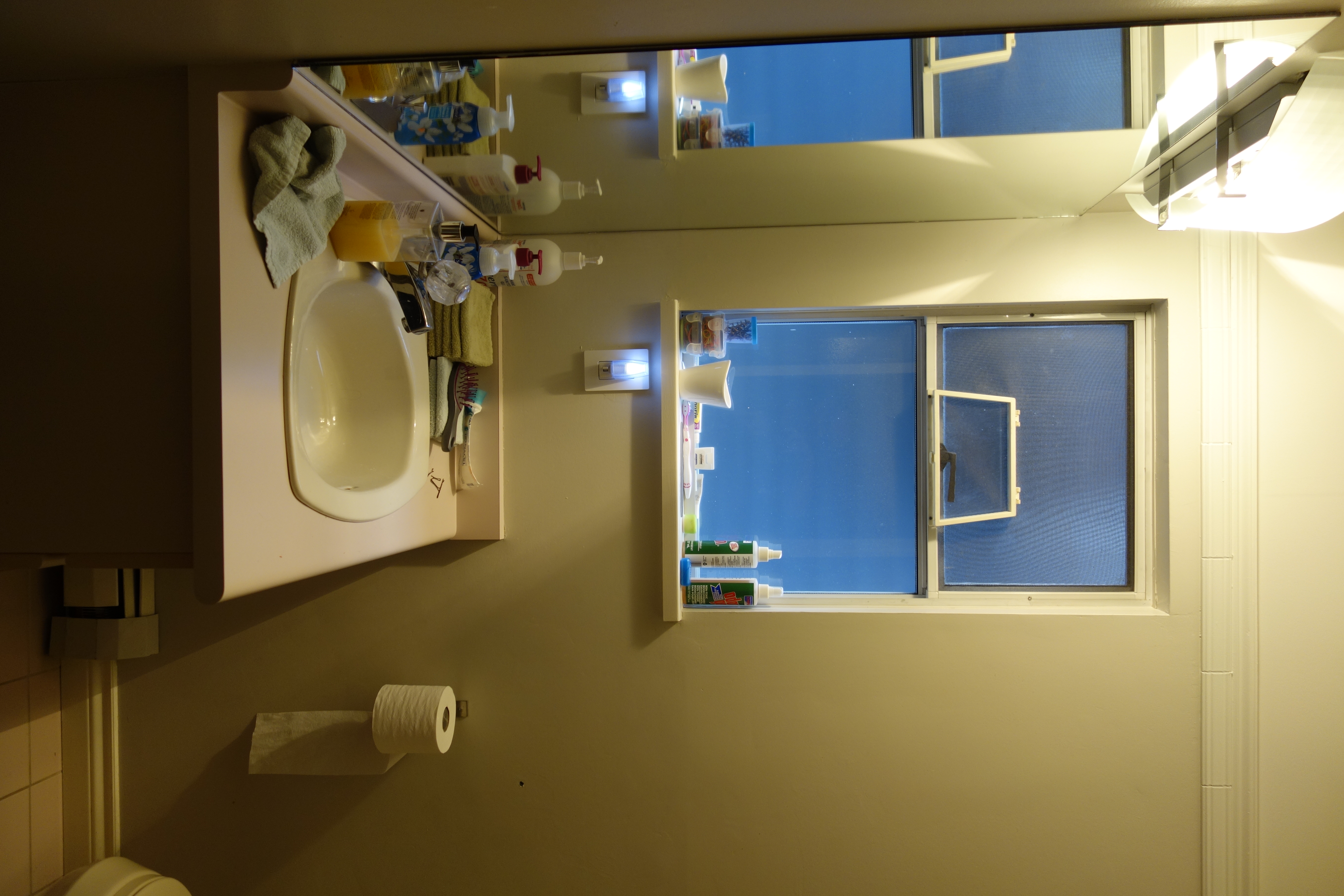
The most dated areas of the home were the bathrooms which were fitted with old furniture and painted in colors that didn't benefit the space. As a result, they didn't feel fresh or bright, and they lacked any sense of style.
After the renovation
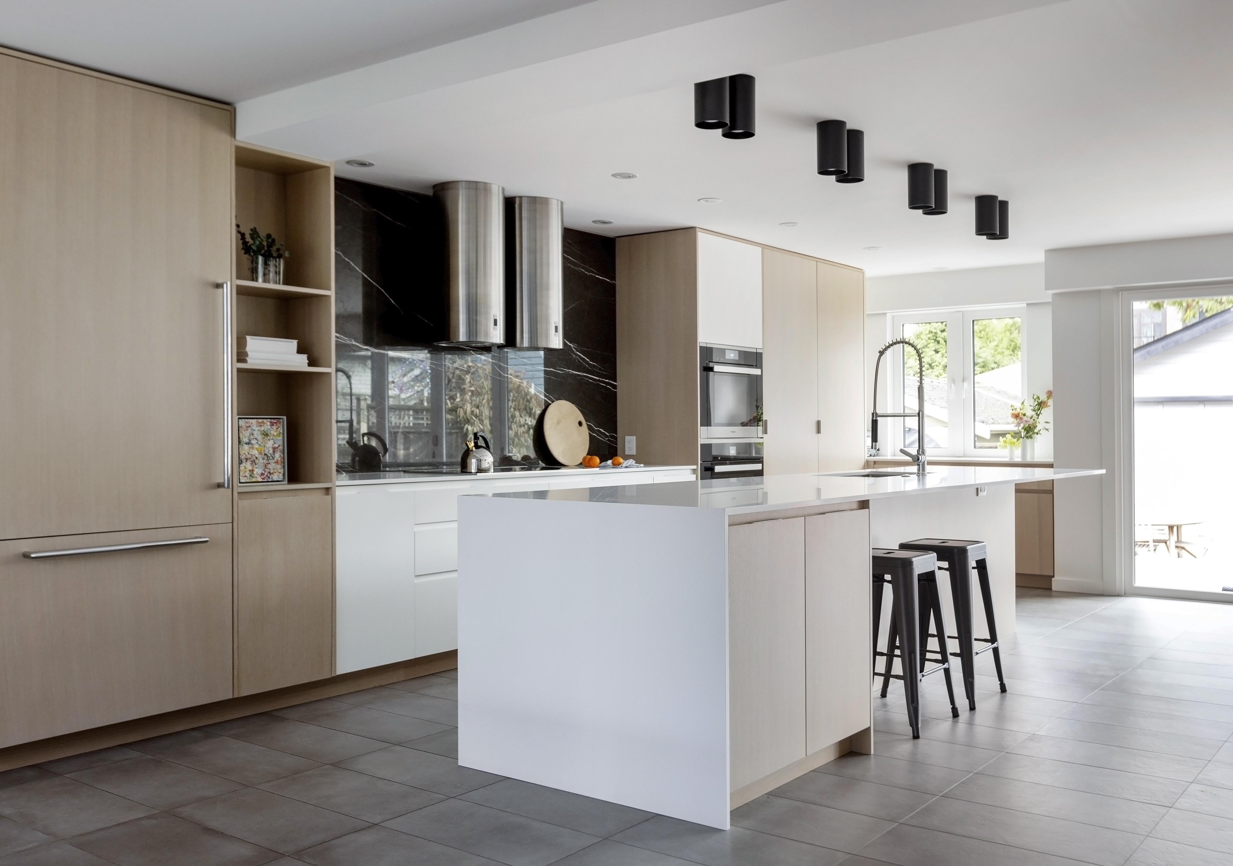
Since the renovation, the kitchen has been transformed into a bright and airy space thanks to the newly updated floor plan. Natural light floods the room and, thanks to the light wooden and white cabinetry, it bounces off the surfaces to create the illusion of being even brighter.
The designers and homeowners agreed on minimalism when it came to their interior design decisions, with simple clean lines and a neutral color scheme throughout. This elevates the space to make it feel contemporary yet timeless.
The open plan floorplan help to introduce more light into the space, too. 'Opening the spaces was one of the main intentions for this renovation,' says Shora Parvaresh, designer at Noble architects. 'The light flows in the entire open space. The reflective nature of the tiled floors also assists with bouncing the light to every corner of the room.'
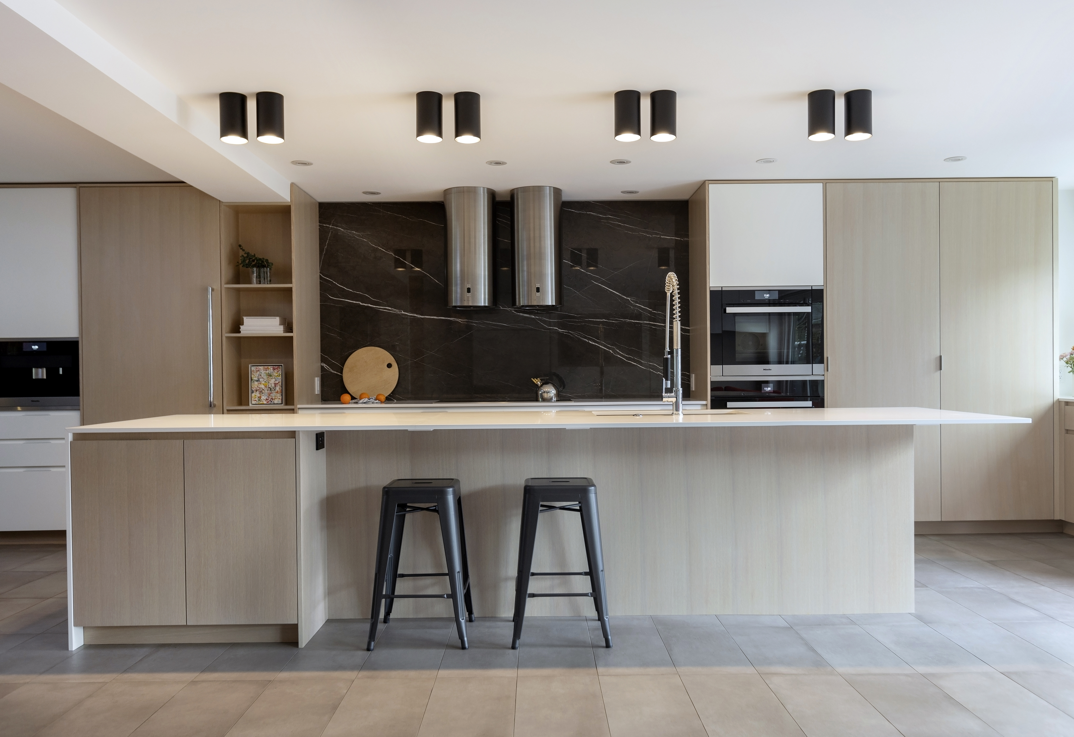
The tubular steel furniture of Breuer and Le Corbusier were inspirations for the kitchen hood fans and island lights, where a cylindrical design hints at an industrial interior design style. The curved lines marry beautifully with the elegantly straight lines featured throughout the rest of the kitchen.
'I was inspired by some of the owner's classic modern furniture pieces,' says Shora. 'A lot of modern furniture, such as Breuer’s dining chairs and Le Corbusier’s chaise lounge, used steel tubing which is an industrial material but yet very refined and elegant.
This was the spark behind the idea for the metal cylindrical hood fans. The cylinders became an element that is repeated in the rest of the house such as in the kitchen double cylindrical lighting as well as the powder room’s cylindrical sink.'

When it came to décor, the homeowners' personal items and existing modern furniture informed the team's decisions. There was an urgency to create something timeless to hold these classic pieces, such as the animal print lounge chair, while still retaining a contemporary feel - and that's exactly what the project achieves in the living room.
'The goal was to create something classic and timeless as well as “New" and “Of The Current Time”,' explains Shora. 'The “classic" and the “new" are inherently of opposing nature and to create a balance between the two was a fun challenge. The owners bought these furniture pieces many years ago and they are all still timeless. I was inspired to create a design that can last the test of time as well.'
Clean lines can again be found in the shelving reinstating the minimalist style while the modern fireplace idea helps to create a cozy atmosphere. Paired with the neutral color palette, it gives the room a warm, calm Scandi decor style.
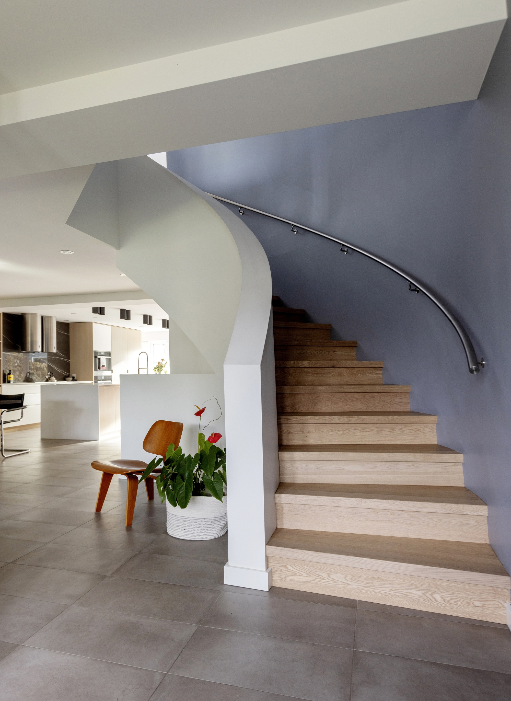
Noble Architects ensured that the curved lines in the staircase were used to their potential. Wooden stairs and a solid white wall contribute to the modern look of this staircase idea, while the smoky grey-colored wall creates depth and shadows that invites you upstairs.
Small details like the chair and plant nestled behind the half wall make the home feel particularly inviting. The raw use of wood in the molded plywood chair guided the use of natural wood in the design of the stairs, resulting in a harmonious, timeless and fresh look.
'The existing staircase was curved but had a heavy wood railing and was not fitting with the new design,' notes Shora. 'The idea was to make it clean and minimal. The drywall solid guardrail created a language that is not visually cluttered and creates a sense of calm.'
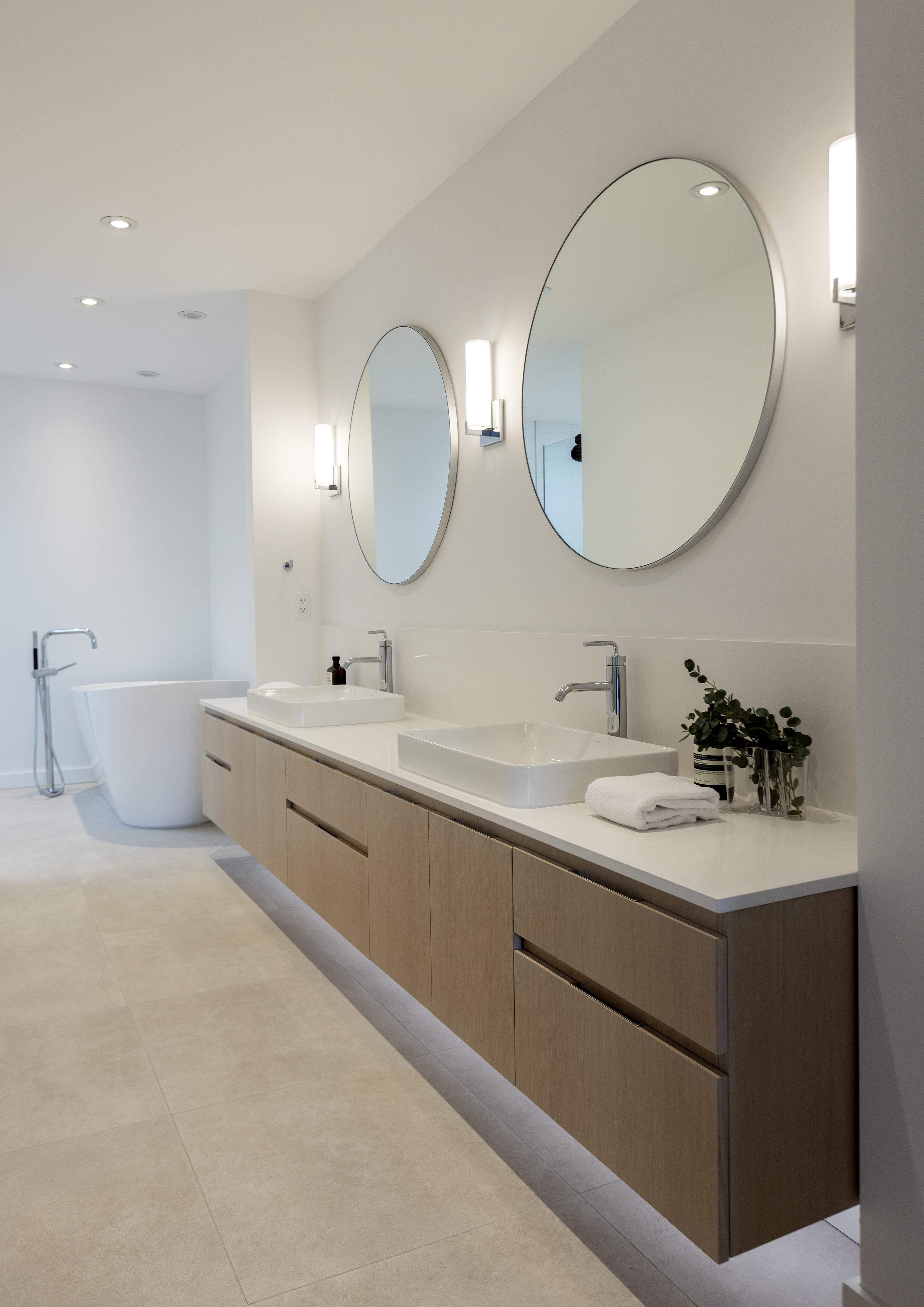
Arguably, the most major transformation took place in the bathrooms. White walls, stone tiles and wooden cabinetry have made the spaces feel clean and bright while still remaining warm and homely.
The unusually long layout of this bathroom allowed for a lengthy double bathroom vanity where butler sinks and classic steel taps add a touch of tradition to an otherwise modern space. Thoughtful additions such as the strip lights under the cabinets give the bathroom a hotel-worthy look.
'One can never go wrong with a minimal white and bright bathroom,' Shora says. 'The homeowners were interested in a functional, beautiful and simple bathroom. White and a touch of wood seemed to be the right balance.'

Lilith Hudson is a freelance writer and regular contributor to Livingetc. She holds an MA in Magazine Journalism from City, University of London, and has written for various titles including Homes & Gardens, House Beautiful, Advnture, the Saturday Times Magazine, Evening Standard, DJ Mag, Metro, and The Simple Things Magazine.
Prior to going freelance, Lilith was the News and Trends Editor at Livingetc. It was a role that helped her develop a keen eye for spotting all the latest micro-trends, interior hacks, and viral decor must-haves you need in your home. With a constant ear to the ground on the design scene, she's ahead of the curve when it comes to the latest color that's sweeping interiors or the hot new style to decorate our homes.
-
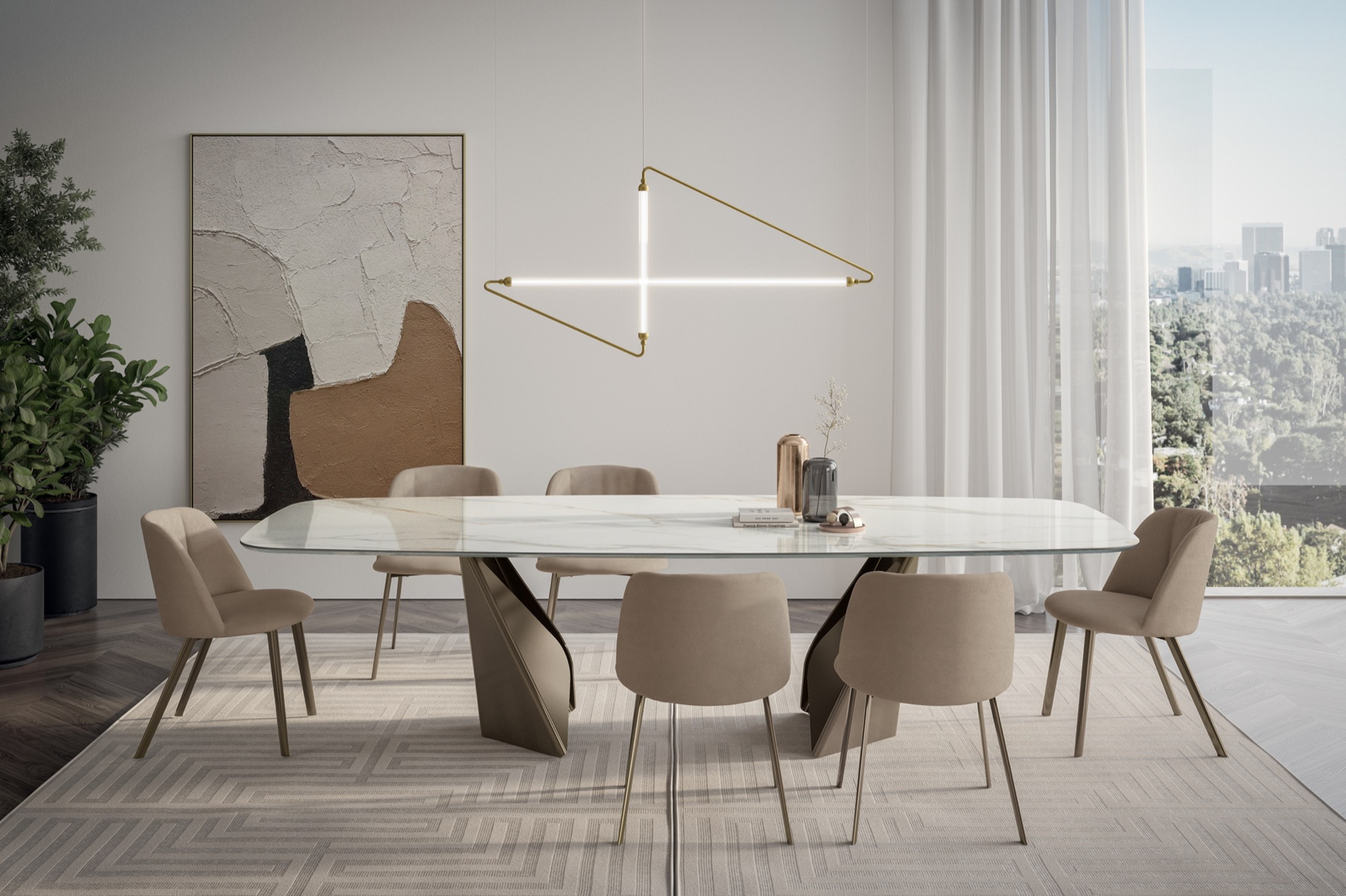 My 10 Favorite Designs at Milan Design Week 2025 — Out of the Hundreds of Pieces I Saw
There is a new elegance, color, and shape being shown in Milan this week, and these are the pieces that caught my eye
By Pip Rich
-
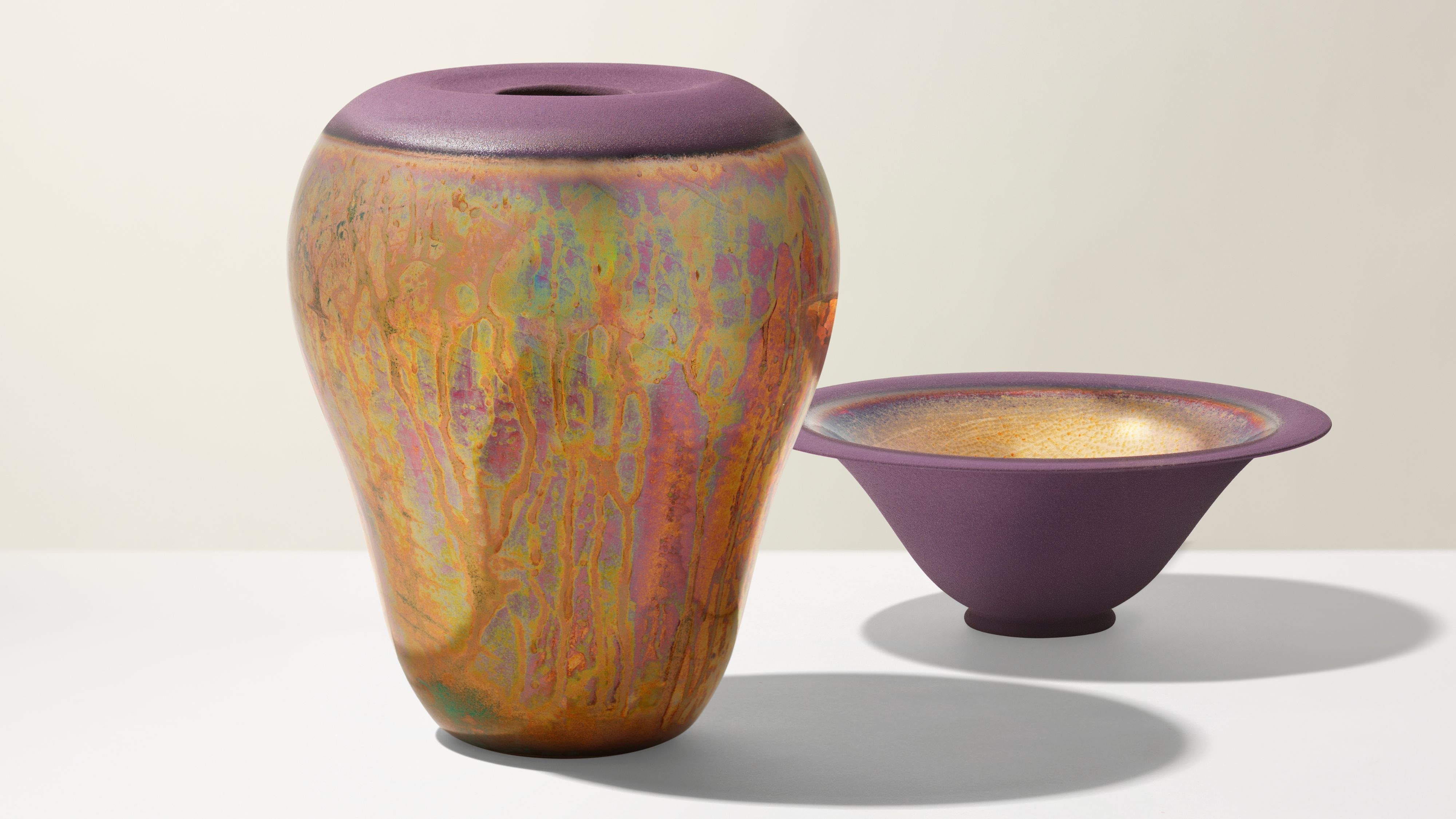 Iridescence Is Chrome’s More Playful, Hard-to-Define Cousin — And You're About to See It Everywhere
This kinetic finish signals a broader shift toward surfaces that move, shimmer, and surprise. Here's where to find it now
By Julia Demer