Before and After — This Home, Featured in the Film "Lady Bird", Underwent a Huge Remodel in Its Kitchen
Find out how this historic home's kitchen was given a modern makeover thanks to McCall Dulkys of Interiors By McCall
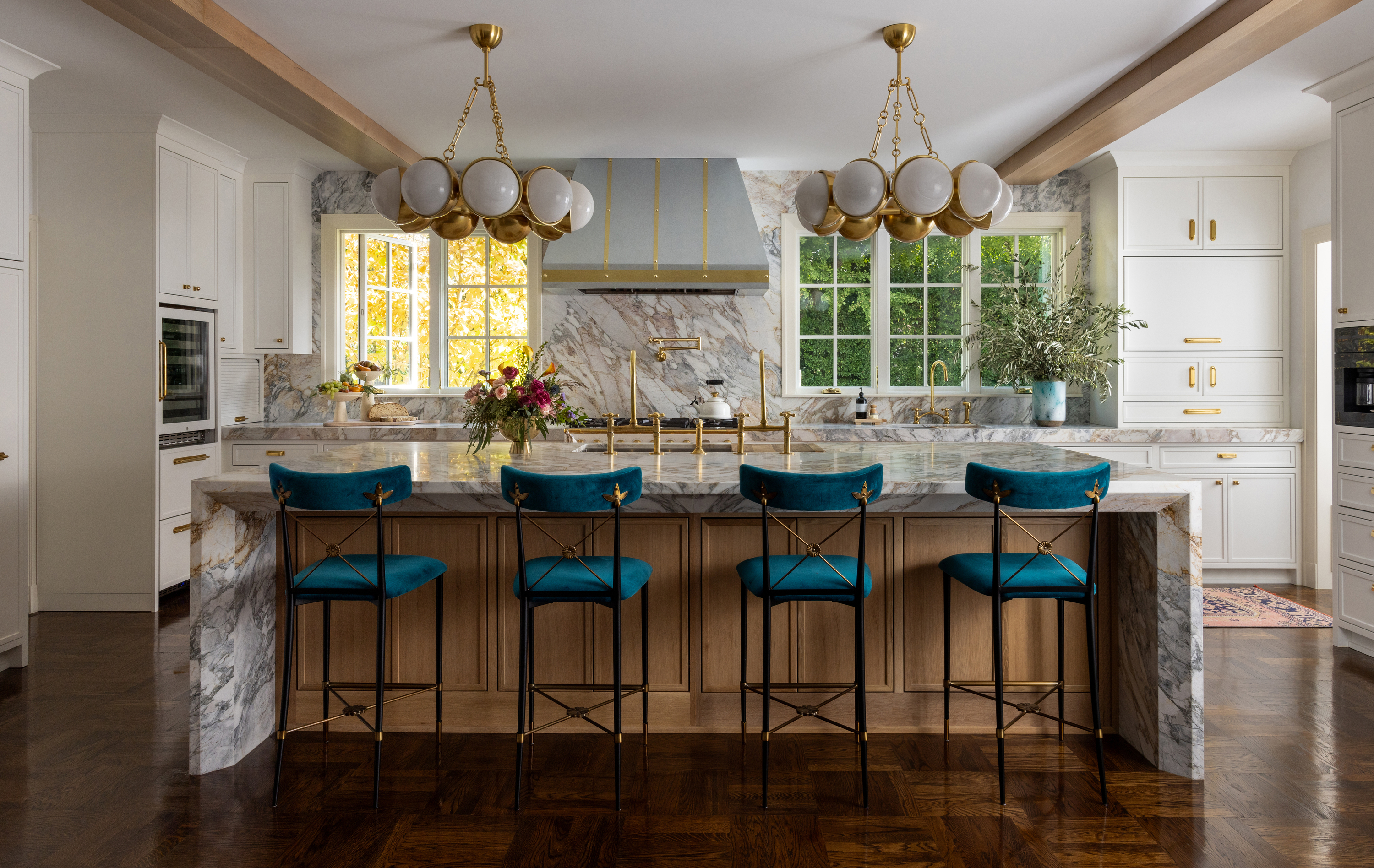

Great locations call for great homes. This one in particular is located on a famous collection of streets in East Sacramento where former President Ronald Reagan once lived while he was Governor there. Plus, it was also featured in the beginning of the movie Lady Bird. While the owners — a celebrity fashion stylist and a political figure — loved their period property, they also felt the need to give it a little bit of a facelift, with modern elements. For their 425 sq ft kitchen, they wanted an update that would retain the home's historic qualities and rich architectural details, while being modern and timeless.
So, they reached out to interior designer McCall Dulkys of Interiors By McCall. While the husband and wife were keen on a white kitchen, the designer decided to give an all-white space a bit of a twist. She used the muted tone as a backdrop to lift other, bold elements that were both classic and unexpected. Unique colors, textures, and prints further add layering to this space.
Take a tour of this modern home and get inspired for your kitchen update.
Before
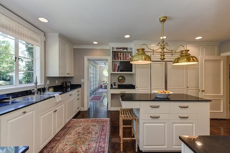
The original white kitchen felt boxy and lacked personality.
'I wanted the kitchen to feel timeless and regal,' says McCall Dulkys of Interiors By McCall. 'Because the house already featured so many colors and patterns, I wanted to pay homage to the owner’s love for color while still having the kitchen remain a place of neutrality where color could be splashed in. Because the marble is so bold, we could add in white cabinets without it feeling like the same white kitchen you’ve seen time and time again.'
'In terms of structural changes, the focus was mostly on working around the beauty of the historic home,' says McCall. 'The flooring, for example, was original to the home. We worked with a local expert to have them refinished and matched when needed.'
After - Kitchen

To begin with, the designer utilized the adjoining sunroom hallway into the kitchen as an extension of the kitchen, but with its own personality. She retained the original kitchen cabinets, adding refrigerator drawers and large Paris brass bistro shelves to hold liquor bottles and fun trinkets from the clients' lives and travels.
Be The First To Know
The Livingetc newsletters are your inside source for what’s shaping interiors now - and what’s next. Discover trend forecasts, smart style ideas, and curated shopping inspiration that brings design to life. Subscribe today and stay ahead of the curve.
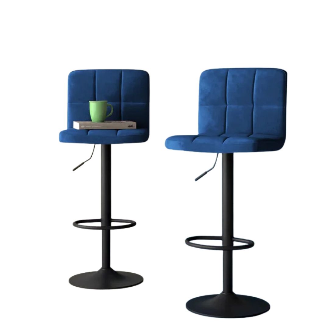
One of the most noticeable elements of this renovated modern kitchen is the kitchen island — a large marble slab with colorful seating. 'The goal for the island was to be able to fit as many people as possible,' says McCall. 'This large family is on the go and I wanted this grandiose island to be a spot they could all gather around while food was prepared, and sit to enjoy it together without the formality of a dining room table.'
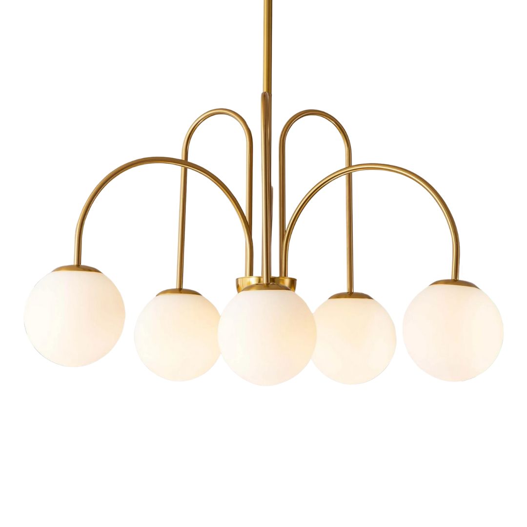
For the kitchen island lighting, the designer chose fixtures from Corbett via Hudson Valley Lighting. 'I knew I wanted something grand to be properly scaled with the island size and these felt like the perfect mix of classic and funky,' says McCall.

The marble kitchen truly takes over the entire scheme and imbues the space with sophistication.
'The marble is the star of the kitchen,' says McCall. 'I wanted something bold with heavy veining that would stop you in your tracks once you look at it. We ran the marble up the backsplash to contribute to that wow factor.'
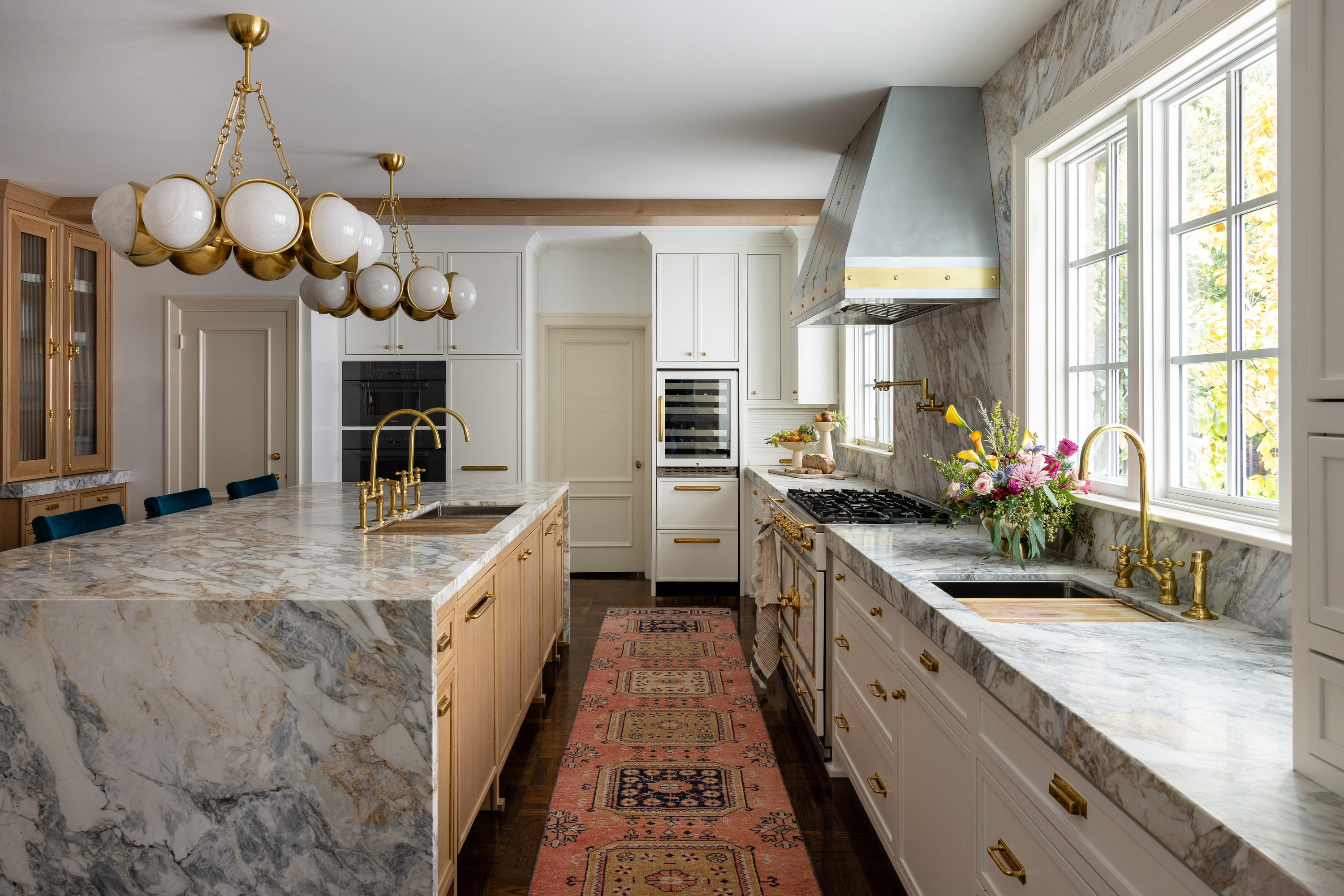
A big kitchen hardware trend, unlacquered brass, adds a touch of vintage charm. 'Unlacquered brass is having a major moment, especially for older homes, as it patinas over time and just continues to look better and better,' says McCall. 'The unlacquered brass knobs and pulls were all sourced from Rejuvenation while the plumbing fixtures were brought in from Morocco. For new construction, I love polished nickel; I think it is classic and will hold up for decades.'
As for the kitchen rug, 'I always recommend a large runner,' advises the designer. 'It’s soft on your feet and protects your flooring in an extremely high-traffic area. We went with a hand-woven runner from Morocco and it presented another opportunity to add a fun pop of color to the space.'
After - Bar

The home bar is designed like a jewel box, with bold colors and tapestry-like walls. This passageway is also anchored by a wall of large white French doors that open to the outdoor entertaining space, making this area the perfect place for homeowners to serve cocktails and mingle with guests.
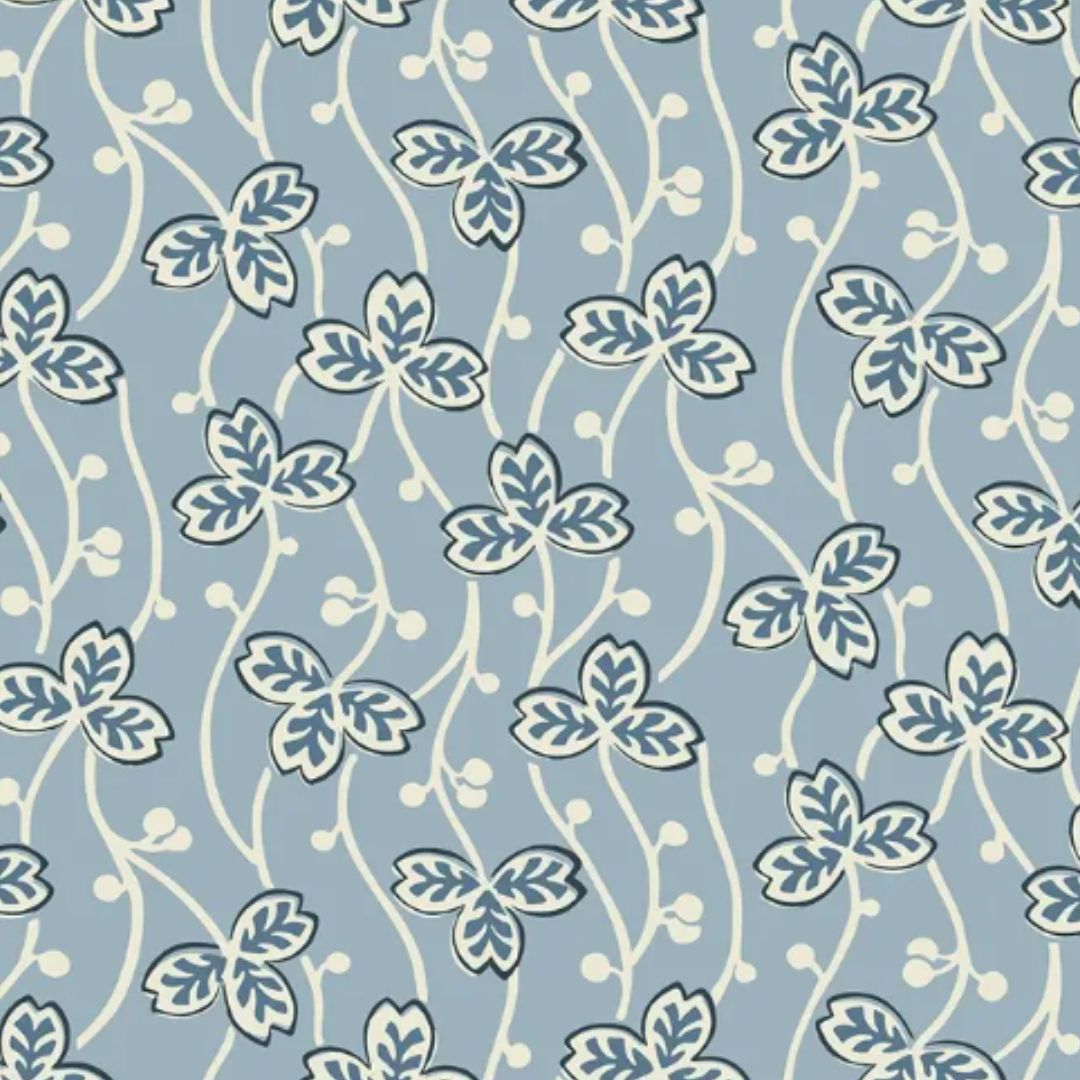
'This is Farrow & Ball Stone Blue,' says McCall. 'The bar is located in a long hallway full of French doors that separates the family room from the exterior. It was such a gorgeous space but lacked any real purpose or design. We wanted this to feel like an extension of the kitchen but also have its own identity. We opted for a bold blue on the walls to tie in the 'Birds and Butterflies' Schumacher wallpaper on the ceiling. The entire space is like its own whimsical unit that will be extremely functional when they host parties or large gatherings of friends.'

For the storage, the designer chose open and closed storage. The floating shelves showcase the best barware, adding to the space's aesthetics. 'We wanted to add the storage in this area without it feeling too heavy so we opted off rates floating French cafe brass shelves,' says McCall. 'In the cabinets below, we’ve hidden a few refrigerator drawers for storing beverages and the cafe shelves are for displaying their more fun glassware and trinkets.'
Get the look

Aditi Sharma Maheshwari started her career at The Address (The Times of India), a tabloid on interiors and art. She wrote profiles of Indian artists, designers, and architects, and covered inspiring houses and commercial properties. After four years, she moved to ELLE DECOR as a senior features writer, where she contributed to the magazine and website, and also worked alongside the events team on India Design ID — the brand’s 10-day, annual design show. She wrote across topics: from designer interviews, and house tours, to new product launches, shopping pages, and reviews. After three years, she was hired as the senior editor at Houzz. The website content focused on practical advice on decorating the home and making design feel more approachable. She created fresh series on budget buys, design hacks, and DIYs, all backed with expert advice. Equipped with sizable knowledge of the industry and with a good network, she moved to Architectural Digest (Conde Nast) as the digital editor. The publication's focus was on high-end design, and her content highlighted A-listers, starchitects, and high-concept products, all customized for an audience that loves and invests in luxury. After a two-year stint, she moved to the UK and was hired at Livingetc as a design editor. She now freelances for a variety of interiors publications.
-
 The Weighted Blanket That Doesn’t Make You Sweat (and the Eye Mask to Match)
Luxury has weight. And apparently, volcanic minerals
By Julia Demer
-
 What Is Biophilic Interior Design? I'm an Actual Biophilic Designer, and This Is How to Apply It to Your Home
A biophilic designer explains the core principles of this practice, and the easy ways you can apply it to your home's design
By Marianna Popejoy
