Before & after: This small LA home's new kitchen now looks so effortlessly chic that the before photos might shock you
The dingy and dated galley kitchen has been transformed into a beautiful sun-soaked space
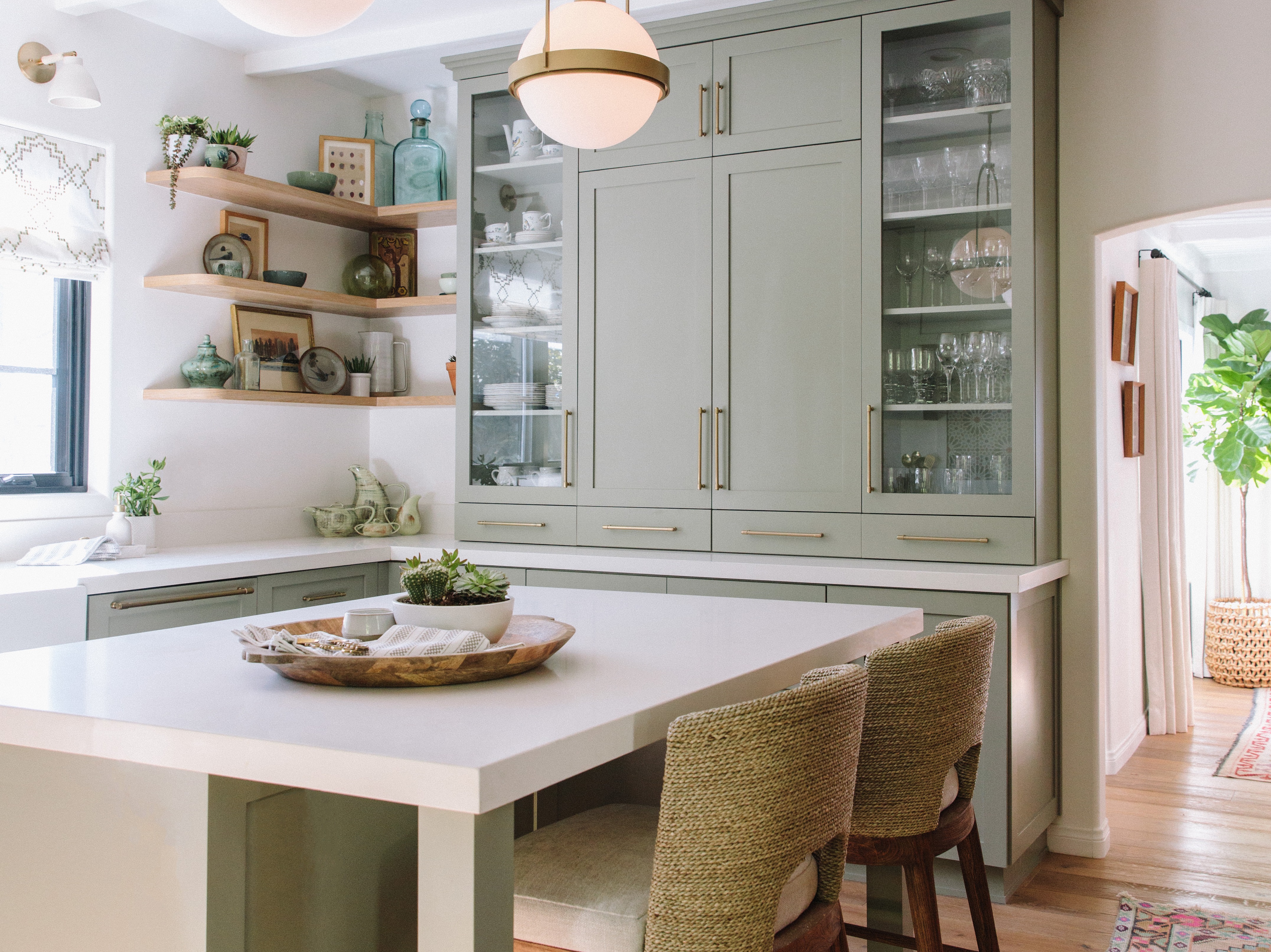

Nestled in the tree-filled hills of LA's Studio City lies a charming little home that's as tranquil within as the surrounding environment that lies beyond, but that wasn't always the case. Local designer Tamarra Younis of Union of Art Interiors transformed the whimsical mid-Century home into the beautiful sun-soaked space it is now, and it masters a modern bohemian style.
Built in 1955, the cozy two-bedroom two-bathroom home orginally featured a narrow galley kitchen with dark wooden cabinetry and limited storage. With a closed floorplan, stucco interior walls, and a lack of natural lighting, Tamarra was keen to open up the kitchen as much as possible for a bright, airy, and inviting space that the homeowners could entertain friends in.
The clients - college sweethearts originally from Texas - wanted a home that felt energetic, playful, and contemporary, and reflecting their own vivacious personalities was vital to Tamarra. 'Deborah and Rusty are an easy going couple who love to travel the world and enjoy relaxing and partaking in creature comforts,' she says. 'I thought it was important to embrace the quirky character of both the house and the clients who live in it - the house has fondly been nicknamed the treehouse as it sits high above street level and is surrounded by lush trees.'
Here, we take a look inside to see how Tamarra's ideas have manifested in the redesign of the kitchen as well as the wider modern home itself.
Kitchen
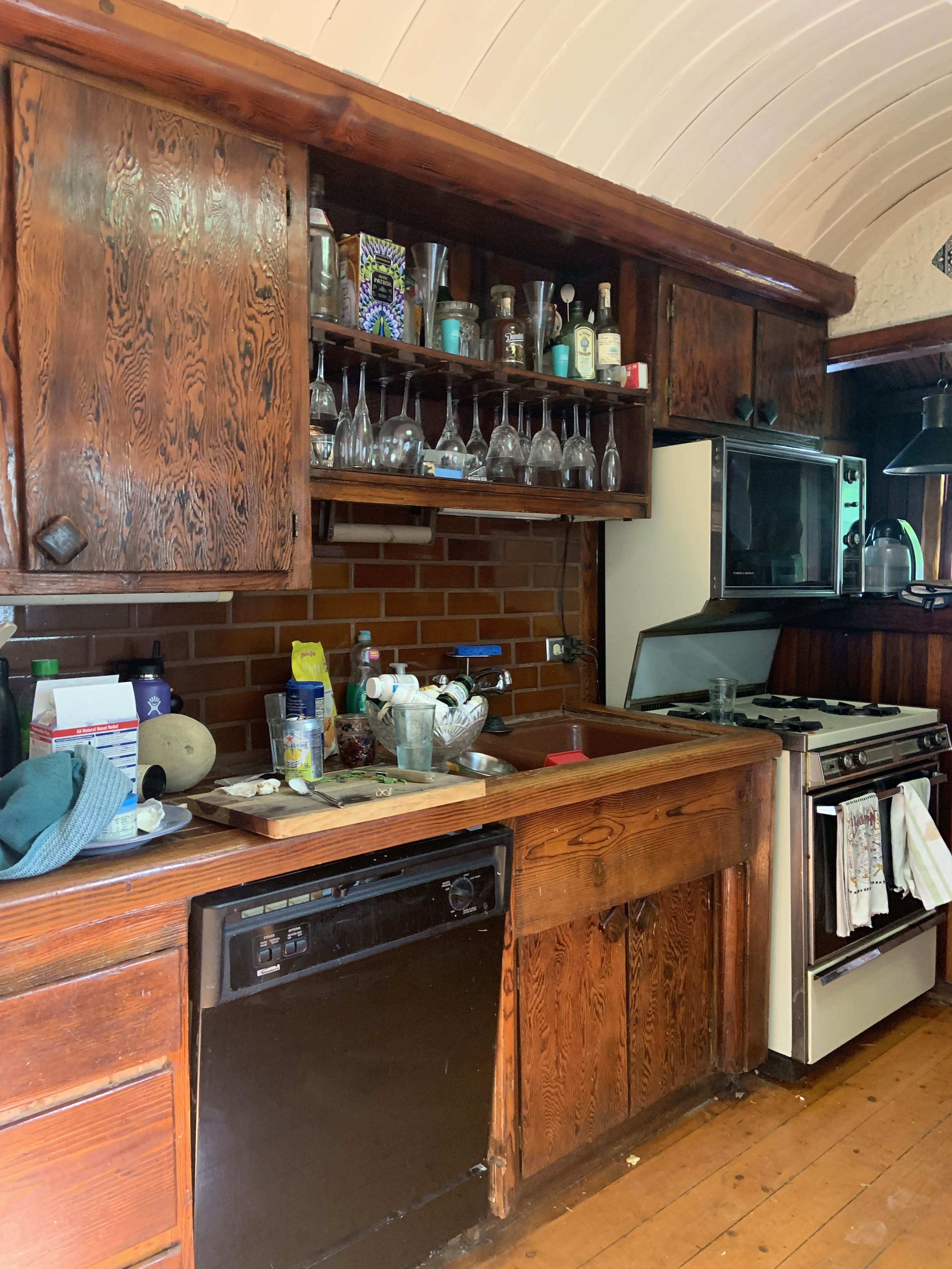
The original galley kitchen was narrow and dingy, made worse by the overwhelming dark wooden cabinetry which immediately dated the space. Alongside the brown subway tiled backsplash and the wooden flooring, the room was washed out with brown, lacking any dimension or vibrancy through color.
Keen to integrate an open plan kitchen and invite light into the space, Tamarra Younis of Union of Art Interiors re-planned the entire layout. 'We wanted to open the home up as much as we could and let in all that beautiful Cali sunshine,' she says. 'We tore open the whole back of the house and added about 80 square feet of space into the backyard. It went from being the smallest, darkest, and most overlooked area of the home to being the heart of the home and a space that they can really enjoy with their family and friends.'
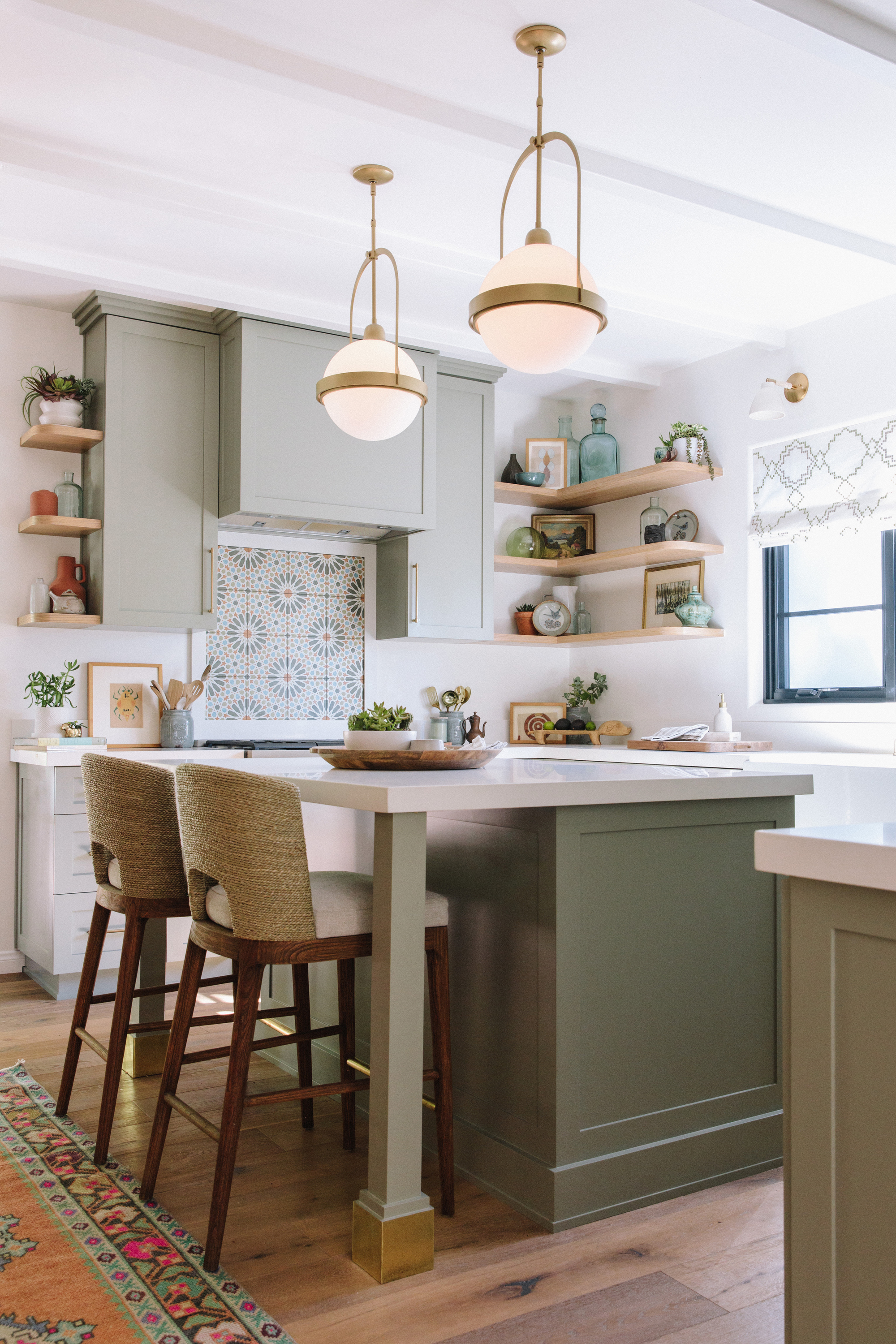
After expanding the kitchen, Tamarra then breathed new life into the space with bright white walls and sage green cabinetry. 'We opted for the sage green cabinet and mixed in a Moroccan tile to give it a farmhouse style with a worldly 70's twist,' explains Tamarra. 'We also gave them a great size island and a little seating nook so that Deb can sit and enjoy a glass of wine while Rusty cooks!'
Be The First To Know
The Livingetc newsletters are your inside source for what’s shaping interiors now - and what’s next. Discover trend forecasts, smart style ideas, and curated shopping inspiration that brings design to life. Subscribe today and stay ahead of the curve.
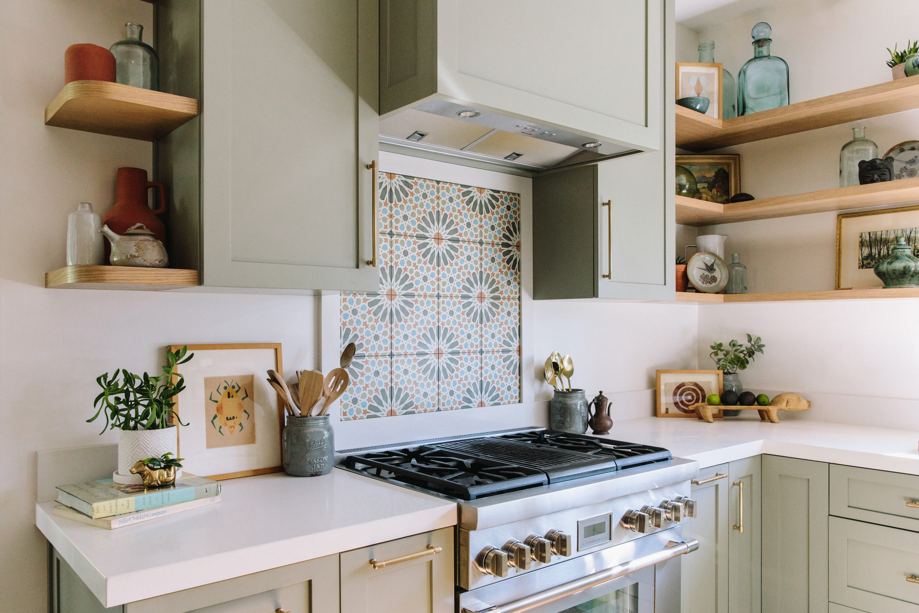
Taking inspiration from nature was key to both Tamarra and her clients. Alongside the original wood-clad architecture, one way she incorporated an organic element into the design was through the light engineered wood flooring which has a feel of rustic old lime oak.
'Another way we incorporated nature into the kitchen design was in the color palette,' she adds. 'We picked the sage green cabinets in the perfect tone to compliment the oak wood details but that also would pick up on the varied green tones of the trees surrounding the home. We wanted it to feel almost like you are perched in a treehouse when you sit at the island and can see the trees outside of the big windows in the garden. It was important to get the level of saturation right to compliment the surrounding landscape.'
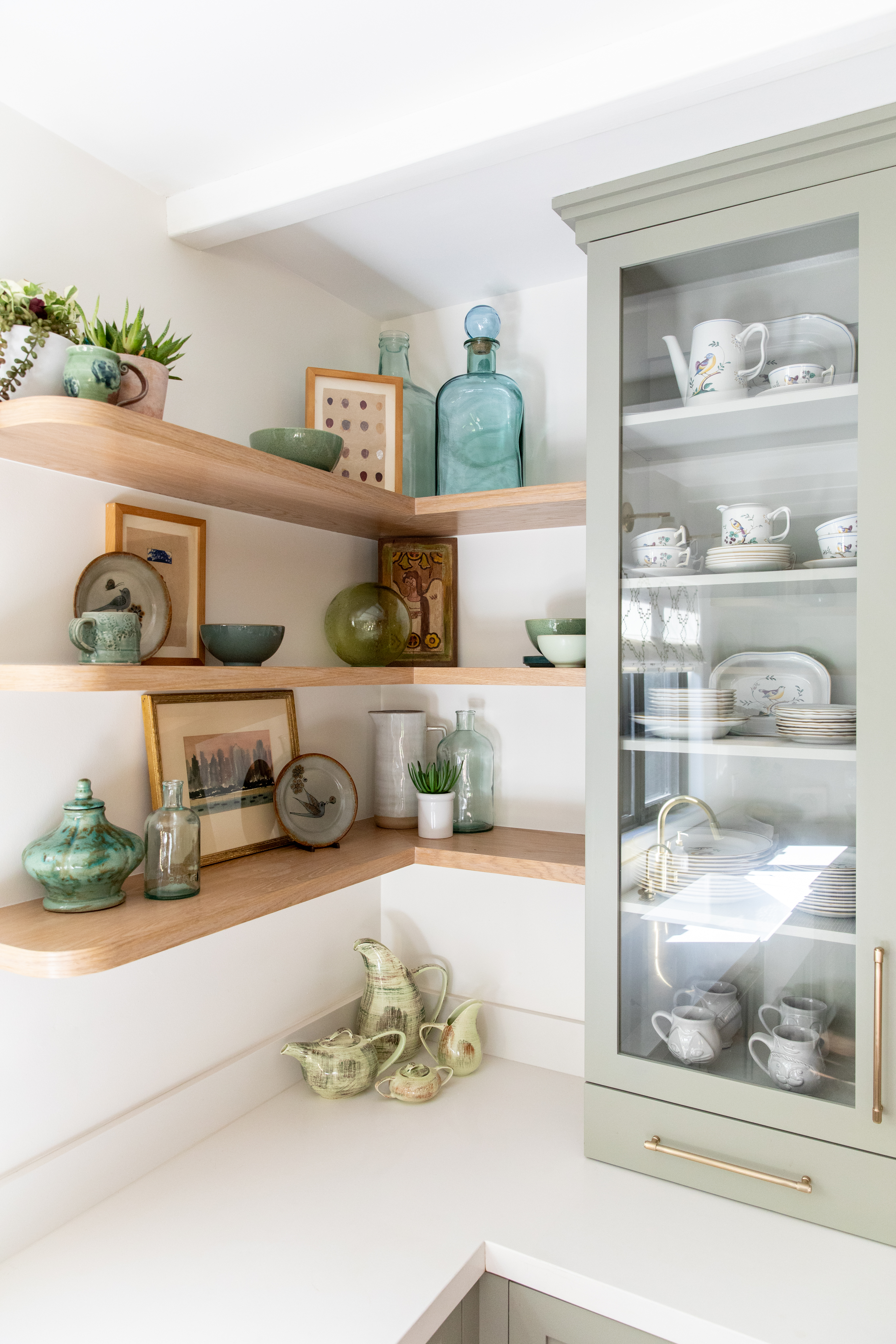
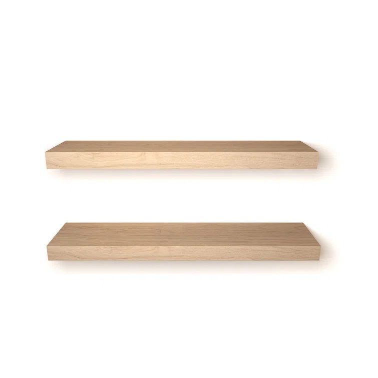
As well as the calming shaker style cabinetry, Tamarra made use of kitchen open shelving so that Deb and Rusty could curate beautiful displays of their treasured possessions.
'We love using open shelving in our kitchen designs as it can make a space feel more open, airy, and modern,' Tamarra says. 'Sometimes fitting a cabinet into a tight corner can get a bit tricky and you end up with cabinets that have a lot of dead or hard to reach spaces in the back.'
While closed cabinetry has its time and place (Tamarra used built in cabinetry to hide the clients laundry utilities), she's keen for us all to recognize the benefits of an open shelf in our own spaces. 'People get very concerned about not having enough storage but we encourage our clients to think about what they want to be surrounded with on a daily basis,' she says. 'An open shelf is the perfect opportunity to display the things that truly make you happy.'
Get the Look
Fireplace
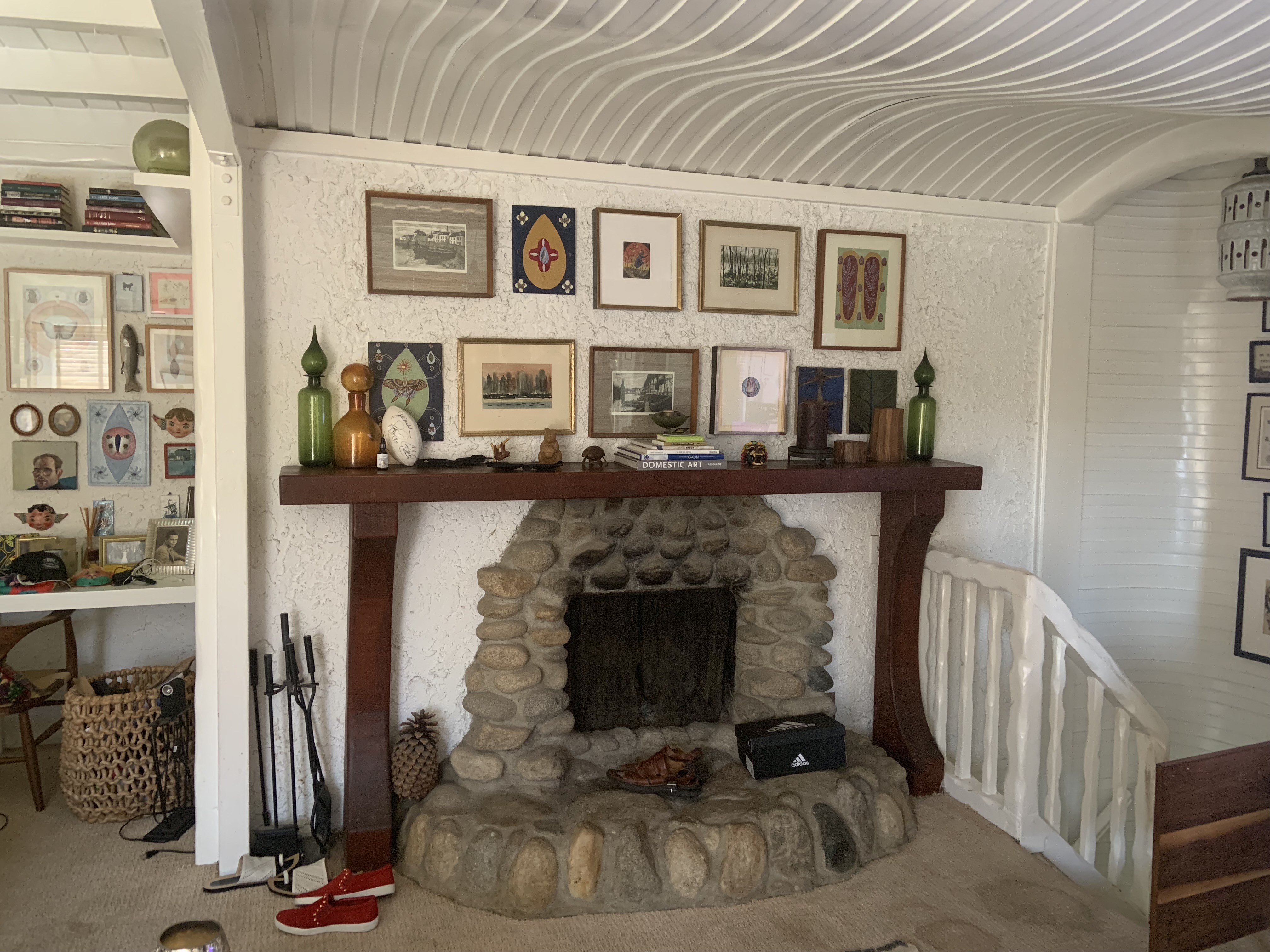
The rest of the home has seen some notable updates, too. Before Tamarra and her team worked their magic, the fireplace in the living room looked bland and lackluster. As Tamarra explains: 'It was truly stuck in the 70's (not in a good way). It had a more old timey rustic feeling with an irregular rock façade and a cherry wood mantle built around it.'
Charming though the wooden mantel-piece was - tastefully decorated with Deb and Rusty's take on a gallery wall - it didn't have the calming coastal feel you'd expect from an LA home. However, retaining the feature was key to the couple. 'Our biggest challenge was finding ways to keep the original charm of the house while introducing more modern style elements,' says Tamarra.
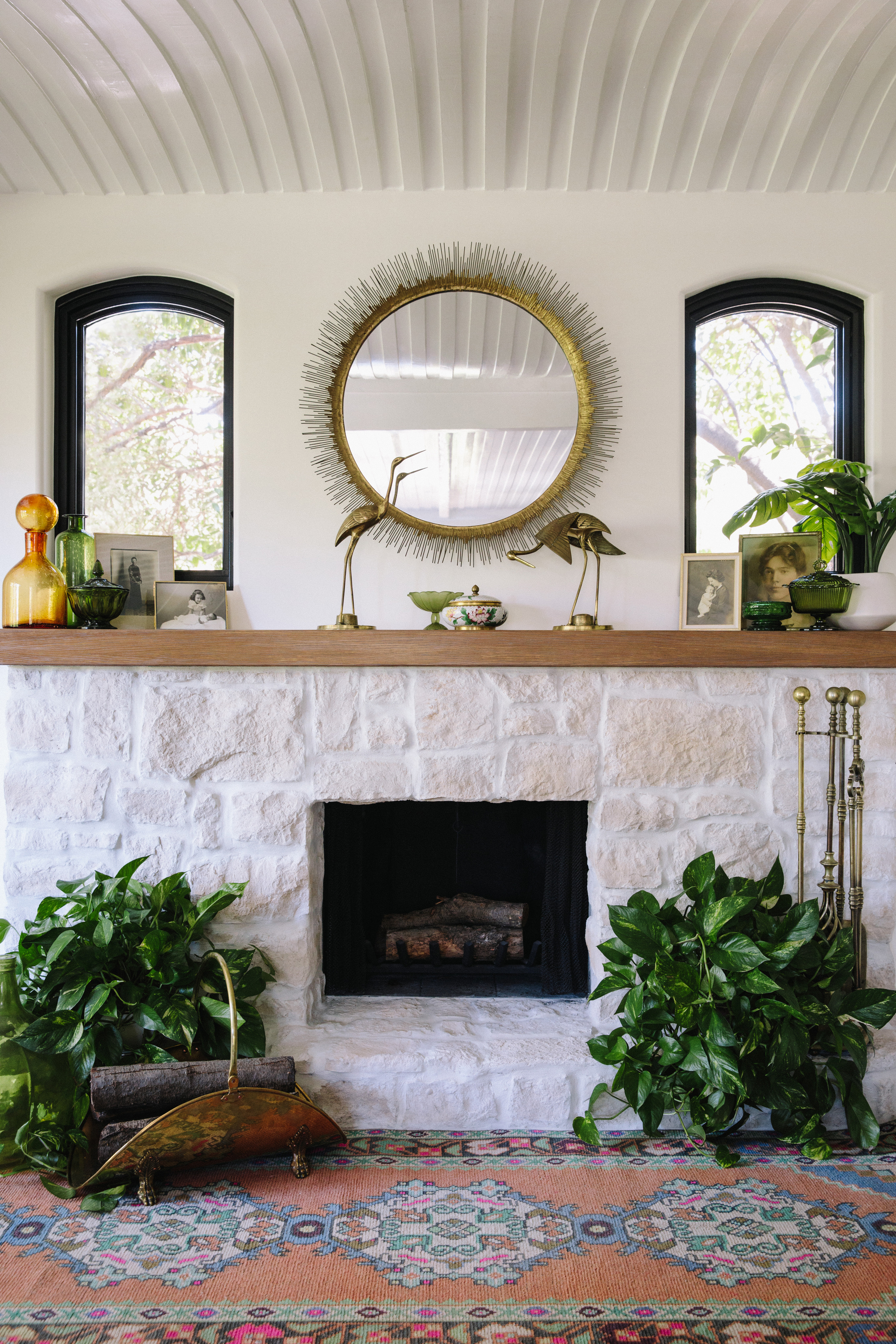
Fortunately, she's mastered it pretty well. The original fireplace has been given a contemporary update with white stone and an oak mantel to give it a lighter, brighter feel that's more in tune with the rest of the space. 'As an homage to the client's home state, we opted to replace the old river rocks with a more fresh and modern white Texas limestone,' notes Tamarra. 'A stone they said, reminds them of home.'
Those with a sharp eye will also notice the addition of two windows above the mantel piece, a discovery made when gutting the fireplace. 'When renovating a home you never know what surprises you'll find within the old walls,' Tamarra says. 'To our pleasant surprise, when we opened up the wall behind the fireplace we found the framing of two original windows that had been plastered over years ago. This detail was a game changer and added so much more light to the space.'
Living room nook
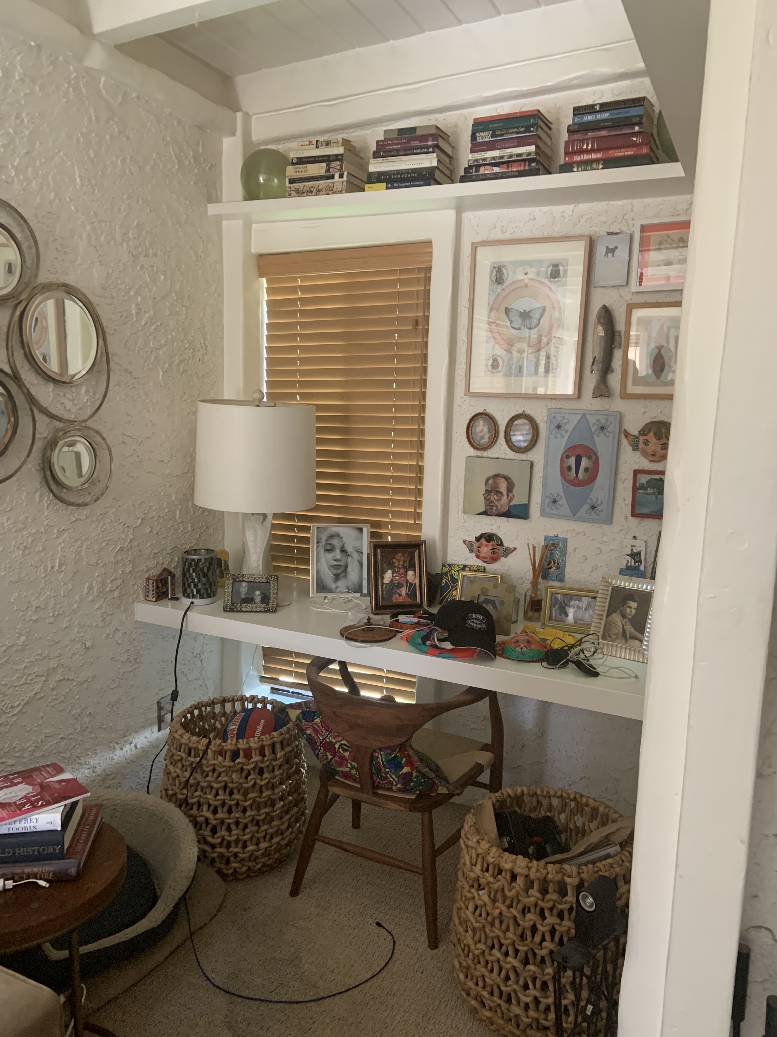
Interesting architectural details, like this super cozy living room nook, gave Deb and Rusty an opportunity to showcase all their weird and wonderful collections, but dated aspects like the stucco effect walls and awkward storage solutions meant these spaces weren't used to their maximum potential.
'Getting rid of the old stucco walls was one of the first major challenges we had to tackle. It's a super messy job, our team had to bust out with the sanders,' Tamarra explains. 'For about two weeks they worked day in and day out grinding off the old finish. After that they went back over with a smooth plaster finish to get the look it has now. When you say to a client, "we want to smooth out the walls", they don't think much of it but once it's done, it makes a massive difference in the space.'
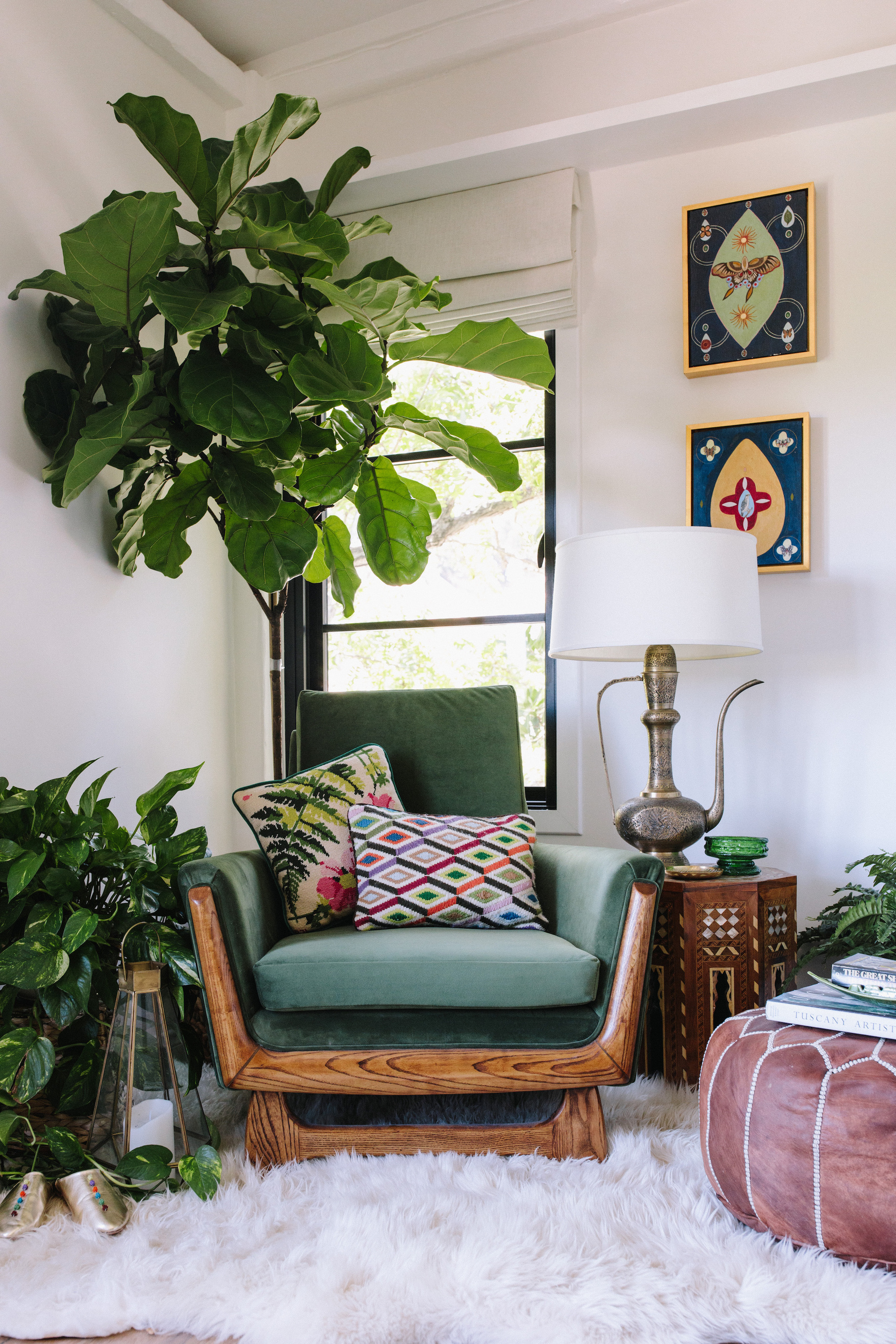
Besides the walls, Tamarra and her team have styles the space with a wonderful bohemian aesthetic with a mix of mid-century and modern furnishings that complemented the couple’s eclectic style. Together, they transforms this alcove into the perfect reading corner.
'Styling with vintage furniture and lighting is one of our signatures at Union Of Art,' says Tamarra. 'We fully re-furnished the home as a part of the process. The clients favorite colors are blue and green so we hunted for unique pieces, like the newly upholstered 1970s green velvet chair we found at one of our favorite vintage boutiques in Los Angeles. We knew it would be perfect in the corner next to the fireplace with one of our custom designed Tea Kettle lamps and a Moroccan pouf to pop your feet up on.'
'When things are mixed right and feel cohesive there is an ease to the eye,' she adds. 'Though we made some bold choices, they feel right in the space which is what gives it that comforting homey feeling!'

Lilith Hudson is a freelance writer and regular contributor to Livingetc. She holds an MA in Magazine Journalism from City, University of London, and has written for various titles including Homes & Gardens, House Beautiful, Advnture, the Saturday Times Magazine, Evening Standard, DJ Mag, Metro, and The Simple Things Magazine.
Prior to going freelance, Lilith was the News and Trends Editor at Livingetc. It was a role that helped her develop a keen eye for spotting all the latest micro-trends, interior hacks, and viral decor must-haves you need in your home. With a constant ear to the ground on the design scene, she's ahead of the curve when it comes to the latest color that's sweeping interiors or the hot new style to decorate our homes.
-
 My 10 Favorite Designs at Milan Design Week 2025 — Out of the Hundreds of Pieces I Saw
There is a new elegance, color, and shape being shown in Milan this week, and these are the pieces that caught my eye
By Pip Rich
-
 Iridescence Is Chrome’s More Playful, Hard-to-Define Cousin — And You're About to See It Everywhere
This kinetic finish signals a broader shift toward surfaces that move, shimmer, and surprise. Here's where to find it now
By Julia Demer
