Before & After: This Virginia home's kitchen was dated and clunky, now it's a timelessly modern space
This designer transformed this home's awkward, old-fashioned kitchen into the picture of classic modern design

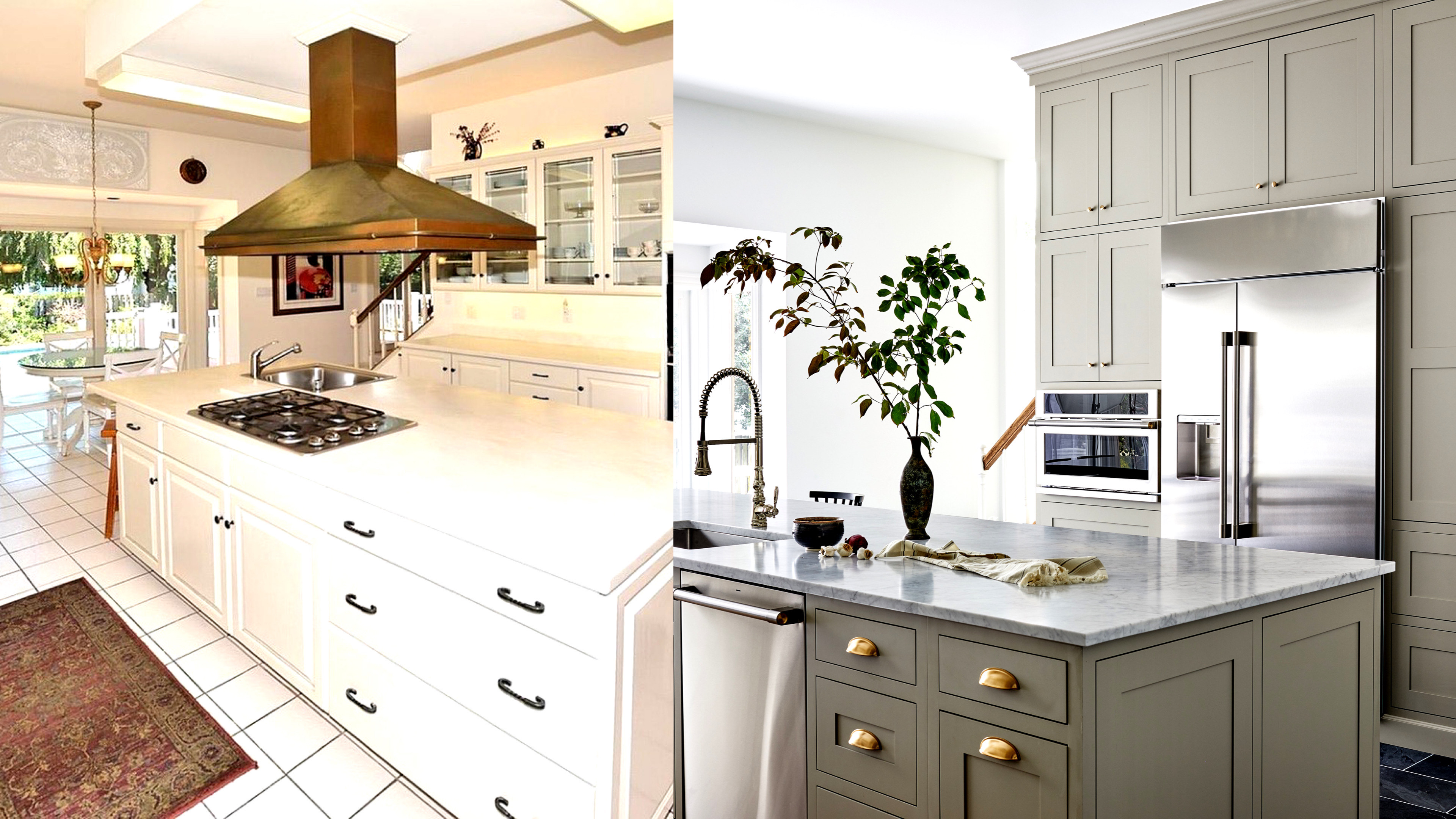
The owners of this 4800 sq ft home in Great Falls, Virginia decided to change up the style of their existing 800 sq ft kitchen, which had seen better days. A dated cabinetry style and clunky layout meant the space was more than due an upgrade.
'The homeowners are a family of four with small kids (a boy and a girl),' says Tanya Smith-Shiflett of Unique Kitchens and Baths, who designed the cabinetry for the space. 'They wanted a space that accommodated all their needs, within a British modern aesthetic. While originally this space was galley-style, it was a challenge for us to fit all of their appliances in while creating enough space for the counters.'
That apart, the entire room was rehauled in terms of colors, counters, and flooring, with a metamorphosis one can only dream of. Take a look at this modern home's kitchen renovation, and gather ideas for yours!
Before
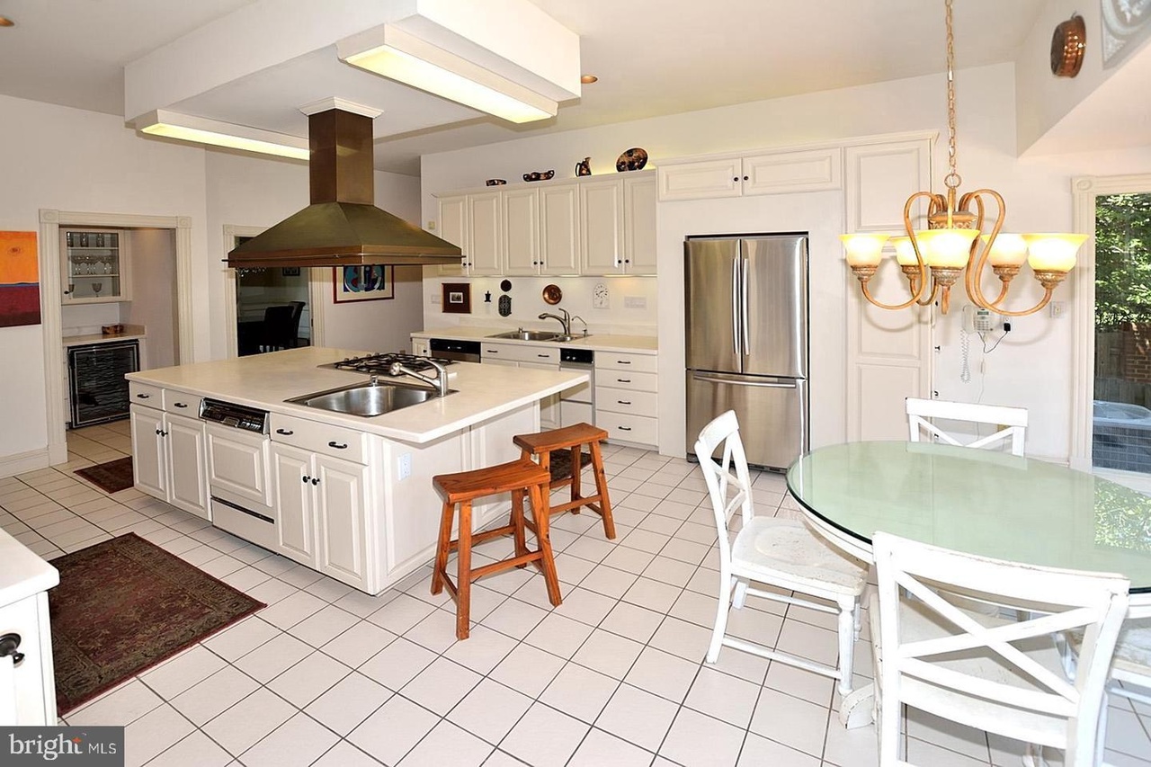
With a bulky island, and a large range hood, all drenched in a muted tones, the original kitchen needed a pick-me-up.
'This kitchen was truly designed to show how the homeowners live with their kids,' says Tanya. 'They wanted an island that would provide seating for them and their kids, as the original layout didn't allow them to add extra seats. Also, as the space leads out to the pool area, the floors needed to be waterproof.'
After: Storage and seating
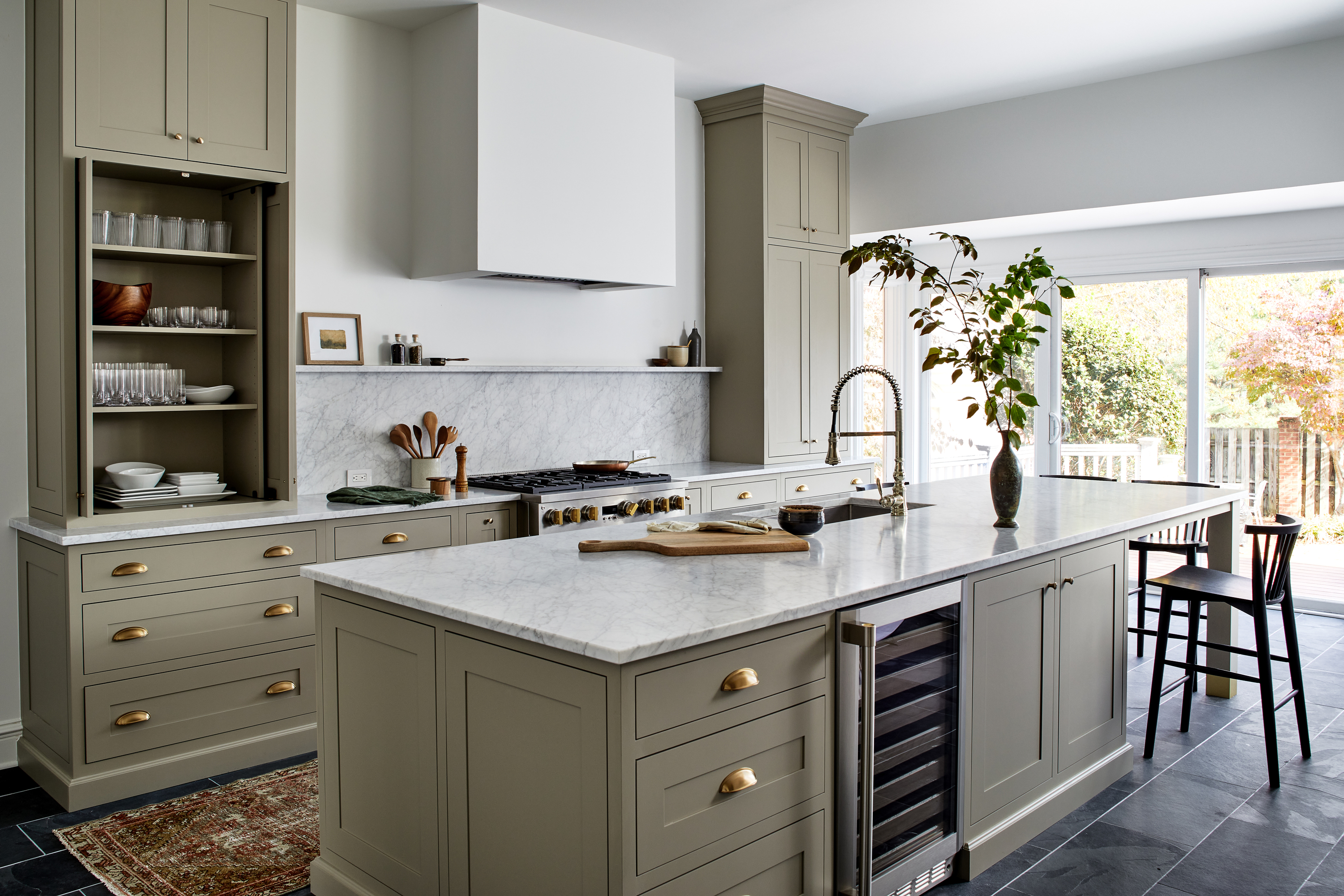
To accommodate a kitchen breakfast bar and to add more seating to the room, Tanya elongated the island and added a table to sit at. 'Making a place where the family could have breakfast together in the kitchen, vs. in the more formal dining area, was a priority,' says Tanya. 'The family loves using the seating area for snacks in the afternoon or for a place to eat during a pool break (the pool is directly outside of the kitchen).'
'It was really important to this busy young family to have a place for everything and keep all of the tools and appliances organized,' says Tanya. 'The way we achieved this was by asking the clients to give us a list of daily things they used and we designed the storage around those items. For this family, we created moments for a coffee station, an air fryer station, double trash, a spice drawer, and lots of pantry storage.'
The Livingetc newsletters are your inside source for what’s shaping interiors now - and what’s next. Discover trend forecasts, smart style ideas, and curated shopping inspiration that brings design to life. Subscribe today and stay ahead of the curve.
After: Colors
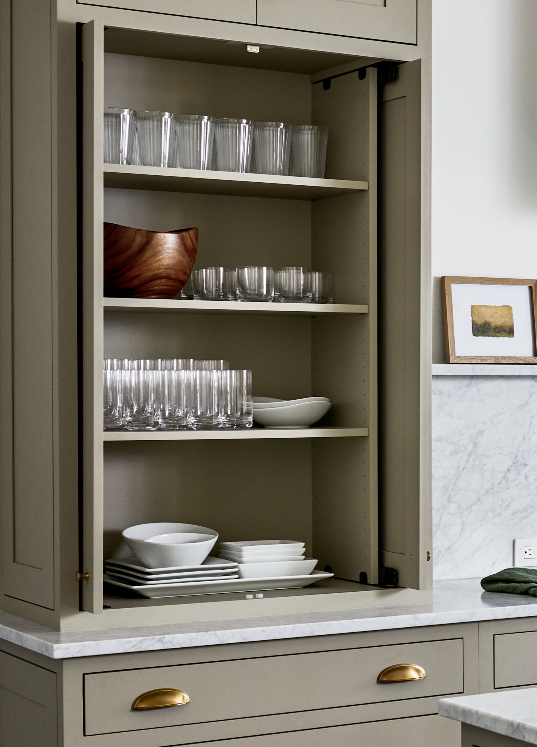
The entire palette was changed and the space was transformed into a colorful kitchen. To get a calm, relaxing yet elegant shade, the designer used a custom blend of light green and light tan to achieve the tone they wanted.
'To add a glittering effect, we chose knobs from Top Knobs for a touch of elegance,' says Tanya. 'For a punch of color, we added a rug for some warmth and visual interest. For the countertops, we chose white marble, as we adore working with natural stone and the owners were on board as well.'
After: Flooring
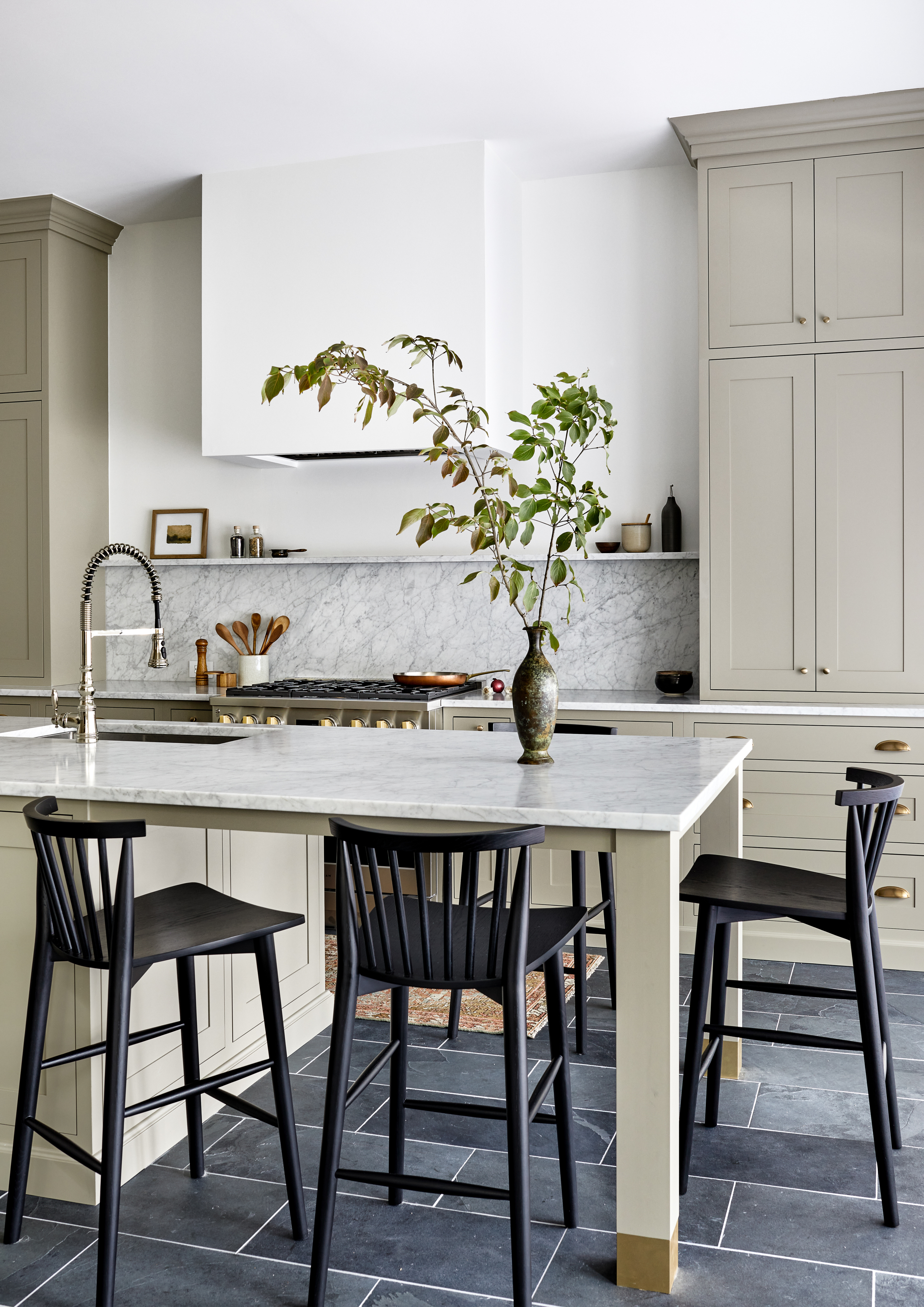
The owners have a pool so the floors needed to be waterproof. So, Tanya installed slate kitchen flooring, which is inherently non-skid and water-resistant.
With fresh tones and new materials, the whole room was given a new identity. 'Working with a galley kitchen is never easy, as the space is limited,' says Tanya. 'So when designing, we made sure to create a designated spot for everything in the kitchen so everyday use would be seamless and easy when living with a family of four.'
More projects by Tanya Smith-Shiflett of Unique Kitchens and Baths.

Aditi Sharma Maheshwari started her career at The Address (The Times of India), a tabloid on interiors and art. She wrote profiles of Indian artists, designers, and architects, and covered inspiring houses and commercial properties. After four years, she moved to ELLE DECOR as a senior features writer, where she contributed to the magazine and website, and also worked alongside the events team on India Design ID — the brand’s 10-day, annual design show. She wrote across topics: from designer interviews, and house tours, to new product launches, shopping pages, and reviews. After three years, she was hired as the senior editor at Houzz. The website content focused on practical advice on decorating the home and making design feel more approachable. She created fresh series on budget buys, design hacks, and DIYs, all backed with expert advice. Equipped with sizable knowledge of the industry and with a good network, she moved to Architectural Digest (Conde Nast) as the digital editor. The publication's focus was on high-end design, and her content highlighted A-listers, starchitects, and high-concept products, all customized for an audience that loves and invests in luxury. After a two-year stint, she moved to the UK and was hired at Livingetc as a design editor. She now freelances for a variety of interiors publications.
