The 6 Best Inspiring Designs From Celebrity Homes This Year That Promise to Elevate Your Space
Decorating by their own rules, celebrity homes have been a constant source of inspiration throughout 2023

The Livingetc newsletters are your inside source for what’s shaping interiors now - and what’s next. Discover trend forecasts, smart style ideas, and curated shopping inspiration that brings design to life. Subscribe today and stay ahead of the curve.
You are now subscribed
Your newsletter sign-up was successful
While we were all paying attention to the latest trends and trying to reorganize our interiors at speed to match the newest inspiration, celebrities were making their own design rules. On the trend-setting side rather than trend-following, they showed us that true style goes a long way, and it’s a sure way to bring character into your home as we head into 2024.
Whether they brought back interior trends we forgot about, shared their obsession with one particular material, or showed off their oversized accessories, we’ve loved getting a sneak peek into the elevated homes of the elite. Here are the six best lessons we’ve learned from them this year to help inspire your designs in the year ahead.
1. A freestanding bathtub needs a view like Cardi B’s

If you own a freestanding bath you must make sure it’s got a great view, for all those post-work evenings when you want to relax and reward yourself with a bubble bath and a glass of fizzy. We spotted this setting on Cardi B’s Instagram story earlier in the year and were completely taken with the singer's uniquely shaped bath, strategically placed in front of a bay window and overlooking a gorgeous sunset. Sheer curtains also cover the side windows for added privacy but don’t obstruct the show-stopping view.
Article continues below 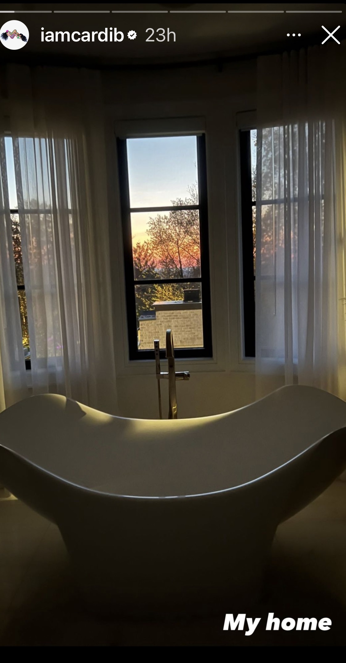
Interior designer Karolina Tornqvist is all for placing your freestanding bath in front of your window to create a real wow moment. This can be in a bathroom or, if you’re going for that ultimate luxe feel, a master bedroom. ‘Definitely position by the window,' she says. 'You just need to make sure to accommodate for privacy, whether that’s sheer curtains or some kind of blind.'
Of course, Cardi’s bathtub ticks both boxes. ‘I think the beauty is that it’s a place where you can relax and unwind, look out the window with a glass of wine or cup of tea... if you want to make even more of a statement add a beautiful fireplace in there as well,’ adds the designer.
2. Ashley Benson brings back the pink and blue pairing

Pink and blue is one of those color combinations that we thought were definitely over. ‘Too cliche!’ maybe, we thought, wearing our minimalist hats, or ‘too unoriginal’ if we’re part of the maximalist’s camp. But leave it to the celebs to ignore the latest trends and just do whatever they like. In this case, we see Ashley Benson proudly bringing back the pink and blue pairing, reminding us all how much we actually love it.
In a social media post this year, the celeb is happily enjoying the softness of her deep blue velvet sofa in her living room peppered with pink accents, from the dog’s bed to the decorative cushion.
The Livingetc newsletters are your inside source for what’s shaping interiors now - and what’s next. Discover trend forecasts, smart style ideas, and curated shopping inspiration that brings design to life. Subscribe today and stay ahead of the curve.
A post shared by Ashley Benson (@ashleybenson)
A photo posted by on
While blue and pink can work together and look beautiful in a living room, there is one rule you need to stick to if you want to make sure they don’t contrast too much. ‘For pink and blue to work harmoniously in a living room, I would choose muted tones,' says interior designer Ami McKay. 'Incorporating a vintage Turkish rug with faded pink and blue tones would be beautiful, and then extra of these colors through the accessories such as throw pillows.'
If, however, you prefer a more maximalist style, follow Ashley Benson’s example and sidestep the muted tones in favor of the bold and contrasting - she even brings in a leopard accent throw pillow for just the right touch of the animal print trend. Ultimately, interior design rules are there for guidance, and if strong color combinations are your thing and they bring you joy, go for it. If it works for Benson, it works for us.
3. Christina Aguilera’s take on maximalist metallic wallpaper

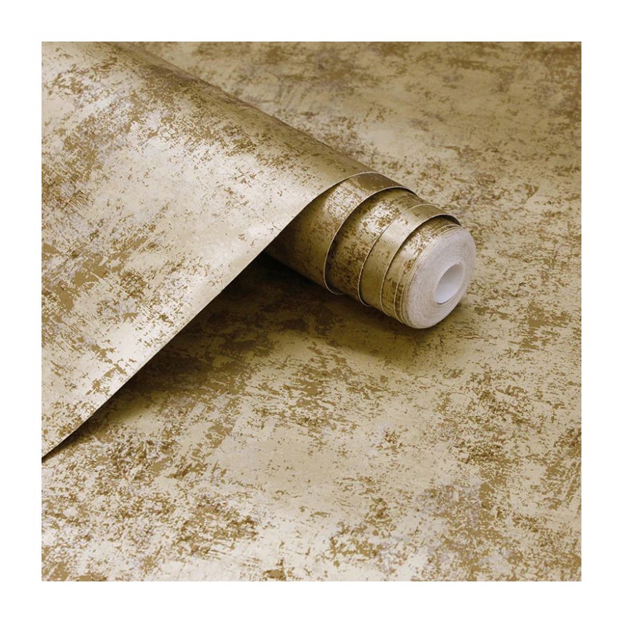
Of course Christina Aguilera was going to give us a lesson in maximalist interiors that exude glamor. In a runway strut through her home posted on social media, she walked us through her dining room, and we couldn’t help but notice the metallic wallpaper, a trend that is sure to be back in favor in 2024. You wouldn't be mistaken for thinking it was quite dated, however, metallic wallpaper is actually quite versatile, and it can be used as a tool not only to glam up a room but also to bounce off light and create the illusion of more space. Come the holiday season, there's nothing that will make your rooms look more dressed up for the occasion than this.
A post shared by Christina Aguilera (@xtina)
A photo posted by on
Amanda Both, Art Director at Tempaper & Co. tells me their metallic chinoiserie peel-and-stick wallpaper murals are some of the brand’s most popular designs. The reason for this is largely down to their versatility. ‘Metallic wallpaper is an easy way to add depth and interest to any space,' Amanda explains. 'They’re perfect for accent walls, bathrooms, and other areas where a bit of shimmer and texture could enhance the overall design.'
4. Kourtney Kardashian's vanity shows us supersized mirrors are a must (and small ones, too)

The Kardashians know how to make a statement, and Kourtney Kardashian’s vanity is definitely one for the books. Brilliantly supersized, it’s the envy of any dressing room. While designers did comment that it wasn’t the most practical, we were definitely impressed by the statement it makes.
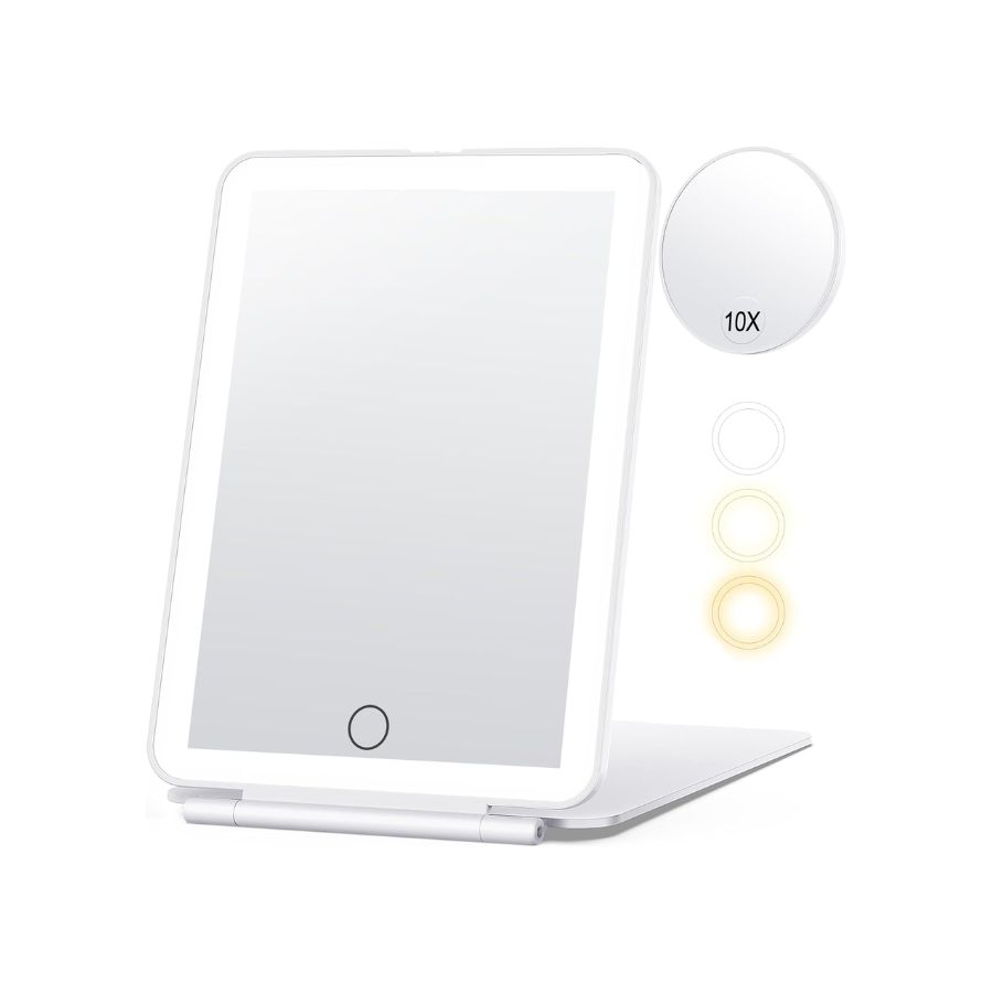
There's actually more to a functional dressing table than the size of the mirror, and interior designer Ami McKay goes through the checklist. ‘For a vanity table, I would have two mirrors,' she says. 'One larger one on the wall to see your overall look and for drying hair etc, and one on an extendable arm swivel, or on a stand that is magnified for doing close-ups. This can then be brought closer to the face if needed.'
A post shared by Kourtney Kardashian Barker (@kourtneykardash)
A photo posted by on
So, in spite of Kourtney’s efforts on size and lighting, her vanity table is missing a trick - a smaller magnifying mirror. Now that Ami’s drawn attention to it, I realize it's a must. I'm certainly still inspired by the extra large size of the main mirror bordered by its bright lighting, but I'll definitely be adding a smaller one to my table top for a vanity table design that will be even better than celebrity standards.
5. Troye Sivan’s show-stealing exterior powder room color

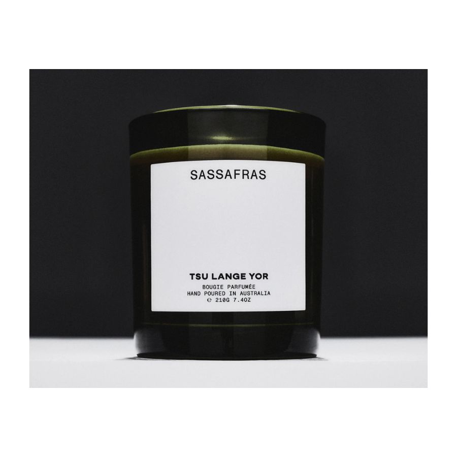
To announce the launch of his new fragrance brand, Tsu Lange Yor, earlier this year Troy gave us a gentle reminder of his beautiful home interior. In the social media post, we see a glimpse of the home's exterior powder room, painted in a color you wouldn't expect for a bathroom - and it really steals the show.
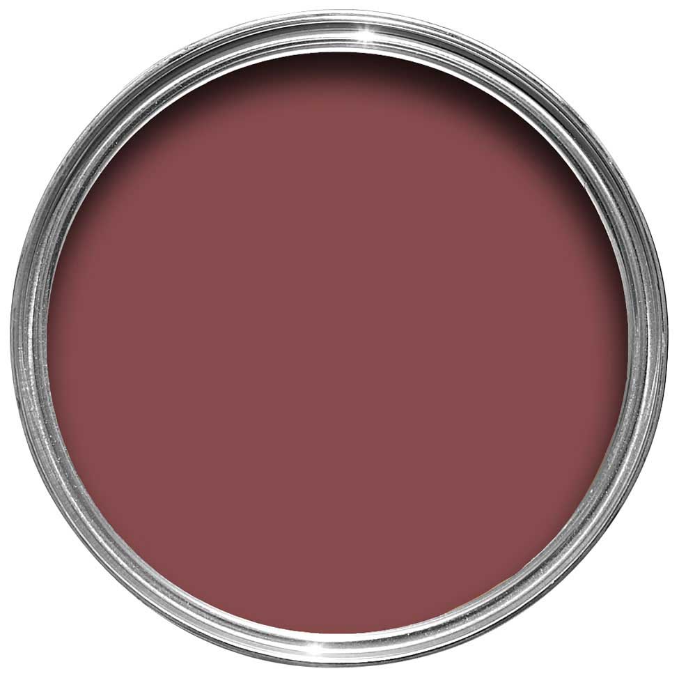
It's only a fleeting glimpse, but Troye's burgundy-red bathroom stands out from the rest of his bright, light home because of its moody color scheme. With an incredible marble bathroom vanity picking up the red tones, on top of which Troye's burning one of his Tsu Lange Yor scented candles, it's a modern, luxurious scheme - but using this much red in the bathroom isn't for the faint of heart. Here’s why it works.
A post shared by troye sivan (@troyesivan)
A photo posted by on
Australian practice Flack Studio, who designed the space, specified a beige marble for the vanity, helping to avoid a stark contrast against any whites in this space. 'If the color palette calls for burgundy paired with white, it's imperative to select a white that is more of a tonal cream color to avoid a sterile, clinical look,' designer Julia Mack tells us.
As well as choosing the right colors that go with burgundy, when choosing red for a space that you want to feel elevated, the tone is important, too. 'When using red it's important to use the right shade of red,' agree Jenna Choate and Mariana Ugarte, founders of design studio Interior Fox. 'This can easily go Christmas special, so we recommend using muted reds such as burnt sienna or burgundy.'
And last but not least, Troye's powder room embraces the power of color drenching, by painting the ceiling and door in the same stand-out shade. 'Using the same color on the ceiling quite simply draws the eye upwards,' says Katherine Errboe from paint brand File Under Pop. 'It lifts the spirit and creates a whole new space that in many cases is left unused. It adds character and definition to a space and simply creates an element of hygge.'
6. Jenna Lyons tells us it's unlacquered brass only
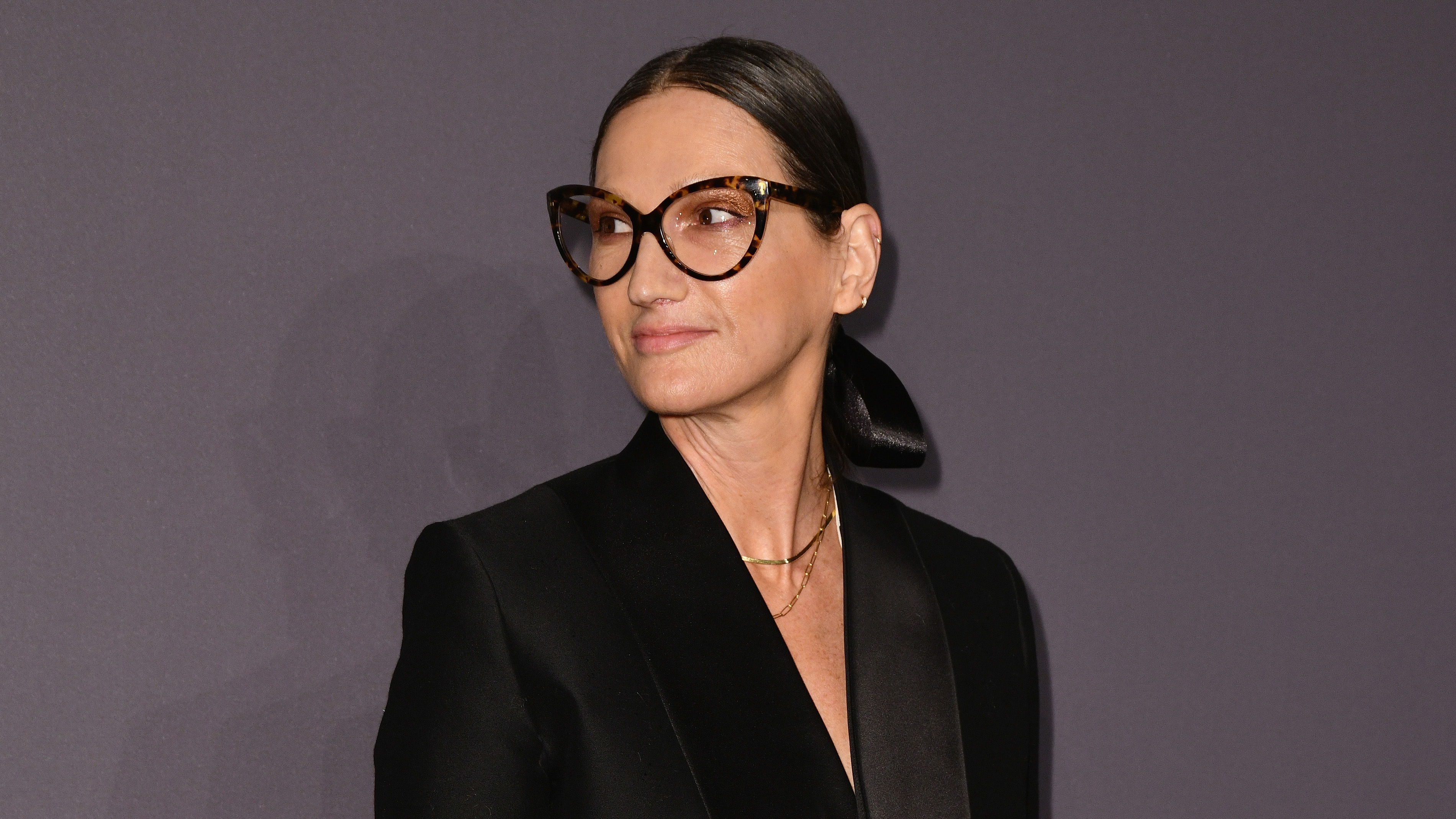
Former fashion designer turned reality TV star Jenna Lyons, has always been an iconic design inspiration. As part of the Real Housewives of New York cast, we get a real glimpse into her immaculately designed apartment, and one thing that not only stands out but is also pointed out by Jenna is her love of unlacquered brass. ‘I think I started the brass appreciation community,’ she says.

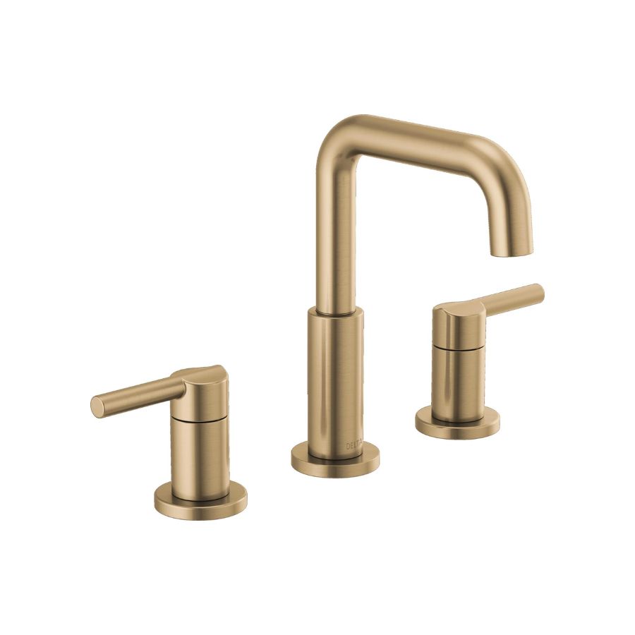
In her apartment, we’re seeing it everywhere from the taps in her bathroom, the cabinet handles, and knobs, even down to the hinges that hold the walk-in closet shelving and drawers together. Oh, and inside the perfectly organized cutlery drawers too, you'll find brass dividers. It’s all so perfectly unlacquered and gorgeous and really shows the attention to detail that went into the design and the build of the space. If I were you I’d be on my way out the door to get some new hardware. Because if Jenna approves, who are we to question it?
Raluca formerly worked at Livingetc.com and is now a contributor with a passion for all things interior and living beautifully. Coming from a background writing and styling shoots for fashion magazines such as Marie Claire Raluca’s love for design started at a very young age when her family’s favourite weekend activity was moving the furniture around the house ‘for fun’. Always happiest in creative environments in her spare time she loves designing mindful spaces and doing colour consultations. She finds the best inspiration in art, nature, and the way we live, and thinks that a home should serve our mental and emotional wellbeing as well as our lifestyle.
