Though inspired by the lairs of Bond villains, this architect's home is a surprisingly welcoming retreat
Architect and designer Timothy Godbold may have had some unusual inspiration for this Hamptons home, but that doesn't stop it feeling like a cozy refuge from the outside world

The homes built, remodeled or even just re-designed over the past few years share a history unlike any other in recent memory. The shadow of a global pandemic hangs over these homes, but not always in the ways you'd expect. There was, if you cast your mind back, a sense of scarcity - both around construction materials or labor - but also a unique sense of what a home means when that is the extent of your world.
In the case of Timothy Godbold's modern home in the Hamptons, the first the architect and designer had created for himself, there's a clear sense that it's a product of these exceptional circumstances.
'We were all at home creating these little sanctuary bubbles for ourselves,' Timothy tells us, 'and mine manifested itself in the memories that gave me great pleasure as a kid growing up in Australia: from science fiction films to James Bond lairs.'
It's an interesting scope of reference for a moment in time which perhaps called for a sense of safety, security and retreat, but as Timothy explains: ' I’m not recreating Neverland, but I nuanced the house with minor details that only I know their origin story.'
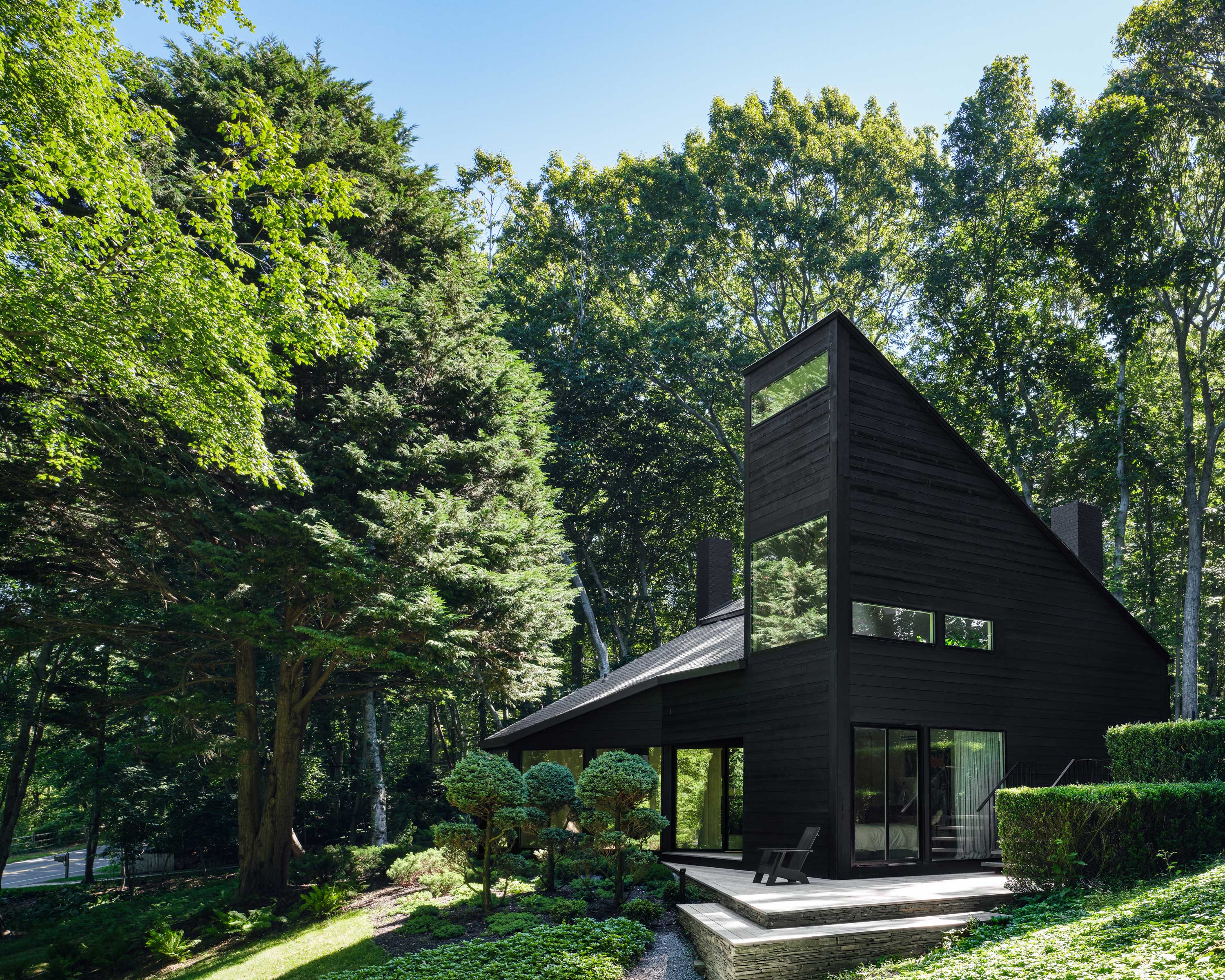
Despite it's now modern appearance, this home wasn't a new build project. The 1,700-square-foot home built in 1973 by Eugene L. Futterman wasn't, however, quite so photo-ready when the designer came across it.
'It was a bit like visiting the Bates house,' Timothy recalls. 'It has this imposing large, pointed roof that juts out over an ascending staircase up to the house. The exterior was run down and drab.'
But for Timothy, who in his spare time advocates for the preservation of modernist dwellings in the Hamptons, it was a property with incredible potential. 'The architecture was insane, it was one of the cleverest uses of geometry I had ever seen, and I have seen a lot in my time as the son of an architect,' he says.
Be The First To Know
The Livingetc newsletters are your inside source for what’s shaping interiors now - and what’s next. Discover trend forecasts, smart style ideas, and curated shopping inspiration that brings design to life. Subscribe today and stay ahead of the curve.
"I wasn’t going to live in a house that wasn’t sexy"
So, how does a Bond villain's headquarters serve as inspiration for a comfortable, relaxing home? 'I had been working on a project in California, and we ended up going with a subterranean working space for the owner who wanted to tinker away on his pet projects,' Timothy recalls. 'I instantly was drawn to the cement bunker type buildings and furnishing from Bond films and then I read the book Lair: Radical Homes and Hideouts of Movie Villains.'
'The first house that ever made an impact on me was the Hitchcock VanDamm house in “North by Northwest,” and so I have always loved a lair as they are modern and always very sexy,' he adds. 'And I wasn’t going to live in a house that wasn’t sexy. That was pretty high up on the list of feelings I wanted to make you feel.'
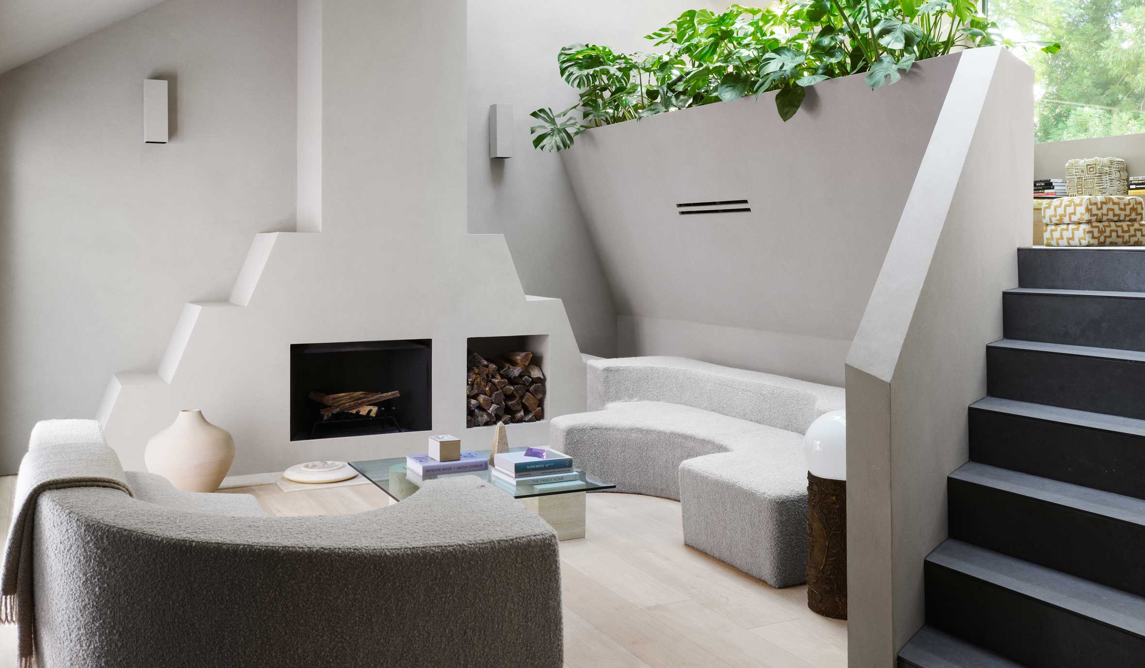
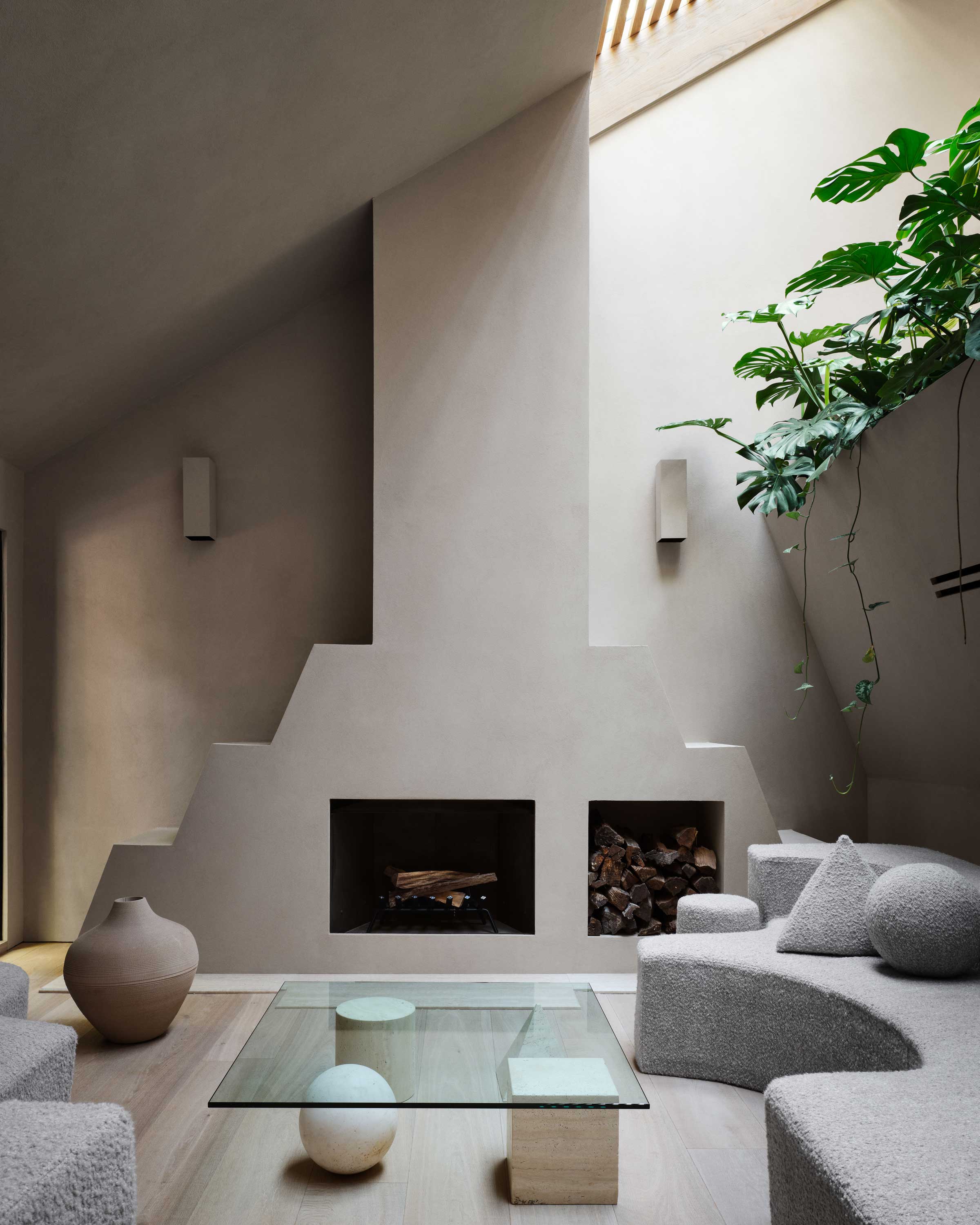
The double-height living room is probably the most "lair"-like space in the entire property, with its dramatic proportions and angular forms. 'The fireplace started off at 90-degree angles from postmodernist fireplaces in the 80s, but I’ve always had a liking for Mesopotamia and Aztec design, so it turned into a ziggurat. My contractor thought I was nuts when I showed him the drawing,' Timothy says. 'He had many of those instances throughout the project.'
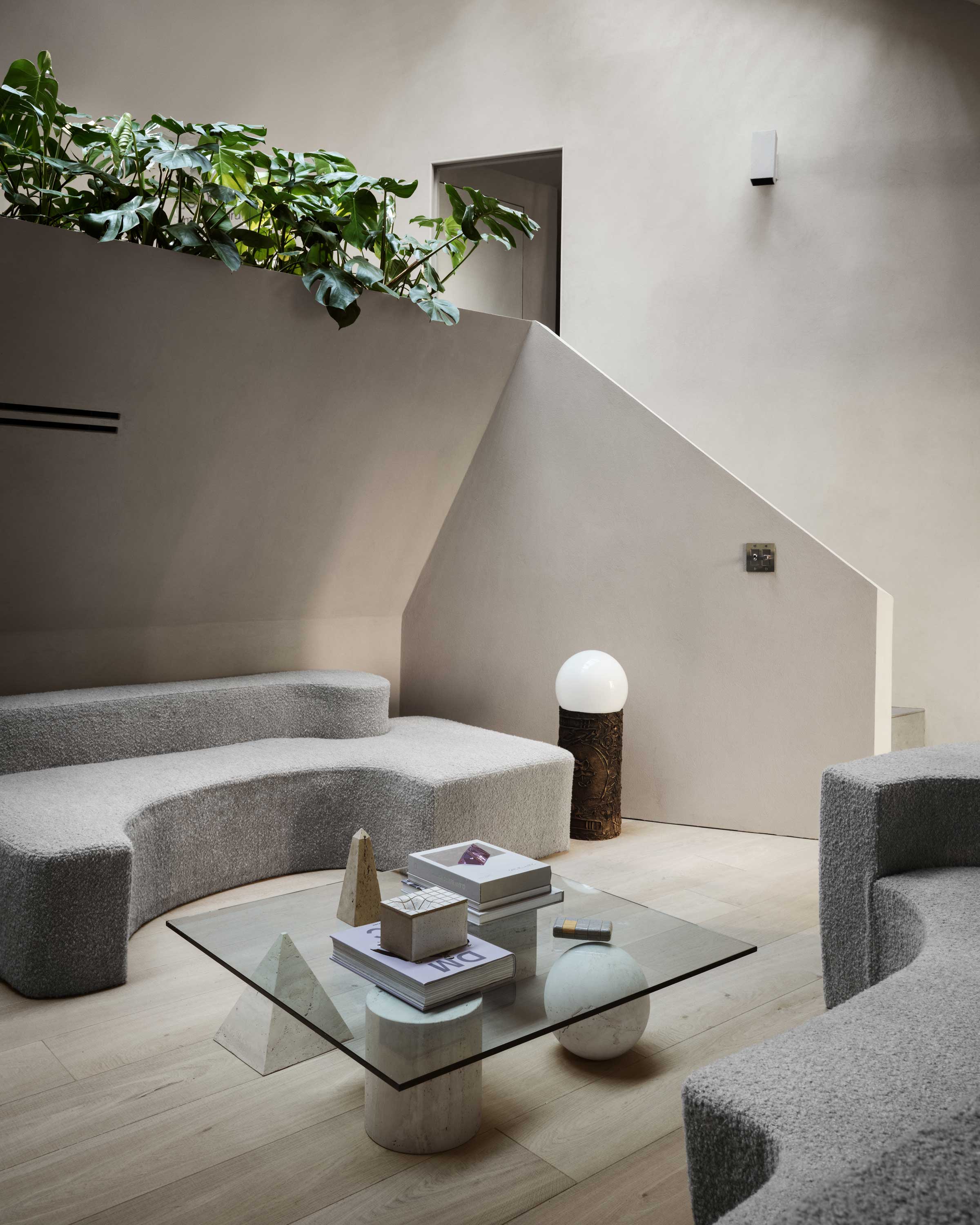
'I can spend hours in here with the music playing and watching the light cast shadows from the fireplace,' Timothy continues. 'There are LED strips behind the furniture in the floor, so it feels very much like a nightclub and very sexy. People say it looks like the perfect place to get high, but I haven’t done any of that for eleven years so I just sit with my thoughts, thinking up the next project and how far I can push it forward.'
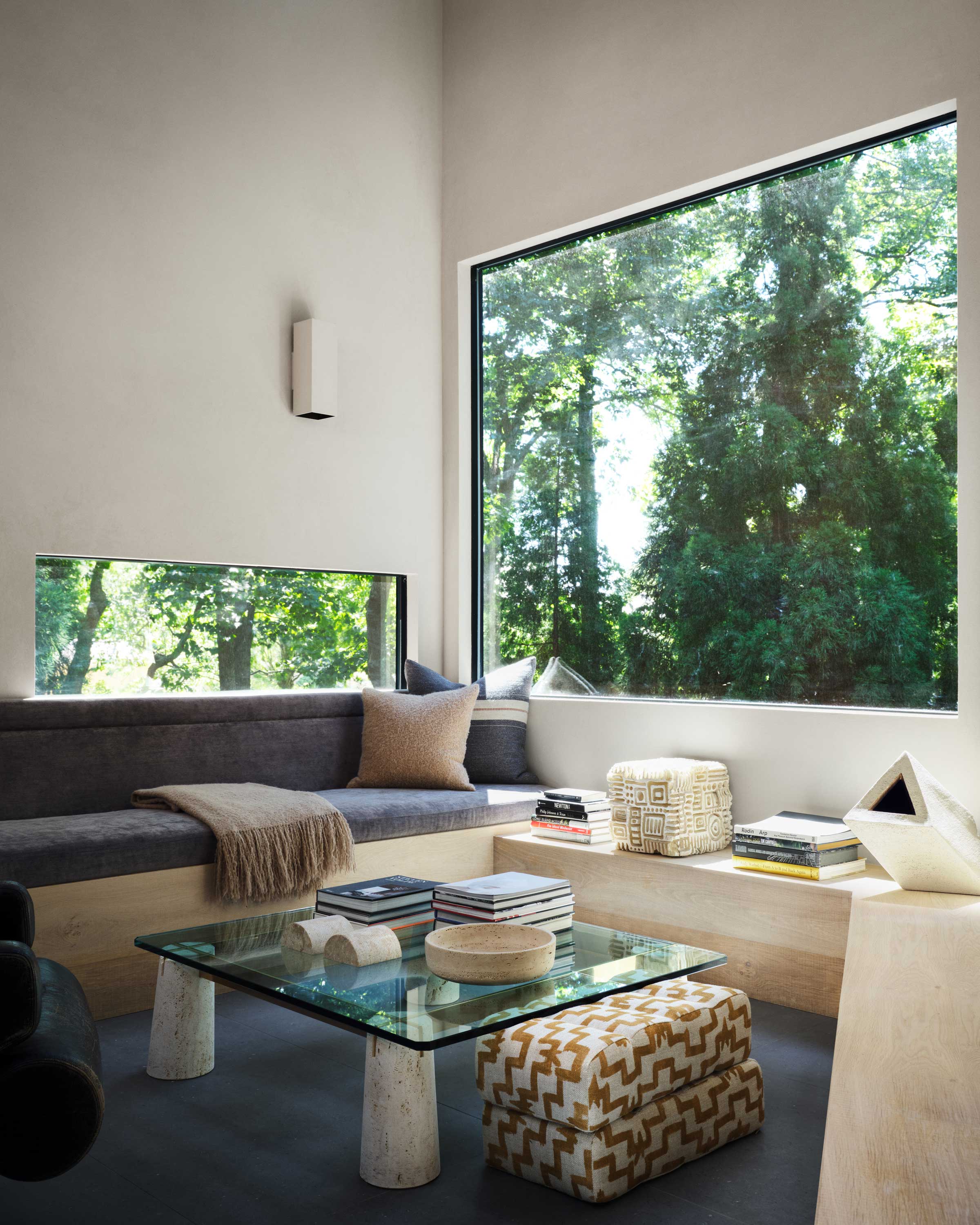
On the level above, a mezzanine sitting area offers views out onto the trees through a large picture window. That, couple with a skylight fitted with slats that cast dramatic shadows across the room, helps flood the space with natural light.
'The mezzanine is quickly turning into an overgrown greenhouse which is what I wanted,' Timothy tells us. 'I just put in this series of three nesting tables from the 70s that have really added another layer to the space.' ”
The soft and the hard
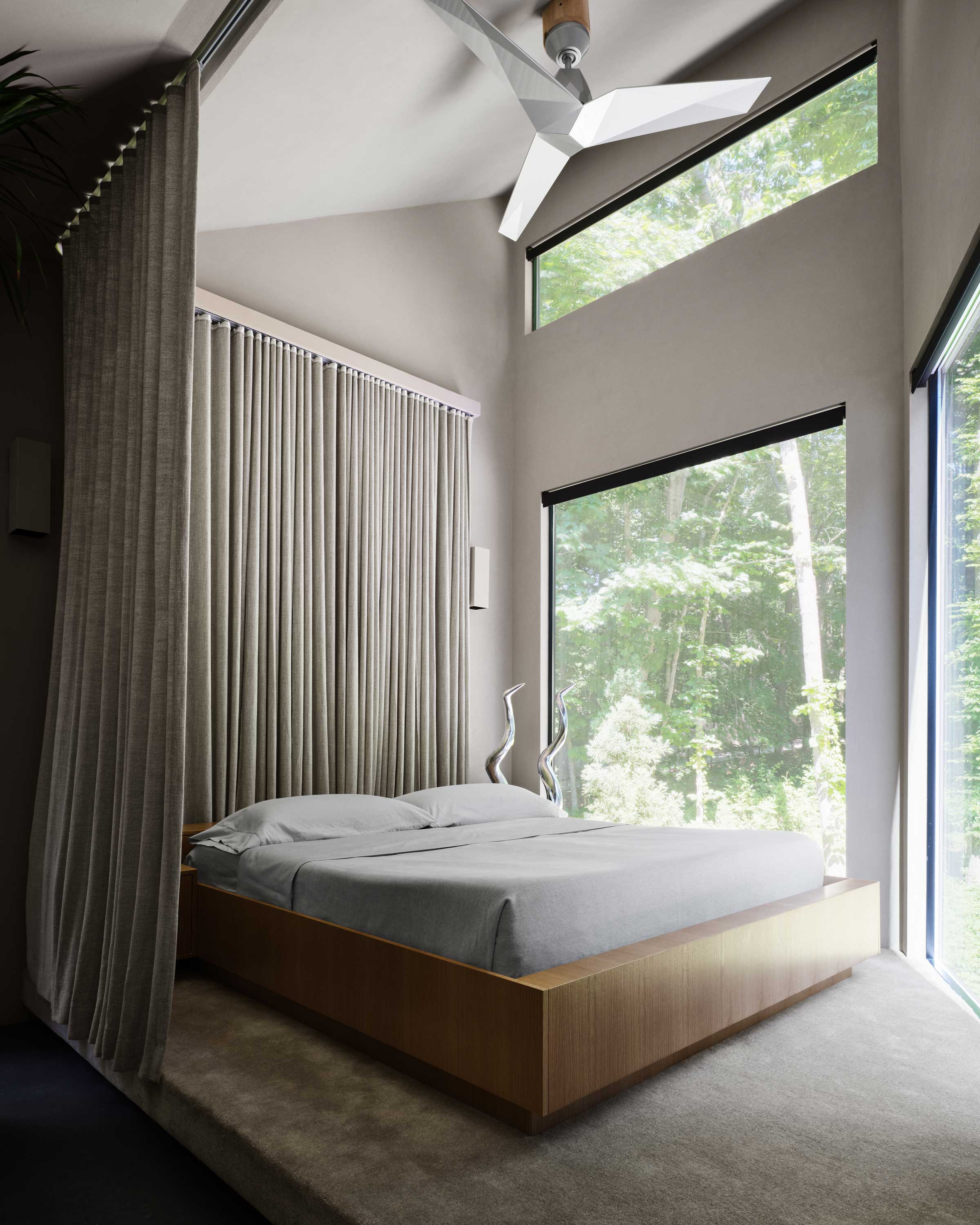
Against the "hardness" of the angular forms and stucco walls, a softness is introduced as a counter-balance. In the living room, curvaceous, textured sofas offer a foil to the domineering architecture, while in the modern bedroom, the bed has been surrounded with drapes to create a smaller-scale refuge within the home.
'Because I took the wall out between the bathroom and the bedroom the skylights flood light into the room in the morning, the drape closes off the whole area at night so I can sleep without any light coming in to wake me up,' Timothy explains. 'It is also a great way to add softness to a space, which I discovered in the 90s at the Delano in Miami and through Starck’s clever use of drapery as walls.'
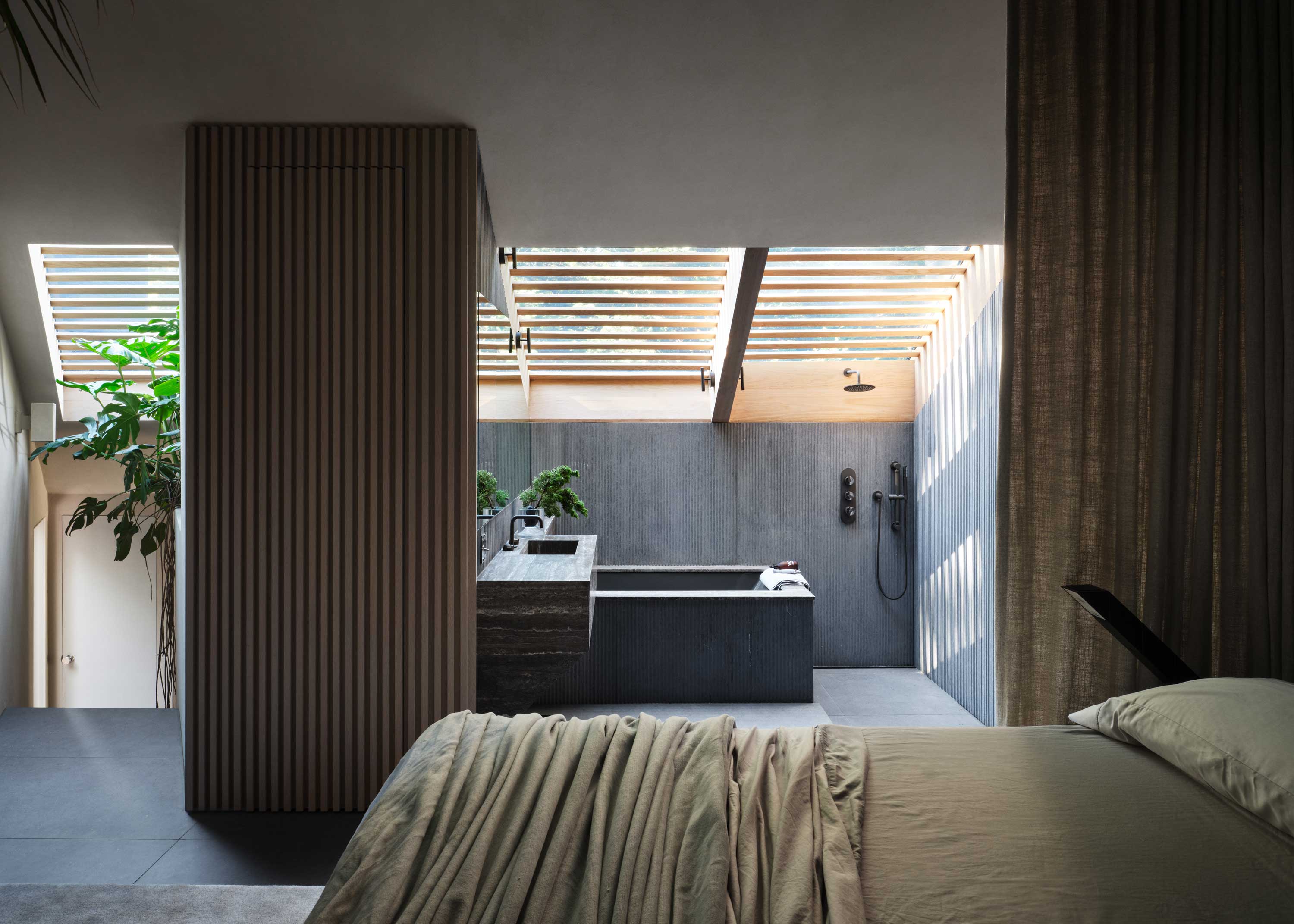
Against the softness of the bedroom, the open plan ensuite returns to a harder materiality, harking back to Bond lairs and bunkers. 'The walls are an exterior fiber cement that are 10’x 4’ so it is very easy to create areas without any join lines,' Timothy tells us. 'It helps create a custom look which gives a space integrity. The cement texture adds another layer of interest, and the use of titanium travertine keeps the palette dark and moody.'

'The use of steel is another reference to Bond, but also from the 70s and Gae Aulenti’s interiors of that period,' Timothy explains. In one of the guest bedrooms, an imposing bed features a sculptural steel desk incorporated into the footboard, inspired by Charles Gwathmey, an American architect who is one of America's most prominent modernists in history.
'Gwathmey would design furniture that had multiple purposes and he used this technique throughout his career,' Timothy explains. 'Gwathmey would put a bed in the middle of a room, not up against a wall like everyone else. He would then build the headboard to be a desk or a set of drawers. I took this idea to create a desk at the end of the bed. The room is not big, so by adding a desk to the footboard I saved about 20” depth of space in the room, which when you are working with finite measurement is a huge saving.'
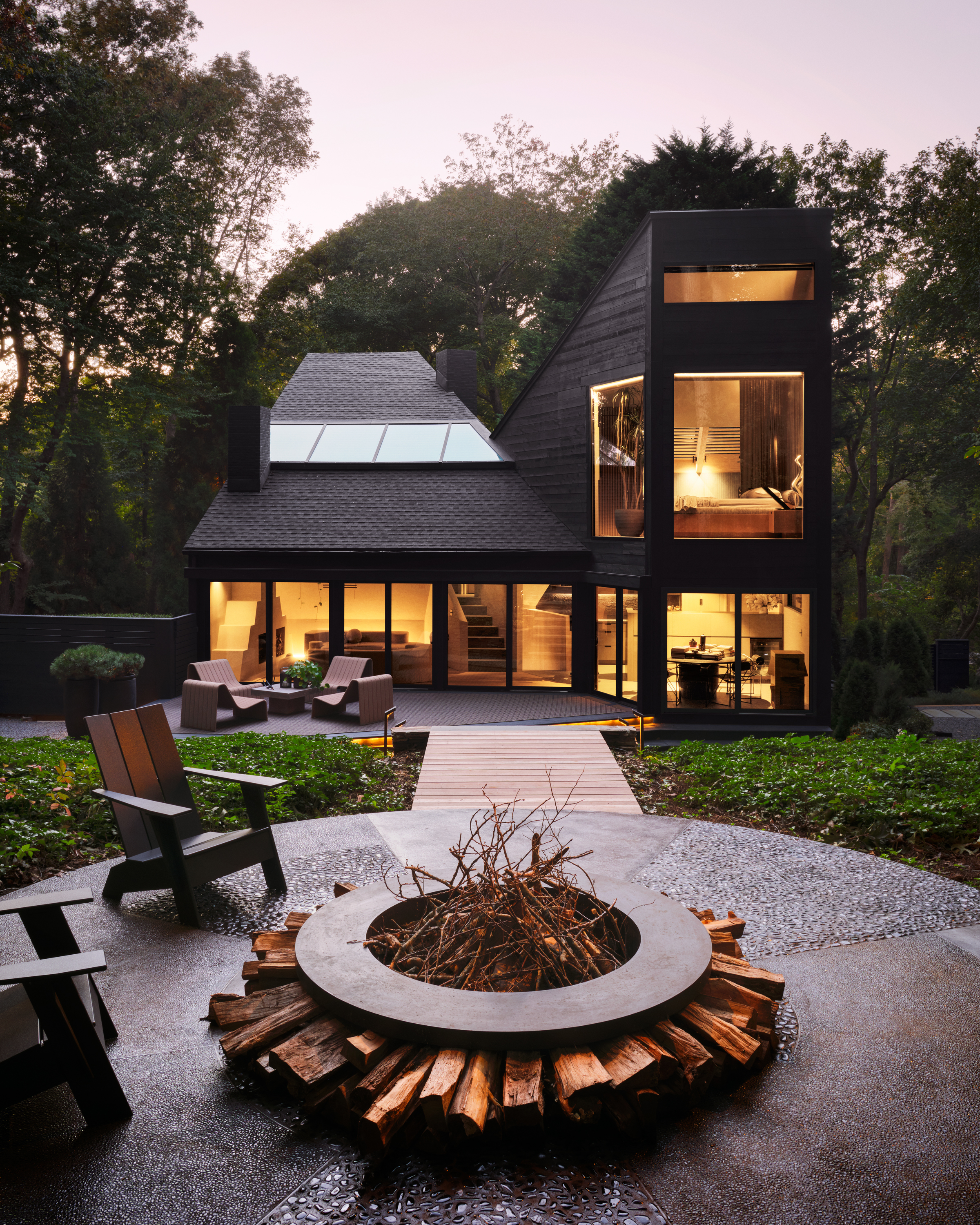
In spite of the vision for a lair-like home, there were some compromises to be made. The biggest challenge? 'Keeping its integrity,' Timothy says. 'I had one arm tied behind my back the whole time as I live on a wetland, and I can’t touch the house's footprint.'
'I had wanted to build a Bond-esque garage in cement underneath the house with a crazy floating staircase to the main house, but I was told very early on it was a “key turn only house” therefore, I had to be clever in how I updated the house (and forget owning a sports car).
'The one thing I did was turn all the sliding windows into massive picture windows, and redesigned all bedroom windows and doors to full floor to ceiling height.' It's a modernization that walks the line perfectly - retaining the Modernist values of this spectacular home, while embracing the strides forward made in contemporary architecture.

Hugh is Livingetc.com’s editor. With 8 years in the interiors industry under his belt, he has the nose for what people want to know about re-decorating their homes. He prides himself as an expert trend forecaster, visiting design fairs, showrooms and keeping an eye out for emerging designers to hone his eye. He joined Livingetc back in 2022 as a content editor, as a long-time reader of the print magazine, before becoming its online editor. Hugh has previously spent time as an editor for a kitchen and bathroom magazine, and has written for “hands-on” home brands such as Homebuilding & Renovating and Grand Designs magazine, so his knowledge of what it takes to create a home goes beyond the surface, too. Though not a trained interior designer, Hugh has cut his design teeth by managing several major interior design projects to date, each for private clients. He's also a keen DIYer — he's done everything from laying his own patio and building an integrated cooker hood from scratch, to undertaking plenty of creative IKEA hacks to help achieve the luxurious look he loves in design, when his budget doesn't always stretch that far.
-
 My 10 Favorite Designs at Milan Design Week 2025 — Out of the Hundreds of Pieces I Saw
There is a new elegance, color, and shape being shown in Milan this week, and these are the pieces that caught my eye
By Pip Rich
-
 Iridescence Is Chrome’s More Playful, Hard-to-Define Cousin — And You're About to See It Everywhere
This kinetic finish signals a broader shift toward surfaces that move, shimmer, and surprise. Here's where to find it now
By Julia Demer
