'Like a puzzle, the pieces fell into place' – how "jewel box" spaces set the tone for this large family's Brooklyn home
In Brooklyn, Charles Cohen Designs completed a gut renovation on a house for a large family — who isn’t afraid of a little color and wanted a space with a strong visual impact
Tucked away in Brooklyn’s Gravesend neighbourhood, where residents enjoy a more laid back lifestyle away from the hustle and bustle of Manhattan, is this 1930s-era house, now home to a lively family of seven. The challenge for its designer, Charles Cohen, was in creating a space that worked both for the many needs of its various inhabitants - this is a family that likes sport, dance, baking, reading and more - as well as having the kind of crafted, contemporary look the owners were after.
Local to the area, the couple - James, who works in a family-owned business that manufactures and imports clothing, and Linda, who is a children’s book author - have five children ranging in age from two- to 16-years-old. ‘Being a large family in New York City, where good real estate is expensive and hard to come by, it was important for James and Linda to have their new home accommodate not only their day-to-day lives, but also afford them the space to entertain and host frequent family gatherings, friends, and children’s parties,’ says Charles.
Here's how the designer tackled the demanding brief for this modern home.
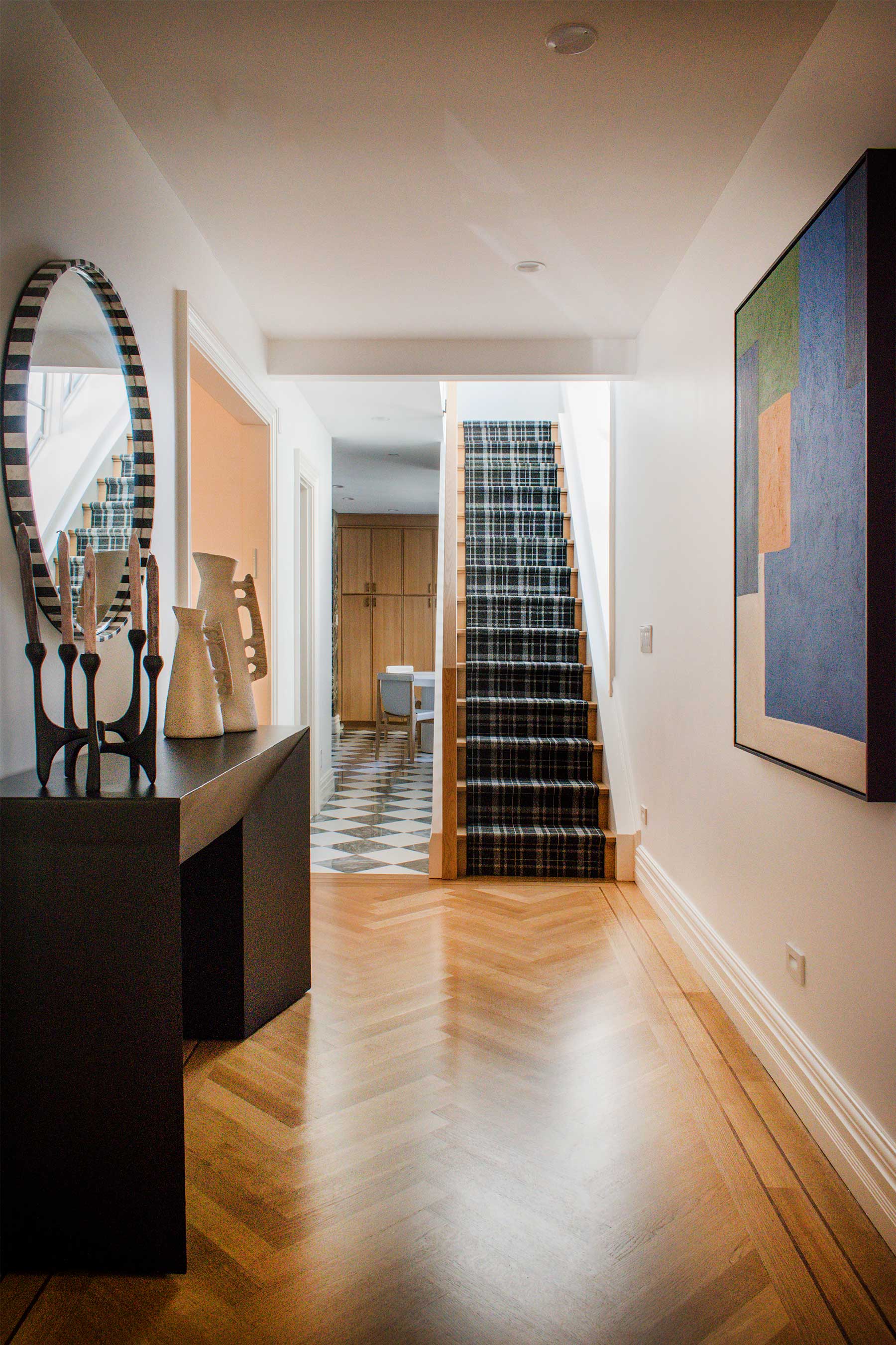
‘We worked hard to create a welcoming foyer, while emphasizing the length of the home through small viewports, inviting family members or guests to further explore,' says Charles.
The house — originally rather dated and divided into too many smaller rooms to work for modern family life — took 14 months to reno and revamp. ‘I was immediately excited to be involved, as I knew it needed a lot of lifestyle upgrades in terms of fitting the needs of the growing family, while encompassing a cohesive design,’ remembers Charles Cohen, who had also worked on the owners’ previous house, in the process developing a friendship as well as a very good working relationship with them.
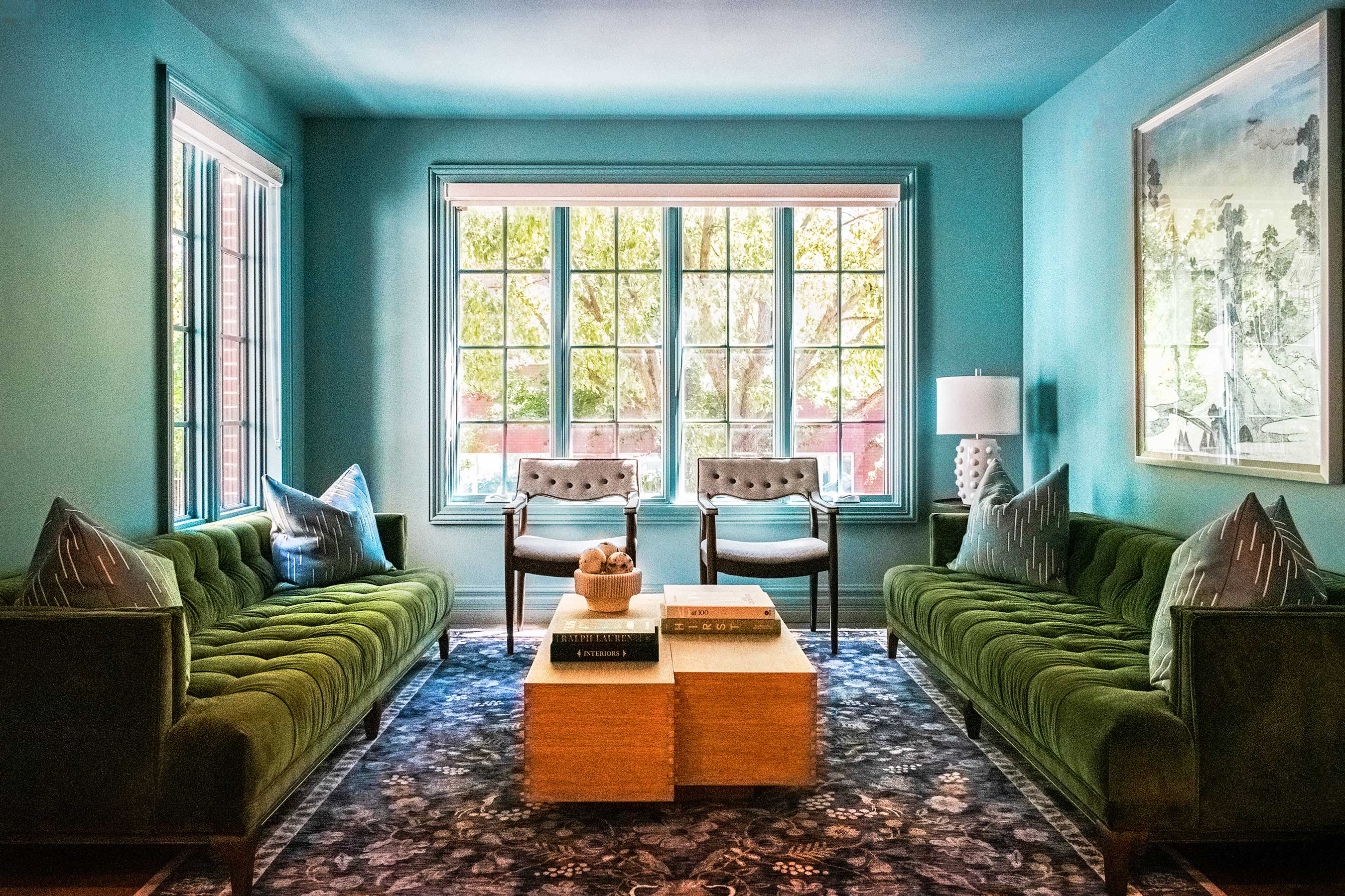
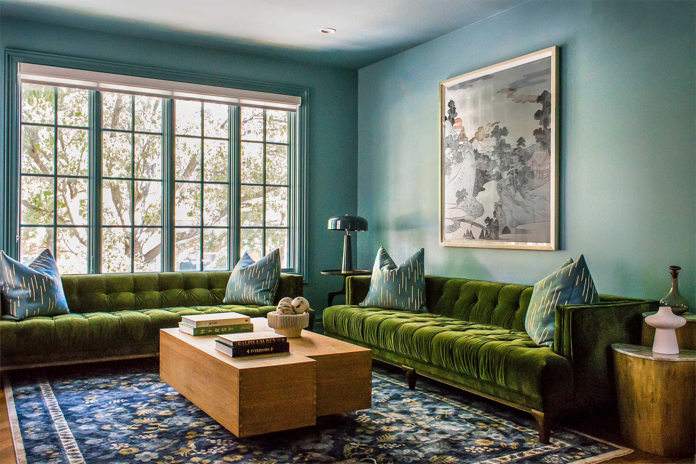
‘It is the jewel box of the home,' Charles explains of this colorful living room. 'Plenty of natural light and the calming teal-colored walls helps create a soothing and uplifting atmosphere, while the rich green velvet sofas add a touch of elegance and luxury.’
‘The key consideration was the function of each space — how was it to be used and who by? During the spatial planning stage, we carefully divided the rooms and thresholds to ensure the maximum use for each one of them, considering things such as entries and exits, sometimes combining two adjacent spaces, sometimes closing off others.’
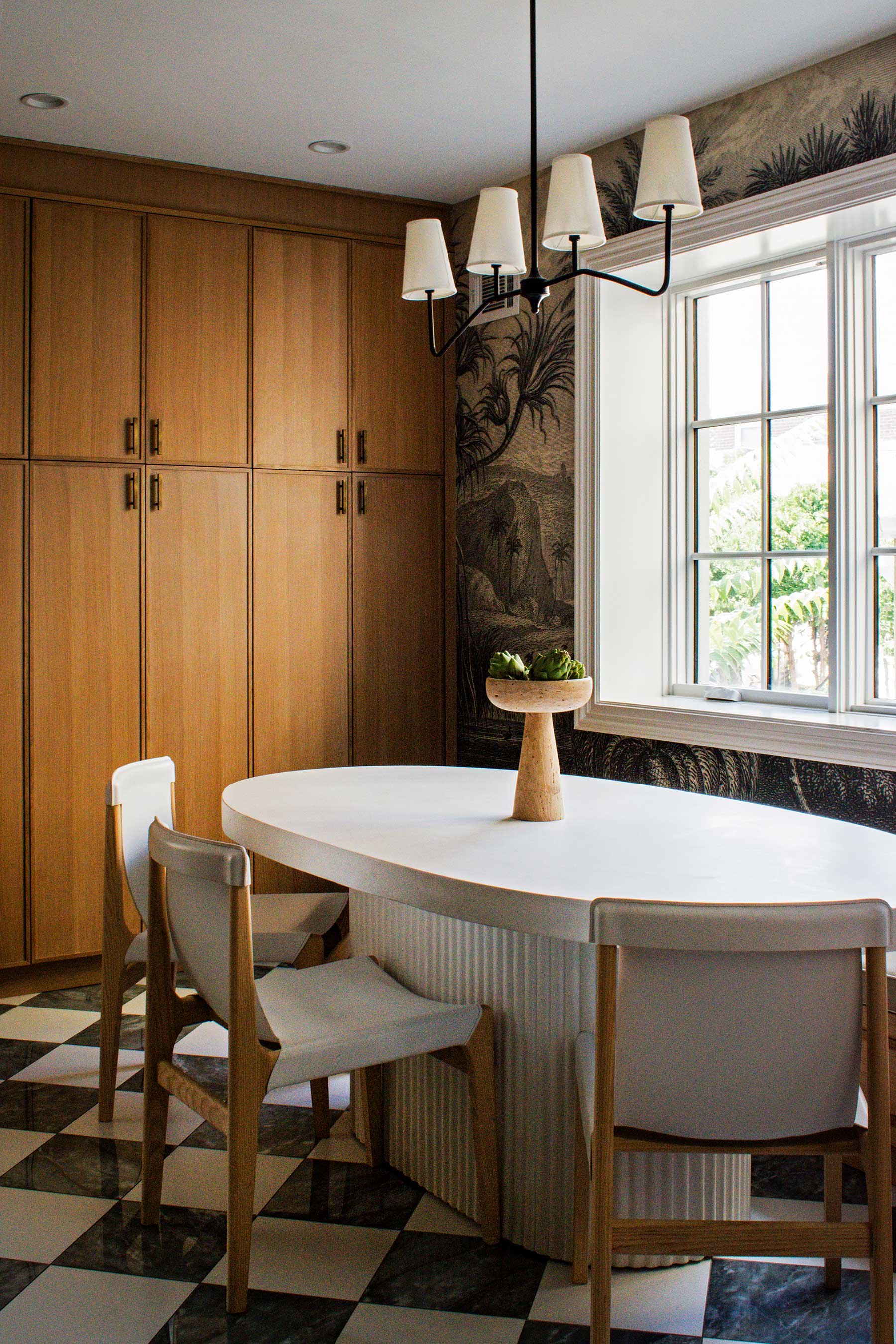
‘With weekly family Friday night dinners, as well as often having guests over, it was important to the owners to have a space where they can comfortably gather,’ Charles says of the dining room.
The result is now an effortless flow between the spaces but with each area also having its own distinctive identity. A trad layout was transformed to create a vibrant family home packed with personality, featuring luxe finishes, natural earthy materials and warm fabrics. ‘The biggest challenge was making sure the home was kid-friendly and durable,’ says Charles. ‘My sources of inspiration were based around the family and how they were to live in this space.’
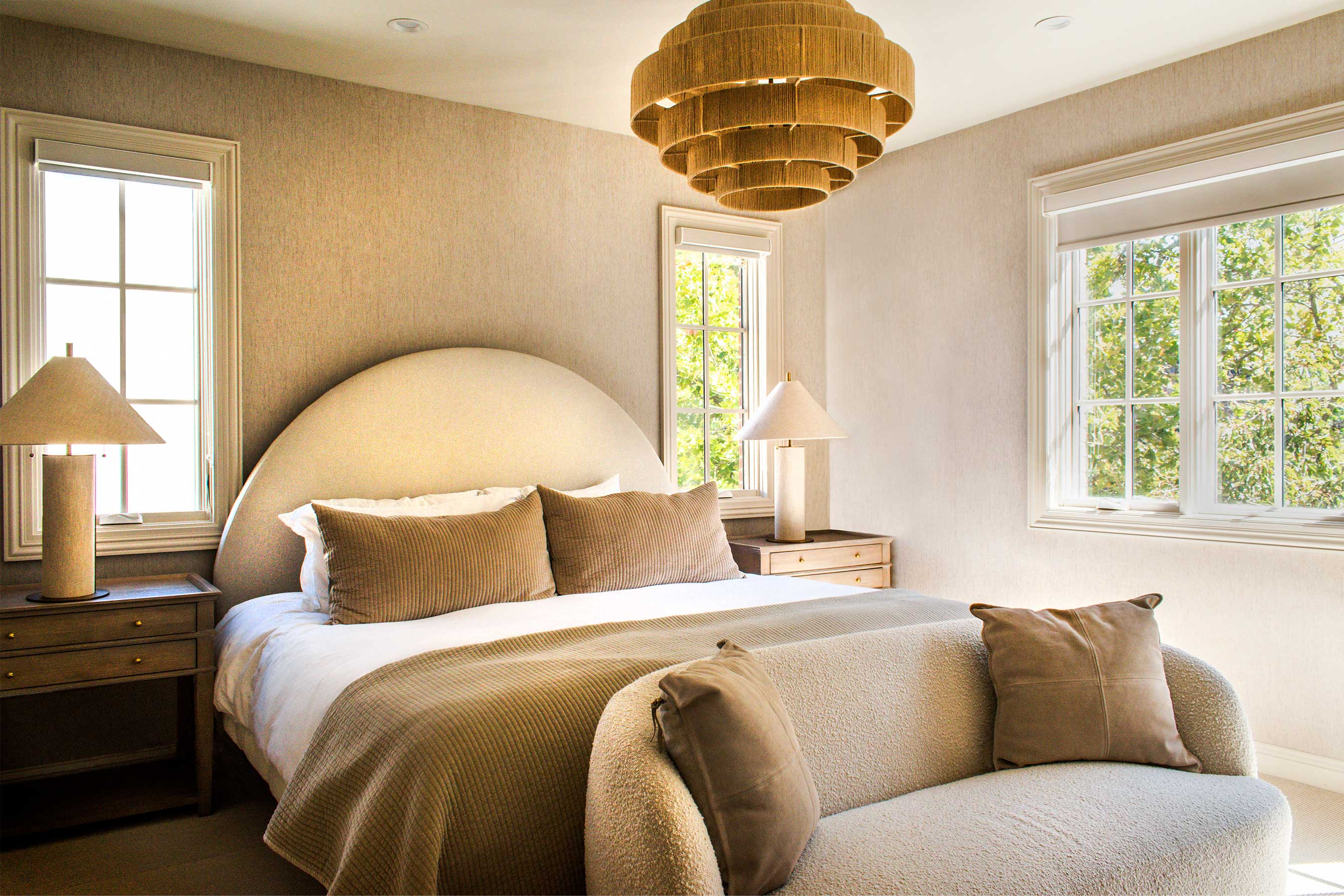
The custom headboard and pillows were all designed by Charles. ‘Overall, this primary bedroom exudes a sense of zen and tranquillity, with its minimalist design, soft colors, and plush textures,' the designer says.
Decoratively Charles chose to use neutrals combined with pops of jewel tones to achieve the desired sense of calm where timeless comfort and elegance meet a more youthful edge. Different materials, patterns and textures feature throughout the home: white oak and marble floors are combined with wool rugs, bouclé fabrics, vibrant accent wallpapers, custom canework and travertine to all bring the space to life.
Be The First To Know
The Livingetc newsletters are your inside source for what’s shaping interiors now - and what’s next. Discover trend forecasts, smart style ideas, and curated shopping inspiration that brings design to life. Subscribe today and stay ahead of the curve.
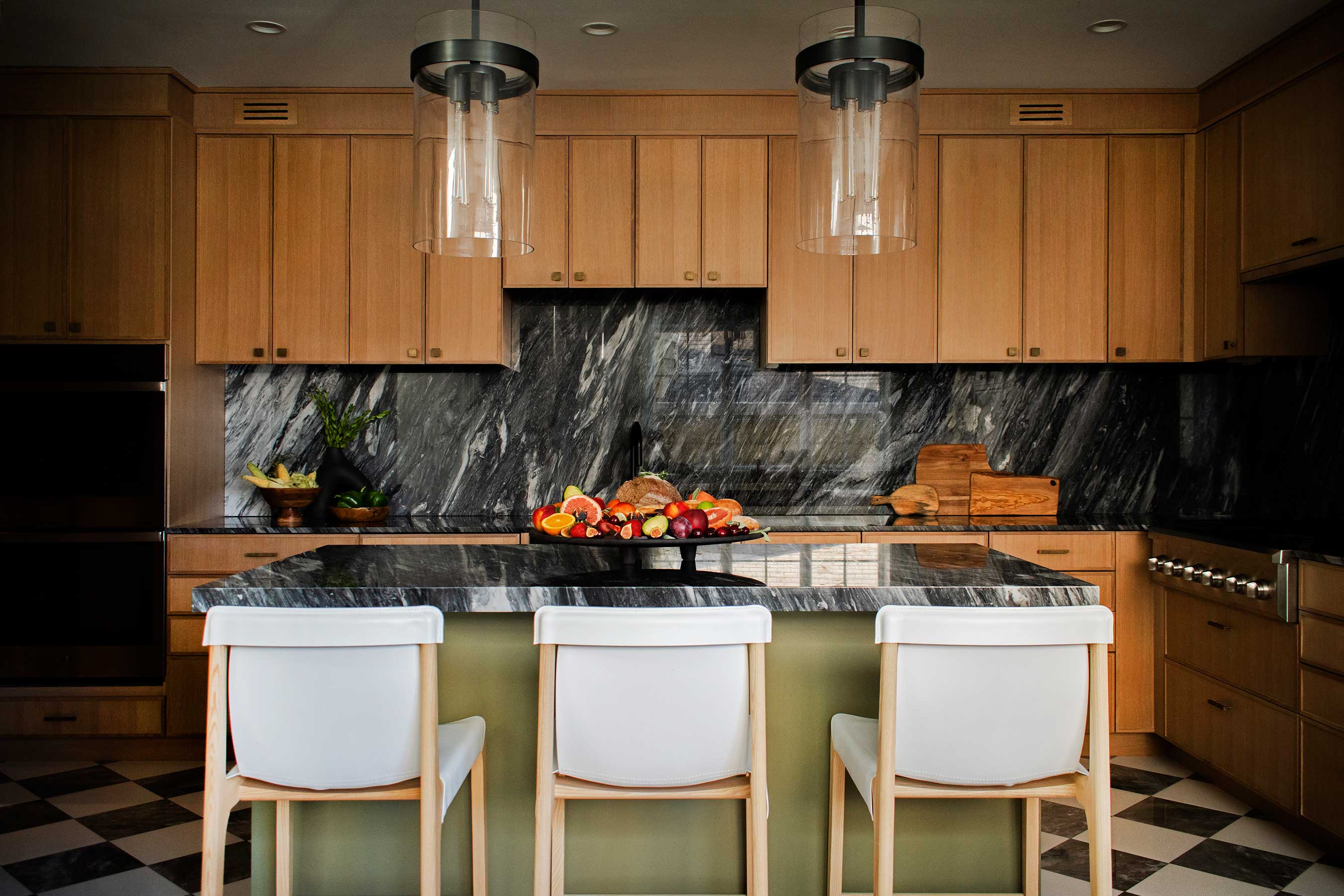
‘It didn’t take too long before falling in love with the thin shaker white oak cabinets. Every selection after that just fell into place, like a puzzle, coming together to fit the house as a whole.’ The cabinets are from S&H Kitchens.
‘I wanted to create a cheerful, modern twist on a classic townhouse design, reflective of the young, fun, family of seven,’ says Charles. For example, the kitchen blends the designer’s style and the family’s desire for both quality materials and great functionality. Charles’ signature checkerboard flooring evokes a classic and timeless feel, while the sage-green island and whimsical mural wallpaper bring plenty of personality to the room. And with every other room telling a similarly strong visual story, this is a vibrant home that’s both oozing style and filled with life.
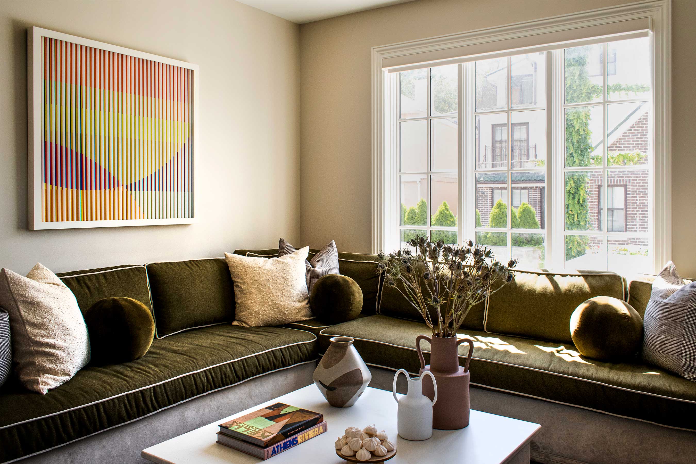
‘This cozy den, which is small but mighty, brings the family together for movie nights, with a spot for everyone and the popcorn flowing.’
A French trilingual editor, content creator, and interior stylist living in Southern California. A compulsive reader of design, architecture, and lifestyle magazines, and an avid traveler, Karine lives and breathes interiors and is inspired by designers Nika Zupanc, Charles and Ray Eames, and Marcel Wanders; architects Luis Barragán and Frank Gehry; artists Gerhard Richter, Beatriz Milhazes, and Anish Kapoor. For the past 12 years, Karine has been contributing to international design, architecture, and fashion publications including Architectural Digest, ELLE Decor, Vogue Living, Design Anthology and MilK Decoration, among many others.
-
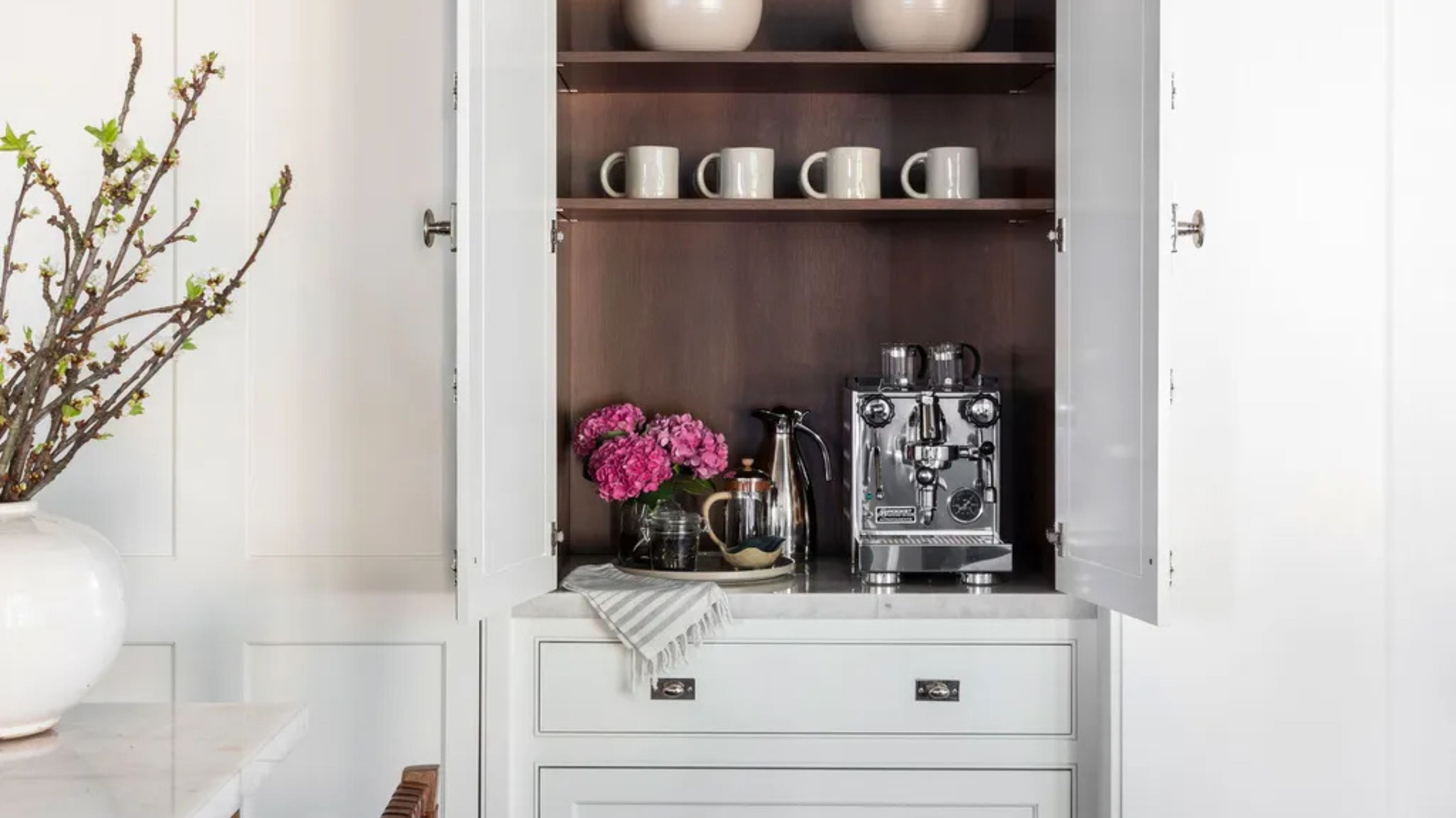 Turns Out the Coolest New Café is Actually In Your Kitchen — Here's How to Steal the Style of TikTok's Latest Trend
Goodbye, over-priced lattes. Hello, home-brewed coffee with friends. TikTok's 'Home Cafe' trend brings stylish cafe culture into the comfort of your own home
By Devin Toolen Published
-
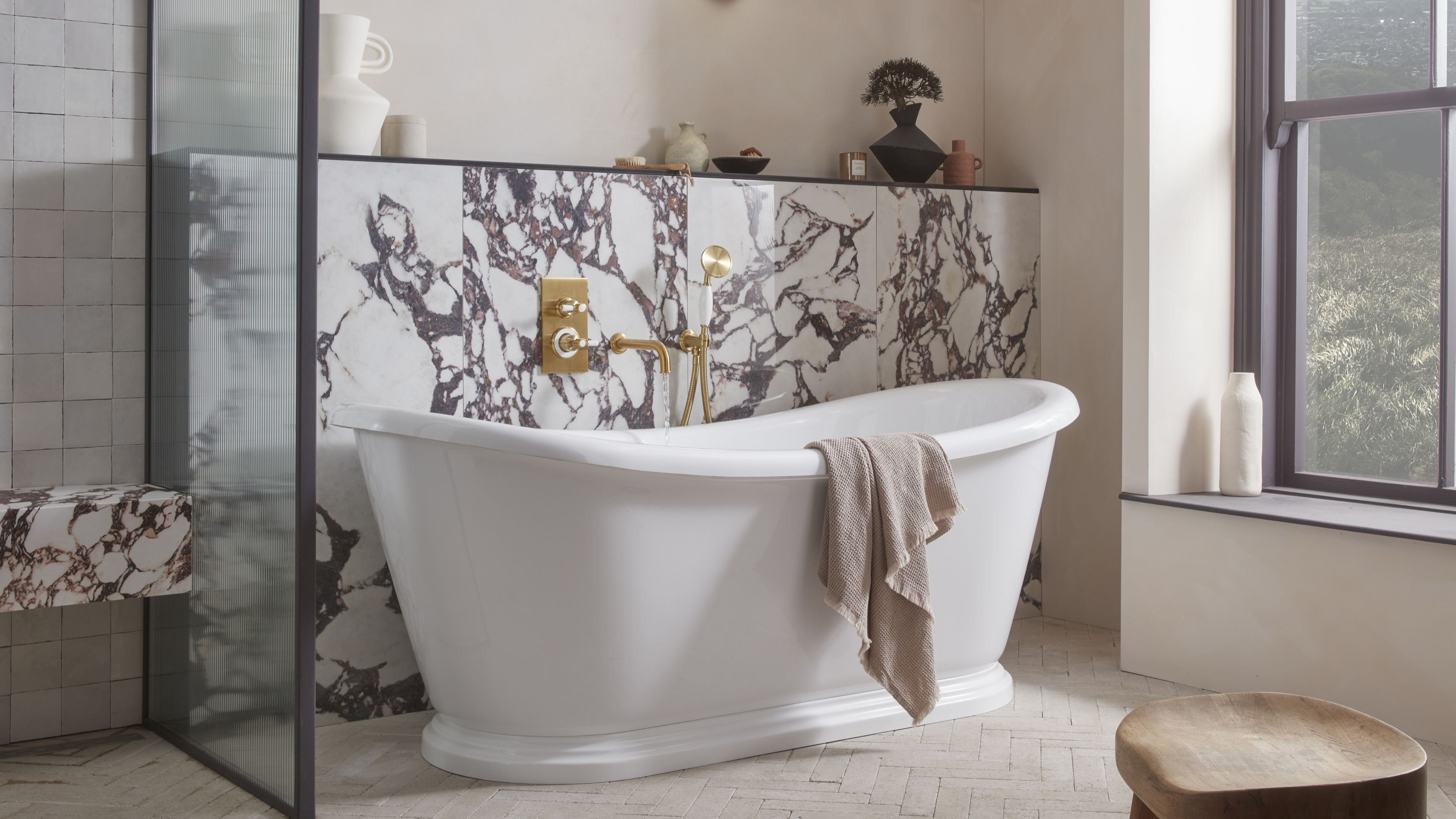 5 Bathroom Layouts That Look Dated in 2025 — Plus the Alternatives Designers Use Instead for a More Contemporary Space
For a bathroom that feels in line with the times, avoid these layouts and be more intentional with the placement and positioning of your features and fixtures
By Lilith Hudson Published
