'It’s the perfect creamy off-white' – these designers chose this exact Farrow & Ball color to spray a townhouse's kitchen
The Brownstone Boys have paid homage to traditional Brooklyn townhouses with this restoration project. From the kitchen to the bedroom these are the paint colors they used
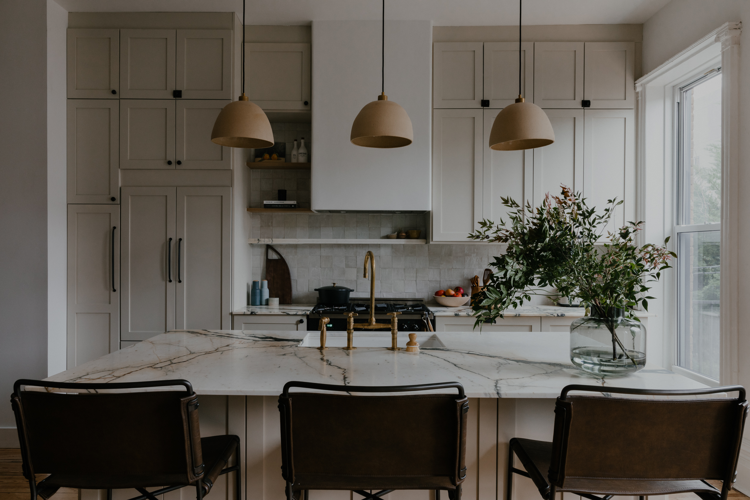

Located in the heart of Brooklyn’s largest Brownstone neighborhood, Bedford-Stuyvesant, this 19th century home was in need of serious restoration after years of neglect. After the homeowners enlisted the help of The Brownstone Boys, it's now a beautiful three-story family home with a large open kitchen and living area, flooded with natural light.
The brief? To save and embrace original features, giving them a new lease of life in a contemporary setting. The hardwood floors, stair banister, plaster moldings, and stained glass are all details that have been lovingly restored.
'We even brought back in some things that might have been missing in a Brownstone, like marble fireplace mantels,' says Jordyn and Barry, 'but even with all of that historical charm, this is no relic from the past.' I spoke to the designers, Jordan Slocum and Barry Bordelon, to find out how they went about converting this classic Brownstone into a modern home suitable for family life.
The kitchen
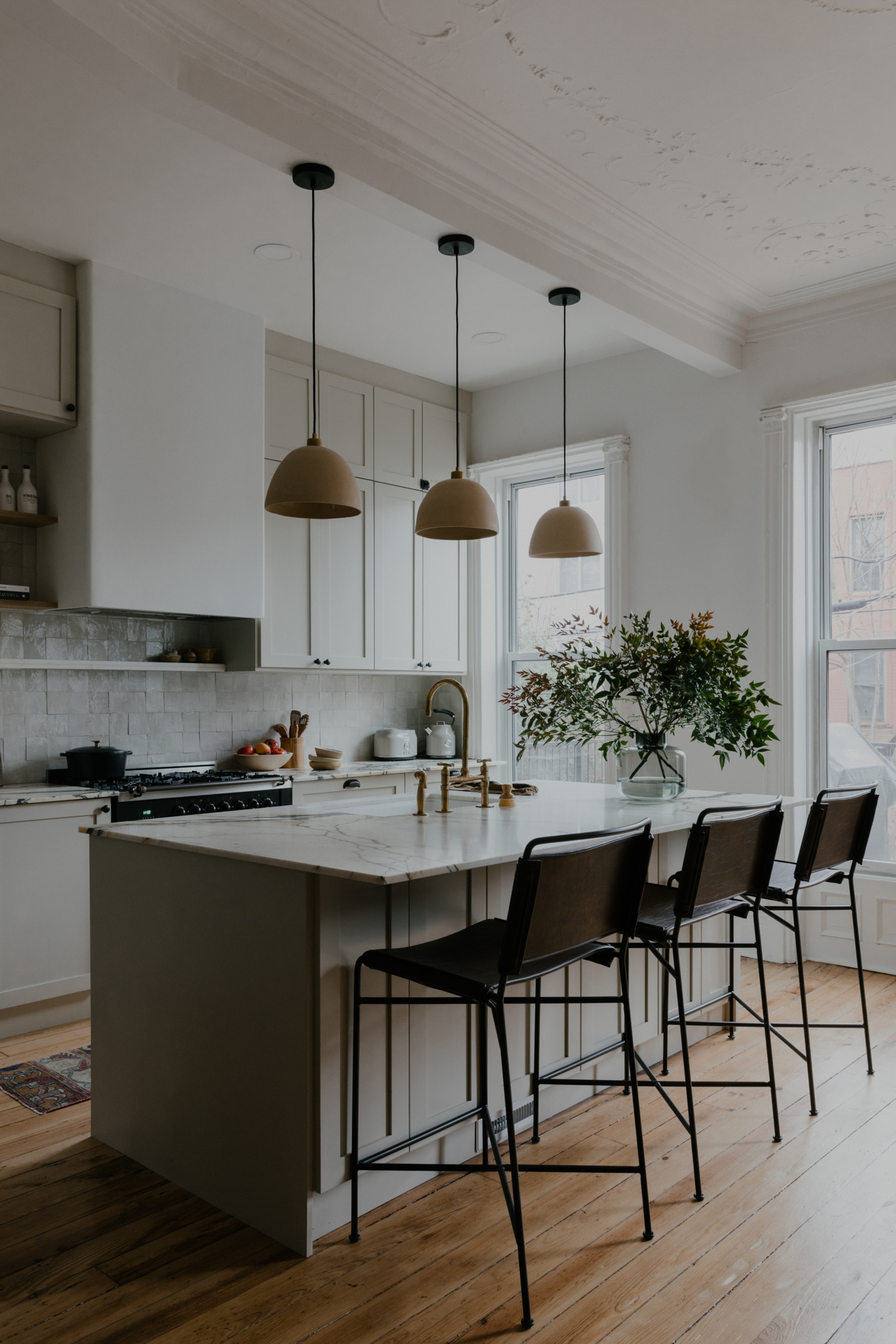
Open and airy, with high ceilings, original crown molding, decorative plasterwork and floor-to-ceiling windows, the kitchen sits at the back of the home. 'We wanted to allow natural light to flow through the house organically while designing the space,' explain Jordyn and Barry.
'To allow for that, we added really neutral tones on the main living spaces.' The kitchen is neutral on neutral with DIY Shaker kitchen cabinets custom sprayed in Shaded White from Farrow & Ball. 'It’s the perfect creamy off-white color and the neutral color scheme kitchen is one of our favorite things in the house.'
'We let the architecture and original features of this house speak for themselves with a nice clean white paint on the walls and ceilings. It makes emphasizes the richness of the original details.'
This beautiful, creamy off-white shade really helps the original details take center stage. The tone is a perfect warmth and not too bright white so as to avoid coldness, and the Brownstone Boys have paired it with a truer white to really make this shade stand out.
The neutral paint works with the original hardwood kitchen flooring, helping the wood to really shine. The three hanging pendants that sit above the island also go far to bring warmth to the otherwise pale color scheme. The kitchen island is a modern addition to the room, with doors that mimic the Shaker cabinet style.
Be The First To Know
The Livingetc newsletters are your inside source for what’s shaping interiors now - and what’s next. Discover trend forecasts, smart style ideas, and curated shopping inspiration that brings design to life. Subscribe today and stay ahead of the curve.
The kitchen island and kitchen countertops are topped with Calacatta Paonazzo marble, bringing drama to the space.
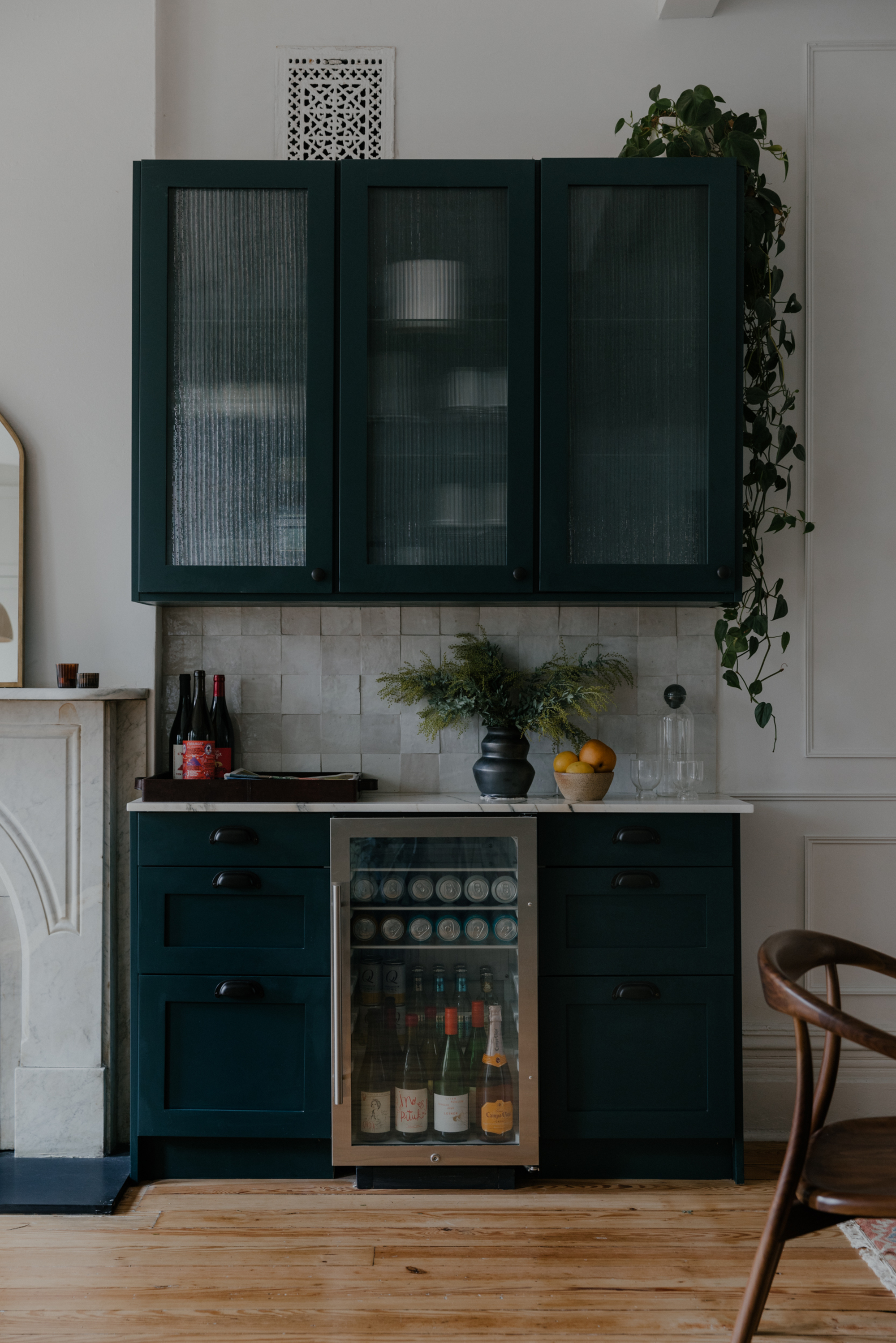
'To add to the kitchen, there is also a home bar cabinet in the kitchen in a dark blue shade of paint as well as white oak shelves that help warm up the neutrality of the scheme,' say Jordyn and Barry. The glass of the cabinet is fluted which gives it an antique-feel, calling to the heritage of the home.
The dining area
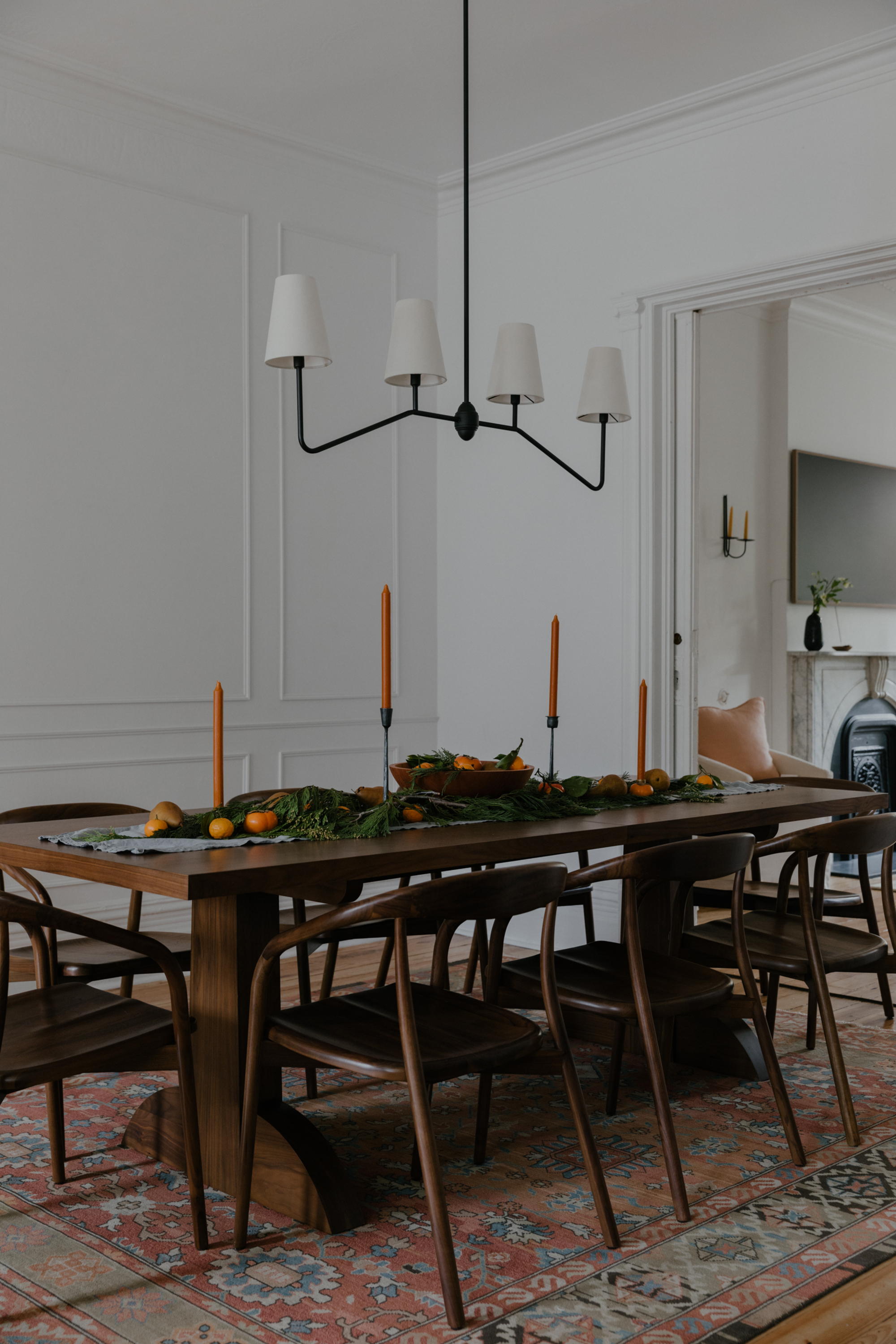
The kitchen area blends into the beautiful dining space where a large solid wooden table sits on one of many Persian rugs used in the home. 'The reds and pinks of the Persian rugs are the perfect complement to the neutral walls. The classic details of the house are also reflected in the classic nature of Persian rug. 'Since so much of the house is painted in neutral colors we wanted to bring in some contrast in the rugs used.'
From the dining area you can access the living room. Here the floor-to-ceiling windows allow for more natural light to come through and bounce off the white walls.
The marble fireplace is the star of the show of the living room, and the material connects the living area to the marble detailing in the kitchen.
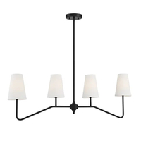
Kelly Clarkson home Diana pendant, Wayfair
A touch modern, a touch traditional, this statement light from Wayfair is one of our favorite picks for a transitional style dining room right now.
The stairs
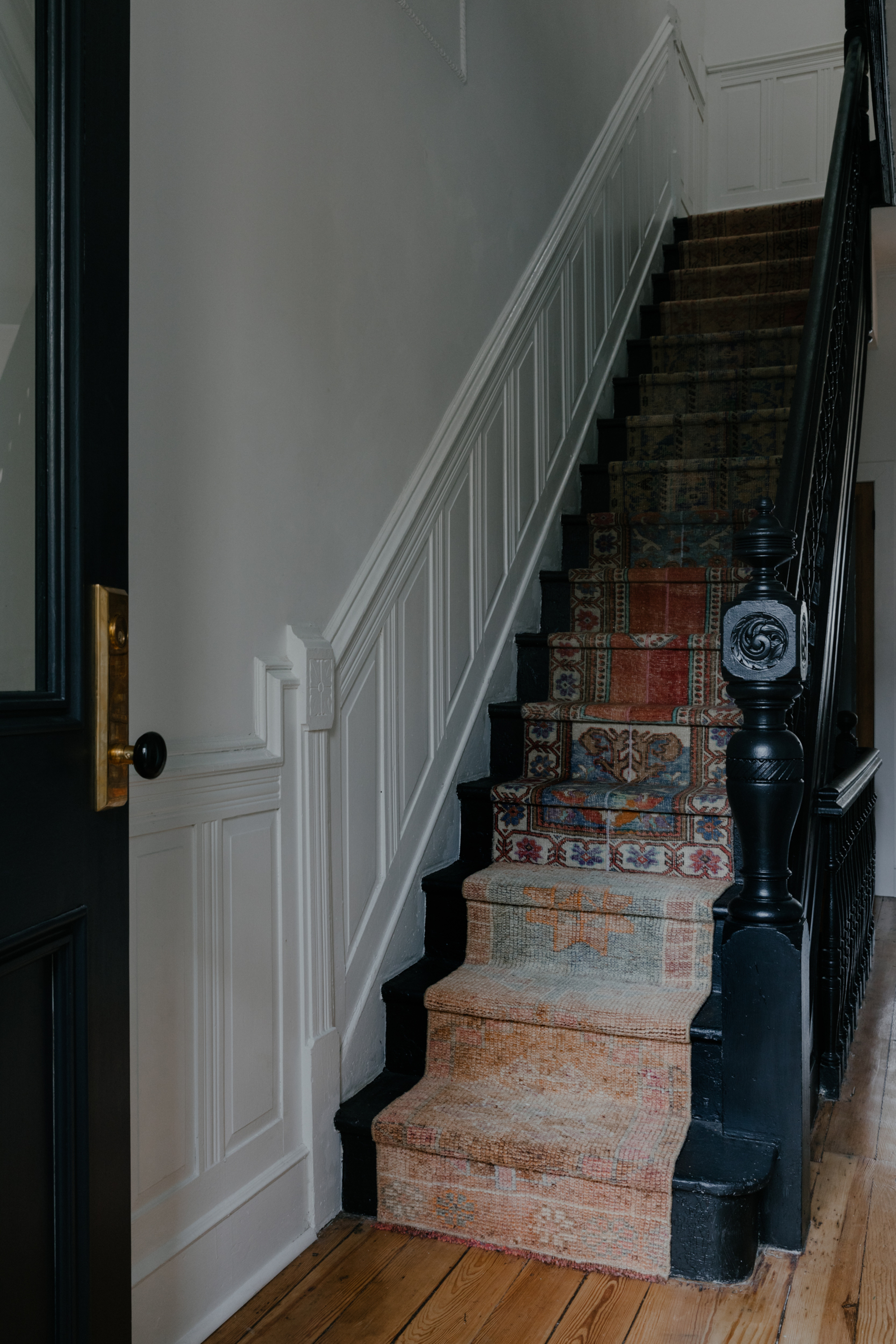
The stairs needed a lot of restoration. Built in the late 19th century, they were an original feature that the designers didn't want to have to tear out. It was a case of making it work with some forward-thinking. 'They really don't make things they way they used to!' say Jordyn and Barry.
'After the stairs were restored, we wanted to add a base of black. We chose Tricorn Black from Sherwin Williams and after they were finished and painted black, we knew we had to dress the staircase up.
An innovative staircase idea, the designers could not find a runner that they all agreed on. 'So collectively, with the homeowners, we had a fun idea to get smaller-sized vintage rugs and stitch them together to get one runner.
'We used different colors, patterns, and textures and now this staircase is truly an aspect of the house that we love so much.'
The main bedroom
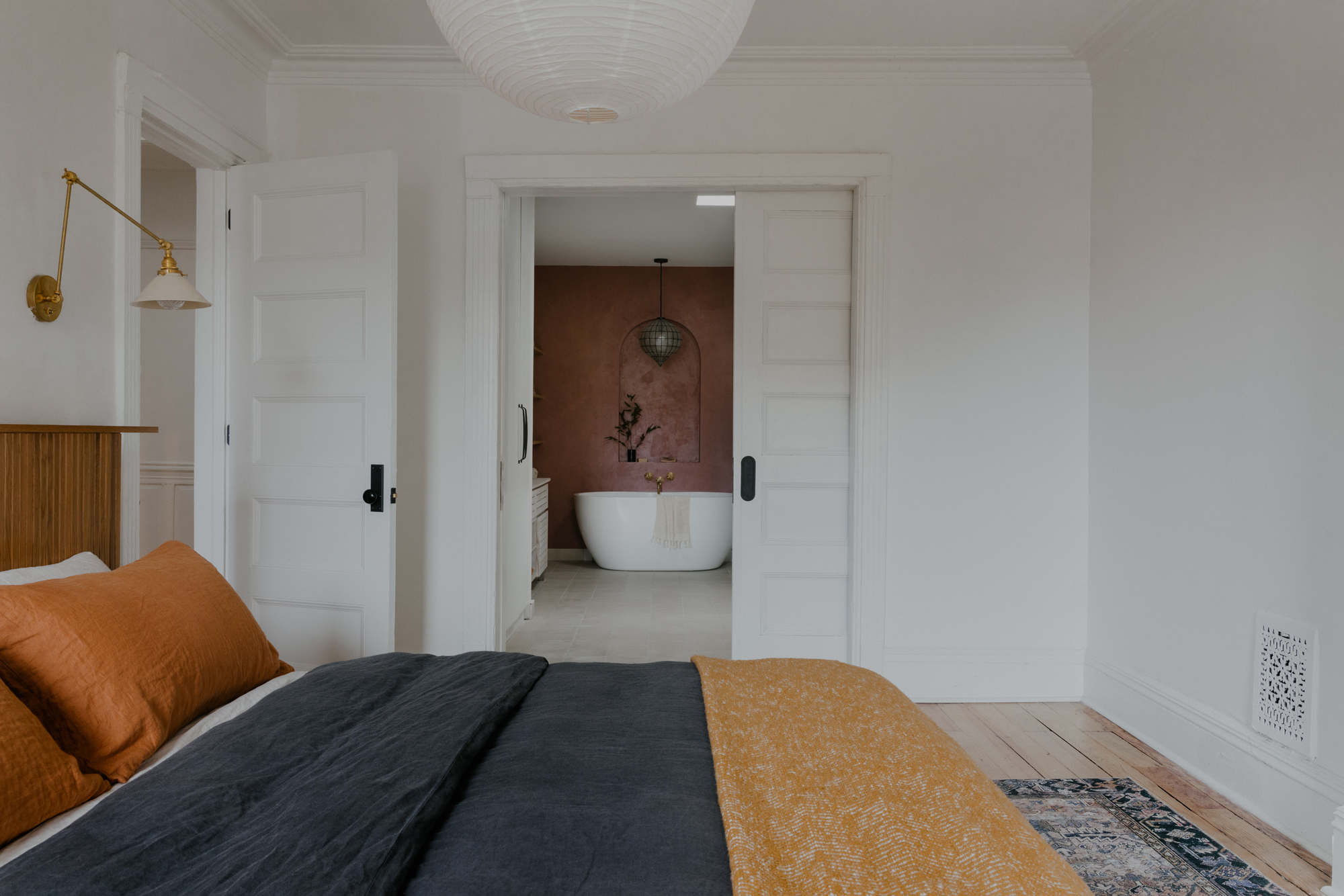
Upstairs and the master bedroom leads on seamlessly from downstairs, with white walls, wooden flooring, and accents of wood and bolder color pops. 'The homeowners are from different parts of the world,' say Jordyn and Barry. 'Taylor is from Australia and Moore is from North Carolina, they spent a lot of time together in California so we wanted to incorporate all of those vibes into a place they could rest and reset.'
'We did a beautiful base of pure white on the walls and designed color and textures that complimented the base paint using bedding patterns, furniture colors,' the designers explain.
The main ensuite
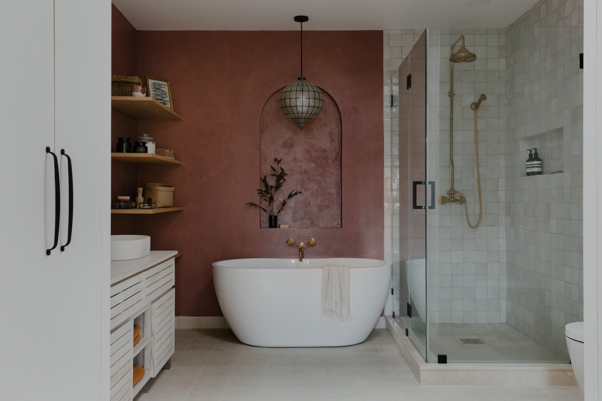
The door from the main bedroom takes you through to the main ensuite, with a Venetian plaster wall showstopper in Cortes from Portola Paints, a beautiful subtle terracotta color. 'The Venetian plaster wall is one of our favorites,' say Jordyn and Barry. 'This pink radiates throughout the entire primary suite.'
'Painting the opposite walls Pure White by Sherwin Williams in the bedroom really allowed the Venetian plaster to be the focal point. We made a custom arched niche behind the tub to really allow the bathtub to be a moment. We love the complimentary contrast with the neutral and beautiful toned plaster work.'
The guest bedroom
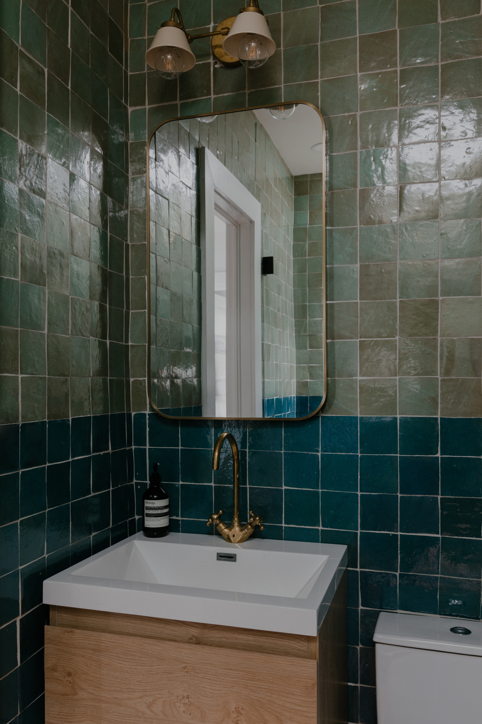
The guest bedroom is space where color really comes into its own with textured bathroom walls made of zellige tiles. The zellige quality creates a gentle sheen with their imperfect nature. Their hand-crafted appearance creates a relaxing bathroom feel.
'One of our favorite rooms in this home is the guest bathroom where you’ll see the two tones of zellige tile from Zia Tile,' say Jordyn and Barry. 'This allows it to pop no matter what sized space your working with and having the two different tones reflects more light off of its counter color.
'We think blue and green are such beautiful colors, especially when they are paired together. These two specifically worked really wonderfully together because you get so many different movements within each piece. With a terracotta base, you’re getting that ceramic feel as well.'

Former content editor at Livingetc.com, Oonagh is an expert at spotting the interior trends that are making waves in the design world. She has written a mix of everything from home tours to news, long-form features to design idea pieces, as well as having frequently been featured in the monthly print magazine. She is the go-to for design advice in the home. Previously, she worked on a London property title, producing long-read interiors features, style pages and conducting interviews with a range of famous faces from the UK interiors scene, from Kit Kemp to Robert Kime. In doing so, she has developed a keen interest in London's historical architecture and the city's distinct tastemakers paving the way in the world of interiors.
-
 Sateen vs Percale Sheets — What's the Difference, and Which Are Better?
Who would have thought a simple weave pattern could make all the difference to your sleep
By Devin Toolen
-
 I Asked Interior Designers to Share the Worst Design Trends They've Seen on Social Media — And What They Want to See Instead
Just because something is trending, doesn't mean it's tasteful — from dupe-culture to OTT lighting, here's what designers hate seeing in homes
By Devin Toolen
