I'm an Interior Designer — These Are the 5 Lessons I Learned When Designing My Own Home
Interior designer Cathie Hong gives us a tour of her Californian mid-century property, and explains the choices she made that made it into her perfect family home
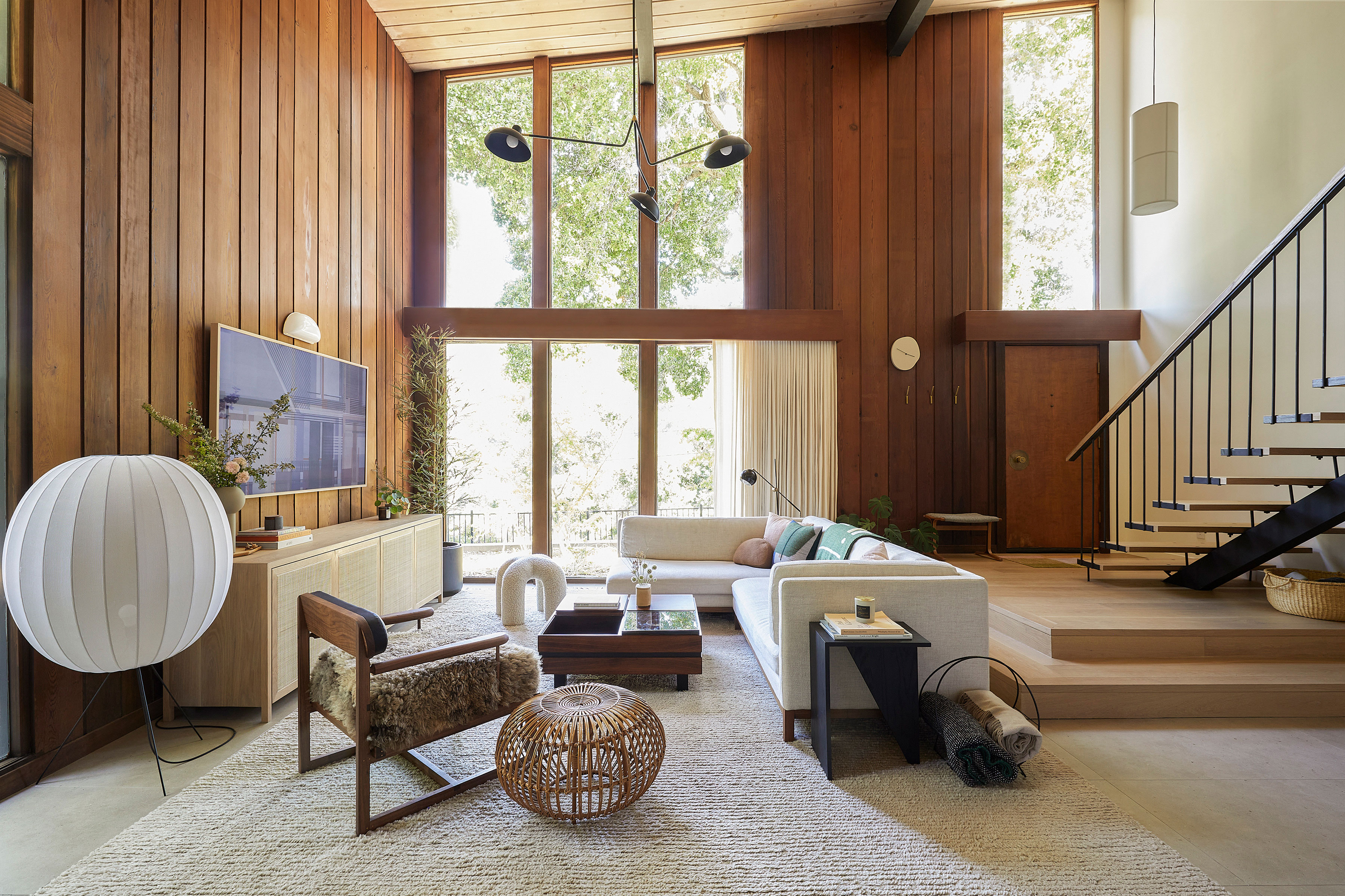

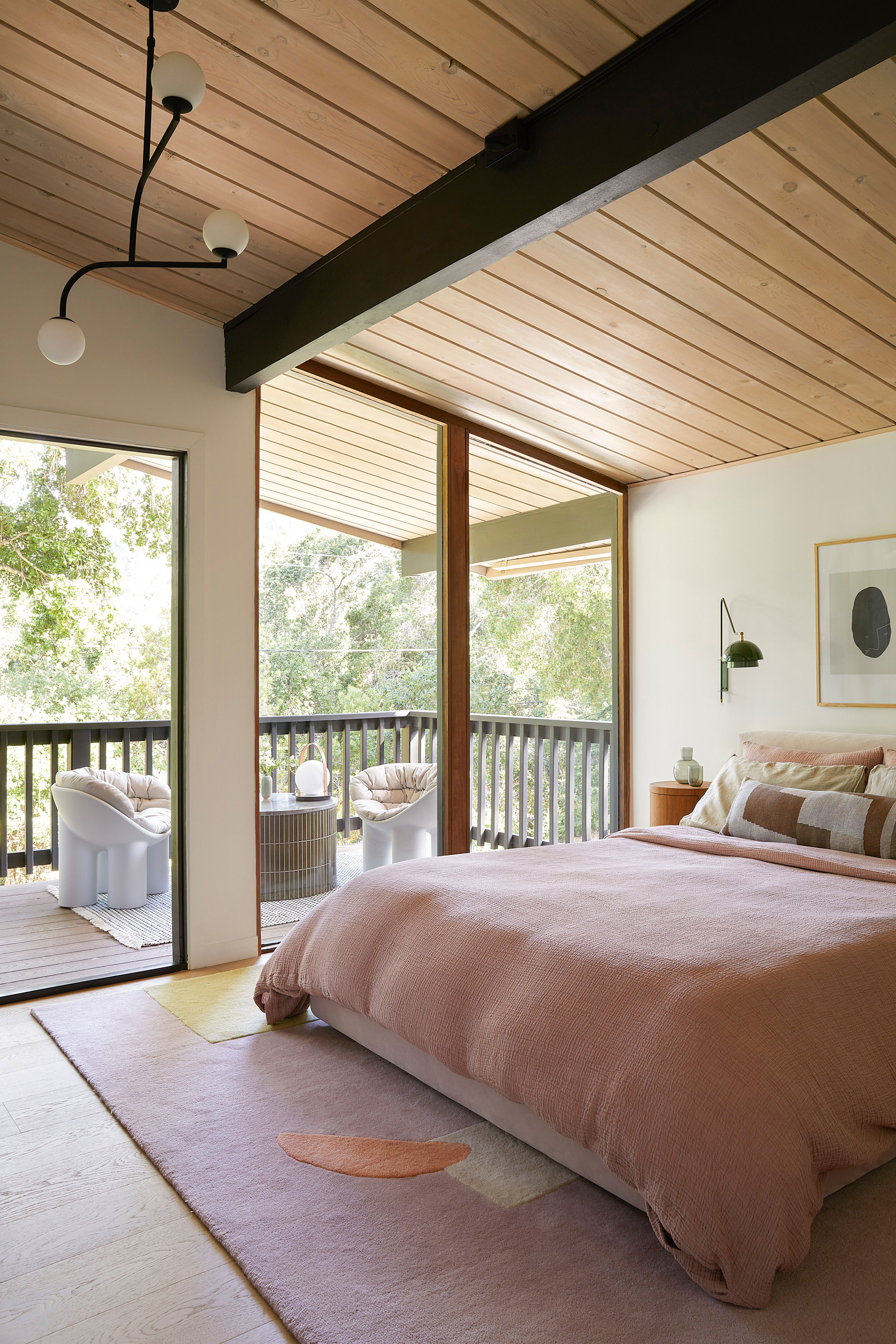
We made an impulsive decision during the pandemic to sell our ranch house and look for a mid-century fixer-upper instead. Being at home 24/7 with two full-time working parents, three remote-learning grade school kids, and a toddler, made it apparent that our current house was not large enough for our family. After a few disappointments, our realtor found out about an original-owner mid-century two-story house in the foothills of Los Gatos that was about to be listed on the market.
The house was clearly old and unkempt, but we both loved it immediately. The feeling when walking through the front door of the double height ceilings, open riser staircase, redwood-clad walls, and floor-to-ceiling glass windows, was awe. It felt like a magically cozy house nestled into the woods. We snapped a family photo in front of the house, wrote a letter to the beneficiaries, and were elated when they accepted our offer.
The design for this house felt simultaneously exhilarating and overwhelming. I loved that I had the freedom to take risks without a client to get approval from (aside from my husband, who was thankfully on board with most of the decisions). It's now a modern home that is a mashup of all the things I love: lots and lots of wood, dainty hardware, handmade Japanese tiles, terrazzo slabs, custom millwork, playful wallpaper, Korean artwork, and collected furniture.
I tried my hand at many new things with our house: a custom quartzite-topped dining table, a handmade tiled outdoor coffee table, a bathroom wrapped in pink grid tiles on all the floors and walls, a secret pantry door, and a very green custom dowel-pull wall cabinet with integrated green sofa.
Each of these new endeavors required risk and courage, and the house feels like a very personal story of reward following risk. These are the 5 lessons I learned through the process.
1. Embrace outside of the box thinking
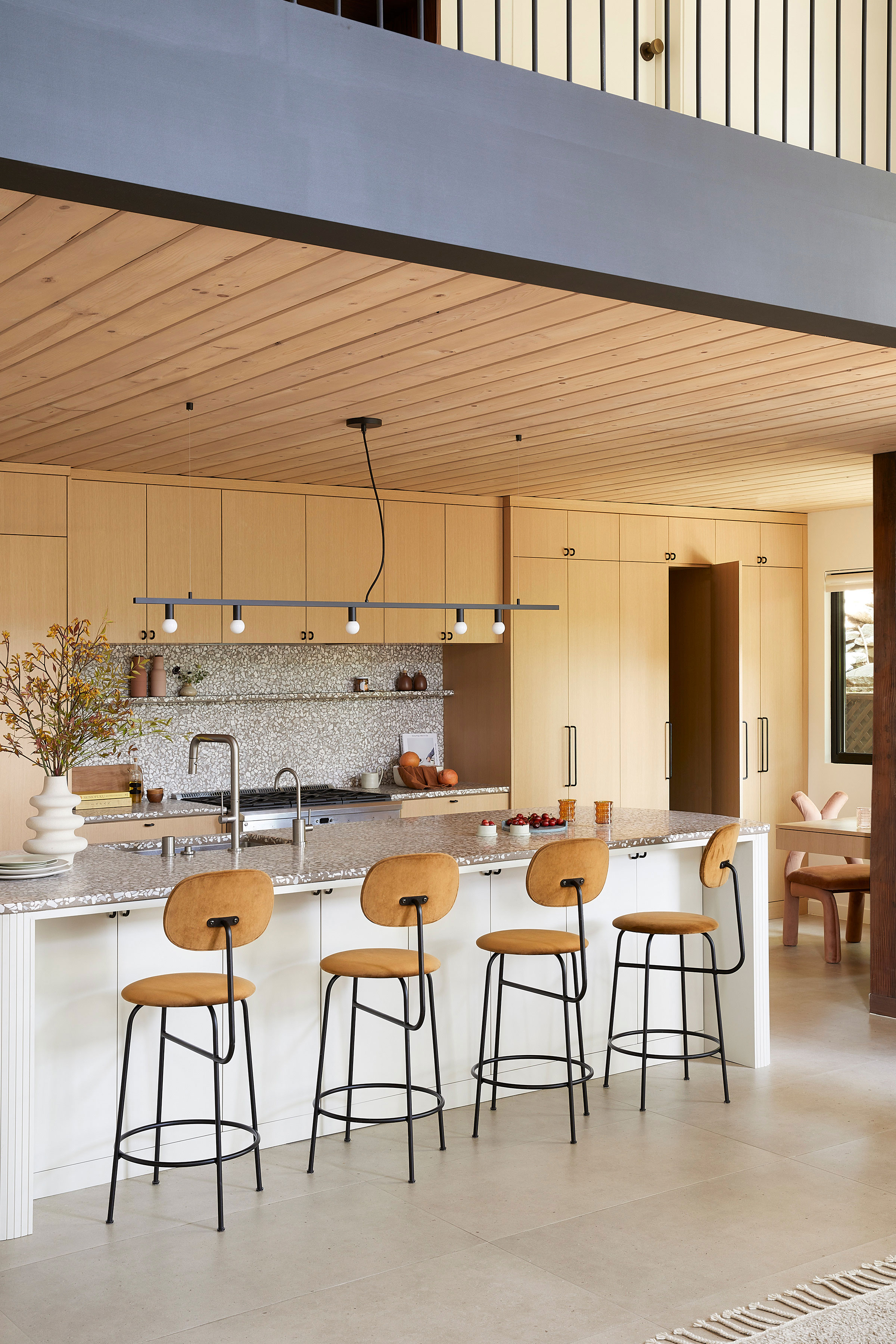
Though my house is architecturally mid-century with original redwood wall paneling and floor-to-ceiling windows, I also wanted to incorporate my own preference for softer, more minimalist, Japandi design. I went back and forth on my kitchen finishes many times, because it was hard to find example photos of redwood and light oak blended together in the same space, but ultimately decided that it was okay to do something uncommon and outside the box if it felt right to me.
The finished design feels like an authentic representation of my style, which falls somewhere between mid-century, Scandinavian and Japandi styles. It’s also been so neat to find this style resonating with a number of new clients who have found their way to us through the photos of my personal home.
Be The First To Know
The Livingetc newsletters are your inside source for what’s shaping interiors now - and what’s next. Discover trend forecasts, smart style ideas, and curated shopping inspiration that brings design to life. Subscribe today and stay ahead of the curve.

Cathie is the lead designer at CHI. She has always been an artist and has pursued it in many different forms throughout her life, but has found her niche in creating beautiful and functional spaces for a wide spectrum of clients. She enjoys the creativity of imagining the layout, materials and finishes of a space, but also enjoys the precision, calculations and careful coordination required in bringing that vision to life with a valued network of tradespeople.
2. Good things come to those that wait
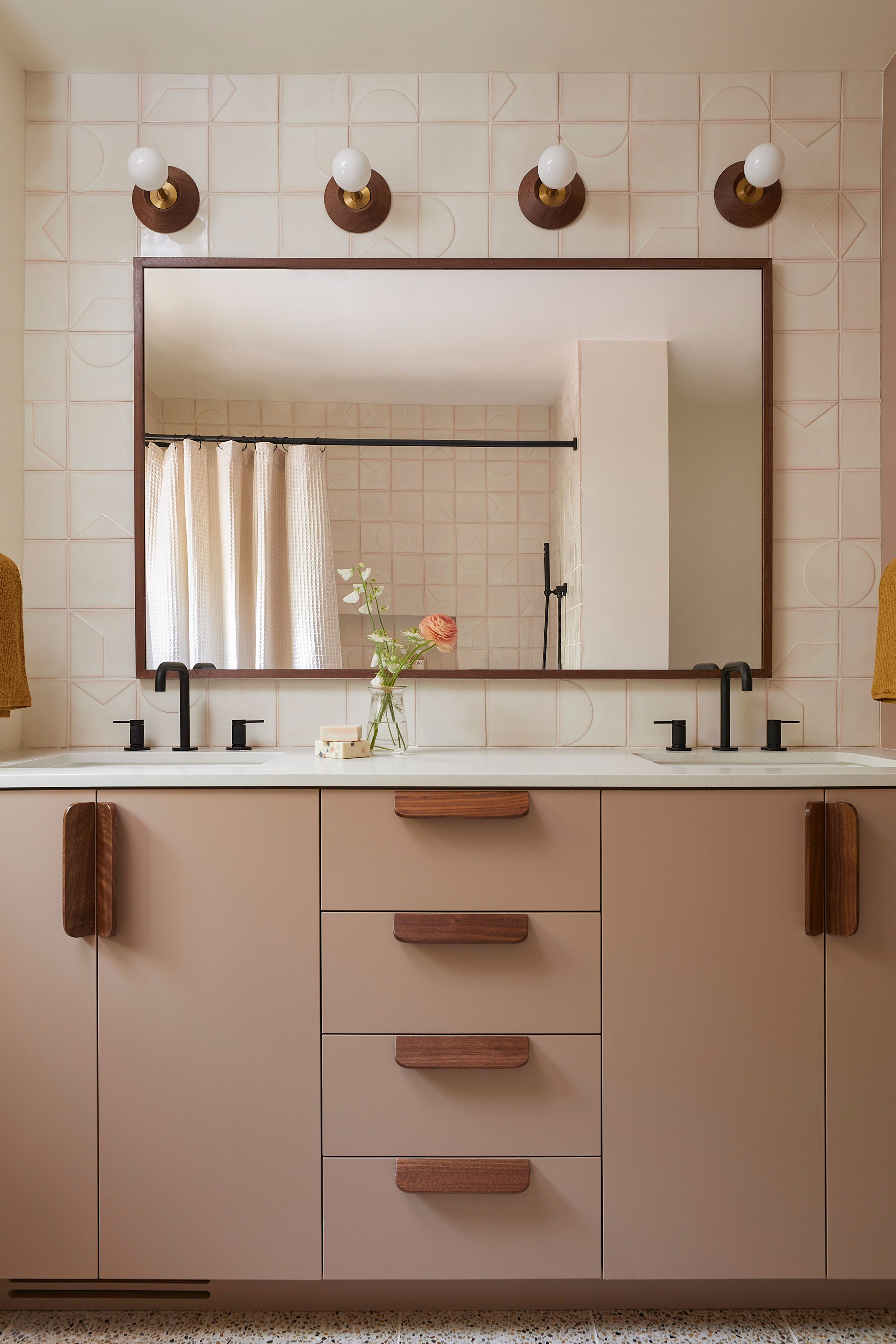
The 'Smink' relief tiles I selected for the kid's bathtub and vanity backsplash area were the first tiles I finalized for the house. They’re minimalist but geometric, which is right up my alley.
I knew I wanted to inset the bathroom mirror into the tile for a custom look, rather than having it rest on top. I had the custom mirror vendor that I’d worked with before and the tile setter that I trusted, but the extra steps of coordination to make the tiles line up with the mirror just right made me hesitate about whether the extra time was worth the effort.
Of course it was! Just a reminder to myself and my clients that all good things take time and a little extra effort.
3. Trust your instincts
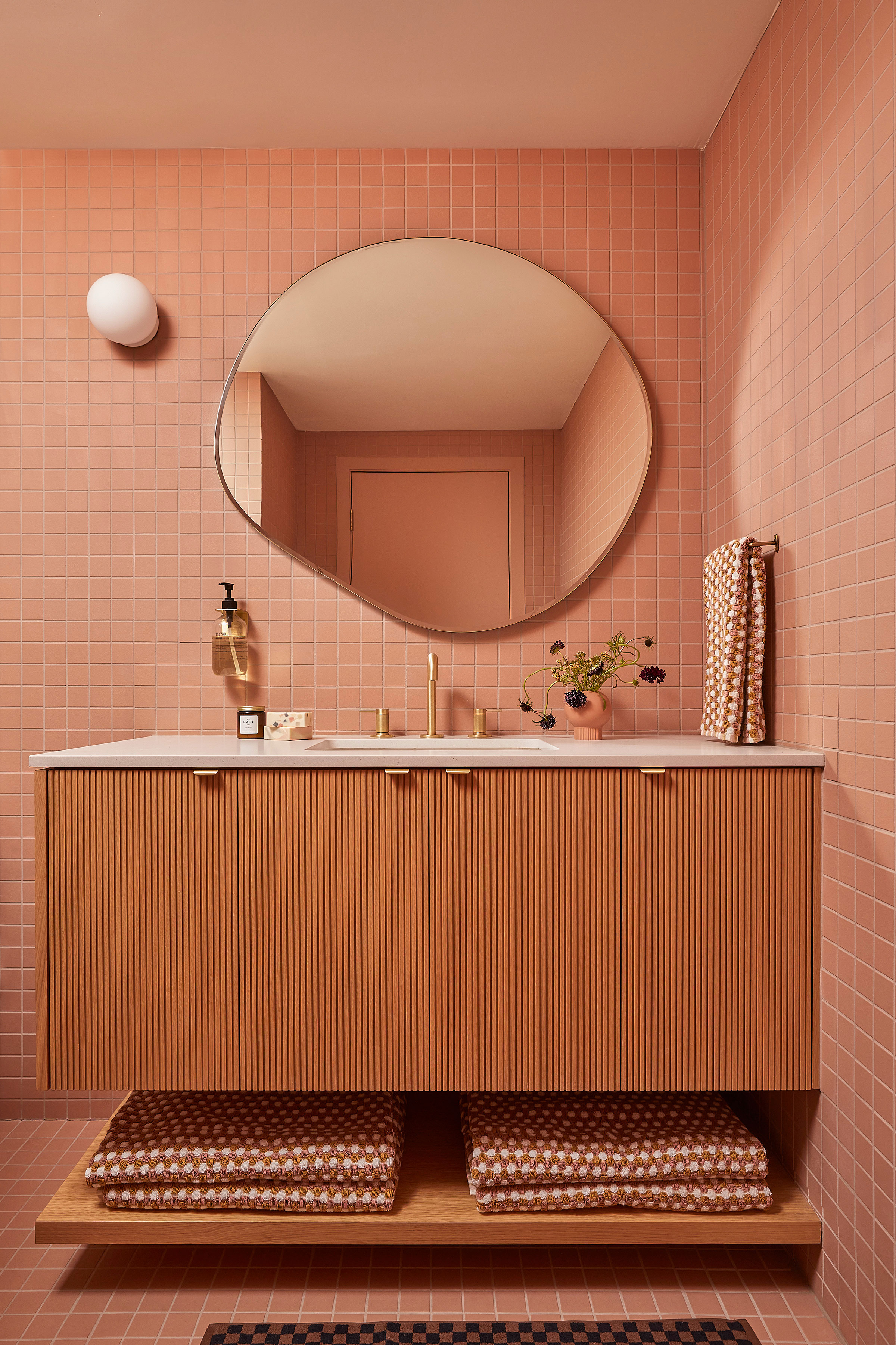
I’ve always loved a monochromatic grid tile but have had a hard time convincing clients to bring this bold look into their homes. In some ways, it requires a lot of restraint to use a singular material for an entire bathroom.
I initially chose this dusty pink Japanese ceramic grid tile for the entire bathroom, but as tends to happen, I started to second-guess my decision right before purchasing the material. I thought of switching to a colorblock grid instead, but my husband (surprisingly!) encouraged me to stay the course. I’m so glad I listened to him — this bathroom tile idea is now one of my favorite design elements of the entire house!
4. Don't be afraid of a built-in
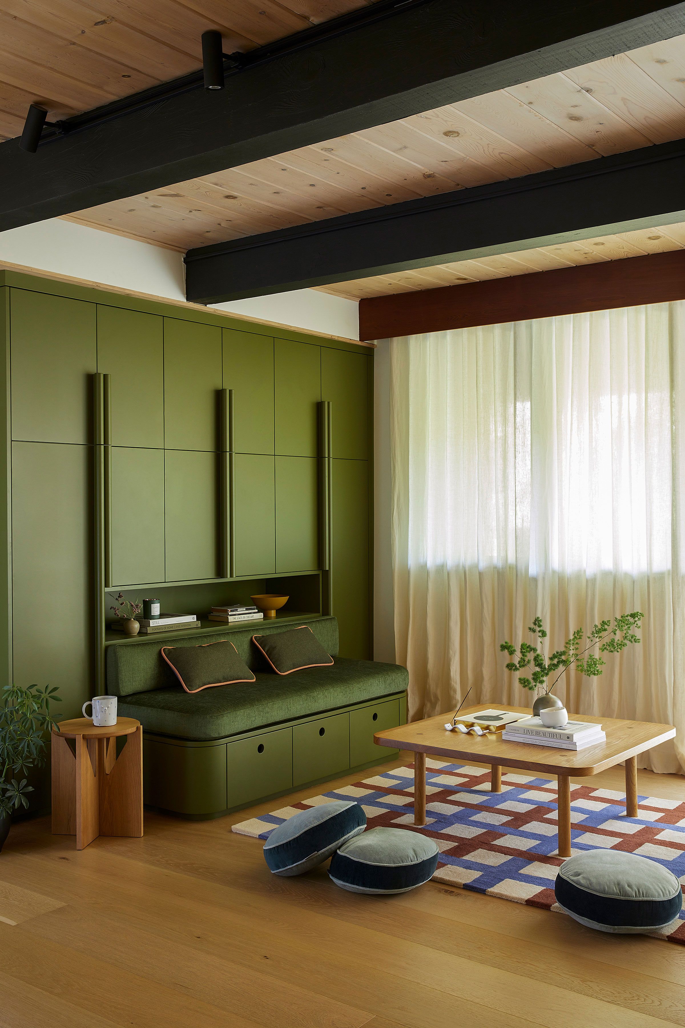
Our music and playroom was the last space I pulled together. After living with toys and craft supplies everywhere, I decided to put my money where my mouth was and invest in a full wall of built-in storage to hide all of my children’s things.
Since this room is also relatively small, I designed a built-in sofa into the built-in cabinet to provide extra seating. Built-ins are a financial and “permanent” commitment, but I can’t say enough how good of an investment piece they are — they provide custom design and storage in a way that furniture pieces often lack.
5. Leave space for retreat
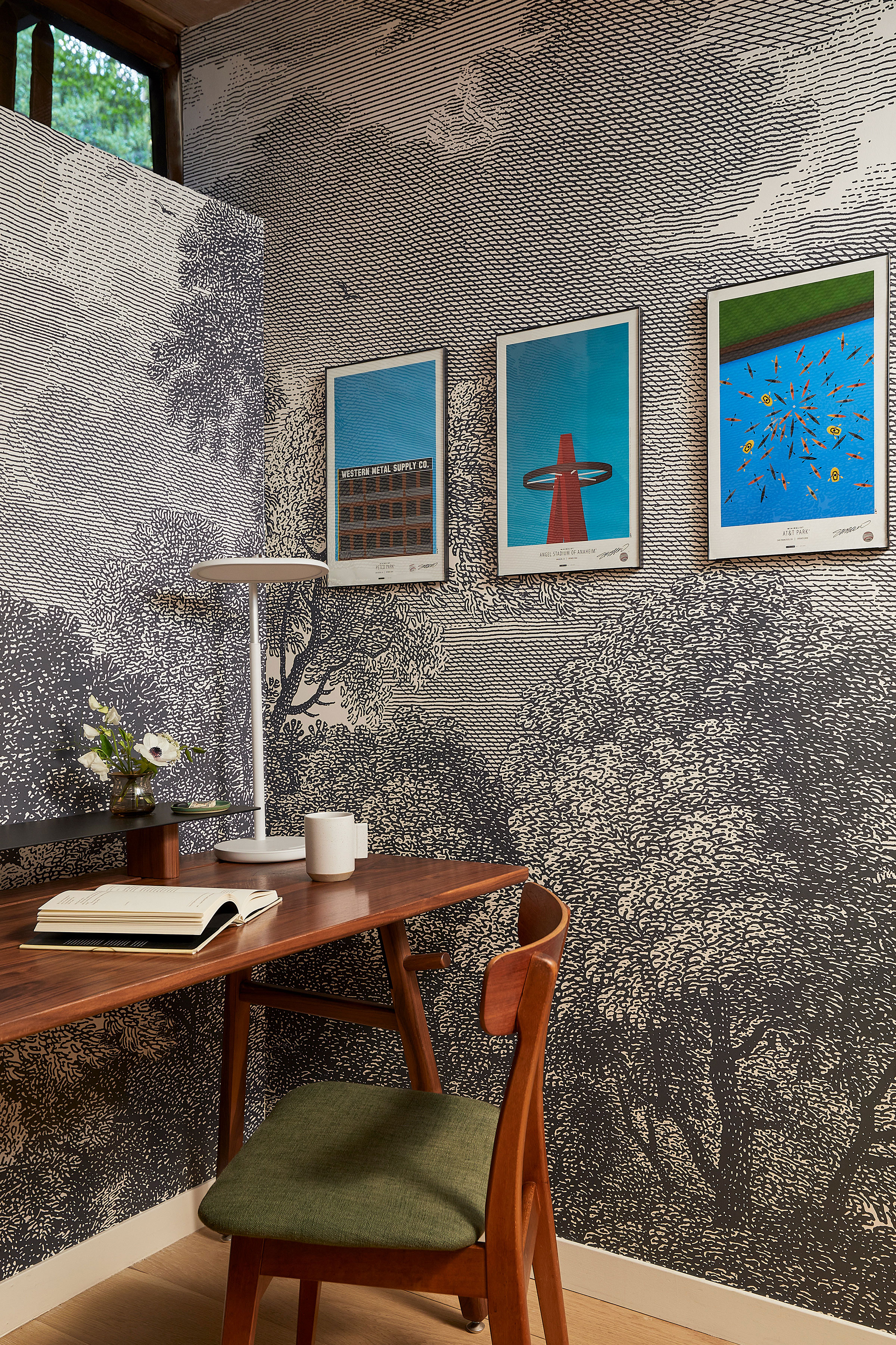
Together with our architect BK Kim, we carved out a tiny little office space for my husband Steven, since he works from home twice a week. The office is landlocked apart from a tiny clerestory window, so we opted for a reeded glass pocket door to let in some natural light.
Though the home office is tiny, I’m so glad we brainstormed a way to make this happen, as I often retreat to this space too when I need some quiet for meetings or heads-down design work.
Get the look

Cathie is the lead designer at CHI. She has always been an artist and has pursued it in many different forms throughout her life, but has found her niche in creating beautiful and functional spaces for a wide spectrum of clients. She enjoys the creativity of imagining the layout, materials and finishes of a space, but also enjoys the precision, calculations and careful coordination required in bringing that vision to life with a valued network of tradespeople. She has lived in San Diego, Orange County, Los Angeles, and has now settled back up in the Bay Area (her hometown) with her husband and four children. Her vision in designing interiors is to help clients actualize their dreams for their homes in a thoughtful and collaborative way.
-
 The Weighted Blanket That Doesn’t Make You Sweat (and the Eye Mask to Match)
Luxury has weight. And apparently, volcanic minerals
By Julia Demer
-
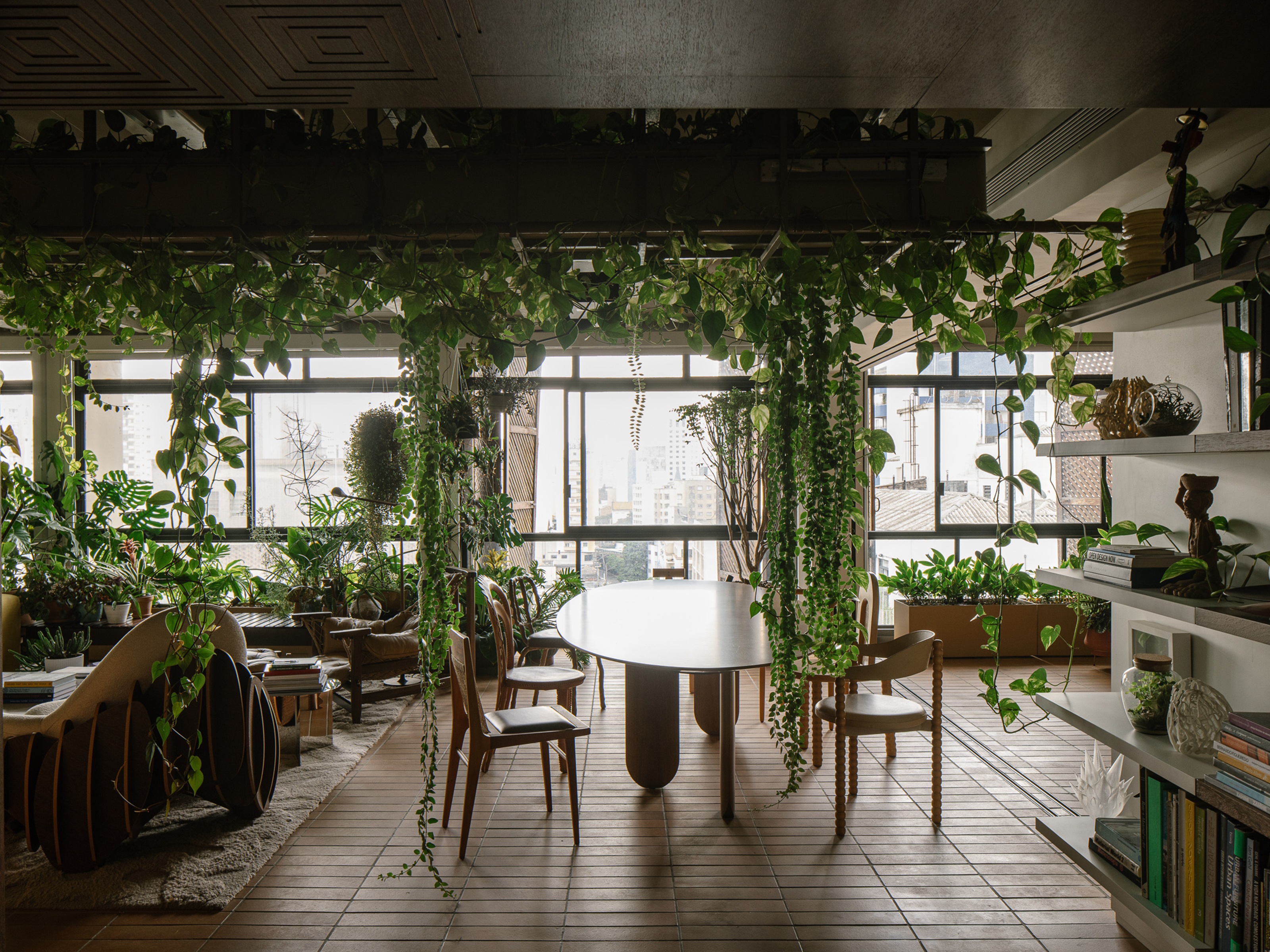 What Is Biophilic Interior Design? I'm an Actual Biophilic Designer, and This Is How to Apply It to Your Home
A biophilic designer explains the core principles of this practice, and the easy ways you can apply it to your home's design
By Marianna Popejoy
