For this coastal California kitchen, solid wood wasn't an option – but the designer's solution looks just as good
A neutral color palette, rustic touches, and soft furnishings make this California home a dreamy escape
Situated in coastal Carlsbad, California, A.Naber Design and Sk7 Architecture took on this project with the aim of designing a 'forever home'. Incorporating a blend of styles, the transitional design marries more traditional elements with cool contemporary touches. 'We ended up with a mix of modern, a nod to cottage style, European rustic and a coastal influence with a bit more refinement,' says Abbie, owner and principal designer of A.Naber Design, San Diego-based interior design firm.
The project was a full renovation, only keeping the necessary structural walls. 'Essentially, it is a brand new home that includes a pool and spa, a workout space and stunning architectural details like the swoop of the roofline, an open two-story ceiling, and a glass catwalk that overlooks the living room area.'
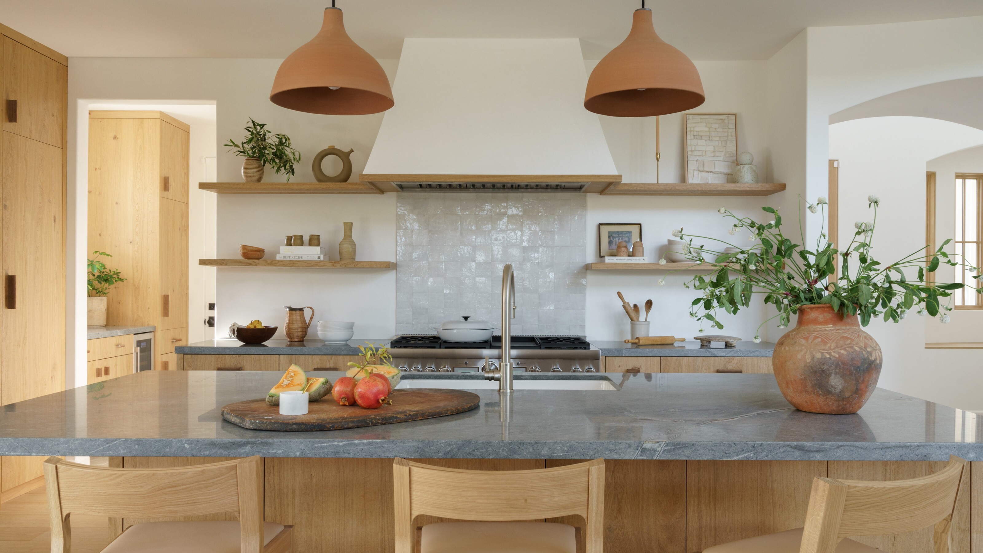
The kitchen is the heart of this modern home, where cost-effective and environmentally-friendly oak veneer cabinets match with wood flooring and open wooden shelves, bringing much-needed warmth to the space.

Oonagh is an interiors writer and editor, and expert at keeping up with trends from the world of interior design. For this story, she's spoken to the the designer at A.Naber to find out how they went about the design process of this bright and colorful Californian home.
Why not wood?
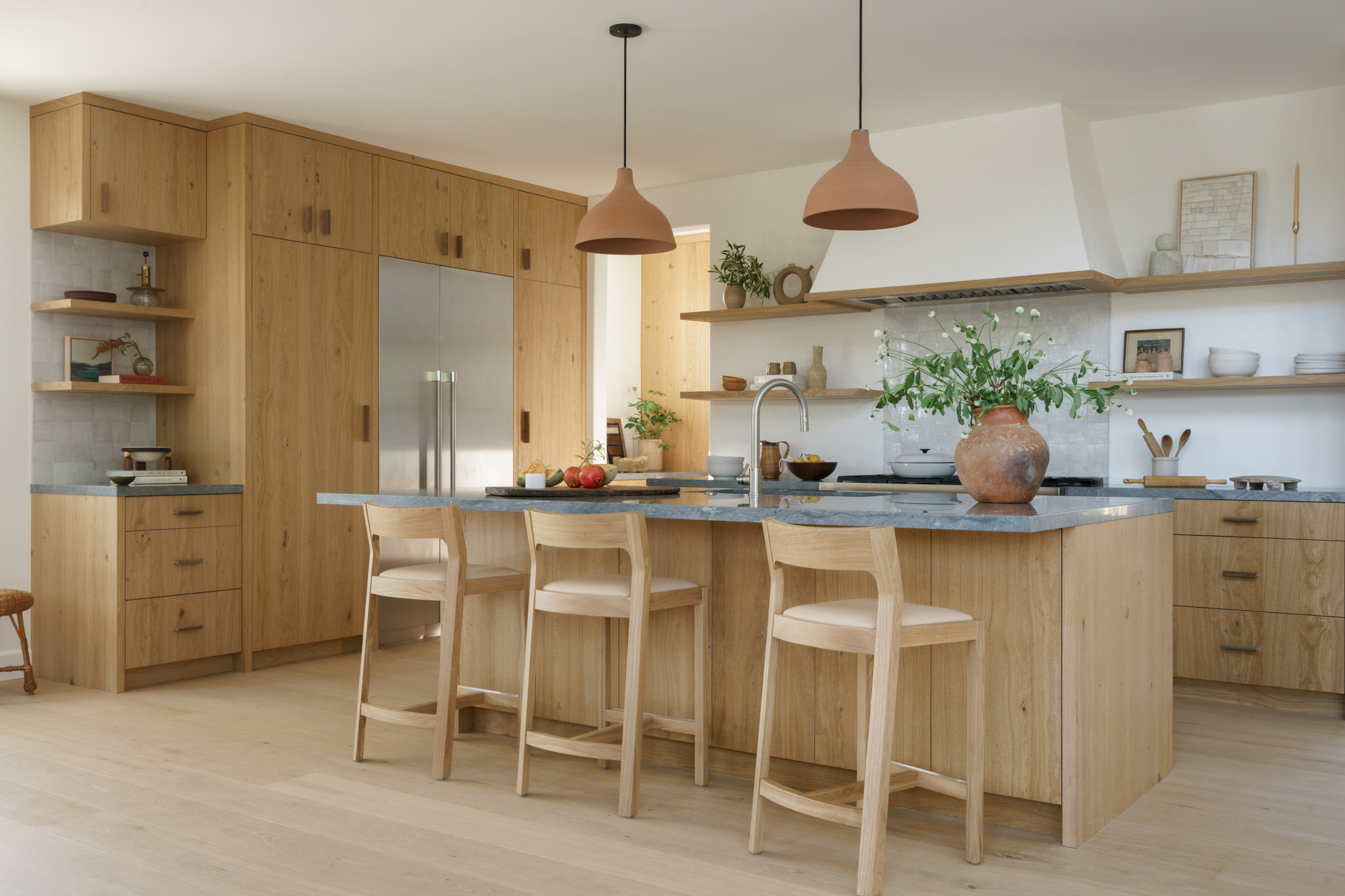
Wood is the standout material used in this warm, minimalist kitchen, and accounts for the majority of the neutral color scheme. With the white oak veneer comes a feeling of nature and texture, and a reflection of the coastal location. 'We did not use solid wood due to the expansion and contraction of solid wood and the homeowners living very coastal,' explains designer Abbie Naber.
The wood veneer was about mimicking reclaimed European cabinetry without actually having to use this material. 'The textured cabinetry veneer brings so much depth to the space, especially with a flat front cabinet profile. We love the small imperfections and tonal changes throughout the cabinet profile.'
Wooden cabinets are complimented with a white oak island base and matching chairs, wooden flooring, and wood shelving flanking the kitchen hood.
Adding to the wooden texture, zellige tiles offer that ethereal glaze and help bounce light around the walls. The sheen of the zellige tile is complimentary to the matte finish of the cabinets, a great juxtaposition in materials. 'The zellige tile splashback offers tile work in an imperfect way,' says Abbie. 'We did not want to tile the entire back wall, so we chose to just tile underneath the hood. The tile was not meant to be the showstopper here, but instead a subtle layer to add to the space, bringing a minimalist touch. I personally love the minimal application here.'
Be The First To Know
The Livingetc newsletters are your inside source for what’s shaping interiors now - and what’s next. Discover trend forecasts, smart style ideas, and curated shopping inspiration that brings design to life. Subscribe today and stay ahead of the curve.
Decorative details like the terracotta ceiling lights and the Grecian urn-like vase on the kitchen island emphasize the continental look.
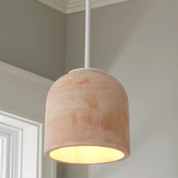
Rustic terracotta pendant by Shades of Light
This terracotta pendant light brings the warmth of this cozy color to any room. The handmade nature of this product means irregularity in each version, which adds to its charm.
Coastal cool
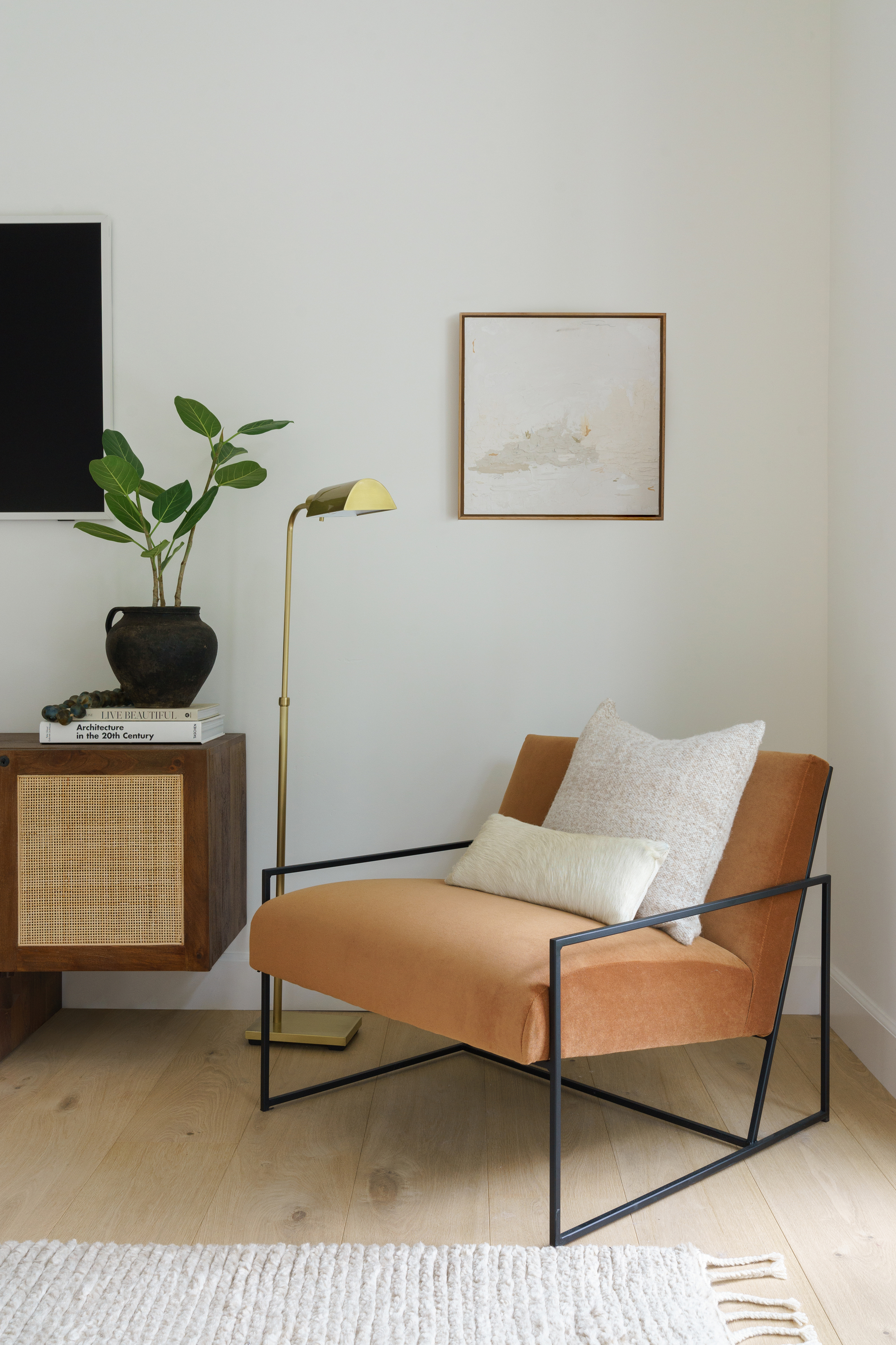
Throughout the house, the neutral color scheme continues, using natural light to its advantage, creating bright walls and shining a light on the layered textures.
'Our client was big on neutrals and layering textiles and materials,' says Abbie. 'There is a prominent vein of chocolate hues in many of the selections, whether it’s the subtle veining of the lavastone kitchen countertops or a nubby pillow in the living room.
'We also introduced coastal blues like the wine nook tiled back wall and the guest bathroom, which is glad in a deep, glossy, saturated blue tone. All in all, there was a delicate dance between cozy yet refined, casual yet special.'
A color contrast
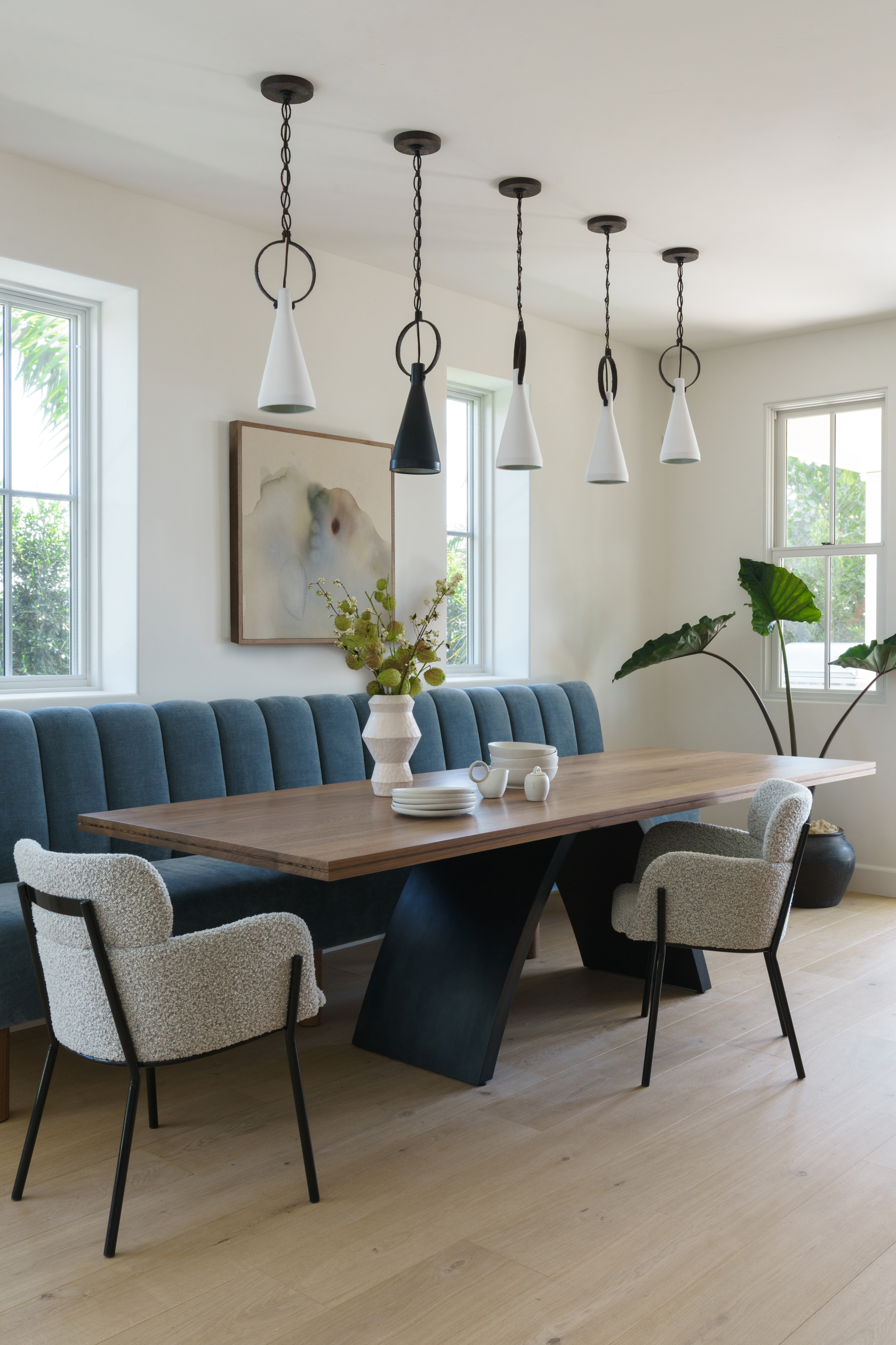
The palette in the dining room is slightly cooler, with a plush blue banquette seating area running along the wall. This space was about striving to achieve a balance between function and elegance, approachable, yet elevated.
'We also wanted to be careful that the banquette didn’t resemble a restaurant diner too much,' Abbie explains. 'We focused on creating more of a furniture look for the banquette, and I think that is achieved with the legs versus a heavy wood base. The fabric resembles velvet and is channeled for a luxurious feel.'
Meanwhile, pendant lights focus the space, help create the feeling of a designated zone, and the perfectly placed palm in the corner of the room brings the natural feel back to the space.
Lofty living
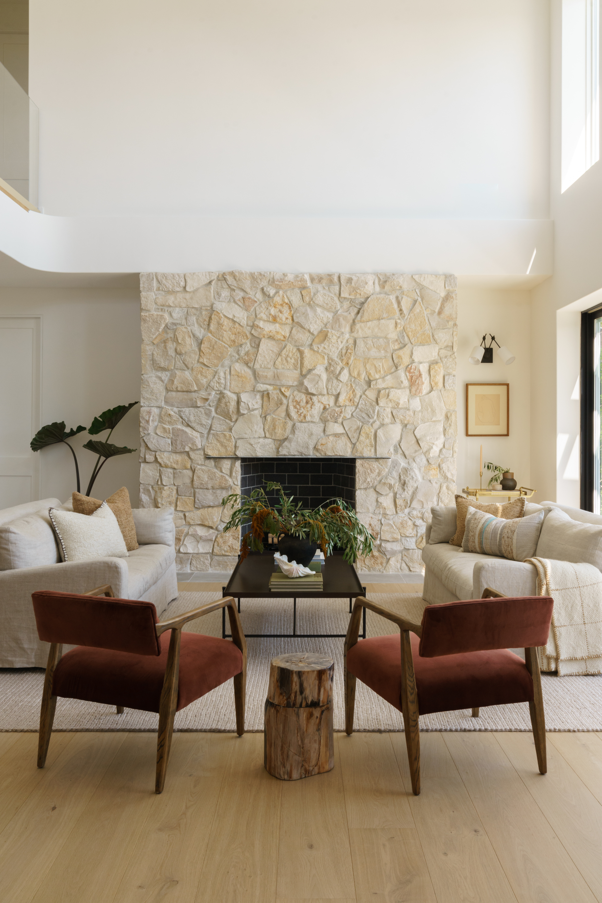
The architects at Sk7 Architecture created a bright and open living room with two story high ceiling.
'The sun leaks in so much beautiful light, and it’s very open and breezy. The goal was to ground the space and create layers and depth through materials,' says Abbie.
'The stone for the fireplace needed to be a showstopper- something that drew people in. We chose a beautiful stone from Eco Outdoor called Bokara. 'We loved its lack of uniformity and its organic nature. We played with over-grouting the stone to create an old-world, European feel.'
The furniture floats in this space, creating a cozy and intimate feel in what is an open and airy space.
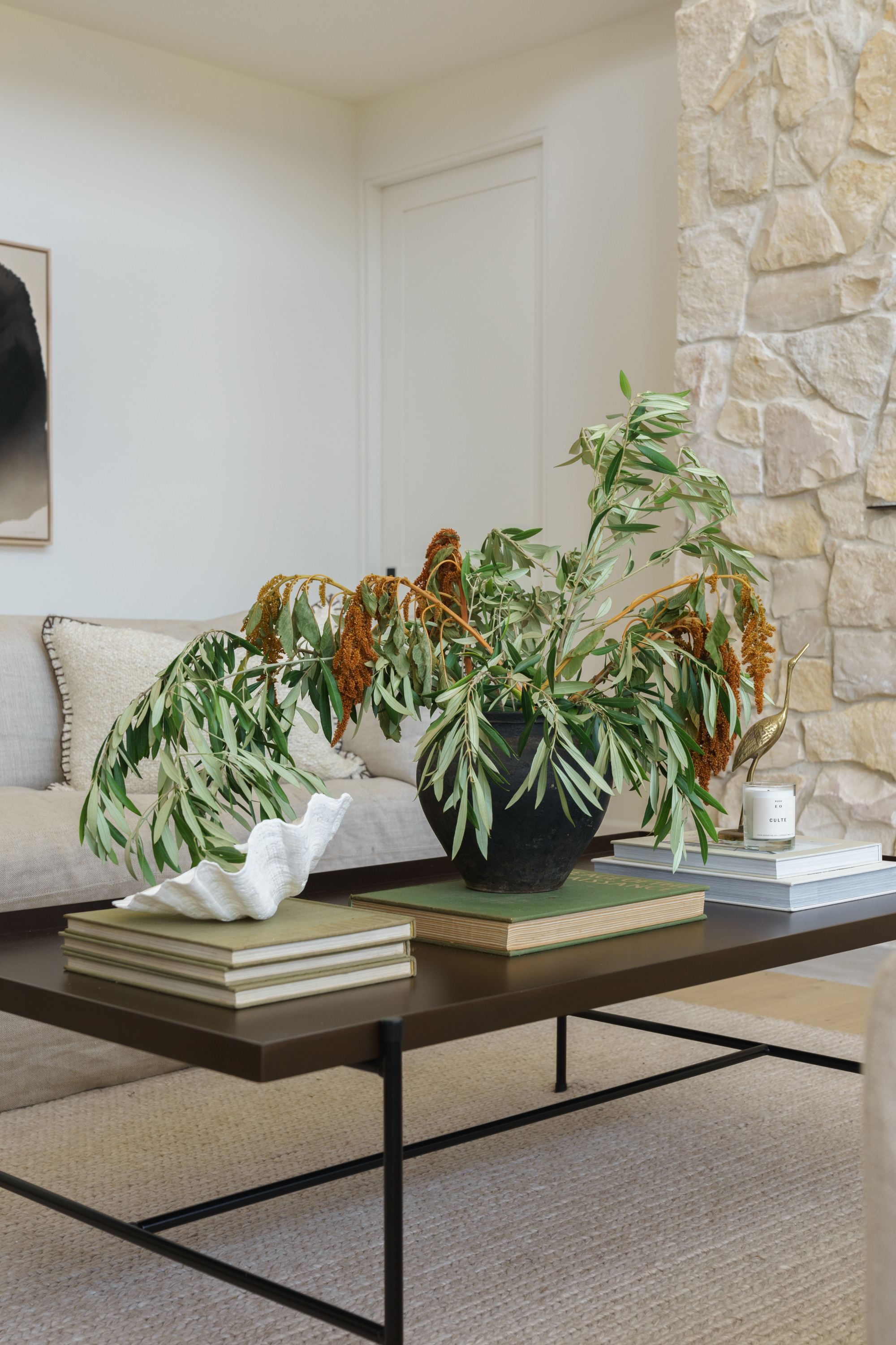
To add layers, homeliness and a cozy feel to the space, decor is important in the living room too. Decorative touches nod to the nearby ocean, with an oversized shell on the coffee table and a vase displaying a bunch of eucalypti.
Natural touches
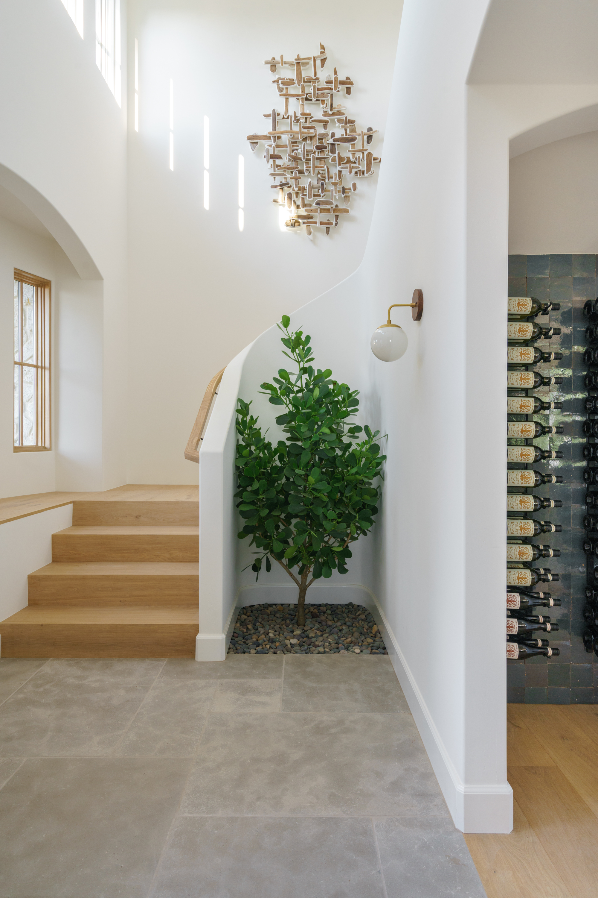
A reminder of the nearby nature, Abbie has layered the home with plants in every corner. 'I try and select plants for their shape as I see them as artful additions to any space,' she says.
The planted indoor tree in the stairwell is a brilliant feature and planned from the beginning. There is irrigation for the tree and the area around it was dug out and not tiled over. What sits below is soil and irrigation, and the plant was placed into the space. On top, the team placed pebbles. A simple, globe-shaped wall light illuminates the area and works as a decorative piece of jewelry for the wall.
Neutral sanctuaries
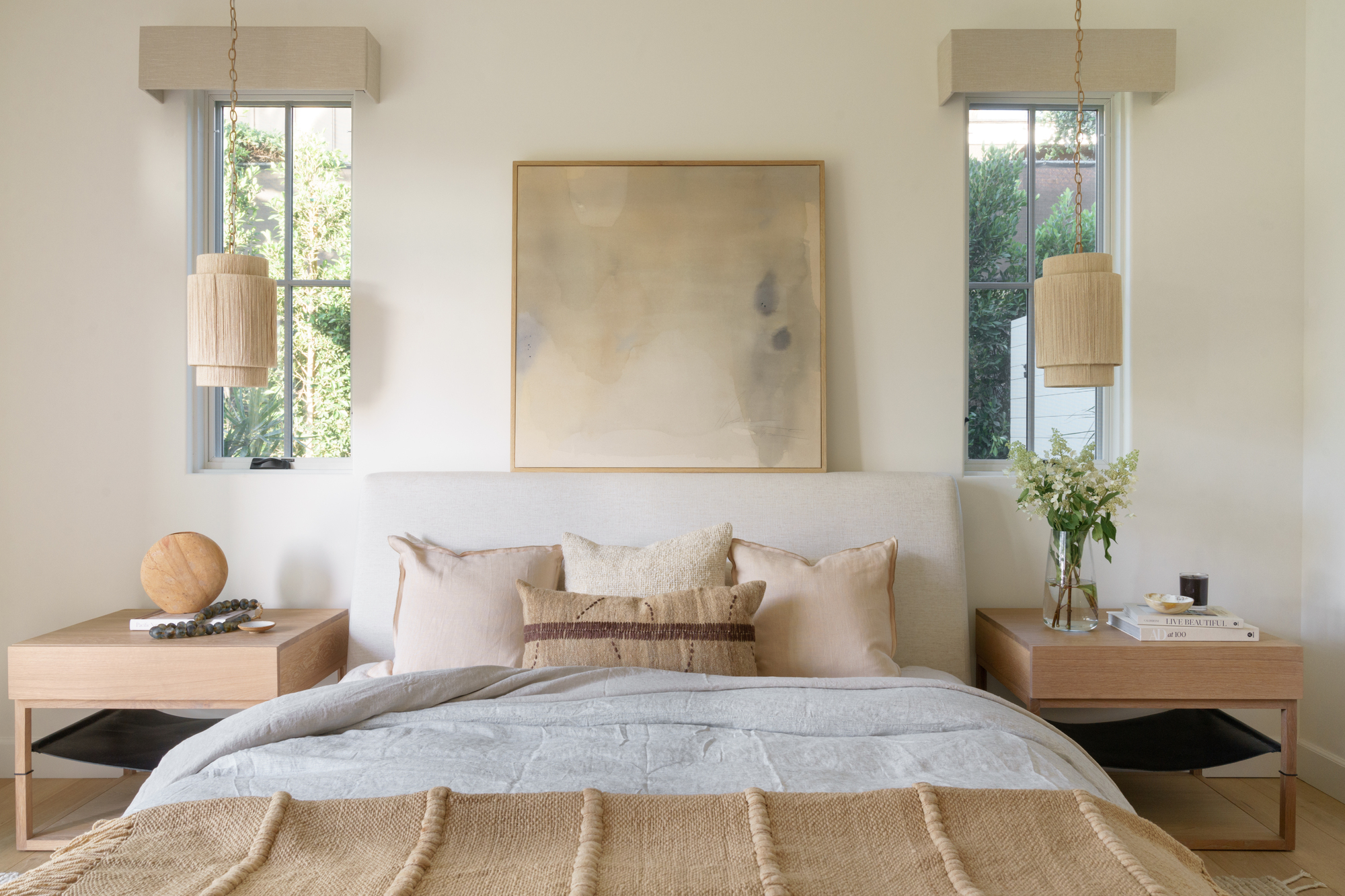
The neutral theme of the home continues into the master bedroom. This bedroom is on the ground floor and situated off the main living room, and why the team continued the neutral color palette, for a smooth and organic transition.
'The hues in this room are layered, neutral, and subtle. Overall, we wanted nothing too contrasting or jarring. This room was meant for a peaceful slumber, so the textile and art selections need to follow suit.'

Former content editor at Livingetc.com, Oonagh is an expert at spotting the interior trends that are making waves in the design world. She has written a mix of everything from home tours to news, long-form features to design idea pieces, as well as having frequently been featured in the monthly print magazine. She is the go-to for design advice in the home. Previously, she worked on a London property title, producing long-read interiors features, style pages and conducting interviews with a range of famous faces from the UK interiors scene, from Kit Kemp to Robert Kime. In doing so, she has developed a keen interest in London's historical architecture and the city's distinct tastemakers paving the way in the world of interiors.
-
 Biophilic Decluttering — What to Take Out of Your Home (and What to Put in) for a More Natural Home
Try your hand at biophilic decluttering to ground your interiors, connect to the environment, and cure chronic clutter in one go. Here's how.
By Amiya Baratan
-
 10 Arrestingly Beautiful Milan Restaurants Locals *Actually* Dine at — Selected for Their Interiors
Brought to you by our community of culture insiders, this edit of the best restaurants in Milan sees authentic Italian food and immersive design unite
By Gilda Bruno
