White walls, but never bland! This Italian apartment's colorful designer touches create an uplifting home
Studio Venturoni has transformed this Italian apartment, using vibrant color pops to bring character and charm to the space
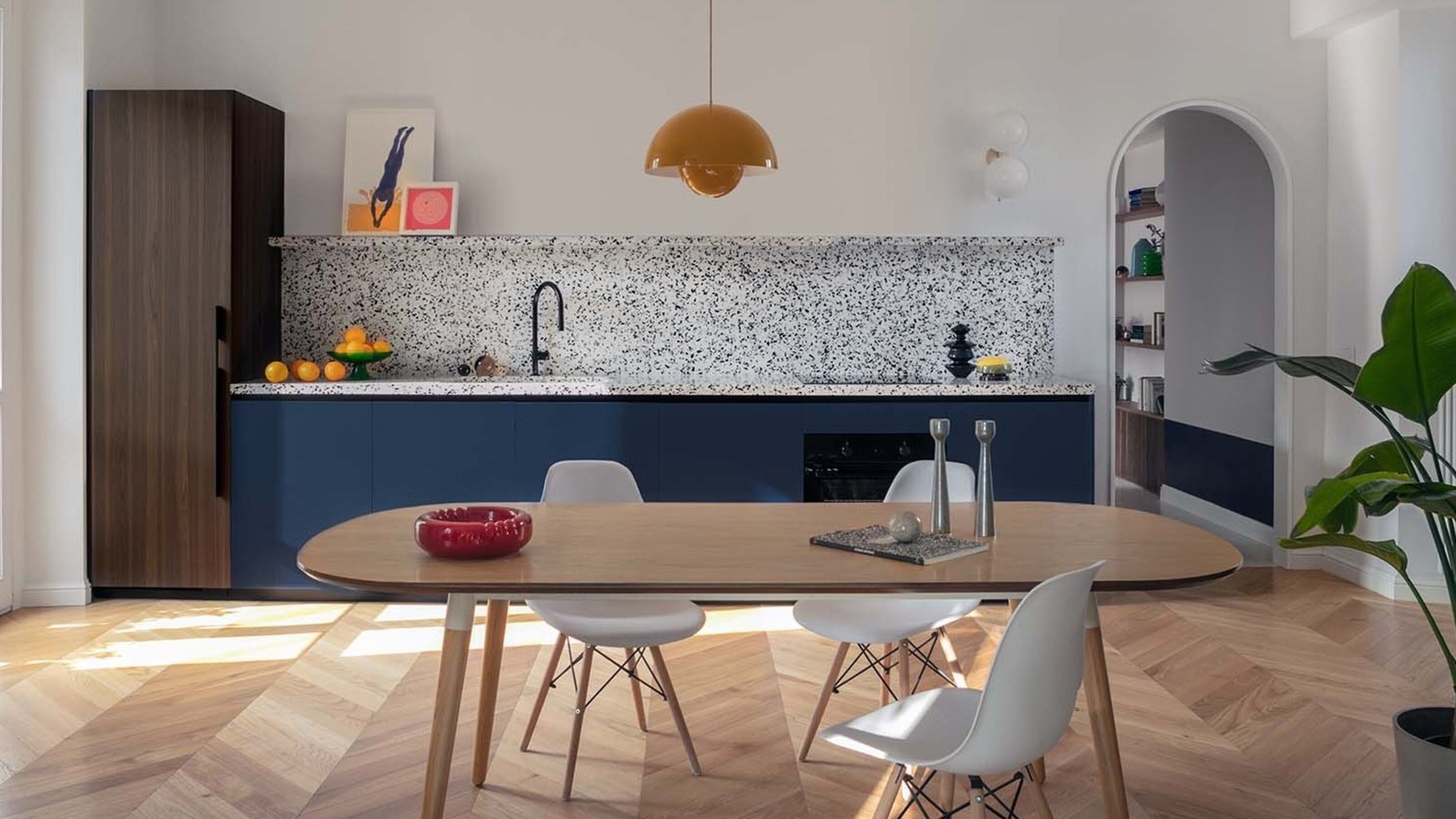

Pops of color, retro furniture, and tactile shapes are the characteristics of this one-bed apartment in Milan that's been overhauled by Studio Venturoni.
The apartment is situated in the Porta Venezia neighborhood, with its narrow cobbled streets that remind the homeowner of her native Rome.
'The colors of the apartment work and come together beautifully, and the white walls serve a perfect background and canvas to bring out all of these elements,' says the studio's founder, Francesca Venturoni. 'We have been greatly inspired by great masters like Castiglioni and Gae Aulenti,' she says. The modern home is decorated with statement pieces of furniture, embracing color in a clever way throughout.

Oonagh is an interiors writer and editor, and expert at keeping up with trends from the world of interior design. For this story, she's spoken to the designers and architects behind this particular Milan-based project, to find out more about the colorful decor decisions in this Italian apartment.
The kitchen
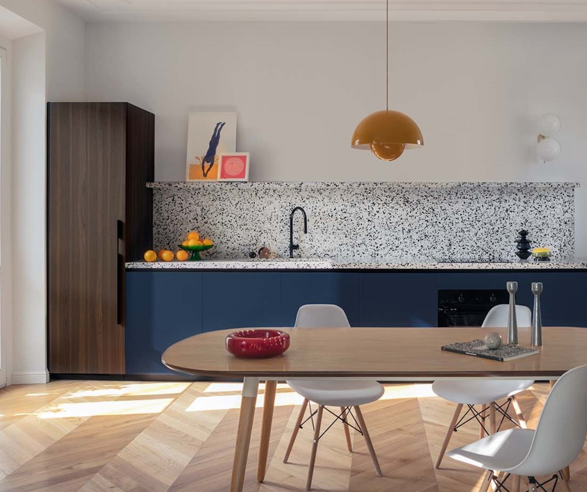
In the kitchen, Studio Venturoni has transformed the white walls, which are given life by the deep blue cabinetry and light wood flooring paired with the dark brown of the Canaletto walnut floor-to-ceiling cabinets.
The star of the show is the terrazzo kitchen countertop that forms a stylish speckled surface, backsplash and shelf where the homeowner can prop decor - as seen here with works of art that lean against the wall.
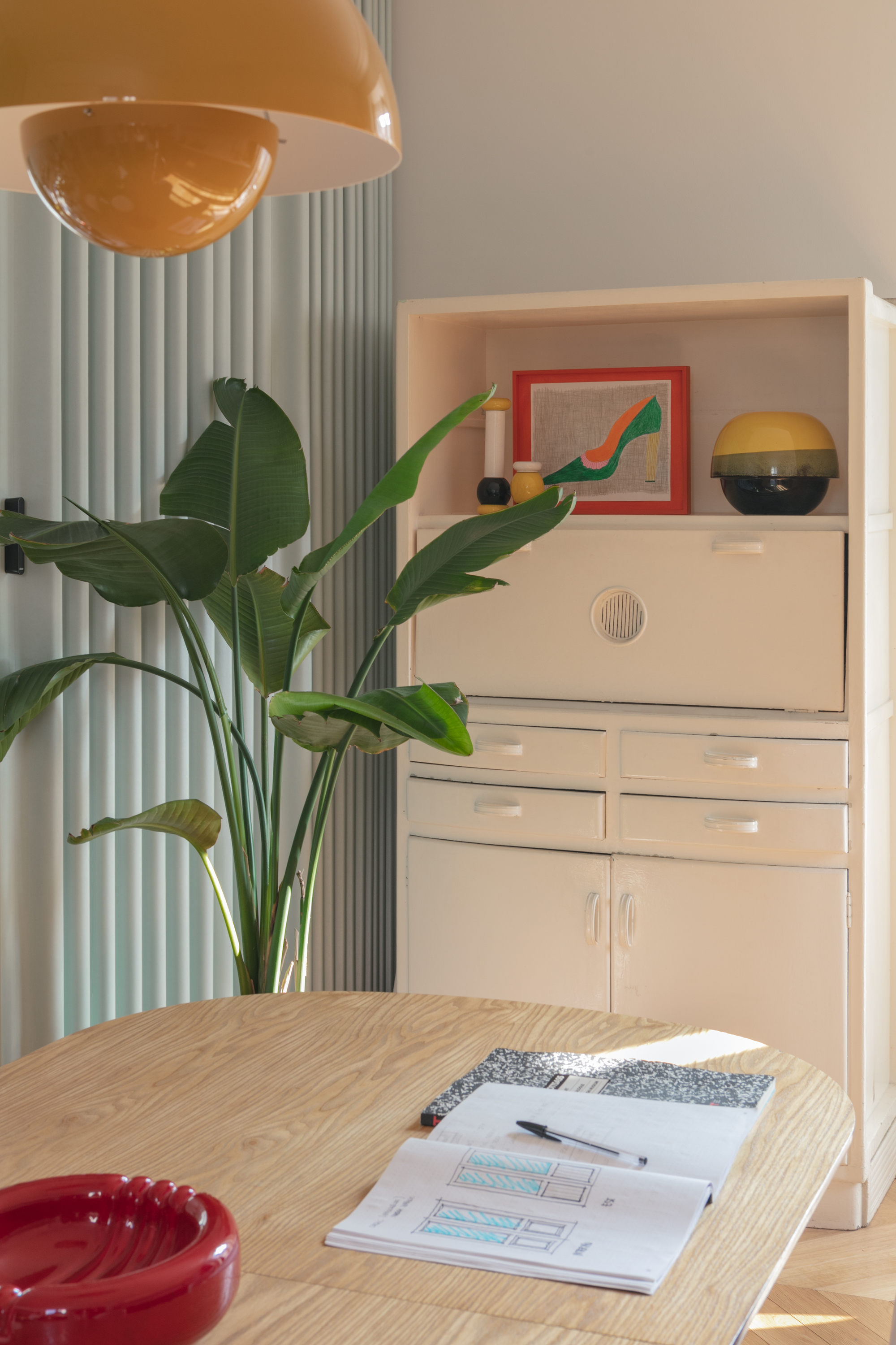
'In terms of decor, to illuminate the environment, we went with the FlowerPot suspension lamp by Verner Panton for &Tradition, a fine art print by Guido Scarabottolo courtesy of Milan's modern art gallery, L'Affiche Milano.'
Even touches like the bowl of oranges and il Picchio’s red ashtray from Compasso Gallery add glimmers of color and unexpected hints, and the vivid green from the indoor tree brings a lushness to the space.
Be The First To Know
The Livingetc newsletters are your inside source for what’s shaping interiors now - and what’s next. Discover trend forecasts, smart style ideas, and curated shopping inspiration that brings design to life. Subscribe today and stay ahead of the curve.
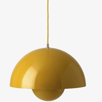
Flowerpot VP7 Pendant from Lumens
Designed originally in 1968, the silhouette of this pendant is tactile and cheery in bright yellow. Hanging from a single cord, it's the perfect pendant for a dopamine dose to any space in the home.
The hallway
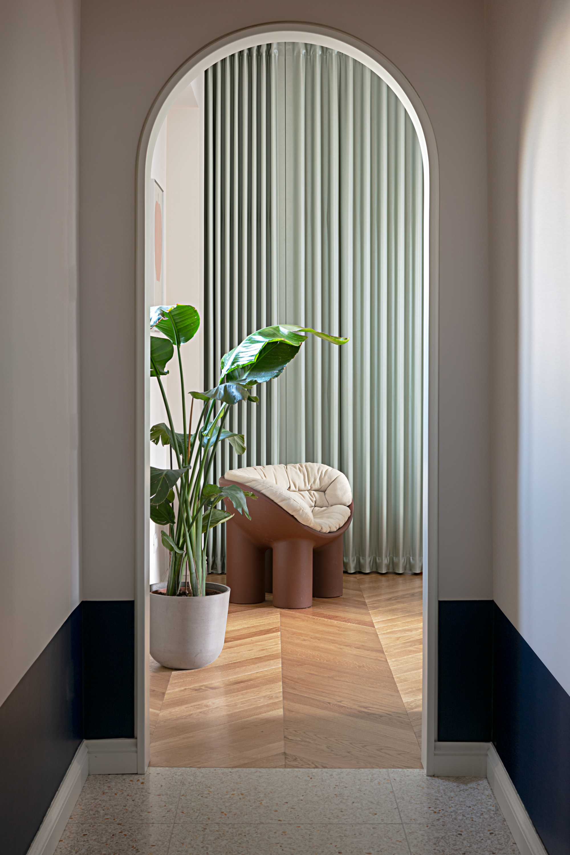
Into the hallway, and the theme of the kitchen flows through, with blue and the wooden elements in the corridor that mirror the style of the kitchen, and a dark strip of paint below the dado rail. 'The granite flooring is also reflected in the kitchen worktop surfaces,' adds Francesca.
'Elsewhere in the hallways, and a 60s rattan seat in Bonacina style is illuminated by a wall lamp, and we have original art on the walls. There is also a built-in wardrobe.'
From the hallway the arched entrance frames the view of a banana palm and the Roly Poly armchair by Driade. 'The boundary of the two rooms is marked by the clear change in flooring,' says Francesca.
The living room
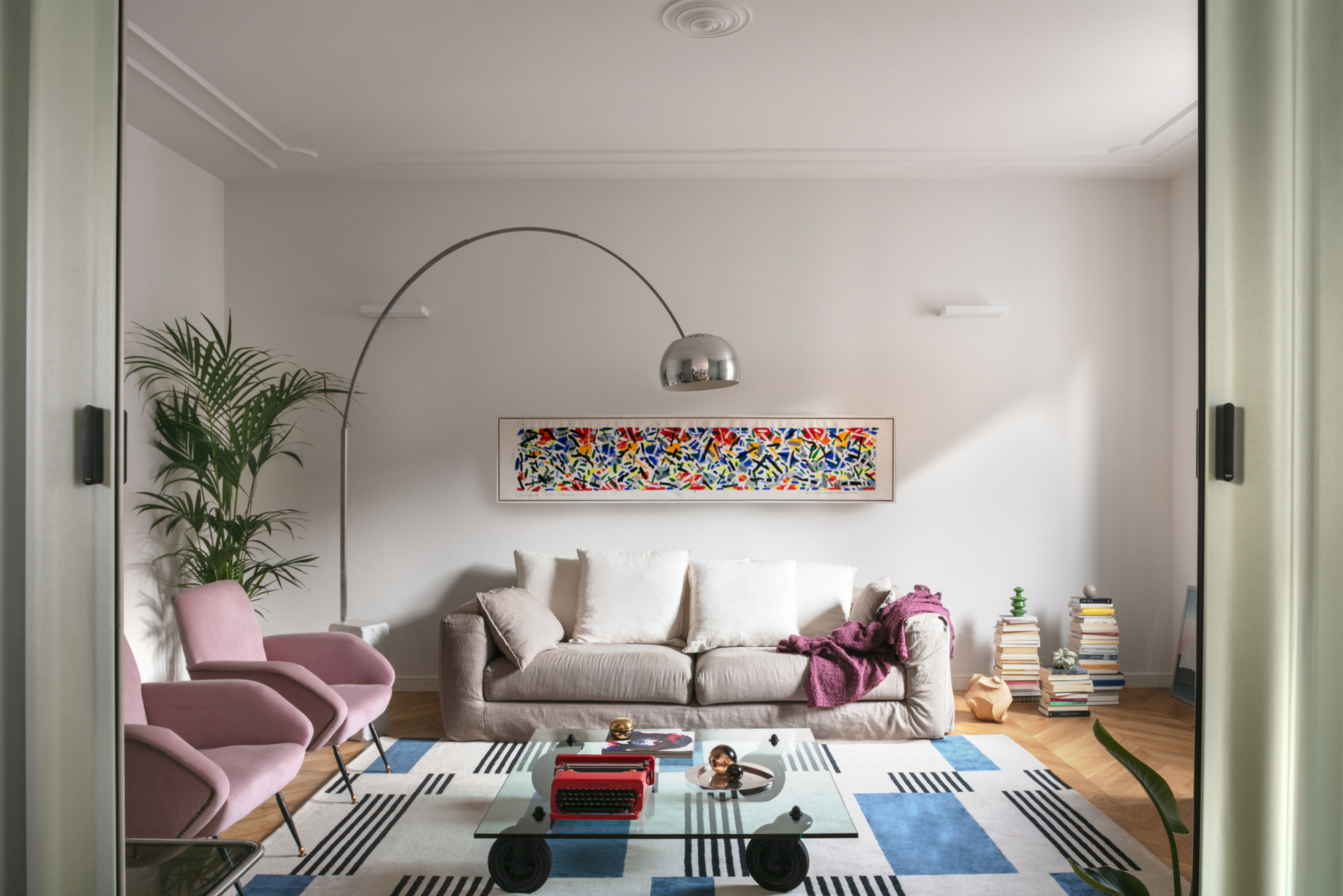
From the kitchen, the sliding wall opens into the living area where a series of modern living room furniture pieces create a colorful aesthetic.
Pale pink armchairs float away from the walls and rest on the contemporary rug, Hello Sonia! by the Italian designers of Studiopepe for CC-Tapis.
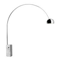
The coffee table by Fontana Arte has wheels for a playful touch and the Arco lamp by Flos swings across the white walls to add extra curves and shape to the space.
Overall, pops of pale pink, blue from the modern rug and glimmers of red from the artwork and coffee table decor bring color into the room without overwhelming it.
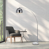
A much-imitated iconic floor lamp made of adjustable stainless steel, reaching to around seven foot with a Carrera marble base.
It may not be as large or grand as the Flos version, but for $130 compared to nearly $4,000, it's a way to get the look when you're on a budget.
The bedroom
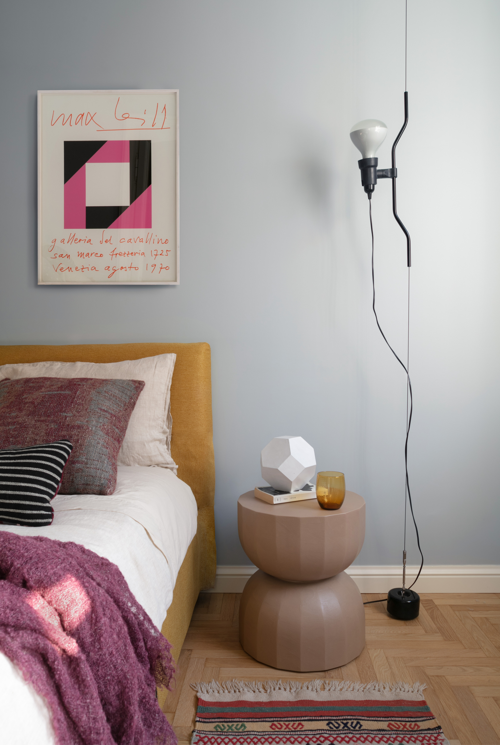
In the bedroom, the cold tones of the walls contrast with the warmth of the furnishings. 'In this environment the shades of blue fade into a grey-light blue that makes the mustard of the bed and the beige of the sculptural bedside table even more vivid and illuminating.'
'The bedside table by Saba Italia is flanked by the Parentesi lamp, also by Flos. The colors of the original poster match the bed linen and decorative cushions by Society Limonta.'
The bathroom
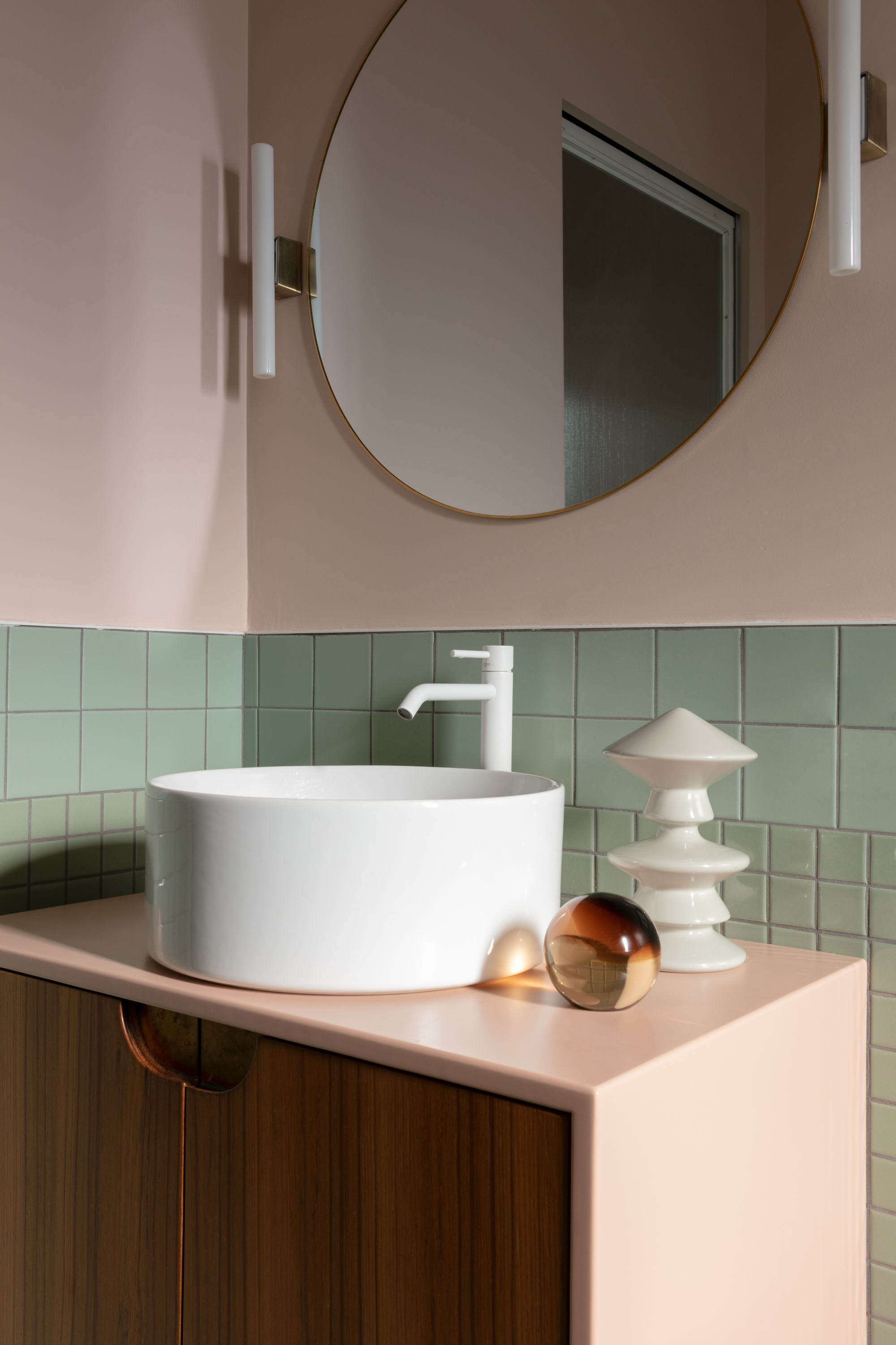
Entering the bathroom, and texture is brought to the walls, which are covered in sage green ceramic bathroom tiles that work against the pale pink nude contrast with the walls and matt white taps by Fir Italia.
'The sage green mono-material brings out the white details of the taps and the bare walls,' says Francesca.
'In the communal areas such as the corridors and the bathroom, we find elements of brighter colors on the walls. This is essential to help those small rooms brighten up and burst with character.'

Former content editor at Livingetc.com, Oonagh is an expert at spotting the interior trends that are making waves in the design world. She has written a mix of everything from home tours to news, long-form features to design idea pieces, as well as having frequently been featured in the monthly print magazine. She is the go-to for design advice in the home. Previously, she worked on a London property title, producing long-read interiors features, style pages and conducting interviews with a range of famous faces from the UK interiors scene, from Kit Kemp to Robert Kime. In doing so, she has developed a keen interest in London's historical architecture and the city's distinct tastemakers paving the way in the world of interiors.
-
 My 10 Favorite Designs at Milan Design Week 2025 — Out of the Hundreds of Pieces I Saw
There is a new elegance, color, and shape being shown in Milan this week, and these are the pieces that caught my eye
By Pip Rich
-
 Iridescence Is Chrome’s More Playful, Hard-to-Define Cousin — And You're About to See It Everywhere
This kinetic finish signals a broader shift toward surfaces that move, shimmer, and surprise. Here's where to find it now
By Julia Demer
-
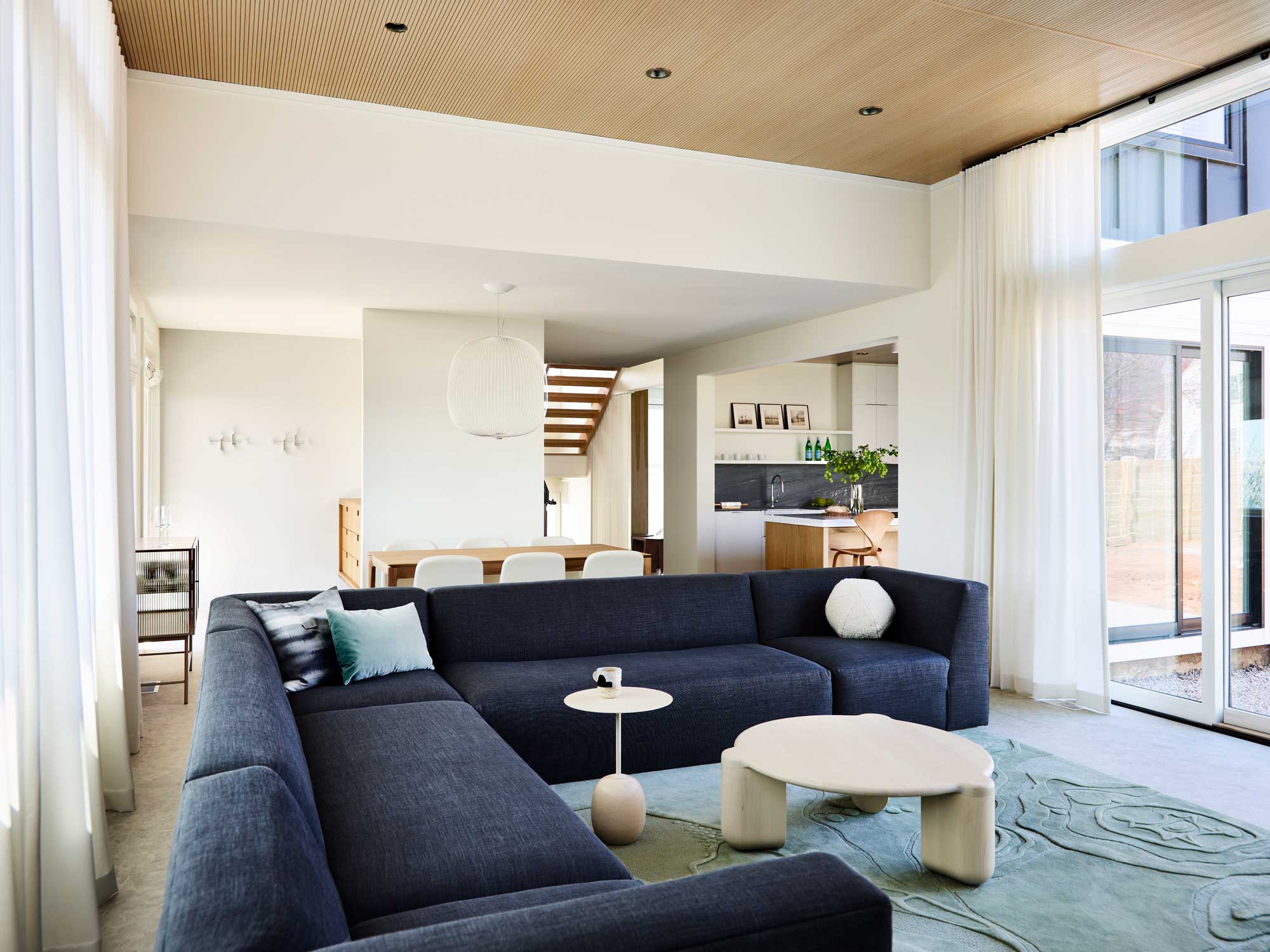 'It's a place to stay still and slow down' - how this Connecticut home took its cue from the 'slow living' trend
From a starting point of creating a home that was an antidote to the hustle and bustle of the city, the design of this project look to nature for inspiration
By Hugh Metcalf
-
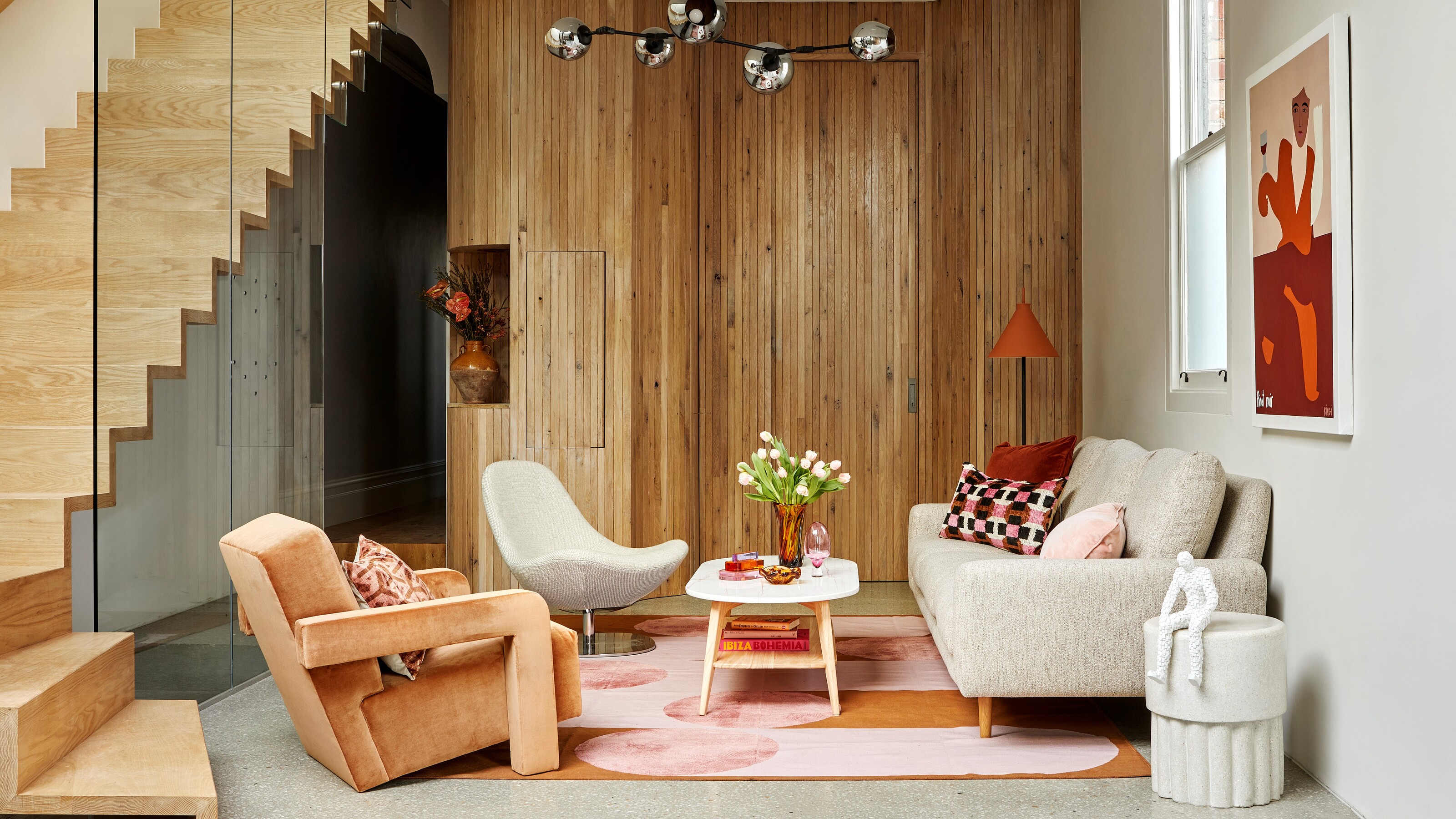 The 10 best living rooms of the year – our pick of the most beautiful designs we've seen
We've trawled through the archives to cherry-pick the living rooms that have stood out to us this year
By Oonagh Turner
-
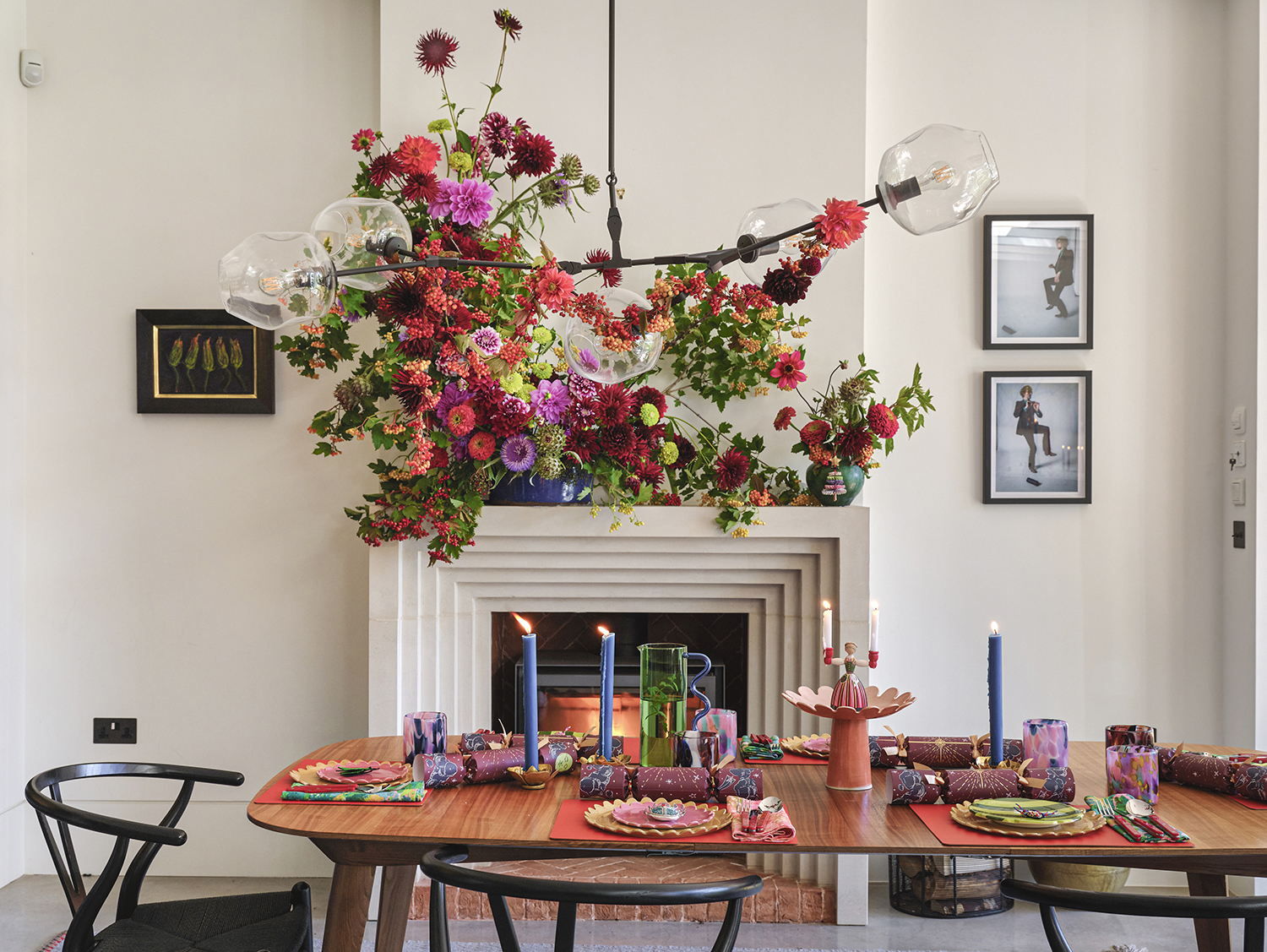 The more joy the better! This designer home shows how to do stylishly maximalist Christmas decor
Bursting with happiness, this colorful home is dressed for Christmas in the most abundant and beautiful of ways
By Mary Weaver
-
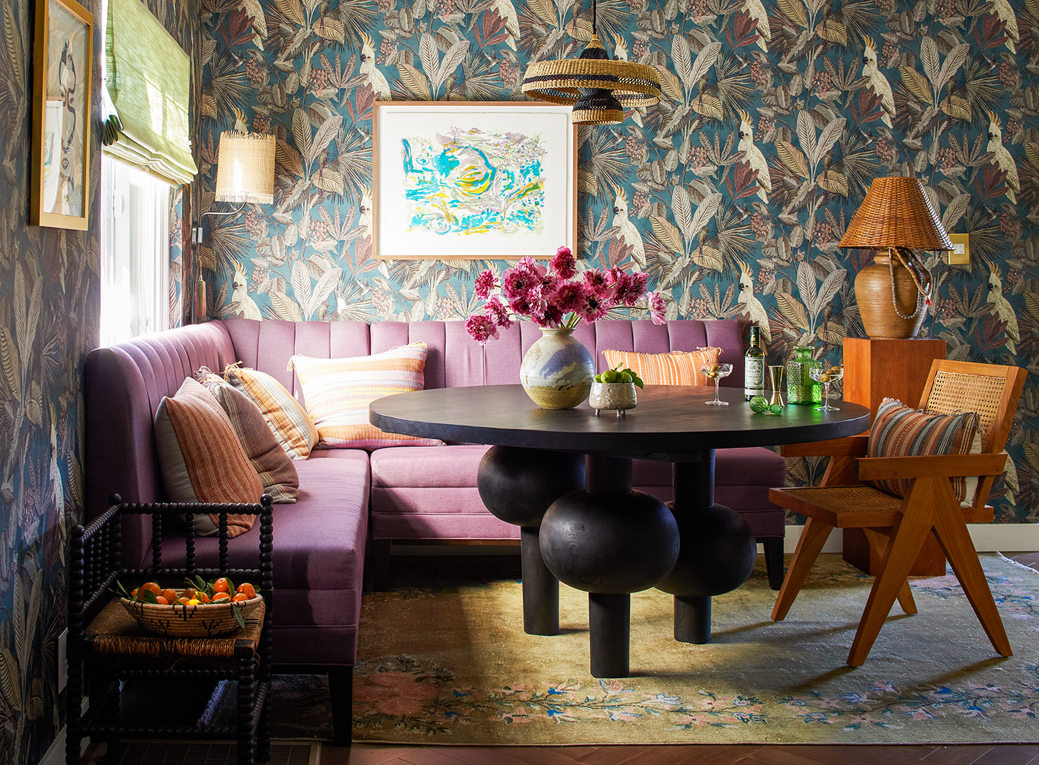 This LA home shows how to do modern eclectic style perfectly - with a utility room of dreams
Creative director Dabito used his interiors know-how to treat his 1950s bungalow to a medley of pattern and color
By Emma J Page
-
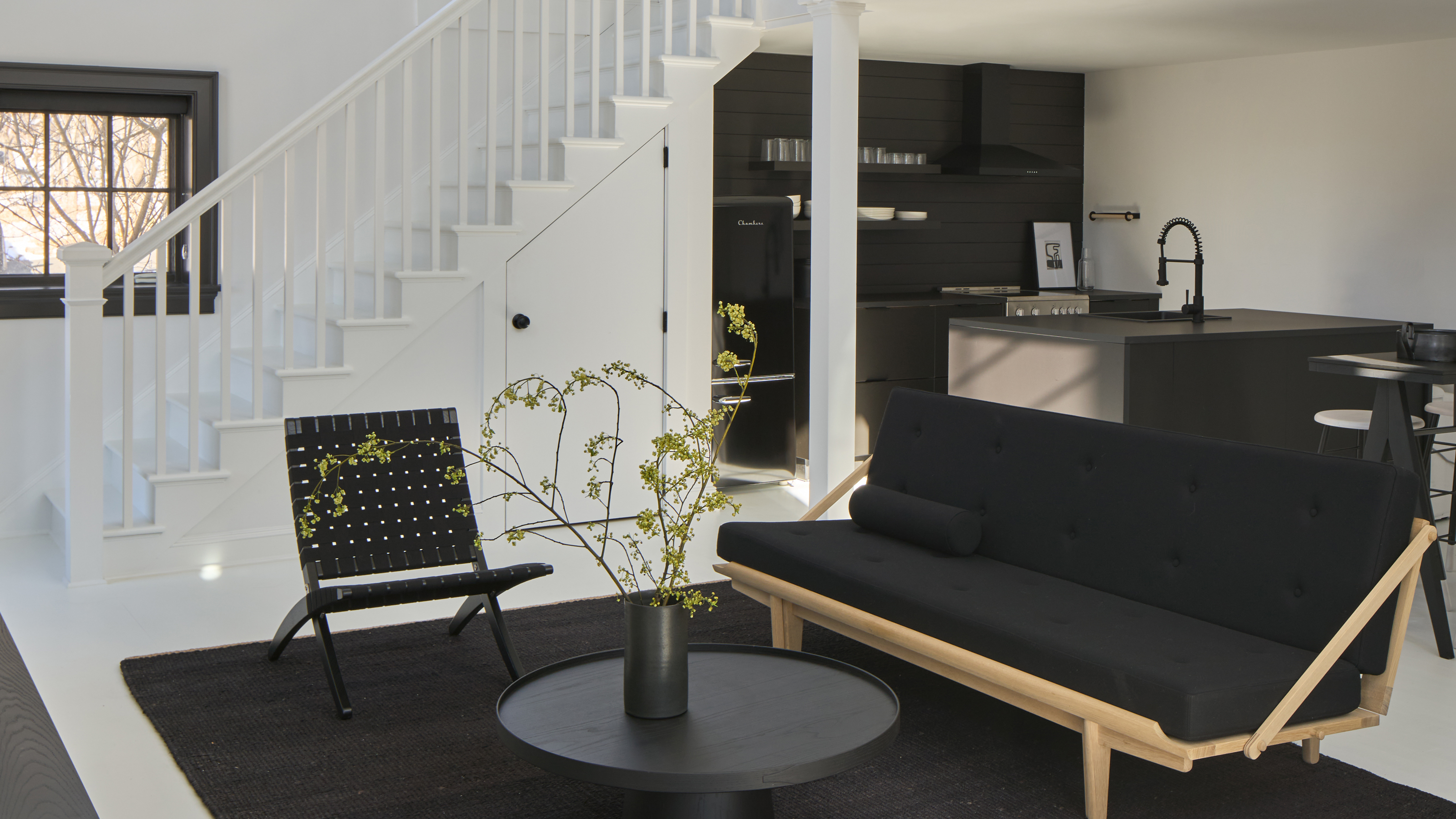 Can you decorate a home with just black and white? This modern cottage proves it's an option
For this guest house in Connecticut, the interior designers used a strict black and white color scheme. Here's how they made it work
By Hugh Metcalf
-
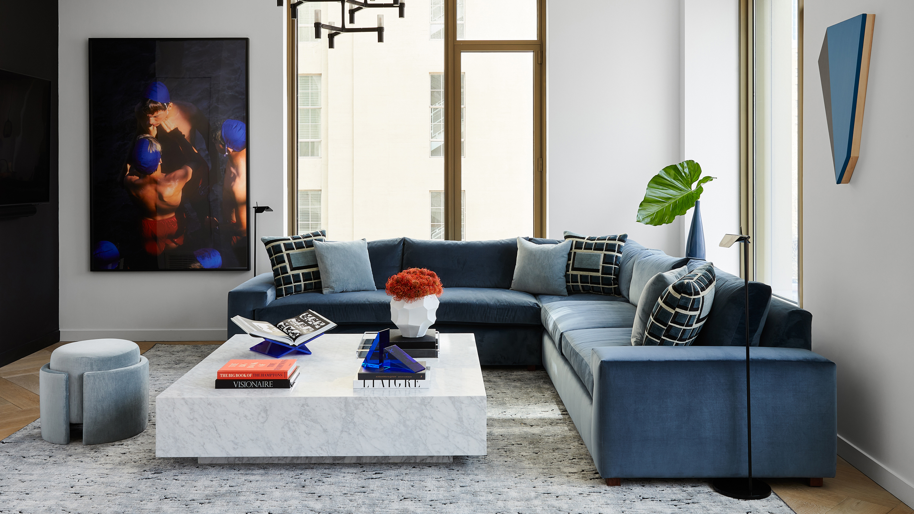 An interior designer completely redesigned this Manhattan apartment in just 90 days from start to finish
Justin Charette proved that a challenging deadline doesn't have to get in the way of creating a beautiful home
By Hugh Metcalf
-
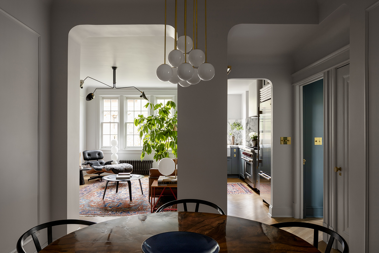 This architect's apartment is a masterclass in how to make a small space feel luxe
Architect Nicholas Potts has turned every corner of his city apartment into an art-filled space that feels opulent yet homely
By Pip Rich
-
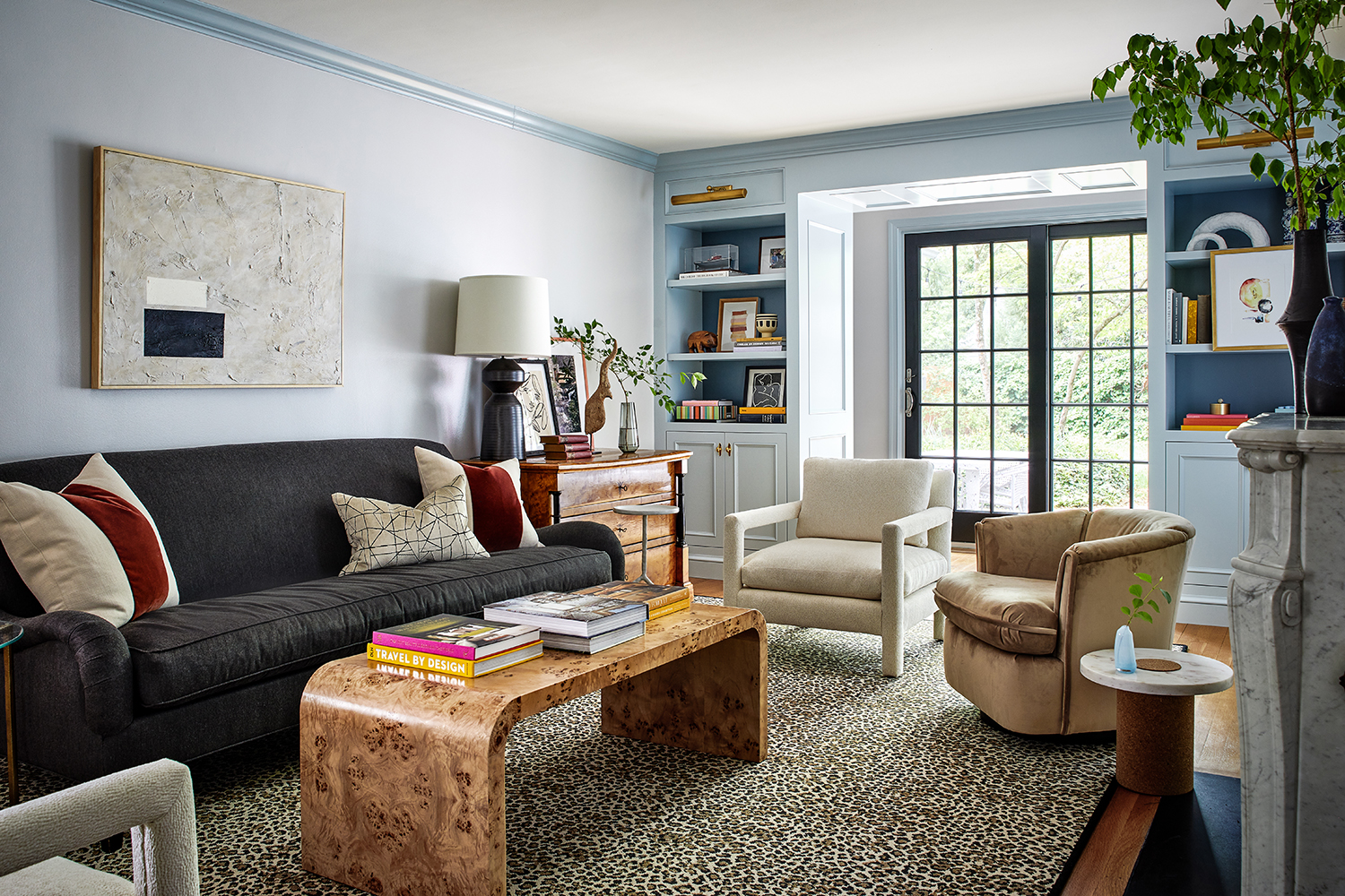 This family home in Washington, D.C. is full of ideas to steal for displaying art in brilliantly personal ways
Designer Zoe Feldman has created a modern home full of contrast, clever color choices and inspiring ways to showcase art
By Pip Rich
