This Connecticut Home Knows The Secret to 'Warm Minimalism' — "It Now Feels So Calming"
Warm woods, moody marbles, and a beautiful brick fireplace make this family home feel calm and serene..but you should see what it was like before

The Livingetc newsletters are your inside source for what’s shaping interiors now - and what’s next. Discover trend forecasts, smart style ideas, and curated shopping inspiration that brings design to life. Subscribe today and stay ahead of the curve.
You are now subscribed
Your newsletter sign-up was successful
Creating a contemporary minimalist space that simultaneously feels calming, warm, and full of character is a job easier said than done. More often than not, stark interiors can feel cool and unwelcoming, but the designer couple behind this Connecticut home knew exactly how to strike a balance for a harmonious space fit for family life.
James Veal and Christine Stucker - the husband and wife duo behind Stewart-Schafer studio - transformed this once-dated interior into a minimalist modern home. Inspired by the beauty of the surroundings outside the four walls, they wanted to seamlessly blend indoors and out, with large windows and skylights to flood the previously dark space with plenty of natural light.
The homeowners, a married couple with two children, wanted a space to accommodate family gatherings and entertain guests. Given the wife's passion for cooking, crafting a top-tier kitchen was paramount, and a streamlined space free of clutter took full priority. Central to their vision was the creation of a warm and inviting heart for the home, realized through a strategically positioned island that invites the family to gather.
Article continues below'We were really given complete creative freedom,' says James. 'The clients are a young family and they wanted the space to be more reflective of their personalities. They come from fashion / creative backgrounds and bought this house site unseen, and we wanted to make it feel timeless and elegant as well as inviting and comfortable.' Here, we take a closer look inside to see how James and Christine achieved just that.
Kitchen

The kitchen before the renovation
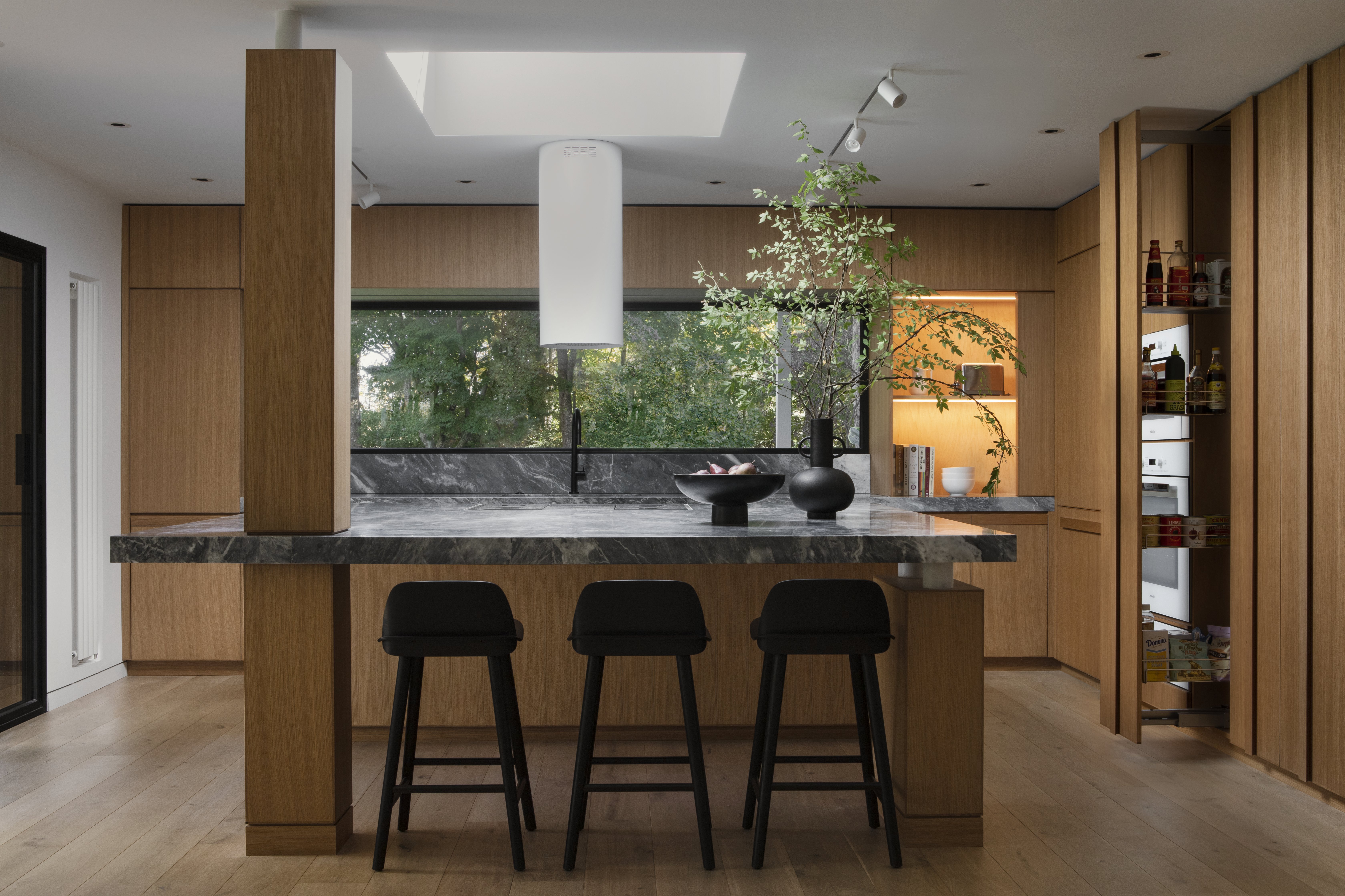
Before James and Christine of Stewart-Schafer worked their magic, the kitchen lacked personality with bland white cabinetry and dark granite countertops that instantly dated the space. Despite being an airy room the space also lacked natural light, so James and Christine strategically integrated a skylight above the island to illuminate the kitchen island below.
'In the kitchen, we gutted the original space and opened it up,' says Christine. 'We moved all the appliances and expanded the overall size. We created a center body which houses the stove - it appears to be holding up the ceiling and follows through into the formal living room. On the back side of this body (in the living room) we added beautiful custom bookcases and additional storage.'
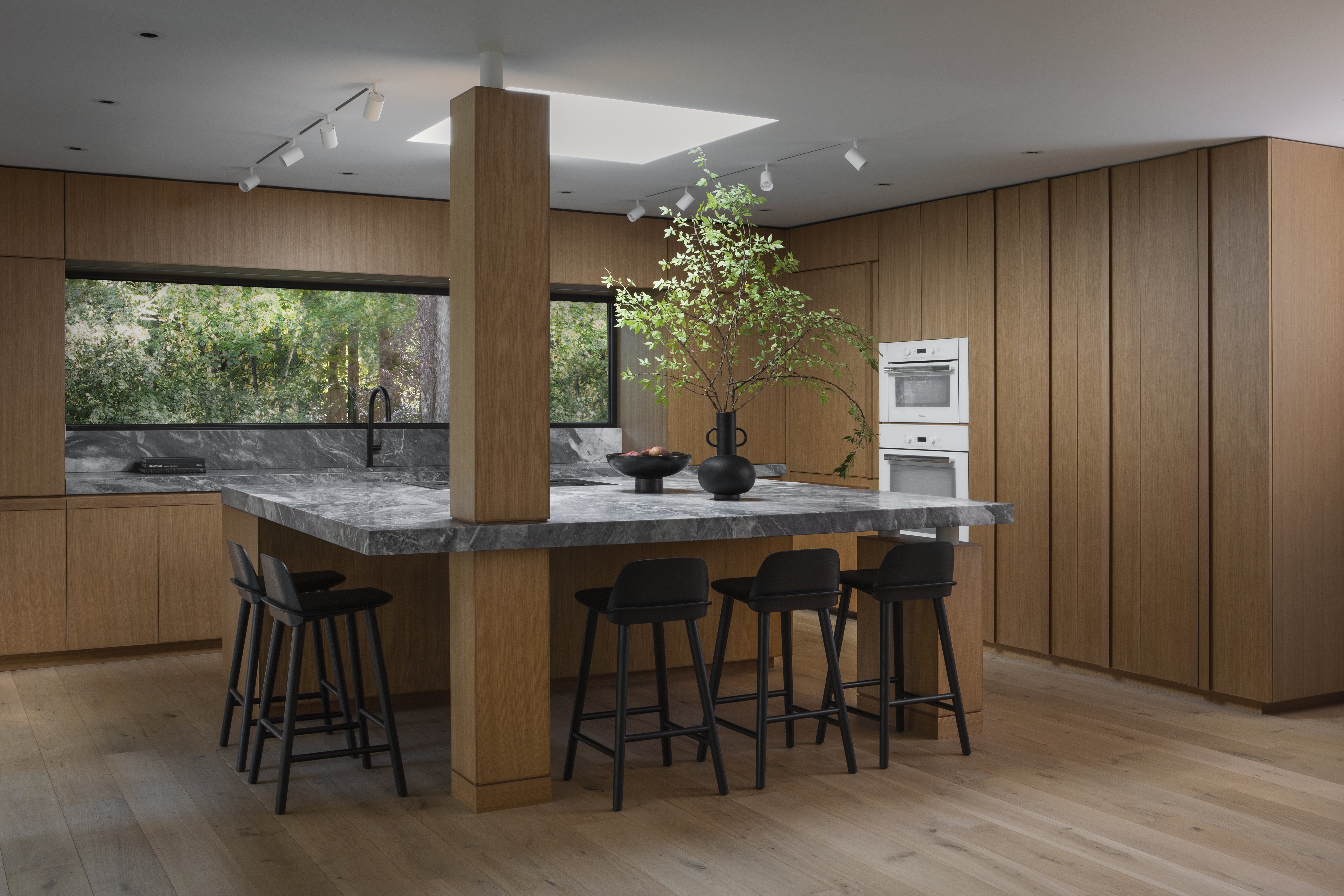
The kitchen after the renovation
Thanks to their hard work, the space now feels like a contemporary, calming oasis. Despite the minimalist kitchen design, it still feels characterful, something James says comes down to the custom detailing on all the millwork. 'Having designed all the cabinets ourselves we were able to create a unique detail to the profile of the cabinet doors,' he says. 'This little unique detail makes for a very bespoke and unique kitchen. We also create custom door jambs with a reveal around them. It's all about the details.'
The Livingetc newsletters are your inside source for what’s shaping interiors now - and what’s next. Discover trend forecasts, smart style ideas, and curated shopping inspiration that brings design to life. Subscribe today and stay ahead of the curve.
The marble and wood pairing has a particularly calming effect in this organic-inspired space. 'We wanted to create a sense of timelessness in this 200-year-old home,' notes Christine. 'We did this by resurrecting some original details and marrying them with new elements. We wanted the home to have an Old World European, yet modern feeling. We wanted it to be a blend of sophisticated modern lines against colonial details, balancing the soul of the house with the clients' desire for a more contemporary feel. We achieved this with a lot of honed marble and various stones throughout.'
Home bar
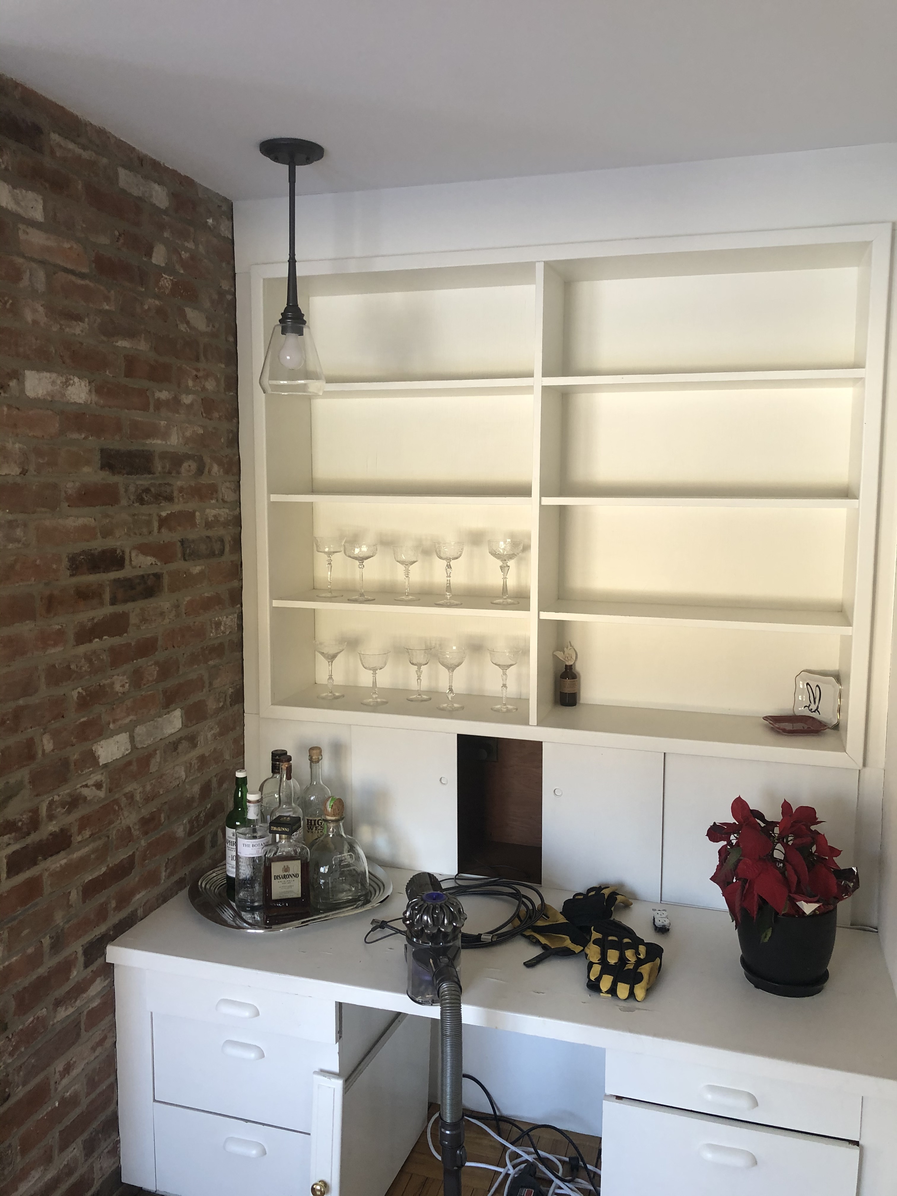
The home bar before the renovation
Exposed brickwork is another element of the home that brings personality and charm to the space, especially in the home bar area. Sadly, though, the simple white desk and open shelving that formed the space prior to the renovation was lackluster and failed to deliver the sense of luxury or sophistication that an at-home bar should.
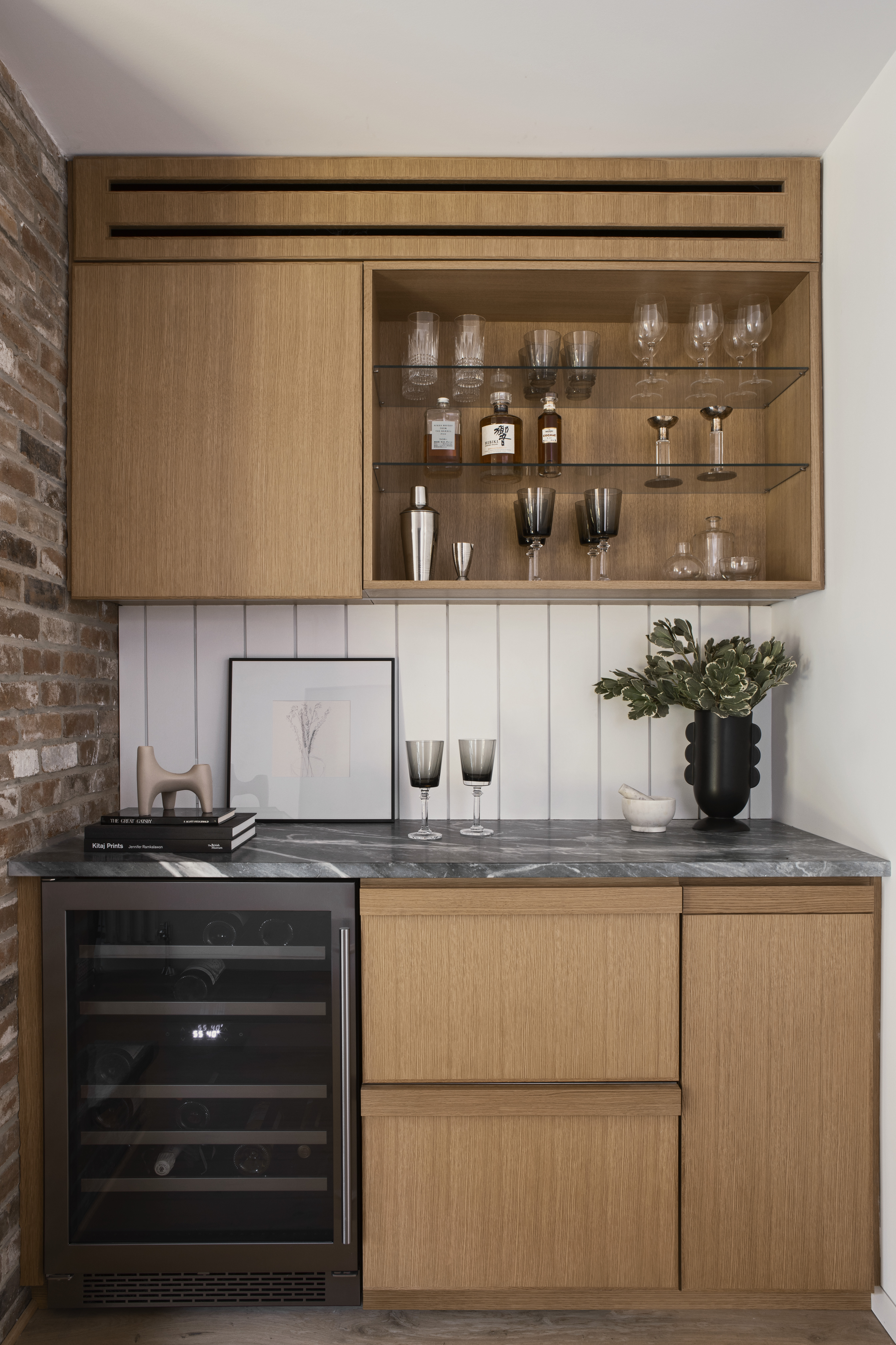
The home bar after the renovation
Now, however, it succeeds in both those departments, the beautiful custom millwork offering plenty of warmth while the paneled back wall feels clean, crisp, and contemporary. The decision to retain the exposed brick wall also pays homage to the roots of this New England home.
Living room
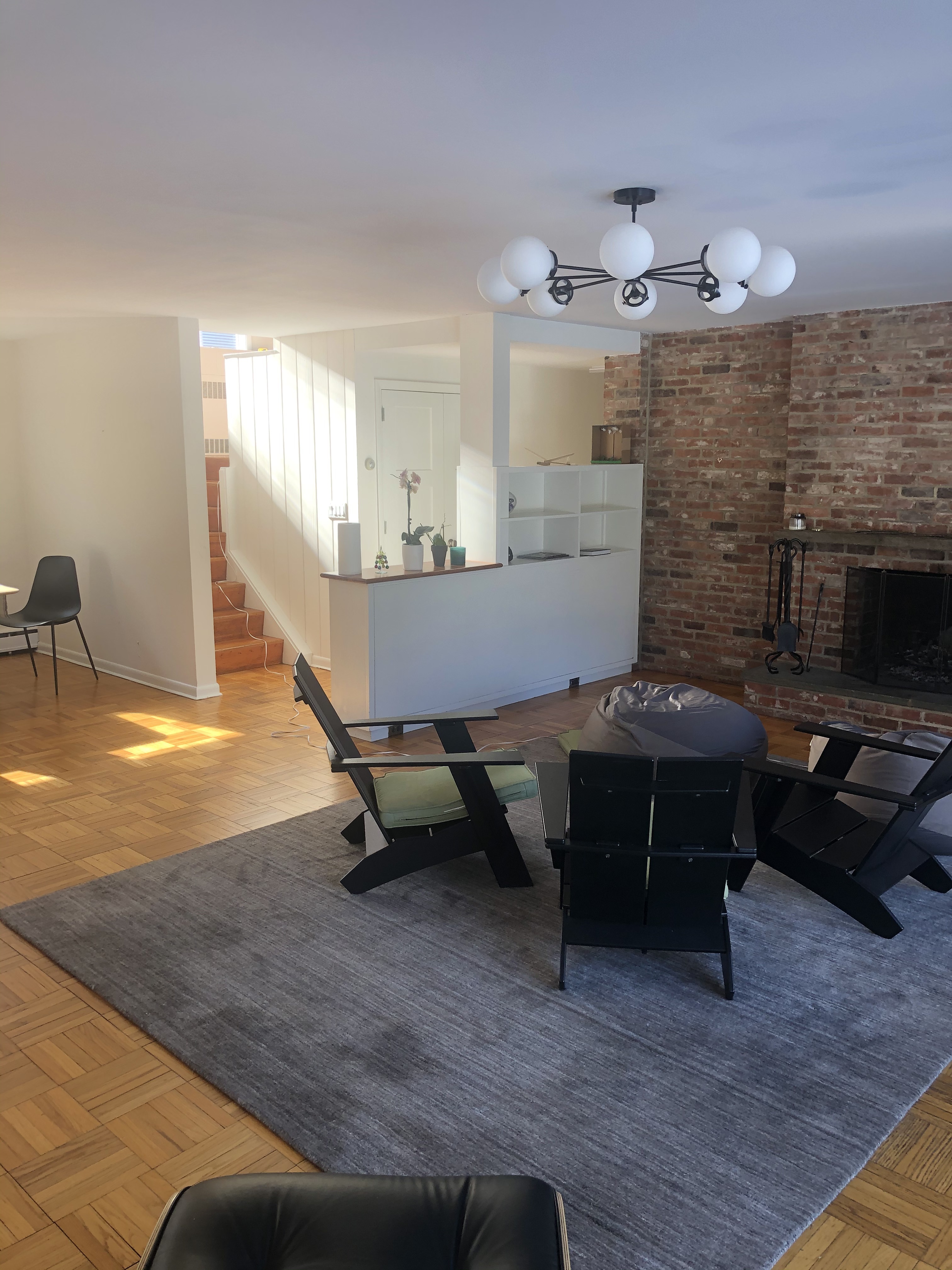
The living room before the renovation
A brick fireplace in the living room is one of the other historical details within the home, although the previous interior failed to frame this worthy focal point. Parquet flooring, a grey rug, and Adirondack-style chairs made this convivial space feel cold and uninviting, and - once again - the space was crying out for more light.
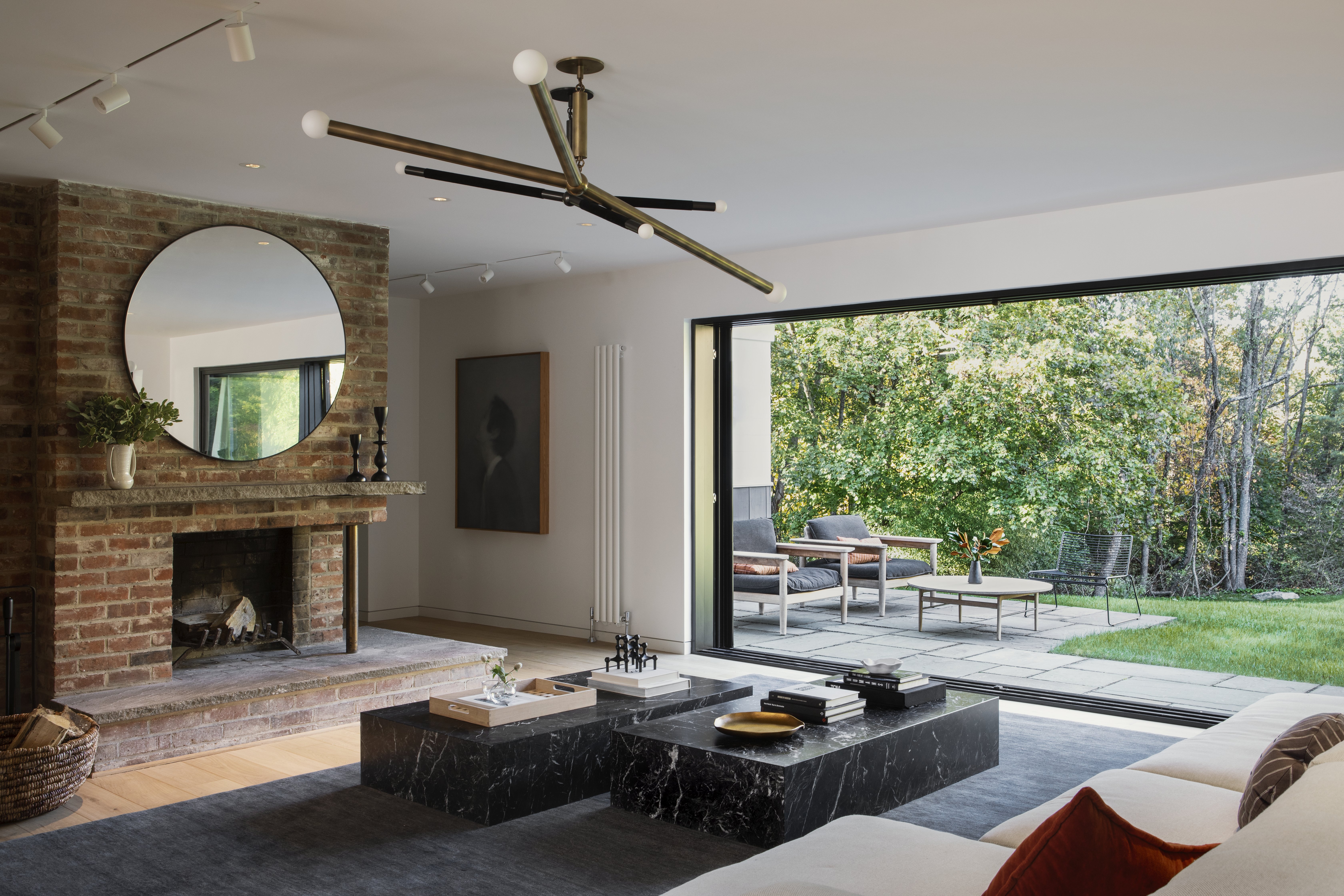
The living room after the renovation
Now, French doors replace the small windows, offering a beautiful view into the backyard. Keen to keep the fireplace, James and Christine also used the original feature to influence the rest of the surrounding design. 'We wanted to pay homage to the original origin of this home,' says James. 'Over the years things were added and taken away which were from conflicting genres. We made a huge effort to listen to the home and push it in the direction that would breathe new life into it yet show respect to its original design.'
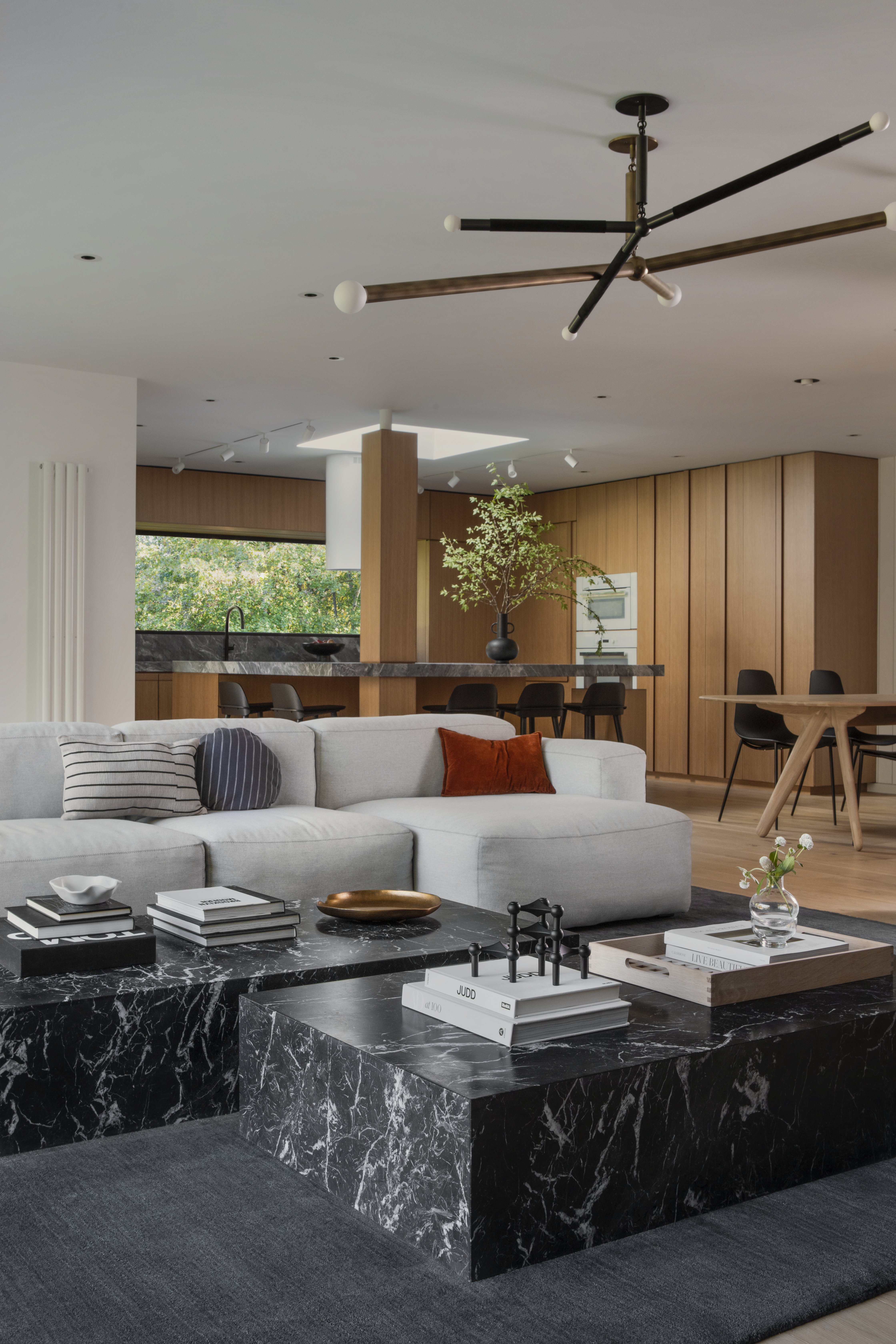
The living room after the renovation
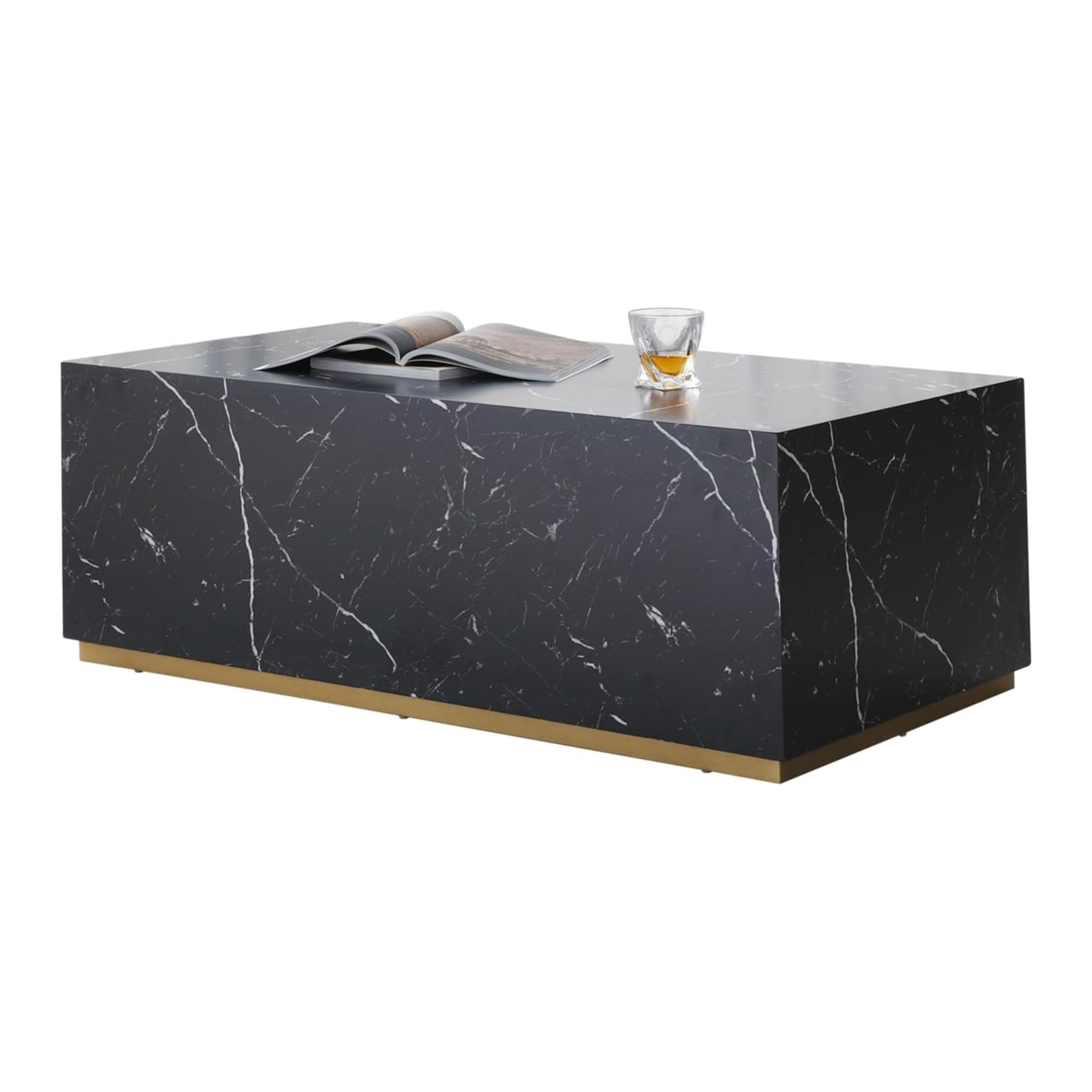
The open living room was also outfitted with custom millwork in the form of a bookcase on the back wall of the kitchen and there are plenty of hidden storage solutions to contribute to a clean, clutter-free aesthetic. Combine that with the beautiful styling which incorporates a sumptuous sectional sofa, a moody marble coffee table, and a striking brass light fixture, and this living room becomes the comfortable and convivial space the homeowners had always envisaged.
Get the look

Lilith Hudson is a freelance writer and regular contributor to Livingetc. She holds an MA in Magazine Journalism from City, University of London, and has written for various titles including Homes & Gardens, House Beautiful, Advnture, the Saturday Times Magazine, Evening Standard, DJ Mag, Metro, and The Simple Things Magazine.
Prior to going freelance, Lilith was the News and Trends Editor at Livingetc. It was a role that helped her develop a keen eye for spotting all the latest micro-trends, interior hacks, and viral decor must-haves you need in your home. With a constant ear to the ground on the design scene, she's ahead of the curve when it comes to the latest color that's sweeping interiors or the hot new style to decorate our homes.
