From Basic to Brilliant! This Designer Turned a Bland Apartment Into a Home Filled With Charming Ideas
Designers played around with antique furnishings, intricate wall art, and a luxurious blue sofa to create an enviable art-deco bachelor pad
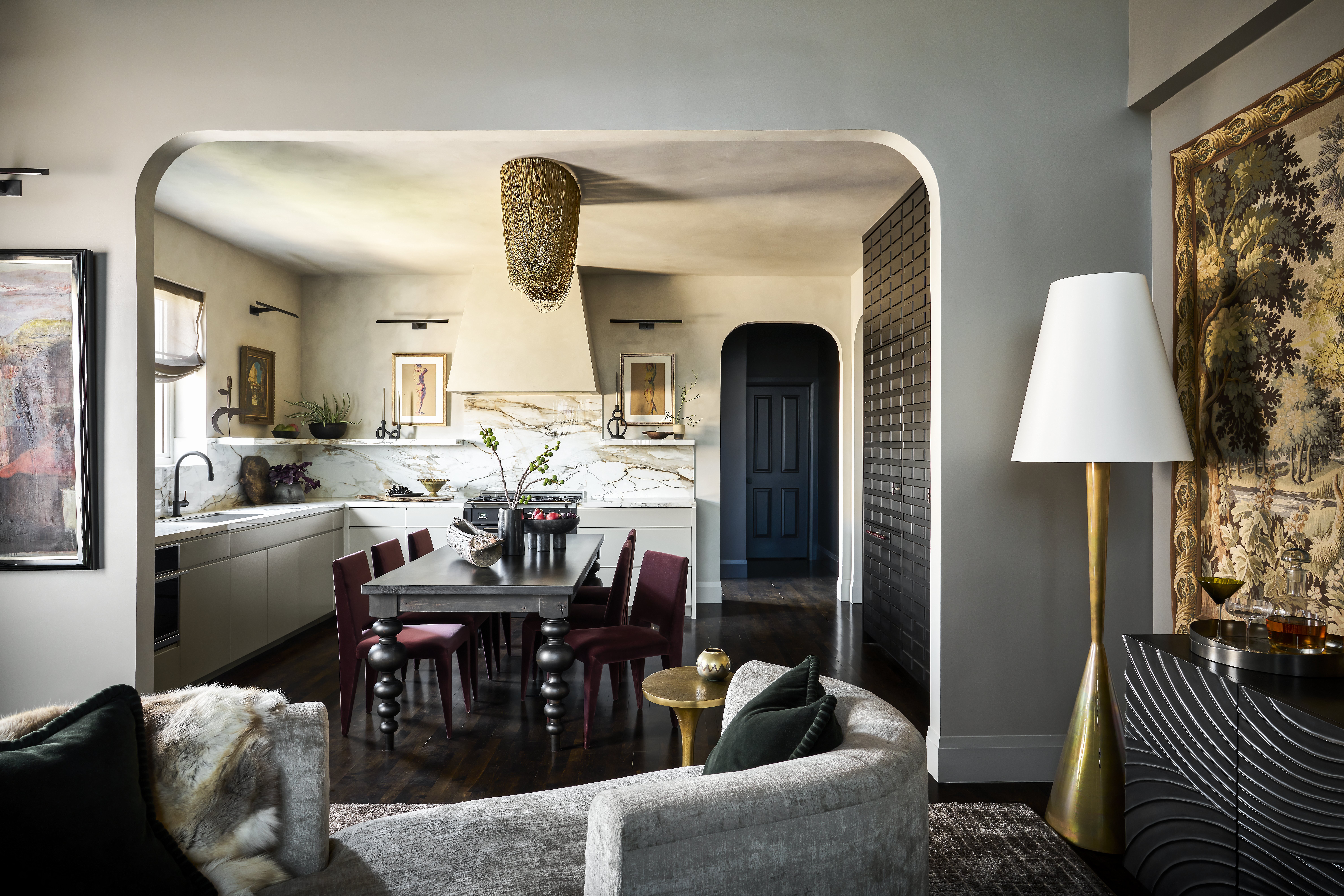

When it comes to designing a home with as many layers as this one, the devil is in the details. At first glance, this home is the epitome of cool maximalism while somehow retaining the vibe of a comfortable home. As effortlessly complete as this bachelor pad may seem, a second glance will reveal the intricacies that truly make this home the kind that will reside in the personal Pinterest boards of interior enthusiasts (including myself).
What was once a home with light accents in the form of white marble, pale wood, beige furniture, and plenty of free space has since been converted into a modern den with dark accents, statement upholstery, and some undeniably gorgeous vintage pieces. The brain behind this beautiful home is Lauren Svenstrup, founder of Chicago-based interior design firm Studio Sven.
Lauren has a history of converting modern homes into gorgeous spaces that ooze with the best of Art Deco interior design, without sacrificing the functionality of the home. It isn't the kind of house where the sofa is a dream to look at but a nightmare to lounge on. Instead, Lauren focuses on creating a space that looks fabulous but is also comfortable enough to live in.
There is a thin line between chic maximalist interiors and overwhelming trend-saturated spaces. This home is the perfect example of how to accessorize to the nines without confusingly compromising the overall aesthetics of a house.
Curious to know more, we spoke to Lauren to find out just how she managed to transform this home from simple to something else entirely.
Kitchen
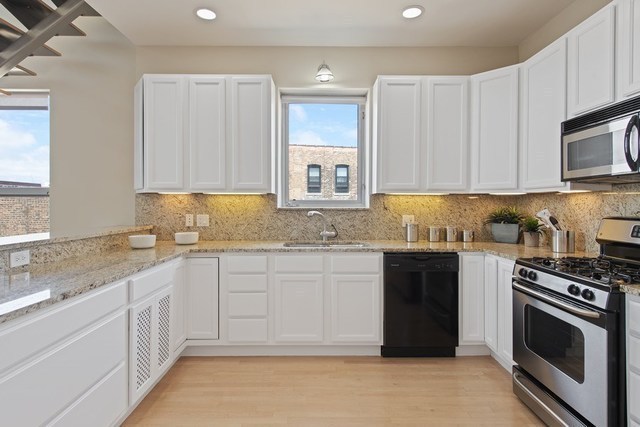
The kitchen before the renovation
Although the varying styles of the equally fashionable rooms make it difficult for us to play favorites with this project, we can't help but daydream about this kitchen. The organic use of dark wood accents is perfectly complemented by the ornate vintage elements, seamlessly tying the kitchen space together.
Lauren tells us that the dining room and the kitchen were designed to be the focal point of the home in order to improve the overall flow of the space while also prioritizing the intimacy of the interiors. The previously standard peninsula kitchen and open dining space were renovated to create a romanticized expanse fit for entertaining.
Be The First To Know
The Livingetc newsletters are your inside source for what’s shaping interiors now - and what’s next. Discover trend forecasts, smart style ideas, and curated shopping inspiration that brings design to life. Subscribe today and stay ahead of the curve.
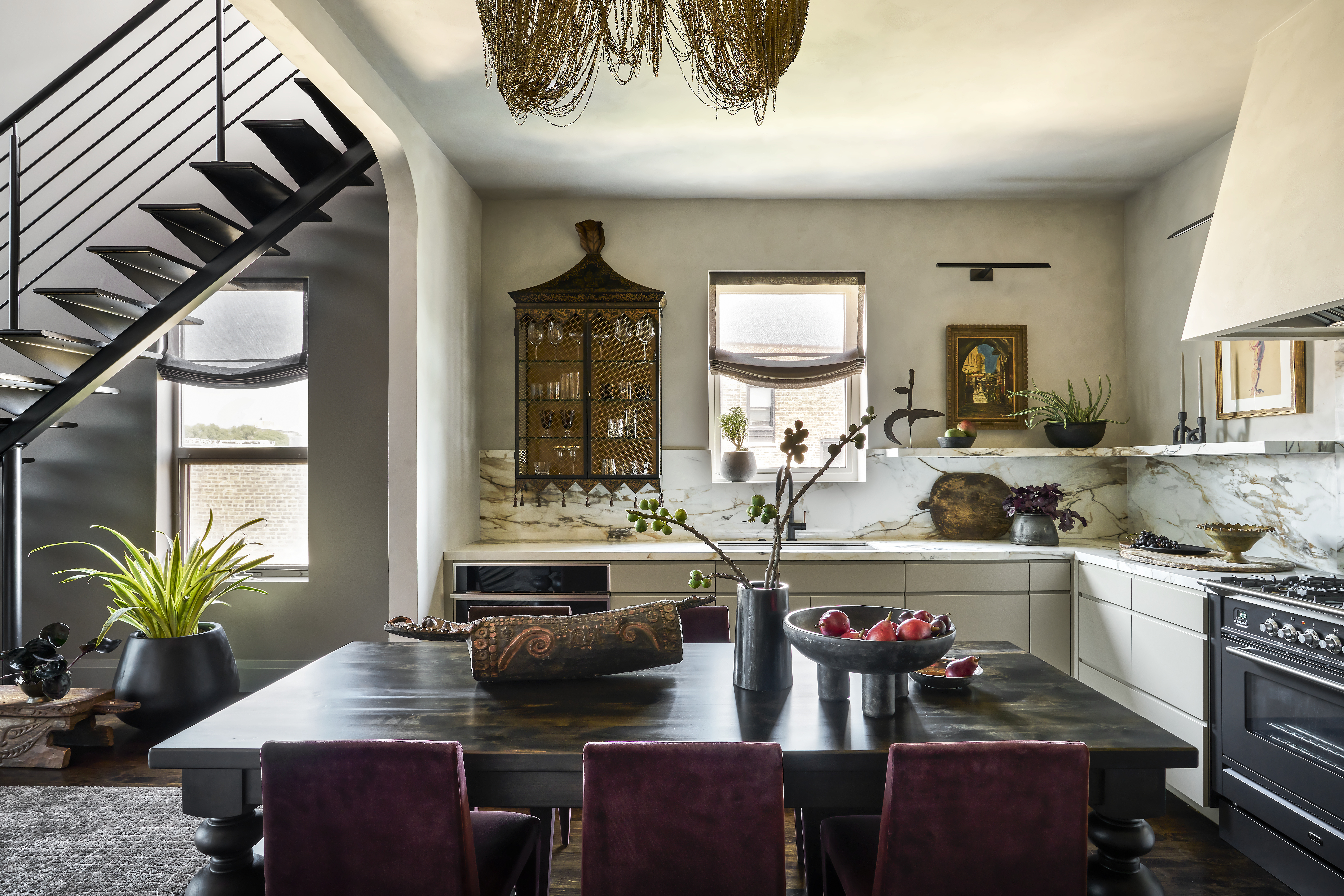
The kitchen after the renovation
The home is filled with calming plants throughout too. Resting in black-colored vases and pots, the greenery doesn't take away from the home's overarching color palette. The dining area features a gorgeous wooden table surrounded by a maroon set of chairs and it's this combination of dark brown and plum that subtly elevates the kitchen.
'Our client had his heart set on a kitchen centered around an exaggerated, traditional dining table (one that sat 10 people to be exact) and he didn’t want the look of a typical kitchen island. He was on the lookout for something more cozy and comforting with a touch of exclusivity – almost like sitting at the private chef's table at a nice restaurant,' notes Lauren Svenstrup.
The styling of the space is meant to tell the story of the client's interests and travels with the help of curated styling and intentional negative space to empower him to grow his collection as his story continues to evolve, the designer explains.
Living Room
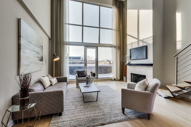
The living room before the renovation
The living room underwent a major transformation to suit the client's passion for entertaining. Considering the fact that the living area is commonly the most used room when hosting, it's no surprise that this redesigned version of the space seems to have all the makings of a soirée to remember.
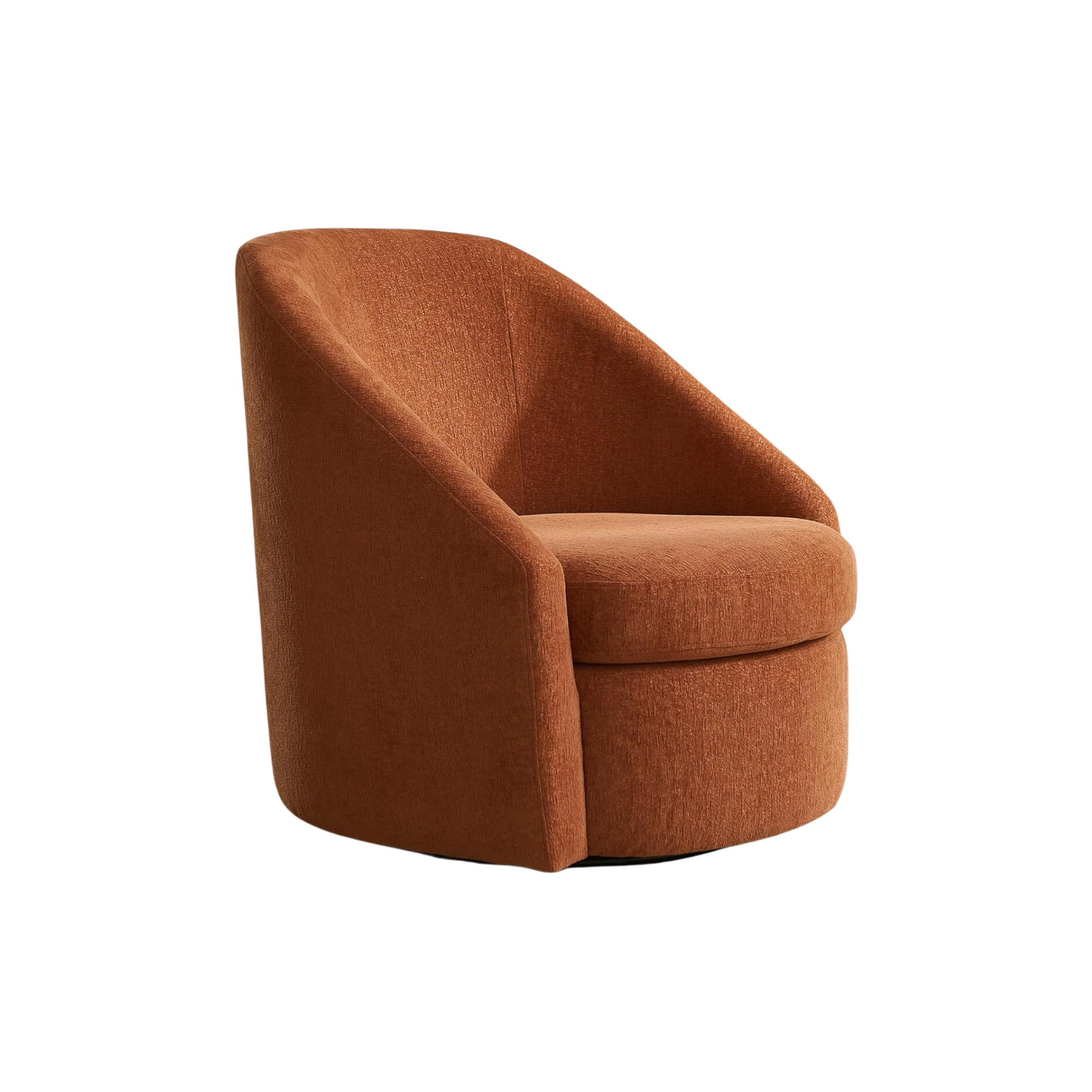
It's almost hard to imagine the space as plain as it once was, with its now plush curved couch and eye-catching fringed orange sofa chair. The unexpected pops of color are a welcome surprise in contrast to the darker neutrals that coat the room.

The living room after the renovation
Lauren is a big fan of curved sofas but only the ones that are as good-looking as they are comfortable. 'We ultimately opted for a feather-wrapped down after conducting a sit-test, not only to perfect the visual crown of the cushion but to ensure we provided a sofa our client would actually want to lounge on,' she says. In addition to its furnishing addition to the space, Lauren tells us that the curved layout of the sofa is essential to the smoothen the flow of the floorplan.

The living room after the renovation
The beautiful antique tapestry is an instant focal point for the room. While Lauren admits that she tends to routinely gravitate towards large focal art, she tells us that this tapestry was well-matched and rather essential to the hyper-traditional yet contemporary aesthetic that she was going for.
'The grand scale of the wall called for a large piece of art to accompany it. We were immediately drawn to the concept of an antique tapestry, and intended for the tapestry to be sourced by our client, so he could have more of a personal connection to the space,' says Lauren.
Study
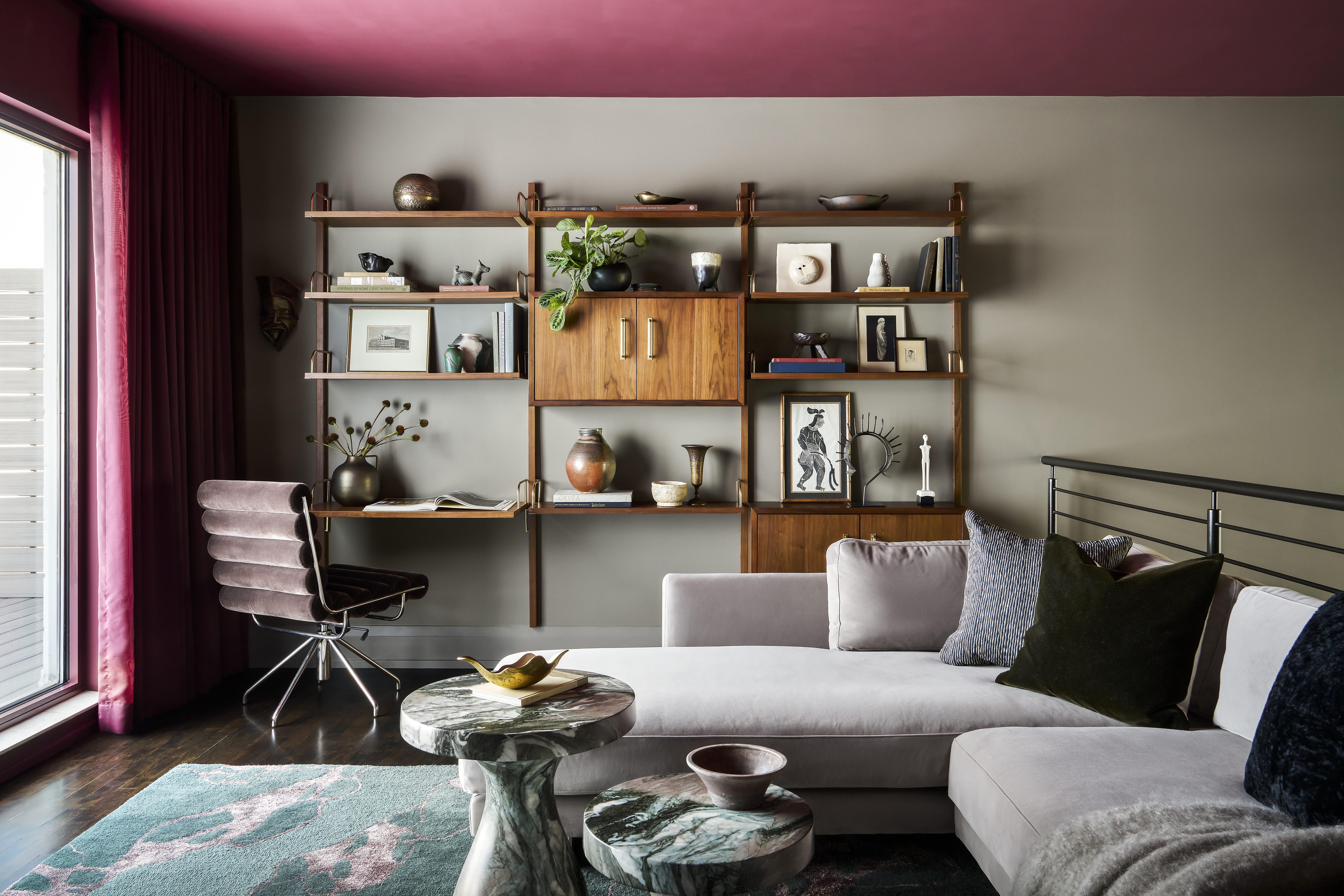
The study after the renovation
The two-story home's upper level was previously bare with heaps of unfurnished space that was just waiting to be decorated. Lauren saw incredible potential in the space and converted it into the perfect open-concept home office. The room was intended to be a workspace, completely fitted with a desk, shelving units, and a soft swivel chair perfect for working from home. However, Lauren took advantage of the large windows and created a personal lounging area, adding a layer of comfort to the workspace.
Bedroom
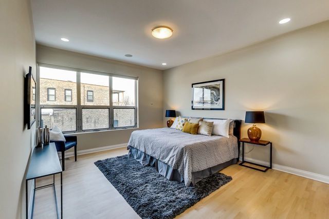
The master bedroom before the renovation
The modern bedroom receives heaps of light, so the hues of black and white add a refreshing contrast to the space. According to Lauren, her client was happily involved in the entirety of the renovation but understandably collaborated with them further to bring his vision of the ultimate bedroom to life.
'The homeowner had his heart set on a four-poster bed, wanting the design to emulate that of a posh hotel. Our take on that concept adds a little drama with a touch of whimsy. We stumbled on this amazing mural wallpaper by Palomba Serafini Associati, and knew the search ended there,' notes Lauren.

The bedroom after the renovation
Lauren mentioned that the homeowner had a very specific definition of what he envisioned a home to be – personal, storied, and collected and felt his past homes lacked that level of personalization. Throughout the transformation of this modern home, from the kitchen to the bedroom, the client wanted each living space to reflect his adventures so far. So it's no surprise that each room tells a story of its own.
Bathroom
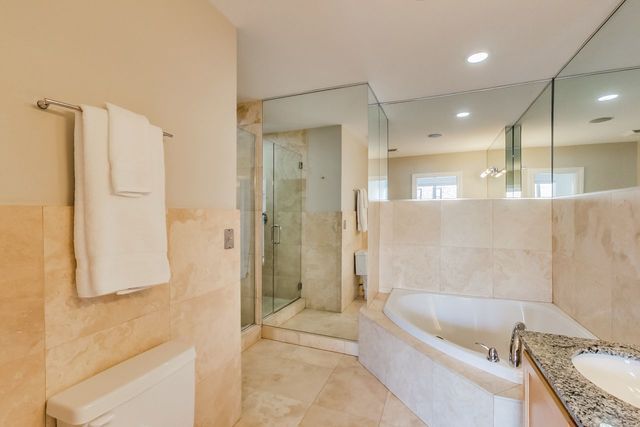
The bathroom before the renovation
Once you peek at the master bathroom post its renovation, you'll understand just how intelligent use of modern interior design can truly make or break a space. Looking at the refreshed bathroom, we can't help but admire the elements of decor that converted it into a virtually unrecognizable space. The bland white marble and aged layout is now a zen bathroom reminiscent of the kind that is usually spotted in spas and resorts.
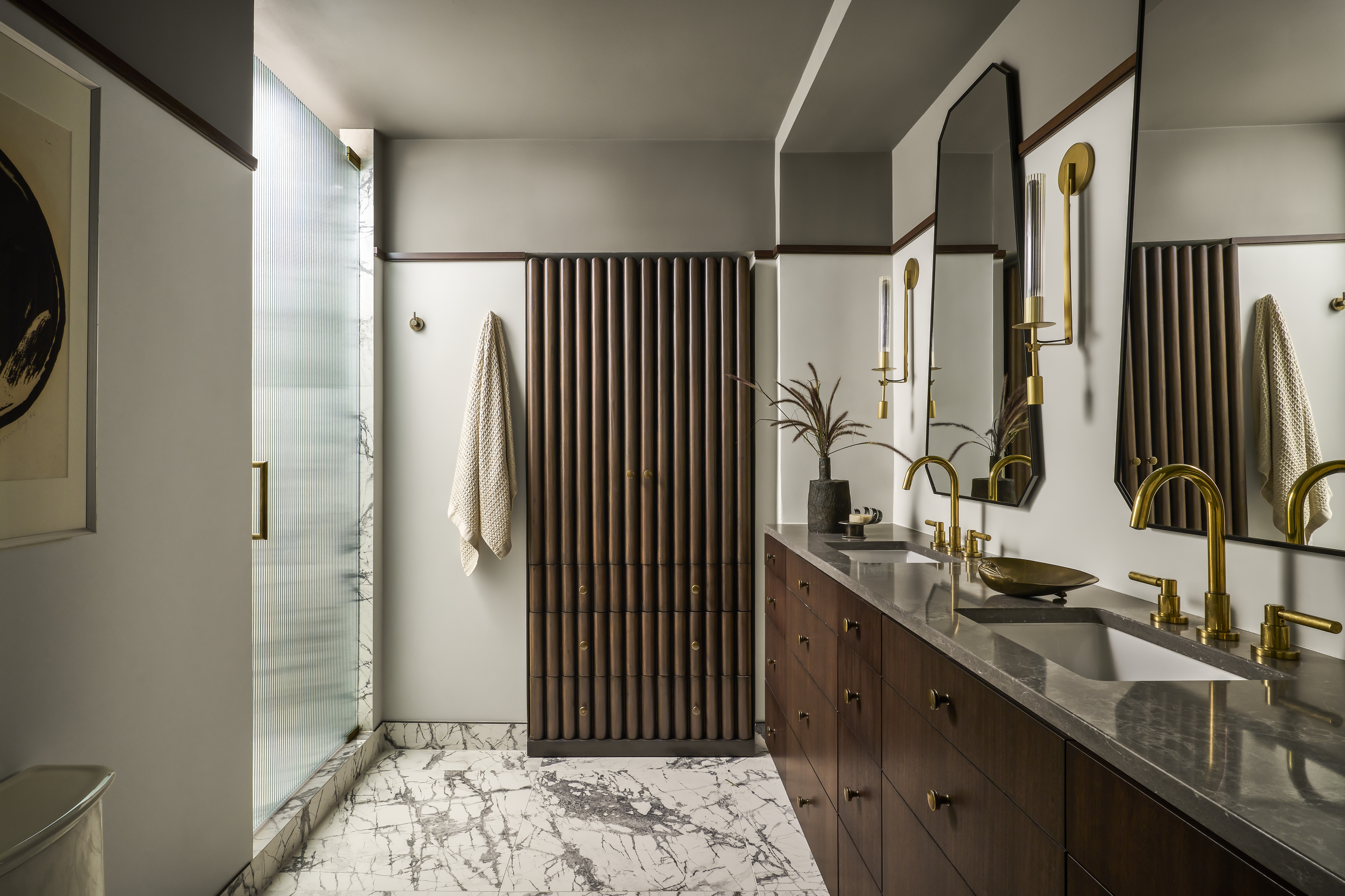
The bathroom after the renovation
Compared to what the modern bathroom once looked like, the new blueprint adds a dynamic dimension to the space. 'The original design was centered around a giant corner jacuzzi tub, a deep alcove for the shower, and a wall-to-wall mirror, making for very little functional counter space or storage. We worked through the layout in hopes of a simplified functional design, while allowing for moments of the unexpected,' she says.

The bathroom after the renovation
Unlike the other rooms, Lauren notes that the bathroom demanded a lighter palette, which explains the incorporation of unlacquered brass fixtures for an organic aged look and feel. She explains that the petite bathroom is full of traditional architectural details that amplify the simplicity in form.
She made use of large format tiles that leaned into the lighter modern palette, while the sophistication of the darker wood tones and moldings tied back into the traditional elements defining the rest of the home. We love a his & hers layout in any bathroom, but it's safe to say that this image will be quick to pop into our minds when the time comes for our home renovation.
Guest Room
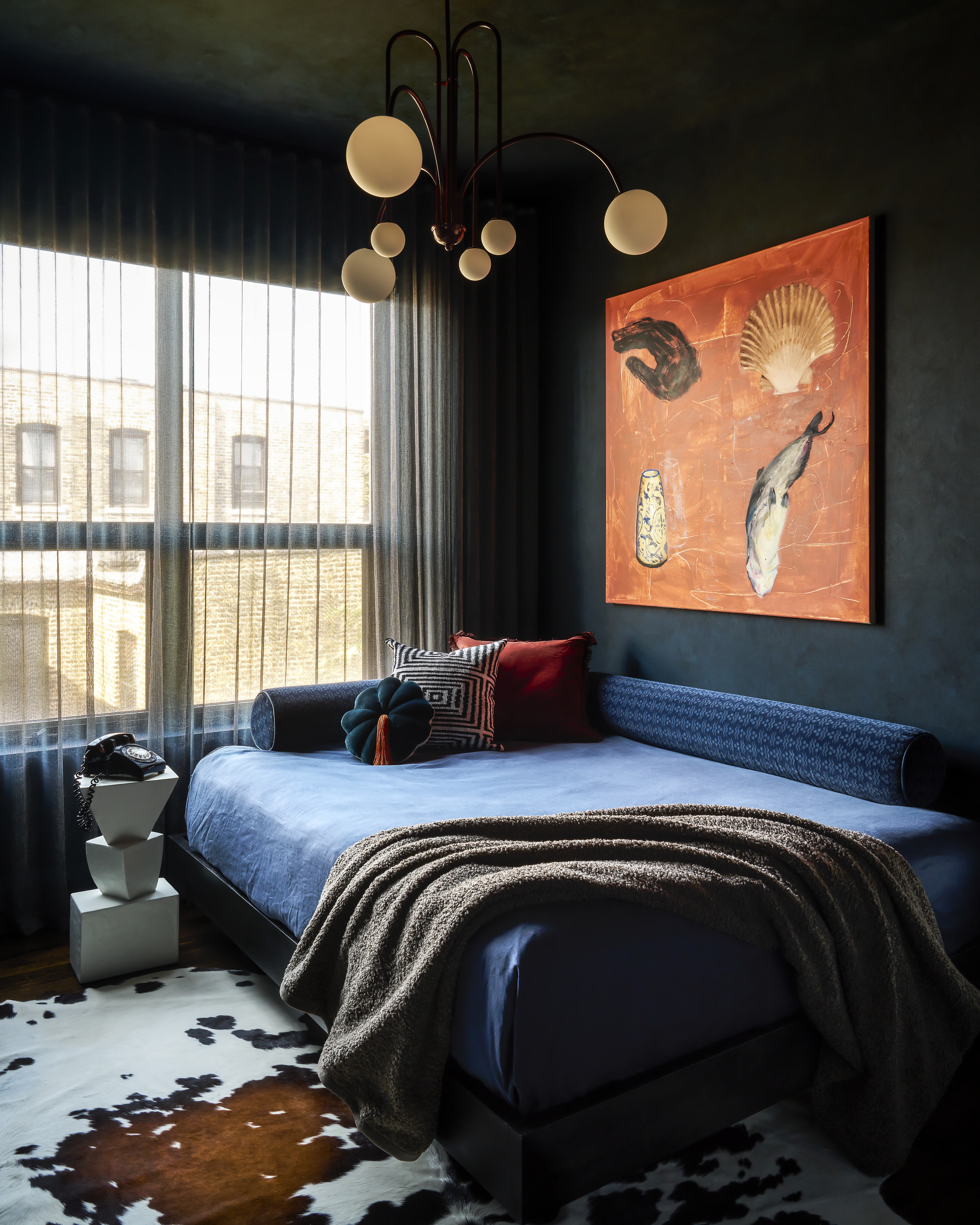
The guest room after the renovation
With its artsy yet comfy interior design, Lauren's idea for this guest bedroom was to create a snug. After coming across the British concept of a snug - which is essentially a small, cozy den-like space, Lauren considered the space to be a perfect fit for a similar aesthetic. 'With smaller city dwellings, rooms rarely have the luxury of serving a singular purpose. I didn’t just want this room to be comfortable for a guest, I wanted it to be inviting to my client – the kind of space that calls to you as you walk by,' she says. Giving us a look into her creative process, she points out that the walls coated in Benjamin Moore’s Gentleman’s Grey create the perfect backing for the stunning wall art by Rachel Pontious sourced from 1st Dibs.
'The queen-sized bed is intended to feel like an inviting daybed for daily pastimes – a place to read, lounge, or stream a show, and the space can also easily transform for guests. Our client loves blue and instead of just using it in a few small elements throughout the home, I dedicated an entire room to it. It’s a color that made him feel calm and collected – that is the feeling the snug was designed to evoke as well,' says Lauren.
Despite the difference in minor themes across the two-story loft, the cohesiveness lies in the minutiae. This home has been transformed from start to finish and aside from the drastic layout changes, including the constructive elements, the carefully curated pieces of decor truly take anyone who steps into this home on a journey.
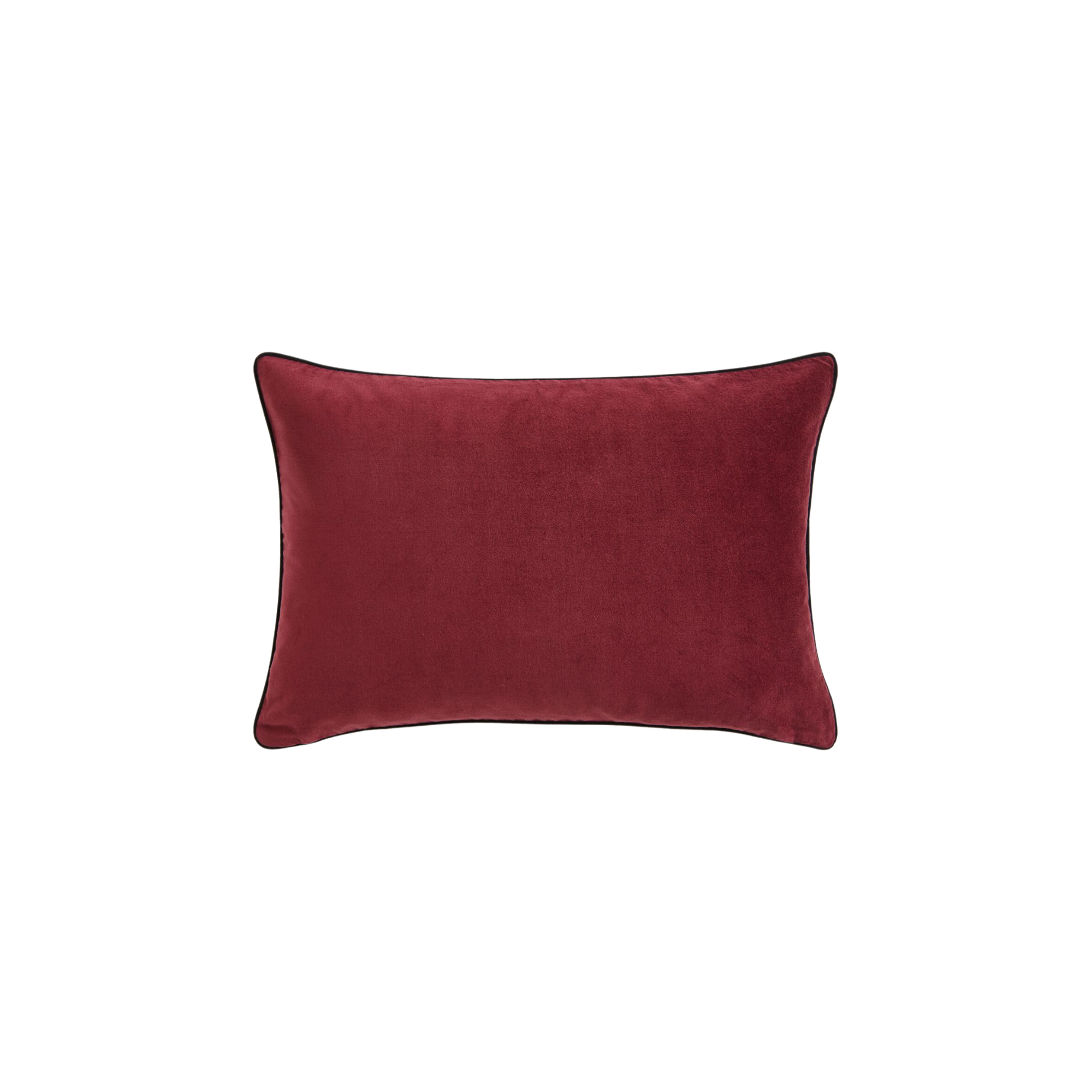
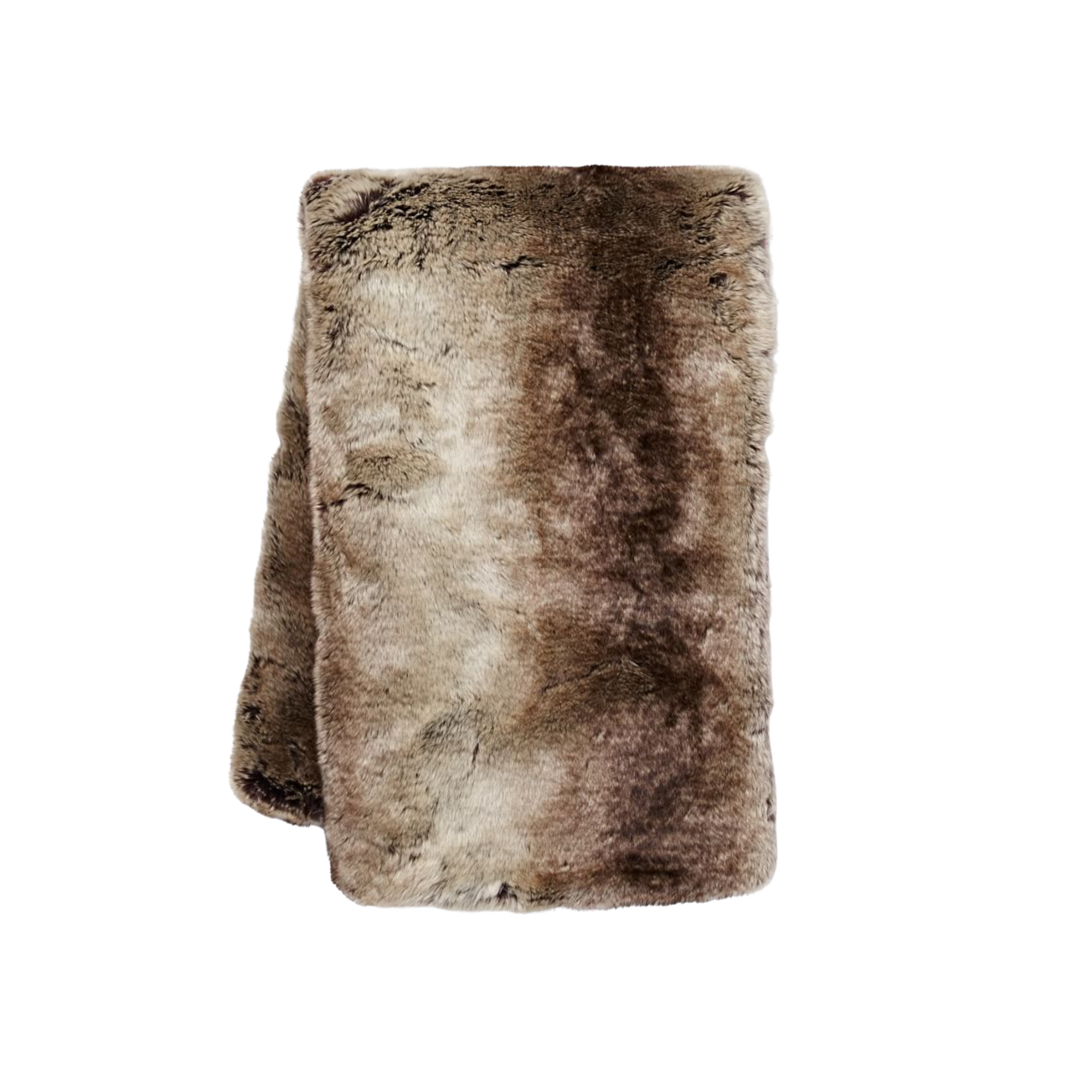
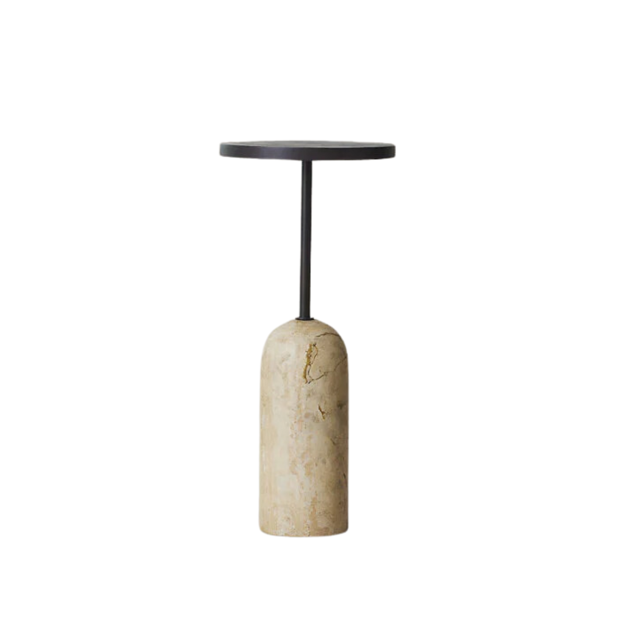
Get the look

Amiya is a Home Wellness Writer at Livingetc. She recently graduated with a Masters Degree in Magazine Journalism from City, University of London, and has lent her words to beauty, fashion, and health sections of lifestyle publications including Harper’s Bazaar and Women’s Health. Her experience as a research analyst has equipped her with an eye for emerging trends. When she’s off the clock, she can be found reading, listening to music, or overanalyzing her latest Co-Star update.
-
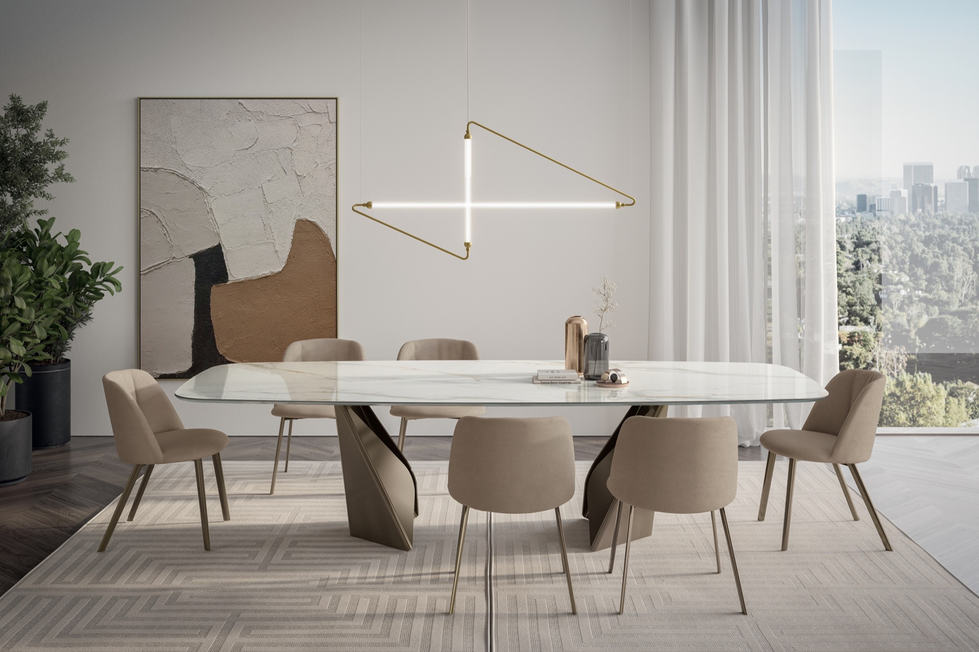 My 10 Favorite Designs at Milan Design Week 2025 — Out of the Hundreds of Pieces I Saw
There is a new elegance, color, and shape being shown in Milan this week, and these are the pieces that caught my eye
By Pip Rich
-
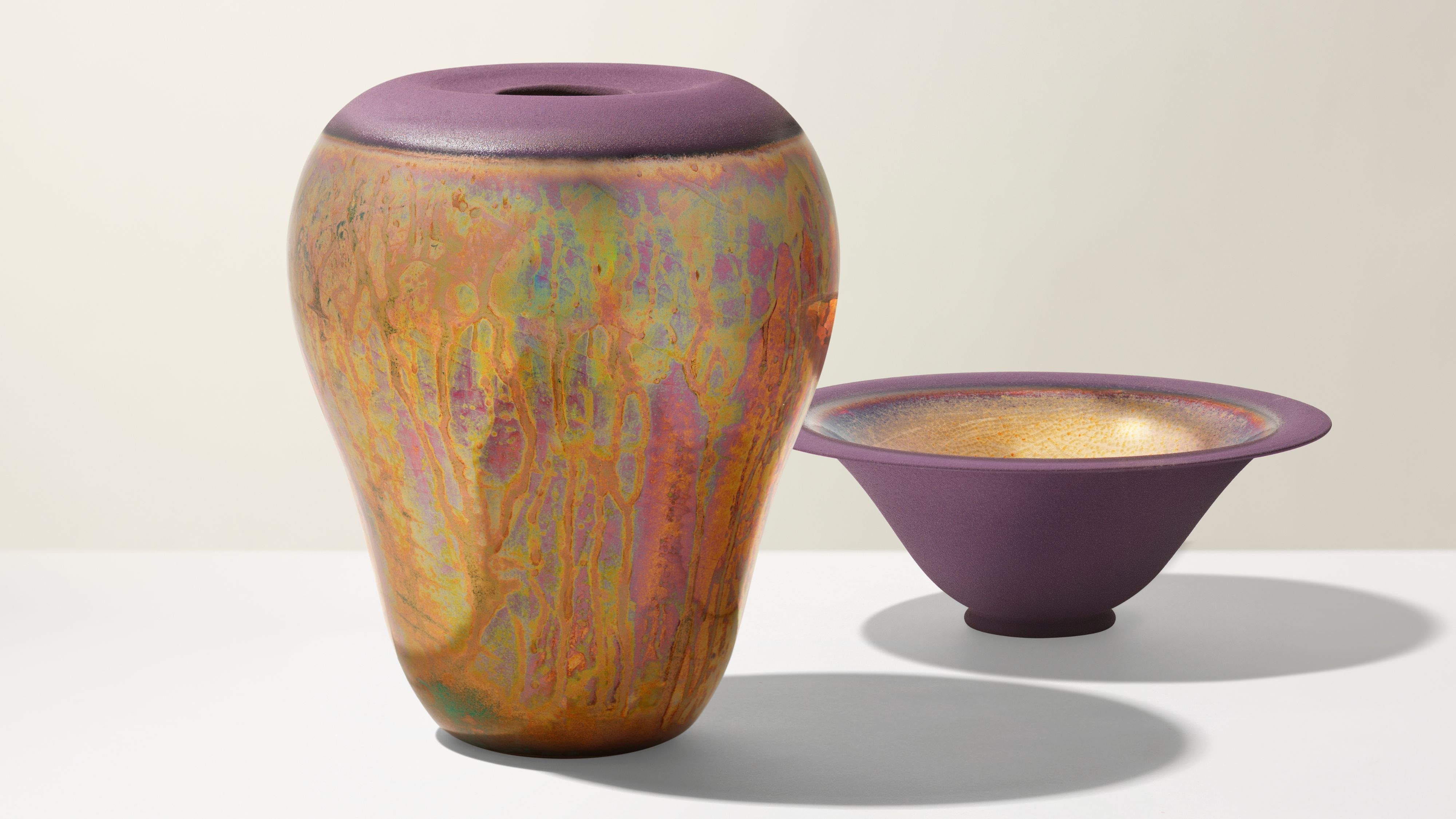 Iridescence Is Chrome’s More Playful, Hard-to-Define Cousin — And You're About to See It Everywhere
This kinetic finish signals a broader shift toward surfaces that move, shimmer, and surprise. Here's where to find it now
By Julia Demer
