This new-build home is a masterclass in decorating with bold contrasting trim for extra character and charm
Bold dark accents make for a visually contrasting space with architectural details that pop
A family of New Yorkers chose a quiet, leafy D.C. neighborhood to build their own home. While the property had great bones the interior lacked personality and architectural interest, but this offered a perfect opportunity to use the space as a blank canvas and create original solutions that catered to the family's needs.
Architectural details were added and highlighted in a blend of modern and traditional, acting as special design ‘moments’ throughout the home. A contrasting palette that mixes light and dark colors, artwork, and minimalist yet comfortable furniture is used, but the real stand out that caught our eye is the bold painted trim which adds real character to the space.
These features culminate a new type of cozy modern home - one that mixes a sculptural, minimalist aesthetic with unique, beautiful details that make one lean in and get comfortably immersed in each room. Here we take a closer look.
Contrasting trim adds architectural interest
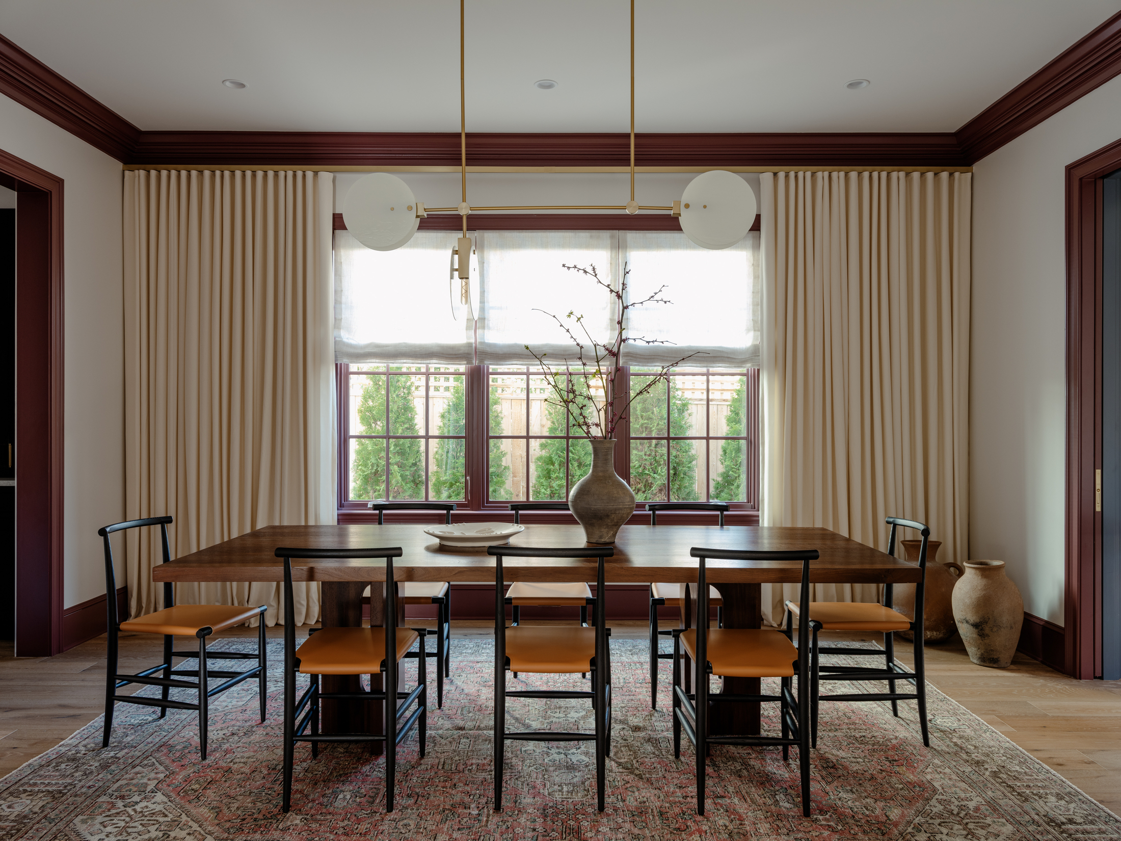
Walking through the space, one can’t help but notice the bold use of color that goes from light, open areas with walls painted in tones of off-white, to areas where bold dark colors dominate. The same theme is discreetly carried through in the dining room, living room, and bedroom where the trim (door frames, skirtings, and crown moldings) are painted in contrasting colors to the walls.
‘Painting the trim a contrasting color was an easy way to make the spaces feel more bespoke, and also added a sense of coziness,’ explains the interior designer behind the project, Zoe Feldman.
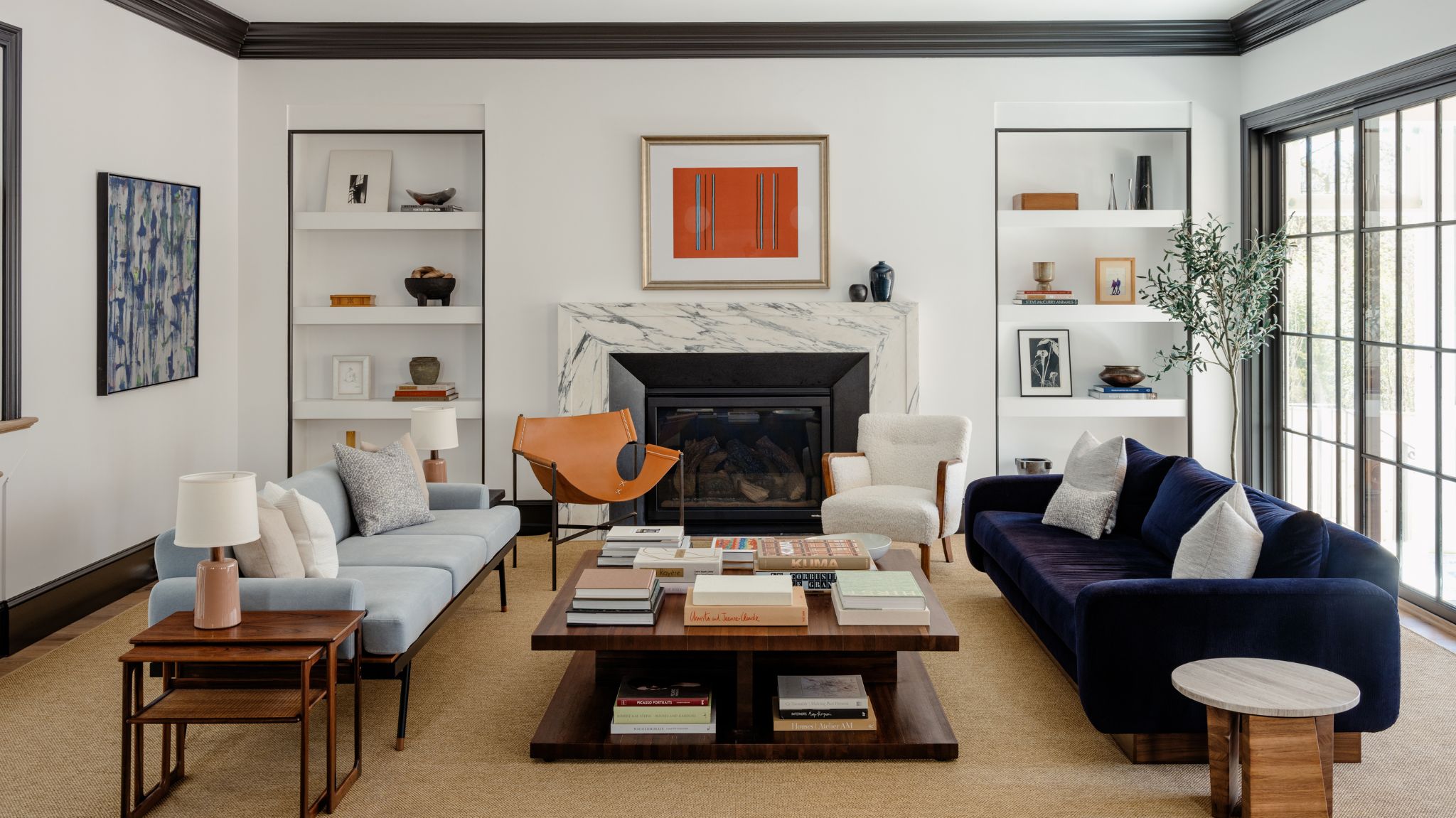
In one of the bedrooms, the white walls are a canvas that highlights the refreshingly yellow crown moldings and the grounding, dark green tone of the skirtings and door frame. In the living room a similar paint idea is used. Here, the black trims against the white walls create a sophisticated look that mirrors the black frames of the glazed doors, the trim of the alcove shelves, and the fireplace.
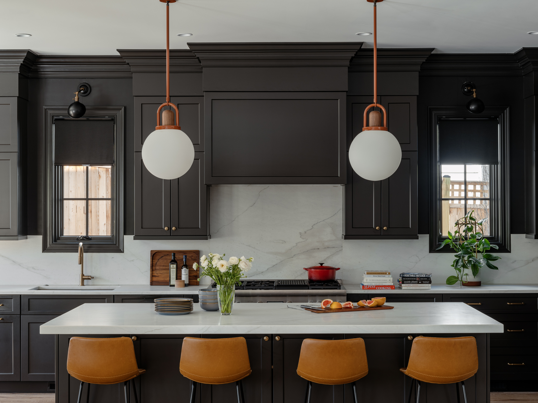
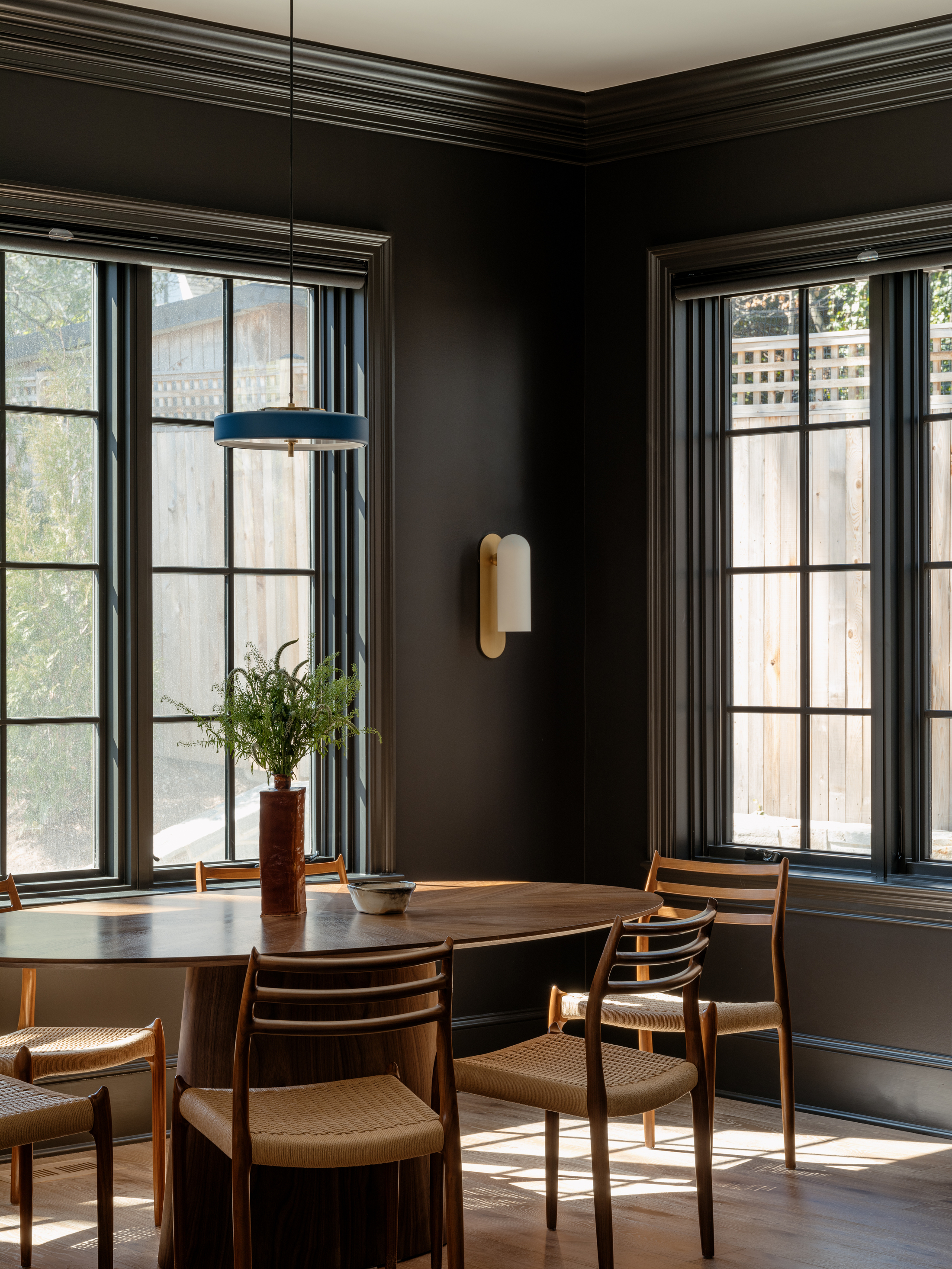
The balancing act of contrasting decorating is continued in the kitchen. ‘Rather than replace the kitchen's perfectly functional cabinets, we painted them a true black and continued the color onto the walls in the breakfast area making it feel saturated and bespoke,' says Zoe. 'In the living room, white walls and lots of light act as a neutralizer to the adjacent dark kitchen.' The black kitchen is beautifully highlighted through the use of white marble on the island and backsplash.
Be The First To Know
The Livingetc newsletters are your inside source for what’s shaping interiors now - and what’s next. Discover trend forecasts, smart style ideas, and curated shopping inspiration that brings design to life. Subscribe today and stay ahead of the curve.
Canvas-like walls let the art and furniture shine
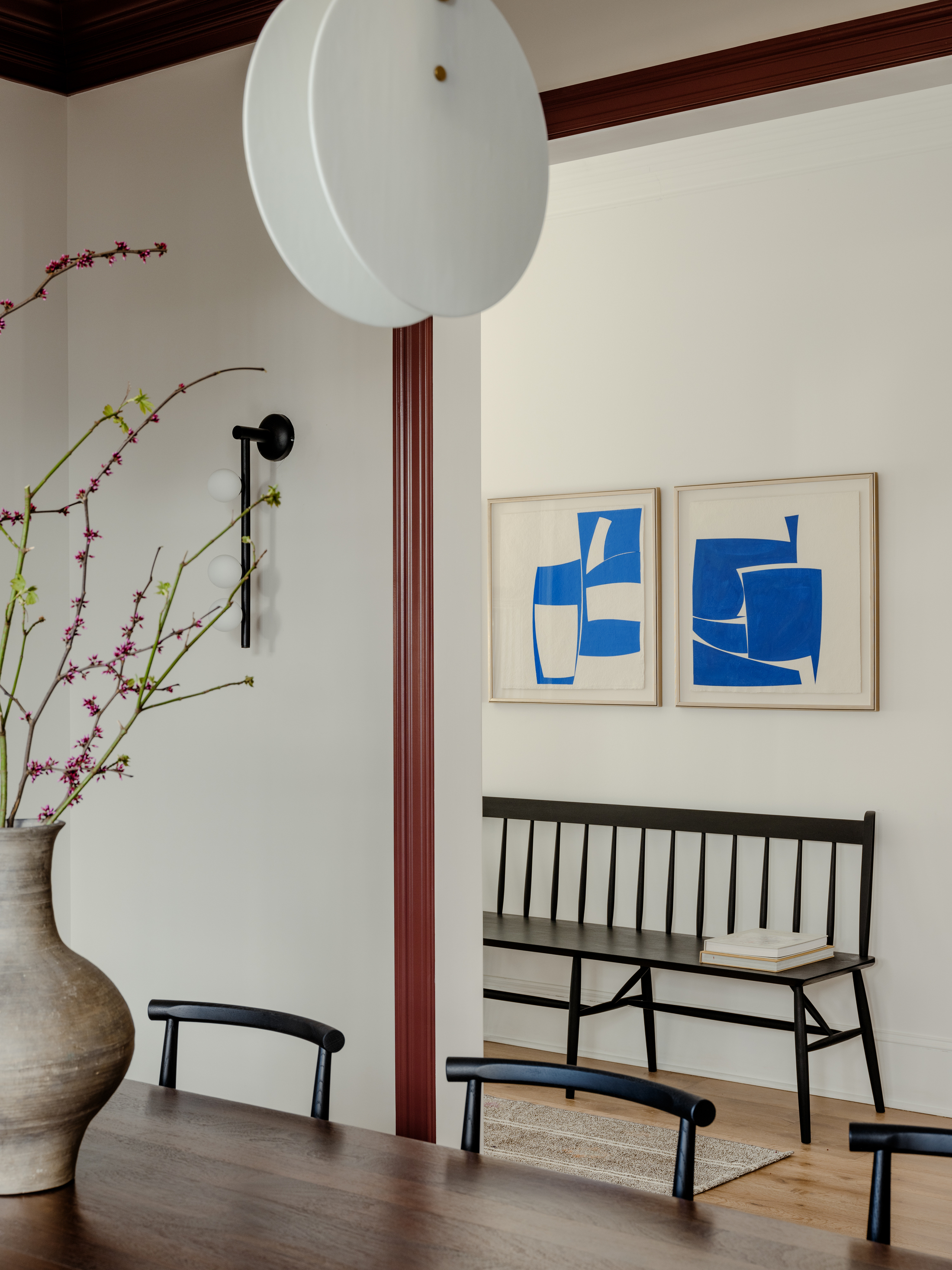
While color was brought into the kitchen and library, Zoe decided to use the communal areas as spaces where art and furniture could play the main role. ‘We embraced a quiet palette in the main common areas that let the art and furniture shine (i.e. dark cabinets in the kitchen, and gallery-like white walls in the living room),’ she says.
The dark black, contrasting trims create a frame-like effect for the carefully curated objects in the living and dining room, highlighting them as unique pieces worthy of display. ‘We furnished the home with deconstructed furniture that had a sculptural, minimalist bend,’ Zoe tells me, and one look is enough to spot a mid-century modern feel that is both minimalist in shape, but feels comfortable and warm in texture and color.
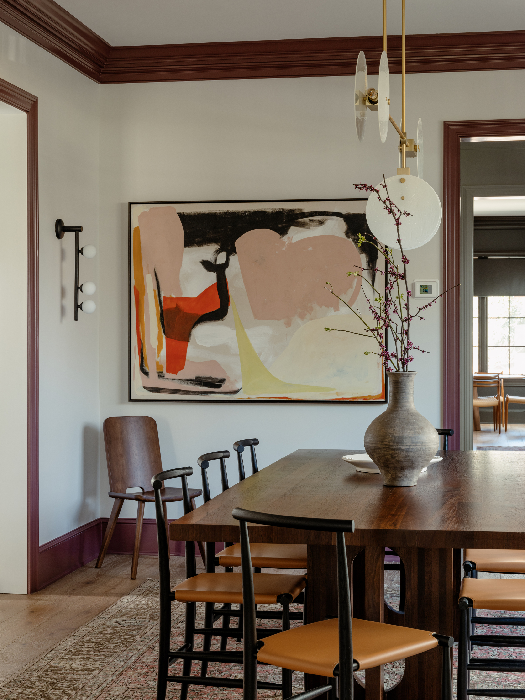
The design of this home makes use of simple yet impactful decorating to add character to what would otherwise be a white box. Playing with contrasting paint, retrofitting architectural details such as crown moldings, and highlighting carefully curated furniture and art, created a sophisticated look that feels as modern as it is timeless.
Get the look
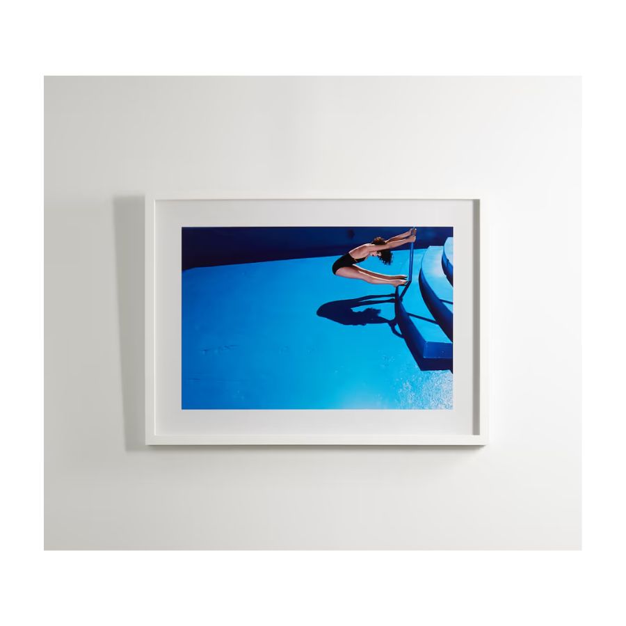
Price: $1,865 (40'' x 29'' size print)
White, canvas-like walls will make your artwork stand out. Further frame your gallery wall with contrasting black trims.
Raluca formerly worked at Livingetc.com and is now a contributor with a passion for all things interior and living beautifully. Coming from a background writing and styling shoots for fashion magazines such as Marie Claire Raluca’s love for design started at a very young age when her family’s favourite weekend activity was moving the furniture around the house ‘for fun’. Always happiest in creative environments in her spare time she loves designing mindful spaces and doing colour consultations. She finds the best inspiration in art, nature, and the way we live, and thinks that a home should serve our mental and emotional wellbeing as well as our lifestyle.
-
 The Easiest Way to Turn Your Designer Scarf Into Wall Art — No Frame, No Fuss, No Regrets
Because silk this pretty should never stay in a drawer
By Julia Demer Published
-
 Italian Kitchen Trends — 5 Emerging Ideas From the Chicest Italian Designers That I Predict Will Go Global in 2025
Fresh from Milan Design Week, these are the exciting finishes, styles, and innovative materials I can't wait to see in more kitchens this year
By Faiza Saqib Published
