In This Apartment, a Fall Color Scheme Creates Rooms That Feel Cozy and Inviting All Year Round
Hues borrowed from autumn leaves — think yellow, red, and brown — play a starring role in this stylish apartment
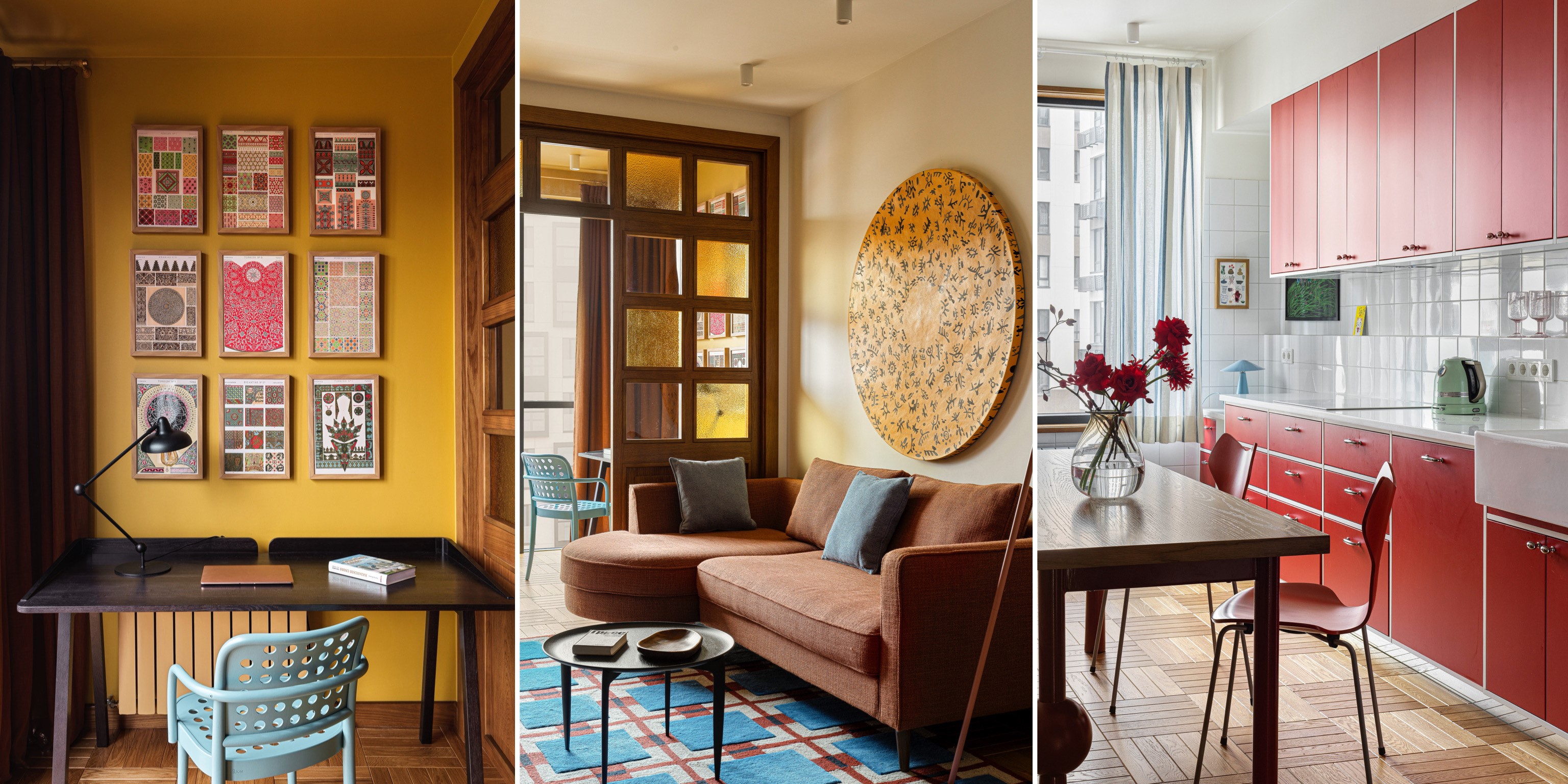

Ochre, tan and burgundy, when used in combination, bring to mind the classic colors of fall — but in this Kazakhstan apartment, this palette is proved to have appeal no matter the season.
Color was the anchor for the design of this 1,140-square-foot home for a family of five, designed by Diana and Elina Musakulov, founders of sdelaemremont. "The clients were very trusting and didn't give us any references for the home's design," shares Diana. "They happily agreed with our ideas, and we went ahead with a bold, colorful interior full of character."
While some might see fall paint color schemes, others will see the gloriously earthy tones of the 70s revival that's gripping interior design right now. Either way, it's a color scheme that's brave and interesting, and that makes this apartment feel undeniably warm — the sort of home that puts a smile on your face.
Living room

The living room is drenched in soothing tones that make for the perfect fall decor palette. Browns, deep yellows, and wood tones envelop the space, and create a laid-back vibe.
"We chose a different color scheme for each room to personalize spaces and reflect the individual preferences of the family members," say Elina and Diana Mussakulova of sdelaemremont. "These bold colors also perfectly align with our clients' personalities."
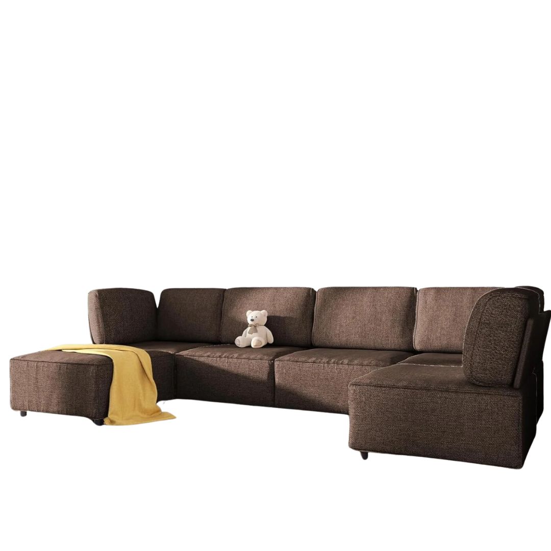
Dimensions: 120"L x 60"W x 30"H
Price: $519.99
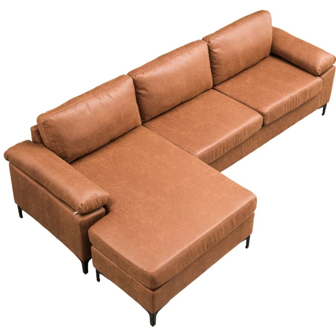
Dimensions: 33.07" H X 97.64" W X 53.54"D
Price: $649.99
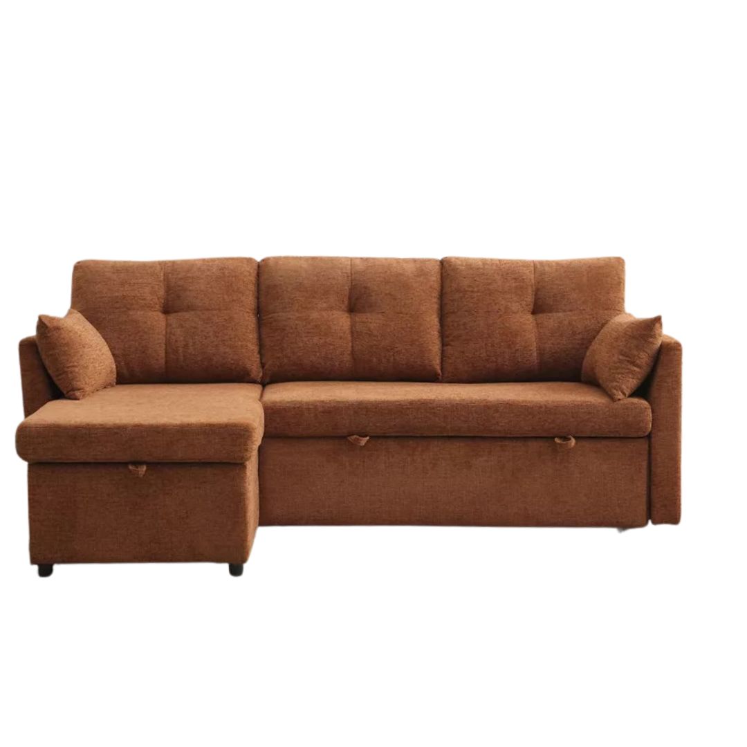
Dimensions: 81.1"W x 51.18"D x 34.65"H
Price: $649.99
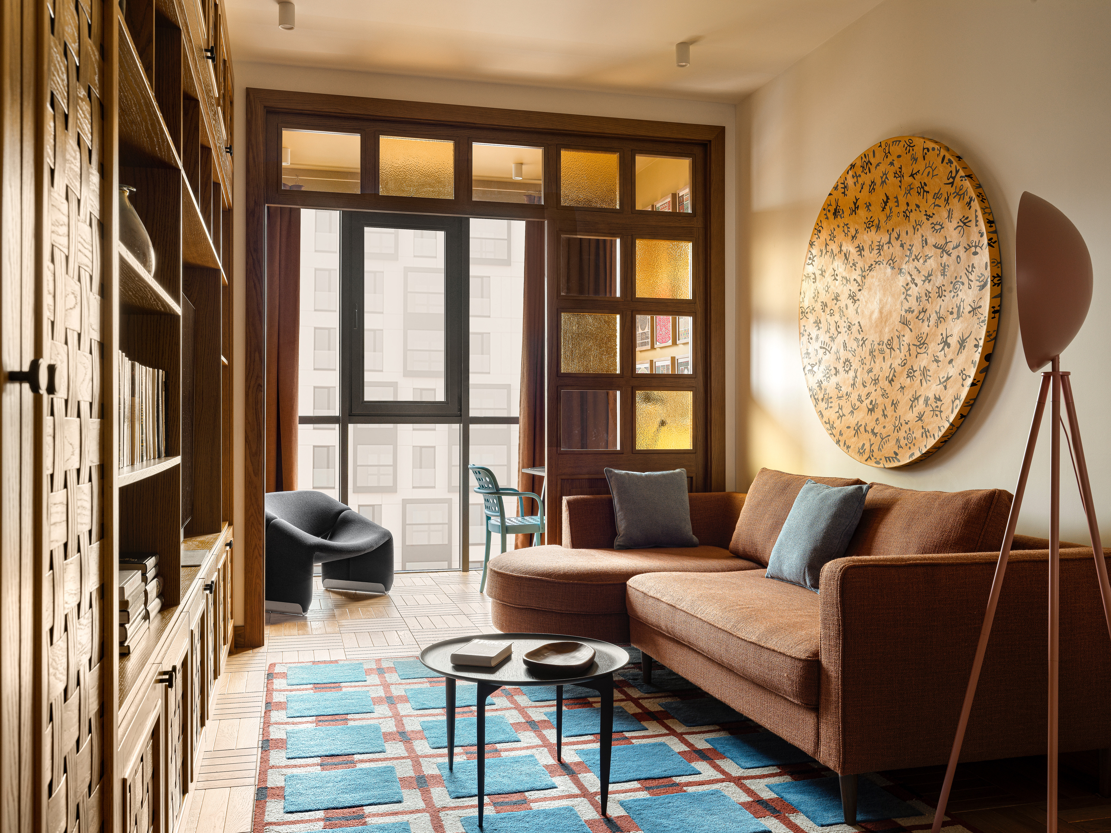
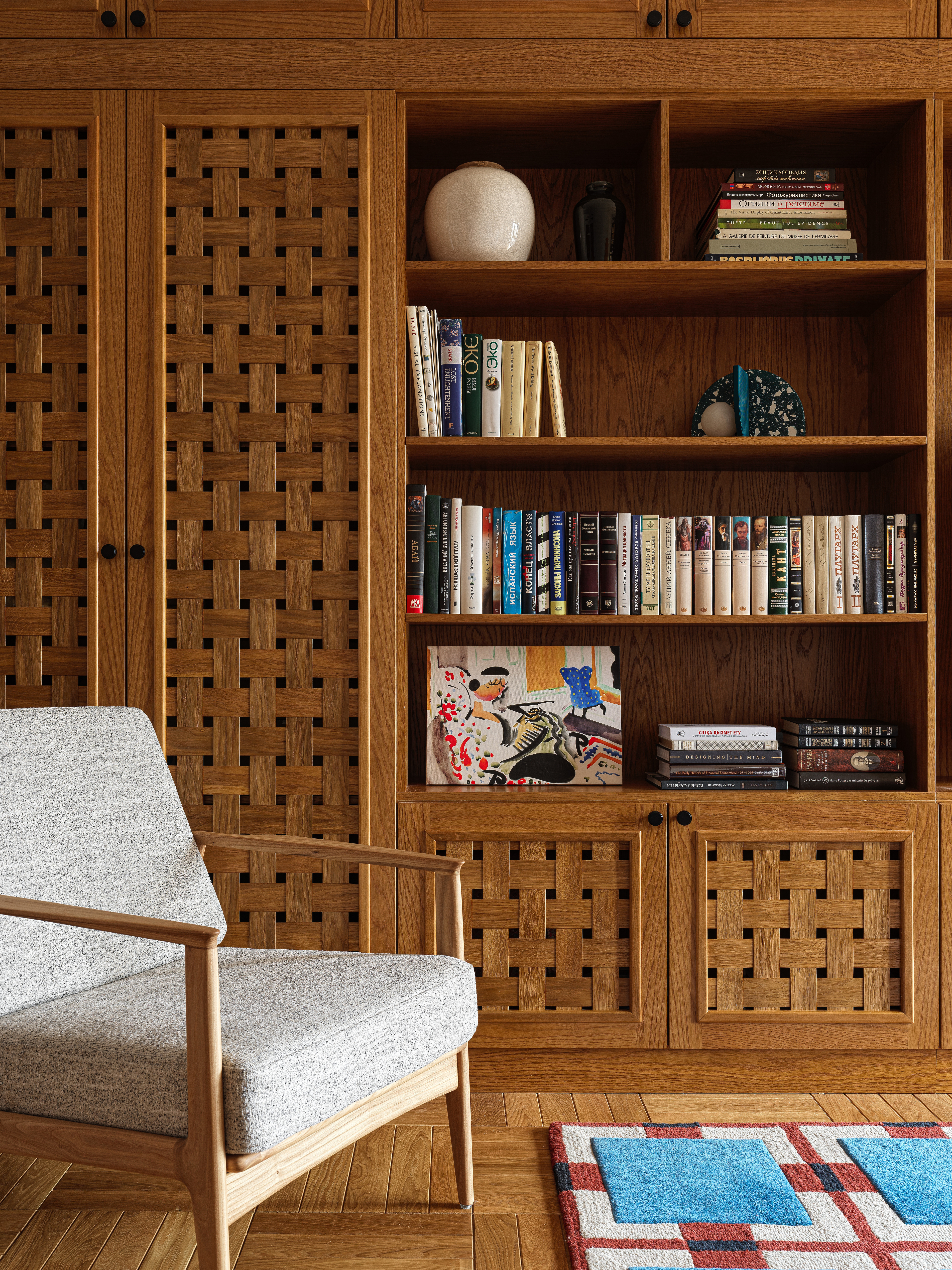
A retro brown sectional takes center stage, while the living room TV is enclosed within a wood built-in with ornate detailing. "We designed a niche, and then built the storage within it so it looks like a wall," shares Elina. "We divided the unit into different sections — the TV unit, bookshelves, and cabinets — and also added wicker facades to the units for a soft visual. As for the final touch, we love decorating shelves with vases and portable lamps."
The living room rug adds further layering, color, and texture to the room. "This piece is from Layered and the sofa is custom-made by local manufacturers," says Diana. "The wall art is the work of the talented Kazakh artist, Adil Aubekerov."
Be The First To Know
The Livingetc newsletters are your inside source for what’s shaping interiors now - and what’s next. Discover trend forecasts, smart style ideas, and curated shopping inspiration that brings design to life. Subscribe today and stay ahead of the curve.
This room separated from the adjoining home office with a wooden partition with colored textured glass, adding further intrigue to the room's design.
Home Office
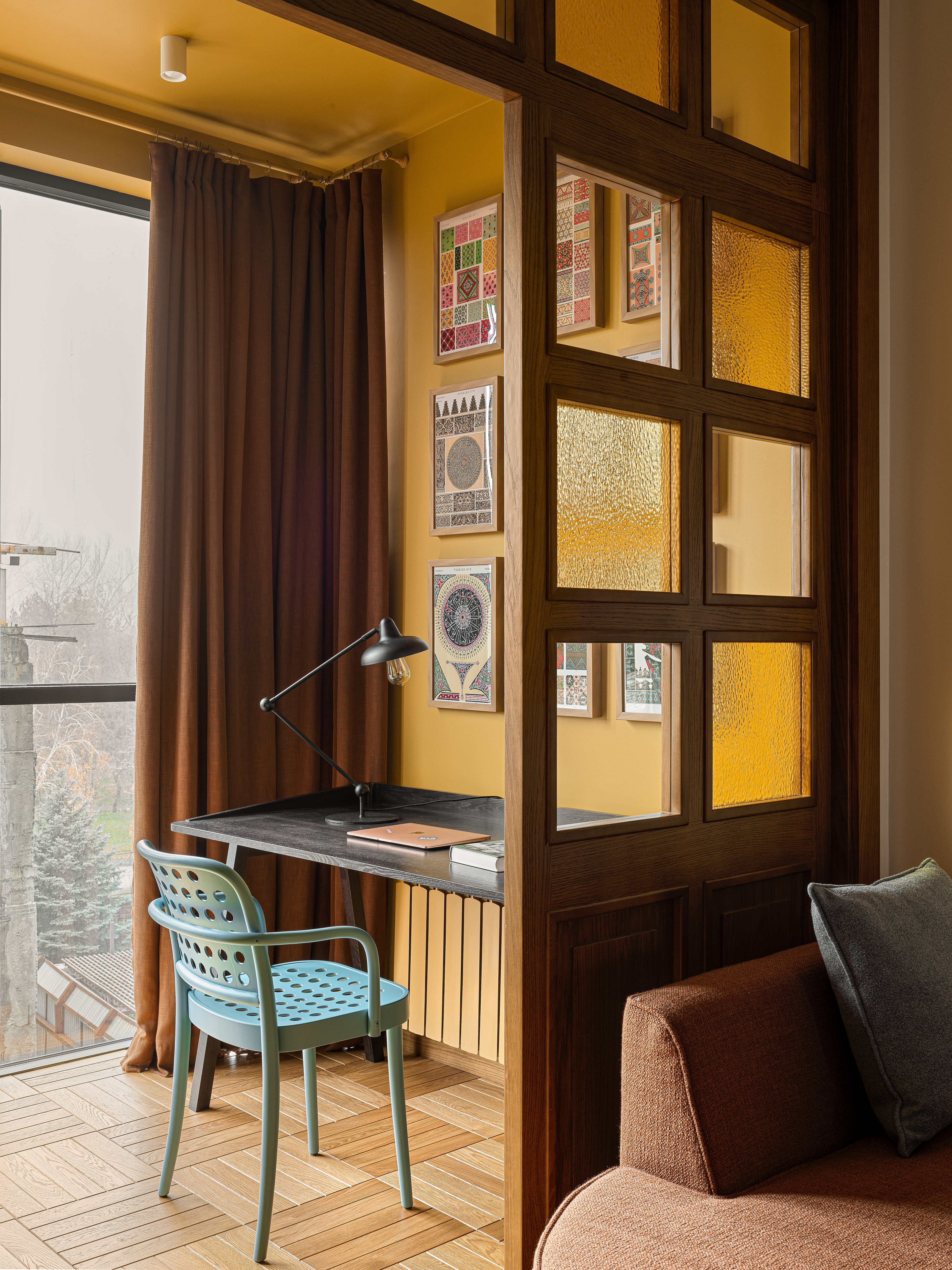
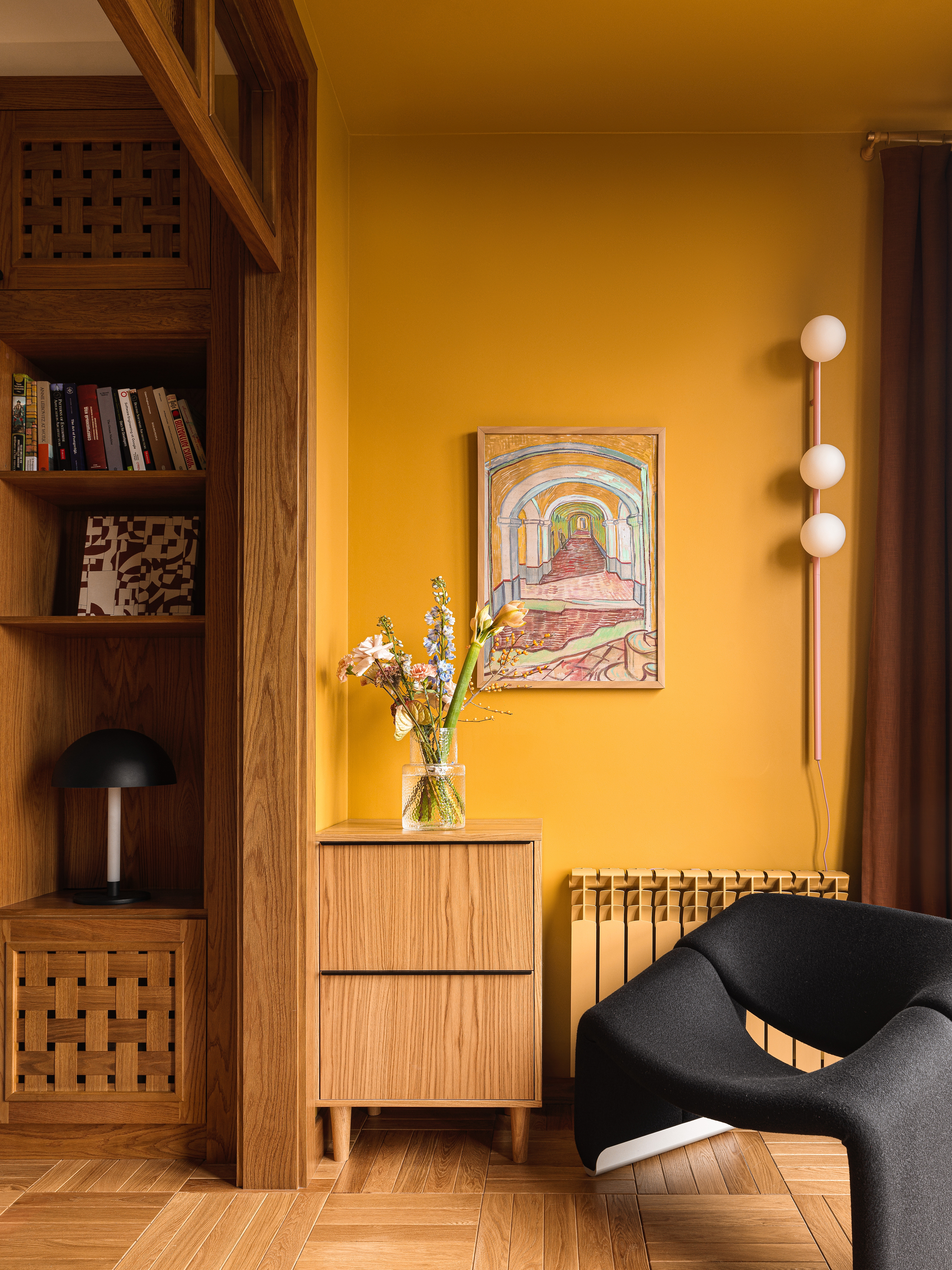
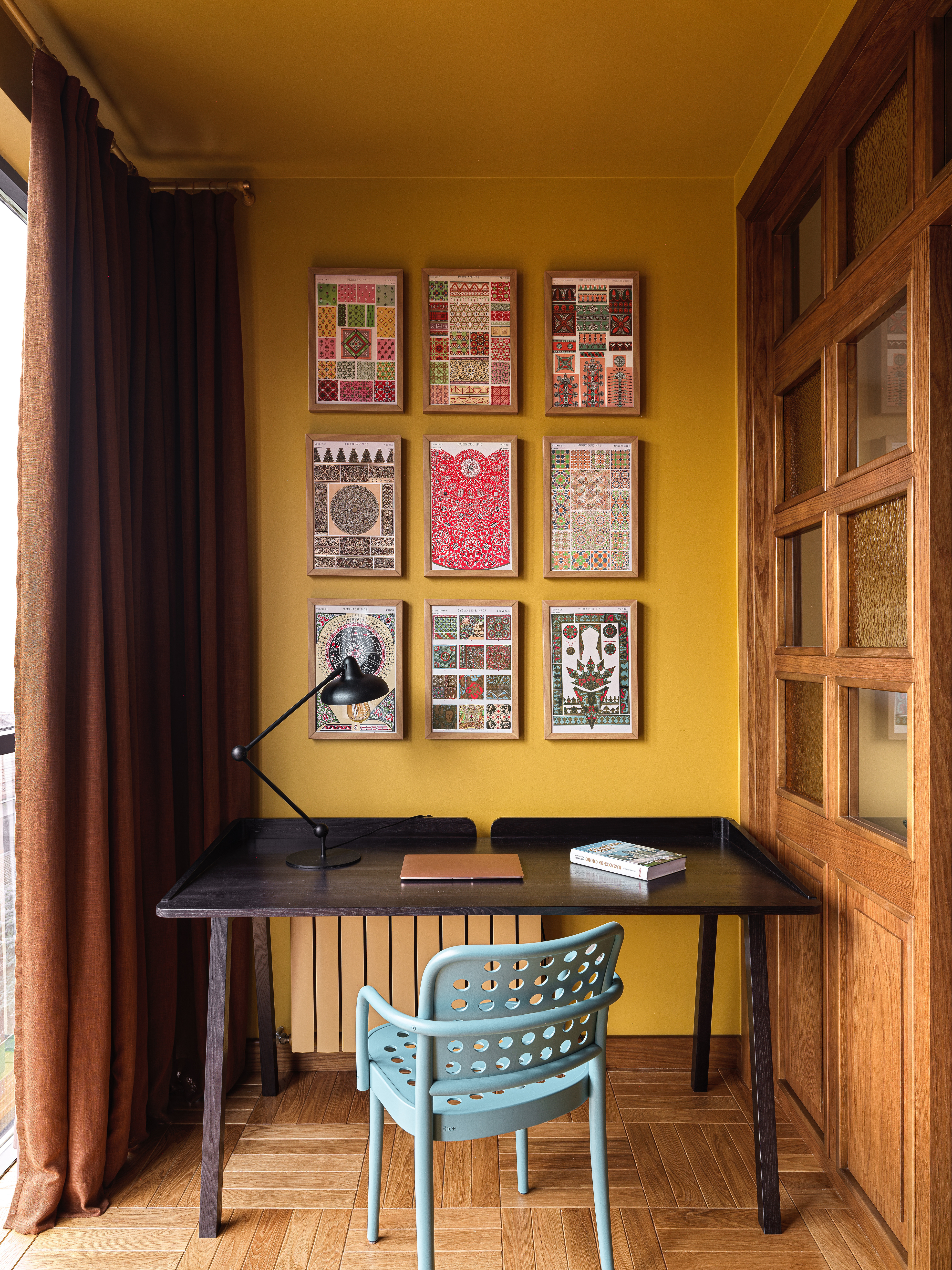
Just beside the living room is the small home office drenched in a warm mustard yellow. "We wanted to add a bright color that would make the room look warm, so we went for the mustard yellow S32 by Tikkurila that matches the yellow corrugated glass," shares Diana. "The chair is from Ton and the desk is custom-made."
The brown curtains and the black chair contribute to a lovely, earthy palette and the artwork on the walls inject a casual, fun appeal.
 Get the look
Price: $5.99 per sample

Price: $2 per sample

Price: $8.50 per sample
HALLWAY
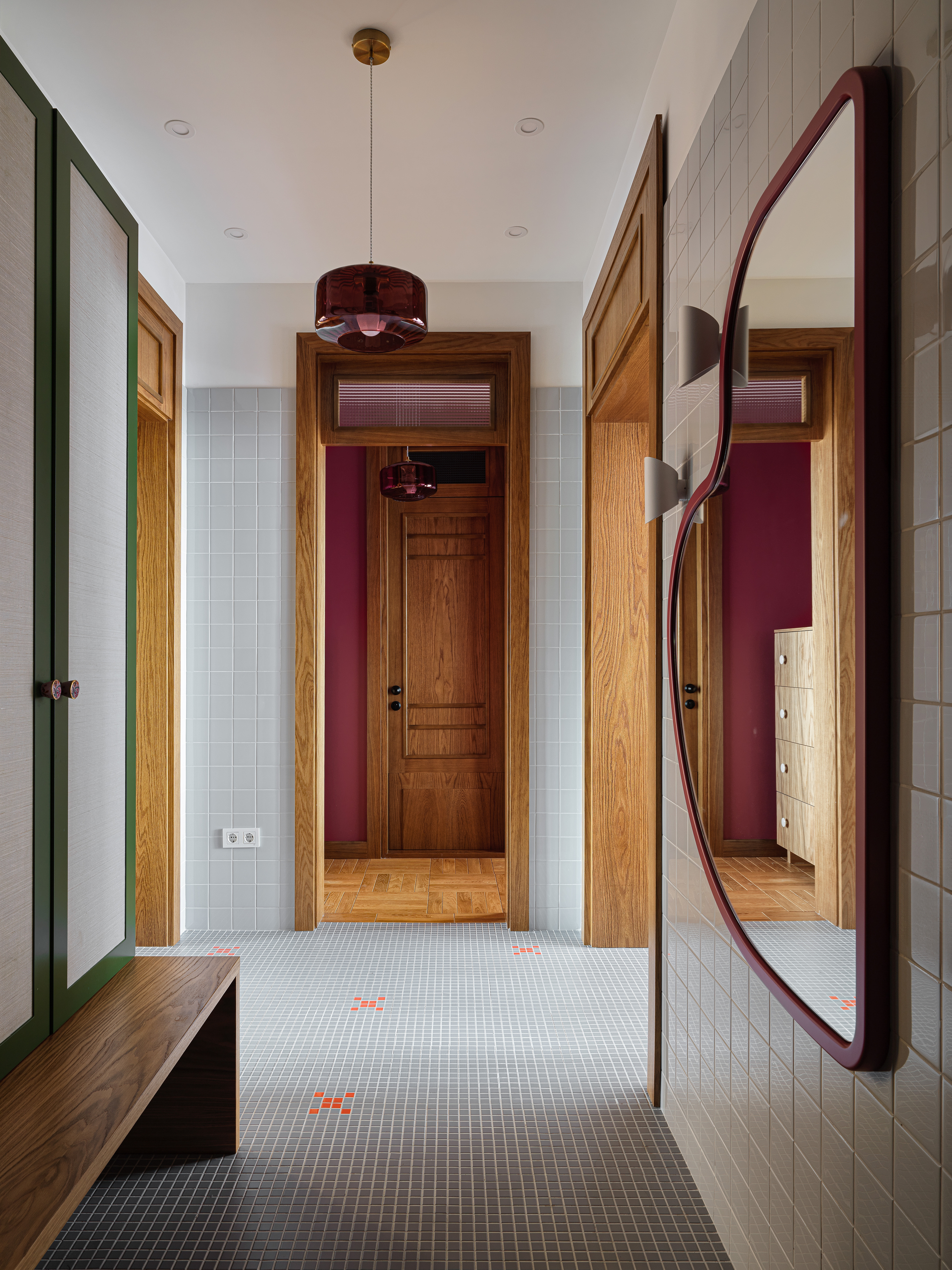
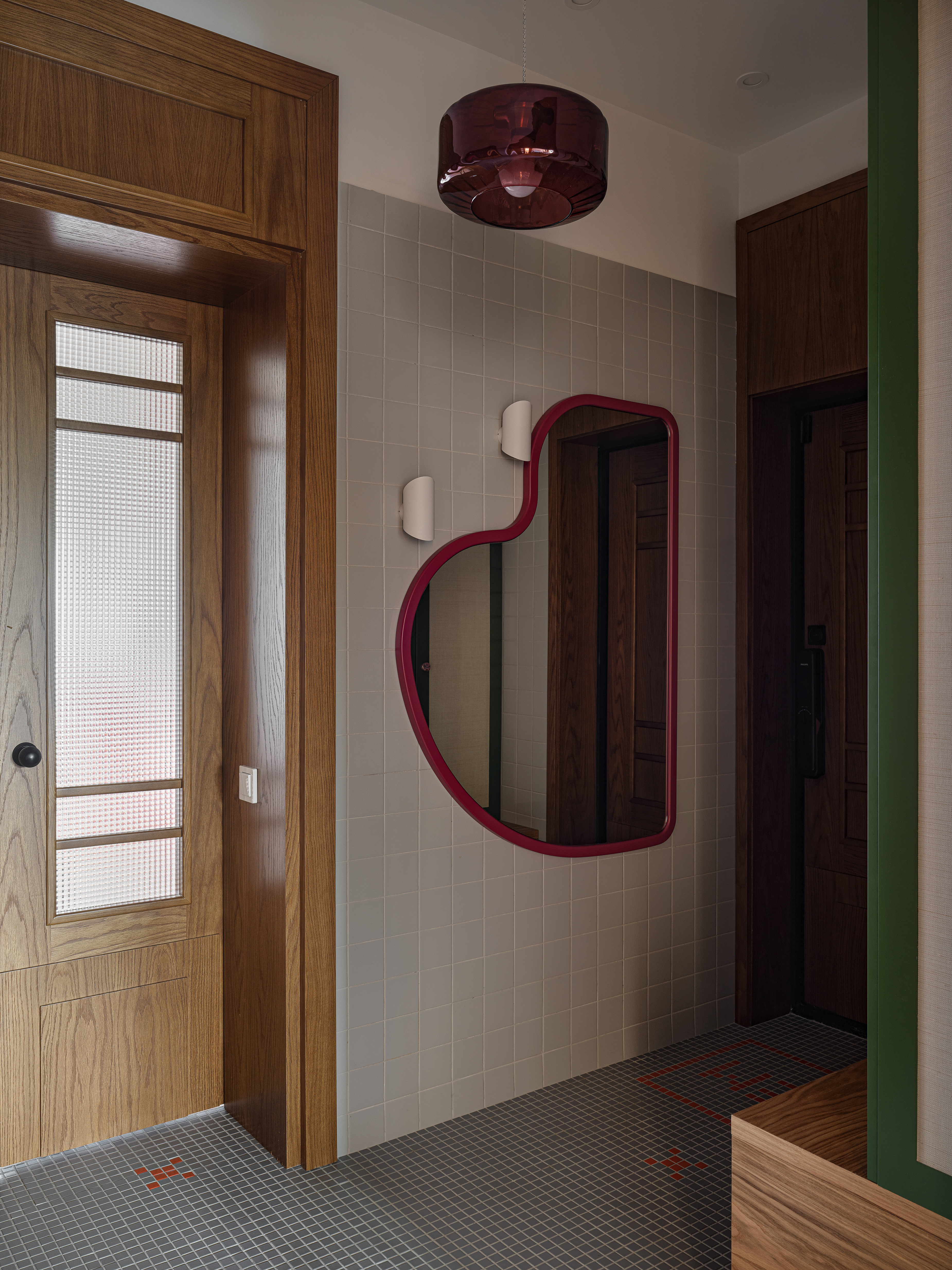
The hallway leading to the kids' room, kitchen, and living room is designed to be a refreshing moment in the apartment's design. A soft, cool palette, along with the organic-shaped mirror, wall storage and tiles with colorful grout lines, make for intriguing details with wow-factor, while still feeling calm and simple.
"Tiling the hallway was a practical solution for a family home with three children — the home faces a lot of wear and tear with shoes and bike marks," says Elina. "The tiles ensure that the walls and floors remain durable and do not show dirt marks easily. And, functionality aside, they also add uniqueness to the apartment. We sourced these tiles from Mir Mosaic."
Kitchen


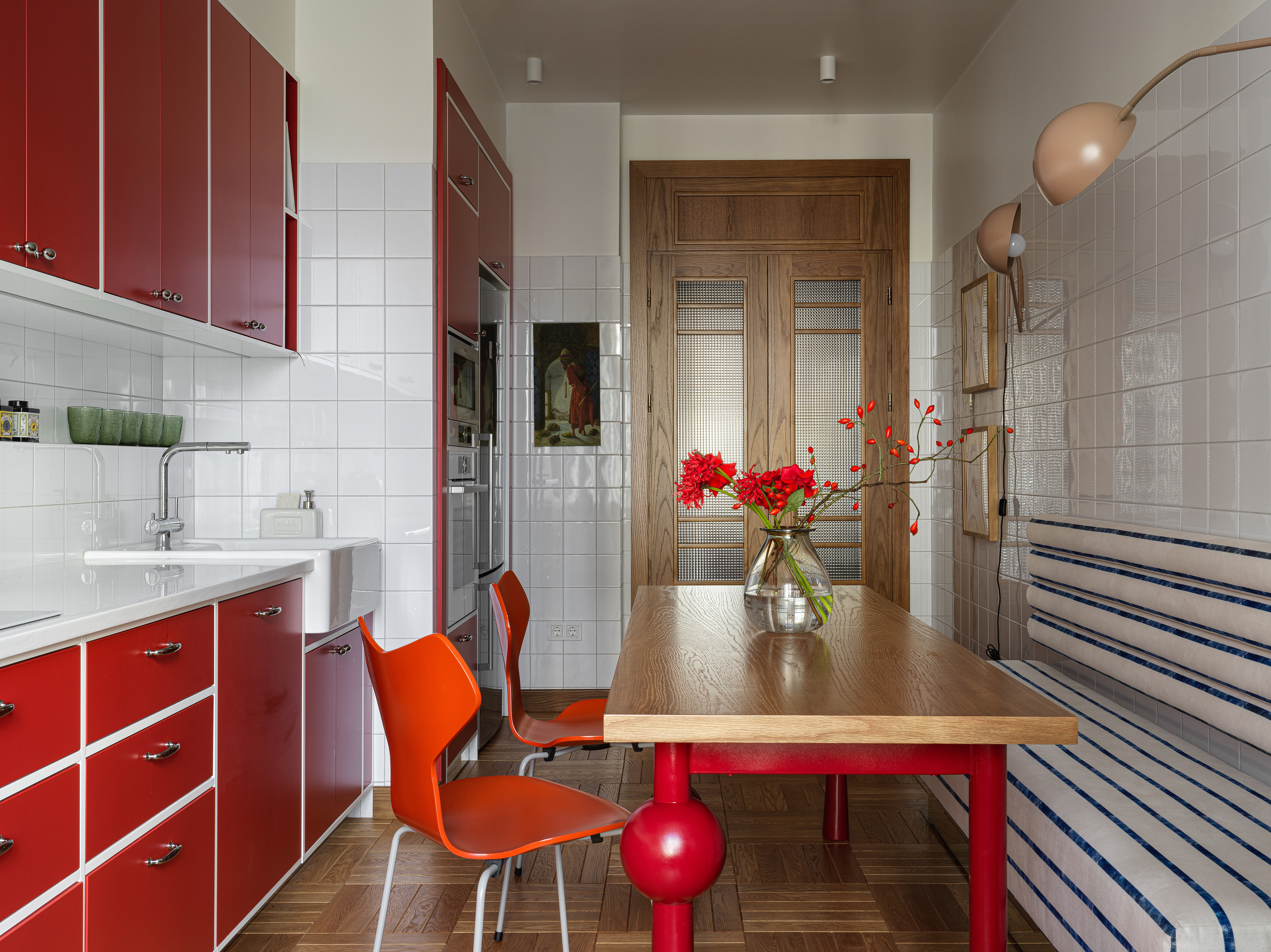
It's not often that a kitchen sports a bold, red color palette, but in this space, the kitchen color is wonderfully balanced with white tiles and a textured wooden floor so it never feels too much.
"We decided to add a splash of red in this kitchen, and added non-standard tiles to make this narrow kitchen enjoyable," says Elina. "The bold tone of the cabinets is offset with the white walls, and this combo brings a sense of freshness and purity."
Since the small kitchen had a long and narrow layout, the designer introduced built-in seating, comfortable for children and adults. "The chairs are Grand Prix Chairs from Fritz Hansen," says Elina. "The table is custom made — we strengthened table legs with a metal frame from within."

Price: $5.98 per sample

Price: $5 per sample

Price: $2 per sample
The home is cozy, convivial, and as practical as it is beautiful. "The biggest challenge we faced while designing it was that we could not change the apartment's layout since all the walls are load-bearing," shares Diana. "Nevertheless, we managed to design two bathrooms and a laundry, and the rest of the rooms with a bold and colorful design that won't date easily."

Aditi Sharma Maheshwari started her career at The Address (The Times of India), a tabloid on interiors and art. She wrote profiles of Indian artists, designers, and architects, and covered inspiring houses and commercial properties. After four years, she moved to ELLE DECOR as a senior features writer, where she contributed to the magazine and website, and also worked alongside the events team on India Design ID — the brand’s 10-day, annual design show. She wrote across topics: from designer interviews, and house tours, to new product launches, shopping pages, and reviews. After three years, she was hired as the senior editor at Houzz. The website content focused on practical advice on decorating the home and making design feel more approachable. She created fresh series on budget buys, design hacks, and DIYs, all backed with expert advice. Equipped with sizable knowledge of the industry and with a good network, she moved to Architectural Digest (Conde Nast) as the digital editor. The publication's focus was on high-end design, and her content highlighted A-listers, starchitects, and high-concept products, all customized for an audience that loves and invests in luxury. After a two-year stint, she moved to the UK and was hired at Livingetc as a design editor. She now freelances for a variety of interiors publications.
-
 Jeremiah Brent Captures the Grit and Glamour of NYC in His New Loloi Collaboration
The TV-famous interior designer looked out of his own window — and hit the pavement — for a collection that turns city spirit into tactile design
By Julia Demer
-
 This Specific Fabric Print Is Literally Everywhere Right Now — Here's Why
It's whimsical, artistic, and full of character. We've called it already: Dedar's 'Tiger Mountain' is the fabric that will define 2025
By Devin Toolen