The architects behind this cool micro loft used a clever trick to bring structure to studio apartment living
Angled furniture is the design idea you need to consider for small homes


One of the biggest problems that occurs when living in a small space like a studio apartment is the lack of defined spaces. It's all too easy to feel like you don't have dedicated room for the different elements of your life – but introducing partitions into a small space might only make the problem worse.
So what's the solution? Well, in designing this tiny studio apartment, architect Ben Edwards, founder of Studio Edwards, found that the answer lay in usually carefully positioned, carefully shaped built-in furniture to bring structure to the space.
'The apartment has been re-imagined as a series of overlapping surfaces and horizontal planes that act to imply kitchen, dining, living and sleeping zones,' the architect tells us. 'There's a dynamic that space is continuous or implied, rather than partitions or walls, through changes in volume.'
It's a clever idea that works magic for this specific compact modern home, but offers something to think about for any small space. Here's how Ben made it work for this cool micro loft.

Hugh is Livingetc.com's deputy editor, and an experienced homes and property journalist. Here, he tours a compact micro apartment and discovers the secret the architect used to make the studio space feel like it has distinct areas.
Introducing angles
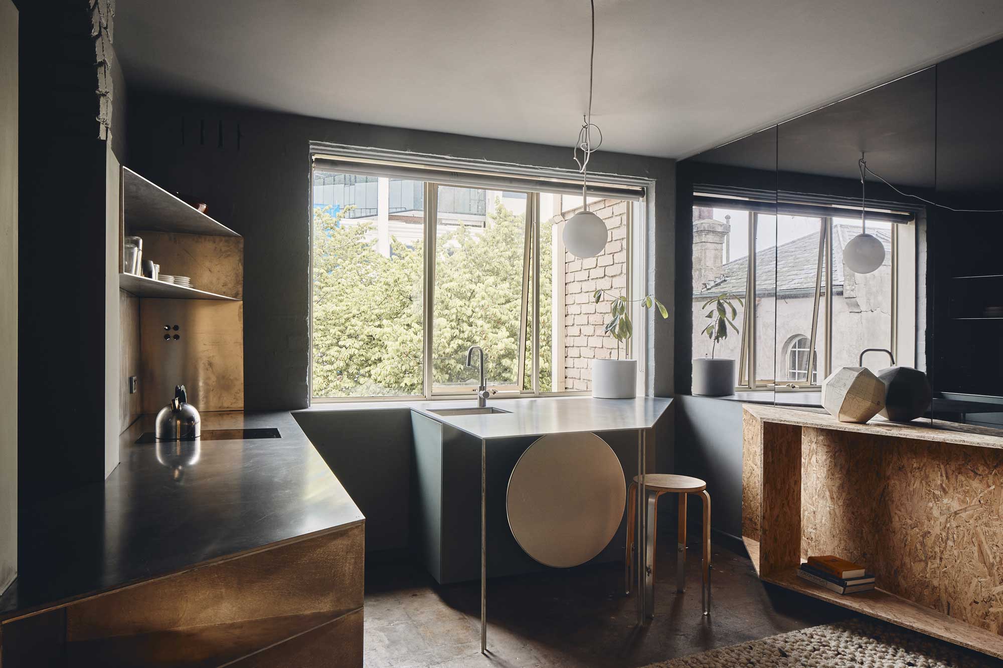
In this studio apartment, angles help to guide how you use the room, while maximizing each of the surfaces to meet the multitude of demands required of it. 'A horizontal raw aluminum surface expands and contracts to create dining & kitchen,' architect Ben Edwards of Studio Edwards explains, 'before extending through an existing brick archway into the sleeping area beyond.'
The kitchen, which melds seamlessly into a dining space too, features angled countertops, while triangular storage shelves make use of the corners of the room also. To the side of the area designated as a living room, another angular volume emerges. 'This angled wedge from the wall provides storage and further animates the space,' Ben explains.
Keeping it low
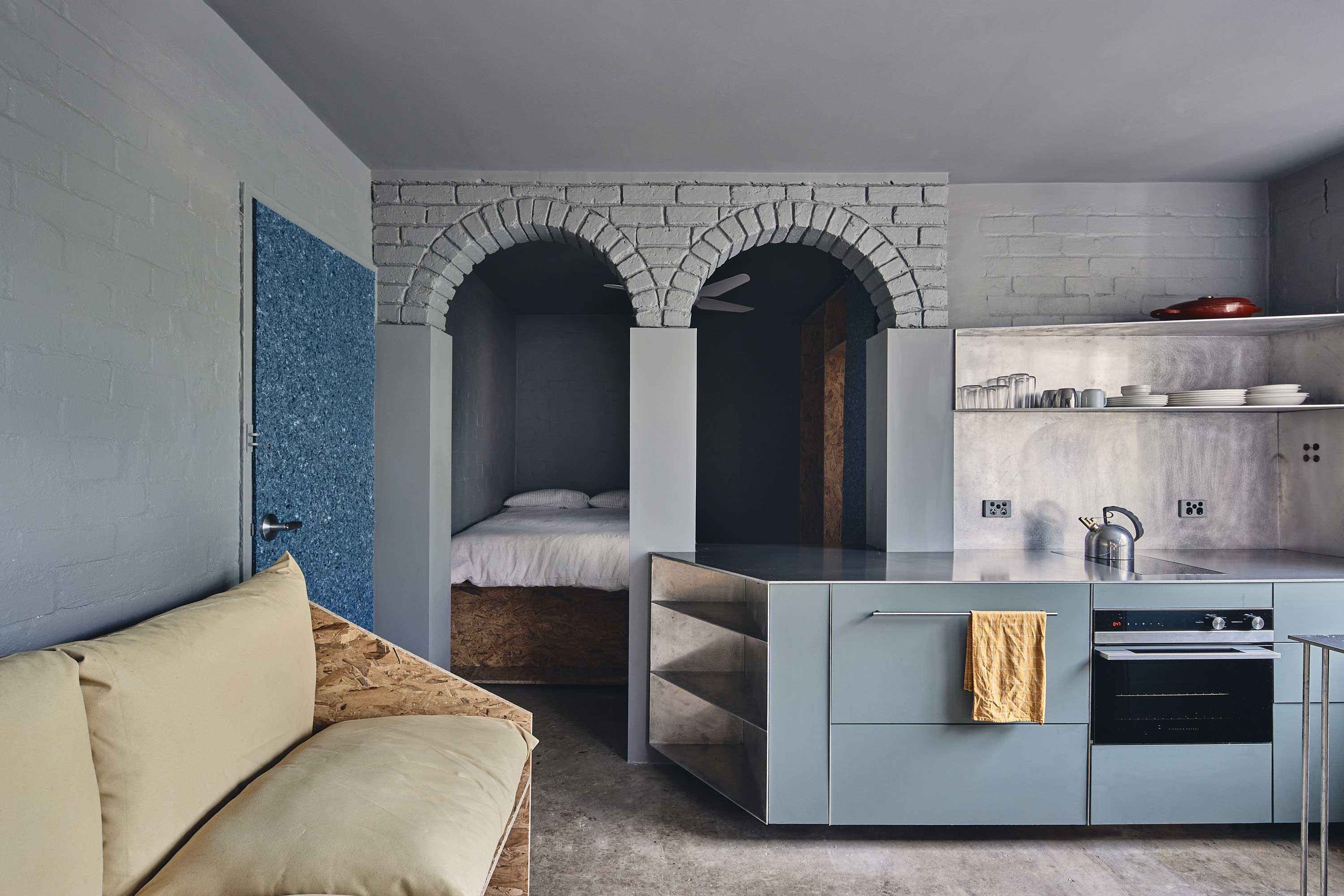
These angled built-ins act in a similar way to room dividers, but the key to this scheme's success is that nothing extends higher than the 'datum' line the architect has introduced, helping the space to remain open, and the whole of the space to be reflected in the large mirrored panels.
Be The First To Know
The Livingetc newsletters are your inside source for what’s shaping interiors now - and what’s next. Discover trend forecasts, smart style ideas, and curated shopping inspiration that brings design to life. Subscribe today and stay ahead of the curve.
'The edges and thresholds are further blurred with a grey mirror running along one edge of the living space above a datum defined by the aluminum dining and kitchen surface,' Ben explains, 'acting to reflect the interior (and a tree from an adjoining property) back onto itself.'
The only real divides in the space are the original brick arches, behind which the platform bed sits, and a wall of storage built from OSB board that leads to the ensuite bathroom.
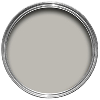
This mid-tone grey shade is the perfect choice for a small space. Warm and inviting, and light enough to not feel dominating when used to drench the walls and ceiling for a modern look.
Material considerations
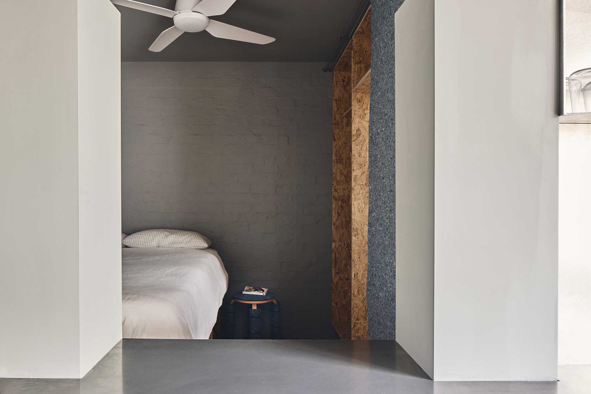
As is often the case with small apartments, the architect turned to built-ins to make full use of the space. 'Many of the items had to be built in, especially given the walls were not 100% square,' he explains. 'The built-in couch, for example, was literally built on site and follows the angled rear wall, and there is also storage underneath. The couch's oversized cushions can be re-configured from an upright mode designed for reading to a more relaxed set-up for lounging.
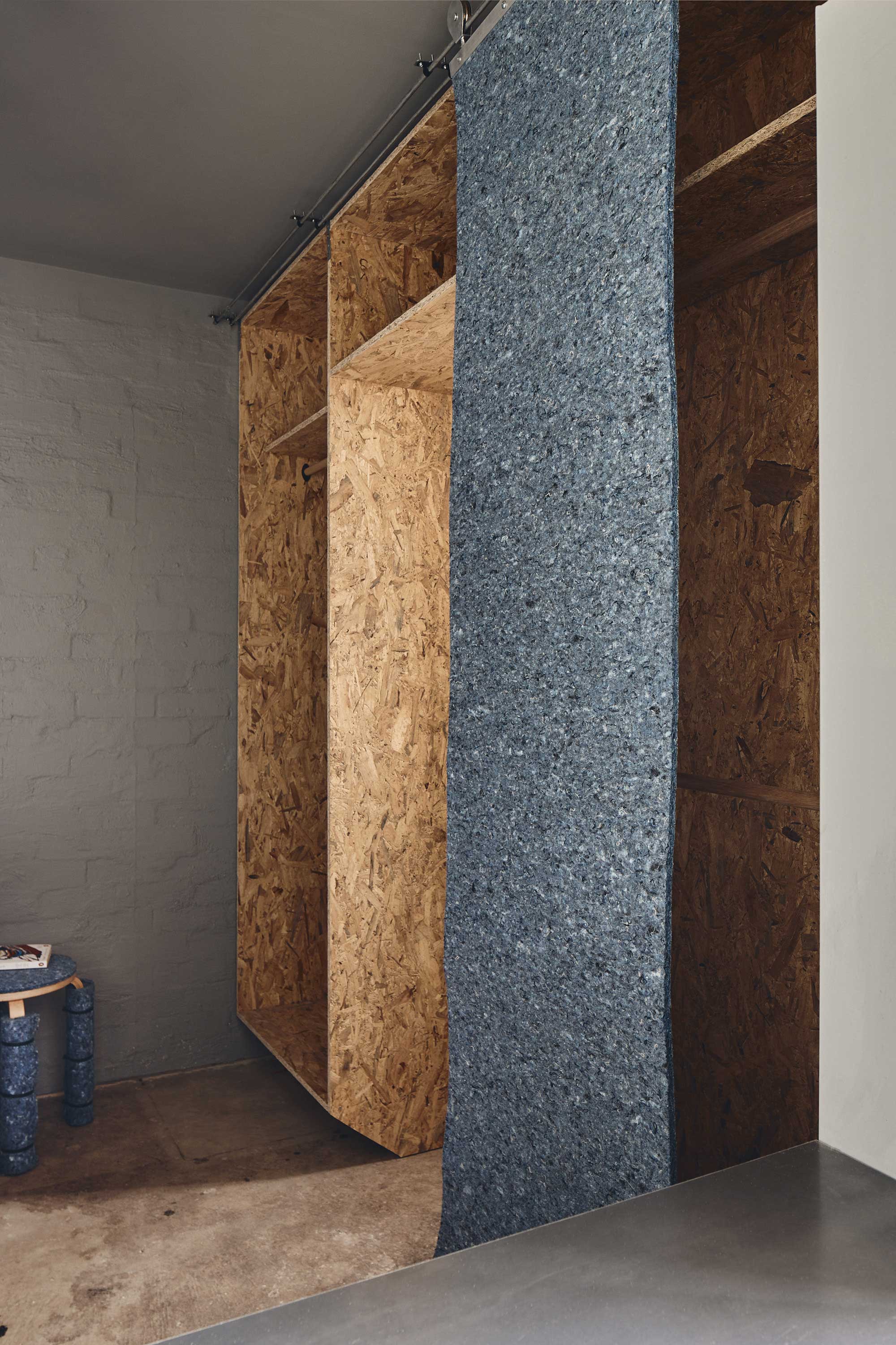
There are bedroom built-ins, too. 'The bed sits on a raised OSB plinth to maximize storage,' Ben explains. The bedroom's open closet is wrapped in recycled denim sliding panels which can be used to hide the contents from view.

Hugh is Livingetc.com’s editor. With 8 years in the interiors industry under his belt, he has the nose for what people want to know about re-decorating their homes. He prides himself as an expert trend forecaster, visiting design fairs, showrooms and keeping an eye out for emerging designers to hone his eye. He joined Livingetc back in 2022 as a content editor, as a long-time reader of the print magazine, before becoming its online editor. Hugh has previously spent time as an editor for a kitchen and bathroom magazine, and has written for “hands-on” home brands such as Homebuilding & Renovating and Grand Designs magazine, so his knowledge of what it takes to create a home goes beyond the surface, too. Though not a trained interior designer, Hugh has cut his design teeth by managing several major interior design projects to date, each for private clients. He's also a keen DIYer — he's done everything from laying his own patio and building an integrated cooker hood from scratch, to undertaking plenty of creative IKEA hacks to help achieve the luxurious look he loves in design, when his budget doesn't always stretch that far.
-
 Biophilic Decluttering — What to Take Out of Your Home (and What to Put in) for a More Natural Home
Try your hand at biophilic decluttering to ground your interiors, connect to the environment, and cure chronic clutter in one go. Here's how.
By Amiya Baratan
-
 10 Arrestingly Beautiful Milan Restaurants Locals *Actually* Dine at — Selected for Their Interiors
Brought to you by our community of culture insiders, this edit of the best restaurants in Milan sees authentic Italian food and immersive design unite
By Gilda Bruno
